# Get started with Streamlit
Source: https://docs.streamlit.io/get-started
This Get Started guide explains how Streamlit works, how to install Streamlit on your preferred
operating system, and how to create your first Streamlit app!
helps you set up your development environment. Walk through installing Streamlit on Windows, macOS, or Linux. Alternatively, code right in your browser with GitHub Codespaces or Streamlit in Snowflake.introduces you to Streamlit's data model and development flow. You'll learn what makes Streamlit the most powerful way to build data apps, including the ability to display and style data, draw charts and maps, add interactive widgets, customize app layouts, cache computation, and define themes.walks you through creating apps using core features to fetch and cache data, draw charts, plot information on a map, and use interactive widgets to filter results.if you want to skip past local installation and code right in your browser. This guide uses Streamlit Community Cloud to help you automatically configure a codespace.{{
text: "Start the challenge",
link: "https://30days.streamlit.app/",
target: "_blank",
}}
image="/30days.png"
/>
---
# Install Streamlit
Source: https://docs.streamlit.io/get-started/installation
There are multiple ways to set up your development environment and install Streamlit.
Developing locally with Python installed on your own computer is the most
common scenario.
Try a Streamlit Playground that runs in your browser no installation required.
(Note that this is not how Streamlit is meant to be used, because it has many downsides. That's why it's a
_playground_!)
## Summary for experienced Python developers
1. To set up your Python environment and test your installation, execute the following terminal commands:
```bash
pip install streamlit
streamlit hello
```
1. Jump to our [Basic concepts](/get-started/fundamentals/main-concepts).
## Install Streamlit on your machine
### Option 1: I like the command line
Install Streamlit on your own machine using tools like `venv` and `pip`.
### Option 2: I prefer a graphical interface
Install Streamlit using the Anaconda Distribution graphical user interface. This is also the best
approach if you're on Windows or don't have Python set up.
## Create an app in the cloud
### Option 1: I want a free cloud environment
Use Streamlit Community Cloud with GitHub Codespaces so you don't have to go through the trouble
of installing Python and setting up an environment.
### Option 2: I need something secure, controlled, and in the cloud
Use Streamlit in Snowflake to code your apps in the cloud, right alongside your
data with role-based access controls.
---
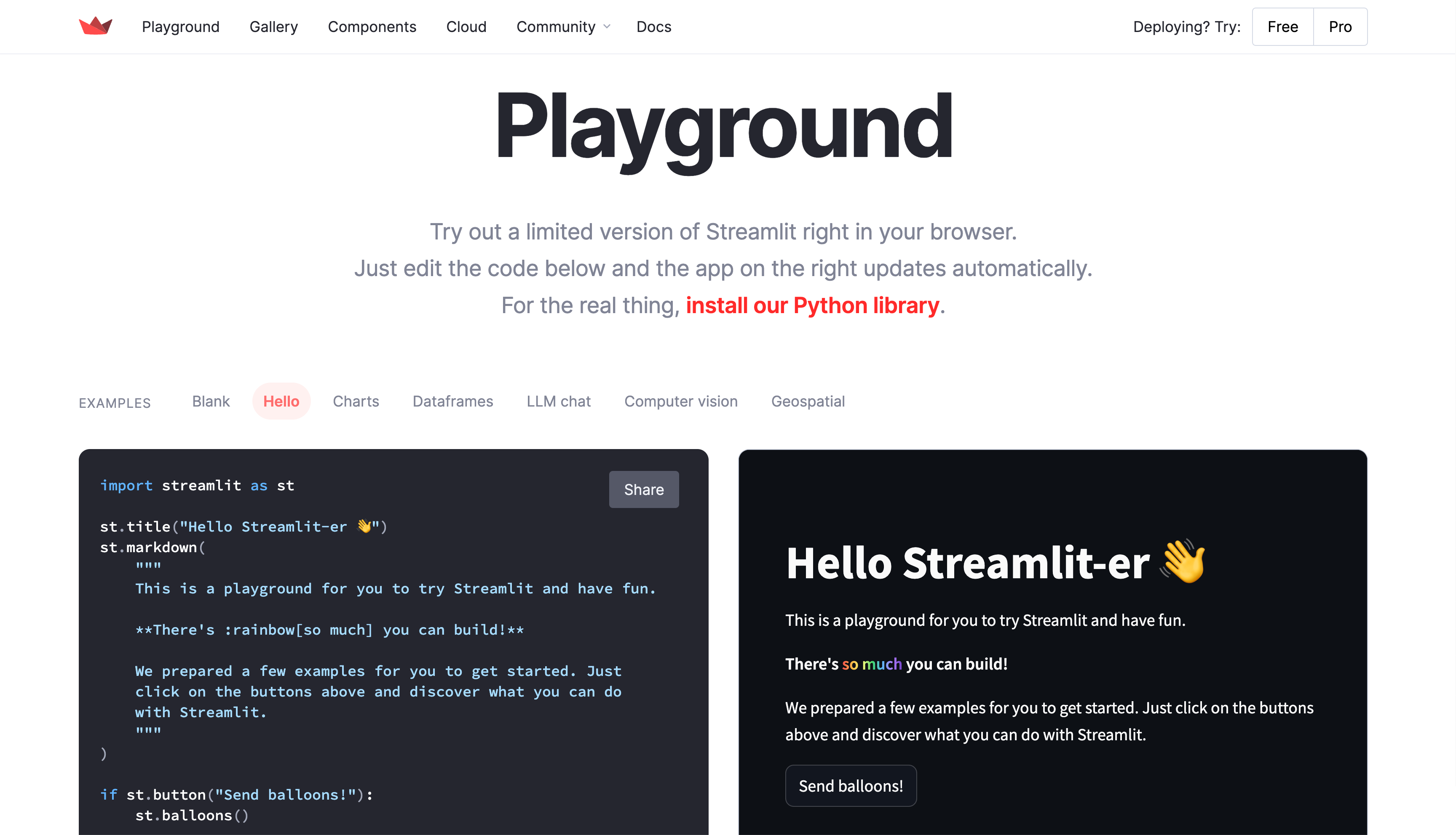
# Use Streamlit Playground in your browser
Source: https://docs.streamlit.io/get-started/installation/streamlit-playground
The fastest way to try out Streamlit is to try out our Playground! Streamlit Playground runs in your browser. Just visit the Playground, and a _limited_ version of Streamlit loads as browser scripts.
Enjoy the following conveniences:
- Start playing with code right away, completely in your browser.
- No configuration.
- No command line.
- No application installations in your OS.
Although the Playground has everything you need to get started, it doesn't contain the full version of Streamlit. To access the full awesomeness of Streamlit, see [Install Streamlit using command line](/get-started/installation/command-line) or [Install Streamlit using Anaconda Distribution](/get-started/installation/anaconda-distribution).
## Prerequisites
Because the Playground runs Streamlit _locally_ in your browser, you should visit the Playground from a personal computer, not a mobile device.
## Go to the Playground
1. Go to [streamlit.io/playground](https://streamlit.io/playground).
1. Wait for the playground to load.
Behind the scenes, the site installs a browser-based version of Python and Streamlit. This can take as little as a few seconds. The setup time can vary depending on your machine and internet connection. When Streamlit is done loading, an example app is displayed in the right panel.
1. Optional: To view different examples, above the editor, select them from the examples list.
## Create a `Hello World` app
1. From the "EXAMPLES" list, select "**Blank**."
1. On the left, update the contents of the code editor to contain the following code:
```python
import streamlit as st
st.write("Hello World")
```
A second or two after typing or pasting the code into the editor, the right panel will display the updated app. The code editor saves your edits whenever you pause from typing. Therefore, if you pause between keystrokes as you type a new line of code, you may see an error on the right because Streamlit executed an incomplete line. If this happens, just keep typing to complete the line(s) you are writing. When you pause again at the end of the line, Streamlit reruns the app.
1. On the left, change `st.write` to `st.title` so the code editor has the following code:
```python
import streamlit as st
st.title("Hello World")
```
A second after you stop typing, Streamlit reruns the app and updates the display on the right.
1. Keep making changes! Watch as your edits are automatically saved and the new result is displayed on the right.
## What's next?
- Option 1: If you're already intrigued and ready to install Streamlit on your computer, see one of the options to [Install Streamlit on your machine](/get-started/installation#install-on-your-machine).
- Option 2: Otherwise, you can keep using the playground while you read about our [Basic concepts](/get-started/fundamentals/main-concepts) and try out more commands in your app.
When you use the Streamlit Playground to work through the basic concepts, you can skip over any instructions to save your file or to select "**Rerun on save**." Streamlit Playground automatically saves your code when you pause from editing, as described above. Also, it is already configured to rerun on save.
---
# Install Streamlit using command line
Source: https://docs.streamlit.io/get-started/installation/command-line
This page will walk you through creating an environment with `venv` and installing Streamlit with `pip`. These are our recommended tools, but if you are familiar with others you can use your favorite ones too. At the end, you'll build a simple "Hello world" app and run it. If you prefer to have a graphical interface to manage your Python environments, check out how to [Install Streamlit using Anaconda Distribution](/get-started/installation/anaconda-distribution).
## Prerequisites
As with any programming tool, in order to install Streamlit you first need to make sure your
computer is properly set up. More specifically, you’ll need:
1. **Python**
We support [version 3.9 to 3.13](https://www.python.org/downloads/).
1. **A Python environment manager** (recommended)
Environment managers create virtual environments to isolate Python package installations between
projects.
We recommend using virtual environments because installing or upgrading a Python package may
cause unintentional effects on another package. For a detailed introduction to Python
environments, check out
[Python Virtual Environments: A Primer](https://realpython.com/python-virtual-environments-a-primer/).
For this guide, we'll be using `venv`, which comes with Python.
1. **A Python package manager**
Package managers handle installing each of your Python packages, including Streamlit.
For this guide, we'll be using `pip`, which comes with Python.
1. **Only on MacOS: Xcode command line tools**
Download Xcode command line tools using [these instructions](https://mac.install.guide/commandlinetools/4.html)
in order to let the package manager install some of Streamlit's dependencies.
1. **A code editor**
Our favorite editor is [VS Code](https://code.visualstudio.com/download), which is also what we use in
all our tutorials.
## Create an environment using `venv`
1. Open a terminal and navigate to your project folder.
```bash
cd myproject
```
2. In your terminal, type:
```bash
python -m venv .venv
```
3. A folder named ".venv" will appear in your project. This directory is where your virtual environment and its dependencies are installed.
## Activate your environment
4. In your terminal, activate your environment with one of the following commands, depending on your operating system.
```bash
# Windows command prompt
.venv\Scripts\activate.bat
# Windows PowerShell
.venv\Scripts\Activate.ps1
# macOS and Linux
source .venv/bin/activate
```
5. Once activated, you will see your environment name in parentheses before your prompt. "(.venv)"
## Install Streamlit in your environment
6. In the terminal with your environment activated, type:
```bash
pip install streamlit
```
7. Test that the installation worked by launching the Streamlit Hello example app:
```bash
streamlit hello
```
If this doesn't work, use the long-form command:
```bash
python -m streamlit hello
```
8. Streamlit's Hello app should appear in a new tab in your web browser!
9. Close your terminal when you are done.
## Create a "Hello World" app and run it
10. Create a file named `app.py` in your project folder.
```python
import streamlit as st
st.write("Hello world")
```
11. Any time you want to use your new environment, you first need to go to your project folder (where the `.venv` directory lives) and run the command to activate it:
```bash
# Windows command prompt
.venv\Scripts\activate.bat
# Windows PowerShell
.venv\Scripts\Activate.ps1
# macOS and Linux
source .venv/bin/activate
```
12. Once activated, you will see your environment's name in parentheses at the beginning of your terminal prompt. "(.venv)"
13. Run your Streamlit app.
```bash
streamlit run app.py
```
If this doesn't work, use the long-form command:
```bash
python -m streamlit run app.py
```
14. To stop the Streamlit server, press `Ctrl+C` in the terminal.
15. When you're done using this environment, return to your normal shell by typing:
```bash
deactivate
```
## What's next?
Read about our [Basic concepts](/get-started/fundamentals/main-concepts) to understand Streamlit's dataflow model.
---
# Install Streamlit using Anaconda Distribution
Source: https://docs.streamlit.io/get-started/installation/anaconda-distribution
This page walks you through installing Streamlit locally using Anaconda Distribution. At the end, you'll build a simple "Hello world" app and run it. You can read more about [Getting started with Anaconda Distribution](https://docs.anaconda.com/free/anaconda/getting-started/) in Anaconda's docs. If you prefer to manage your Python environments via command line, check out how to [Install Streamlit using command line](/get-started/installation/command-line).
## Prerequisites
1. **A code editor**
Anaconda Distribution includes Python and basically everything you need to get started.
The only thing left for you to choose is a code editor.
Our favorite editor is [VS Code](https://code.visualstudio.com/download), which is also what we
use in all our tutorials.
1. **Knowledge about environment managers**
Environment managers create virtual environments to isolate Python package installations between
projects. For a detailed introduction to Python environments, check out
[Python Virtual Environments: A Primer](https://realpython.com/python-virtual-environments-a-primer/).
But don't worry! In this guide we'll teach you how to install and use an environment manager
(Anaconda).
## Install Anaconda Distribution
1. Go to [anaconda.com/download](https://www.anaconda.com/download).
2. Install Anaconda Distribution for your OS.
## Create an environment using Anaconda Navigator
3. Open Anaconda Navigator (the graphical interface included with Anaconda Distribution).
4. You can decline signing in to Anaconda if prompted.
5. In the left menu, click "**Environments**."
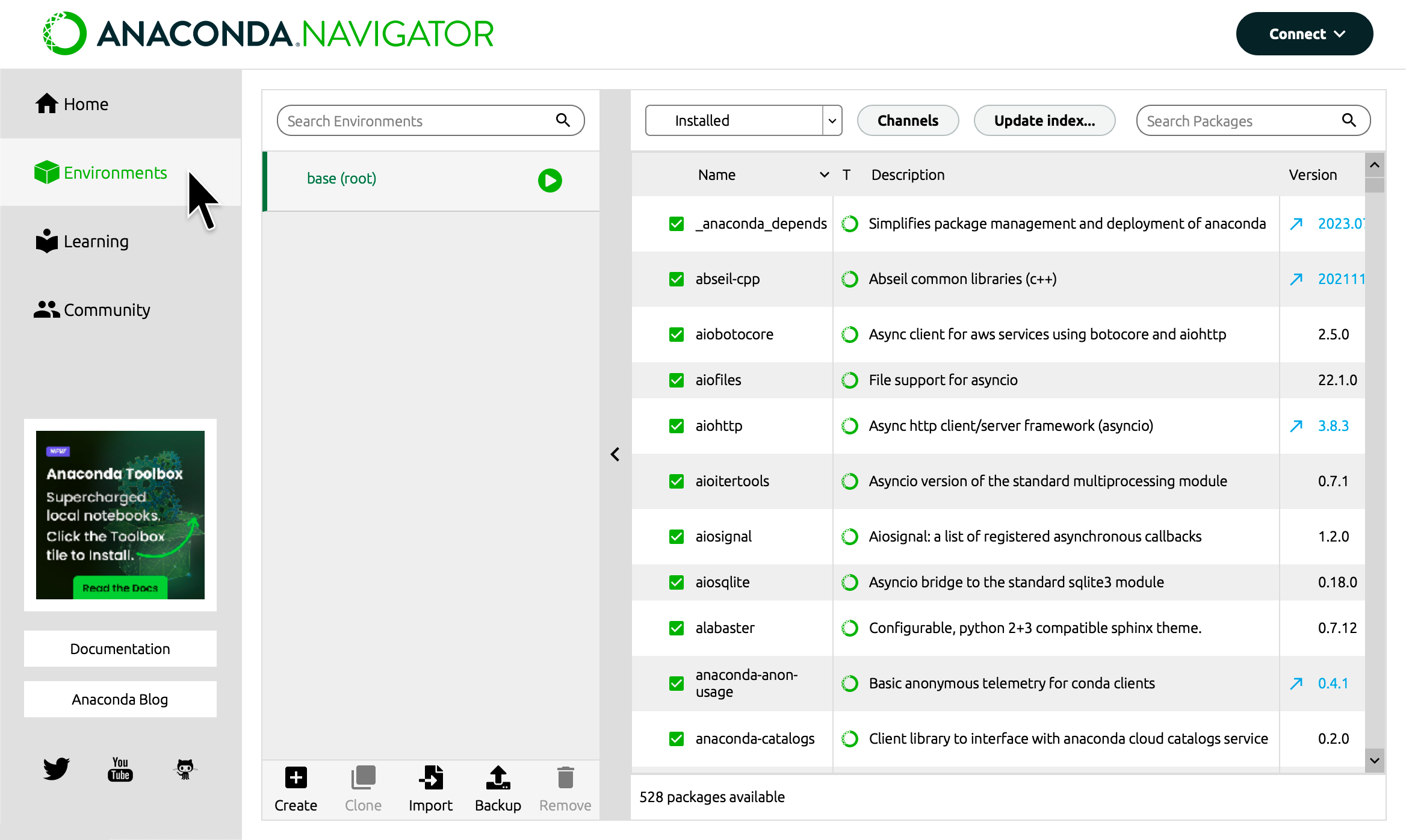
6. At the bottom of your environments list, click "**Create**."
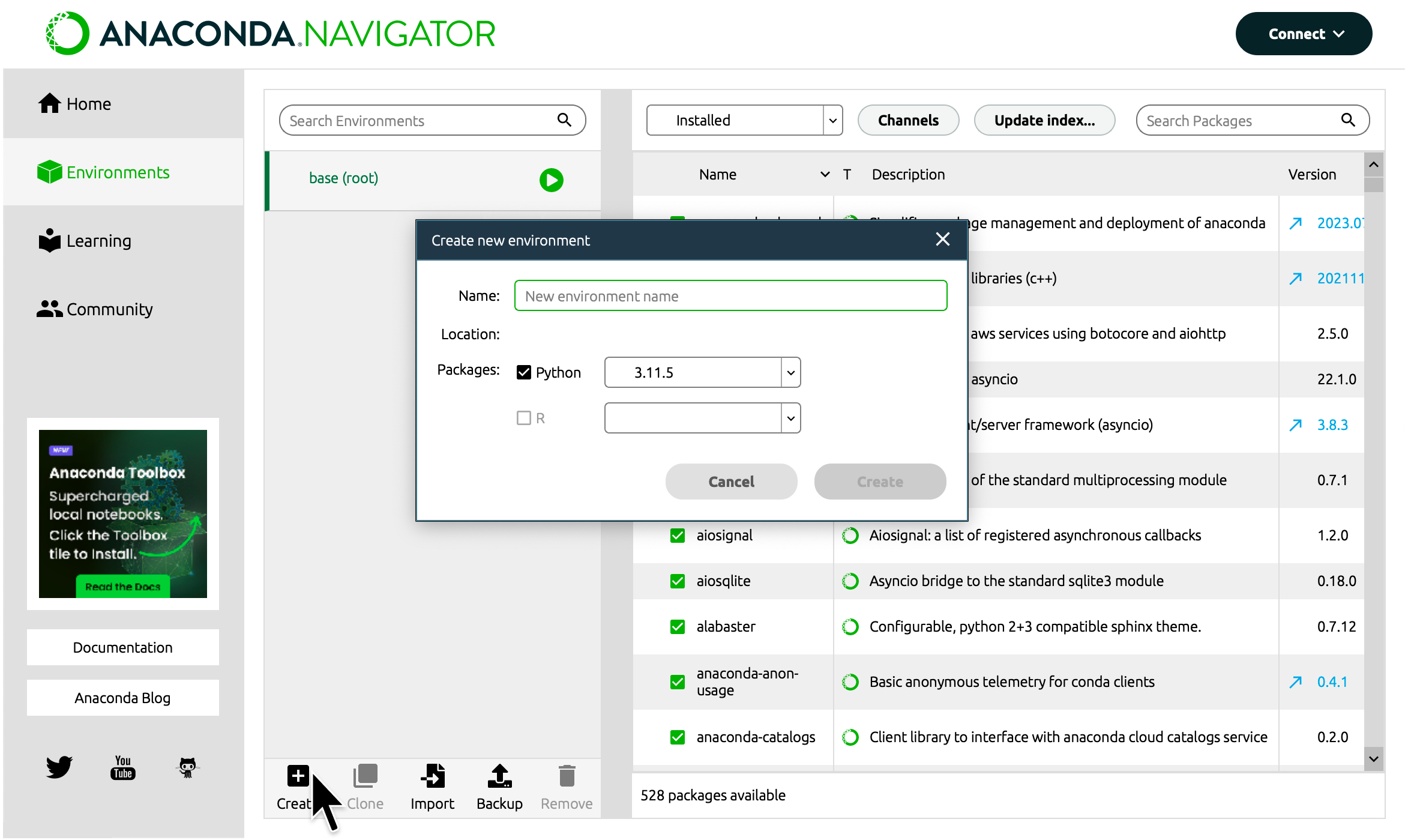
7. Enter "streamlitenv" for the name of your environment.
8. Click "**Create**."
{{ maxWidth: '50%', margin: 'auto' }}>
---
# Use Community Cloud to develop with GitHub Codespaces
Source: https://docs.streamlit.io/get-started/installation/community-cloud
To use GitHub Codespaces for Streamlit development, you need a properly configured `devcontainer.json` file to set up the environment. Fortunately, Streamlit Community Cloud is here to help! Although Community Cloud is primarily used to deploy and share apps with the rest of the world, we've built in some handy features to make it easy to use GitHub Codespaces. This guide explains how to create a Community Cloud account and use an automated workflow to get you into a GitHub codespace and live-editing a Streamlit app. All this happens right in your browser, no installation required.
If you already created a Community Cloud account and connected GitHub, jump ahead to [Create a new app from a template](/get-started/installation/community-cloud#create-a-new-app-from-a-template).
## Prerequisites
- You must have a GitHub account.
## Sign up for Streamlit Community Cloud
1. Go to share.streamlit.io.
1. Click "**Continue to sign-in**."
1. Click "**Continue with GitHub**."
1. Enter your GitHub credentials and follow GitHub's authentication prompts.
1. Fill in your account information, and click "**I accept**" at the bottom.
## Add access to your public repositories
1. In the upper-left corner, click on "**Workspaces {{ verticalAlign: "-.25em", color: "#ff8700" }} className={{ class: "material-icons-sharp" }}>warning
---
# Use Streamlit in Snowflake to code in a secure environment
Source: https://docs.streamlit.io/get-started/installation/streamlit-in-snowflake
Snowflake is a single, global platform that powers the Data Cloud. If you want to use a secure platform with role-based access control, this is the option for you! This page walks you through creating a trial Snowflake account and building a "Hello world" app. Your trial account comes with an account credit so you can try out the service without entering any payment information.
For more information, see [Limitations and unsupported features](https://docs.snowflake.com/en/developer-guide/streamlit/limitations) in the Snowflake documentation.
## Prerequisites
All you need is an email address! Everything else happens in your 30-day trial account.
## Create an account
1. Go to . (This link will open in a new tab.)
1. Fill in your information, and click "**CONTINUE**."
1. Select "**Standard**" for your Snowflake edition and "**Amazon Web Services**" for your cloud provider.
1. Choose the region nearest you, accept the terms, and click "**GET STARTED**."
{{ maxWidth: '50%', margin: 'auto' }}>
---
# Fundamental concepts
Source: https://docs.streamlit.io/get-started/fundamentals
Are you new to Streamlit and want the grand tour? If so, you're in the right place!
Learn the fundamental concepts of Streamlit. How is a Streamlit app structured? How does it run? How does it magically get your data on a webpage?After you understand the rerun logic of Streamlit, learn how to make efficient and dynamic apps with caching and Session State. Get introduced to handling database connections.Learn about Streamlit's additional features. You don't need to know these concepts for your first app, but check it out to know what's available.
---
# Basic concepts of Streamlit
Source: https://docs.streamlit.io/get-started/fundamentals/main-concepts
Working with Streamlit is simple. First you sprinkle a few Streamlit commands
into a normal Python script, then you run it with `streamlit run`:
```bash
streamlit run your_script.py [-- script args]
```
As soon as you run the script as shown above, a local Streamlit server will
spin up and your app will open in a new tab in your default web browser. The app
is your canvas, where you'll draw charts, text, widgets, tables, and more.
What gets drawn in the app is up to you. For example
[`st.text`](/develop/api-reference/text/st.text) writes raw text to your app, and
[`st.line_chart`](/develop/api-reference/charts/st.line_chart) draws — you guessed it — a
line chart. Refer to our [API documentation](/develop/api-reference) to see all commands that
are available to you.
When passing your script some custom arguments, they must be passed after two dashes. Otherwise the
arguments get interpreted as arguments to Streamlit itself.
Another way of running Streamlit is to run it as a Python module. This can be
useful when configuring an IDE like PyCharm to work with Streamlit:
```bash
# Running
python -m streamlit run your_script.py
# is equivalent to:
streamlit run your_script.py
```
You can also pass a URL to `streamlit run`! This is great when combined with
GitHub Gists. For example:
```bash
streamlit run https://raw.githubusercontent.com/streamlit/demo-uber-nyc-pickups/master/streamlit_app.py
```
## Development flow
Every time you want to update your app, save the source file. When you do
that, Streamlit detects if there is a change and asks you whether you want to
rerun your app. Choose "Always rerun" at the top-right of your screen to
automatically update your app every time you change its source code.
This allows you to work in a fast interactive loop: you type some code, save
it, try it out live, then type some more code, save it, try it out, and so on
until you're happy with the results. This tight loop between coding and viewing
results live is one of the ways Streamlit makes your life easier.
While developing a Streamlit app, it's recommended to lay out your editor and
browser windows side by side, so the code and the app can be seen at the same
time. Give it a try!
As of Streamlit version 1.10.0 and higher, Streamlit apps cannot be run from the root directory of Linux distributions. If you try to run a Streamlit app from the root directory, Streamlit will throw a `FileNotFoundError: [Errno 2] No such file or directory` error. For more information, see GitHub issue [#5239](https://github.com/streamlit/streamlit/issues/5239).
If you are using Streamlit version 1.10.0 or higher, your main script should live in a directory other than the root directory. When using Docker, you can use the `WORKDIR` command to specify the directory where your main script lives. For an example of how to do this, read [Create a Dockerfile](/deploy/tutorials/docker#create-a-dockerfile).
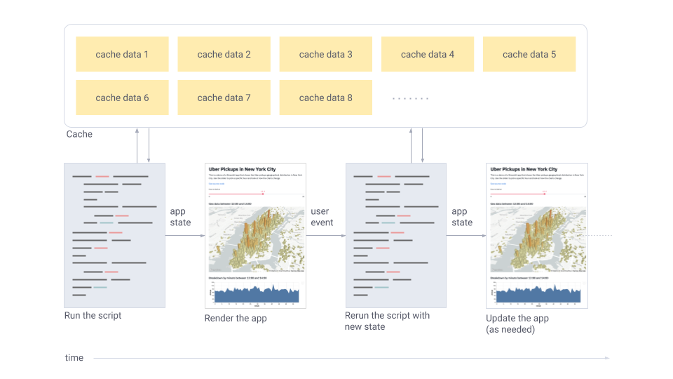
## Data flow
Streamlit's architecture allows you to write apps the same way you write plain
Python scripts. To unlock this, Streamlit apps have a unique data flow: any
time something must be updated on the screen, Streamlit reruns your entire
Python script from top to bottom.
This can happen in two situations:
- Whenever you modify your app's source code.
- Whenever a user interacts with widgets in the app. For example, when dragging
a slider, entering text in an input box, or clicking a button.
Whenever a callback is passed to a widget via the `on_change` (or `on_click`) parameter, the callback will always run before the rest of your script. For details on the Callbacks API, please refer to our [Session State API Reference Guide](/develop/api-reference/caching-and-state/st.session_state#use-callbacks-to-update-session-state).
And to make all of this fast and seamless, Streamlit does some heavy lifting
for you behind the scenes. A big player in this story is the
[`@st.cache_data`](#caching) decorator, which allows developers to skip certain
costly computations when their apps rerun. We'll cover caching later in this
page.
## Display and style data
There are a few ways to display data (tables, arrays, data frames) in Streamlit
apps. [Below](#use-magic), you will be introduced to _magic_
and [`st.write()`](/develop/api-reference/write-magic/st.write), which can be used to write
anything from text to tables. After that, let's take a look at methods designed
specifically for visualizing data.
### Use magic
You can also write to your app without calling any Streamlit methods.
Streamlit supports "[magic commands](/develop/api-reference/write-magic/magic)," which means you don't have to use
[`st.write()`](/develop/api-reference/write-magic/st.write) at all! To see this in action try this snippet:
```python try
"""
# My first app
Here's our first attempt at using data to create a table:
"""
import streamlit as st
import pandas as pd
df = pd.DataFrame({
'first column': [1, 2, 3, 4],
'second column': [10, 20, 30, 40]
})
df
```
Any time that Streamlit sees a variable or a literal
value on its own line, it automatically writes that to your app using
[`st.write()`](/develop/api-reference/write-magic/st.write). For more information, refer to the
documentation on [magic commands](/develop/api-reference/write-magic/magic).
### Write a data frame
Along with [magic commands](/develop/api-reference/write-magic/magic),
[`st.write()`](/develop/api-reference/write-magic/st.write) is Streamlit's "Swiss Army knife". You
can pass almost anything to [`st.write()`](/develop/api-reference/write-magic/st.write):
text, data, Matplotlib figures, Altair charts, and more. Don't worry, Streamlit
will figure it out and render things the right way.
```python
import streamlit as st
import pandas as pd
st.write("Here's our first attempt at using data to create a table:")
st.write(pd.DataFrame({
'first column': [1, 2, 3, 4],
'second column': [10, 20, 30, 40]
}))
```
There are other data specific functions like
[`st.dataframe()`](/develop/api-reference/data/st.dataframe) and
[`st.table()`](/develop/api-reference/data/st.table) that you can also use for displaying
data. Let's understand when to use these features and how to add colors and styling to your data frames.
You might be asking yourself, "why wouldn't I always use `st.write()`?" There are
a few reasons:
1. _Magic_ and [`st.write()`](/develop/api-reference/write-magic/st.write) inspect the type of
data that you've passed in, and then decide how to best render it in the
app. Sometimes you want to draw it another way. For example, instead of
drawing a dataframe as an interactive table, you may want to draw it as a
static table by using `st.table(df)`.
2. The second reason is that other methods return an object that can be used
and modified, either by adding data to it or replacing it.
3. Finally, if you use a more specific Streamlit method you can pass additional
arguments to customize its behavior.
For example, let's create a data frame and change its formatting with a Pandas
`Styler` object. In this example, you'll use Numpy to generate a random sample,
and the [`st.dataframe()`](/develop/api-reference/data/st.dataframe) method to draw an
interactive table.
This example uses Numpy to generate a random sample, but you can use Pandas
DataFrames, Numpy arrays, or plain Python arrays.
```python
import streamlit as st
import numpy as np
dataframe = np.random.randn(10, 20)
st.dataframe(dataframe)
```
Let's expand on the first example using the Pandas `Styler` object to highlight
some elements in the interactive table.
```python
import streamlit as st
import numpy as np
import pandas as pd
dataframe = pd.DataFrame(
np.random.randn(10, 20),
columns=('col %d' % i for i in range(20)))
st.dataframe(dataframe.style.highlight_max(axis=0))
```
Streamlit also has a method for static table generation:
[`st.table()`](/develop/api-reference/data/st.table).
```python
import streamlit as st
import numpy as np
import pandas as pd
dataframe = pd.DataFrame(
np.random.randn(10, 20),
columns=('col %d' % i for i in range(20)))
st.table(dataframe)
```
### Draw charts and maps
Streamlit supports several popular data charting libraries like [Matplotlib,
Altair, deck.gl, and more](/develop/api-reference#chart-elements). In this section, you'll
add a bar chart, line chart, and a map to your app.
### Draw a line chart
You can easily add a line chart to your app with
[`st.line_chart()`](/develop/api-reference/charts/st.line_chart). We'll generate a random
sample using Numpy and then chart it.
```python
import streamlit as st
import numpy as np
import pandas as pd
chart_data = pd.DataFrame(
np.random.randn(20, 3),
columns=['a', 'b', 'c'])
st.line_chart(chart_data)
```
### Plot a map
With [`st.map()`](/develop/api-reference/charts/st.map) you can display data points on a map.
Let's use Numpy to generate some sample data and plot it on a map of
San Francisco.
```python
import streamlit as st
import numpy as np
import pandas as pd
map_data = pd.DataFrame(
np.random.randn(1000, 2) / [50, 50] + [37.76, -122.4],
columns=['lat', 'lon'])
st.map(map_data)
```
## Widgets
When you've got the data or model into the state that you want to explore, you
can add in widgets like [`st.slider()`](/develop/api-reference/widgets/st.slider),
[`st.button()`](/develop/api-reference/widgets/st.button) or
[`st.selectbox()`](/develop/api-reference/widgets/st.selectbox). It's really straightforward
— treat widgets as variables:
```python
import streamlit as st
x = st.slider('x') # 👈 this is a widget
st.write(x, 'squared is', x * x)
```
On first run, the app above should output the text "0 squared is 0". Then
every time a user interacts with a widget, Streamlit simply reruns your script
from top to bottom, assigning the current state of the widget to your variable
in the process.
For example, if the user moves the slider to position `10`, Streamlit will
rerun the code above and set `x` to `10` accordingly. So now you should see the
text "10 squared is 100".
Widgets can also be accessed by key, if you choose to specify a string to use as the unique key for the widget:
```python
import streamlit as st
st.text_input("Your name", key="name")
# You can access the value at any point with:
st.session_state.name
```
Every widget with a key is automatically added to Session State. For more information about Session State, its association with widget state, and its limitations, see [Session State API Reference Guide](/develop/api-reference/caching-and-state/st.session_state).
### Use checkboxes to show/hide data
One use case for checkboxes is to hide or show a specific chart or section in
an app. [`st.checkbox()`](/develop/api-reference/widgets/st.checkbox) takes a single argument,
which is the widget label. In this sample, the checkbox is used to toggle a
conditional statement.
```python
import streamlit as st
import numpy as np
import pandas as pd
if st.checkbox('Show dataframe'):
chart_data = pd.DataFrame(
np.random.randn(20, 3),
columns=['a', 'b', 'c'])
chart_data
```
### Use a selectbox for options
Use [`st.selectbox`](/develop/api-reference/widgets/st.selectbox) to choose from a series. You
can write in the options you want, or pass through an array or data frame
column.
Let's use the `df` data frame we created earlier.
```python
import streamlit as st
import pandas as pd
df = pd.DataFrame({
'first column': [1, 2, 3, 4],
'second column': [10, 20, 30, 40]
})
option = st.selectbox(
'Which number do you like best?',
df['first column'])
'You selected: ', option
```
## Layout
Streamlit makes it easy to organize your widgets in a left panel sidebar with
[`st.sidebar`](/develop/api-reference/layout/st.sidebar). Each element that's passed to
[`st.sidebar`](/develop/api-reference/layout/st.sidebar) is pinned to the left, allowing
users to focus on the content in your app while still having access to UI
controls.
For example, if you want to add a selectbox and a slider to a sidebar,
use `st.sidebar.slider` and `st.sidebar.selectbox` instead of `st.slider` and
`st.selectbox`:
```python
import streamlit as st
# Add a selectbox to the sidebar:
add_selectbox = st.sidebar.selectbox(
'How would you like to be contacted?',
('Email', 'Home phone', 'Mobile phone')
)
# Add a slider to the sidebar:
add_slider = st.sidebar.slider(
'Select a range of values',
0.0, 100.0, (25.0, 75.0)
)
```
Beyond the sidebar, Streamlit offers several other ways to control the layout
of your app. [`st.columns`](/develop/api-reference/layout/st.columns) lets you place widgets side-by-side, and
[`st.expander`](/develop/api-reference/layout/st.expander) lets you conserve space by hiding away large content.
```python
import streamlit as st
left_column, right_column = st.columns(2)
# You can use a column just like st.sidebar:
left_column.button('Press me!')
# Or even better, call Streamlit functions inside a "with" block:
with right_column:
chosen = st.radio(
'Sorting hat',
("Gryffindor", "Ravenclaw", "Hufflepuff", "Slytherin"))
st.write(f"You are in {chosen} house!")
```
`st.echo` and `st.spinner` are not currently supported inside the sidebar
or layout options. Rest assured, though, we're currently working on adding support for those too!
### Show progress
When adding long running computations to an app, you can use
[`st.progress()`](/develop/api-reference/status/st.progress) to display status in real time.
First, let's import time. We're going to use the `time.sleep()` method to
simulate a long running computation:
```python
import time
```
Now, let's create a progress bar:
```python
import streamlit as st
import time
'Starting a long computation...'
# Add a placeholder
latest_iteration = st.empty()
bar = st.progress(0)
for i in range(100):
# Update the progress bar with each iteration.
latest_iteration.text(f'Iteration {i+1}')
bar.progress(i + 1)
time.sleep(0.1)
'...and now we\'re done!'
```
---
# Advanced concepts of Streamlit
Source: https://docs.streamlit.io/get-started/fundamentals/advanced-concepts
Now that you know how a Streamlit app runs and handles data, let's talk about being efficient. Caching allows you to save the output of a function so you can skip over it on rerun. Session State lets you save information for each user that is preserved between reruns. This not only allows you to avoid unecessary recalculation, but also allows you to create dynamic pages and handle progressive processes.
## Caching
Caching allows your app to stay performant even when loading data from the web, manipulating large datasets, or performing expensive computations.
The basic idea behind caching is to store the results of expensive function calls and return the cached result when the same inputs occur again. This avoids repeated execution of a function with the same input values.
To cache a function in Streamlit, you need to apply a caching decorator to it. You have two choices:
- `st.cache_data` is the recommended way to cache computations that return data. Use `st.cache_data` when you use a function that returns a serializable data object (e.g. str, int, float, DataFrame, dict, list). **It creates a new copy of the data at each function call**, making it safe against [mutations and race conditions](/develop/concepts/architecture/caching#mutation-and-concurrency-issues). The behavior of `st.cache_data` is what you want in most cases – so if you're unsure, start with `st.cache_data` and see if it works!
- `st.cache_resource` is the recommended way to cache global resources like ML models or database connections. Use `st.cache_resource` when your function returns unserializable objects that you don’t want to load multiple times. **It returns the cached object itself**, which is shared across all reruns and sessions without copying or duplication. If you mutate an object that is cached using `st.cache_resource`, that mutation will exist across all reruns and sessions.
Example:
```python
@st.cache_data
def long_running_function(param1, param2):
return …
```
In the above example, `long_running_function` is decorated with `@st.cache_data`. As a result, Streamlit notes the following:
- The name of the function (`"long_running_function"`).
- The value of the inputs (`param1`, `param2`).
- The code within the function.
Before running the code within `long_running_function`, Streamlit checks its cache for a previously saved result. If it finds a cached result for the given function and input values, it will return that cached result and not rerun function's code. Otherwise, Streamlit executes the function, saves the result in its cache, and proceeds with the script run. During development, the cache updates automatically as the function code changes, ensuring that the latest changes are reflected in the cache.
For more information about the Streamlit caching decorators, their configuration parameters, and their limitations, see [Caching](/develop/concepts/architecture/caching).
## Session State
Session State provides a dictionary-like interface where you can save information that is preserved between script reruns. Use `st.session_state` with key or attribute notation to store and recall values. For example, `st.session_state["my_key"]` or `st.session_state.my_key`. Remember that widgets handle their statefulness all by themselves, so you won't always need to use Session State!
### What is a session?
A session is a single instance of viewing an app. If you view an app from two different tabs in your browser, each tab will have its own session. So each viewer of an app will have a Session State tied to their specific view. Streamlit maintains this session as the user interacts with the app. If the user refreshes their browser page or reloads the URL to the app, their Session State resets and they begin again with a new session.
### Examples of using Session State
Here's a simple app that counts the number of times the page has been run. Every time you click the button, the script will rerun.
```python
import streamlit as st
if "counter" not in st.session_state:
st.session_state.counter = 0
st.session_state.counter += 1
st.header(f"This page has run {st.session_state.counter} times.")
st.button("Run it again")
```
- **First run:** The first time the app runs for each user, Session State is empty. Therefore, a key-value pair is created (`"counter":0`). As the script continues, the counter is immediately incremented (`"counter":1`) and the result is displayed: "This page has run 1 times." When the page has fully rendered, the script has finished and the Streamlit server waits for the user to do something. When that user clicks the button, a rerun begins.
- **Second run:** Since "counter" is already a key in Session State, it is not reinitialized. As the script continues, the counter is incremented (`"counter":2`) and the result is displayed: "This page has run 2 times."
There are a few common scenarios where Session State is helpful. As demonstrated above, Session State is used when you have a progressive process that you want to build upon from one rerun to the next. Session State can also be used to prevent recalculation, similar to caching. However, the differences are important:
- Caching associates stored values to specific functions and inputs. Cached values are accessible to all users across all sessions.
- Session State associates stored values to keys (strings). Values in session state are only available in the single session where it was saved.
If you have random number generation in your app, you'd likely use Session State. Here's an example where data is generated randomly at the beginning of each session. By saving this random information in Session State, each user gets different random data when they open the app but it won't keep changing on them as they interact with it. If you select different colors with the picker you'll see that the data does not get re-randomized with each rerun. (If you open the app in a new tab to start a new session, you'll see different data!)
```python
import streamlit as st
import pandas as pd
import numpy as np
if "df" not in st.session_state:
st.session_state.df = pd.DataFrame(np.random.randn(20, 2), columns=["x", "y"])
st.header("Choose a datapoint color")
color = st.color_picker("Color", "#FF0000")
st.divider()
st.scatter_chart(st.session_state.df, x="x", y="y", color=color)
```
If you are pulling the same data for all users, you'd likely cache a function that retrieves that data. On the other hand, if you pull data specific to a user, such as querying their personal information, you may want to save that in Session State. That way, the queried data is only available in that one session.
As mentioned in [Basic concepts](/get-started/fundamentals/main-concepts#widgets), Session State is also related to widgets. Widgets are magical and handle statefulness quietly on their own. As an advanced feature however, you can manipulate the value of widgets within your code by assigning keys to them. Any key assigned to a widget becomes a key in Session State tied to the value of the widget. This can be used to manipulate the widget. After you finish understanding the basics of Streamlit, check out our guide on [Widget behavior](/develop/concepts/architecture/widget-behavior) to dig in the details if you're interested.
## Connections
As hinted above, you can use `@st.cache_resource` to cache connections. This is the most general solution which allows you to use almost any connection from any Python library. However, Streamlit also offers a convenient way to handle some of the most popular connections, like SQL! `st.connection` takes care of the caching for you so you can enjoy fewer lines of code. Getting data from your database can be as easy as:
```python
import streamlit as st
conn = st.connection("my_database")
df = conn.query("select * from my_table")
st.dataframe(df)
```
Of course, you may be wondering where your username and password go. Streamlit has a convenient mechanism for [Secrets management](/develop/concepts/connections/secrets-management). For now, let's just see how `st.connection` works very nicely with secrets. In your local project directory, you can save a `.streamlit/secrets.toml` file. You save your secrets in the toml file and `st.connection` just uses them! For example, if you have an app file `streamlit_app.py` your project directory may look like this:
```none hideHeader
your-LOCAL-repository/
├── .streamlit/
│ └── secrets.toml # Make sure to gitignore this!
└── streamlit_app.py
```
For the above SQL example, your `secrets.toml` file might look like the following:
```toml
[connections.my_database]
type="sql"
dialect="mysql"
username="xxx"
password="xxx"
host="example.com" # IP or URL
port=3306 # Port number
database="mydb" # Database name
```
Since you don't want to commit your `secrets.toml` file to your repository, you'll need to learn how your host handles secrets when you're ready to publish your app. Each host platform may have a different way for you to pass your secrets. If you use Streamlit Community Cloud for example, each deployed app has a settings menu where you can load your secrets. After you've written an app and are ready to deploy, you can read all about how to [Deploy your app](/deploy/streamlit-community-cloud/deploy-your-app) on Community Cloud.
---
# Additional Streamlit features
Source: https://docs.streamlit.io/get-started/fundamentals/additional-features
So you've read all about Streamlit's [Basic concepts](/get-started/fundamentals/main-concepts) and gotten a taste of caching and Session State in [Advanced concepts](/get-started/fundamentals/advanced-concepts). But what about the bells and whistles? Here's a quick look at some extra features to take your app to the next level.
## Theming
Streamlit supports Light and Dark themes out of the box. Streamlit will first
check if the user viewing an app has a Light or Dark mode preference set by
their operating system and browser. If so, then that preference will be used.
Otherwise, the Light theme is applied by default.
You can also change the active theme from "⋮" → "Settings".
Want to add your own theme to an app? The "Settings" menu has a theme editor
accessible by clicking on "Edit active theme". You can use this editor to try
out different colors and see your app update live.
When you're happy with your work, themes can be saved by
[setting config options](/develop/concepts/configuration)
in the `[theme]` config section. After you've defined a theme for your app, it
will appear as "Custom Theme" in the theme selector and will be applied by
default instead of the included Light and Dark themes.
More information about the options available when defining a theme can be found
in the [theme option documentation](/develop/concepts/configuration/theming).
The theme editor menu is available only in local development. If you've deployed your app using
Streamlit Community Cloud, the "Edit active theme" button will no longer be displayed in the "Settings"
menu.
Another way to experiment with different theme colors is to turn on the "Run on save" option, edit
your config.toml file, and watch as your app reruns with the new theme colors applied.
## Pages
As apps grow large, it becomes useful to organize them into multiple pages. This makes the app easier to manage as a developer and easier to navigate as a user. Streamlit provides a powerful way to create multipage apps using [`st.Page`](/develop/api-reference/navigation/st.page) and [`st.navigation`](/develop/api-reference/navigation/st.navigation). Just create your pages and connect them with navigation as follows:
1. Create an entry point script that defines and connects your pages
2. Create separate Python files for each page's content
3. Use [`st.Page`](/develop/api-reference/navigation/st.page) to define your pages and [`st.navigation`](/develop/api-reference/navigation/st.navigation) to connect them
Here's an example of a three-page app:
streamlit_app.py
```python
import streamlit as st
# Define the pages
main_page = st.Page("main_page.py", title="Main Page", icon="🎈")
page_2 = st.Page("page_2.py", title="Page 2", icon="❄️")
page_3 = st.Page("page_3.py", title="Page 3", icon="🎉")
# Set up navigation
pg = st.navigation([main_page, page_2, page_3])
# Run the selected page
pg.run()
```
main_page.py
```python
import streamlit as st
# Main page content
st.markdown("# Main page 🎈")
st.sidebar.markdown("# Main page 🎈")
```
page_2.py
```python
import streamlit as st
st.markdown("# Page 2 ❄️")
st.sidebar.markdown("# Page 2 ❄️")
```
page_3.py
```python
import streamlit as st
st.markdown("# Page 3 🎉")
st.sidebar.markdown("# Page 3 🎉")
```
Now run `streamlit run streamlit_app.py` and view your shiny new multipage app! The navigation menu will automatically appear, allowing users to switch between pages.
Our documentation on [Multipage apps](/develop/concepts/multipage-apps) teaches you how to add pages to your app, including how to define pages, structure and run multipage apps, and navigate between pages. Once you understand the basics, [create your first multipage app](/get-started/tutorials/create-a-multipage-app)!
## Custom components
If you can't find the right component within the Streamlit library, try out custom components to extend Streamlit's built-in functionality. Explore and browse through popular, community-created components in the [Components gallery](https://streamlit.io/components). If you dabble in frontend development, you can build your own custom component with Streamlit's [components API](/develop/concepts/custom-components/intro).
## Static file serving
As you learned in Streamlit fundamentals, Streamlit runs a server that clients connect to. That means viewers of your app don't have direct access to the files which are local to your app. Most of the time, this doesn't matter because Streamlt commands handle that for you. When you use `st.image()` your Streamlit server will access the file and handle the necessary hosting so your app viewers can see it. However, if you want a direct URL to an image or file you'll need to host it. This requires setting the correct configuration and placing your hosted files in a directory named `static`. For example, your project could look like:
```bash
your-project/
├── static/
│ └── my_hosted-image.png
└── streamlit_app.py
```
To learn more, read our guide on [Static file serving](/develop/concepts/configuration/serving-static-files).
## App testing
Good development hygiene includes testing your code. Automated testing allows you to write higher quality code, faster! Streamlit has a built-in testing framework that let's you build tests easily. Use your favorite testing framework to run your tests. We like [`pytest`](https://pypi.org/project/pytest/). When you test a Streamlit app, you simulate running the app, declare user input, and inspect the results. You can use GitHub workflows to automate your tests and get instant alerts about breaking changes. Learn more in our guide to [App testing](/develop/concepts/app-testing).
---
# App model summary
Source: https://docs.streamlit.io/get-started/fundamentals/summary
Now that you know a little more about all the individual pieces, let's close
the loop and review how it works together:
1. Streamlit apps are Python scripts that run from top to bottom.
1. Every time a user opens a browser tab pointing to your app, the script is executed and a new session starts.
1. As the script executes, Streamlit draws its output live in a browser.
1. Every time a user interacts with a widget, your script is re-executed and Streamlit redraws its output in the browser.
- The output value of that widget matches the new value during that rerun.
1. Scripts use the Streamlit cache to avoid recomputing expensive functions, so updates happen very fast.
1. Session State lets you save information that persists between reruns when you need more than a simple widget.
1. Streamlit apps can contain multiple pages, which are defined in separate `.py` files in a `pages` folder.
---
# First steps building Streamlit apps
Source: https://docs.streamlit.io/get-started/tutorials
If you've just read through our [Basic concepts](/get-started/fundamentals/main-concepts) and want to get your hands on Streamlit. Check out these tutorials. Make sure you have [installed Streamlit](/get-started/installation) so you can execute the code yourself.
uses the concepts learned in Fundamentals along with caching to walk through making your first app.walks through the easy steps to add pages to your app.
---
# Create an app
Source: https://docs.streamlit.io/get-started/tutorials/create-an-app
If you've made it this far, chances are you've [installed Streamlit](/get-started/installation) and run through the basics in [Basic concepts](/get-started/fundamentals/main-concepts) and [Advanced concepts](/get-started/fundamentals/advanced-concepts). If not, now is a good time to take a look.
The easiest way to learn how to use Streamlit is to try things out yourself. As you read through this guide, test each method. As long as your app is running, every time you add a new element to your script and save, Streamlit's UI will ask if you'd like to rerun the app and view the changes. This allows you to work in a fast interactive loop: you write some code, save it, review the output, write some more, and so on, until you're happy with the results. The goal is to use Streamlit to create an interactive app for your data or model and along the way to use Streamlit to review, debug, perfect, and share your code.
In this guide, you're going to use Streamlit's core features to
create an interactive app; exploring a public Uber dataset for pickups and
drop-offs in New York City. When you're finished, you'll know how to fetch
and cache data, draw charts, plot information on a map, and use interactive
widgets, like a slider, to filter results.
If you'd like to skip ahead and see everything at once, the [complete script
is available below](#lets-put-it-all-together).
## Create your first app
Streamlit is more than just a way to make data apps, it’s also a community of creators that share their apps and ideas and help each other make their work better. Please come join us on the community forum. We love to hear your questions, ideas, and help you work through your bugs — stop by today!
1. The first step is to create a new Python script. Let's call it
`uber_pickups.py`.
2. Open `uber_pickups.py` in your favorite IDE or text editor, then add these
lines:
```python
import streamlit as st
import pandas as pd
import numpy as np
```
3. Every good app has a title, so let's add one:
```python
st.title('Uber pickups in NYC')
```
4. Now it's time to run Streamlit from the command line:
```bash
streamlit run uber_pickups.py
```
Running a Streamlit app is no different than any other Python script. Whenever you need to view the app, you can use this command.
Did you know you can also pass a URL to `streamlit run`? This is great when combined with GitHub Gists. For example:
```bash
streamlit run https://raw.githubusercontent.com/streamlit/demo-uber-nyc-pickups/master/streamlit_app.py
```
5. As usual, the app should automatically open in a new tab in your
browser.
## Fetch some data
Now that you have an app, the next thing you'll need to do is fetch the Uber
dataset for pickups and drop-offs in New York City.
1. Let's start by writing a function to load the data. Add this code to your
script:
```python
DATE_COLUMN = 'date/time'
DATA_URL = ('https://s3-us-west-2.amazonaws.com/'
'streamlit-demo-data/uber-raw-data-sep14.csv.gz')
def load_data(nrows):
data = pd.read_csv(DATA_URL, nrows=nrows)
lowercase = lambda x: str(x).lower()
data.rename(lowercase, axis='columns', inplace=True)
data[DATE_COLUMN] = pd.to_datetime(data[DATE_COLUMN])
return data
```
You'll notice that `load_data` is a plain old function that downloads some
data, puts it in a Pandas dataframe, and converts the date column from text
to datetime. The function accepts a single parameter (`nrows`), which
specifies the number of rows that you want to load into the dataframe.
2. Now let's test the function and review the output. Below your function, add
these lines:
```python
# Create a text element and let the reader know the data is loading.
data_load_state = st.text('Loading data...')
# Load 10,000 rows of data into the dataframe.
data = load_data(10000)
# Notify the reader that the data was successfully loaded.
data_load_state.text('Loading data...done!')
```
You'll see a few buttons in the upper-right corner of your app asking if
you'd like to rerun the app. Choose **Always rerun**, and you'll see your
changes automatically each time you save.
Ok, that's underwhelming...
It turns out that it takes a long time to download data, and load 10,000 lines
into a dataframe. Converting the date column into datetime isn’t a quick job
either. You don’t want to reload the data each time the app is updated –
luckily Streamlit allows you to cache the data.
## Effortless caching
1. Try adding `@st.cache_data` before the `load_data` declaration:
```python
@st.cache_data
def load_data(nrows):
```
2. Then save the script, and Streamlit will automatically rerun your app. Since
this is the first time you’re running the script with `@st.cache_data`, you won't
see anything change. Let’s tweak your file a little bit more so that you can
see the power of caching.
3. Replace the line `data_load_state.text('Loading data...done!')` with this:
```python
data_load_state.text("Done! (using st.cache_data)")
```
4. Now save. See how the line you added appeared immediately? If you take a
step back for a second, this is actually quite amazing. Something magical is
happening behind the scenes, and it only takes one line of code to activate
it.
### How's it work?
Let's take a few minutes to discuss how `@st.cache_data` actually works.
When you mark a function with Streamlit’s cache annotation, it tells Streamlit
that whenever the function is called that it should check two things:
1. The input parameters you used for the function call.
2. The code inside the function.
If this is the first time Streamlit has seen both these items, with these exact
values, and in this exact combination, it runs the function and stores the
result in a local cache. The next time the function is called, if the two
values haven't changed, then Streamlit knows it can skip executing the function
altogether. Instead, it reads the output from the local cache and passes it on
to the caller -- like magic.
"But, wait a second," you’re saying to yourself, "this sounds too good to be
true. What are the limitations of all this awesomesauce?"
Well, there are a few:
1. Streamlit will only check for changes within the current working directory.
If you upgrade a Python library, Streamlit's cache will only notice this if
that library is installed inside your working directory.
2. If your function is not deterministic (that is, its output depends on random
numbers), or if it pulls data from an external time-varying source (for
example, a live stock market ticker service) the cached value will be
none-the-wiser.
3. Lastly, you should avoid mutating the output of a function cached with `st.cache_data` since cached
values are stored by reference.
While these limitations are important to keep in mind, they tend not to be an
issue a surprising amount of the time. Those times, this cache is really
transformational.
Whenever you have a long-running computation in your code, consider
refactoring it so you can use `@st.cache_data`, if possible. Please read [Caching](/develop/concepts/architecture/caching) for more details.
Now that you know how caching with Streamlit works, let’s get back to the Uber
pickup data.
## Inspect the raw data
It's always a good idea to take a look at the raw data you're working with
before you start working with it. Let's add a subheader and a printout of the
raw data to the app:
```python
st.subheader('Raw data')
st.write(data)
```
In the [Basic concepts](/get-started/fundamentals/main-concepts) guide you learned that
[`st.write`](/develop/api-reference/write-magic/st.write) will render almost anything you pass
to it. In this case, you're passing in a dataframe and it's rendering as an
interactive table.
[`st.write`](/develop/api-reference/write-magic/st.write) tries to do the right thing based on
the data type of the input. If it isn't doing what you expect you can use a
specialized command like [`st.dataframe`](/develop/api-reference/data/st.dataframe)
instead. For a full list, see [API reference](/develop/api-reference).
## Draw a histogram
Now that you've had a chance to take a look at the dataset and observe what's
available, let's take things a step further and draw a histogram to see what
Uber's busiest hours are in New York City.
1. To start, let's add a subheader just below the raw data section:
```python
st.subheader('Number of pickups by hour')
```
2. Use NumPy to generate a histogram that breaks down pickup times binned by
hour:
```python
hist_values = np.histogram(
data[DATE_COLUMN].dt.hour, bins=24, range=(0,24))[0]
```
3. Now, let's use Streamlit's
[`st.bar_chart()`](/develop/api-reference/charts/st.bar_chart) method to draw this
histogram.
```python
st.bar_chart(hist_values)
```
4. Save your script. This histogram should show up in your app right away.
After a quick review, it looks like the busiest time is 17:00 (5 P.M.).
To draw this diagram we used Streamlit's native `bar_chart()` method, but it's
important to know that Streamlit supports more complex charting libraries like
Altair, Bokeh, Plotly, Matplotlib and more. For a full list, see
[supported charting libraries](/develop/api-reference/charts).
## Plot data on a map
Using a histogram with Uber's dataset helped us determine what the busiest
times are for pickups, but what if we wanted to figure out where pickups were
concentrated throughout the city. While you could use a bar chart to show this
data, it wouldn't be easy to interpret unless you were intimately familiar with
latitudinal and longitudinal coordinates in the city. To show pickup
concentration, let's use Streamlit [`st.map()`](/develop/api-reference/charts/st.map)
function to overlay the data on a map of New York City.
1. Add a subheader for the section:
```python
st.subheader('Map of all pickups')
```
2. Use the `st.map()` function to plot the data:
```python
st.map(data)
```
3. Save your script. The map is fully interactive. Give it a try by panning or
zooming in a bit.
After drawing your histogram, you determined that the busiest hour for Uber
pickups was 17:00. Let's redraw the map to show the concentration of pickups
at 17:00.
1. Locate the following code snippet:
```python
st.subheader('Map of all pickups')
st.map(data)
```
2. Replace it with:
```python
hour_to_filter = 17
filtered_data = data[data[DATE_COLUMN].dt.hour == hour_to_filter]
st.subheader(f'Map of all pickups at {hour_to_filter}:00')
st.map(filtered_data)
```
3. You should see the data update instantly.
To draw this map we used the [`st.map`](/develop/api-reference/charts/st.map) function that's built into Streamlit, but
if you'd like to visualize complex map data, we encourage you to take a look at
the [`st.pydeck_chart`](/develop/api-reference/charts/st.pydeck_chart).
## Filter results with a slider
In the last section, when you drew the map, the time used to filter results was
hardcoded into the script, but what if we wanted to let a reader dynamically
filter the data in real time? Using Streamlit's widgets you can. Let's add a
slider to the app with the `st.slider()` method.
1. Locate `hour_to_filter` and replace it with this code snippet:
```python
hour_to_filter = st.slider('hour', 0, 23, 17) # min: 0h, max: 23h, default: 17h
```
2. Use the slider and watch the map update in real time.
## Use a button to toggle data
Sliders are just one way to dynamically change the composition of your app.
Let's use the [`st.checkbox`](/develop/api-reference/widgets/st.checkbox) function to add a
checkbox to your app. We'll use this checkbox to show/hide the raw data
table at the top of your app.
1. Locate these lines:
```python
st.subheader('Raw data')
st.write(data)
```
2. Replace these lines with the following code:
```python
if st.checkbox('Show raw data'):
st.subheader('Raw data')
st.write(data)
```
We're sure you've got your own ideas. When you're done with this tutorial, check out all the widgets that Streamlit exposes in our [API Reference](/develop/api-reference).
## Let's put it all together
That's it, you've made it to the end. Here's the complete script for our interactive app.
If you've skipped ahead, after you've created your script, the command to run
Streamlit is `streamlit run [app name]`.
```python
import streamlit as st
import pandas as pd
import numpy as np
st.title('Uber pickups in NYC')
DATE_COLUMN = 'date/time'
DATA_URL = ('https://s3-us-west-2.amazonaws.com/'
'streamlit-demo-data/uber-raw-data-sep14.csv.gz')
@st.cache_data
def load_data(nrows):
data = pd.read_csv(DATA_URL, nrows=nrows)
lowercase = lambda x: str(x).lower()
data.rename(lowercase, axis='columns', inplace=True)
data[DATE_COLUMN] = pd.to_datetime(data[DATE_COLUMN])
return data
data_load_state = st.text('Loading data...')
data = load_data(10000)
data_load_state.text("Done! (using st.cache_data)")
if st.checkbox('Show raw data'):
st.subheader('Raw data')
st.write(data)
st.subheader('Number of pickups by hour')
hist_values = np.histogram(data[DATE_COLUMN].dt.hour, bins=24, range=(0,24))[0]
st.bar_chart(hist_values)
# Some number in the range 0-23
hour_to_filter = st.slider('hour', 0, 23, 17)
filtered_data = data[data[DATE_COLUMN].dt.hour == hour_to_filter]
st.subheader('Map of all pickups at %s:00' % hour_to_filter)
st.map(filtered_data)
```
## Share your app
After you’ve built a Streamlit app, it's time to share it! To show it off to the world you can use **Streamlit Community Cloud** to deploy, manage, and share your app for free.
It works in 3 simple steps:
1. Put your app in a public GitHub repo (and make sure it has a requirements.txt!)
2. Sign into [share.streamlit.io](https://share.streamlit.io)
3. Click 'Deploy an app' and then paste in your GitHub URL
That's it! 🎈 You now have a publicly deployed app that you can share with the world. Click to learn more about [how to use Streamlit Community Cloud](/deploy/streamlit-community-cloud).
## Get help
That's it for getting started, now you can go and build your own apps! If you
run into difficulties here are a few things you can do.
- Check out our [community forum](https://discuss.streamlit.io/) and post a question
- Quick help from command line with `streamlit help`
- Go through our [Knowledge Base](/knowledge-base) for tips, step-by-step tutorials, and articles that answer your questions about creating and deploying Streamlit apps.
- Read more documentation! Check out:
- [Concepts](/develop/concepts) for things like caching, theming, and adding statefulness to apps.
- [API reference](/develop/api-reference/) for examples of every Streamlit command.
---
# Create a multipage app
Source: https://docs.streamlit.io/get-started/tutorials/create-a-multipage-app
In [Additional features](/get-started/fundamentals/additional-features), we introduced multipage apps, including how to define pages, structure and run multipage apps, and navigate between pages in the user interface. You can read more details in our guide to [Multipage apps](/develop/concepts/multipage-apps)
In this guide, let’s put our understanding of multipage apps to use by converting the previous version of our `streamlit hello` app to a multipage app!
## Motivation
Before Streamlit 1.10.0, the streamlit hello command was a large single-page app. As there was no support for multiple pages, we resorted to splitting the app's content using `st.selectbox` in the sidebar to choose what content to run. The content is comprised of three demos for plotting, mapping, and dataframes.
Here's what the code and single-page app looked like:
hello.py (👈 Toggle to expand)
```python
import streamlit as st
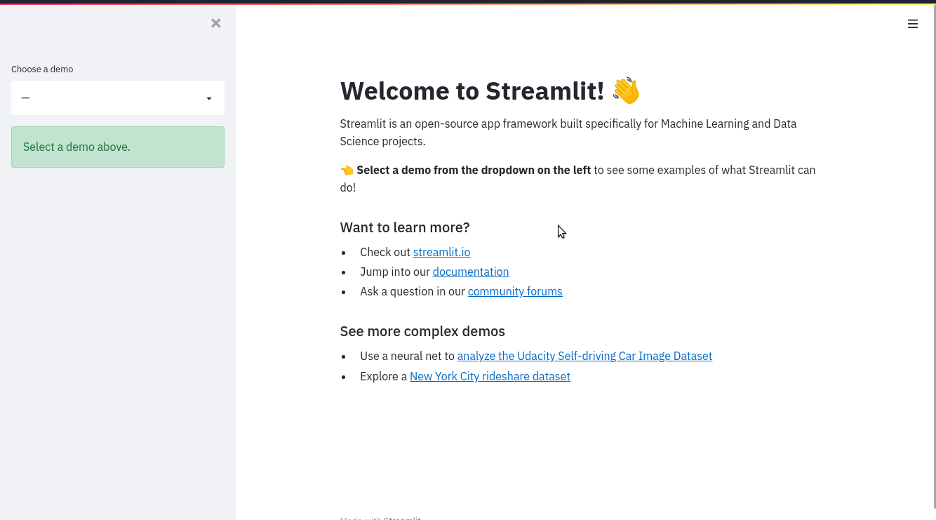
def intro():
import streamlit as st
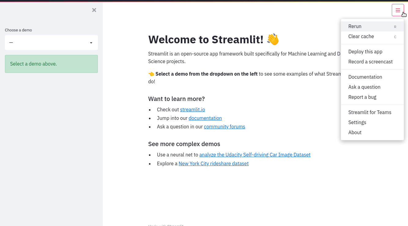
st.write("# Welcome to Streamlit! 👋")
st.sidebar.success("Select a demo above.")
st.markdown(
"""
Streamlit is an open-source app framework built specifically for
Machine Learning and Data Science projects.
**👈 Select a demo from the dropdown on the left** to see some examples
of what Streamlit can do!
### Want to learn more?
- Check out [streamlit.io](https://streamlit.io)
- Jump into our [documentation](https://docs.streamlit.io)
- Ask a question in our [community
forums](https://discuss.streamlit.io)
### See more complex demos
- Use a neural net to [analyze the Udacity Self-driving Car Image
Dataset](https://github.com/streamlit/demo-self-driving)
- Explore a [New York City rideshare dataset](https://github.com/streamlit/demo-uber-nyc-pickups)
"""
)
def mapping_demo():
import streamlit as st
import pandas as pd
import pydeck as pdk
from urllib.error import URLError
st.markdown(f"# {list(page_names_to_funcs.keys())[2]}")
st.write(
"""
This demo shows how to use
[`st.pydeck_chart`](https://docs.streamlit.io/develop/api-reference/charts/st.pydeck_chart)
to display geospatial data.
"""
)
@st.cache_data
def from_data_file(filename):
url = (
"http://raw.githubusercontent.com/streamlit/"
"example-data/master/hello/v1/%s" % filename
)
return pd.read_json(url)
try:
ALL_LAYERS = {
"Bike Rentals": pdk.Layer(
"HexagonLayer",
data=from_data_file("bike_rental_stats.json"),
get_position=["lon", "lat"],
radius=200,
elevation_scale=4,
elevation_range=[0, 1000],
extruded=True,
),
"Bart Stop Exits": pdk.Layer(
"ScatterplotLayer",
data=from_data_file("bart_stop_stats.json"),
get_position=["lon", "lat"],
get_color=[200, 30, 0, 160],
get_radius="[exits]",
radius_scale=0.05,
),
"Bart Stop Names": pdk.Layer(
"TextLayer",
data=from_data_file("bart_stop_stats.json"),
get_position=["lon", "lat"],
get_text="name",
get_color=[0, 0, 0, 200],
get_size=15,
get_alignment_baseline="'bottom'",
),
"Outbound Flow": pdk.Layer(
"ArcLayer",
data=from_data_file("bart_path_stats.json"),
get_source_position=["lon", "lat"],
get_target_position=["lon2", "lat2"],
get_source_color=[200, 30, 0, 160],
get_target_color=[200, 30, 0, 160],
auto_highlight=True,
width_scale=0.0001,
get_width="outbound",
width_min_pixels=3,
width_max_pixels=30,
),
}
st.sidebar.markdown("### Map Layers")
selected_layers = [
layer
for layer_name, layer in ALL_LAYERS.items()
if st.sidebar.checkbox(layer_name, True)
]
if selected_layers:
st.pydeck_chart(
pdk.Deck(
map_style="mapbox://styles/mapbox/light-v9",
initial_view_state={
"latitude": 37.76,
"longitude": -122.4,
"zoom": 11,
"pitch": 50,
},
layers=selected_layers,
)
)
else:
st.error("Please choose at least one layer above.")
except URLError as e:
st.error(
"""
**This demo requires internet access.**
Connection error: %s
"""
% e.reason
)
def plotting_demo():
import streamlit as st
import time
import numpy as np
st.markdown(f'# {list(page_names_to_funcs.keys())[1]}')
st.write(
"""
This demo illustrates a combination of plotting and animation with
Streamlit. We're generating a bunch of random numbers in a loop for around
5 seconds. Enjoy!
"""
)
progress_bar = st.sidebar.progress(0)
status_text = st.sidebar.empty()
last_rows = np.random.randn(1, 1)
chart = st.line_chart(last_rows)
for i in range(1, 101):
new_rows = last_rows[-1, :] + np.random.randn(5, 1).cumsum(axis=0)
status_text.text("%i%% Complete" % i)
chart.add_rows(new_rows)
progress_bar.progress(i)
last_rows = new_rows
time.sleep(0.05)
progress_bar.empty()
# Streamlit widgets automatically run the script from top to bottom. Since
# this button is not connected to any other logic, it just causes a plain
# rerun.
st.button("Re-run")
def data_frame_demo():
import streamlit as st
import pandas as pd
import altair as alt
from urllib.error import URLError
st.markdown(f"# {list(page_names_to_funcs.keys())[3]}")
st.write(
"""
This demo shows how to use `st.write` to visualize Pandas DataFrames.
(Data courtesy of the [UN Data Explorer](http://data.un.org/Explorer.aspx).)
"""
)
@st.cache_data
def get_UN_data():
AWS_BUCKET_URL = "http://streamlit-demo-data.s3-us-west-2.amazonaws.com"
df = pd.read_csv(AWS_BUCKET_URL + "/agri.csv.gz")
return df.set_index("Region")
try:
df = get_UN_data()
countries = st.multiselect(
"Choose countries", list(df.index), ["China", "United States of America"]
)
if not countries:
st.error("Please select at least one country.")
else:
data = df.loc[countries]
data /= 1000000.0
st.write("### Gross Agricultural Production ($B)", data.sort_index())
data = data.T.reset_index()
data = pd.melt(data, id_vars=["index"]).rename(
columns={"index": "year", "value": "Gross Agricultural Product ($B)"}
)
chart = (
alt.Chart(data)
.mark_area(opacity=0.3)
.encode(
x="year:T",
y=alt.Y("Gross Agricultural Product ($B):Q", stack=None),
color="Region:N",
)
)
st.altair_chart(chart, use_container_width=True)
except URLError as e:
st.error(
"""
**This demo requires internet access.**
Connection error: %s
"""
% e.reason
)
page_names_to_funcs = {
"—": intro,
"Plotting Demo": plotting_demo,
"Mapping Demo": mapping_demo,
"DataFrame Demo": data_frame_demo
}
demo_name = st.sidebar.selectbox("Choose a demo", page_names_to_funcs.keys())
page_names_to_funcs[demo_name]()
```
Notice how large the file is! Each app “page" is written as a function, and the selectbox is used to pick which page to display. As our app grows, maintaining the code requires a lot of additional overhead. Moreover, we’re limited by the `st.selectbox` UI to choose which “page" to run, we cannot customize individual page titles with `st.set_page_config`, and we’re unable to navigate between pages using URLs.
## Convert an existing app into a multipage app
Now that we've identified the limitations of a single-page app, what can we do about it? Armed with our knowledge from the previous section, we can convert the existing app to be a multipage app, of course! At a high level, we need to perform the following steps:
1. Create a new `pages` folder in the same folder where the “entrypoint file" (`hello.py`) lives
2. Rename our entrypoint file to `Hello.py` , so that the title in the sidebar is capitalized
3. Create three new files inside of `pages`:
- `pages/1_📈_Plotting_Demo.py`
- `pages/2_🌍_Mapping_Demo.py`
- `pages/3_📊_DataFrame_Demo.py`
4. Move the contents of the `plotting_demo`, `mapping_demo`, and `data_frame_demo` functions into their corresponding new files from Step 3
5. Run `streamlit run Hello.py` to view your newly converted multipage app!
Now, let’s walk through each step of the process and view the corresponding changes in code.
## Create the entrypoint file
Hello.py
```python
import streamlit as st
st.set_page_config(
page_title="Hello",
page_icon="👋",
)
st.write("# Welcome to Streamlit! 👋")
st.sidebar.success("Select a demo above.")
st.markdown(
"""
Streamlit is an open-source app framework built specifically for
Machine Learning and Data Science projects.
**👈 Select a demo from the sidebar** to see some examples
of what Streamlit can do!
### Want to learn more?
- Check out [streamlit.io](https://streamlit.io)
- Jump into our [documentation](https://docs.streamlit.io)
- Ask a question in our [community
forums](https://discuss.streamlit.io)
### See more complex demos
- Use a neural net to [analyze the Udacity Self-driving Car Image
Dataset](https://github.com/streamlit/demo-self-driving)
- Explore a [New York City rideshare dataset](https://github.com/streamlit/demo-uber-nyc-pickups)
"""
)
```
We rename our entrypoint file to `Hello.py` , so that the title in the sidebar is capitalized and only the code for the intro page is included. Additionally, we’re able to customize the page title and favicon — as it appears in the browser tab with `st.set_page_config`. We can do so for each of our pages too!
Notice how the sidebar does not contain page labels as we haven’t created any pages yet.
## Create multiple pages
A few things to remember here:
1. We can change the ordering of pages in our MPA by adding numbers to the beginning of each Python file. If we add a 1 to the front of our file name, Streamlit will put that file first in the list.
2. The name of each Streamlit app is determined by the file name, so to change the app name you need to change the file name!
3. We can add some fun to our app by adding emojis to our file names that will render in our Streamlit app.
4. Each page will have its own URL, defined by the name of the file.
Check out how we do all this below! For each new page, we create a new file inside the pages folder, and add the appropriate demo code into it.
pages/1_📈_Plotting_Demo.py
```python
import streamlit as st
import time
import numpy as np
st.set_page_config(page_title="Plotting Demo", page_icon="📈")
st.markdown("# Plotting Demo")
st.sidebar.header("Plotting Demo")
st.write(
"""This demo illustrates a combination of plotting and animation with
Streamlit. We're generating a bunch of random numbers in a loop for around
5 seconds. Enjoy!"""
)
progress_bar = st.sidebar.progress(0)
status_text = st.sidebar.empty()
last_rows = np.random.randn(1, 1)
chart = st.line_chart(last_rows)
for i in range(1, 101):
new_rows = last_rows[-1, :] + np.random.randn(5, 1).cumsum(axis=0)
status_text.text("%i%% Complete" % i)
chart.add_rows(new_rows)
progress_bar.progress(i)
last_rows = new_rows
time.sleep(0.05)
progress_bar.empty()
# Streamlit widgets automatically run the script from top to bottom. Since
# this button is not connected to any other logic, it just causes a plain
# rerun.
st.button("Re-run")
```
pages/2_🌍_Mapping_Demo.py
```python
import streamlit as st
import pandas as pd
import pydeck as pdk
from urllib.error import URLError
st.set_page_config(page_title="Mapping Demo", page_icon="🌍")
st.markdown("# Mapping Demo")
st.sidebar.header("Mapping Demo")
st.write(
"""This demo shows how to use
[`st.pydeck_chart`](https://docs.streamlit.io/develop/api-reference/charts/st.pydeck_chart)
to display geospatial data."""
)
@st.cache_data
def from_data_file(filename):
url = (
"http://raw.githubusercontent.com/streamlit/"
"example-data/master/hello/v1/%s" % filename
)
return pd.read_json(url)
try:
ALL_LAYERS = {
"Bike Rentals": pdk.Layer(
"HexagonLayer",
data=from_data_file("bike_rental_stats.json"),
get_position=["lon", "lat"],
radius=200,
elevation_scale=4,
elevation_range=[0, 1000],
extruded=True,
),
"Bart Stop Exits": pdk.Layer(
"ScatterplotLayer",
data=from_data_file("bart_stop_stats.json"),
get_position=["lon", "lat"],
get_color=[200, 30, 0, 160],
get_radius="[exits]",
radius_scale=0.05,
),
"Bart Stop Names": pdk.Layer(
"TextLayer",
data=from_data_file("bart_stop_stats.json"),
get_position=["lon", "lat"],
get_text="name",
get_color=[0, 0, 0, 200],
get_size=15,
get_alignment_baseline="'bottom'",
),
"Outbound Flow": pdk.Layer(
"ArcLayer",
data=from_data_file("bart_path_stats.json"),
get_source_position=["lon", "lat"],
get_target_position=["lon2", "lat2"],
get_source_color=[200, 30, 0, 160],
get_target_color=[200, 30, 0, 160],
auto_highlight=True,
width_scale=0.0001,
get_width="outbound",
width_min_pixels=3,
width_max_pixels=30,
),
}
st.sidebar.markdown("### Map Layers")
selected_layers = [
layer
for layer_name, layer in ALL_LAYERS.items()
if st.sidebar.checkbox(layer_name, True)
]
if selected_layers:
st.pydeck_chart(
pdk.Deck(
map_style="mapbox://styles/mapbox/light-v9",
initial_view_state={
"latitude": 37.76,
"longitude": -122.4,
"zoom": 11,
"pitch": 50,
},
layers=selected_layers,
)
)
else:
st.error("Please choose at least one layer above.")
except URLError as e:
st.error(
"""
**This demo requires internet access.**
Connection error: %s
"""
% e.reason
)
```
pages/3_📊_DataFrame_Demo.py
```python
import streamlit as st
import pandas as pd
import altair as alt
from urllib.error import URLError
st.set_page_config(page_title="DataFrame Demo", page_icon="📊")
st.markdown("# DataFrame Demo")
st.sidebar.header("DataFrame Demo")
st.write(
"""This demo shows how to use `st.write` to visualize Pandas DataFrames.
(Data courtesy of the [UN Data Explorer](http://data.un.org/Explorer.aspx).)"""
)
@st.cache_data
def get_UN_data():
AWS_BUCKET_URL = "http://streamlit-demo-data.s3-us-west-2.amazonaws.com"
df = pd.read_csv(AWS_BUCKET_URL + "/agri.csv.gz")
return df.set_index("Region")
try:
df = get_UN_data()
countries = st.multiselect(
"Choose countries", list(df.index), ["China", "United States of America"]
)
if not countries:
st.error("Please select at least one country.")
else:
data = df.loc[countries]
data /= 1000000.0
st.write("### Gross Agricultural Production ($B)", data.sort_index())
data = data.T.reset_index()
data = pd.melt(data, id_vars=["index"]).rename(
columns={"index": "year", "value": "Gross Agricultural Product ($B)"}
)
chart = (
alt.Chart(data)
.mark_area(opacity=0.3)
.encode(
x="year:T",
y=alt.Y("Gross Agricultural Product ($B):Q", stack=None),
color="Region:N",
)
)
st.altair_chart(chart, use_container_width=True)
except URLError as e:
st.error(
"""
**This demo requires internet access.**
Connection error: %s
"""
% e.reason
)
```
With our additional pages created, we can now put it all together in the final step below.
## Run the multipage app
To run your newly converted multipage app, run:
```bash
streamlit run Hello.py
```
That’s it! The `Hello.py` script now corresponds to the main page of your app, and other scripts that Streamlit finds in the pages folder will also be present in the new page selector that appears in the sidebar.
## Next steps
Congratulations! 🎉 If you've read this far, chances are you've learned to create both single-page and multipage apps. Where you go from here is entirely up to your creativity! We’re excited to see what you’ll build now that adding additional pages to your apps is easier than ever. Try adding more pages to the app we've just built as an exercise. Also, stop by the forum to show off your multipage apps with the Streamlit community! 🎈
Here are a few resources to help you get started:
- Deploy your app for free on Streamlit's [Community Cloud](/deploy/streamlit-community-cloud).
- Post a question or share your multipage app on our [community forum](https://discuss.streamlit.io/c/streamlit-examples/9).
- Check out our documentation on [Multipage apps](/develop/concepts/multipage-apps).
- Read through [Concepts](/develop/concepts) for things like caching, theming, and adding statefulness to apps.
- Browse our [API reference](/develop/api-reference/) for examples of every Streamlit command.
---
# Develop
Source: https://docs.streamlit.io/develop
Get all the information you need to build beautiful, performant web apps with Streamlit!
Learn how Streamlit works with in-depth guides to our execution model and features.Learn about our API with function definitions and examples.Follow step-by-step instructions to build example apps and useful snippets.Check out our quick references for easy access to convenient information like our changelog, cheat sheet, pre-release features, and roadmap.
---
# Development concepts
Source: https://docs.streamlit.io/develop/concepts
This section gives you background on how different parts of Streamlit work.
Streamlit's architecture and execution model
Streamlit's execution model makes it easy to turn your scripts into beautiful, interactive web apps.
- Understand how to run your app.
- Understand Streamlit's execution and client-server model.
- Understand the primary tools to work with Streamlit reruns.
Multipage apps
Streamlit provides an automated way to build multipage apps through directory structure.
- Learn how to structure and configure your multipage app.
App design considerations
Bring together Streamlit's architecture and execution model to design your app. Work with Streamlit commands to render dynamic and
interactic content for your users.
- Learn how to make your apps performant and easy-to-manage.
- Learn how to structure and design your project.
Connections and secrets
- Learn how to manage connections and secrets with Streamlit's convenient, built-in features.
Creating custom components
Custom components extend Streamlit's functionality.
- Learn how to build your own custom component.
- Learn how install a third-party component.
Configuration and theming
Streamlit provides a variety options to customize and configure your app.
- Learn how to work with configuration options, including server settings, client settings, and theming.
App testing
Streamlit app testing enables developers to build and run automated tests. Bring your favorite test automation software and enjoy simple syntax to simulate user input and inspect rendered output.
---
# Working with Streamlit's execution model
Source: https://docs.streamlit.io/develop/concepts/architecture
Run your app
Understand how to start your Streamlit app.
Streamlit's architecture
Understand Streamlit's client-server architecture and related considerations.
The app chrome
Every Streamlit app has a few widgets in the top right to help you as you develop your app and help your users as they view your app. This is called the app chrome.
Caching
Make your app performant by caching results to avoid unecessary recomputation with each rerun.
Session State
Manage your app's statefulness with Session State.
Forms
Use forms to isolate user input and prevent unnecessary app reruns.
Widget behavior
Understand how widgets work in detail.
---
# Run your Streamlit app
Source: https://docs.streamlit.io/develop/concepts/architecture/run-your-app
Working with Streamlit is simple. First you sprinkle a few Streamlit commands into a normal Python script, and then you run it. We list few ways to run your script, depending on your use case.
## Use streamlit run
Once you've created your script, say `your_script.py`, the easiest way to run it is with `streamlit run`:
```bash
streamlit run your_script.py
```
As soon as you run the script as shown above, a local Streamlit server will spin up and your app will open in a new tab in your default web browser.
### Pass arguments to your script
When passing your script some custom arguments, they must be passed after two dashes. Otherwise the arguments get interpreted as arguments to Streamlit itself:
```bash
streamlit run your_script.py [-- script args]
```
### Pass a URL to streamlit run
You can also pass a URL to `streamlit run`! This is great when your script is hosted remotely, such as a GitHub Gist. For example:
```bash
streamlit run https://raw.githubusercontent.com/streamlit/demo-uber-nyc-pickups/master/streamlit_app.py
```
## Run Streamlit as a Python module
Another way of running Streamlit is to run it as a Python module. This is useful when configuring an IDE like PyCharm to work with Streamlit:
```bash
# Running
python -m streamlit run your_script.py
```
```bash
# is equivalent to:
streamlit run your_script.py
```
---
# Understanding Streamlit's client-server architecture
Source: https://docs.streamlit.io/develop/concepts/architecture/architecture
Streamlit apps have a client-server structure. The Python backend of your app is the server. The frontend you view through a browser is the client. When you develop an app locally, your computer runs both the server and the client. If someone views your app across a local or global network, the server and client run on different machines. If you intend to share or deploy your app, it's important to understand this client-server structure to avoid common pitfalls.
## Python backend (server)
When you execute the command `streamlit run your_app.py`, your computer uses Python to start up a Streamlit server. This server is the brains of your app and performs the computations for all users who view your app. Whether users view your app across a local network or the internet, the Streamlit server runs on the one machine where the app was initialized with `streamlit run`. The machine running your Streamlit server is also called a host.
## Browser frontend (client)
When someone views your app through a browser, their device is a Streamlit client. When you view your app from the same computer where you are running or developing your app, then server and client are coincidentally running on the same machine. However, when users view your app across a local network or the internet, the client runs on a different machine from the server.
## Server-client impact on app design
Keep in mind the following considerations when building your Streamlit app:
- The computer running or hosting your Streamlit app is responsible for providing the compute and storage necessary to run your app for all users and must be sized appropriately to handle concurrent users.
- Your app will not have access to a user's files, directories, or OS. Your app can only work with specific files a user has uploaded to your app through a widget like `st.file_uploader`.
- If your app communicates with any peripheral devices (like cameras), you must use Streamlit commands or custom components that will access those devices _through the user's browser_ and correctly communicate between the client (frontend) and server (backend).
- If your app opens or uses any program or process outside of Python, they will run on the server. For example, you may want to use `webrowser` to open a browser for the user, but this will not work as expected when viewing your app over a network; it will open a browser on the Streamlit server, unseen by the user.
- If you use load balancing or replication in your deployment, some Streamlit features won't work without session affinity or stickiness. For more information, continue reading.
## WebSockets and session management
While most Streamlit app developers don’t need to interact directly with WebSockets, understanding their role is important for advanced deployments, custom components, or managing connections at scale.
Streamlit’s server is built on the Tornado web framework, which uses WebSockets to maintain a persistent, two-way communication channel between the client and server. This persistent connection allows the server to push real-time updates to the client and maintain session context for each user. Each browser tab or window creates its own WebSocket connection, resulting in a separate session within your app.
In large-scale or production deployments, load balancing and server replication are common. However, the way Streamlit handles sessions and local (server) files requires special consideration in these environments. When a client requests media (such as an image or audio file) via HTTP, there is no session context attached to that request. In deployments with multiple server replicas or load balancers, the HTTP request for the media file might be routed to a different server than the one handling the user’s WebSocket connection and session information. If the media file isn’t available on all replicas, you may encounter errors like `MediaFileStorageError: Bad filename`. Any command that allows the user to upload files can also be impacted and may raise HTTP status code 400.
### Session affinity or stickiness
In general, you can do one of the following to resolve or reduce this limitation:
- Enable session affinity (also known as stickiness) in your proxy. This ensures that all requests from a user’s session are handled by the same server instance.
- Convert media to a Base64 encoded data URI before passing it to a Streamlit command. This passes the media data through the WebSocket instead of using Streamlit's media storage which is accessed through HTTP requests.
- Save dynamically generated files to a stable location outside of your server replicas (e.g. S3 storage), and pass the external URLs to Streamlit commands. This avoids Streamlit's media storage.
Enabling session affinity is a general solution which resolves the limitation for both media files and uploaded files. For configuration details, consult your deployment platform’s documentation.
Using Base64 encoded data URIs or external file storage can straightforwardly resolve the limitation for media files, but are not complete solutions to resolve the limitation for file uploads. For more information, see GitHub issue [#4173](https://github.com/streamlit/streamlit/issues/4173).
---
# The app chrome
Source: https://docs.streamlit.io/develop/concepts/architecture/app-chrome
Your Streamlit app has a few widgets in the top right to help you as you develop. These widgets also help your viewers as they use your app. We call this things “the app chrome”. The chrome includes a status area, toolbar, and app menu.
Your app menu is configurable. By default, you can access developer options from the app menu when viewing an app locally or on Streamlit Community Cloud while logged into an account with administrative access. While viewing an app, click the icon in the upper-right corner to access the menu.
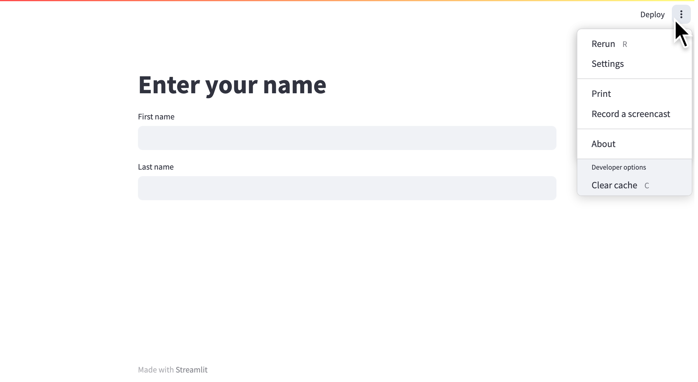
## Menu options
The menu is split into two sections. The upper section contains options available to all viewers and the lower section contains options for developers. Read more about [customizing this menu](#customize-the-menu) at the end of this page.
### Rerun
You can manually trigger a rerun of your app by clicking "**Rerun**" from the app menu. This rerun will not reset your session. Your widget states and values stored in [`st.session_state`](/develop/concepts/architecture/session-state) will be preserved. As a shortcut, without opening the app menu, you can rerun your app by pressing "**R**" on your keyboard (if you aren't currently focused on an input element).
### Settings
With the "**Settings**" option, you can control the appearance of your app while it is running. If viewing the app locally, you can set how your app responds to changes in your source code. See more about development flow in [Basic concepts](/get-started/fundamentals/main-concepts#development-flow). You can also force your app to appear in wide mode, even if not set within the script using [`st.set_page_config`](/develop/api-reference/configuration/st.set_page_config).
#### Theme settings
After clicking "**Settings**" from the app menu, you can choose between "**Light**", "**Dark**", or "**Use system setting**" for the app's base theme. Click "**Edit active theme**" to modify the theme, color-by-color.
{{ maxWidth: '90%', margin: '0 2em 0 2em' }}>
---
# Caching overview
Source: https://docs.streamlit.io/develop/concepts/architecture/caching
Streamlit runs your script from top to bottom at every user interaction or code change. This execution model makes development super easy. But it comes with two major challenges:
1. Long-running functions run again and again, which slows down your app.
2. Objects get recreated again and again, which makes it hard to persist them across reruns or sessions.
But don't worry! Streamlit lets you tackle both issues with its built-in caching mechanism. Caching stores the results of slow function calls, so they only need to run once. This makes your app much faster and helps with persisting objects across reruns. Cached values are available to all users of your app. If you need to save results that should only be accessible within a session, use [Session State](/develop/concepts/architecture/session-state) instead.
{true}>
1. [Minimal example](#minimal-example)
2. [Basic usage](#basic-usage)
3. [Advanced usage](#advanced-usage)
4. [Migrating from st.cache](#migrating-from-stcache)
---
# Add statefulness to apps
Source: https://docs.streamlit.io/develop/concepts/architecture/session-state
## What is State?
We define access to a Streamlit app in a browser tab as a **session**. For each browser tab that connects to the Streamlit server, a new session is created. Streamlit reruns your script from top to bottom every time you interact with your app. Each reruns takes place in a blank slate: no variables are shared between runs.
Session State is a way to share variables between reruns, for each user session. In addition to the ability to store and persist state, Streamlit also exposes the ability to manipulate state using Callbacks. Session state also persists across pages inside a [multipage app](/develop/concepts/multipage-apps).
In this guide, we will illustrate the usage of **Session State** and **Callbacks** as we build a stateful Counter app.
For details on the Session State and Callbacks API, please refer to our [Session State API Reference Guide](/develop/api-reference/caching-and-state/st.session_state).
Also, check out this Session State basics tutorial video by Streamlit Developer Advocate Dr. Marisa Smith to get started:
## Build a Counter
Let's call our script `counter.py`. It initializes a `count` variable and has a button to increment the value stored in the `count` variable:
```python
import streamlit as st
st.title('Counter Example')
count = 0
increment = st.button('Increment')
if increment:
count += 1
st.write('Count = ', count)
```
No matter how many times we press the **_Increment_** button in the above app, the `count` remains at 1. Let's understand why:
- Each time we press the **_Increment_** button, Streamlit reruns `counter.py` from top to bottom, and with every run, `count` gets initialized to `0` .
- Pressing **_Increment_** subsequently adds 1 to 0, thus `count=1` no matter how many times we press **_Increment_**.
As we'll see later, we can avoid this issue by storing `count` as a Session State variable. By doing so, we're indicating to Streamlit that it should maintain the value stored inside a Session State variable across app reruns.
Let's learn more about the API to use Session State.
### Initialization
The Session State API follows a field-based API, which is very similar to Python dictionaries:
```python
import streamlit as st
# Check if 'key' already exists in session_state
# If not, then initialize it
if 'key' not in st.session_state:
st.session_state['key'] = 'value'
# Session State also supports the attribute based syntax
if 'key' not in st.session_state:
st.session_state.key = 'value'
```
### Reads and updates
Read the value of an item in Session State by passing the item to `st.write` :
```python
import streamlit as st
if 'key' not in st.session_state:
st.session_state['key'] = 'value'
# Reads
st.write(st.session_state.key)
# Outputs: value
```
Update an item in Session State by assigning it a value:
```python
import streamlit as st
if 'key' not in st.session_state:
st.session_state['key'] = 'value'
# Updates
st.session_state.key = 'value2' # Attribute API
st.session_state['key'] = 'value2' # Dictionary like API
```
Streamlit throws an exception if an uninitialized variable is accessed:
```python
import streamlit as st
st.write(st.session_state['value'])
# Throws an exception!
```
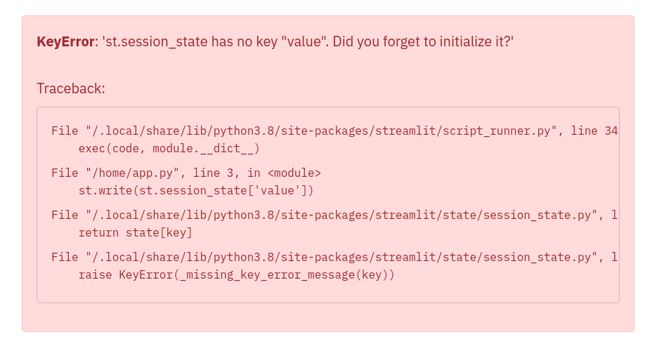
Let's now take a look at a few examples that illustrate how to add Session State to our Counter app.
### Example 1: Add Session State
Now that we've got a hang of the Session State API, let's update our Counter app to use Session State:
```python
import streamlit as st
st.title('Counter Example')
if 'count' not in st.session_state:
st.session_state.count = 0
increment = st.button('Increment')
if increment:
st.session_state.count += 1
st.write('Count = ', st.session_state.count)
```
As you can see in the above example, pressing the **_Increment_** button updates the `count` each time.
### Example 2: Session State and Callbacks
Now that we've built a basic Counter app using Session State, let's move on to something a little more complex. The next example uses Callbacks with Session State.
**Callbacks**: A callback is a Python function which gets called when an input widget changes. Callbacks can be used with widgets using the parameters `on_change` (or `on_click`), `args`, and `kwargs`. The full Callbacks API can be found in our [Session State API Reference Guide](/develop/api-reference/caching-and-state/st.session_state#use-callbacks-to-update-session-state).
```python
import streamlit as st
st.title('Counter Example using Callbacks')
if 'count' not in st.session_state:
st.session_state.count = 0
def increment_counter():
st.session_state.count += 1
st.button('Increment', on_click=increment_counter)
st.write('Count = ', st.session_state.count)
```
Now, pressing the **_Increment_** button updates the count each time by calling the `increment_counter()` function.
### Example 3: Use args and kwargs in Callbacks
Callbacks also support passing arguments using the `args` parameter in a widget:
```python
import streamlit as st
st.title('Counter Example using Callbacks with args')
if 'count' not in st.session_state:
st.session_state.count = 0
increment_value = st.number_input('Enter a value', value=0, step=1)
def increment_counter(increment_value):
st.session_state.count += increment_value
increment = st.button('Increment', on_click=increment_counter,
args=(increment_value, ))
st.write('Count = ', st.session_state.count)
```
Additionally, we can also use the `kwargs` parameter in a widget to pass named arguments to the callback function as shown below:
```python
import streamlit as st
st.title('Counter Example using Callbacks with kwargs')
if 'count' not in st.session_state:
st.session_state.count = 0
def increment_counter(increment_value=0):
st.session_state.count += increment_value
def decrement_counter(decrement_value=0):
st.session_state.count -= decrement_value
st.button('Increment', on_click=increment_counter,
kwargs=dict(increment_value=5))
st.button('Decrement', on_click=decrement_counter,
kwargs=dict(decrement_value=1))
st.write('Count = ', st.session_state.count)
```
### Example 4: Forms and Callbacks
Say we now want to not only increment the `count`, but also store when it was last updated. We illustrate doing this using Callbacks and `st.form`:
```python
import streamlit as st
import datetime
st.title('Counter Example')
if 'count' not in st.session_state:
st.session_state.count = 0
st.session_state.last_updated = datetime.time(0,0)
def update_counter():
st.session_state.count += st.session_state.increment_value
st.session_state.last_updated = st.session_state.update_time
with st.form(key='my_form'):
st.time_input(label='Enter the time', value=datetime.datetime.now().time(), key='update_time')
st.number_input('Enter a value', value=0, step=1, key='increment_value')
submit = st.form_submit_button(label='Update', on_click=update_counter)
st.write('Current Count = ', st.session_state.count)
st.write('Last Updated = ', st.session_state.last_updated)
```
## Advanced concepts
### Session State and Widget State association
Session State provides the functionality to store variables across reruns. Widget state (i.e. the value of a widget) is also stored in a session.
For simplicity, we have _unified_ this information in one place. i.e. the Session State. This convenience feature makes it super easy to read or write to the widget's state anywhere in the app's code. Session State variables mirror the widget value using the `key` argument.
We illustrate this with the following example. Let's say we have an app with a slider to represent temperature in Celsius. We can **set** and **get** the value of the temperature widget by using the Session State API, as follows:
```python
import streamlit as st
if "celsius" not in st.session_state:
# set the initial default value of the slider widget
st.session_state.celsius = 50.0
st.slider(
"Temperature in Celsius",
min_value=-100.0,
max_value=100.0,
key="celsius"
)
# This will get the value of the slider widget
st.write(st.session_state.celsius)
```
There is a limitation to setting widget values using the Session State API.
Streamlit **does not allow** setting widget values via the Session State API for `st.button` and `st.file_uploader`.
The following example will raise a `StreamlitAPIException` on trying to set the state of `st.button` via the Session State API:
```python
import streamlit as st
if 'my_button' not in st.session_state:
st.session_state.my_button = True
# Streamlit will raise an Exception on trying to set the state of button
st.button('Submit', key='my_button')
```
### Serializable Session State
Serialization refers to the process of converting an object or data structure into a format that can be persisted and shared, and allowing you to recover the data’s original structure. Python’s built-in [pickle](https://docs.python.org/3/library/pickle.html) module serializes Python objects to a byte stream ("pickling") and deserializes the stream into an object ("unpickling").
By default, Streamlit’s [Session State](/develop/concepts/architecture/session-state) allows you to persist any Python object for the duration of the session, irrespective of the object’s pickle-serializability. This property lets you store Python primitives such as integers, floating-point numbers, complex numbers and booleans, dataframes, and even [lambdas](https://docs.python.org/3/reference/expressions.html#lambda) returned by functions. However, some execution environments may require serializing all data in Session State, so it may be useful to detect incompatibility during development, or when the execution environment will stop supporting it in the future.
To that end, Streamlit provides a `runner.enforceSerializableSessionState` [configuration option](/develop/concepts/configuration) that, when set to `true`, only allows pickle-serializable objects in Session State. To enable the option, either create a global or project config file with the following or use it as a command-line flag:
```toml
# .streamlit/config.toml
[runner]
enforceSerializableSessionState = true
```
By "_pickle-serializable_", we mean calling `pickle.dumps(obj)` should not raise a [`PicklingError`](https://docs.python.org/3/library/pickle.html#pickle.PicklingError) exception. When the config option is enabled, adding unserializable data to session state should result in an exception. E.g.,
```python
import streamlit as st
def unserializable_data():
return lambda x: x
#👇 results in an exception when enforceSerializableSessionState is on
st.session_state.unserializable = unserializable_data()
```
When `runner.enforceSerializableSessionState` is set to `true`, Session State implicitly uses the `pickle` module, which is known to be insecure. Ensure all data saved and retrieved from Session State is trusted because it is possible to construct malicious pickle data that will execute arbitrary code during unpickling. Never load data that could have come from an untrusted source in an unsafe mode or that could have been tampered with. **Only load data you trust**.
### Caveats and limitations
Here are some limitations to keep in mind when using Session State:
- Session State exists for as long as the tab is open and connected to the Streamlit server. As soon as you close the tab, everything stored in Session State is lost.
- Session State is not persisted. If the Streamlit server crashes, then everything stored in Session State gets wiped
- For caveats and limitations with the Session State API, please see the [API limitations](/develop/api-reference/caching-and-state/st.session_state#caveats-and-limitations).
---
# Using forms
Source: https://docs.streamlit.io/develop/concepts/architecture/forms
When you don't want to rerun your script with each input made by a user, [`st.form`](/develop/api-reference/execution-flow/st.form) is here to help! Forms make it easy to batch user input into a single rerun. This guide to using forms provides examples and explains how users interact with forms.
## Example
In the following example, a user can set multiple parameters to update the map. As the user changes the parameters, the script will not rerun and the map will not update. When the user submits the form with the button labeled "**Update map**", the script reruns and the map updates.
If at any time the user clicks "**Generate new points**" which is outside of the form, the script will rerun. If the user has any unsubmitted changes within the form, these will _not_ be sent with the rerun. All changes made to a form will only be sent to the Python backend when the form itself is submitted.
{false} >
```python
import streamlit as st
import pandas as pd
import numpy as np
def get_data():
df = pd.DataFrame({
"lat": np.random.randn(200) / 50 + 37.76,
"lon": np.random.randn(200) / 50 + -122.4,
"team": ['A','B']*100
})
return df
if st.button('Generate new points'):
st.session_state.df = get_data()
if 'df' not in st.session_state:
st.session_state.df = get_data()
df = st.session_state.df
with st.form("my_form"):
header = st.columns([1,2,2])
header[0].subheader('Color')
header[1].subheader('Opacity')
header[2].subheader('Size')
row1 = st.columns([1,2,2])
colorA = row1[0].color_picker('Team A', '#0000FF')
opacityA = row1[1].slider('A opacity', 20, 100, 50, label_visibility='hidden')
sizeA = row1[2].slider('A size', 50, 200, 100, step=10, label_visibility='hidden')
row2 = st.columns([1,2,2])
colorB = row2[0].color_picker('Team B', '#FF0000')
opacityB = row2[1].slider('B opacity', 20, 100, 50, label_visibility='hidden')
sizeB = row2[2].slider('B size', 50, 200, 100, step=10, label_visibility='hidden')
st.form_submit_button('Update map')
alphaA = int(opacityA*255/100)
alphaB = int(opacityB*255/100)
df['color'] = np.where(df.team=='A',colorA+f'{alphaA:02x}',colorB+f'{alphaB:02x}')
df['size'] = np.where(df.team=='A',sizeA, sizeB)
st.map(df, size='size', color='color')
```
---
# Working with fragments
Source: https://docs.streamlit.io/develop/concepts/architecture/fragments
Reruns are a central part of every Streamlit app. When users interact with widgets, your script reruns from top to bottom, and your app's frontend is updated. Streamlit provides several features to help you develop your app within this execution model. Streamlit version 1.37.0 introduced fragments to allow rerunning a portion of your code instead of your full script. As your app grows larger and more complex, these fragment reruns help your app be efficient and performant. Fragments give you finer, easy-to-understand control over your app's execution flow.
Before you read about fragments, we recommend having a basic understanding of [caching](/develop/concepts/architecture/caching), [Session State](/concepts/architecture/session-state), and [forms](/develop/concepts/architecture/forms).
## Use cases for fragments
Fragments are versatile and applicable to a wide variety of circumstances. Here are just a few, common scenarios where fragments are useful:
- Your app has multiple visualizations and each one takes time to load, but you have a filter input that only updates one of them.
- You have a dynamic form that doesn't need to update the rest of your app (until the form is complete).
- You want to automatically update a single component or group of components to stream data.
## Defining and calling a fragment
Streamlit provides a decorator ([`st.fragment`](/develop/api-reference/execution-flow/st.fragment)) to turn any function into a fragment function. When you call a fragment function that contains a widget function, a user triggers a _fragment rerun_ instead of a full rerun when they interact with that fragment's widget. During a fragment rerun, only your fragment function is re-executed. Anything within the main body of your fragment is updated on the frontend, while the rest of your app remains the same. We'll describe fragments written across multiple containers later on.
Here is a basic example of defining and calling a fragment function. Just like with caching, remember to call your function after defining it.
```python
import streamlit as st
@st.fragment
def fragment_function():
if st.button("Hi!"):
st.write("Hi back!")
fragment_function()
```
If you want the main body of your fragment to appear in the sidebar or another container, call your fragment function inside a context manager.
```python
with st.sidebar:
fragment_function()
```
### Fragment execution flow
Consider the following code with the explanation and diagram below.
```python
import streamlit as st
st.title("My Awesome App")
@st.fragment()
def toggle_and_text():
cols = st.columns(2)
cols[0].toggle("Toggle")
cols[1].text_area("Enter text")
@st.fragment()
def filter_and_file():
cols = st.columns(2)
cols[0].checkbox("Filter")
cols[1].file_uploader("Upload image")
toggle_and_text()
cols = st.columns(2)
cols[0].selectbox("Select", [1,2,3], None)
cols[1].button("Update")
filter_and_file()
```
When a user interacts with an input widget inside a fragment, only the fragment reruns instead of the full script. When a user interacts with an input widget outside a fragment, the full script reruns as usual.
If you run the code above, the full script will run top to bottom on your app's initial load. If you flip the toggle button in your running app, the first fragment (`toggle_and_text()`) will rerun, redrawing the toggle and text area while leaving everything else unchanged. If you click the checkbox, the second fragment (`filter_and_file()`) will rerun and consequently redraw the checkbox and file uploader. Everything else remains unchanged. Finally, if you click the update button, the full script will rerun, and Streamlit will redraw everything.
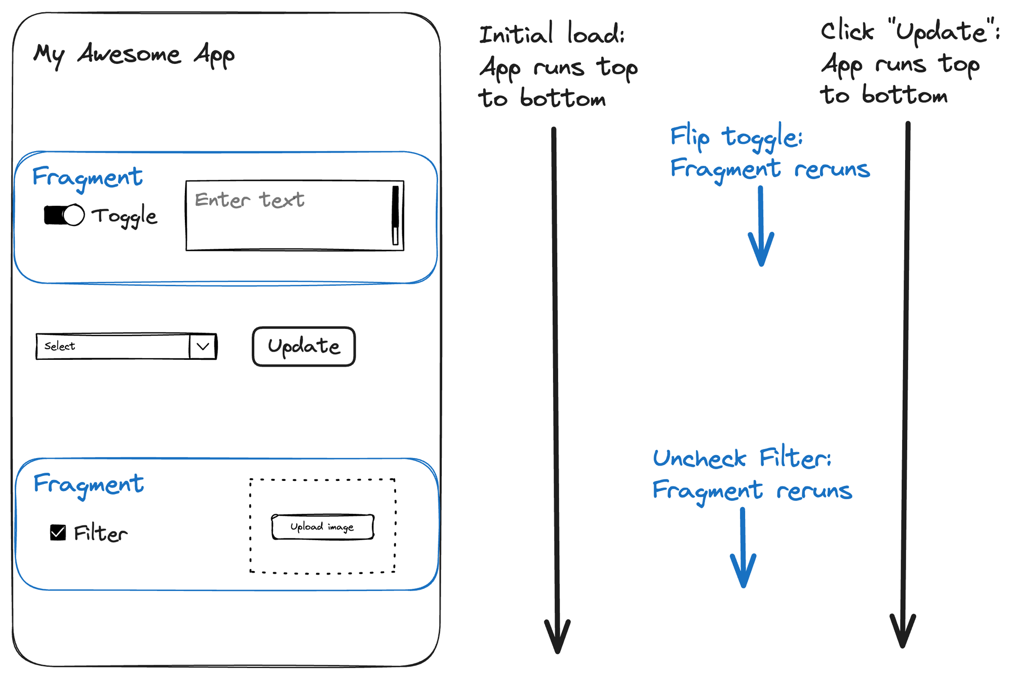
## Fragment return values and interacting with the rest of your app
Streamlit ignores fragment return values during fragment reruns, so defining return values for your fragment functions is not recommended. Instead, if your fragment needs to share data with the rest of your app, use Session State. Fragments are just functions in your script, so they can access Session State, imported modules, and other Streamlit elements like containers. If your fragment writes to any container created outside of itself, note the following difference in behavior:
- Elements drawn in the main body of your fragment are cleared and redrawn in place during a fragment rerun. Repeated fragment reruns will not cause additional elements to appear.
- Elements drawn to containers outside the main body of fragment will not be cleared with each fragment rerun. Instead, Streamlit will draw them additively and these elements will accumulate until the next full-script rerun.
- A fragment can't draw widgets in containers outside of the main body of the fragment. Widgets can only go in the main body of a fragment.
To prevent elements from accumulating in outside containers, use [`st.empty`](/develop/api-reference/layout/st.empty) containers. For a related tutorial, see [Create a fragment across multiple containers](/develop/tutorials/execution-flow/create-a-multiple-container-fragment).
If you need to trigger a full-script rerun from inside a fragment, call [`st.rerun`](/develop/api-reference/execution-flow/st.rerun). For a related tutorial, see [Trigger a full-script rerun from inside a fragment](/develop/tutorials/execution-flow/trigger-a-full-script-rerun-from-a-fragment).
## Automate fragment reruns
`st.fragment` includes a convenient `run_every` parameter that causes the fragment to rerun automatically at the specified time interval. These reruns are in addition to any reruns (fragment or full-script) triggered by your user. The automatic fragment reruns will continue even if your user is not interacting with your app. This is a great way to show a live data stream or status on a running background job, efficiently updating your rendered data and _only_ your rendered data.
```python
@st.fragment(run_every="10s")
def auto_function():
# This will update every 10 seconds!
df = get_latest_updates()
st.line_chart(df)
auto_function()
```
For a related tutorial, see [Start and stop a streaming fragment](/develop/tutorials/execution-flow/start-and-stop-fragment-auto-reruns).
## Compare fragments to other Streamlit features
### Fragments vs forms
Here is a comparison between fragments and forms:
- **Forms** allow users to interact with widgets without rerunning your app. Streamlit does not send user actions within a form to your app's Python backend until the form is submitted. Widgets within a form can not dynamically update other widgets (in or out of the form) in real-time.
- **Fragments** run independently from the rest of your code. As your users interact with fragment widgets, their actions are immediately processed by your app's Python backend and your fragment code is rerun. Widgets within a fragment can dynamically update other widgets within the same fragment in real-time.
A form batches user input without interaction between any widgets. A fragment immediately processes user input but limits the scope of the rerun.
### Fragments vs callbacks
Here is a comparison between fragments and callbacks:
- **Callbacks** allow you to execute a function at the beginning of a script rerun. A callback is a _single prefix_ to your script rerun.
- **Fragments** allow you to rerun a portion of your script. A fragment is a _repeatable postfix_ to your script, running each time a user interacts with a fragment widget, or automatically in sequence when `run_every` is set.
When callbacks render elements to your page, they are rendered before the rest of your page elements. When fragments render elements to your page, they are updated with each fragment rerun (unless they are written to containers outside of the fragment, in which case they accumulate there).
### Fragments vs custom components
Here is a comparison between fragments and custom components:
- **Components** are custom frontend code that can interact with the Python code, native elements, and widgets in your Streamlit app. Custom components extend what’s possible with Streamlit. They follow the normal Streamlit execution flow.
- **Fragments** are parts of your app that can rerun independently of the full app. Fragments can be composed of multiple Streamlit elements, widgets, or any Python code.
A fragment can include one or more custom components. A custom component could not easily include a fragment!
### Fragments vs caching
Here is a comparison between fragments and caching:
- **Caching:** allows you to skip over a function and return a previously computed value. When you use caching, you execute everything except the cached function (if you've already run it before).
- **Fragments:** allow you to freeze most of your app and just execute the fragment. When you use fragments, you execute only the fragment (when triggering a fragment rerun).
Caching saves you from unnecessarily running a piece of your app while the rest runs. Fragments save you from running your full app when you only want to run one piece.
## Limitations and unsupported behavior
- Fragments can't detect a change in input values. It is best to use Session State for dynamic input and output for fragment functions.
- Using caching and fragments on the same function is unsupported.
- Fragments can't render widgets in externally-created containers; widgets can only be in the main body of a fragment.
---
# Understanding widget behavior
Source: https://docs.streamlit.io/develop/concepts/architecture/widget-behavior
Widgets (like `st.button`, `st.selectbox`, and `st.text_input`) are at the heart of Streamlit apps. They are the interactive elements of Streamlit that pass information from your users into your Python code. Widgets are magical and often work how you want, but they can have surprising behavior in some situations. Understanding the different parts of a widget and the precise order in which events occur helps you achieve your desired results.
This guide covers advanced concepts about widgets. Generally, it begins with simpler concepts and increases in complexity. For most beginning users, these details won't be important to know right away. When you want to dynamically change widgets or preserve widget information between pages, these concepts will be important to understand. We recommend having a basic understanding of [Session State](/develop/api-reference/caching-and-state/st.session_state) before reading this guide.
{false}>
1. The actions of one user don't affect the widgets of any other user.
2. A widget command returns the widget's current value, which is a simple Python type. For example, `st.button` returns a Boolean value.
3. Widgets return their default values on their first call before a user interacts with them.
4. A widget's identity depends on the arguments passed to the widget command. If a key is provided, the key determines the widget's identity, with limited exceptions noted in each widget's `key` parameter description. If no key is provided, changing a widget's label, min value, max value, default value, placeholder text, or help text will cause it to reset.
5. If you don't call a widget command in a script run, Streamlit will delete the widget's information_including its key-value pair in Session State_. If you call the same widget command later, Streamlit treats it as a new widget.
6. Widgets are not stateful between pages. If you have two widgets with the same key on different pages, they will be treated as two different widgets.
The last three points (widget identity and widget deletion) are the most relevant when dynamically changing widgets or working with multi-page applications. This is covered in detail later in this guide: [Statefulness of widgets](#statefulness-of-widgets) and [Widget life cycle](#widget-life-cycle).
---
# Multipage apps
Source: https://docs.streamlit.io/develop/concepts/multipage-apps
Overview of multipage apps
Streamlit provides multiple ways to define multipage apps. Understand the terminology and basic comparison between methods.
Define multipage apps with st.Page and st.navigation
Learn about the preferred method for defining multipage apps. `st.Page` and `st.navigation` give you flexibility to organize your project directory and label your pages as you please.
Creating multipage apps using the pages/ directory
Define your multipage apps through directory structure. Place additional Python files in a `pages/` directory alongside your entrypoint file and pages are automatically shown in a navigation widget inside your app's sidebar.
Working with widgets in multipage apps
Understand how widget identity is tied to pages. Learn strategies to get the behavior you want out of widgets.
---
# Overview of multipage apps
Source: https://docs.streamlit.io/develop/concepts/multipage-apps/overview
Streamlit provides two built-in mechanisms for creating multipage apps. The simplest method is to use a `pages/` directory. However, the preferred and more customizable method is to use `st.navigation`.
## `st.Page` and `st.navigation`
If you want maximum flexibility in defining your multipage app, we recommend using `st.Page` and `st.navigation`. With `st.Page` you can declare any Python file or `Callable` as a page in your app. Furthermore, you can define common elements for your pages in your entrypoint file (the file you pass to `streamlit run`). With these methods, your entrypoint file becomes like a picture frame shared by all your pages.
You must include `st.navigation` in your entrypoint file to configure your app's navigation menu. This is also how your entrypoint file serves as the router between your pages.
## `pages/` directory
If you're looking for a quick and simple solution, just place a `pages/` directory next to your entrypoint file. For every Python file in your `pages/` directory, Streamlit will create an additional page for your app. Streamlit determines the page labels and URLs from the file name and automatically populates a navigation menu at the top of your app's sidebar.
```
your_working_directory/
├── pages/
│ ├── a_page.py
│ └── another_page.py
└── your_homepage.py
```
Streamlit determines the page order in navigation from the filenames. You can use numerical prefixes in the filenames to adjust page order. For more information, see [How pages are sorted in the sidebar](/develop/concepts/multipage-apps/pages-directory#how-pages-are-sorted-in-the-sidebar). If you want to customize your navigation menu with this option, you can deactivate the default navigation through [configuration](/develop/api-reference/configuration/config.toml) (`client.showSidebarNavigation = false`). Then, you can use `st.page_link` to manually contruct a custom navigation menu. With `st.page_link`, you can change the page label and icon in your navigation menu, but you can't change the URLs of your pages.
## Page terminology
A page has four identifying pieces as follows:
- **Page source**: This is a Python file or callable function with the page's source code.
- **Page label**: This is how the page is identified within the navigation menu. See {{ verticalAlign: "-.25em" }} class="material-icons-sharp">looks_one
---
# Define multipage apps with `st.Page` and `st.navigation`
Source: https://docs.streamlit.io/develop/concepts/multipage-apps/page-and-navigation
`st.Page` and `st.navigation` are the preferred commands for defining multipage apps. With these commands, you have flexibility to organize your project files and customize your navigation menu. Simply initialize `StreamlitPage` objects with `st.Page`, then pass those `StreamlitPage` objects to `st.navigation` in your entrypoint file (i.e. the file you pass to `streamlit run`).
This page assumes you understand the [Page terminology](/develop/concepts/multipage-apps/overview#page-terminology) presented in the overview.
## App structure
When using `st.navigation`, your entrypoint file acts like a page router. Each page is a script executed from your entrypoint file. You can define a page from a Python file or function. If you include elements or widgets in your entrypoint file, they become common elements between your pages. In this case, you can think of your entrypoint file like a picture frame around each of your pages.
You can only call `st.navigation` once per app run and you must call it from your entrypoint file. When a user selects a page in navigation (or is routed through a command like `st.switch_page`), `st.navigation` returns the selected page. You must manually execute that page with the `.run()` method. The following example is a two-page app where each page is defined by a Python file.
**Directory structure:**
```
your-repository/
├── page_1.py
├── page_2.py
└── streamlit_app.py
```
**`streamlit_app.py`:**
```python
import streamlit as st
pg = st.navigation([st.Page("page_1.py"), st.Page("page_2.py")])
pg.run()
```
## Defining pages
`st.Page` lets you define a page. The first and only required argument defines your page source, which can be a Python file or function. When using Python files, your pages may be in a subdirectory (or superdirectory). The path to your page file must always be relative to the entrypoint file. Once you create your page objects, pass them to `st.navigation` to register them as pages in your app.
If you don't define your page title or URL pathname, Streamlit will infer them from the file or function name as described in the multipage apps [Overview](/develop/concepts/multipage-apps/overview#automatic-page-labels-and-urls). However, `st.Page` lets you configure them manually. Within `st.Page`, Streamlit uses `title` to set the page label and title. Additionaly, Streamlit uses `icon` to set the page icon and favicon. If you want to have a different page title and label, or different page icon and favicon, you can use `st.set_page_config` to change the page title and/or favicon. Just call `st.set_page_config` in your entrypoint file or in your page script. You can call `st.set_page_config` multiple times to additively configure your page. Use `st.set_page_config` in your entrypoint file to declare a default configuration, and call it within page scripts to override that default.
The following example uses `st.set_page_config` to set a page title and favicon consistently across pages. Each page will have its own label and icon in the navigation menu, but the browser tab will show a consistent title and favicon on all pages.
**Directory structure:**
```
your-repository/
├── create.py
├── delete.py
└── streamlit_app.py
```
**`streamlit_app.py`:**
```python
import streamlit as st
create_page = st.Page("create.py", title="Create entry", icon=":material/add_circle:")
delete_page = st.Page("delete.py", title="Delete entry", icon=":material/delete:")
pg = st.navigation([create_page, delete_page])
st.set_page_config(page_title="Data manager", page_icon=":material/edit:")
pg.run()
```
{{ maxWidth: '564px', margin: 'auto' }}>
---
# Creating multipage apps using the `pages/` directory
Source: https://docs.streamlit.io/develop/concepts/multipage-apps/pages-directory
The most customizable method for declaring multipage apps is using [Page and navigation](/develop/concepts/multipage-apps/page-and-navigation). However, Streamlit also provides a frictionless way to create multipage apps where pages are automatically recognized and shown in a navigation widget inside your app's sidebar. This method uses the `pages/` directory.
This page assumes you understand the [Page terminology](/develop/concepts/multipage-apps/overview#page-terminology) presented in the overview.
## App structure
When you use the `pages/` directory, Streamlit identifies pages in your multipage app by directory structure and filenames. Your entrypoint file (the file you pass to `streamlit run`), is your app's homepage. When you have a `pages/` directory next to your entrypoint file, Streamlit will identify each Python file within it as a page. The following example has three pages. `your_homepage.py` is the entrypoint file and homepage.
```
your_working_directory/
├── pages/
│ ├── a_page.py
│ └── another_page.py
└── your_homepage.py
```
Run your multipage app just like you would for a single-page app. Pass your entrypoint file to `streamlit run`.
```
streamlit run your_homepage.py
```
Only `.py` files in the `pages/` directory will be identified as pages. Streamlit ignores all other files in the `pages/` directory and its subdirectories. Streamlit also ignores Python files in subdirectories of `pages/`.
If you call `st.navigation` in your app (in any session), Streamlit will switch to using the newer, Page-and-navigation multipage structure. In this case, the `pages/` directory will be ignored across all sessions. You will not be able to revert back to the `pages/` directory unless you restart you app.
### How pages are sorted in the sidebar
See the overview to understand how Streamlit assigns [Automatic page labels and URLs](/develop/concepts/multipage-apps/overview#automatic-page-labels-and-urls) based on the `number`, `separator`, `identifier`, and `".py"` extension that constitute a filename.
The entrypoint file is always displayed first. The remaining pages are sorted as follows:
- Files that have a `number` appear before files without a `number`.
- Files are sorted based on the `number` (if any), followed by the `label` (if any).
- When files are sorted, Streamlit treats the `number` as an actual number rather than a string. So `03` is the same as `3`.
This table shows examples of filenames and their corresponding labels, sorted by the order in which they appear in the sidebar.
**Examples**:
| **Filename** | **Rendered label** |
| :------------------------ | :----------------- |
| `1 - first page.py` | first page |
| `12 monkeys.py` | monkeys |
| `123.py` | 123 |
| `123_hello_dear_world.py` | hello dear world |
| `_12 monkeys.py` | 12 monkeys |
Emojis can be used to make your page names more fun! For example, a file named `🏠_Home.py` will create a page titled "🏠 Home" in the sidebar. When adding emojis to filenames, it’s best practice to include a numbered prefix to make autocompletion in your terminal easier. Terminal-autocomplete can get confused by unicode (which is how emojis are represented).
## Notes and limitations
- Pages support run-on-save.
- When you update a page while your app is running, this causes a rerun for users currently viewing that exact page.
- When you update a page while your app is running, the app will not automatically rerun for users currently viewing a different page.
- While your app is running, adding or deleting a page updates the sidebar navigation immediately.
- [`st.set_page_config`](/develop/api-reference/configuration/st.set_page_config) works at the page level.
- When you set `title` or `favicon` using `st.set_page_config`, this applies to the current page only.
- When you set `layout` using `st.set_page_config`, the setting will remain for the session until changed by another call to `st.set_page_config`. If you use `st.set_page_config` to set `layout`, it's recommended to call it on _all_ pages.
- Pages share the same Python modules globally:
```python
# page1.py
import foo
foo.hello = 123
# page2.py
import foo
st.write(foo.hello) # If page1 already executed, this writes 123
```
- Pages share the same [st.session_state](/develop/concepts/architecture/session-state):
```python
# page1.py
import streamlit as st
if "shared" not in st.session_state:
st.session_state["shared"] = True
# page2.py
import streamlit as st
st.write(st.session_state["shared"]) # If page1 already executed, this writes True
```
You now have a solid understanding of multipage apps. You've learned how to structure apps, define pages, and navigate between pages in the user interface. It's time to [create your first multipage app](/get-started/tutorials/create-a-multipage-app)! 🥳
---
# Working with widgets in multipage apps
Source: https://docs.streamlit.io/develop/concepts/multipage-apps/widgets
When you create a widget in a Streamlit app, Streamlit generates a widget ID and uses it to make your widget stateful. As your app reruns with user interaction, Streamlit keeps track of the widget's value by associating its value to its ID. In particular, a widget's ID depends on the page where it's created. If you define an identical widget on two different pages, then the widget will reset to its default value when you switch pages.
This guide explains three strategies to deal with the behavior if you'd like to have a widget remain stateful across all pages. If don't want a widget to appear on all pages, but you do want it to remain stateful when you navigate away from its page (and then back), Options 2 and 3 can be used. For detailed information about these strategies, see [Understanding widget behavior](/develop/concepts/architecture/widget-behavior).
## Option 1 (preferred): Execute your widget command in your entrypoint file
When you define your multipage app with `st.Page` and `st.navigation`, your entrypoint file becomes a frame of common elements around your pages. When you execute a widget command in your entrypoint file, Streamlit associates the widget to your entrypoint file instead of a particular page. Since your entrypoint file is executed in every app rerun, any widget in your entrypoint file will remain stateful as your users switch between pages.
This method does not work if you define your app with the `pages/` directory.
The following example includes a selectbox and slider in the sidebar that are rendered and stateful on all pages. The widgets each have an assigned key so you can access their values through Session State within a page.
**Directory structure:**
```
your-repository/
├── page_1.py
├── page_2.py
└── streamlit_app.py
```
**`streamlit_app.py`:**
```python
import streamlit as st
pg = st.navigation([st.Page("page_1.py"), st.Page("page_2.py")])
st.sidebar.selectbox("Group", ["A","B","C"], key="group")
st.sidebar.slider("Size", 1, 5, key="size")
pg.run()
```
## Option 2: Save your widget values into a dummy key in Session State
If you want to navigate away from a widget and return to it while keeping its value, or if you want to use the same widget on multiple pages, use a separate key in `st.session_state` to save the value independently from the widget. In this example, a temporary key is used with a widget. The temporary key uses an underscore prefix. Hence, `"_my_key"` is used as the widget key, but the data is copied to `"my_key"` to preserve it between pages.
```python
import streamlit as st
def store_value():
# Copy the value to the permanent key
st.session_state["my_key"] = st.session_state["_my_key"]
# Copy the saved value to the temporary key
st.session_state["_my_key"] = st.session_state["my_key"]
st.number_input("Number of filters", key="_my_key", on_change=store_value)
```
If this is functionalized to work with multiple widgets, it could look something like this:
```python
import streamlit as st
def store_value(key):
st.session_state[key] = st.session_state["_"+key]
def load_value(key):
st.session_state["_"+key] = st.session_state[key]
load_value("my_key")
st.number_input("Number of filters", key="_my_key", on_change=store_value, args=["my_key"])
```
## Option 3: Interrupt the widget clean-up process
When Streamlit gets to the end of an app run, it will delete the data for any widgets that were not rendered. This includes data for any widget not associated to the current page. However, if you re-save a key-value pair in an app run, Streamlit will not associate the key-value pair to any widget until you execute a widget command again with that key.
As a result, if you have the following code at the top of every page, any widget with the key `"my_key"` will retain its value wherever it's rendered (or not). Alternatively, if you are using `st.navigation` and `st.Page`, you can include this once in your entrypoint file before executing your page.
```python
if "my_key" in st.session_state:
st.session_state.my_key = st.session_state.my_key
```
---
# App design concepts and considerations
Source: https://docs.streamlit.io/develop/concepts/design
Using layouts and containers
Arrange and organize elements with columns, tabs, expanders, flex layouts, and dynamic containers.
Update and replace elements
Understand how Streamlit commands return objects you can use to update, replace, or clear elements in place.
Button behavior and examples
Understand how buttons work with explanations and examples to avoid common mistakes.
Dataframes
Dataframes are a great way to display and edit data in a tabular format. Understand the UI and options available in Streamlit.
Using custom Python classes in your Streamlit app
Understand the impact of defining your own Python classes within Streamlit's rerun model.
Multithreading
Understand how to use multithreading within Streamlit apps.
Working with timezones
Understand how to localize time to your users.
---
# Using layouts and containers
Source: https://docs.streamlit.io/develop/concepts/design/layouts-and-containers
By default, Streamlit renders elements top-to-bottom in the order they appear in your script. Containers let you group elements, arrange them side by side, hide them behind tabs or expanders, and control alignment and spacing. This guide walks through Streamlit's layout tools from the basics to advanced patterns.
## Summary
1. Use `st.sidebar` for persistent controls that stay visible across your app.
2. Use `st.columns` to place elements side by side.
3. Use `st.tabs`, `st.expander`, and `st.popover` to organize content behind collapsible or overlay containers.
4. Use `st.container` to group elements and control display order independently from script order.
5. Use `st.empty` to create a single-element placeholder that can be replaced or cleared.
6. Horizontal containers, gap, alignment, and `st.space` give you fine-grained control over flex layouts.
7. `st.tabs`, `st.expander`, and `st.popover` can track their open/closed state and trigger reruns when you set `on_change`.
## Writing into containers
There are two ways to add elements to a container: context managers and method calls.
With a **context manager** (`with`), everything inside the block is written to the container:
```python
import streamlit as st
with st.container():
st.write("Text inside the container")
st.button("A button inside the container")
```
With **method calls**, you call Streamlit commands directly on the container object:
```python
import streamlit as st
c = st.container()
c.write("Text inside the container")
c.button("A button inside the container")
```
Method calls are especially useful when you need to write into a container that was created earlier in your script, letting you display elements in a different order than the script executes. The previous two examples produce the same visual result.
## Basic containers
### `st.sidebar`
The sidebar is a persistent panel on the left side of your app. It's ideal for controls and filters that should stay visible while the user scrolls through the main content.
```python try
import streamlit as st
st.sidebar.selectbox("Choose a model", ["GPT-4", "Claude", "Gemini"])
st.sidebar.slider("Temperature", 0.0, 1.0, 0.7)
st.write("Main content area")
```
You can also use the context manager syntax:
```python try
import streamlit as st
with st.sidebar:
st.selectbox("Choose a model", ["GPT-4", "Claude", "Gemini"])
```
### `st.container`
A plain container groups elements together. On its own, a container is invisible — it doesn't add any visual boundary. Its primary purpose is letting you write elements out of order. In the following example, the empty container is drawn first, and then text is drawn after it. Finally, text is drawn inside it, appearing before the previously drawn text.
```python try
import streamlit as st
header = st.container()
st.write("This runs first but appears second.")
header.write("This runs second but appears first.")
```
You can add a visible border with `border=True`:
```python try
import streamlit as st
with st.container(border=True):
st.write("This has a border around it.")
```
### `st.columns`
Columns are the simplest way to place elements side by side. Each column gets a fixed share of the available width. Pass the number of equal columns or a list of relative widths:
```python try
import streamlit as st
col1, col2, col3 = st.columns(3)
col1.metric("Revenue", "$12K", "8%")
col2.metric("Users", "1,204", "12%")
col3.metric("Latency", "42ms", "-3%")
```
For unequal widths, pass a list:
```python try
import streamlit as st
left, right = st.columns([2, 1])
left.write("This column is twice as wide.")
right.write("This column is narrower.")
```
Columns are great for quick grid-like layouts, but they are not as adaptive as horizontal containers. If the screen width is too narrow, the columns will stack instead of flex wrapping. For more control over how elements flow and wrap, see [Horizontal containers](#horizontal-containers) in the flex layouts section below.
## Collapsible and overlay containers
### `st.expander`
An expander hides content behind a collapsible header. It's useful for secondary details, help text, or advanced options:
```python try
import streamlit as st
with st.expander("Show details"):
st.write("Here are the details...")
st.image("https://static.streamlit.io/examples/dice.jpg")
```
### `st.tabs`
Tabs organize content into labeled views. Only one tab is visible at a time, but by default all tab content runs on every rerun:
```python try
import streamlit as st
tab1, tab2, tab3 = st.tabs(["Chart", "Data", "Settings"])
with tab1:
st.line_chart({"data": [1, 5, 2, 6, 2, 1]})
with tab2:
st.dataframe({"col1": [1, 2, 3], "col2": [4, 5, 6]})
with tab3:
st.checkbox("Show gridlines")
```
### `st.popover`
A popover displays content in a floating overlay triggered by a button. It's useful for settings or filters that shouldn't take up permanent space:
```python try
import streamlit as st
with st.popover("Filter settings"):
st.checkbox("Include archived")
st.slider("Min score", 0, 100, 50)
```
## Placeholder containers
### `st.empty`
`st.empty` creates a single-element placeholder. Each time you write to it, the previous content is replaced:
```python try
import streamlit as st
import time
placeholder = st.empty()
for i in range(5):
placeholder.write(f"Iteration {i}")
time.sleep(0.5)
placeholder.empty()
```
To replace multiple elements at once, nest a `st.container` inside `st.empty`:
```python try
import streamlit as st
import time
placeholder = st.empty()
with placeholder.container():
st.write("First set of content")
st.button("A button")
time.sleep(2)
with placeholder:
st.write("Replacement content")
```
`st.empty` is the primary tool for updating your app's display in place. For more about updating and replacing elements, see [Update and replace elements](/develop/concepts/design/animate).
## Flex layouts
### Horizontal containers
Set `horizontal=True` on `st.container` to lay out its children in a horizontal row. Unlike columns, elements in a horizontal container size themselves based on their content and wrap to the next line when they overflow:
```python
import streamlit as st
with st.container(horizontal=True):
st.button("One")
st.button("Two")
st.button("Three")
```
Horizontal containers are generally preferred over `st.columns` for side-by-side layouts because they adapt naturally to their content. Columns divide the available width into fixed proportions, which works well for simple grids but can waste space or cause awkward sizing when elements vary in width. Horizontal containers avoid this by letting each element take only the space it needs.
For example, a row of inputs with a submit button works well in a horizontal container without worrying about proportions:
```python
import streamlit as st
with st.container(horizontal=True):
st.text_input("Name")
st.text_input("Email")
st.date_input("Birthday")
```
### Alignment
Containers and columns support vertical and horizontal alignment:
```python
import streamlit as st
with st.container(horizontal=True, horizontal_alignment="right"):
st.button("Cancel")
st.button("Submit")
```
For more information about alignment, see the [`st.container` API reference](/develop/api-reference/layout/st.container).
### Gap and spacing
Columns and containers accept a `gap` parameter to control spacing between child elements. Valid sizes range from `"xxsmall"` through `"xxlarge"`:
```python
import streamlit as st
col1, col2 = st.columns(2, gap="large")
col1.write("Wide gap between columns")
col2.write("See the space?")
```
For manual spacing, use `st.space`:
```python
import streamlit as st
st.write("Above")
st.space("large")
st.write("Below, with a large gap")
```
### Fixed-height and scrollable containers
Set `height` on a container to a pixel value to create a scrollable region:
```python
import streamlit as st
with st.container(height=200):
for i in range(20):
st.write(f"Line {i}")
```
## Dynamic containers
Dynamic containers were introduced in v1.55.0. When `on_change` is set, containers become widget-like. This means that they track state, accept callbacks, and support keys. If you're unfamiliar with how Streamlit widgets manage state and identity, see [Widget behavior](/develop/concepts/architecture/widget-behavior) first.
By default, `st.tabs`, `st.expander`, and `st.popover` are static: all of their content runs on every rerun regardless of whether they are open or closed. You can change this with the `on_change` parameter, which enables state tracking and reruns.
### Tracking open and closed state
Set `on_change="rerun"` to make a container track its state. The `.open` attribute on the returned container object tells you whether the container is currently open. This enables lazy loading of content in tabs and expanders.
```python
import streamlit as st
import time
tab1, tab2 = st.tabs(["Chart", "Data"], on_change="rerun")
if tab1.open:
with st.spinner("Loading Tab 1..."):
time.sleep(2)
with tab1:
st.line_chart({"data": [1, 5, 2, 6]})
if tab2.open:
with st.spinner("Loading Tab 2..."):
time.sleep(2)
with tab2:
st.dataframe({"col1": [1, 2, 3]})
```
### Using callbacks
Pass a callable to `on_change` to run a function when the user opens, closes, or switches containers. If you need to access the container's state in the callback, use a `key` and retrieve the state from `st.session_state`.
```python
import streamlit as st
def on_tab_change():
st.toast(f"Tab changed to {st.session_state.tabs}!")
tab1, tab2 = st.tabs(["Input", "Output"], on_change=on_tab_change, key="tabs")
```
### Programmatic control
When you provide a `key` to a state-tracking container, you can manipulate the container's state through `st.session_state`:
```python
import streamlit as st
def toggle_expander():
st.session_state.details = not st.session_state.details
exp = st.expander("Details", key="details", on_change="rerun")
with exp:
st.write("Detailed content here")
st.button("Toggle expander", on_click=toggle_expander)
```
## Nesting containers
You can nest containers inside each other. For example, columns inside tabs or expanders inside columns:
```python try
import streamlit as st
tab1, tab2 = st.tabs(["Overview", "Details"])
with tab1:
col1, col2 = st.columns(2)
col1.metric("Users", "1,204")
col2.metric("Revenue", "$12K")
with tab2:
with st.expander("Advanced settings"):
st.slider("Threshold", 0.0, 1.0, 0.5)
```
---
# Update and replace elements
Source: https://docs.streamlit.io/develop/concepts/design/animate
Most Streamlit commands draw something on the screen, and most commands also return an object. What that object is — and what you can do with it — depends on the type of command. Understanding this is the key to updating your app's display in place without triggering a full rerun.
## Elements, containers, and widgets
Streamlit commands fall into three categories based on what they return:
### Element commands
Commands like `st.markdown`, `st.image`, `st.dataframe`, and `st.line_chart` draw a single visible element. They return an **element object**, an object you can use to replace or clear that element later:
```python
import streamlit as st
el = st.text("Loading...")
# Later, replace the text with something else:
el.write("Done!")
```
You can call `.empty()` on any element object to clear it from the screen:
```python
import streamlit as st
el = st.text("Temporary message")
el.empty()
```
### Container commands
Commands like `st.container`, `st.columns`, `st.tabs`, and `st.empty` create regions that hold other elements. They return a **container object** that you can write into using method calls or context managers:
```python
import streamlit as st
c = st.container()
c.write("Written via method call")
with c:
st.write("Written via context manager")
```
`st.empty` is a special container that holds only one element at a time. Each write to an `st.empty` object replaces the previous content. This makes it the primary tool for in-place updates. For more on containers, see [Using layouts and containers](/develop/concepts/design/layouts-and-containers).
### Widget commands
Commands like `st.slider`, `st.selectbox`, `st.button`, and `st.text_input` are widgets. They return a **Python value** like `int`, `str`, or `bool` instead of an abstract Streamlit object. You interact with widget state through `st.session_state` and callbacks, not by calling methods on their returned values:
```python
import streamlit as st
val = st.slider("Pick a number", 0, 100)
st.write(f"You picked {val}")
```
For details on how widgets manage state and identity, see [Widget behavior](/develop/concepts/architecture/widget-behavior).
### Widget-mode elements
Some elements can switch into **widget mode** when configured with interactive parameters. In widget mode, the element either returns its state directly, or its usual element object has state attributes. Elements in widget mode follow widget rules with respect to keys, callbacks, and Session State.
For example, `st.dataframe` normally returns an element object. However, when you set `on_select="rerun"`, it returns a selection dictionary instead:
```python
import streamlit as st
import pandas as pd
df = pd.DataFrame({"Name": ["Alice", "Bob"], "Score": [85, 92]})
# Default mode: returns an element object
el = st.dataframe(df)
# Widget mode: returns a selection dictionary
selection = st.dataframe(df, on_select="rerun", key="my_table")
st.write(selection)
```
Similarly, `st.tabs`, `st.expander`, and `st.popover` become widget-like when you set `on_change`. They still return container objects, but they also track state, which is available as attributes on the container objects. See [Dynamic containers](/develop/concepts/design/layouts-and-containers#dynamic-containers) for details.
## Replacing and clearing elements
The most common pattern for in-place updates is using `st.empty`:
```python
import streamlit as st
import time
placeholder = st.empty()
for i in range(5):
placeholder.write(f"Iteration {i}")
time.sleep(0.5)
placeholder.empty()
```
To replace a group of elements, nest `st.container` inside `st.empty`:
```python
import streamlit as st
import time
placeholder = st.empty()
with placeholder.container():
st.write("First set of content")
st.button("A button")
time.sleep(2)
with placeholder:
st.write("Replacement content")
```
Any element (not just `st.empty`) supports replacement and clearing. This works because every non-widget Streamlit command returns an element object for the position it occupies in the app:
```python
import streamlit as st
el = st.text("Loading...")
# Later, replace the text with something else:
el.write("Done!")
```
## Updating specific element types
Some elements have specialized update methods beyond replacement:
### `st.progress`
Update a progress bar by calling `.progress()` on the returned object. Clear it with `.empty()`:
```python
import streamlit as st
import time
bar = st.progress(0, text="Working...")
for i in range(100):
time.sleep(0.02)
bar.progress(i + 1, text=f"Working... {i + 1}%")
bar.empty()
```
### `st.status`
Update a status container's label, state, and expanded state with `.update()`:
```python
import streamlit as st
import time
with st.status("Downloading data...", expanded=True) as status:
st.write("Searching for data...")
time.sleep(1)
st.write("Downloading...")
time.sleep(1)
status.update(label="Download complete!", state="complete", expanded=False)
```
### `st.toast`
Update a toast notification in place by calling `.toast()` on the returned object:
```python
import streamlit as st
import time
msg = st.toast("Starting process...")
time.sleep(1)
msg.toast("Almost there...")
time.sleep(1)
msg.toast("Done!", icon="✅")
```
## Appending data with `.add_rows()`
`st.dataframe`, `st.table`, and basic chart elements like `st.line_chart` support an `.add_rows()` method that appends data to the element without replacing it. This is useful for streaming data or building up a chart incrementally:
```python
import streamlit as st
import pandas as pd
import numpy as np
import time
df = pd.DataFrame(np.random.randn(15, 3), columns=["A", "B", "C"])
chart = st.line_chart(df)
for tick in range(10):
time.sleep(0.5)
new_row = pd.DataFrame(np.random.randn(1, 3), columns=["A", "B", "C"])
chart.add_rows(new_row)
st.button("Regenerate")
```
The Streamlit team is evaluating the future of `.add_rows()`. If you use this method, please share your feedback in the [community discussion](https://github.com/streamlit/streamlit/issues/13063).
---
# Button behavior and examples
Source: https://docs.streamlit.io/develop/concepts/design/buttons
## Summary
Buttons created with [`st.button`](/develop/api-reference/widgets/st.button) do not retain state. They return `True` on the script rerun resulting from their click and immediately return to `False` on the next script rerun. If a displayed element is nested inside `if st.button('Click me'):`, the element will be visible when the button is clicked and disappear as soon as the user takes their next action. This is because the script reruns and the button return value becomes `False`.
In this guide, we will illustrate the use of buttons and explain common misconceptions. Read on to see a variety of examples that expand on `st.button` using [`st.session_state`](/develop/api-reference/caching-and-state/st.session_state). [Anti-patterns](#anti-patterns) are included at the end. Go ahead and pull up your favorite code editor so you can `streamlit run` the examples as you read. Check out Streamlit's [Basic concepts](/get-started/fundamentals/main-concepts) if you haven't run your own Streamlit scripts yet.
## When to use `if st.button()`
When code is conditioned on a button's value, it will execute once in response to the button being clicked and not again (until the button is clicked again).
Good to nest inside buttons:
- Transient messages that immediately disappear.
- Once-per-click processes that saves data to session state, a file, or
a database.
Bad to nest inside buttons:
- Displayed items that should persist as the user continues.
- Other widgets which cause the script to rerun when used.
- Processes that neither modify session state nor write to a file/database.\*
\* This can be appropriate when disposable results are desired. If you
have a "Validate" button, that could be a process conditioned directly on a
button. It could be used to create an alert to say 'Valid' or 'Invalid' with no
need to keep that info.
## Common logic with buttons
### Show a temporary message with a button
If you want to give the user a quick button to check if an entry is valid, but not keep that check displayed as the user continues.
In this example, a user can click a button to check if their `animal` string is in the `animal_shelter` list. When the user clicks "**Check availability**" they will see "We have that animal!" or "We don't have that animal." If they change the animal in [`st.text_input`](/develop/api-reference/widgets/st.text_input), the script reruns and the message disappears until they click "**Check availability**" again.
```python
import streamlit as st
animal_shelter = ['cat', 'dog', 'rabbit', 'bird']
animal = st.text_input('Type an animal')
if st.button('Check availability'):
have_it = animal.lower() in animal_shelter
'We have that animal!' if have_it else 'We don\'t have that animal.'
```
Note: The above example uses [magic](/develop/api-reference/write-magic/magic) to render the message on the frontend.
### Stateful button
If you want a clicked button to continue to be `True`, create a value in `st.session_state` and use the button to set that value to `True` in a callback.
```python
import streamlit as st
if 'clicked' not in st.session_state:
st.session_state.clicked = False
def click_button():
st.session_state.clicked = True
st.button('Click me', on_click=click_button)
if st.session_state.clicked:
# The message and nested widget will remain on the page
st.write('Button clicked!')
st.slider('Select a value')
```
### Toggle button
If you want a button to work like a toggle switch, consider using [`st.checkbox`](/develop/api-reference/widgets/st.checkbox). Otherwise, you can use a button with a callback function to reverse a boolean value saved in `st.session_state`.
In this example, we use `st.button` to toggle another widget on and off. By displaying [`st.slider`](/develop/api-reference/widgets/st.slider) conditionally on a value in `st.session_state`, the user can interact with the slider without it disappearing.
```python
import streamlit as st
if 'button' not in st.session_state:
st.session_state.button = False
def click_button():
st.session_state.button = not st.session_state.button
st.button('Click me', on_click=click_button)
if st.session_state.button:
# The message and nested widget will remain on the page
st.write('Button is on!')
st.slider('Select a value')
else:
st.write('Button is off!')
```
Alternatively, you can use the value in `st.session_state` on the slider's `disabled` parameter.
```python
import streamlit as st
if 'button' not in st.session_state:
st.session_state.button = False
def click_button():
st.session_state.button = not st.session_state.button
st.button('Click me', on_click=click_button)
st.slider('Select a value', disabled=st.session_state.button)
```
### Buttons to continue or control stages of a process
Another alternative to nesting content inside a button is to use a value in `st.session_state` that designates the "step" or "stage" of a process. In this example, we have four stages in our script:
0. Before the user begins.
1. User enters their name.
2. User chooses a color.
3. User gets a thank-you message.
A button at the beginning advances the stage from 0 to 1. A button at the end resets the stage from 3 to 0. The other widgets used in stage 1 and 2 have callbacks to set the stage. If you have a process with dependant steps and want to keep previous stages visible, such a callback forces a user to retrace subsequent stages if they change an earlier widget.
```python
import streamlit as st
if 'stage' not in st.session_state:
st.session_state.stage = 0
def set_state(i):
st.session_state.stage = i
if st.session_state.stage == 0:
st.button('Begin', on_click=set_state, args=[1])
if st.session_state.stage >= 1:
name = st.text_input('Name', on_change=set_state, args=[2])
if st.session_state.stage >= 2:
st.write(f'Hello {name}!')
color = st.selectbox(
'Pick a Color',
[None, 'red', 'orange', 'green', 'blue', 'violet'],
on_change=set_state, args=[3]
)
if color is None:
set_state(2)
if st.session_state.stage >= 3:
st.write(f':{color}[Thank you!]')
st.button('Start Over', on_click=set_state, args=[0])
```
### Buttons to modify `st.session_state`
If you modify `st.session_state` inside of a button, you must consider where that button is within the script.
#### A slight problem
In this example, we access `st.session_state.name` both before and after the buttons which modify it. When a button ("**Jane**" or "**John**") is clicked, the script reruns. The info displayed before the buttons lags behind the info written after the button. The data in `st.session_state` before the button is not updated. When the script executes the button function, that is when the conditional code to update `st.session_state` creates the change. Thus, this change is reflected after the button.
```python
import streamlit as st
import pandas as pd
if 'name' not in st.session_state:
st.session_state['name'] = 'John Doe'
st.header(st.session_state['name'])
if st.button('Jane'):
st.session_state['name'] = 'Jane Doe'
if st.button('John'):
st.session_state['name'] = 'John Doe'
st.header(st.session_state['name'])
```
#### Logic used in a callback
Callbacks are a clean way to modify `st.session_state`. Callbacks are executed as a prefix to the script rerunning, so the position of the button relative to accessing data is not important.
```python
import streamlit as st
import pandas as pd
if 'name' not in st.session_state:
st.session_state['name'] = 'John Doe'
def change_name(name):
st.session_state['name'] = name
st.header(st.session_state['name'])
st.button('Jane', on_click=change_name, args=['Jane Doe'])
st.button('John', on_click=change_name, args=['John Doe'])
st.header(st.session_state['name'])
```
#### Logic nested in a button with a rerun
Although callbacks are often preferred to avoid extra reruns, our first 'John Doe'/'Jane Doe' example can be modified by adding [`st.rerun`](/develop/api-reference/execution-flow/st.rerun) instead. If you need to acces data in `st.session_state` before the button that modifies it, you can include `st.rerun` to rerun the script after the change has been committed. This means the script will rerun twice when a button is clicked.
```python
import streamlit as st
import pandas as pd
if 'name' not in st.session_state:
st.session_state['name'] = 'John Doe'
st.header(st.session_state['name'])
if st.button('Jane'):
st.session_state['name'] = 'Jane Doe'
st.rerun()
if st.button('John'):
st.session_state['name'] = 'John Doe'
st.rerun()
st.header(st.session_state['name'])
```
### Buttons to modify or reset other widgets
When a button is used to modify or reset another widget, it is the same as the above examples to modify `st.session_state`. However, an extra consideration exists: you cannot modify a key-value pair in `st.session_state` if the widget with that key has already been rendered on the page for the current script run.
Don't do this!
```python
import streamlit as st
st.text_input('Name', key='name')
# These buttons will error because their nested code changes
# a widget's state after that widget within the script.
if st.button('Clear name'):
st.session_state.name = ''
if st.button('Streamlit!'):
st.session_state.name = ('Streamlit')
```
#### Option 1: Use a key for the button and put the logic before the widget
If you assign a key to a button, you can condition code on a button's state by using its value in `st.session_state`. This means that logic depending on your button can be in your script before that button. In the following example, we use the `.get()` method on `st.session_state` because the keys for the buttons will not exist when the script runs for the first time. The `.get()` method will return `False` if it can't find the key. Otherwise, it will return the value of the key.
```python
import streamlit as st
# Use the get method since the keys won't be in session_state
# on the first script run
if st.session_state.get('clear'):
st.session_state['name'] = ''
if st.session_state.get('streamlit'):
st.session_state['name'] = 'Streamlit'
st.text_input('Name', key='name')
st.button('Clear name', key='clear')
st.button('Streamlit!', key='streamlit')
```
#### Option 2: Use a callback
```python
import streamlit as st
st.text_input('Name', key='name')
def set_name(name):
st.session_state.name = name
st.button('Clear name', on_click=set_name, args=[''])
st.button('Streamlit!', on_click=set_name, args=['Streamlit'])
```
#### Option 3: Use containers
By using [`st.container`](/develop/api-reference/layout/st.container) you can have widgets appear in different orders in your script and frontend view (webpage).
```python
import streamlit as st
begin = st.container()
if st.button('Clear name'):
st.session_state.name = ''
if st.button('Streamlit!'):
st.session_state.name = ('Streamlit')
# The widget is second in logic, but first in display
begin.text_input('Name', key='name')
```
### Buttons to add other widgets dynamically
When dynamically adding widgets to the page, make sure to use an index to keep the keys unique and avoid a `DuplicateWidgetID` error. In this example, we define a function `display_input_row` which renders a row of widgets. That function accepts an `index` as a parameter. The widgets rendered by `display_input_row` use `index` within their keys so that `display_input_row` can be executed multiple times on a single script rerun without repeating any widget keys.
```python
import streamlit as st
def display_input_row(index):
left, middle, right = st.columns(3)
left.text_input('First', key=f'first_{index}')
middle.text_input('Middle', key=f'middle_{index}')
right.text_input('Last', key=f'last_{index}')
if 'rows' not in st.session_state:
st.session_state['rows'] = 0
def increase_rows():
st.session_state['rows'] += 1
st.button('Add person', on_click=increase_rows)
for i in range(st.session_state['rows']):
display_input_row(i)
# Show the results
st.subheader('People')
for i in range(st.session_state['rows']):
st.write(
f'Person {i+1}:',
st.session_state[f'first_{i}'],
st.session_state[f'middle_{i}'],
st.session_state[f'last_{i}']
)
```
### Buttons to handle expensive or file-writing processes
When you have expensive processes, set them to run upon clicking a button and save the results into `st.session_state`. This allows you to keep accessing the results of the process without re-executing it unnecessarily. This is especially helpful for processes that save to disk or write to a database. In this example, we have an `expensive_process` that depends on two parameters: `option` and `add`. Functionally, `add` changes the output, but `option` does not`option` is there to provide a parameter
```python
import streamlit as st
import pandas as pd
import time
def expensive_process(option, add):
with st.spinner('Processing...'):
time.sleep(5)
df = pd.DataFrame({'A': [1, 2, 3], 'B': [4, 5, 6], 'C':[7, 8, 9]}) + add
return (df, add)
cols = st.columns(2)
option = cols[0].selectbox('Select a number', options=['1', '2', '3'])
add = cols[1].number_input('Add a number', min_value=0, max_value=10)
if 'processed' not in st.session_state:
st.session_state.processed = {}
# Process and save results
if st.button('Process'):
result = expensive_process(option, add)
st.session_state.processed[option] = result
st.write(f'Option {option} processed with add {add}')
result[0]
```
Astute observers may think, "This feels a little like caching." We are only saving results relative to one parameter, but the pattern could easily be expanded to save results relative to both parameters. In that sense, yes, it has some similarities to caching, but also some important differences. When you save results in `st.session_state`, the results are only available to the current user in their current session. If you use [`st.cache_data`](/develop/api-reference/caching-and-state/st.cache_data) instead, the results are available to all users across all sessions. Furthermore, if you want to update a saved result, you have to clear all saved results for that function to do so.
## Anti-patterns
Here are some simplified examples of how buttons can go wrong. Be on the lookout for these common mistakes.
### Buttons nested inside buttons
```python
import streamlit as st
if st.button('Button 1'):
st.write('Button 1 was clicked')
if st.button('Button 2'):
# This will never be executed.
st.write('Button 2 was clicked')
```
### Other widgets nested inside buttons
```python
import streamlit as st
if st.button('Sign up'):
name = st.text_input('Name')
if name:
# This will never be executed.
st.success(f'Welcome {name}')
```
### Nesting a process inside a button without saving to session state
```python
import streamlit as st
import pandas as pd
file = st.file_uploader("Upload a file", type="csv")
if st.button('Get data'):
df = pd.read_csv(file)
# This display will go away with the user's next action.
st.write(df)
if st.button('Save'):
# This will always error.
df.to_csv('data.csv')
```
---
# Dataframes
Source: https://docs.streamlit.io/develop/concepts/design/dataframes
Dataframes are a great way to display and edit data in a tabular format. Working with Pandas DataFrames and other tabular data structures is key to data science workflows. If developers and data scientists want to display this data in Streamlit, they have multiple options: `st.dataframe` and `st.data_editor`. If you want to solely display data in a table-like UI, [st.dataframe](/develop/api-reference/data/st.dataframe) is the way to go. If you want to interactively edit data, use [st.data_editor](/develop/api-reference/data/st.data_editor). We explore the use cases and advantages of each option in the following sections.
## Display dataframes with st.dataframe
Streamlit can display dataframes in a table-like UI via `st.dataframe` :
```python
import streamlit as st
import pandas as pd
df = pd.DataFrame(
[
{"command": "st.selectbox", "rating": 4, "is_widget": True},
{"command": "st.balloons", "rating": 5, "is_widget": False},
{"command": "st.time_input", "rating": 3, "is_widget": True},
]
)
st.dataframe(df, use_container_width=True)
```
## `st.dataframe` UI features
`st.dataframe` provides additional functionality by using [glide-data-grid](https://github.com/glideapps/glide-data-grid) under the hood:
- **Column sorting**: To sort columns, select their headers, or select "**Sort ascending**" or "**Sort descending**" from the header menu ({{ verticalAlign: "-.25em" }} className={{ class: "material-icons-sharp" }}>more_vert
---
# Multithreading in Streamlit
Source: https://docs.streamlit.io/develop/concepts/design/multithreading
Multithreading is a type of concurrency, which improves the efficiency of computer programs. It's a way for processors to multitask. Streamlit uses threads within its architecture, which can make it difficult for app developers to include their own multithreaded processes. Streamlit does not officially support multithreading in app code, but this guide provides information on how it can be accomplished.
## Prerequisites
- You should have a basic understanding of Streamlit's [architecture](/develop/concepts/architecture/architecture).
## When to use multithreading
Multithreading is just one type of concurrency. Multiprocessing and coroutines are other forms of concurrency. You need to understand how your code is bottlenecked to choose the correct kind of concurrency.
Multiprocessing is inherently parallel, meaning that resources are split and multiple tasks are performed simultaneously. Therefore, multiprocessing is helpful with compute-bound operations. In contrast, multithreading and coroutines are not inherently parallel and instead allow resource switching. This makes them good choices when your code is stuck _waiting_ for something, like an IO operation. AsyncIO uses coroutines and may be preferable with very slow IO operations. Threading may be preferable with faster IO operations. For a helpful guide to using AsyncIO with Streamlit, see this [Medium article by Sehmi-Conscious Thoughts](https://sehmi-conscious.medium.com/got-that-asyncio-feeling-f1a7c37cab8b).
Don't forget that Streamlit has [fragments](/develop/concepts/architecture/fragments) and [caching](/develop/concepts/architecture/caching), too! Use caching to avoid unnecessarily repeating computations or IO operations. Use fragments to isolate a bit of code you want to update separately from the rest of the app. You can set fragments to rerun at a specified interval, so they can be used to stream updates to a chart or table.
## Threads created by Streamlit
Streamlit creates two types of threads in Python:
- The **server thread** runs the Tornado web (HTTP + WebSocket) server.
- A **script thread** runs page code one thread for each script run in a session.
When a user connects to your app, this creates a new session and runs a script thread to initialize the app for that user. As the script thread runs, it renders elements in the user's browser tab and reports state back to the server. When the user interacts with the app, another script thread runs, re-rendering the elements in the browser tab and updating state on the server.
This is a simplifed illustration to show how Streamlit works:

## `streamlit.errors.NoSessionContext`
Many Streamlit commands, including `st.session_state`, expect to be called from a script thread. When Streamlit is running as expected, such commands use the `ScriptRunContext` attached to the script thread to ensure they work within the intended session and update the correct user's view. When those Streamlit commands can't find any `ScriptRunContext`, they raise a `streamlit.errors.NoSessionContext` exception. Depending on your logger settings, you may also see a console message identifying a thread by name and warning, "missing ScriptRunContext!"
## Creating custom threads
When you work with IO-heavy operations like remote query or data loading, you may need to mitigate delays. A general programming strategy is to create threads and let them work concurrently. However, if you do this in a Streamlit app, these custom threads may have difficulty interacting with your Streamlit server.
This section introduces two patterns to let you create custom threads in your Streamlit app. These are only patterns to provide a starting point rather than complete solutions.
### Option 1: Do not use Streamlit commands within a custom thread
If you don't call Streamlit commands from a custom thread, you can avoid the problem entirely. Luckily Python threading provides ways to start a thread and collect its result from another thread.
In the following example, five custom threads are created from the script thread. After the threads are finished running, their results are displayed in the app.
```python
import streamlit as st
import time
from threading import Thread
class WorkerThread(Thread):
def __init__(self, delay):
super().__init__()
self.delay = delay
self.return_value = None
def run(self):
start_time = time.time()
time.sleep(self.delay)
end_time = time.time()
self.return_value = f"start: {start_time}, end: {end_time}"
delays = [5, 4, 3, 2, 1]
threads = [WorkerThread(delay) for delay in delays]
for thread in threads:
thread.start()
for thread in threads:
thread.join()
for i, thread in enumerate(threads):
st.header(f"Thread {i}")
st.write(thread.return_value)
st.button("Rerun")
```
If you want to display results in your app as various custom threads finish running, use containers. In the following example, five custom threads are created similarly to the previous example. However, five containers are initialized before running the custom threads and a `while` loop is used to display results as they become available. Since the Streamlit `write` command is called outside of the custom threads, this does not raise an exception.
```python
import streamlit as st
import time
from threading import Thread
class WorkerThread(Thread):
def __init__(self, delay):
super().__init__()
self.delay = delay
self.return_value = None
def run(self):
start_time = time.time()
time.sleep(self.delay)
end_time = time.time()
self.return_value = f"start: {start_time}, end: {end_time}"
delays = [5, 4, 3, 2, 1]
result_containers = []
for i, delay in enumerate(delays):
st.header(f"Thread {i}")
result_containers.append(st.container())
threads = [WorkerThread(delay) for delay in delays]
for thread in threads:
thread.start()
thread_lives = [True] * len(threads)
while any(thread_lives):
for i, thread in enumerate(threads):
if thread_lives[i] and not thread.is_alive():
result_containers[i].write(thread.return_value)
thread_lives[i] = False
time.sleep(0.5)
for thread in threads:
thread.join()
st.button("Rerun")
```
### Option 2: Expose `ScriptRunContext` to the thread
If you want to call Streamlit commands from within your custom threads, you must attach the correct `ScriptRunContext` to the thread.
- This is not officially supported and may change in a future version of Streamlit.
- This may not work with all Streamlit commands.
- Ensure custom threads do not outlive the script thread owning the `ScriptRunContext`. Leaking of `ScriptRunContext` may cause security vulnerabilities, fatal errors, or unexpected behavior.
In the following example, a custom thread with `ScriptRunContext` attached can call `st.write` without a warning.
```python
import streamlit as st
from streamlit.runtime.scriptrunner import add_script_run_ctx, get_script_run_ctx
import time
from threading import Thread
class WorkerThread(Thread):
def __init__(self, delay, target):
super().__init__()
self.delay = delay
self.target = target
def run(self):
# runs in custom thread, but can call Streamlit APIs
start_time = time.time()
time.sleep(self.delay)
end_time = time.time()
self.target.write(f"start: {start_time}, end: {end_time}")
delays = [5, 4, 3, 2, 1]
result_containers = []
for i, delay in enumerate(delays):
st.header(f"Thread {i}")
result_containers.append(st.container())
threads = [
WorkerThread(delay, container)
for delay, container in zip(delays, result_containers)
]
for thread in threads:
add_script_run_ctx(thread, get_script_run_ctx())
thread.start()
for thread in threads:
thread.join()
st.button("Rerun")
```
---
# Using custom Python classes in your Streamlit app
Source: https://docs.streamlit.io/develop/concepts/design/custom-classes
If you are building a complex Streamlit app or working with existing code, you may have custom Python classes defined in your script. Common examples include the following:
- Defining a `@dataclass` to store related data within your app.
- Defining an `Enum` class to represent a fixed set of options or values.
- Defining custom interfaces to external services or databases not covered by [`st.connection`](/develop/api-reference/connections/st.connection).
Because Streamlit reruns your script after every user interaction, custom classes may be redefined multiple times within the same Streamlit session. This may result in unwanted effects, especially with class and instance comparisons. Read on to understand this common pitfall and how to avoid it.
We begin by covering some general-purpose patterns you can use for different types of custom classes, and follow with a few more technical details explaining why this matters. Finally, we go into more detail about [Using `Enum` classes](#using-enum-classes-in-streamlit) specifically, and describe a configuration option which can make them more convenient.
## Patterns to define your custom classes
### Pattern 1: Define your class in a separate module
This is the recommended, general solution. If possible, move class definitions into their own module file and import them into your app script. As long as you are not editing the files that define your app, Streamlit will not re-import those classes with each rerun. Therefore, if a class is defined in an external file and imported into your script, the class will not be redefined during the session, unless you are actively editing your app.
#### Example: Move your class definition
Try running the following Streamlit app where `MyClass` is defined within the page's script. `isinstance()` will return `True` on the first script run then return `False` on each rerun thereafter.
```python
# app.py
import streamlit as st
# MyClass gets redefined every time app.py reruns
class MyClass:
def __init__(self, var1, var2):
self.var1 = var1
self.var2 = var2
if "my_instance" not in st.session_state:
st.session_state.my_instance = MyClass("foo", "bar")
# Displays True on the first run then False on every rerun
st.write(isinstance(st.session_state.my_instance, MyClass))
st.button("Rerun")
```
If you move the class definition out of `app.py` into another file, you can make `isinstance()` consistently return `True`. Consider the following file structure:
```
myproject/
├── my_class.py
└── app.py
```
```python
# my_class.py
class MyClass:
def __init__(self, var1, var2):
self.var1 = var1
self.var2 = var2
```
```python
# app.py
import streamlit as st
from my_class import MyClass # MyClass doesn't get redefined with each rerun
if "my_instance" not in st.session_state:
st.session_state.my_instance = MyClass("foo", "bar")
# Displays True on every rerun
st.write(isinstance(st.session_state.my_instance, MyClass))
st.button("Rerun")
```
Streamlit only reloads code in imported modules when it detects the code has changed. Thus, if you are actively editing your app code, you may need to start a new session or restart your Streamlit server to avoid an undesirable class redefinition.
### Pattern 2: Force your class to compare internal values
For classes that store data (like [dataclasses](https://docs.python.org/3/library/dataclasses.html)), you may be more interested in comparing the internally stored values rather than the class itself. If you define a custom `__eq__` method, you can force comparisons to be made on the internally stored values.
#### Example: Define `__eq__`
Try running the following Streamlit app and observe how the comparison is `True` on the first run then `False` on every rerun thereafter.
```python
import streamlit as st
from dataclasses import dataclass
@dataclass
class MyDataclass:
var1: int
var2: float
if "my_dataclass" not in st.session_state:
st.session_state.my_dataclass = MyDataclass(1, 5.5)
# Displays True on the first run the False on every rerun
st.session_state.my_dataclass == MyDataclass(1, 5.5)
st.button("Rerun")
```
Since `MyDataclass` gets redefined with each rerun, the instance stored in Session State will not be equal to any instance defined in a later script run. You can fix this by forcing a comparison of internal values as follows:
```python
import streamlit as st
from dataclasses import dataclass
@dataclass
class MyDataclass:
var1: int
var2: float
def __eq__(self, other):
# An instance of MyDataclass is equal to another object if the object
# contains the same fields with the same values
return (self.var1, self.var2) == (other.var1, other.var2)
if "my_dataclass" not in st.session_state:
st.session_state.my_dataclass = MyDataclass(1, 5.5)
# Displays True on every rerun
st.session_state.my_dataclass == MyDataclass(1, 5.5)
st.button("Rerun")
```
The default Python `__eq__` implementation for a regular class or `@dataclass` depends on the in-memory ID of the class or class instance. To avoid problems in Streamlit, your custom `__eq__` method should not depend the `type()` of `self` and `other`.
### Pattern 3: Store your class as serialized data
Another option for classes that store data is to define serialization and deserialization methods like `to_str` and `from_str` for your class. You can use these to store class instance data in `st.session_state` rather than storing the class instance itself. Similar to pattern 2, this is a way to force comparison of the internal data and bypass the changing in-memory IDs.
#### Example: Save your class instance as a string
Using the same example from pattern 2, this can be done as follows:
```python
import streamlit as st
from dataclasses import dataclass
@dataclass
class MyDataclass:
var1: int
var2: float
def to_str(self):
return f"{self.var1},{self.var2}"
@classmethod
def from_str(cls, serial_str):
values = serial_str.split(",")
var1 = int(values[0])
var2 = float(values[1])
return cls(var1, var2)
if "my_dataclass" not in st.session_state:
st.session_state.my_dataclass = MyDataclass(1, 5.5).to_str()
# Displays True on every rerun
MyDataclass.from_str(st.session_state.my_dataclass) == MyDataclass(1, 5.5)
st.button("Rerun")
```
### Pattern 4: Use caching to preserve your class
For classes that are used as resources (database connections, state managers, APIs), consider using the cached singleton pattern. Use `@st.cache_resource` to decorate a `@staticmethod` of your class to generate a single, cached instance of the class. For example:
```python
import streamlit as st
class MyResource:
def __init__(self, api_url: str):
self._url = api_url
@st.cache_resource(ttl=300)
@staticmethod
def get_resource_manager(api_url: str):
return MyResource(api_url)
# This is cached until Session State is cleared or 5 minutes has elapsed.
resource_manager = MyResource.get_resource_manager("http://example.com/api/")
```
When you use one of Streamlit's caching decorators on a function, Streamlit doesn't use the function object to look up cached values. Instead, Streamlit's caching decorators index return values using the function's qualified name and module. So, even though Streamlit redefines `MyResource` with each script run, `st.cache_resource` is unaffected by this. `get_resource_manager()` will return its cached value with each rerun, until the value expires.
## Understanding how Python defines and compares classes
So what's really happening here? We'll consider a simple example to illustrate why this is a pitfall. Feel free to skip this section if you don't want to deal more details. You can jump ahead to learn about [Using `Enum` classes](#using-enum-classes-in-streamlit).
### Example: What happens when you define the same class twice?
Set aside Streamlit for a moment and think about this simple Python script:
```python
from dataclasses import dataclass
@dataclass
class Student:
student_id: int
name: str
Marshall_A = Student(1, "Marshall")
Marshall_B = Student(1, "Marshall")
# This is True (because a dataclass will compare two of its instances by value)
Marshall_A == Marshall_B
# Redefine the class
@dataclass
class Student:
student_id: int
name: str
Marshall_C = Student(1, "Marshall")
# This is False
Marshall_A == Marshall_C
```
In this example, the dataclass `Student` is defined twice. All three Marshalls have the same internal values. If you compare `Marshall_A` and `Marshall_B` they will be equal because they were both created from the first definition of `Student`. However, if you compare `Marshall_A` and `Marshall_C` they will not be equal because `Marshall_C` was created from the _second_ definition of `Student`. Even though both `Student` dataclasses are defined exactly the same, they have different in-memory IDs and are therefore different.
### What's happening in Streamlit?
In Streamlit, you probably don't have the same class written twice in your page script. However, the rerun logic of Streamlit creates the same effect. Let's use the above example for an analogy. If you define a class in one script run and save an instance in Session State, then a later rerun will redefine the class and you may end up comparing a `Mashall_C` in your rerun to a `Marshall_A` in Session State. Since widgets rely on Session State under the hood, this is where things can get confusing.
## How Streamlit widgets store options
Several Streamlit UI elements, such as `st.selectbox` or `st.radio`, accept multiple-choice options via an `options` argument. The user of your application can typically select one or more of these options. The selected value is returned by the widget function. For example:
```python
number = st.selectbox("Pick a number, any number", options=[1, 2, 3])
# number == whatever value the user has selected from the UI.
```
When you call a function like `st.selectbox` and pass an `Iterable` to `options`, the `Iterable` and current selection are saved into a hidden portion of [Session State](/develop/concepts/architecture/session-state) called the Widget Metadata.
When the user of your application interacts with the `st.selectbox` widget, the broswer sends the index of their selection to your Streamlit server. This index is used to determine which values from the original `options` list, _saved in the Widget Metadata from the previous page execution_, are returned to your application.
The key detail is that the value returned by `st.selectbox` (or similar widget function) is from an `Iterable` saved in Session State during a _previous_ execution of the page, NOT the values passed to `options` on the _current_ execution. There are a number of architectural reasons why Streamlit is designed this way, which we won't go into here. However, **this** is how we end up comparing instances of different classes when we think we are comparing instances of the same class.
### A pathological example
The above explanation might be a bit confusing, so here's a pathological example to illustrate the idea.
```python
import streamlit as st
from dataclasses import dataclass
@dataclass
class Student:
student_id: int
name: str
Marshall_A = Student(1, "Marshall")
if "B" not in st.session_state:
st.session_state.B = Student(1, "Marshall")
Marshall_B = st.session_state.B
options = [Marshall_A,Marshall_B]
selected = st.selectbox("Pick", options)
# This comparison does not return expected results:
selected == Marshall_A
# This comparison evaluates as expected:
selected == Marshall_B
```
As a final note, we used `@dataclass` in the example for this section to illustrate a point, but in fact it is possible to encounter these same problems with classes, in general. Any class which checks class identity inside of a comparison operatorsuch as `__eq__` or `__gt__`can exhibit these issues.
## Using `Enum` classes in Streamlit
The [`Enum`](https://docs.python.org/3/library/enum.html#enum.Enum) class from the Python standard library is a powerful way to define custom symbolic names that can be used as options for `st.multiselect` or `st.selectbox` in place of `str` values.
For example, you might add the following to your streamlit page:
```python
from enum import Enum
import streamlit as st
# class syntax
class Color(Enum):
RED = 1
GREEN = 2
BLUE = 3
selected_colors = set(st.multiselect("Pick colors", options=Color))
if selected_colors == {Color.RED, Color.GREEN}:
st.write("Hooray, you found the color YELLOW!")
```
If you're using the latest version of Streamlit, this Streamlit page will work as it appears it should. When a user picks both `Color.RED` and `Color.GREEN`, they are shown the special message.
However, if you've read the rest of this page you might notice something tricky going on. Specifically, the `Enum` class `Color` gets redefined every time this script is run. In Python, if you define two `Enum` classes with the same class name, members, and values, the classes and their members are still considered unique from each other. This _should_ cause the above `if` condition to always evaluate to `False`. In any script rerun, the `Color` values returned by `st.multiselect` would be of a different class than the `Color` defined in that script run.
If you run the snippet above with Streamlit version 1.28.0 or less, you will not be able see the special message. Thankfully, as of version 1.29.0, Streamlit introduced a configuration option to greatly simplify the problem. That's where the enabled-by-default `enumCoercion` configuration option comes in.
### Understanding the `enumCoercion` configuration option
When `enumCoercion` is enabled, Streamlit tries to recognize when you are using an element like `st.multiselect` or `st.selectbox` with a set of `Enum` members as options.
If Streamlit detects this, it will convert the widget's returned values to members of the `Enum` class defined in the latest script run. This is something we call automatic `Enum` coercion.
This behavior is [configurable](/develop/concepts/configuration) via the `enumCoercion` setting in your Streamlit `config.toml` file. It is enabled by default, and may be disabled or set to a stricter set of matching criteria.
If you find that you still encounter issues with `enumCoercion` enabled, consider using the [custom class patterns](#patterns-to-define-your-custom-classes) described above, such as moving your `Enum` class definition to a separate module file.
---
# Working with timezones
Source: https://docs.streamlit.io/develop/concepts/design/timezone-handling
In general, working with timezones can be tricky. Your Streamlit app users are not necessarily in the same timezone as the server running your app. It is especially true of public apps, where anyone in the world (in any timezone) can access your app. As such, it is crucial to understand how Streamlit handles timezones, so you can avoid unexpected behavior when displaying `datetime` information.
## How Streamlit handles timezones
Streamlit always shows `datetime` information on the frontend with the same information as its corresponding `datetime` instance in the backend. I.e., date or time information does not automatically adjust to the users' timezone. We distinguish between the following two cases:
### **`datetime` instance without a timezone (naive)**
When you provide a `datetime` instance _without specifying a timezone_, the frontend shows the `datetime` instance without timezone information. For example (this also applies to other widgets like [`st.dataframe`](/develop/api-reference/data/st.dataframe)):
```python
import streamlit as st
from datetime import datetime
st.write(datetime(2020, 1, 10, 10, 30))
# Outputs: 2020-01-10 10:30:00
```
Users of the above app always see the output as `2020-01-10 10:30:00`.
### **`datetime` instance with a timezone**
When you provide a `datetime` instance _and specify a timezone_, the frontend shows the `datetime` instance in that same timezone. For example (this also applies to other widgets like [`st.dataframe`](/develop/api-reference/data/st.dataframe)):
```python
import streamlit as st
from datetime import datetime
import pytz
st.write(datetime(2020, 1, 10, 10, 30, tzinfo=pytz.timezone("EST")))
# Outputs: 2020-01-10 10:30:00-05:00
```
Users of the above app always see the output as `2020-01-10 10:30:00-05:00`.
In both cases, neither the date nor time information automatically adjusts to the users' timezone on the frontend. What users see is identical to the corresponding `datetime` instance in the backend. It is currently not possible to automatically adjust the date or time information to the timezone of the users viewing the app.
The legacy version of the `st.dataframe` has issues with timezones. We do not plan to roll out additional fixes or enhancements for the legacy dataframe. If you need stable timezone support, please consider switching to the arrow serialization by changing the [config setting](/develop/concepts/configuration), _config.dataFrameSerialization = "arrow"_.
---
# Working with connections, secrets, and user authentication
Source: https://docs.streamlit.io/develop/concepts/connections
Connecting to data
Connect your app to remote data or a third-party API.
Secrets managements
Set up your development environement and design your app to handle secrets securely.
Authentication and user information
Use an OpenID Connect provider to authenticate users and personalize your app.
Security reminders
Check out a few reminders to follow best practices and avoid security mistakes.
---
# Connecting to data
Source: https://docs.streamlit.io/develop/concepts/connections/connecting-to-data
Most Streamlit apps need some kind of data or API access to be useful - either retrieving data to view or saving the results of some user action. This data or API is often part of some remote service, database, or other data source.
**Anything you can do with Python, including data connections, will generally work in Streamlit**. Streamlit's [tutorials](/develop/tutorials/databases) are a great starting place for many data sources. However:
- Connecting to data in a Python application is often tedious and annoying.
- There are specific considerations for connecting to data from streamlit apps, such as caching and secrets management.
**Streamlit provides [`st.connection()`](/develop/api-reference/connections/st.connection) to more easily connect your Streamlit apps to data and APIs with just a few lines of code**. This page provides a basic example of using the feature and then focuses on advanced usage.
For a comprehensive overview of this feature, check out this video tutorial by Joshua Carroll, Streamlit's Product Manager for Developer Experience. You'll learn about the feature's utility in creating and managing data connections within your apps by using real-world examples.
## Basic usage
For basic startup and usage examples, read up on the relevant [data source tutorial](/develop/tutorials/databases). Streamlit has built-in connections to SQL dialects and Snowflake. We also maintain installable connections for [Cloud File Storage](https://github.com/streamlit/files-connection) and [Google Sheets](https://github.com/streamlit/gsheets-connection).
If you are just starting, the best way to learn is to pick a data source you can access and get a minimal example working from one of the pages above 👆. Here, we will provide an ultra-minimal usage example for using a SQLite database. From there, the rest of this page will focus on advanced usage.
### A simple starting point - using a local SQLite database
A [local SQLite database](https://sqlite.org/index.html) could be useful for your app's semi-persistent data storage.
Community Cloud apps do not guarantee the persistence of local file storage, so the platform may delete data stored using this technique at any time.
To see the example below running live, check out the interactive demo below:
#### Step 1: Install prerequisite library - SQLAlchemy
All SQLConnections in Streamlit use SQLAlchemy. For most other SQL dialects, you also need to install the driver. But the [SQLite driver ships with python3](https://docs.python.org/3/develop/sqlite3.html), so it isn't necessary.
```bash
pip install SQLAlchemy==1.4.0
```
#### Step 2: Set a database URL in your Streamlit secrets.toml file
Create a directory and file `.streamlit/secrets.toml` in the same directory your app will run from. Add the following to the file.
```toml
# .streamlit/secrets.toml
[connections.pets_db]
url = "sqlite:///pets.db"
```
#### Step 3: Use the connection in your app
The following app creates a connection to the database, uses it to create a table and insert some data, then queries the data back and displays it in a data frame.
```python
# streamlit_app.py
import streamlit as st
# Create the SQL connection to pets_db as specified in your secrets file.
conn = st.connection('pets_db', type='sql')
# Insert some data with conn.session.
with conn.session as s:
s.execute('CREATE TABLE IF NOT EXISTS pet_owners (person TEXT, pet TEXT);')
s.execute('DELETE FROM pet_owners;')
pet_owners = {'jerry': 'fish', 'barbara': 'cat', 'alex': 'puppy'}
for k in pet_owners:
s.execute(
'INSERT INTO pet_owners (person, pet) VALUES (:owner, :pet);',
params=dict(owner=k, pet=pet_owners[k])
)
s.commit()
# Query and display the data you inserted
pet_owners = conn.query('select * from pet_owners')
st.dataframe(pet_owners)
```
In this example, we didn't set a `ttl=` value on the call to [`conn.query()`](/develop/api-reference/connections/st.connections.sqlconnection#sqlconnectionquery), meaning Streamlit caches the result indefinitely as long as the app server runs.
Now, on to more advanced topics! 🚀
## Advanced topics
### Global secrets, managing multiple apps and multiple data stores
Streamlit [supports a global secrets file](/develop/concepts/connections/secrets-management) specified in the user's home directory, such as `~/.streamlit/secrets.toml`. If you build or manage multiple apps, we recommend using a global credential or secret file for local development across apps. With this approach, you only need to set up and manage your credentials in one place, and connecting a new app to your existing data sources is effectively a one-liner. It also reduces the risk of accidentally checking in your credentials to git since they don't need to exist in the project repository.
For cases where you have multiple similar data sources that you connect to during local development (such as a local vs. staging database), you can define different connection sections in your secrets or credentials file for different environments and then decide which to use at runtime. `st.connection` supports this with the _`name=env:`_ syntax.
E.g., say I have a local and a staging MySQL database and want to connect my app to either at different times. I could create a global secrets file like this:
```toml
# ~/.streamlit/secrets.toml
[connections.local]
url = "mysql://me:****@localhost:3306/local_db"
[connections.staging]
url = "mysql://jdoe:******@staging.acmecorp.com:3306/staging_db"
```
Then I can configure my app connection to take its name from a specified environment variable
```python
# streamlit_app.py
import streamlit as st
conn = st.connection("env:DB_CONN", "sql")
df = conn.query("select * from mytable")
# ...
```
Now I can specify whether to connect to local or staging at runtime by setting the `DB_CONN` environment variable.
```bash
# connect to local
DB_CONN=local streamlit run streamlit_app.py
# connect to staging
DB_CONN=staging streamlit run streamlit_app.py
```
### Advanced SQLConnection configuration
The [SQLConnection](/develop/api-reference/connections/st.connections.sqlconnection) configuration uses SQLAlchemy `create_engine()` function. It will take a single URL argument or attempt to construct a URL from several parts (username, database, host, and so on) using [`SQLAlchemy.engine.URL.create()`](https://docs.sqlalchemy.org/en/20/core/engines.html#sqlalchemy.engine.URL.create).
Several popular SQLAlchemy dialects, such as Snowflake and Google BigQuery, can be configured using additional arguments to `create_engine()` besides the URL. These can be passed as `**kwargs` to the [st.connection](/develop/api-reference/connections/st.connection) call directly or specified in an additional secrets section called `create_engine_kwargs`.
E.g. snowflake-sqlalchemy takes an additional [`connect_args`](https://docs.sqlalchemy.org/en/20/core/engines.html#sqlalchemy.create_engine.params.connect_args) argument as a dictionary for configuration that isn’t supported in the URL. These could be specified as follows:
```toml
# .streamlit/secrets.toml
[connections.snowflake]
url = "snowflake://@/"
[connections.snowflake.create_engine_kwargs.connect_args]
authenticator = "externalbrowser"
warehouse = "xxx"
role = "xxx"
```
```python
# streamlit_app.py
import streamlit as st
# url and connect_args from secrets.toml above are picked up and used here
conn = st.connection("snowflake", "sql")
# ...
```
Alternatively, this could be specified entirely in `**kwargs`.
```python
# streamlit_app.py
import streamlit as st
# secrets.toml is not needed
conn = st.connection(
"snowflake",
"sql",
url = "snowflake://@/",
connect_args = dict(
authenticator = "externalbrowser",
warehouse = "xxx",
role = "xxx",
)
)
# ...
```
You can also provide both kwargs and secrets.toml values, and they will be merged (typically, kwargs take precedence).
### Connection considerations in frequently used or long-running apps
By default, connection objects are cached without expiration using [`st.cache_resource`](/develop/api-reference/caching-and-state/st.cache_resource). In most cases this is desired. You can do `st.connection('myconn', type=MyConnection, ttl=)` if you want the connection object to expire after some time.
Many connection types are expected to be long-running or completely stateless, so expiration is unnecessary. Suppose a connection becomes stale (such as a cached token expiring or a server-side connection being closed). In that case, every connection has a `reset()` method, which will invalidate the cached version and cause Streamlit to recreate the connection the next time it is retrieved
Convenience methods like `query()` and `read()` will typically cache results by default using [`st.cache_data`](/develop/api-reference/caching-and-state/st.cache_data) without an expiration. When an app can run many different read operations with large results, it can cause high memory usage over time and results to become stale in a long-running app, the same as with any other usage of `st.cache_data`. For production use cases, we recommend setting an appropriate `ttl` on these read operations, such as `conn.read('path/to/file', ttl="1d")`. Refer to [Caching](/develop/concepts/architecture/caching) for more information.
For apps that could get significant concurrent usage, ensure that you understand any thread safety implications of your connection, particularly when using a connection built by a third party. Connections built by Streamlit should provide thread-safe operations by default.
### Build your own connection
Building your own basic connection implementation using an existing driver or SDK is quite straightforward in most cases. However, you can add more complex functionality with further effort. This custom implementation can be a great way to extend support to a new data source and contribute to the Streamlit ecosystem.
Maintaining a tailored internal Connection implementation across many apps can be a powerful practice for organizations with frequently used access patterns and data sources.
Check out the [Build your own Connection page](https://experimental-connection.streamlit.app/Build_your_own) in the st.experimental connection demo app below for a quick tutorial and working implementation. This demo builds a minimal but very functional Connection on top of DuckDB.
The typical steps are:
1. Declare the Connection class, extending [`ExperimentalBaseConnection`](/develop/api-reference/connections/st.connections.experimentalbaseconnection) with the type parameter bound to the underlying connection object:
```python
from streamlit.connections import ExperimentalBaseConnection
import duckdb
class DuckDBConnection(ExperimentalBaseConnection[duckdb.DuckDBPyConnection])
```
2. Implement the `_connect` method that reads any kwargs, external config/credential locations, and Streamlit secrets to initialize the underlying connection:
```python
def _connect(self, **kwargs) -> duckdb.DuckDBPyConnection:
if 'database' in kwargs:
db = kwargs.pop('database')
else:
db = self._secrets['database']
return duckdb.connect(database=db, **kwargs)
```
3. Add useful helper methods that make sense for your connection (wrapping them in `st.cache_data` where caching is desired)
### Connection-building best practices
We recommend applying the following best practices to make your Connection consistent with the Connections built into Streamlit and the wider Streamlit ecosystem. These practices are especially important for Connections that you intend to distribute publicly.
1. **Extend existing drivers or SDKs, and default to semantics that makes sense for their existing users.**
You should rarely need to implement complex data access logic from scratch when building a Connection. Use existing popular Python drivers and clients whenever possible. Doing so makes your Connection easier to maintain, more secure, and enables users to get the latest features. E.g. [SQLConnection](/develop/api-reference/connections/st.connections.sqlconnection) extends SQLAlchemy, [FileConnection](https://github.com/streamlit/files-connection) extends [fsspec](https://filesystem-spec.readthedocs.io/en/latest/), [GsheetsConnection](https://github.com/streamlit/gsheets-connection) extends [gspread](https://docs.gspread.org/en/latest/), etc.
Consider using access patterns, method/argument naming, and return values that are consistent with the underlying package and familiar to existing users of that package.
2. **Intuitive, easy to use read methods.**
Much of the power of st.connection is providing intuitive, easy-to-use read methods that enable app developers to get started quickly. Most connections should expose at least one read method that is:
- Named with a simple verb, like `read()`, `query()`, or `get()`
- Wrapped by `st.cache_data` by default, with at least `ttl=` argument supported
- If the result is in a tabular format, it returns a pandas DataFrame
- Provides commonly used keyword arguments (such as paging or formatting) with sensible defaults - ideally, the common case requires only 1-2 arguments.
3. **Config, secrets, and precedence in `_connect` method.**
Every Connection should support commonly used connection parameters provided via Streamlit secrets and keyword arguments. The names should match the ones used when initializing or configuring the underlying package.
Additionally, where relevant, Connections should support data source specific configuration through existing standard environment variables or config / credential files. In many cases, the underlying package provides constructors or factory functions that already handle this easily.
When you can specify the same connection parameters in multiple places, we recommend using the following precedence order when possible (highest to lowest):
- Keyword arguments specified in the code
- Streamlit secrets
- data source specific configuration (if relevant)
4. **Handling thread safety and stale connections.**
Connections should provide thread-safe operations when practical (which should be most of the time) and clearly document any considerations around this. Most underlying drivers or SDKs should provide thread-safe objects or methods - use these when possible.
If the underlying driver or SDK has a risk of stateful connection objects becoming stale or invalid, consider building a low impact health check or reset/retry pattern into the access methods. The SQLConnection built into Streamlit has a good example of this pattern using [tenacity](https://tenacity.readthedocs.io/) and the built-in [Connection.reset()](/develop/api-reference/connections/st.connections.sqlconnection#sqlconnectionreset) method. An alternate approach is to encourage developers to set an appropriate TTL on the `st.connection()` call to ensure it periodically reinitializes the connection object.
---
# Secrets management
Source: https://docs.streamlit.io/develop/concepts/connections/secrets-management
Storing unencrypted secrets in a git repository is a bad practice. For applications that require access to sensitive credentials, the recommended solution is to store those credentials outside the repository - such as using a credentials file not committed to the repository or passing them as environment variables.
Streamlit provides native file-based secrets management to easily store and securely access your secrets in your Streamlit app.
Existing secrets management tools, such as [dotenv files](https://pypi.org/project/python-dotenv/), [AWS credentials files](https://boto3.amazonaws.com/v1/documentation/api/latest/guide/credentials.html#configuring-credentials), [Google Cloud Secret Manager](https://pypi.org/project/google-cloud-secret-manager/), or [Hashicorp Vault](https://www.vaultproject.io/use-cases/secrets-management), will work fine in Streamlit. We just add native secrets management for times when it's useful.
## How to use secrets management
### Develop locally and set up secrets
Streamlit provides two ways to set up secrets locally using [TOML](https://toml.io/en/latest) format:
1. In a **global secrets file** at `~/.streamlit/secrets.toml` for macOS/Linux or `%userprofile%/.streamlit/secrets.toml` for Windows:
```toml
# Everything in this section will be available as an environment variable
db_username = "Jane"
db_password = "mypassword"
# You can also add other sections if you like.
# The contents of sections as shown below will not become environment variables,
# but they'll be easily accessible from within Streamlit anyway as we show
# later in this doc.
[my_other_secrets]
things_i_like = ["Streamlit", "Python"]
```
If you use the global secrets file, you don't have to duplicate secrets across several project-level files if multiple Streamlit apps share the same secrets.
2. In a **per-project secrets file** at `$CWD/.streamlit/secrets.toml`, where `$CWD` is the folder you're running Streamlit from. If both a global secrets file and a per-project secrets file exist, _secrets in the per-project file overwrite those defined in the global file_.
Add this file to your `.gitignore` so you don't commit your secrets!
### Use secrets in your app
Access your secrets by querying the `st.secrets` dict, or as environment variables. For example, if you enter the secrets from the section above, the code below shows you how to access them within your Streamlit app.
```python
import streamlit as st
# Everything is accessible via the st.secrets dict:
st.write("DB username:", st.secrets["db_username"])
st.write("DB password:", st.secrets["db_password"])
# And the root-level secrets are also accessible as environment variables:
import os
st.write(
"Has environment variables been set:",
os.environ["db_username"] == st.secrets["db_username"],
)
```
You can access `st.secrets` via attribute notation (e.g. `st.secrets.key`), in addition to key notation (e.g. `st.secrets["key"]`) — like [st.session_state](/develop/api-reference/caching-and-state/st.session_state).
You can even compactly use TOML sections to pass multiple secrets as a single attribute. Consider the following secrets:
```toml
[db_credentials]
username = "my_username"
password = "my_password"
```
Rather than passing each secret as attributes in a function, you can more compactly pass the section to achieve the same result. See the notional code below, which uses the secrets above:
```python
# Verbose version
my_db.connect(username=st.secrets.db_credentials.username, password=st.secrets.db_credentials.password)
# Far more compact version!
my_db.connect(**st.secrets.db_credentials)
```
### Error handling
Here are some common errors you might encounter when using secrets management.
- If a `.streamlit/secrets.toml` is created _while_ the app is running, the server needs to be restarted for changes to be reflected in the app.
- If you try accessing a secret, but no `secrets.toml` file exists, Streamlit will raise a `FileNotFoundError` exception:
- If you try accessing a secret that doesn't exist, Streamlit will raise a `KeyError` exception:
```python
import streamlit as st
st.write(st.secrets["nonexistent_key"])
```
### Use secrets on Streamlit Community Cloud
When you deploy your app to [Streamlit Community Cloud](https://streamlit.io/cloud), you can use the same secrets management workflow as you would locally. However, you'll need to also set up your secrets in the Community Cloud Secrets Management console. Learn how to do so via the Cloud-specific [Secrets management](/deploy/streamlit-community-cloud/deploy-your-app/secrets-management) documentation.
---
# User authentication and information
Source: https://docs.streamlit.io/develop/concepts/connections/authentication
Personalizing your app for your users is a great way to make your app more engaging.
User authentication and personalization unlocks a plethora of use cases for developers, including controls for admins, a personalized stock ticker, or a chatbot app with a saved history between sessions.
Before reading this guide, you should have a basic understanding of [secrets management](/develop/concepts/connections/secrets-management).
## OpenID Connect
Streamlit supports user authentication with OpenID Connect (OIDC), which is an authentication protocol built on top of OAuth 2.0. OIDC supports authentication, but not authorization: that is, OIDC connections tell you _who_ a user is (authentication), but don't give you the authority to _impersonate_ them (authorization). If you need to connect with a generic OAuth 2.0 provider or have your app to act on behalf of a user, consider using or creating a custom component.
Some popular OIDC providers are:
- [Google Identity](https://developers.google.com/identity/openid-connect/openid-connect)
- [Microsoft Entra ID](https://learn.microsoft.com/en-us/power-pages/security/authentication/openid-settings)
- [Okta](https://help.okta.com/en-us/content/topics/apps/apps_app_integration_wizard_oidc.htm)
- [Auth0](https://auth0.com/docs/get-started/auth0-overview/create-applications/regular-web-apps)
## `st.login()`, `st.user`, and `st.logout()`
There are three commands involved with user authentication:
- [`st.login()`](/develop/api-reference/user/st.login) redirects the user to your identity provider. After they log in, Streamlit stores an identity cookie and then redirects them to the homepage of your app in a new session.
- [`st.user`](/develop/api-reference/user/st.user) is a dict-like object for accessing user information. It has a persistent attribute, `.is_logged_in`, which you can check for the user's login status. When they are logged in, other attributes are available per your identity provider's configuration.
- [`st.logout()`](/develop/api-reference/user/st.logout) removes the identity cookie from the user's browser and redirects them to the homepage of your app in a new session.
## User cookies and logging out
Streamlit checks for the identity cookie at the beginning of each new session. If a user logs in to your app in one tab and then opens a new tab, they will automatically be logged in to your app in the new tab. When you call `st.logout()` in a user session, Streamlit removes the identity cookie and starts a new session. This logs the user out from the current session. However, if they were logged in to other sessions already, they will remain logged in within those sessions. The information in `st.user` is updated at the beginning of a session (which is why `st.login()` and `st.logout()` both start new sessions after saving or deleting the identity cookie).
If a user closes your app without logging out, the identity cookie will expire after 30 days. This expiration time is not configurable and is not tied to any expiration time that may be returned in your user's identity token. If you need to prevent persistent authentication in your app, check the expiration information returned by the identity provider in `st.user` and manually call `st.logout()` when needed.
Streamlit does not modify or delete any cookies saved directly by your identity provider. For example, if you use Google as your identity provider and a user logs in to your app with Google, they will remain logged in to their Google account after they log out of your app with `st.logout()`.
## Setting up an identity provider
In order to use an identity provider, you must first configure your identity provider through an admin account. This typically involves setting up a client or application within the identity provider's system. Follow the documentation for your identity provider. As a general overview, an identity-provider client typically does the following:
- Manages the list of your users.
- Optional: Allows users to add themselves to your user list.
- Declares the set of attributes passed from each user account to the client (which is then passed to your Streamlit app).
- Only allows authentication requests to come from your Streamlit app.
- Redirects users back to your Streamlit app after they authenticate.
To configure your app, you'll need the following:
- Your app's URL
For example, use `http://localhost:8501` for most local development cases.
- A redirect URL, which is your app's URL with the pathname `oauth2callback`
For example, `http://localhost:8501/oauth2callback` for most local development cases.
- A cookie secret, which should be a strong, randomly generated string
After you use this information to configure your identity-provider client, you'll receive the following information from your identity provider:
- Client ID
- Client secret
- Server metadata URL
Examples for popular OIDC provider configurations are listed in the API reference for `st.login()`.
## Configure your OIDC connection in Streamlit
After you've configured your identity-provider client, you'll need to configure your Streamlit app, too. `st.login()` uses your app's `secrets.toml` file to configure your connection, similar to how `st.connection()` works.
Whether you have one OIDC provider or many, you'll need to have an `[auth]` dictionary in `secrets.toml`. You must declare `redirect_uri` and `cookie_secret` in the `[auth]` dictionary. These two values are shared between all OIDC providers in your app.
If you are only using one OIDC provider, you can put the remaining three properties (`client_id`, `client_secret`, and `server_metadata_url`) in `[auth]`. However, if you are using multiple providers, they should each have a unique name so you can declare their unique values in their own dictionaries. For example, if you name your connections `"connection_1"` and `"connection_2"`, put their remaining properties in dictionaries named `[auth.connection_1]` and `[auth.connection_2]`, respectively.
## A simple example
If you use Google Identity as your identity provider, a basic configuration for local development will look like the following TOML file:
`.streamlit/secrets.toml`:
```toml
[auth]
redirect_uri = "http://localhost:8501/oauth2callback"
cookie_secret = "xxx"
client_id = "xxx"
client_secret = "xxx"
server_metadata_url = "https://accounts.google.com/.well-known/openid-configuration"
```
Make sure the port in `redirect_uri` matches the port you are using. The `cookie_secret` should be a strong, randomly generated secret. Both the `redirect_uri` and `cookie_secret` should have been entered into your client configuration on Google Cloud. You must copy the `client_id` and `client_secret` from Google Cloud after you create your client. For some identity providers, `server_metadata_url` may be unique to your client. However, for Google Cloud, a single URL is shared for OIDC clients.
In your app, create a simple login flow:
```python
import streamlit as st
if not st.user.is_logged_in:
if st.button("Log in with Google"):
st.login()
st.stop()
if st.button("Log out"):
st.logout()
st.markdown(f"Welcome! {st.user.name}")
```
When you use `st.stop()`, your script run ends as soon as the login button is displayed. This lets you avoid nesting your entire page within a conditional block. Additionally, you can use callbacks to simplify the code further:
```python
import streamlit as st
if not st.user.is_logged_in:
st.button("Log in with Google", on_click=st.login)
st.stop()
st.button("Log out", on_click=st.logout)
st.markdown(f"Welcome! {st.user.name}")
```
## Using multiple OIDC providers
If you use more than one OIDC provider, you'll need to declare a unique name for each. If you want to use Google Identity and Microsoft Entra ID as two providers for the same app, your configuration for local development will look like the following TOML file:
`.streamlit/secrets.toml`:
```toml
[auth]
redirect_uri = "http://localhost:8501/oauth2callback"
cookie_secret = "xxx"
[auth.google]
client_id = "xxx"
client_secret = "xxx"
server_metadata_url = "https://accounts.google.com/.well-known/openid-configuration"
[auth.microsoft]
client_id = "xxx"
client_secret = "xxx"
server_metadata_url = "https://login.microsoftonline.com/{tenant}/v2.0/.well-known/openid-configuration"
```
Microsoft's server metadata URL varies slightly depending on how your client is scoped. Replace `{tenant}` with the appropriate value described in Microsoft's documentation for [OpenID configuration](https://learn.microsoft.com/en-us/entra/identity-platform/v2-protocols-oidc#find-your-apps-openid-configuration-document-uri).
Your app code:
```python
import streamlit as st
if not st.user.is_logged_in:
if st.button("Log in with Google"):
st.login("google")
if st.button("Log in with Microsoft"):
st.login("microsoft")
st.stop()
if st.button("Log out"):
st.logout()
st.markdown(f"Welcome! {st.user.name}")
```
Using callbacks, this would look like:
```python
import streamlit as st
if not st.user.is_logged_in:
st.button("Log in with Google", on_click=st.login, args=["google"])
st.button("Log in with Microsoft", on_click=st.login, args=["microsoft"])
st.stop()
st.button("Log out", on_click=st.logout)
st.markdown(f"Welcome! {st.user.name}")
```
## Passing keywords to your identity provider
To customize the behavior of your identity provider, you may need to declare additional keywords. For a complete list of OIDC parameters, see [OpenID Connect Core](https://openid.net/specs/openid-connect-core-1_0.html#AuthRequest) and your provider's documentation. By default, Streamlit sets `scope="openid profile email"` and `prompt="select_account"`. You can change these and other OIDC parameters by passing a dictionary of settings to `client_kwargs`. `state` and `nonce`, which are used for security, are handled automatically and don't need to be specified.
For example,if you are using Auth0 and need to force users to log in every time, use `prompt="login"` as described in Auth0's [Customize Signup and Login Prompts](https://auth0.com/docs/customize/login-pages/universal-login/customize-signup-and-login-prompts). Your configuration will look like this:
```toml
[auth]
redirect_uri = "http://localhost:8501/oauth2callback"
cookie_secret = "xxx"
[auth.auth0]
client_id = "xxx"
client_secret = "xxx"
server_metadata_url = "https://{account}.{region}.auth0.com/.well-known/openid-configuration"
client_kwargs = { "prompt" = "login" }
```
Hosted Code environments such as GitHub Codespaces have additional security controls in place preventing the login redirect to be handled properly.
---
# Security reminders
Source: https://docs.streamlit.io/develop/concepts/connections/security-reminders
## Protect your secrets
Never save usernames, passwords, or security keys directly in your code or commit them to your repository.
### Use environment variables
Avoid putting sensitve information in your code by using environment variables. Be sure to check out [`st.secrets`](/develop/concepts/connections/secrets-management). Research any platform you use to follow their security best practices. If you use Streamlit Community Cloud, [Secrets management](/deploy/streamlit-community-cloud/deploy-your-app/secrets-management) allows you save environment variables and store secrets outside of your code.
### Keep `.gitignore` updated
If you use any sensitive or private information during development, make sure that information is saved in separate files from your code. Ensure `.gitignore` is properly configured to prevent saving private information to your repository.
## Pickle warning
Streamlit's [`st.cache_data`](/develop/concepts/architecture/caching#stcache_data) and [`st.session_state`](/develop/concepts/architecture/session-state#serializable-session-state) implicitly use the `pickle` module, which is known to be insecure. It is possible to construct malicious pickle data that will execute arbitrary code during unpickling. Never load data that could have come from an untrusted source in an unsafe mode or that could have been tampered with. **Only load data you trust**.
- When using `st.cache_data`, anything your function returns is pickled and stored, then unpickled on retrieval. Ensure your cached functions return trusted values. This warning also applies to [`st.cache`](/develop/api-reference/caching-and-state/st.cache) (deprecated).
- When the `runner.enforceSerializableSessionState` [configuration option](
---
# Custom Components
Source: https://docs.streamlit.io/develop/concepts/custom-components
Components are third-party Python modules that extend what's possible with Streamlit.
## How to use a Component
Components are super easy to use:
1. Start by finding the Component you'd like to use. Two great resources for this are:
- The [Component gallery](https://streamlit.io/components)
- [This thread](https://discuss.streamlit.io/t/streamlit-components-community-tracker/4634),
by Fanilo A. from our forums.
2. Install the Component using your favorite Python package manager. This step and all following
steps are described in your component's instructions.
For example, to use the fantastic [AgGrid
Component](https://github.com/PablocFonseca/streamlit-aggrid), you first install it with:
```python
pip install streamlit-aggrid
```
3. In your Python code, import the Component as described in its instructions. For AgGrid, this step
is:
```python
from st_aggrid import AgGrid
```
4. ...now you're ready to use it! For AgGrid, that's:
```python
AgGrid(my_dataframe)
```
## Making your own Component
If you're interested in making your own component, check out the following resources:
- [Create a Component](/develop/concepts/custom-components/create)
- [Publish a Component](/develop/concepts/custom-components/publish)
- [Components API](/develop/concepts/custom-components/intro)
- [Blog post for when we launched Components!](https://blog.streamlit.io/introducing-streamlit-components/)
Alternatively, if you prefer to learn using videos, our engineer Tim Conkling has put together some
amazing tutorials:
##### Video tutorial, part 1
##### Video tutorial, part 2
---
# Intro to custom components
Source: https://docs.streamlit.io/develop/concepts/custom-components/intro
The first step in developing a Streamlit Component is deciding whether to create a static component (i.e. rendered once, controlled by Python) or to create a bi-directional component that can communicate from Python to JavaScript and back.
## Create a static component
If your goal in creating a Streamlit Component is solely to display HTML code or render a chart from a Python visualization library, Streamlit provides two methods that greatly simplify the process: `components.html()` and `components.iframe()`.
If you are unsure whether you need bi-directional communication, **start here first**!
### Render an HTML string
While [`st.text`](/develop/api-reference/text/st.text), [`st.markdown`](/develop/api-reference/text/st.markdown) and [`st.write`](/develop/api-reference/write-magic/st.write) make it easy to write text to a Streamlit app, sometimes you'd rather implement a custom piece of HTML. Similarly, while Streamlit natively supports [many charting libraries](/develop/api-reference/charts#chart-elements), you may want to implement a specific HTML/JavaScript template for a new charting library. [`components.html`](/develop/api-reference/custom-components/st.components.v1.html) works by giving you the ability to embed an iframe inside of a Streamlit app that contains your desired output.
**Example**
```python
import streamlit as st
import streamlit.components.v1 as components
# bootstrap 4 collapse example
components.html(
"""
Collapsible Group Item #1 content
Collapsible Group Item #2 content
""",
height=600,
)
```
### Render an iframe URL
[`components.iframe`](/develop/api-reference/custom-components/st.components.v1.iframe) is similar in features to `components.html`, with the difference being that `components.iframe` takes a URL as its input. This is used for situations where you want to include an entire page within a Streamlit app.
**Example**
```python
import streamlit as st
import streamlit.components.v1 as components
# embed streamlit docs in a streamlit app
components.iframe("https://example.com", height=500)
```
## Create a bi-directional component
A bi-directional Streamlit Component has two parts:
1. A **frontend**, which is built out of HTML and any other web tech you like (JavaScript, React, Vue, etc.), and gets rendered in Streamlit apps via an iframe tag.
2. A **Python API**, which Streamlit apps use to instantiate and talk to that frontend
To make the process of creating bi-directional Streamlit Components easier, we've created a React template and a TypeScript-only template in the [Streamlit Component-template GitHub repo](https://github.com/streamlit/component-template). We also provide some [example Components](https://github.com/streamlit/component-template/tree/master/examples) in the same repo.
### Development Environment Setup
To build a Streamlit Component, you need the following installed in your development environment:
- Python 3.9 - Python 3.13
- Streamlit
- [nodejs](https://nodejs.org/en/)
- [npm](https://www.npmjs.com/) or [yarn](https://yarnpkg.com/)
Clone the [component-template GitHub repo](https://github.com/streamlit/component-template), then decide whether you want to use the React.js (["template"](https://github.com/streamlit/component-template/tree/master/template)) or plain TypeScript (["template-reactless"](https://github.com/streamlit/component-template/tree/master/template-reactless)) template.
1. Initialize and build the component template frontend from the terminal:
```bash
# React template
template/my_component/frontend
npm install # Initialize the project and install npm dependencies
npm run start # Start the Vite dev server
# or
# TypeScript-only template
template-reactless/my_component/frontend
npm install # Initialize the project and install npm dependencies
npm run start # Start the Vite dev server
```
2. _From a separate terminal_, run the Streamlit app (Python) that declares and uses the component:
```bash
# React template
cd template
. venv/bin/activate # or similar to activate the venv/conda environment where Streamlit is installed
pip install -e . # install template as editable package
streamlit run my_component/example.py # run the example
# or
# TypeScript-only template
cd template-reactless
. venv/bin/activate # or similar to activate the venv/conda environment where Streamlit is installed
pip install -e . # install template as editable package
streamlit run my_component/example.py # run the example
```
After running the steps above, you should see a Streamlit app in your browser that looks like this:
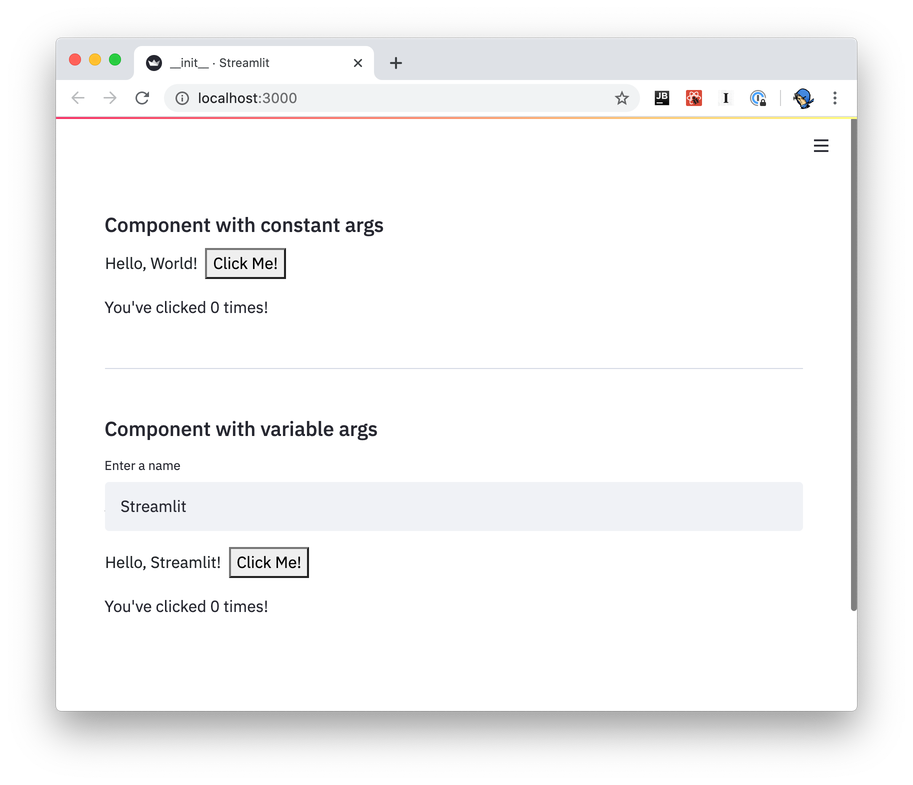
The example app from the template shows how bi-directional communication is implemented. The Streamlit Component displays a button (`Python → JavaScript`), and the end-user can click the button. Each time the button is clicked, the JavaScript front-end increments the counter value and passes it back to Python (`JavaScript → Python`), which is then displayed by Streamlit (`Python → JavaScript`).
### Frontend
Because each Streamlit Component is its own webpage that gets rendered into an `iframe`, you can use just about any web tech you'd like to create that web page. We provide two templates to get started with in the Streamlit [Components-template GitHub repo](https://github.com/streamlit/component-template/); one of those templates uses [React](https://reactjs.org/) and the other does not.
Even if you're not already familiar with React, you may still want to check out the React-based
template. It handles most of the boilerplate required to send and receive data from Streamlit, and
you can learn the bits of React you need as you go.
If you'd rather not use React, please read this section anyway! It explains the fundamentals of
Streamlit ↔ Component communication.
#### React
The React-based template is in `template/my_component/frontend/src/MyComponent.tsx`.
- `MyComponent.render()` is called automatically when the component needs to be re-rendered (just like in any React app)
- Arguments passed from the Python script are available via the `this.props.args` dictionary:
```python
# Send arguments in Python:
result = my_component(greeting="Hello", name="Streamlit")
```
```javascript
// Receive arguments in frontend:
let greeting = this.props.args["greeting"]; // greeting = "Hello"
let name = this.props.args["name"]; // name = "Streamlit"
```
- Use `Streamlit.setComponentValue()` to return data from the component to the Python script:
```javascript
// Set value in frontend:
Streamlit.setComponentValue(3.14);
```
```python
# Access value in Python:
result = my_component(greeting="Hello", name="Streamlit")
st.write("result = ", result) # result = 3.14
```
When you call `Streamlit.setComponentValue(new_value)`, that new value is sent to Streamlit, which then _re-executes the Python script from top to bottom_. When the script is re-executed, the call to `my_component(...)` will return the new value.
From a _code flow_ perspective, it appears that you're transmitting data synchronously with the frontend: Python sends the arguments to JavaScript, and JavaScript returns a value to Python, all in a single function call! But in reality this is all happening _asynchronously_, and it's the re-execution of the Python script that achieves the sleight of hand.
- Use `Streamlit.setFrameHeight()` to control the height of your component. By default, the React template calls this automatically (see `StreamlitComponentBase.componentDidUpdate()`). You can override this behavior if you need more control.
- There's a tiny bit of magic in the last line of the file: `export default withStreamlitConnection(MyComponent)` - this does some handshaking with Streamlit, and sets up the mechanisms for bi-directional data communication.
#### TypeScript-only
The TypeScript-only template is in `template-reactless/my_component/frontend/src/MyComponent.tsx`.
This template has much more code than its React sibling, in that all the mechanics of handshaking, setting up event listeners, and updating the component's frame height are done manually. The React version of the template handles most of these details automatically.
- Towards the bottom of the source file, the template calls `Streamlit.setComponentReady()` to tell Streamlit it's ready to start receiving data. (You'll generally want to do this after creating and loading everything that the Component relies on.)
- It subscribes to `Streamlit.RENDER_EVENT` to be notified of when to redraw. (This event won't be fired until `setComponentReady` is called)
- Within its `onRender` event handler, it accesses the arguments passed in the Python script via `event.detail.args`
- It sends data back to the Python script in the same way that the React template does—clicking on the "Click Me!" button calls `Streamlit.setComponentValue()`
- It informs Streamlit when its height may have changed via `Streamlit.setFrameHeight()`
#### Working with Themes
Custom component theme support requires streamlit-component-lib version 1.2.0 or higher.
Along with sending an `args` object to your component, Streamlit also sends
a `theme` object defining the active theme so that your component can adjust
its styling in a compatible way. This object is sent in the same message as
`args`, so it can be accessed via `this.props.theme` (when using the React
template) or `event.detail.theme` (when using the plain TypeScript template).
The `theme` object has the following shape:
```json
{
"base": "lightORdark",
"primaryColor": "someColor1",
"backgroundColor": "someColor2",
"secondaryBackgroundColor": "someColor3",
"textColor": "someColor4",
"font": "someFont"
}
```
The `base` option allows you to specify a preset Streamlit theme that your custom theme inherits from. Any theme config options not defined in your theme settings have their values set to those of the base theme. Valid values for `base` are `"light"` and `"dark"`.
Note that the theme object has fields with the same names and semantics as the
options in the "theme" section of the config options printed with the command
`streamlit config show`.
When using the React template, the following CSS variables are also set
automatically.
```css
--base
--primary-color
--background-color
--secondary-background-color
--text-color
--font
```
If you're not familiar with
[CSS variables](https://developer.mozilla.org/en-US/docs/Web/CSS/Using_CSS_custom_properties),
the TLDR version is that you can use them like this:
```css
.mySelector {
color: var(--text-color);
}
```
These variables match the fields defined in the `theme` object above, and
whether to use CSS variables or the theme object in your component is a matter
of personal preference.
#### Other frontend details
- Because you're hosting your component from a dev server (via `npm run start`), any changes you make should be automatically reflected in the Streamlit app when you save.
- If you want to add more packages to your component, run `npm add` to add them from within your component's `frontend/` directory.
```bash
npm add baseui
```
- To build a static version of your component, run `npm run export`. See [Prepare your Component](publish#prepare-your-component) for more information
### Python API
`components.declare_component()` is all that's required to create your Component's Python API:
```python
import streamlit.components.v1 as components
my_component = components.declare_component(
"my_component",
url="http://localhost:3001"
)
```
You can then use the returned `my_component` function to send and receive data with your frontend code:
```python
# Send data to the frontend using named arguments.
return_value = my_component(name="Blackbeard", ship="Queen Anne's Revenge")
# `my_component`'s return value is the data returned from the frontend.
st.write("Value = ", return_value)
```
While the above is all you need to define from the Python side to have a working Component, we recommend creating a "wrapper" function with named arguments and default values, input validation and so on. This will make it easier for end-users to understand what data values your function accepts and allows for defining helpful docstrings.
Please see [this example](https://github.com/streamlit/component-template/blob/master/template/my_component/__init__.py#L41-L77) from the Components-template for an example of creating a wrapper function.
### Data serialization
#### Python → Frontend
You send data from Python to the frontend by passing keyword args to your Component's invoke function (that is, the function returned from `declare_component`). You can send the following types of data from Python to the frontend:
- Any JSON-serializable data
- `numpy.array`
- `pandas.DataFrame`
Any JSON-serializable data gets serialized to a JSON string, and deserialized to its JavaScript equivalent. `numpy.array` and `pandas.DataFrame` get serialized using [Apache Arrow](https://arrow.apache.org/) and are deserialized as instances of `ArrowTable`, which is a custom type that wraps Arrow structures and provides a convenient API on top of them.
Check out the [CustomDataframe](https://github.com/streamlit/component-template/tree/master/examples/CustomDataframe) and [SelectableDataTable](https://github.com/streamlit/component-template/tree/master/examples/SelectableDataTable) Component example code for more context on how to use `ArrowTable`.
#### Frontend → Python
You send data from the frontend to Python via the `Streamlit.setComponentValue()` API (which is part of the template code). Unlike arg-passing from Python → frontend, **this API takes a single value**. If you want to return multiple values, you'll need to wrap them in an `Array` or `Object`.
Custom Components can send JSON-serializable data from the frontend to Python, as well as [Apache Arrow](http://arrow.apache.org/) `ArrowTable`s to represent dataframes.
---
# Create a Component
Source: https://docs.streamlit.io/develop/concepts/custom-components/create
If you are only interested in **using Streamlit Components**, then you can skip this section and
head over to the [Streamlit Components Gallery](https://streamlit.io/components) to find and install
components created by the community!
Developers can write JavaScript and HTML "components" that can be rendered in Streamlit apps. Streamlit Components can receive data from, and also send data to, Streamlit Python scripts.
Streamlit Components let you expand the functionality provided in the base Streamlit package. Use Streamlit Components to create the needed functionality for your use-case, then wrap it up in a Python package and share with the broader Streamlit community!
**With Streamlit Components you can add new features to your app in the following ways:**
- Create your own components to use in place of existing Streamlit elements and widgets.
- Create completely new Streamlit elements and widgets by wrapping existing React.js, Vue.js, or other JavaScript widget toolkits.
- Render Python objects by constructing HTML representations and styling them to fit your app's theme.
- Create convenience functions to embed commonly-used web features like [GitHub gists and Pastebin](https://github.com/randyzwitch/streamlit-embedcode).
Check out these Streamlit Components tutorial videos by Streamlit engineer Tim Conkling to get started:
## Part 1: Setup and Architecture
## Part 2: Make a Slider Widget
---
# Publish a Component
Source: https://docs.streamlit.io/develop/concepts/custom-components/publish
## Publish to PyPI
Publishing your Streamlit Component to [PyPI](https://pypi.org/) makes it easily accessible to Python users around the world. This step is completely optional, so if you won’t be releasing your component publicly, you can skip this section!
For [static Streamlit Components](/develop/concepts/custom-components/intro#create-a-static-component), publishing a Python package to PyPI follows the same steps as the
[core PyPI packaging instructions](https://packaging.python.org/tutorials/packaging-projects/). A static Component likely contains only Python code, so once you have your
[setup.py](https://packaging.python.org/tutorials/packaging-projects/#creating-setup-py) file correct and
[generate your distribution files](https://packaging.python.org/tutorials/packaging-projects/#generating-distribution-archives), you're ready to
[upload to PyPI](https://packaging.python.org/tutorials/packaging-projects/#uploading-the-distribution-archives).
[Bi-directional Streamlit Components](/develop/concepts/custom-components/intro#create-a-bi-directional-component) at minimum include both Python and JavaScript code, and as such, need a bit more preparation before they can be published on PyPI. The remainder of this page focuses on the bi-directional Component preparation process.
### Prepare your Component
A bi-directional Streamlit Component varies slightly from a pure Python library in that it must contain pre-compiled frontend code. This is how base Streamlit works as well; when you `pip install streamlit`, you are getting a Python library where the HTML and frontend code contained within it have been compiled into static assets.
The [component-template](https://github.com/streamlit/component-template) GitHub repo provides the folder structure necessary for PyPI publishing. But before you can publish, you'll need to do a bit of housekeeping:
1. Give your Component a name, if you haven't already
- Rename the `template/my_component/` folder to `template//`
- Pass your component's name as the the first argument to `declare_component()`
2. Edit `MANIFEST.in`, change the path for recursive-include from `package/frontend/build *` to `/frontend/build *`
3. Edit `setup.py`, adding your component's name and other relevant info
4. Create a release build of your frontend code. This will add a new directory, `frontend/build/`, with your compiled frontend in it:
```bash
cd frontend
npm run build
```
5. Pass the build folder's path as the `path` parameter to `declare_component`. (If you're using the template Python file, you can set `_RELEASE = True` at the top of the file):
```python
import streamlit.components.v1 as components
# Change this:
# component = components.declare_component("my_component", url="http://localhost:3001")
# To this:
parent_dir = os.path.dirname(os.path.abspath(__file__))
build_dir = os.path.join(parent_dir, "frontend/build")
component = components.declare_component("new_component_name", path=build_dir)
```
### Build a Python wheel
Once you've changed the default `my_component` references, compiled the HTML and JavaScript code and set your new component name in `components.declare_component()`, you're ready to build a Python wheel:
1. Make sure you have the latest versions of setuptools, wheel, and twine
2. Create a wheel from the source code:
```bash
# Run this from your component's top-level directory; that is,
# the directory that contains `setup.py`
python setup.py sdist bdist_wheel
```
### Upload your wheel to PyPI
With your wheel created, the final step is to upload to PyPI. The instructions here highlight how to upload to [Test PyPI](https://test.pypi.org/), so that you can learn the mechanics of the process without worrying about messing anything up. Uploading to PyPI follows the same basic procedure.
1. Create an account on [Test PyPI](https://test.pypi.org/) if you don't already have one
- Visit [https://test.pypi.org/account/register/](https://test.pypi.org/account/register/) and complete the steps
- Visit [https://test.pypi.org/manage/account/#api-tokens](https://test.pypi.org/manage/account/#api-tokens) and create a new API token. Don’t limit the token scope to a particular project, since you are creating a new project. Copy your token before closing the page, as you won’t be able to retrieve it again.
2. Upload your wheel to Test PyPI. `twine` will prompt you for a username and password. For the username, use **\_\_token\_\_**. For the password, use your token value from the previous step, including the `pypi-` prefix:
```bash
python -m twine upload --repository testpypi dist/*
```
3. Install your newly-uploaded package in a new Python project to make sure it works:
```bash
python -m pip install --index-url https://test.pypi.org/simple/ --no-deps example-pkg-YOUR-USERNAME-HERE
```
If all goes well, you're ready to upload your library to PyPI by following the instructions at [https://packaging.python.org/tutorials/packaging-projects/#next-steps](https://packaging.python.org/tutorials/packaging-projects/#next-steps).
Congratulations, you've created a publicly-available Streamlit Component!
## Promote your Component!
We'd love to help you share your Component with the Streamlit Community! To share it:
1. If you host your code on GitHub, add the tag `streamlit-component`, so that it's listed in the [GitHub **streamlit-component** topic](https://github.com/topics/streamlit-component):
2. Post on the Streamlit Forum in [Show the Community!](https://discuss.streamlit.io/c/streamlit-examples/9). Use a post title similar to "New Component: `name>`, a new way to do X".
3. Add your component to the [Community Component Tracker](https://discuss.streamlit.io/t/streamlit-components-community-tracker/4634).
4. Tweet us at [@streamlit](https://twitter.com/streamlit) so that we can retweet your announcement for you.
Our [Components Gallery](https://streamlit.io/components) is updated approximately every month. Follow the above recommendations to maximize the liklihood of your component landing in our Components Gallery. Community Components featured in our docs are hand-curated on a less-regular basis. Popular components with many stars and good documentation are more likely to be selected.
---
# Limitations of custom components
Source: https://docs.streamlit.io/develop/concepts/custom-components/limitations
## How do Streamlit Components differ from functionality provided in the base Streamlit package?
- Streamlit Components are wrapped up in an iframe, which gives you the ability to do whatever you want (within the iframe) using any web technology you like.
## What types of things aren't possible with Streamlit Components?
Because each Streamlit Component gets mounted into its own sandboxed iframe, this implies a few limitations on what is possible with Components:
- **Can't communicate with other Components**: Components can’t contain (or otherwise communicate with) other components, so Components cannot be used to build something like a grid layout.
- **Can't modify CSS**: A Component can’t modify the CSS that the rest of the Streamlit app uses, so you can't create something to put the app in dark mode, for example.
- **Can't add/remove elements**: A Component can’t add or remove other elements of a Streamlit app, so you couldn't make something to remove the app menu, for example.
## My Component seems to be blinking/stuttering...how do I fix that?
Currently, no automatic debouncing of Component updates is performed within Streamlit. The Component creator themselves can decide to rate-limit the updates they send back to Streamlit.
---
# Configure and customize your app
Source: https://docs.streamlit.io/develop/concepts/configuration
Configuration options
Understand the types of options available to you through Streamlit configuration.
HTTPS support
Understand how to configure SSL and TLS for your Streamlit app.
Static file serving
Understand how to host files alongside your app to make them accessible by URL. Use this if you want to point to files with raw HTML.
## Theming
Theming
Understand how you can use theming configuration options to customize the appearance of your app.
Customize colors and borders
Understand the configuration options for customizing your app's color scheme.
Customize fonts
Understand the configuration options for customizing your app's font.
---
# Working with configuration options
Source: https://docs.streamlit.io/develop/concepts/configuration/options
Streamlit provides four different ways to set configuration options. This list is in reverse order of precedence, i.e. command line flags take precedence over environment variables when the same configuration option is provided multiple times.
If you change theme settings in `.streamlit/config.toml` _while_ the app is running, these changes will reflect immediately. If you change non-theme settings in `.streamlit/config.toml` _while_ the app is running, the server needs to be restarted for changes to be reflected in the app.
1. In a **global config file** at `~/.streamlit/config.toml` for macOS/Linux or `%userprofile%/.streamlit/config.toml` for Windows:
```toml
[server]
port = 80
```
2. In a **per-project config file** at `$CWD/.streamlit/config.toml`, where
`$CWD` is the folder you're running Streamlit from.
3. Through `STREAMLIT_*` **environment variables**, such as:
```bash
export STREAMLIT_SERVER_PORT=80
export STREAMLIT_SERVER_COOKIE_SECRET=dontforgottochangeme
```
4. As **flags on the command line** when running `streamlit run`:
```bash
streamlit run your_script.py --server.port 80
```
## Available options
All available configuration options are documented in [`config.toml`](/develop/api-reference/configuration/config.toml). These options may be declared in a TOML file, as environment variables, or as command line options.
When using environment variables to override `config.toml`, convert the variable (including its section header) to upper snake case and add a `STREAMLIT_` prefix. For example, `STREAMLIT_CLIENT_SHOW_ERROR_DETAILS` is equivalent to the following in TOML:
```toml
[client]
showErrorDetails = true
```
When using command line options to override `config.toml` and environment variables, use the same case as you would in the TOML file and include the section header as a period-separated prefix. For example, the command line option `--server.enableStaticServing true` is equivalent to the following:
```toml
[server]
enableStaticServing = true
```
## Telemetry
As mentioned during the installation process, Streamlit collects usage statistics. You can find out
more by reading our [Privacy Notice](https://streamlit.io/privacy-policy), but the high-level
summary is that although we collect telemetry data we cannot see and do not store information
contained in Streamlit apps.
If you'd like to opt out of usage statistics, add the following to your config file:
```toml
[browser]
gatherUsageStats = false
```
## Theming
You can change the base colors of your app using the `[theme]` section of the configuration system.
To learn more, see [Theming.](/develop/concepts/configuration/theming)
## View all configuration options
As described in [Command-line options](/develop/api-reference/cli), you can
view all available configuration options using:
```bash
streamlit config show
```
---
# HTTPS support
Source: https://docs.streamlit.io/develop/concepts/configuration/https-support
Many apps need to be accessed with SSL / [TLS](https://en.wikipedia.org/wiki/Transport_Layer_Security) protocol or `https://`.
We recommend performing SSL termination in a reverse proxy or load balancer for self-hosted and production use cases, not directly in the app. [Streamlit Community Cloud](/deploy/streamlit-community-cloud) uses this approach, and every major cloud and app hosting platform should allow you to configure it and provide extensive documentation. You can find some of these platforms in our [Deployment tutorials](/deploy/tutorials).
To terminate SSL in your Streamlit app, you must configure `server.sslCertFile` and `server.sslKeyFile`. Learn how to set config options in [Configuration](/develop/concepts/configuration).
## Details on usage
- The configuration value should be a local file path to a cert file and key file. These must be available at the time the app starts.
- Both `server.sslCertFile` and `server.sslKeyFile` must be specified. If only one is specified, your app will exit with an error.
- This feature will not work in Community Cloud. Community Cloud already serves your app with TLS.
In a production environment, we recommend performing SSL termination by the load balancer or the reverse proxy, not using this option. The use of this option in Streamlit has not gone through extensive security audits or performance tests.
## Example usage
```toml
# .streamlit/config.toml
[server]
sslCertFile = '/path/to/certchain.pem'
sslKeyFile = '/path/to/private.key'
```
---
# Static file serving
Source: https://docs.streamlit.io/develop/concepts/configuration/serving-static-files
Streamlit apps can host and serve small, static media files to support media embedding use cases that
won't work with the normal [media elements](/develop/api-reference/media).
To enable this feature, set `enableStaticServing = true` under `[server]` in your config file,
or environment variable `STREAMLIT_SERVER_ENABLE_STATIC_SERVING=true`.
Media stored in the folder `./static/` relative to the running app file is served at path
`app/static/[filename]`, such as `http://localhost:8501/app/static/cat.png`.
## Details on usage
- Files with the following extensions will be served normally:
- Common image types: `.jpg`, `.jpeg`, `.png`, `.gif`
- Common font types: `.otf`, `.ttf`, `.woff`, `.woff2`
- Other types: `.pdf`, `.xml`, `.json`
Any other file will be sent with header `Content-Type:text/plain` which will cause browsers to render in plain text.
This is included for security - other file types that need to render should be hosted outside the app.
- Streamlit also sets `X-Content-Type-Options:nosniff` for all files rendered from the static directory.
- For apps running on Streamlit Community Cloud:
- Files available in the Github repo will always be served. Any files generated while the app is running,
such as based on user interaction (file upload, etc), are not guaranteed to persist across user sessions.
- Apps which store and serve many files, or large files, may run into resource limits and be shut down.
## Example usage
- Put an image `cat.png` in the folder `./static/`
- Add `enableStaticServing = true` under `[server]` in your `.streamlit/config.toml`
- Any media in the `./static/` folder is served at the relative URL like `app/static/cat.png`
```toml
# .streamlit/config.toml
[server]
enableStaticServing = true
```
```python
# app.py
import streamlit as st
with st.echo():
st.title("CAT")
st.markdown("[](https://streamlit.io)")
```
Additional resources:
- [https://docs.streamlit.io/develop/concepts/configuration](https://docs.streamlit.io/develop/concepts/configuration)
- [https://static-file-serving.streamlit.app/](https://static-file-serving.streamlit.app/)
---
# Theming overview
Source: https://docs.streamlit.io/develop/concepts/configuration/theming
In this guide, we provide an overview of theming and visual customization of Streamlit apps. Streamlit themes are defined using configuration options, which are most commonly defined in a `.streamlit/config.toml` file. For more information about setting configuration options, see [Working with configuration options](/develop/concepts/configuration/options). For a complete list of configuration options and definitions, see the API reference for [config.toml](/develop/api-reference/configuration/config.toml#theme).
You can configure a light and dark theme for your app that the user can change through the settings menu. The sidebar is separately
configurable from the main app for almost all theming options.
The following options can be set in the `[theme]` table of `config.toml` and can't be set separately in the sidebar, dark-theme, or
light-theme tables:
- **Base color scheme**: Set your custom theme to inherit from Streamlit's light or dark theme, or use an external theming TOML file.
- **Base font**: Set the base font weight and size. (This can be configured separately for heading and code font.)
- **Chart color**: Set series colors for Plotly, Altair, and Vega-Lite charts.
- **Sidebar border**: Set the visibility of the sidebar border.
The following options can be configured separately for the main body of your app and the sidebar. They can also be specified separately for
dark and light themes (`[theme.light]`, `[theme.light.sidebar]`, `[theme.dark]`, `[theme.dark.sidebar]`):
- **Font family**: Set the font family for body text, headings, and code.
- **Font style**: Set the weight and size of heading and code font, and set visibility of link underlines.
- **Text color**: Set the color of body, inline code, and link text.
- **Primary color**: Set the color of interactive elements and highlights.
- **Background color**: Set the color of app, widget, code block, and dataframe header backgrounds.
- **Border radius**: Set the roundness of elements and widgets.
- **Border color**: Set the color and visibility of element, widget, sidebar, and dataframe borders.
- **Basic color palette**: Set the color palette (red, orange, yellow, green, blue, violet, and gray/grey) for things like colored Markdown text and sparklines.
## Example themes
The following light theme is inspired by [Anthropic](https://docs.anthropic.com/en/home).
The following dark theme is inspired by [Spotify](https://open.spotify.com/).
## Working with theme configuration during development
Most theme configuration options can be updated while an app is running. This makes it easy to iterate on your custom theme. If you change your app's primary color, save your `config.toml` file, and rerun your app, you will immediately see the new color. However, some configuration options (like `[[theme.fontFace]]`) require you to restart the Streamlit server to reflect the updates. If in doubt, when updating your app's configuration, stop the Streamlit server in your terminal and restart your app with the `streamlit run` command.
---
# Customize colors and borders in your Streamlit app
Source: https://docs.streamlit.io/develop/concepts/configuration/theming-customize-colors-and-borders
## Color values
For all configuration options that accept a color, you can specify the value with one of the following strings:
- A CSS [``](https://developer.mozilla.org/en-US/docs/Web/CSS/named-color) like `"darkBlue"` or `"maroon"`.
- A HEX string like `"#483d8b"` or `"#6A5ACD"`.
- An RGB string like `"rgb(106, 90, 205)"` or `"RGB(70, 130, 180)"`.
- An HSL string like `"hsl(248, 53%, 58%)"` or `"HSL(147, 50%, 47%)"`.
Although you can specify an alpha value for your colors, this isn't necessary for most options. Streamlit adjusts the alpha value of colors to ensure contextually appropriate shading between background and foreground.
## Default Streamlit colors
Streamlit comes with two preconfigured themes: light and dark. If you don't specify any theme configuration options, Streamlit will attempt to use the preconfigured theme that best matches each user's browser settings. These themes feature a red primary color in addition to a basic color palette (red, orange, yellow, green, blue, violet, and gray/grey) for elements like colored Markdown text.
## Color and border configuration options
Most theme configuration options can be set for your whole app, but you can override some with a different value for the sidebar. For example, your app's primary color (`primaryColor`) is used to highlight interactive elements and show focus. If you set `theme.primaryColor`, this will change the primary color for your whole app. However, if you set `theme.sidebar.primaryColor`, this will override `theme.primaryColor` in the sidebar, allowing you to use two different primary colors.
The following two configuration options can only be applied to the whole app:
- `theme.base` sets the default colors for your app's theme to match one of Streamlit's two default themes (`"light"` or `"dark"`). If any theme configuation option is used and `theme.base` is not set, then Streamlit will use `"light"`.
- `theme.showSidebarBorder` sets the visibility of the border between the sidebar and the main body of your app.
- `theme.chartCategoricalColors`, `theme.chartSequentialColors`, and `theme.chartDivergingColors` set the series colors for Plotly, Altair, and Vega-Lite charts.
The following configuration options can be set separately for the sidebar by using the `[theme.sidebar]` table instead of the `[theme]` table in `config.toml`:
- `theme.primaryColor`
- `theme.backgroundColor`
- `theme.secondaryBackgroundColor`
- `theme.textColor`
- `theme.linkColor`
- `theme.linkUnderline`
- `theme.codeTextColor`
- `theme.codeBackgroundColor`
- `theme.baseRadius`
- `theme.buttonRadius`
- `theme.borderColor`
- `theme.dataframeBorderColor`
- `theme.dataframeHeaderBackgroundColor`
- `theme.showWidgetBorder`
- All color palette options
For brevity, on the rest of this page, theming configuration options will not include the `theme.` or `theme.sidebar.` prefix.
### Basic color palette
Various elements in Streamlit use or let you choose from a predefined palette of colors: red, orange, yellow, green, blue, violet, and gray/grey. These are some of the elements that use this basic color palette:
- Markdown text and background color (including `st.badge`).
- `st.metric` sparklines and deltas.
- Dataframe chart columns.
- Chat message avatars.
- Alert elements like `st.success` and `st.warning`.
For each color in the palette, you can define a base color, background color, and text color. If you only define a base color, Streamlit adjusts lightness/darkness and opacity to automatically provide a corresponding background and text color. However, you can manually define each of them, too. These are the color palette options:
- `redColor`, `redBackgroundColor`, `redTextColor`
- `orangeColor`, `orangeBackgroundColor`, `orangeTextColor`
- `yellowColor`, `yellowBackgroundColor`, `yellowTextColor`
- `greenColor`, `greenBackgroundColor`, `greenTextColor`
- `blueColor`, `blueBackgroundColor`, `blueTextColor`
- `violetColor`, `violetBackgroundColor`, `violetTextColor`
- `grayColor`, `grayBackgroundColor`, `grayTextColor`
### `primaryColor`
`primaryColor` defines the accent color most often used throughout your Streamlit
app. The following features and effects use your primary color:
- Button hover effects
- Elements in focus
- Selected elements
When your primary color is used as a background, Streamlit changes the text color to white. For example, this happens for `type="primary"` buttons and for selected items in `st.multiselect`.
For legibility, always choose a primary color that is dark enough to contrast well with white text.
#### Example 1: Primary color
The following configuration example has a `"forestGreen"` primary color. In the sidebar, the configuration overrides the primary color to `"darkGoldenrod"`. If you click inside a widget to give it focus, Streamlit displays a primary-color border around the widget. Additionally, if you hover over the secondary and tertiary buttons, the hover color matches the primary color.
```toml
[theme]
base="dark"
primaryColor="forestGreen"
[theme.sidebar]
primaryColor="darkGoldrod"
```
### `backgroundColor`, `secondaryBackgroundColor`, `codeBackgroundColor`, and `dataframeHeaderBackgroundColor`
- `backgroundColor` defines the background color of your app.
- `secondaryBackgroundColor` is used for contrast in the following places:
- The background of input or selection regions for widgets
- Headers within elements like `st.help` and `st.dataframe` (if `dataframeHeaderBackgroundColor` isn't set)
- Code blocks and inline code (if `codeBackgroundColor` isn't set)
- `codeBackgroundColor` sets the background for code blocks and line code. If `codeBackgroundColor` is not set, Streamlit uses `secondaryBackgroundColor` instead.
- `dataframeHeaderBackgroundColor` sets the background for dataframe headers (including the cells used for row selection and addition, if present).
If you do not define background colors for the sidebar, Streamlit will swap `backgroundColor` and `secondaryBackgroundColor` in the sidebar:
- If `theme.sidebar.backgroundColor` is not defined, Streamlit uses `theme.secondaryBackgroundColor`.
- If `theme.sidebar.secondaryBackgroundColor` is not defined, Streamlit uses `theme.backgroundColor`.
#### Example 2: Background colors
The following configuration example has a `"white"` background, with a lavender-tinted `"ghostWhite"` sidebar background. The secondary color for the whole app is `"lavender"` and the code background color is `"powderBlue"`. The code background color is configured once in `[theme]` and inherited in the sidebar. However, because Streamlit swaps background colors when the sidebar inherits them, the secondary background color is set in both `[theme]` and `[theme.sidebar]`. To see the secondary color used for a hover effect, hover over a dataframe cell or open the multiselect drop-down menu.
```toml
[theme]
base="light"
backgroundColor="white"
secondaryBackgroundColor="lavender"
codeBackgroundColor="powderBlue"
[theme.sidebar]
backgroundColor="ghostWhite"
secondaryBackgroundColor="lavender"
```
### `textColor`, `codeTextColor`, `linkColor`, and `linkUnderline`
You can configure the color of body, code, and link text.
`textColor` sets the default text color for all text in the app except language-highlighting in code blocks, inline code, and links.
`codeTextColor` sets the default text color for inline code, but doesn't affect code blocks.
`linkColor` sets the default font color for all Markdown links in the app. If `linkUnderline` is set to true (default), the link underline color matches `linkColor`.
The following elements are impacted by `textColor`:
- Markdown text, except links
- Text in code blocks that's not colored otherwise from language highlighting
- App-chrome and sidebar menu icons
- Widget labels, icons, option text, and placeholder text
- Dataframe and table text
- Non-Markdown links, like `st.page_link`, `st.link_button`, and the navigation menu
As noted previously, Streamlit changes the text color to white when text is displayed against your primary color.
#### Example 3: Text colors
The following configuration example has `"darkGoldenrod"` text and `"darkOrchid"` links on a `"dark"` base. Buttons (including `st.link_button`) use the `"darkGoldenrod"` text color. In the multiselect widget, the placeholder text, drop-down menu, and tooltip all have `"darkGoldenrod"` text. If you hover over the sidebar, the scrollbar and collapse icon ({{ verticalAlign: "-.25em" }} className={{ class: "material-icons-sharp" }}>chevron_left) are `"darkGoldenrod"`.
```toml
[theme]
base="dark"
textColor="darkGoldenrod"
linkColor="darkOrchid"
```
### `baseRadius` and `buttonRadius`
`baseRadius` defines the radius of borders and backgrounds for the following elements:
- Buttons and input areas on widgets
- Selected items, including items in `st.multiselect` and the navigation menu
- Code blocks and inline code
- Dataframes (exterior)
- Badges and Markdown-text backgrounds
- Containers with borders, including expanders, forms, dialogs, popovers, and toasts
- Tooltips, including tooltips within charts
- Status and exception message blocks
- Images, including `st.graphviz` and `st.pyplot`, which display as static images
`buttonRadius` overrides `baseRadius` for buttons and `st.segmented_control`.
A few elements are notably not fully affected by `baseRadius`. Interactive charts and videos, which have a more complex underlying HTML, will always have square corners. This includes `st.video`, `st.map`, and `st.pydeck_chart`. Conversely, `st.chat_input` and `st.audio_input` will always be fully rounded. Sub-elements like tooltips are still affected by `baseRadius`.
#### Example 4: Border radius
In the following configuration example, the main body of the app uses a `"full"` (1rem) base radius, and the sidebar uses `"none"` (0rem). To better highlight this difference, the example includes contrasting primary and background colors.
```toml
[theme]
base="light"
primaryColor="slateBlue"
backgroundColor="mintCream"
secondaryBackgroundColor="darkSeaGreen"
baseRadius="full"
[theme.sidebar]
backgroundColor="aliceBlue"
secondaryBackgroundColor="skyBlue"
baseRadius="none"
```
### `borderColor`, `dataframeBorderColor`, and `showWidgetBorder`
Streamlit does not display borders for unfocused widgets by default (except for buttons). When a user focuses on a widget, Streamlit displays a border around the input area in your `primaryColor`. When the user removes focus, Streamlit hides the border.
If you set `showWidgetBorder=true`, Streamlit will display widget borders when the widget is not in focus. For those widgets, the border color is set by `borderColor`. If `borderColor` is not set, Streamlit infers a color by adding transparency to your `textColor`.
The following elements have borders that you can modify:
- Containers with borders, including expanders, forms, dialogs, popovers, and toasts
- The sidebar, including the right edge and the boundary below the navigation menu
- Dataframes and tables
- `st.tabs` (bottom border)
- Buttons, including `st.button`, `st.pills`, and `st.segmented_control`
- Borders on input regions
`dataframeBorderColor` overrides `borderColor` for dataframes and tables.
#### Example 5: Border color and visibility
The following configuration example uses a `"mediumSlateBlue"` border color throughout the app. In the sidebar, widget borders are shown. In the main body of the app, widget borders are not shown, and there is no border around the multiselect, text, or chat input regions except when they are in focus. However, many other elements, like buttons and dataframes, have always-visible borders.
```toml
[theme]
base="dark"
borderColor="mediumSlateBlue"
showWidgetBorder=false
[theme.sidebar]
showWidgetBorder=true
```
---
# Customize fonts in your Streamlit app
Source: https://docs.streamlit.io/develop/concepts/configuration/theming-customize-fonts
Streamlit lets you change and customize the fonts in your app. You can load font files from a public URL or host them with your app using [static file serving](/develop/concepts/configuration/serving-static-files).
## Default Streamlit fonts
Streamlit comes with [Source Sans](https://fonts.adobe.com/fonts/source-sans), [Source Serif](https://fonts.adobe.com/fonts/source-serif), and [Source Code](https://fonts.adobe.com/fonts/source-code-pro) fonts. These font files are included with the Streamlit library so clients don't download them from a third party. By default, Streamlit uses Source Sans for all text except inline code and code blocks, which use Source Code instead.
To use these default faults, you can set each of the following configuration options to `"sans-serif"` (Source Sans), `"serif"` (Source Serif), or `"monospace"` (Source Code) in `config.toml`:
```toml filename=".streamlit/config.toml"
[theme]
font = "sans-serif"
headingFont = "sans-serif"
codeFont = "monospace"
[theme.sidebar]
font = "sans-serif"
headingFont = "sans-serif"
codeFont = "monospace"
```
You can set the base font weight and size in the `[theme]` table in `config.toml`. These can't be configured separately in the sidebar.
- `theme.baseFontSize` sets the root font size for your app.
- `theme.baseFontWeight` sets the root font weight for your app.
The following configuration options can be set separately for the sidebar by using the `[theme.sidebar]` table instead of the `[theme]` table in `config.toml`:
- `theme.font` sets the default font for all text in the app (except inline code and code blocks). This is `"sans-serif"` (Source Sans) by default.
- `theme.headingFont` sets the default font for all headings in the app. If this is not set, Streamlit uses `theme.font` instead.
- `theme.headingFontSizes` sets the font sizes for `
`-`
` headings.
- `theme.headingFontWeights` sets the font sizes for `
`-`
` headings.
- `theme.codeFont` sets the default font for all inline code and code blocks. This is `"monospace"` (Source Code) by default.
- `theme.codeFontSize` sets the size of code text in code blocks, `st.json`, and `st.help` (but not inline code).
- `theme.codeFontWeight` sets the weight of code text in code blocks, `st.json`, and `st.help` (but not inline code).
When fonts are not declared in `[theme.sidebar]`, Streamlit will inherit each option from `[theme]` before defaulting to less specific options. For example, if `theme.sidebar.headingFont` is not set, Streamlit uses (in order of precedence) `theme.headingFont`, `theme.sidebar.font`, or `theme.font` instead.
In the following `config.toml` example, Streamlit uses Source Serif in the main body of the app and Source Sans in the sidebar.
```toml filename=".streamlit/config.toml"
[theme]
font = "serif"
[theme.sidebar]
font = "sans-serif"
```
## Externally hosted fonts
If you use a font service like Google Fonts or Adobe Fonts, you can use those fonts directly by encoding their font family (name) and CSS URL into a single string of the form `{font_name}:{css_url}`. If your font family includes a space, use inner quotes on the font family. In the following `config.toml` example, Streamlit uses Nunito font for all text except code, which is Space Mono instead. Space Mono has inner quotes because it has a space.
```toml filename=".streamlit/config.toml"
[theme]
font = "Nunito:https://fonts.googleapis.com/css2?family=Nunito=swap"
codeFont = "'Space Mono':https://fonts.googleapis.com/css2?family=Space+Mono=swap"
```
If you configure your app to include any third-party integrations, including externally hosted fonts, your app may transmit user data (for example, IP addresses) to external servers. As the app developer, you are solely responsible for notifying your users about these third-party integrations, providing access to relevant privacy policies, and ensuring compliance with all applicable data protection laws and regulations.
## Hosting alternative fonts
If you have font files that you want to host with your app, you must declare the font in `config.toml` under `[[theme.fontFaces]]`. For multiple alternative fonts, declare multiple `[[theme.fontFaces]]` tables in your configuration file. You can self-host your font by using Streamlit static file serving, or you can point to a publicly hosted font file.
Streamlit supports self-hosting for OTF, TTF, WOFF, and WOFF2 font file formats. Other font file formats must be hosted externally.
Fonts are defined with the following attributes in their `[[theme.fontFaces]]` tables:
- `family`: This is the name of the font and is used to identify the font for use by other configuration options.
- `url`: This is the location of the font file. If you are self-hosting the font file with your app, the value will be similar to `"app/static/font_file.woff"`.
- `weight` (optional): This declares the weight of the font within the font file (e.g., `400`, `"200 800"`, or `"bold"`). For more information, see the [`font-weight`](https://developer.mozilla.org/en-US/docs/Web/CSS/@font-face/font-weight) CSS `@font-face` descriptor.
- `style` (optional): This declares the style of the font within the font file (e.g., `"normal"`, `"italic"`, or `"oblique"`). For more information, see the [`font-style`](https://developer.mozilla.org/en-US/docs/Web/CSS/@font-face/font-style) CSS `@font-face` descriptor.
- `unicodeRange` (optional): This declares the specific range of characters within the font file (e.g. `"U+0025-00FF, U+4??"`) For more information, see the [`unicode-range`](https://developer.mozilla.org/en-US/docs/Web/CSS/@font-face/unicode-range) CSS `@font-face descriptor.
Font files can be static or variable. A static font file contains a single weight and style of font. If you use static font files, it is common to load multiple files to fully support the font across different weights (normal, bold) and styles (normal, italic). Variable font files parameterize one or more font attributes, which means a single font file can support multiple weights and styles.
### Example 1: Define an alternative font with variable font files
The following example uses static file serving to host Google's [Noto Sans](https://fonts.google.com/noto/specimen/Noto+Sans) and [Noto Sans Mono](https://fonts.google.com/noto/specimen/Noto+Sans+Mono) fonts and configures the app to use them. Both of these fonts are defined with variable font files that include a parameterized weight. However, because font style is not parameterized, Noto Sans requires two files to define the normal and italic styles separately. Noto Sans Mono does not include a separate file for its italic style. Per [CSS rules](https://developer.mozilla.org/en-US/docs/Web/CSS/font-style#italic), if no italic style is explicitly provided, it will be simulated by skewing the normal-style font.
A line-by-line explanation of this example is available in a [tutorial](/develop/tutorials/configuration-and-theming/variable-fonts).
```toml filename=".streamlit/config.toml"
[server]
enableStaticServing = true
[[theme.fontFaces]]
family="noto-sans"
url="app/static/NotoSans-Italic-VariableFont_wdth,wght.ttf"
style="italic"
[[theme.fontFaces]]
family="noto-sans"
url="app/static/NotoSans-VariableFont_wdth,wght.ttf"
style="normal"
[[theme.fontFaces]]
family="noto-mono"
url="app/static/NotoSansMono-VariableFont_wdth,wght.ttf"
[theme]
font="noto-sans"
codeFont="noto-mono"
```
```none filename="Directory structure"
project_directory/
├── .streamlit/
│ └── config.toml
├── static/
│ ├── NotoSans-Italic-VariableFont_wdth,wght.ttf
│ ├── NotoSans-VariableFont_wdth,wght.ttf
│ └── NotoSansMono-VariableFont_wdth,wght.ttf
└── streamlit_app.py
```
### Example 2: Define an alternative font with static font files
In this configuration example, an alternative font is declared with multiple static font files. To cover basic Markdown formatting, each font should have at least four static files to define the following weight-style pairs:
- normal normal
- normal bold
- italic normal
- italic bold
If your app uses a font without a matching weight-style definition, the user's browser will use the closest font that is available. The default weight for `
`-`
` headings is semibold (600). For completeness, include additional font files to cover the semibold weight and all the font weights in your app. The following example uses [Tuffy](https://fonts.google.com/specimen/Tuffy) font. The font has four static font files that cover the four weight-style pairs.
A line-by-line explanation of this example is available in a [tutorial](/develop/tutorials/configuration-and-theming/static-fonts).
```toml filename=".streamlit/config.toml"
[server]
enableStaticServing = true
[[theme.fontFaces]]
family="tuffy"
url="app/static/Tuffy-Regular.ttf"
style="normal"
weight=400
[[theme.fontFaces]]
family="tuffy"
url="app/static/Tuffy-Bold.ttf"
style="normal"
weight=700
[[theme.fontFaces]]
family="tuffy"
url="app/static/Tuffy-Italic.ttf"
style="italic"
weight=400
[[theme.fontFaces]]
family="tuffy"
url="app/static/Tuffy-BoldItalic.ttf"
style="italic"
weight=700
[theme]
font="tuffy"
```
```none filename="Directory structure"
project_directory/
├── .streamlit/
│ └── config.toml
├── static/
│ ├── Tuffy-Bold.ttf
│ ├── Tuffy-BoldItalic.ttf
│ ├── Tuffy-Italic.ttf
│ └── Tuffy-Regular.ttf
└── streamlit_app.py
```
## Font fallbacks
If you use complicated font that might not be compatible with all browsers, or if you are using externally hosted fonts, it's best practice to include font fallbacks.
### Example 3: Define an alternative font with fallbacks
In your configuration file, wherever you declare a default font, you can use a comma-separated list of fonts instead. The font (or comma-separated list of fonts) is passed to the CSS [`font-family`](https://developer.mozilla.org/en-US/docs/Web/CSS/font-family) property.
You can always include one of Streamlit's default fonts as a final fallback. The following example uses [Nunito](https://fonts.google.com/specimen/Nunito) and [Space Mono](https://fonts.google.com/specimen/Space+Mono) fonts. The configuration file points to the Google-hosted font files and identifies Streamlit's built-in font as the backup.
A line-by-line explanation of this example is available in a [tutorial](/develop/tutorials/configuration-and-theming/external-fonts).
```toml filename=".streamlit/config.toml"
[theme]
font="Nunito:https://fonts.googleapis.com/css2?family=Nunito:ital,wght@0,200..1000;1,200..1000, sans-serif"
codeFont="'Space Mono':https://fonts.googleapis.com/css2?family=Space+Mono:ital,wght@0,400;0,700;1,400;1,700=swap, monospace"
```
If any of your font family names contain spaces and you are declaring a fallback sequence, use inner quotes around the names. For example, if you name the font `"Nunito Sans"`, use `font="'Nunito Sans', sans-serif"` instead.
## Font size
You can set the base font size for your app in pixels. You must specify the base font size as an integer. The following configuration is equivalent to the default base font size of 16 pixels:
```toml filename=".streamlit/config.toml"
[theme]
baseFontSize=16
```
Additionally, you can set the font size for code blocks. The font size can be declared in pixels or rem. The following configuration is equivalent to the default code font size of 0.875rem.
```toml filename=".streamlit/config.toml"
[theme]
codeFontSize="0.875rem"
```
Inline code in Markdown is not impacted by `theme.codeFontSize`. Inline code is set at 0.75em.
## Font colors
Font color options are described in [Customize colors and borders in your Streamlit app](/develop/concepts/configuration/theming-customize-colors-and-borders#textcolor-and-linkcolor).
## Design tips
When using alternative fonts in your Streamlit app, keep good design practices in mind. The legibility of a font is strongly influenced by its size, contrast with its background, and shape. Streamlit lets you declare a different font for your headers from the rest of your text. If you introduce a more elaborate font, limit it to your headers. Because `theme.font` and `theme.sidebar.font` are used to set the font in widget labels, tooltips, column headers, and dataframe cells, they should always be a highly readable font.
For inspiration, see [Fonts in Use](https://fontsinuse.com/).
---
# Streamlit's native app testing framework
Source: https://docs.streamlit.io/develop/concepts/app-testing
Streamlit app testing enables developers to build and run automated tests. Bring your favorite test automation software and enjoy simple syntax to simulate user input and inspect rendered output.
The provided class, AppTest, simulates a running app and provides methods to set up, manipulate, and inspect the app contents via API instead of a browser UI. AppTest provides similar functionality to browser automation tools like Selenium or Playwright, but with less overhead to write and execute tests. Use our testing framework with a tool like [pytest](https://docs.pytest.org/) to execute or automate your tests. A typical pattern is to build a suite of tests for an app to ensure consistent functionality as the app evolves. The tests run locally and/or in a CI environment like GitHub Actions.
introduces you to the app testing framework and how to execute tests using pytest. Learn how to initialize and run simulated apps, including how to retrieve, manipulate, and inspect app elements.explains how to work with secrets and Session State within app tests, including how to test multipage apps.with Continuous Integration (CI) to validate app changes over time.puts together the concepts explained above. Check out an app with multiple tests in place.is a compact reference summarizing the available syntax.
---
# Get started with app testing
Source: https://docs.streamlit.io/develop/concepts/app-testing/get-started
This guide will cover a simple example of how tests are structured within a project and how to execute them with `pytest`. After seeing the big picture, keep reading to learn about the [Fundamentals of app testing](#fundamentals-of-app-testing):
- Initializing and running a simulated app
- Retrieving elements
- Manipulating widgets
- Inspecting the results
Streamlit's app testing framework is not tied to any particular testing tool, but we'll use `pytest` for our examples since it is one of the most common Python test frameworks. To try out the examples in this guide, be sure to install `pytest` into your Streamlit development environment before you begin:
```bash
pip install pytest
```
## A simple testing example with `pytest`
This section explains how a simple test is structured and executed with `pytest`. For a comprehensive introduction to `pytest`, check out Real Python's guide to [Effective Python testing with pytest](https://realpython.com/pytest-python-testing/).
### How `pytest` is structured
`pytest` uses a naming convention for files and functions to execute tests conveniently. Name your test scripts of the form `test_.py` or `_test.py`. For example, you can use `test_myapp.py` or `myapp_test.py`. Within your test scripts, each test is written as a function. Each function is named to begin or end with `test`. We will prefix all our test scripts and test functions with `test_` for our examples in this guide.
You can write as many tests (functions) within a single test script as you want. When calling `pytest` in a directory, all `test_.py` files within it will be used for testing. This includes files within subdirectories. Each `test_` function within those files will be executed as a test. You can place test files anywhere in your project directory, but it is common to collect tests into a designated `tests/` directory. For other ways to structure and execute tests, check out [How to invoke pytest](https://docs.pytest.org/how-to/usage.html) in the `pytest` docs.
### Example project with app testing
Consider the following project:
```none
myproject/
├── app.py
└── tests/
└── test_app.py
```
Main app file:
```python
"""app.py"""
import streamlit as st
# Initialize st.session_state.beans
st.session_state.beans = st.session_state.get("beans", 0)
st.title("Bean counter :paw_prints:")
addend = st.number_input("Beans to add", 0, 10)
if st.button("Add"):
st.session_state.beans += addend
st.markdown(f"Beans counted: {st.session_state.beans}")
```
Testing file:
```python
"""test_app.py"""
from streamlit.testing.v1 import AppTest
def test_increment_and_add():
"""A user increments the number input, then clicks Add"""
at = AppTest.from_file("app.py").run()
at.number_input[0].increment().run()
at.button[0].click().run()
assert at.markdown[0].value == "Beans counted: 1"
```
Let's take a quick look at what's in this app and test before we run it. The main app file (`app.py`) contains four elements when rendered: `st.title`, `st.number_input`, `st.button`, and `st.markdown`. The test script (`test_app.py`) includes a single test (the function named `test_increment_and_add`). We'll cover test syntax in more detail in the latter half of this guide, but here's a brief explanation of what this test does:
1. Initialize the simulated app and execute the first script run.
```python
at = AppTest.from_file("app.py").run()
```
2. Simulate a user clicking the plus icon ({{ verticalAlign: "-.25em" }} className={{ class: "material-icons-sharp" }}>add) to increment the number input (and the resulting script rerun).
```python
at.number_input[0].increment().run()
```
3. Simulate a user clicking the "**Add**" button (and the resulting script rerun).
```python
at.button[0].click().run()
```
4. Check if the correct message is displayed at the end.
```python
assert at.markdown[0].value == "Beans counted: 1"
```
Assertions are the heart of tests. When the assertion is true, the test passes. When the assertion is false, the test fails. A test can have multiple assertions, but keeping tests tightly focused is good practice. When tests focus on a single behavior, it is easier to understand and respond to failure.
### Try out a simple test with `pytest`
1. Copy the files above into a new "myproject" directory.
2. Open a terminal and change directory to your project.
```bash
cd myproject
```
3. Execute `pytest`:
```bash
pytest
```
The test should execute successfully. Your terminal should show something like this:
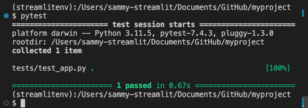
By executing `pytest` at the root of your project directory, all Python files with the test prefix (`test_.py`) will be scanned for test functions. Within each test file, each function with the test prefix will be executed as a test. `pytest` then counts successes and itemizes failures. You can also direct `pytest` to only scan your testing directory. For example, from the root of your project directory, execute:
```bash
pytest tests/
```
### Handling file paths and imports with `pytest`
Imports and paths within a test script should be relative to the directory where `pytest` is called. That is why the test function uses the path `app.py` instead of `../app.py` even though the app file is one directory up from the test script. You'll usually call `pytest` from the directory containing your main app file. This is typically the root of your project directory.
Additionally, if `.streamlit/` is present in the directory where you call `pytest`, any `config.toml` and `secrets.toml` within it will be accessible to your simulated app. For example, your simulated app will have access to the `config.toml` and `secrets.toml` files in this common setup:
Project structure:
```none
myproject/
├── .streamlit/
│ ├── config.toml
│ └── secrets.toml
├── app.py
└── tests/
└── test_app.py
```
Initialization within `test_app.py`:
```python
# Path to app file is relative to myproject/
at = AppTest.from_file("app.py").run()
```
Command to execute tests:
```bash
cd myproject
pytest tests/
```
## Fundamentals of app testing
Now that you understand the basics of `pytest` let's dive into using Streamlit's app testing framework. Every test begins with initializing and running your simulated app. Additional commands are used to retrieve, manipulate, and inspect elements.
On the next page, we'll go [Beyond the basics](/develop/concepts/app-testing/beyond-the-basics) and cover more advanced scenarios like working with secrets, Session State, or multipage apps.
### How to initialize and run a simulated app
To test a Streamlit app, you must first initialize an instance of [`AppTest`](/develop/api-reference/app-testing/st.testing.v1.apptest) with the code for one page of your app. There are three methods for initializing a simulated app. These are provided as class methods to `AppTest`. We will focus on `AppTest.from_file()` which allows you to provide a path to a page of your app. This is the most common scenario for building automated tests during app development. `AppTest.from_string()` and `AppTest.from_function()` may be helpful for some simple or experimental scenarios.
Let's continue with the [example from above](#example-project-with-app-testing).
Recall the testing file:
```python
"""test_app.py"""
from streamlit.testing.v1 import AppTest
def test_increment_and_add():
"""A user increments the number input, then clicks Add"""
at = AppTest.from_file("app.py").run()
at.number_input[0].increment().run()
at.button[0].click().run()
assert at.markdown[0].value == "Beans counted: 1"
```
Look at the first line in the test function:
```python
at = AppTest.from_file("app.py").run()
```
This is doing two things and is equivalent to:
```python
# Initialize the app.
at = AppTest.from_file("app.py")
# Run the app.
at.run()
```
`AppTest.from_file()` returns an instance of `AppTest`, initialized with the contents of `app.py`. The `.run()` method is used to run the app for the first time. Looking at the test, notice that the `.run()` method manually executes each script run. A test must explicitly run the app each time. This applies to the app's first run and any rerun resulting from simulated user input.
### How to retrieve elements
The attributes of the `AppTest` class return sequences of elements. The elements are sorted according to display order in the rendered app. Specific elements can be retrieved by index. Additionally, widgets with keys can be retrieved by key.
#### Retrieve elements by index
Each attribute of `AppTest` returns a sequence of the associated element type. Specific elements can be retrieved by index. In the above example, `at.number_input` returns a sequence of all `st.number_input` elements in the app. Thus, `at.number_input[0]` is the first such element in the app. Similarly, `at.markdown` returns a collection of all `st.markdown` elements where `at.markdown[0]` is the first such element.
Check out the current list of supported elements in the "Attributes" section of the [`AppTest`](/develop/api-reference/app-testing/st.testing.v1.apptest) class or the [App testing cheat sheet](/develop/concepts/app-testing/cheat-sheet). You can also use the `.get()` method and pass the attribute's name. `at.get("number_input")` and `at.get("markdown")` are equivalent to `at.number_input` and `at.markdown`, respectively.
The returned sequence of elements is ordered by appearance on the page. If containers are used to insert elements in a different order, these sequences may not match the order within your code. Consider the following example where containers are used to switch the order of two buttons on the page:
```python
import streamlit as st
first = st.container()
second = st.container()
second.button("A")
first.button("B")
```
If the above app was tested, the first button (`at.button[0]`) would be labeled "B" and the second button (`at.button[1]`) would be labeled "A." As true assertions, these would be:
```python
assert at.button[0].label == "B"
assert at.button[1].label == "A"
```
#### Retrieve widgets by key
You can retrieve keyed widgets by their keys instead of their order on the page. The key of the widget is passed as either an arg or kwarg. For example, look at this app and the following (true) assertions:
```python
import streamlit as st
st.button("Next", key="submit")
st.button("Back", key="cancel")
```
```python
assert at.button(key="submit").label == "Next"
assert at.button("cancel").label == "Back"
```
#### Retrieve containers
You can also narrow down your sequences of elements by retrieving specific containers. Each retrieved container has the same attributes as `AppTest`. For example, `at.sidebar.checkbox` returns a sequence of all checkboxes in the sidebar. `at.main.selectbox` returns the sequence of all selectboxes in the main body of the app (not in the sidebar).
For `AppTest.columns` and `AppTest.tabs`, a sequence of containers is returned. So `at.columns[0].button` would be the sequence of all buttons in the first column appearing in the app.
### How to manipulate widgets
All widgets have a universal `.set_value()` method. Additionally, many widgets have specific methods for manipulating their value. The names of [Testing element classes](/develop/api-reference/app-testing/testing-element-classes) closely match the names of the `AppTest` attributes. For example, look at the return type of [`AppTest.button`](/develop/api-reference/app-testing/st.testing.v1.apptest#apptestbutton) to see the corresponding class of [`Button`](/develop/api-reference/app-testing/testing-element-classes#sttestingv1element_treebutton). Aside from setting the value of a button with `.set_value()`, you can also use `.click()`. Check out each testing element class for its specific methods.
### How to inspect elements
All elements, including widgets, have a universal `.value` property. This returns the contents of the element. For widgets, this is the same as the return value or value in Session State. For non-input elements, this will be the value of the primary contents argument. For example, `.value` returns the value of `body` for `st.markdown` or `st.error`. It returns the value of `data` for `st.dataframe` or `st.table`.
Additionally, you can check many other details for widgets like labels or disabled status. Many parameters are available for inspection, but not all. Use linting software to see what is currently supported. Here's an example:
```python
import streamlit as st
st.selectbox("A", [1,2,3], None, help="Pick a number", placeholder="Pick me")
```
```python
assert at.selectbox[0].value == None
assert at.selectbox[0].label == "A"
assert at.selectbox[0].options == ["1","2","3"]
assert at.selectbox[0].index == None
assert at.selectbox[0].help == "Pick a number"
assert at.selectbox[0].placeholder == "Pick me"
assert at.selectbox[0].disabled == False
```
Note that the `options` for `st.selectbox` were declared as integers but asserted as strings. As noted in the documentation for [`st.selectbox`](/develop/api-reference/widgets/st.selectbox), options are cast internally to strings. If you ever find yourself getting unexpected results, check the documentation carefully for any notes about recasting types internally.
---
# Beyond the basics of app testing
Source: https://docs.streamlit.io/develop/concepts/app-testing/beyond-the-basics
Now that you're comfortable with executing a basic test for a Streamlit app let's cover the mutable attributes of [`AppTest`](/develop/api-reference/app-testing/st.testing.v1.apptest):
- `AppTest.secrets`
- `AppTest.session_state`
- `AppTest.query_params`
You can read and update values using dict-like syntax for all three attributes. For `.secrets` and `.query_params`, you can use key notation but not attribute notation. For example, the `.secrets` attribute for `AppTest` accepts `at.secrets["my_key"]` but **_not_** `at.secrets.my_key`. This differs from how you can use the associated command in the main library. On the other hand, `.session_state` allows both key notation and attribute notation.
For these attributes, the typical pattern is to declare any values before executing the app's first run. Values can be inspected at any time in a test. There are a few extra considerations for secrets and Session State, which we'll cover now.
## Using secrets with app testing
Be careful not to include secrets directly in your tests. Consider this simple project with `pytest` executed in the project's root directory:
```none
myproject/
├── .streamlit/
│ ├── config.toml
│ └── secrets.toml
├── app.py
└── tests/
└── test_app.py
```
```bash
cd myproject
pytest tests/
```
In the above scenario, your simulated app will have access to your `secrets.toml` file. However, since you don't want to commit your secrets to your repository, you may need to write tests where you securely pull your secrets into memory or use dummy secrets.
### Example: declaring secrets in a test
Within a test, declare each secret after initializing your `AppTest` instance but before the first run. (A missing secret may result in an app that doesn't run!) For example, consider the following secrets file and corresponding test initialization to assign the same secrets manually:
Secrets file:
```toml
db_username = "Jane"
db_password = "mypassword"
[my_other_secrets]
things_i_like = ["Streamlit", "Python"]
```
Testing file with equivalent secrets:
```python
# Initialize an AppTest instance.
at = AppTest.from_file("app.py")
# Declare the secrets.
at.secrets["db_username"] = "Jane"
at.secrets["db_password"] = "mypassword"
at.secrets["my_other_secrets.things_i_like"] = ["Streamlit", "Python"]
# Run the app.
at.run()
```
Generally, you want to avoid typing your secrets directly into your test. If you don't need your real secrets for your test, you can declare dummy secrets as in the example above. If your app uses secrets to connect to an external service like a database or API, consider mocking that service in your app tests. If you need to use the real secrets and actually connect, you should use an API to pass them securely and anonymously. If you are automating your tests with GitHub actions, check out their [Security guide](https://docs.github.com/en/actions/security-guides/using-secrets-in-github-actions).
```python
at.secrets["my_key"] = through API>
```
## Working with Session State in app testing
The `.session_state` attribute for `AppTest` lets you read and update Session State values using key notation (`at.session_state["my_key"]`) and attribute notation (`at.session_state.my_key`). By manually declaring values in Session State, you can directly jump to a specific state instead of simulating many steps to get there. Additionally, the testing framework does not provide native support for multipage apps. An instance of `AppTest` can only test one page. You must manually declare Session State values to simulate a user carrying data from another page.
### Example: testing a multipage app
Consider a simple multipage app where the first page can modify a value in Session State. To test the second page, set Session State manually and run the simulated app within the test:
Project structure:
```none
myproject/
├── pages/
│ └── second.py
├── first.py
└── tests/
└── test_second.py
```
First app page:
```python
"""first.py"""
import streamlit as st
st.session_state.magic_word = st.session_state.get("magic_word", "Streamlit")
new_word = st.text_input("Magic word:")
if st.button("Set the magic word"):
st.session_state.magic_word = new_word
```
Second app page:
```python
"""second.py"""
import streamlit as st
st.session_state.magic_word = st.session_state.get("magic_word", "Streamlit")
if st.session_state.magic_word == "Balloons":
st.markdown(":balloon:")
```
Testing file:
```python
"""test_second.py"""
from streamlit.testing.v1 import AppTest
def test_balloons():
at = AppTest.from_file("pages/second.py")
at.session_state["magic_word"] = "Balloons"
at.run()
assert at.markdown[0].value == ":balloon:"
```
By setting the value `at.session_state["magic_word"] = "Balloons"` within the test, you can simulate a user navigating to `second.py` after entering and saving "Balloons" on `first.py`.
---
# Automate your tests with CI
Source: https://docs.streamlit.io/develop/concepts/app-testing/automate-tests
One of the key benefits of app testing is that tests can be automated using Continuous Integration (CI). By running tests automatically during development, you can validate that changes to your app don't break existing functionality. You can verify app code as you commit, catch bugs early, and prevent accidental breaks before deployment.
There are many popular CI tools, including GitHub Actions, Jenkins, GitLab CI, Azure DevOps, and Circle CI. Streamlit app testing will integrate easily with any of them similar to any other Python tests.
## GitHub Actions
Since many Streamlit apps (and all Community Cloud apps) are built in GitHub, this page uses examples from [GitHub Actions](https://docs.github.com/en/actions). For more information about GitHub Actions, see:
- [Quickstart for GitHub Actions](https://docs.github.com/en/actions/quickstart)
- [GitHub Actions: About continuous integration](https://docs.github.com/en/actions/automating-builds-and-tests/about-continuous-integration)
- [GitHub Actions: Build test Python](https://docs.github.com/en/actions/automating-builds-and-tests/building-and-testing-python)
## Streamlit App Action
[Streamlit App Action](https://github.com/marketplace/actions/streamlit-app-action) provides an easy way to add automated testing to your app repository in GitHub. It also includes basic smoke testing for each page of your app without you writing any test code.
To install Streamlit App Action, add a workflow `.yml` file to your repository's `.github/workflows/` folder. For example:
```yaml
# .github/workflows/streamlit-app.yml
name: Streamlit app
on:
push:
branches: ["main"]
pull_request:
branches: ["main"]
permissions:
contents: read
jobs:
streamlit:
runs-on: ubuntu-latest
steps:
- uses: actions/checkout@v4
- uses: actions/setup-python@v5
with:
python-version: "3.11"
- uses: streamlit/streamlit-app-action@v0.0.3
with:
app-path: streamlit_app.py
```
Let's take a look in more detail at what this action workflow is doing.
### Triggering the workflow
```yaml
on:
push:
branches: ["main"]
pull_request:
branches: ["main"]
```
This workflow will be triggered and execute tests on pull requests targeting the `main` branch, as well as any new commits pushed to the `main` branch. Note that it will also execute the tests on subsequent commits to any open pull requests. See [GitHub Actions: Triggering a workflow](https://docs.github.com/en/actions/using-workflows/triggering-a-workflow) for more information and examples.
### Setting up the test environment
```yaml
jobs:
streamlit:
runs-on: ubuntu-latest
steps:
- uses: actions/checkout@v4
- uses: actions/setup-python@v5
with:
python-version: "3.11"
```
The workflow has a `streamlit` job that executes a series of steps. The job runs on a Docker container with the `ubuntu-latest` image.
- `actions/checkout@v4` checks out the current repository code from GitHub and copies the code to the job environment.
- `actions/setup-python@v5` installs Python version 3.11.
### Running the app tests
```yaml
- uses: streamlit/streamlit-app-action@v0.0.3
with:
app-path: streamlit_app.py
```
Streamlit App Action does the following:
- Install `pytest` and install any dependencies specified in `requirements.txt`.
- Run the built-in app smoke tests.
- Run any other Python tests found in the repository.
If your app doesn't include `requirements.txt` in the repository root directory, you will need to add a step to install dependencies with your chosen package manager before running Streamlit App Action.
The built-in smoke tests have the following behavior:
- Run the app specified at `app-path` as an AppTest.
- Validate that it completes successfully and does not result in an uncaught exception.
- Do the same for any additional `pages/` of the app relative to `app-path`.
If you want to run Streamlit App Action without the smoke tests, you can set `skip-smoke: true`.
### Linting your app code
Linting is the automated checking of source code for programmatic and stylistic errors. This is done by using a lint tool (otherwise known as a linter). Linting is important to reduce errors and improve the overall quality of your code, especially for repositories with multiple developers or public repositories.
You can add automated linting with [Ruff](https://docs.astral.sh/ruff/) by passing `ruff: true` to Streamlit App Action.
```yaml
- uses: streamlit/streamlit-app-action@v0.0.3
with:
app-path: streamlit_app.py
ruff: true
```
You may want to add a pre-commit hook like [ruff-pre-commit](https://github.com/astral-sh/ruff-pre-commit) in your local development environment to fix linting errors before they get to CI.
### Viewing results
If tests fail, the CI workflow will fail and you will see the results in GitHub. Console logs are available by clicking into the workflow run [as described here](https://docs.github.com/en/actions/using-workflows/about-workflows#viewing-the-activity-for-a-workflow-run).
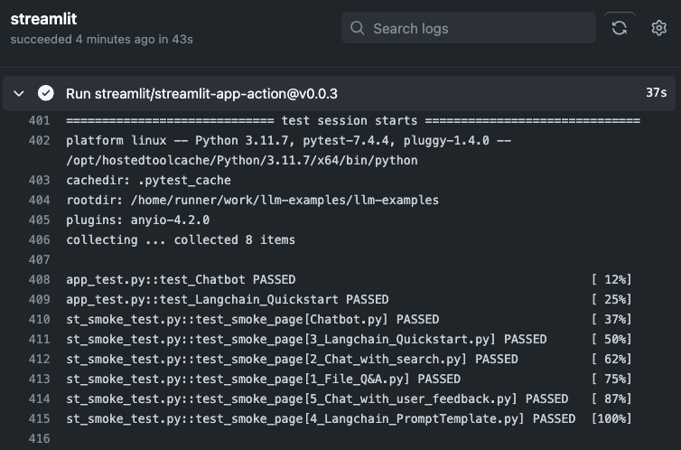
For higher-level test results, you can use [pytest-results-action](https://github.com/marketplace/actions/pytest-results-actions). You can combine this with Streamlit App Action as follows:
```yaml
# ... setup as above ...
- uses: streamlit/streamlit-app-action@v0.0.3
with:
app-path: streamlit_app.py
# Add pytest-args to output junit xml
pytest-args: -v --junit-xml=test-results.xml
- if: always()
uses: pmeier/pytest-results-action@v0.6.0
with:
path: test-results.xml
summary: true
display-options: fEX
```
## Writing your own actions
The above is just provided as an example. Streamlit App Action is a quick way to get started. Once you learn the basics of your CI tool of choice, it's easy to build and customize your own automated workflows. This is a great way to improve your overall productivity as a developer and the quality of your apps.
## Working example
As a final working example example, take a look at our [`streamlit/llm-examples` Actions](https://github.com/streamlit/llm-examples/actions), defined in [this workflow file](https://github.com/streamlit/llm-examples/blob/main/.github/workflows/app-testing.yml).
---
# App testing example
Source: https://docs.streamlit.io/develop/concepts/app-testing/examples
## Testing a login page
Let's consider a login page. In this example, `secrets.toml` is not present. We'll manually declare dummy secrets directly in the tests. To avoid [timing attacks](https://en.wikipedia.org/wiki/Timing_attack), the login script uses `hmac` to compare a user's password to the secret value as a security best practice.
### Project summary
#### Login page behavior
Before diving into the app's code, let's think about what this page is supposed to do. Whether you use test-driven development or you write unit tests after your code, it's a good idea to think about the functionality that needs to be tested. The login page should behave as follows:
- Before a user interacts with the app:
- Their status is "unverified."
- A password prompt is displayed.
- If a user types an incorrect password:
- Their status is "incorrect."
- An error message is displayed.
- The password attempt is cleared from the input.
- If a user types a correct password:
- Their status is "verified."
- A confirmation message is displayed.
- A logout button is displayed (without a login prompt).
- If a logged-in user clicks the **Log out** button:
- Their status is "unverified."
- A password prompt is displayed.
#### Login page project structure
```none
myproject/
├── app.py
└── tests/
└── test_app.py
```
#### Login page Python file
The user's status mentioned in the page's specifications are encoded in `st.session_state.status`. This value is initialized at the beginning of the script as "unverified" and is updated through a callback when the password prompt receives a new entry.
```python
"""app.py"""
import streamlit as st
import hmac
st.session_state.status = st.session_state.get("status", "unverified")
st.title("My login page")
def check_password():
if hmac.compare_digest(st.session_state.password, st.secrets.password):
st.session_state.status = "verified"
else:
st.session_state.status = "incorrect"
st.session_state.password = ""
def login_prompt():
st.text_input("Enter password:", key="password", on_change=check_password)
if st.session_state.status == "incorrect":
st.warning("Incorrect password. Please try again.")
def logout():
st.session_state.status = "unverified"
def welcome():
st.success("Login successful.")
st.button("Log out", on_click=logout)
if st.session_state.status != "verified":
login_prompt()
st.stop()
welcome()
```
#### Login page test file
These tests closely follow the app's specifications above. In each test, a dummy secret is set before running the app and proceeding with further simulations and checks.
```python
from streamlit.testing.v1 import AppTest
def test_no_interaction():
at = AppTest.from_file("app.py")
at.secrets["password"] = "streamlit"
at.run()
assert at.session_state["status"] == "unverified"
assert len(at.text_input) == 1
assert len(at.warning) == 0
assert len(at.success) == 0
assert len(at.button) == 0
assert at.text_input[0].value == ""
def test_incorrect_password():
at = AppTest.from_file("app.py")
at.secrets["password"] = "streamlit"
at.run()
at.text_input[0].input("balloon").run()
assert at.session_state["status"] == "incorrect"
assert len(at.text_input) == 1
assert len(at.warning) == 1
assert len(at.success) == 0
assert len(at.button) == 0
assert at.text_input[0].value == ""
assert "Incorrect password" in at.warning[0].value
def test_correct_password():
at = AppTest.from_file("app.py")
at.secrets["password"] = "streamlit"
at.run()
at.text_input[0].input("streamlit").run()
assert at.session_state["status"] == "verified"
assert len(at.text_input) == 0
assert len(at.warning) == 0
assert len(at.success) == 1
assert len(at.button) == 1
assert "Login successful" in at.success[0].value
assert at.button[0].label == "Log out"
def test_log_out():
at = AppTest.from_file("app.py")
at.secrets["password"] = "streamlit"
at.session_state["status"] = "verified"
at.run()
at.button[0].click().run()
assert at.session_state["status"] == "unverified"
assert len(at.text_input) == 1
assert len(at.warning) == 0
assert len(at.success) == 0
assert len(at.button) == 0
assert at.text_input[0].value == ""
```
See how Session State was modified in the last test? Instead of fully simulating a user logging in, the test jumps straight to a logged-in state by setting `at.session_state["status"] = "verified"`. After running the app, the test proceeds to simulate the user logging out.
### Automating your tests
If `myproject/` was pushed to GitHub as a repository, you could add GitHub Actions test automation with [Streamlit App Action](https://github.com/marketplace/actions/streamlit-app-action). This is as simple as adding a workflow file at `myproject/.github/workflows/`:
```yaml
# .github/workflows/streamlit-app.yml
name: Streamlit app
on:
push:
branches: ["main"]
pull_request:
branches: ["main"]
permissions:
contents: read
jobs:
streamlit:
runs-on: ubuntu-latest
steps:
- uses: actions/checkout@v4
- uses: actions/setup-python@v5
with:
python-version: "3.11"
- uses: streamlit/streamlit-app-action@v0.0.3
with:
app-path: app.py
```
---
# App testing cheat sheet
Source: https://docs.streamlit.io/develop/concepts/app-testing/cheat-sheet
## Text elements
```python
from streamlit.testing.v1 import AppTest
at = AppTest.from_file("cheatsheet_app.py")
# Headers
assert "My app" in at.title[0].value
assert "New topic" in at.header[0].value
assert "Interesting sub-topic" in at.subheader[0].value
assert len(at.divider) == 2
# Body / code
assert "Hello, world!" in at.markdown[0].value
assert "import streamlit as st" in at.code[0].value
assert "A cool diagram" in at.caption[0].value
assert "Hello again, world!" in at.text[0].value
assert "\int a x^2 \,dx" in at.latex[0].value
```
## Input widgets
```python
from streamlit.testing.v1 import AppTest
at = AppTest.from_file("cheatsheet_app.py")
# button
assert at.button[0].value == False
at.button[0].click().run()
assert at.button[0].value == True
# checkbox
assert at.checkbox[0].value == False
at.checkbox[0].check().run() # uncheck() is also supported
assert at.checkbox[0].value == True
# color_picker
assert at.color_picker[0].value == "#FFFFFF"
at.color_picker[0].pick("#000000").run()
# date_input
assert at.date_input[0].value == datetime.date(2019, 7, 6)
at.date_input[0].set_value(datetime.date(2022, 12, 21)).run()
# form_submit_button - shows up just like a button
assert at.button[0].value == False
at.button[0].click().run()
assert at.button[0].value == True
# multiselect
assert at.multiselect[0].value == ["foo", "bar"]
at.multiselect[0].select("baz").unselect("foo").run()
# number_input
assert at.number_input[0].value == 5
at.number_input[0].increment().run()
# radio
assert at.radio[0].value == "Bar"
assert at.radio[0].index == 3
at.radio[0].set_value("Foo").run()
# selectbox
assert at.selectbox[0].value == "Bar"
assert at.selectbox[0].index == 3
at.selectbox[0].set_value("Foo").run()
# select_slider
assert at.select_slider[0].value == "Feb"
at.select_slider[0].set_value("Mar").run()
at.select_slider[0].set_range("Apr", "Jun").run()
# slider
assert at.slider[0].value == 2
at.slider[0].set_value(3).run()
at.slider[0].set_range(4, 6).run()
# text_area
assert at.text_area[0].value == "Hello, world!"
at.text_area[0].set_value("Hello, yourself!").run()
# text_input
assert at.text_input[0].value == "Hello, world!")
at.text_input[0].set_value("Hello, yourself!").run()
# time_input
assert at.time_input[0].value == datetime.time(8, 45)
at.time_input[0].set_value(datetime.time(12, 30))
# toggle
assert at.toggle[0].value == False
assert at.toggle[0].label == "Debug mode"
at.toggle[0].set_value(True).run()
assert at.toggle[0].value == True
```
## Data elements
```python
from streamlit.testing.v1 import AppTest
at = AppTest.from_file("cheatsheet_app.py")
# dataframe
expected_df = pd.DataFrame([1, 2, 3])
assert at.dataframe[0].value.equals(expected_df)
# metric
assert at.metric[0].value == "9500"
assert at.metric[0].delta == "1000"
# json
assert at.json[0].value == '["hi", {"foo": "bar"}]'
# table
table_df = pd.DataFrame([1, 2, 3])
assert at.table[0].value.equals(table_df)
```
## Layouts and containers
```python
from streamlit.testing.v1 import AppTest
at = AppTest.from_file("cheatsheet_app.py")
# sidebar
at.sidebar.text_input[0].set_value("Jane Doe")
# columns
at.columns[1].markdown[0].value == "Hello, world!"
# tabs
at.tabs[2].markdown[0].value == "Hello, yourself!"
```
## Chat elements
```python
from streamlit.testing.v1 import AppTest
at = AppTest.from_file("cheatsheet_app.py")
# chat_input
at.chat_input[0].set_value("Do you know any jokes?").run()
# Note: chat_input value clears after every re-run (like in a real app)
# chat_message
assert at.chat_message[0].markdown[0].value == "Do you know any jokes?"
assert at.chat_message[0].avatar == "user"
```
## Status elements
```python
from streamlit.testing.v1 import AppTest
at = AppTest.from_file("cheatsheet_app.py")
# exception
assert len(at.exception) == 1
assert "TypeError" in at.exception[0].value
# Other in-line alerts: success, info, warning, error
assert at.success[0].value == "Great job!"
assert at.info[0].value == "Please enter an API key to continue"
assert at.warning[0].value == "Sorry, the passwords didn't match"
assert at.error[0].value == "Something went wrong :("
# toast
assert at.toast[0].value == "That was lit!" and at.toast[0].icon == "🔥"
```
## Limitations
As of Streamlit 1.28, the following Streamlit features are not natively supported by `AppTest`. However, workarounds are possible for many of them by inspecting the underlying proto directly using `AppTest.get()`. We plan to regularly add support for missing elements until all features are supported.
- Chart elements (`st.bar_chart`, `st.line_chart`, etc)
- Media elements (`st.image`, `st.video`, `st.audio`)
- `st.file_uploader`
- `st.data_editor`
- `st.expander`
- `st.status`
- `st.camera_input`
- `st.download_button`
- `st.link_button`
---
# API reference
Source: https://docs.streamlit.io/develop/api-reference
Streamlit makes it easy for you to visualize, mutate, and share data. The API
reference is organized by activity type, like displaying data or optimizing
performance. Each section includes methods associated with the activity type,
including examples.
Browse our API below and click to learn more about any of our available commands! 🎈
## Display almost anything
### Write and magic
st.write
Write arguments to the app.
```python
st.write("Hello **world**!")
st.write(my_data_frame)
st.write(my_mpl_figure)
```
st.write_stream
Write generators or streams to the app with a typewriter effect.
```python
st.write_stream(my_generator)
st.write_stream(my_llm_stream)
```
Magic
Any time Streamlit sees either a variable or literal value on its own line, it automatically writes that to your app using `st.write`
```python
"Hello **world**!"
my_data_frame
my_mpl_figure
```
### Text elements
alt="screenshot" src="/images/api/markdown.jpg" />
Display text in small font.
```python
st.caption("This is written small caption text")
```
alt="screenshot" src="/images/api/code.jpg" />
Code block
Display a code block with optional syntax highlighting.
```python
st.code("a = 1234")
```
alt="screenshot" src="/images/api/code.jpg" />
Echo
Display some code in the app, then execute it. Useful for tutorials.
```python
with st.echo():
st.write('This code will be printed')
```
alt="screenshot" src="/images/api/latex.jpg" />
LaTeX
Display mathematical expressions formatted as LaTeX.
```python
st.latex("\int a x^2 \,dx")
```
alt="screenshot" src="/images/api/text.jpg" />
Display annotated text in Streamlit apps. Created by [@tvst](https://github.com/tvst).
```python
annotated_text("This ", ("is", "verb"), " some ", ("annotated", "adj"), ("text", "noun"), " for those of ", ("you", "pronoun"), " who ", ("like", "verb"), " this sort of ", ("thing", "noun"), ".")
```
alt="screenshot" src="/images/api/components/drawable-canvas.jpg" />
Drawable Canvas
Provides a sketching canvas using [Fabric.js](http://fabricjs.com/). Created by [@andfanilo](https://github.com/andfanilo).
```python
st_canvas(fill_color="rgba(255, 165, 0, 0.3)", stroke_width=stroke_width, stroke_color=stroke_color, background_color=bg_color, background_image=Image.open(bg_image) if bg_image else None, update_streamlit=realtime_update, height=150, drawing_mode=drawing_mode, point_display_radius=point_display_radius if drawing_mode == 'point' else 0, key="canvas",)
```
alt="screenshot" src="/images/api/components/tags.jpg" />
Tags
Add tags to your Streamlit apps. Created by [@gagan3012](https://github.com/gagan3012).
```python
st_tags(label='# Enter Keywords:', text='Press enter to add more', value=['Zero', 'One', 'Two'], suggestions=['five', 'six', 'seven', 'eight', 'nine', 'three', 'eleven', 'ten', 'four'], maxtags = 4, key='1')
```
alt="screenshot" src="/images/api/components/nlu.jpg" />
NLU
Apply text mining on a dataframe. Created by [@JohnSnowLabs](https://github.com/JohnSnowLabs/).
```python
nlu.load("sentiment").predict("I love NLU!
---
# st.write and magic commands
Source: https://docs.streamlit.io/develop/api-reference/write-magic
Streamlit has two easy ways to display information into your app, which should typically be the
first thing you try: `st.write` and magic.
st.write
Write arguments to the app.
```python
st.write("Hello **world**!")
st.write(my_data_frame)
st.write(my_mpl_figure)
```
st.write_stream
Write generators or streams to the app with a typewriter effect.
```python
st.write_stream(my_generator)
st.write_stream(my_llm_stream)
```
Magic
Any time Streamlit sees either a variable or literal value on its own line, it automatically writes that to your app using `st.write`
```python
"Hello **world**!"
my_data_frame
my_mpl_figure
```
---
Source: https://docs.streamlit.io/develop/api-reference/write-magic/st.write
* Function signature:
st.write(*args, unsafe_allow_html=False)
* Parameters:
| name | type | default | description |
|---|---|---|---|
| *args | any | | One or many objects to display in the app. Each type of argument is handled as follows: Type Handling str Uses st.markdown(). dataframe-like, dict, or list Uses st.dataframe(). Exception Uses st.exception(). function, module, or class Uses st.help(). DeltaGenerator Uses st.help(). Altair chart Uses st.altair_chart(). Bokeh figure Uses st.bokeh_chart(). Graphviz graph Uses st.graphviz_chart(). Keras model Converts model and uses st.graphviz_chart(). Matplotlib figure Uses st.pyplot(). Plotly figure Uses st.plotly_chart(). PIL.Image Uses st.image(). generator or stream (like openai.Stream) Uses st.write_stream(). SymPy expression Uses st.latex(). An object with ._repr_html() Uses st.html(). Database cursor Displays DB API 2.0 cursor results in a table. Any Displays str(arg) as inline code. |
| unsafe_allow_html | bool | | Whether to render HTML within *args. This only applies to strings or objects falling back on _repr_html_(). If this is False (default), any HTML tags found in body will be escaped and therefore treated as raw text. If this is True, any HTML expressions within body will be rendered. Adding custom HTML to your app impacts safety, styling, and maintainability. Note If you only want to insert HTML or CSS without Markdown text, we recommend using st.html instead. |
* Returns: None
### Featured video
Learn what the [`st.write`](/develop/api-reference/write-magic/st.write) and [magic](/develop/api-reference/write-magic/magic) commands are and how to use them.
---
Source: https://docs.streamlit.io/develop/api-reference/write-magic/st.write_stream
* Function signature:
st.write_stream(stream, *, cursor=None)
* Parameters:
| name | type | default | description |
|---|---|---|---|
| stream | Callable, Generator, Iterable, OpenAI Stream, or LangChain Stream | | The generator or iterable to stream. If you pass an async generator, Streamlit will internally convert it to a sync generator. If the generator depends on a cached object with async references, this can raise an error. Note To use additional LLM libraries, you can create a wrapper to manually define a generator function and include custom output parsing. |
| cursor | str or None | | A string to append to text as it's being written. If this is None (default), no cursor is shown. Otherwise, the string is rendered as Markdown and appears as a cursor at the end of the streamed text. For example, you can use an emoji, emoji shortcode, or Material icon. The first line of the cursor string can contain GitHub-flavored Markdown of the following types: Bold, Italics, Strikethroughs, Inline Code, Links, and Images. Images display like icons, with a max height equal to the font height. If you pass a multiline string, additional lines display after the text with the full Markdown rendering capabilities of st.markdown. See the body parameter of st.markdown for additional, supported Markdown directives. |
* Returns: str or list
The full response. If the streamed output only contains text, this
is a string. Otherwise, this is a list of all the streamed objects.
The return value is fully compatible as input for st.write.
If your stream object is not compatible with `st.write_stream`, define a wrapper around your stream object to create a compatible generator function.
```python
for chunk in unsupported_stream:
yield preprocess(chunk)
```
For an example, see how we use [Replicate](https://replicate.com/docs/get-started/python) with [Snowflake Arctic](https://www.snowflake.com/en/data-cloud/arctic/) in [this code](https://github.com/streamlit/snowflake-arctic-st-demo/blob/0f0d8b49f328f72ae58ced2e9000790fb5e56e6f/simple_app.py#L58).
---
Source: https://docs.streamlit.io/develop/api-reference/write-magic/magic
## Magic
Magic commands are a feature in Streamlit that allows you to write almost anything (markdown, data,
charts) without having to type an explicit command at all. Just put the thing you want to show on
its own line of code, and it will appear in your app. Here's an example:
```python
# Draw a title and some text to the app:
'''
# This is the document title
This is some _markdown_.
'''
import pandas as pd
df = pd.DataFrame({'col1': [1,2,3]})
df # 👈 Draw the dataframe
x = 10
'x', x # 👈 Draw the string 'x' and then the value of x
# Also works with most supported chart types
import matplotlib.pyplot as plt
import numpy as np
arr = np.random.normal(1, 1, size=100)
fig, ax = plt.subplots()
ax.hist(arr, bins=20)
fig # 👈 Draw a Matplotlib chart
```
### How Magic works
Any time Streamlit sees either a variable or literal
value on its own line, it automatically writes that to your app using
[`st.write`](/develop/api-reference/write-magic/st.write) (which you'll learn about later).
Also, magic is smart enough to ignore docstrings. That is, it ignores the
strings at the top of files and functions.
If you prefer to call Streamlit commands more explicitly, you can always turn
magic off in your `~/.streamlit/config.toml` with the following setting:
```toml
[runner]
magicEnabled = false
```
Right now, Magic only works in the main Python app file, not in imported files. See GitHub issue #288 for a discussion of the issues.
### Featured video
Learn what the [`st.write`](/develop/api-reference/write-magic/st.write) and [magic](/develop/api-reference/write-magic/magic) commands are and how to use them.
---
# Text elements
Source: https://docs.streamlit.io/develop/api-reference/text
Streamlit apps usually start with a call to `st.title` to set the
app's title. After that, there are 2 heading levels you can use:
`st.header` and `st.subheader`.
Pure text is entered with `st.text`, and Markdown with
`st.markdown`.
We also offer a "swiss-army knife" command called `st.write`, which accepts
multiple arguments, and multiple data types. And as described above, you can
also use [magic commands](/develop/api-reference/write-magic/magic) in place of `st.write`.
## Headings and body text
alt="screenshot" src="/images/api/markdown.jpg" />
Display text in title formatting.
```python
st.title("The app title")
```
alt="screenshot" src="/images/api/header.jpg" />
Header
Display text in header formatting.
```python
st.header("This is a header")
```
alt="screenshot" src="/images/api/subheader.jpg" />
Subheader
Display text in subheader formatting.
```python
st.subheader("This is a subheader")
```
## Formatted text
alt="screenshot" src="/images/api/badge.jpg" />
Display text in small font.
```python
st.caption("This is written small caption text")
```
alt="screenshot" src="/images/api/code.jpg" />
Code block
Display a code block with optional syntax highlighting.
```python
st.code("a = 1234")
```
alt="screenshot" src="/images/api/code.jpg" />
Echo
Display some code on the app, then execute it. Useful for tutorials.
```python
with st.echo():
st.write('This code will be printed')
```
alt="screenshot" src="/images/api/text.jpg" />
Display annotated text in Streamlit apps. Created by [@tvst](https://github.com/tvst).
```python
annotated_text("This ", ("is", "verb"), " some ", ("annotated", "adj"), ("text", "noun"), " for those of ", ("you", "pronoun"), " who ", ("like", "verb"), " this sort of ", ("thing", "noun"), ".")
```
alt="screenshot" src="/images/api/components/drawable-canvas.jpg" />
Drawable Canvas
Provides a sketching canvas using [Fabric.js](http://fabricjs.com/). Created by [@andfanilo](https://github.com/andfanilo).
```python
st_canvas(fill_color="rgba(255, 165, 0, 0.3)", stroke_width=stroke_width, stroke_color=stroke_color, background_color=bg_color, background_image=Image.open(bg_image) if bg_image else None, update_streamlit=realtime_update, height=150, drawing_mode=drawing_mode, point_display_radius=point_display_radius if drawing_mode == 'point' else 0, key="canvas",)
```
alt="screenshot" src="/images/api/components/tags.jpg" />
Tags
Add tags to your Streamlit apps. Created by [@gagan3012](https://github.com/gagan3012).
```python
st_tags(label='# Enter Keywords:', text='Press enter to add more', value=['Zero', 'One', 'Two'], suggestions=['five', 'six', 'seven', 'eight', 'nine', 'three', 'eleven', 'ten', 'four'], maxtags = 4, key='1')
```
alt="screenshot" src="/images/api/components/nlu.jpg" />
NLU
Apply text mining on a dataframe. Created by [@JohnSnowLabs](https://github.com/JohnSnowLabs/).
```python
nlu.load('sentiment').predict('I love NLU!
---
Source: https://docs.streamlit.io/develop/api-reference/text/st.title
* Function signature:
st.title(body, anchor=None, *, help=None, width="stretch", text_alignment="left")
* Parameters:
| name | type | default | description |
|---|---|---|---|
| body | str | | The text to display as GitHub-flavored Markdown. Syntax information can be found at: https://github.github.com/gfm. See the body parameter of st.markdown for additional, supported Markdown directives. |
| anchor | str or False | | The anchor name of the header that can be accessed with #anchor in the URL. If omitted, it generates an anchor using the body. If False, the anchor is not shown in the UI. |
| help | str or None | | A tooltip that gets displayed next to the title. If this is None (default), no tooltip is displayed. The tooltip can optionally contain GitHub-flavored Markdown, including the Markdown directives described in the body parameter of st.markdown. |
| width | "stretch", "content", or int | | The width of the title element. This can be one of the following: "stretch" (default): The width of the element matches the width of the parent container. "content": The width of the element matches the width of its content, but doesn't exceed the width of the parent container. An integer specifying the width in pixels: The element has a fixed width. If the specified width is greater than the width of the parent container, the width of the element matches the width of the parent container. |
| text_alignment | "left", "center", "right", or "justify" | | The horizontal alignment of the text within the element. This can be one of the following: "left" (default): Text is aligned to the left edge. "center": Text is centered. "right": Text is aligned to the right edge. "justify": Text is justified (stretched to fill the available width with the last line left-aligned). Note For text alignment to have a visible effect, the element's width must be wider than its content. If you use width="content" with short text, the alignment may not be noticeable. |
---
Source: https://docs.streamlit.io/develop/api-reference/text/st.header
* Function signature:
st.header(body, anchor=None, *, help=None, divider=False, width="stretch", text_alignment="left")
* Parameters:
| name | type | default | description |
|---|---|---|---|
| body | str | | The text to display as GitHub-flavored Markdown. Syntax information can be found at: https://github.github.com/gfm. See the body parameter of st.markdown for additional, supported Markdown directives. |
| anchor | str or False | | The anchor name of the header that can be accessed with #anchor in the URL. If omitted, it generates an anchor using the body. If False, the anchor is not shown in the UI. |
| help | str or None | | A tooltip that gets displayed next to the header. If this is None (default), no tooltip is displayed. The tooltip can optionally contain GitHub-flavored Markdown, including the Markdown directives described in the body parameter of st.markdown. |
| divider | bool, "blue", "green", "orange", "red", "violet", "yellow", "gray"/"grey", or "rainbow" | | Shows a colored divider below the header. If this is True, successive headers will cycle through divider colors, except gray and rainbow. That is, the first header will have a blue line, the second header will have a green line, and so on. If this is a string, the color can be set to one of the following: blue, green, orange, red, violet, yellow, gray/grey, or rainbow. |
| width | "stretch", "content", or int | | The width of the header element. This can be one of the following: "stretch" (default): The width of the element matches the width of the parent container. "content": The width of the element matches the width of its content, but doesn't exceed the width of the parent container. An integer specifying the width in pixels: The element has a fixed width. If the specified width is greater than the width of the parent container, the width of the element matches the width of the parent container. |
| text_alignment | "left", "center", "right", or "justify" | | The horizontal alignment of the text within the element. This can be one of the following: "left" (default): Text is aligned to the left edge. "center": Text is centered. "right": Text is aligned to the right edge. "justify": Text is justified (stretched to fill the available width with the last line left-aligned). Note For text alignment to have a visible effect, the element's width must be wider than its content. If you use width="content" with short text, the alignment may not be noticeable. |
---
Source: https://docs.streamlit.io/develop/api-reference/text/st.subheader
* Function signature:
st.subheader(body, anchor=None, *, help=None, divider=False, width="stretch", text_alignment="left")
* Parameters:
| name | type | default | description |
|---|---|---|---|
| body | str | | The text to display as GitHub-flavored Markdown. Syntax information can be found at: https://github.github.com/gfm. See the body parameter of st.markdown for additional, supported Markdown directives. |
| anchor | str or False | | The anchor name of the header that can be accessed with #anchor in the URL. If omitted, it generates an anchor using the body. If False, the anchor is not shown in the UI. |
| help | str or None | | A tooltip that gets displayed next to the subheader. If this is None (default), no tooltip is displayed. The tooltip can optionally contain GitHub-flavored Markdown, including the Markdown directives described in the body parameter of st.markdown. |
| divider | bool, "blue", "green", "orange", "red", "violet", "yellow", "gray"/"grey", or "rainbow" | | Shows a colored divider below the header. If this is True, successive headers will cycle through divider colors, except gray and rainbow. That is, the first header will have a blue line, the second header will have a green line, and so on. If this is a string, the color can be set to one of the following: blue, green, orange, red, violet, yellow, gray/grey, or rainbow. |
| width | "stretch", "content", or int | | The width of the subheader element. This can be one of the following: "stretch" (default): The width of the element matches the width of the parent container. "content": The width of the element matches the width of its content, but doesn't exceed the width of the parent container. An integer specifying the width in pixels: The element has a fixed width. If the specified width is greater than the width of the parent container, the width of the element matches the width of the parent container. |
| text_alignment | "left", "center", "right", or "justify" | | The horizontal alignment of the text within the element. This can be one of the following: "left" (default): Text is aligned to the left edge. "center": Text is centered. "right": Text is aligned to the right edge. "justify": Text is justified (stretched to fill the available width with the last line left-aligned). Note For text alignment to have a visible effect, the element's width must be wider than its content. If you use width="content" with short text, the alignment may not be noticeable. |
---
Source: https://docs.streamlit.io/develop/api-reference/text/st.markdown
* Function signature:
st.markdown(body, unsafe_allow_html=False, *, help=None, width="auto", text_alignment="left")
* Parameters:
| name | type | default | description |
|---|---|---|---|
| body | any | primary | The text to display as GitHub-flavored Markdown. Syntax information can be found at: https://github.github.com/gfm. If anything other than a string is passed, it will be converted into a string behind the scenes using str(body). This also supports: Emoji shortcodes, such as :+1: and :sunglasses:. For a list of all supported codes, see https://share.streamlit.io/streamlit/emoji-shortcodes. Streamlit logo shortcode. Use :streamlit: to add a little Streamlit flair to your text. A limited set of typographical symbols. "-> -- >= becomes "← → ↔ — ≥ ≤ ≈" when parsed as Markdown. Google Material Symbols (rounded style), using the syntax :material/icon_name:, where "icon_name" is the name of the icon in snake case. For a complete list of icons, see Google's Material Symbols font library. LaTeX expressions, by wrapping them in "$" or "$$" (the "$$" must be on their own lines). Supported LaTeX functions are listed at https://katex.org/docs/supported.html. Colored text and background colors for text. There are two ways to apply colors: Streamlit color palette: Use the syntax :color[your text] and :color-background[your text], where color is one of: red, orange, yellow, green, blue, violet, gray, grey, rainbow, or primary. For example, :orange[your text] or :blue-background[your text]. If you use "primary", Streamlit will use the default primary accent color unless you set the theme.primaryColor configuration option. Custom CSS colors: Use the syntax :color[your text]{foreground="..." background="..."} with a valid CSS color value. Both foreground and background are optional. Supported formats include named CSS colors, HEX, RGB(A), and HSL(A). For example, :color[warning]{foreground="#d50000"} or :color[note]{foreground="rgb(0,100,200)" background="hsl(60,100%,90%)"}. Note When using :color[...]{} with custom CSS colors, a named color like "red" refers to the standard CSS named color, not the Streamlit palette color. RGB and HSL values must use comma-separated syntax; the modern space-separated syntax isn't supported. Colors are parsed by color2k. Colored badges, using the syntax :color-badge[text in the badge]. color must be replaced with any of the following supported colors: red, orange, yellow, green, blue, violet, gray/grey, or primary. For example, you can use :orange-badge[your text here] or :blue-badge[your text here]. Small text, using the syntax :small[text to show small]. |
| unsafe_allow_html | bool | | Whether to render HTML within body. If this is False (default), any HTML tags found in body will be escaped and therefore treated as raw text. If this is True, any HTML expressions within body will be rendered. Adding custom HTML to your app impacts safety, styling, and maintainability. Note If you only want to insert HTML or CSS without Markdown text, we recommend using st.html instead. |
| help | str or None | | A tooltip that gets displayed next to the Markdown. If this is None (default), no tooltip is displayed. The tooltip can optionally contain GitHub-flavored Markdown, including the Markdown directives described in the body parameter of st.markdown. |
| width | "auto", "stretch", "content", or int | | The width of the Markdown element. This can be one of the following: "auto" (default): The width of the element adapts based on the container flex layout. In vertical containers, the element uses "stretch" width. In horizontal containers, the element uses "content" width. "stretch": The width of the element matches the width of the parent container. "content": The width of the element matches the width of its content, but doesn't exceed the width of the parent container. An integer specifying the width in pixels: The element has a fixed width. If the specified width is greater than the width of the parent container, the width of the element matches the width of the parent container. |
| text_alignment | "left", "center", "right", or "justify" | | The horizontal alignment of the text within the element. This can be one of the following: "left" (default): Text is aligned to the left edge. "center": Text is centered. "right": Text is aligned to the right edge. "justify": Text is justified (stretched to fill the available width with the last line left-aligned). Note For text alignment to have a visible effect, the element's width must be wider than its content. If you use width="content" with short text, the alignment may not be noticeable. |
```python
import streamlit as st
md = st.text_area('Type in your markdown string (without outer quotes)',
"Happy Streamlit-ing! :balloon:")
st.code(f"""
import streamlit as st
st.markdown('''{md}''')
""")
st.markdown(md)
```
---
Source: https://docs.streamlit.io/develop/api-reference/text/st.badge
* Function signature:
st.badge(label, *, icon=None, color="blue", width="content", help=None)
* Parameters:
| name | type | default | description |
|---|---|---|---|
| label | str | | The label to display in the badge. The label can optionally contain GitHub-flavored Markdown of the following types: Bold, Italics, Strikethroughs, Inline Code. See the body parameter of st.markdown for additional, supported Markdown directives. Because this command escapes square brackets ([ ]) in this parameter, any directive requiring square brackets is not supported. |
| icon | str or None | | An optional emoji or icon to display next to the badge label. If icon is None (default), no icon is displayed. If icon is a string, the following options are valid: A single-character emoji. For example, you can set icon="🚨" or icon="🔥". Emoji short codes are not supported. An icon from the Material Symbols library (rounded style) in the format ":material/icon_name:" where "icon_name" is the name of the icon in snake case. For example, icon=":material/thumb_up:" will display the Thumb Up icon. Find additional icons in the Material Symbols font library. |
| color | str | s | The color to use for the badge. This defaults to "blue". This can be one of the following supported colors: red, orange, yellow, blue, green, violet, gray/grey, or primary. If you use "primary", Streamlit will use the default primary accent color unless you set the theme.primaryColor configuration option. |
| width | "content", "stretch", or int | | The width of the badge element. This can be one of the following: "content" (default): The width of the element matches the width of its content, but doesn't exceed the width of the parent container. "stretch": The width of the element matches the width of the parent container. An integer specifying the width in pixels: The element has a fixed width. If the specified width is greater than the width of the parent container, the width of the element matches the width of the parent container. |
| help | str or None | | A tooltip to display when hovering over the badge. If this is None (default), no tooltip is displayed. The tooltip can optionally contain GitHub-flavored Markdown, including the Markdown directives described in the body parameter of st.markdown. |
---
Source: https://docs.streamlit.io/develop/api-reference/text/st.caption
* Function signature:
st.caption(body, unsafe_allow_html=False, *, help=None, width="stretch", text_alignment="left")
* Parameters:
| name | type | default | description |
|---|---|---|---|
| body | str | | The text to display as GitHub-flavored Markdown. Syntax information can be found at: https://github.github.com/gfm. See the body parameter of st.markdown for additional, supported Markdown directives. |
| unsafe_allow_html | bool | | Whether to render HTML within body. If this is False (default), any HTML tags found in body will be escaped and therefore treated as raw text. If this is True, any HTML expressions within body will be rendered. Adding custom HTML to your app impacts safety, styling, and maintainability. Note If you only want to insert HTML or CSS without Markdown text, we recommend using st.html instead. |
| help | str or None | | A tooltip that gets displayed next to the caption. If this is None (default), no tooltip is displayed. The tooltip can optionally contain GitHub-flavored Markdown, including the Markdown directives described in the body parameter of st.markdown. |
| width | "stretch", "content", or int | | The width of the caption element. This can be one of the following: "stretch" (default): The width of the element matches the width of the parent container. "content": The width of the element matches the width of its content, but doesn't exceed the width of the parent container. An integer specifying the width in pixels: The element has a fixed width. If the specified width is greater than the width of the parent container, the width of the element matches the width of the parent container. |
| text_alignment | "left", "center", "right", or "justify" | | The horizontal alignment of the text within the element. This can be one of the following: "left" (default): Text is aligned to the left edge. "center": Text is centered. "right": Text is aligned to the right edge. "justify": Text is justified (stretched to fill the available width with the last line left-aligned). Note For text alignment to have a visible effect, the element's width must be wider than its content. If you use width="content" with short text, the alignment may not be noticeable. |
---
Source: https://docs.streamlit.io/develop/api-reference/text/st.code
* Function signature:
st.code(body, language="python", *, line_numbers=False, wrap_lines=False, height="content", width="stretch")
* Parameters:
| name | type | default | description |
|---|---|---|---|
| body | str | | The string to display as code or monospace text. |
| language | str or None | s | The language that the code is written in, for syntax highlighting. This defaults to "python". If this is None, the code will be plain, monospace text. For a list of available language values, see react-syntax-highlighter on GitHub. |
| line_numbers | bool | s | An optional boolean indicating whether to show line numbers to the left of the code block. This defaults to False. |
| wrap_lines | bool | s | An optional boolean indicating whether to wrap lines. This defaults to False. |
| height | "content", "stretch", or int | | The height of the code block element. This can be one of the following: "content" (default): The height of the element matches the height of its content. "stretch": The height of the element matches the height of its content or the height of the parent container, whichever is larger. If the element is not in a parent container, the height of the element matches the height of its content. An integer specifying the height in pixels: The element has a fixed height. If the content is larger than the specified height, scrolling is enabled. Note Use scrolling containers sparingly. If you use scrolling containers, avoid heights that exceed 500 pixels. Otherwise, the scroll surface of the container might cover the majority of the screen on mobile devices, which makes it hard to scroll the rest of the app. |
| width | "stretch", "content", or int | | The width of the code block element. This can be one of the following: "stretch" (default): The width of the element matches the width of the parent container. "content": The width of the element matches the width of its content, but doesn't exceed the width of the parent container. An integer specifying the width in pixels: The element has a fixed width. If the specified width is greater than the width of the parent container, the width of the element matches the width of the parent container. |
---
Source: https://docs.streamlit.io/develop/api-reference/text/st.divider
* Function signature:
st.divider(*, width="stretch")
* Parameters:
| name | type | default | description |
|---|---|---|---|
| width | "stretch" or int | | The width of the divider element. This can be one of the following: "stretch" (default): The width of the element matches the width of the parent container. An integer specifying the width in pixels: The element has a fixed width. If the specified width is greater than the width of the parent container, the width of the element matches the width of the parent container. |
Here's what it looks like in action when you have multiple elements in the app:
```python
import streamlit as st
st.write("This is some text.")
st.slider("This is a slider", 0, 100, (25, 75))
st.divider() # 👈 Draws a horizontal rule
st.write("This text is between the horizontal rules.")
st.divider() # 👈 Another horizontal rule
```
---
Source: https://docs.streamlit.io/develop/api-reference/text/st.echo
* Function signature:
st.echo(code_location="above")
* Parameters:
| name | type | default | description |
|---|---|---|---|
| code_location | "above" or "below" | | Whether to show the echoed code before or after the results of the executed code block. |
### Display code
Sometimes you want your Streamlit app to contain _both_ your usual
Streamlit graphic elements _and_ the code that generated those elements.
That's where `st.echo()` comes in.
Ok so let's say you have the following file, and you want to make its
app a little bit more self-explanatory by making that middle section
visible in the Streamlit app:
```python
import streamlit as st
def get_user_name():
return 'John'
# ------------------------------------------------
# Want people to see this part of the code...
def get_punctuation():
return '!!!'
greeting = "Hi there, "
user_name = get_user_name()
punctuation = get_punctuation()
st.write(greeting, user_name, punctuation)
# ...up to here
# ------------------------------------------------
foo = 'bar'
st.write('Done!')
```
The file above creates a Streamlit app containing the words "Hi there,
`John`", and then "Done!".
Now let's use `st.echo()` to make that middle section of the code visible
in the app:
```python
import streamlit as st
def get_user_name():
return 'John'
with st.echo():
# Everything inside this block will be both printed to the screen
# and executed.
def get_punctuation():
return '!!!'
greeting = "Hi there, "
value = get_user_name()
punctuation = get_punctuation()
st.write(greeting, value, punctuation)
# And now we're back to _not_ printing to the screen
foo = 'bar'
st.write('Done!')
```
It's _that_ simple!
You can have multiple `st.echo()` blocks in the same file.
Use it as often as you wish!
---
Source: https://docs.streamlit.io/develop/api-reference/text/st.latex
* Function signature:
st.latex(body, *, help=None, width="stretch")
* Parameters:
| name | type | default | description |
|---|---|---|---|
| body | str or SymPy expression | | The string or SymPy expression to display as LaTeX. If str, it's a good idea to use raw Python strings since LaTeX uses backslashes a lot. |
| help | str or None | | A tooltip that gets displayed next to the LaTeX expression. If this is None (default), no tooltip is displayed. The tooltip can optionally contain GitHub-flavored Markdown, including the Markdown directives described in the body parameter of st.markdown. |
| width | "stretch", "content", or int | | The width of the LaTeX element. This can be one of the following: "stretch" (default): The width of the element matches the width of the parent container. "content": The width of the element matches the width of its content, but doesn't exceed the width of the parent container. An integer specifying the width in pixels: The element has a fixed width. If the specified width is greater than the width of the parent container, the width of the element matches the width of the parent container. |
---
Source: https://docs.streamlit.io/develop/api-reference/text/st.text
* Function signature:
st.text(body, *, help=None, width="content", text_alignment="left")
* Parameters:
| name | type | default | description |
|---|---|---|---|
| body | str | | The string to display. |
| help | str or None | | A tooltip that gets displayed next to the text. If this is None (default), no tooltip is displayed. The tooltip can optionally contain GitHub-flavored Markdown, including the Markdown directives described in the body parameter of st.markdown. |
| width | "content", "stretch", or int | | The width of the text element. This can be one of the following: "content" (default): The width of the element matches the width of its content, but doesn't exceed the width of the parent container. "stretch": The width of the element matches the width of the parent container. An integer specifying the width in pixels: The element has a fixed width. If the specified width is greater than the width of the parent container, the width of the element matches the width of the parent container. |
| text_alignment | "left", "center", "right", or "justify" | | The horizontal alignment of the text within the element. This can be one of the following: "left" (default): Text is aligned to the left edge. "center": Text is centered. "right": Text is aligned to the right edge. "justify": Text is justified (stretched to fill the available width with the last line left-aligned). Note For text alignment to have a visible effect, the element's width must be wider than its content. If you use width="content" with short text, the alignment may not be noticeable. |
---
Source: https://docs.streamlit.io/develop/api-reference/text/st.help
* Function signature:
st.help(obj=<module 'streamlit' from '/Users/dmatthews/Documents/GitHub/streamlit/lib/streamlit/__init__.py'>, *, width="stretch")
* Parameters:
| name | type | default | description |
|---|---|---|---|
| obj | any | | The object whose information should be displayed. If left unspecified, this call will display help for Streamlit itself. |
| width | "stretch" or int | | The width of the help element. This can be one of the following: "stretch" (default): The width of the element matches the width of the parent container. An integer specifying the width in pixels: The element has a fixed width. If the specified width is greater than the width of the parent container, the width of the element matches the width of the parent container. |
---
Source: https://docs.streamlit.io/develop/api-reference/text/st.html
* Function signature:
st.html(body, *, width="stretch", unsafe_allow_javascript=False)
* Parameters:
| name | type | default | description |
|---|---|---|---|
| body | any | | The HTML code to insert. This can be one of the following: A string of HTML code. A path to a local file with HTML code. The path can be a str or Path object. Paths can be absolute or relative to the working directory (where you execute streamlit run). Any object. If body is not a string or path, Streamlit will convert the object to a string. body._repr_html_() takes precedence over str(body) when available. If the resulting HTML content is empty, Streamlit will raise an error. If body is a path to a CSS file, Streamlit will wrap the CSS content in tags automatically. When the resulting HTML content only contains style tags, Streamlit will send the content to the event container instead of the main container to avoid taking up space in the app. |
| width | "stretch", "content", or int | | The width of the HTML element. This can be one of the following: "stretch" (default): The width of the element matches the width of the parent container. "content": The width of the element matches the width of its content, but doesn't exceed the width of the parent container. An integer specifying the width in pixels: The element has a fixed width. If the specified width is greater than the width of the parent container, the width of the element matches the width of the parent container. |
| unsafe_allow_javascript | bool | | Whether to execute JavaScript contained in your HTML. If this is False (default), JavaScript is ignored. If this is True, JavaScript is executed. Use this with caution and never pass untrusted input. |
---
# Data elements
Source: https://docs.streamlit.io/develop/api-reference/data
When you're working with data, it is extremely valuable to visualize that
data quickly, interactively, and from multiple different angles. That's what
Streamlit is actually built and optimized for.
You can display data via [charts](#display-charts), and you can display it in
raw form. These are the Streamlit commands you can use to display and interact with raw data.
alt="screenshot" src="/images/api/dataframe.jpg" />
Dataframes
Display a dataframe as an interactive table.
```python
st.dataframe(my_data_frame)
```
alt="screenshot" src="/images/api/data_editor.jpg" />
Data editor
Display a data editor widget.
```python
edited = st.data_editor(df, num_rows="dynamic")
```
alt="screenshot" src="/images/api/column_config.jpg" />
Column configuration
Configure the display and editing behavior of dataframes and data editors.
```python
st.column_config.NumberColumn("Price (in USD)", min_value=0, format="$%d")
```
alt="screenshot" src="/images/api/table.jpg" />
Static tables
Display a static table.
```python
st.table(my_data_frame)
```
alt="screenshot" src="/images/api/metric.jpg" />
Metrics
Display a metric in big bold font, with an optional indicator of how the metric changed.
```python
st.metric("My metric", 42, 2)
```
alt="screenshot" src="/images/api/json.jpg" />
Dicts and JSON
Display object or string as a pretty-printed JSON string.
```python
st.json(my_dict)
```
alt="screenshot" src="/images/api/components/aggrid.jpg" />
Streamlit Aggrid
Implementation of Ag-Grid component for Streamlit. Created by [@PablocFonseca](https://github.com/PablocFonseca).
```python
df = pd.DataFrame({'col1': [1, 2, 3], 'col2': [4, 5, 6]})
grid_return = AgGrid(df, editable=True)
new_df = grid_return['data']
```
alt="screenshot" src="/images/api/components/folium.jpg" />
Streamlit Folium
Streamlit Component for rendering Folium maps. Created by [@randyzwitch](https://github.com/randyzwitch).
```python
m = folium.Map(location=[39.949610, -75.150282], zoom_start=16)
folium.Marker([39.949610, -75.150282], popup="Liberty Bell", tooltip="Liberty Bell").add_to(m)
st_data = st_folium(m, width=725)
```
alt="screenshot" src="/images/api/components/pandas-profiling.jpg" />
Pandas Profiling
Pandas profiling component for Streamlit. Created by [@okld](https://github.com/okld/).
```python
df = pd.read_csv("https://storage.googleapis.com/tf-datasets/titanic/train.csv")
pr = df.profile_report()
st_profile_report(pr)
```
alt="screenshot" src="/images/api/components/image-coordinates.jpg" />
Image Coordinates
Get the coordinates of clicks on an image. Created by [@blackary](https://github.com/blackary/).
```python
from streamlit_image_coordinates import streamlit_image_coordinates
value = streamlit_image_coordinates("https://placekitten.com/200/300")
st.write(value)
```
alt="screenshot" src="/images/api/components/plotly-events.jpg" />
Plotly Events
Make Plotly charts interactive!. Created by [@null-jones](https://github.com/null-jones/).
```python
from streamlit_plotly_events import plotly_events
fig = px.line(x=[1], y=[1])
selected_points = plotly_events(fig)
```
alt="screenshot" src="/images/api/components/extras-metric-cards.jpg" />
Streamlit Extras
A library with useful Streamlit extras. Created by [@arnaudmiribel](https://github.com/arnaudmiribel/).
```python
from streamlit_extras.metric_cards import style_metric_cards
col3.metric(label="No Change", value=5000, delta=0)
style_metric_cards()
```
---
Source: https://docs.streamlit.io/develop/api-reference/data/st.dataframe
Learn more in our [Dataframes](/develop/concepts/design/dataframes) guide and check out our tutorial, [Get dataframe row-selections from users](/develop/tutorials/elements/dataframe-row-selections).
* Function signature:
st.dataframe(data=None, width="stretch", height="auto", *, use_container_width=None, hide_index=None, column_order=None, column_config=None, key=None, on_select="ignore", selection_mode="multi-row", row_height=None, placeholder=None)
* Parameters:
| name | type | default | description |
|---|---|---|---|
| data | dataframe-like, collection-like, or None | | The data to display. Dataframe-like objects include dataframe and series objects from popular libraries like Dask, Modin, Numpy, pandas, Polars, PyArrow, Snowpark, Xarray, and more. You can use database cursors and clients that comply with the Python Database API Specification v2.0 (PEP 249). Additionally, you can use anything that supports the Python dataframe interchange protocol. For example, you can use the following: pandas.DataFrame, pandas.Series, pandas.Index, pandas.Styler, and pandas.Array polars.DataFrame, polars.LazyFrame, and polars.Series snowflake.snowpark.dataframe.DataFrame, snowflake.snowpark.table.Table If a data type is not recognized, Streamlit will convert the object to a pandas.DataFrame or pyarrow.Table using a .to_pandas() or .to_arrow() method, respectively, if available. If data is a pandas.Styler, it will be used to style its underlying pandas.DataFrame. Streamlit supports custom cell values, colors, and font weights. It does not support some of the more exotic styling options, like bar charts, hovering, and captions. For these styling options, use column configuration instead. Text and number formatting from column_config always takes precedence over text and number formatting from pandas.Styler. Collection-like objects include all Python-native Collection types, such as dict, list, and set. If data is None, Streamlit renders an empty table. |
| width | "stretch", "content", or int | | The width of the dataframe element. This can be one of the following: "stretch" (default): The width of the element matches the width of the parent container. "content": The width of the element matches the width of its content, but doesn't exceed the width of the parent container. An integer specifying the width in pixels: The element has a fixed width. If the specified width is greater than the width of the parent container, the width of the element matches the width of the parent container. |
| height | "auto", "content", "stretch", or int | | The height of the dataframe element. This can be one of the following: "auto" (default): Streamlit sets the height to show at most ten rows. "content": The height of the element matches the height of its content. The height is capped at 10,000 pixels to prevent performance issues with very large dataframes. "stretch": The height of the element expands to fill the available vertical space in its parent container. When multiple elements with stretch height are in the same container, they share the available vertical space evenly. The dataframe will maintain a minimum height to display up to three rows, but otherwise won't exceed the available height in its parent container. An integer specifying the height in pixels: The element has a fixed height. Vertical scrolling within the dataframe element is enabled when the height does not accommodate all rows. |
| use_container_width | bool | | Whether to override width with the width of the parent container. If this is True (default), Streamlit sets the width of the dataframe to match the width of the parent container. If this is False, Streamlit sets the dataframe's width according to width. |
| hide_index | bool or None | | Whether to hide the index column(s). If hide_index is None (default), the visibility of index columns is automatically determined based on the data and other configurations. |
| column_order | Iterable[str] or None | | The ordered list of columns to display. If this is None (default), Streamlit displays all columns in the order inherited from the underlying data structure. If this is a list, the indicated columns will display in the order they appear within the list. Columns may be omitted or repeated within the list. For example, column_order=("col2", "col1") will display "col2" first, followed by "col1", and will hide all other non-index columns. column_order does not accept positional column indices and can't move the index column(s). |
| column_config | dict or None | | Configuration to customize how columns are displayed. If this is None (default), columns are styled based on the underlying data type of each column. Column configuration can modify column names, visibility, type, width, format, and more. If this is a dictionary, the keys are column names (strings) and/or positional column indices (integers), and the values are one of the following: None to hide the column. A string to set the display label of the column. One of the column types defined under st.column_config. For example, to show a column as dollar amounts, use st.column_config.NumberColumn("Dollar values", format="$ %d"). See more info on the available column types and config options here. To configure the index column(s), use "_index" as the column name, or use a positional column index where 0 refers to the first index column. |
| key | str, int, or None | | An optional string to use for giving this element a stable identity. If this is None (default), the element's identity will be determined based on the values of the other parameters. If selections are activated and key is provided, Streamlit will register the key in Session State to store the selection state. The selection state is read-only. For more details, see Widget behavior. Additionally, if key is provided, it will be used as a CSS class name prefixed with st-key-. |
| on_select | "ignore" or "rerun" or callable | | How the dataframe should respond to user selection events. This controls whether or not the dataframe behaves like an input widget. on_select can be one of the following: "ignore" (default): Streamlit will not react to any selection events in the dataframe. The dataframe will not behave like an input widget. "rerun": Streamlit will rerun the app when the user selects rows, columns, or cells in the dataframe. In this case, st.dataframe will return the selection data as a dictionary. A callable: Streamlit will rerun the app and execute the callable as a callback function before the rest of the app. In this case, st.dataframe will return the selection data as a dictionary. |
| selection_mode | "single-row", "multi-row", "single-column", "multi-column", "single-cell", "multi-cell", or Iterable of these | | The types of selections Streamlit should allow when selections are enabled with on_select. This can be one of the following: "multi-row" (default): Multiple rows can be selected at a time. "single-row": Only one row can be selected at a time. "multi-column": Multiple columns can be selected at a time. "single-column": Only one column can be selected at a time. "multi-cell": A rectangular range of cells can be selected. "single-cell": Only one cell can be selected at a time. An Iterable of the above options: The table will allow selection based on the modes specified. For example, to allow the user to select multiple rows and multiple cells, use ["multi-row", "multi-cell"]. When column selections are enabled, column sorting is disabled. |
| row_height | int or None | row | The height of each row in the dataframe in pixels. If row_height is None (default), Streamlit will use a default row height, which fits one line of text. |
| placeholder | str or None | | The text that should be shown for missing values. If this is None (default), missing values are displayed as "None". To leave a cell empty, use an empty string (""). Other common values are "null", "NaN" and "-". |
* Returns: element or dict
If on_select is "ignore" (default), this command returns an
internal placeholder for the dataframe element that can be used
with the .add_rows() method. Otherwise, this command returns a
dictionary-like object that supports both key and attribute
notation. The attributes are described by the DataframeState
dictionary schema.
## Dataframe selections
* Function signature:
DataframeState
* Parameters:
| name | type | default | description |
|---|---|---|---|
| selection | dict | | The state of the on_select event. This attribute returns a dictionary-like object that supports both key and attribute notation. The attributes are described by the DataframeSelectionState dictionary schema. |
* Function signature:
DataframeSelectionState
* Parameters:
| name | type | default | description |
|---|---|---|---|
| rows | list[int] | | The selected rows, identified by their integer position. The integer positions match the original dataframe, even if the user sorts the dataframe in their browser. For a pandas.DataFrame, you can retrieve data from its integer position using methods like .iloc[] or .iat[]. |
| columns | list[str] | | The selected columns, identified by their names. |
| cells | list[tuple[int, str]] | | The selected cells, provided as a tuple of row integer position and column name. For example, the first cell in a column named "col 1" is represented as (0, "col 1"). Cells within index columns are not returned. |
* Function signature:
element.add_rows(data=None, **kwargs)
* Parameters:
| name | type | default | description |
|---|---|---|---|
| data | pandas.DataFrame, pandas.Styler, pyarrow.Table, numpy.ndarray, pyspark.sql.DataFrame, snowflake.snowpark.dataframe.DataFrame, Iterable, dict, or None | | Table to concat. Optional. |
| **kwargs | pandas.DataFrame, numpy.ndarray, Iterable, dict, or None | | The named dataset to concat. Optional. You can only pass in 1 dataset (including the one in the data parameter). |
---
Source: https://docs.streamlit.io/develop/api-reference/data/st.data_editor
This page only contains information on the `st.data_editor` API. For an overview of working with dataframes and to learn more about the data editor's capabilities and limitations, read [Dataframes](/develop/concepts/design/dataframes).
* Function signature:
st.data_editor(data, *, width="stretch", height="auto", use_container_width=None, hide_index=None, column_order=None, column_config=None, num_rows="fixed", disabled=False, key=None, on_change=None, args=None, kwargs=None, row_height=None, placeholder=None)
* Parameters:
| name | type | default | description |
|---|---|---|---|
| data | Anything supported by st.dataframe | to | The data to edit in the data editor. Note Styles from pandas.Styler will only be applied to non-editable columns. Text and number formatting from column_config always takes precedence over text and number formatting from pandas.Styler. If your dataframe starts with an empty column, you should set the column datatype in the underlying dataframe to ensure your intended datatype, especially for integers versus floats. Mixing data types within a column can make the column uneditable. Additionally, the following data types are not yet supported for editing: complex, tuple, bytes, bytearray, memoryview, dict, set, frozenset, fractions.Fraction, pandas.Interval, and pandas.Period. To prevent overflow in JavaScript, columns containing datetime.timedelta and pandas.Timedelta values will default to uneditable, but this can be changed through column configuration. |
| width | "stretch", "content", or int | | The width of the data editor. This can be one of the following: "stretch" (default): The width of the editor matches the width of the parent container. "content": The width of the editor matches the width of its content, but doesn't exceed the width of the parent container. An integer specifying the width in pixels: The editor has a fixed width. If the specified width is greater than the width of the parent container, the width of the editor matches the width of the parent container. |
| height | "auto", "content", "stretch", or int | | The height of the data editor. This can be one of the following: "auto" (default): Streamlit sets the height to show at most ten rows. "content": The height of the editor matches the height of its content. The height is capped at 10,000 pixels to prevent performance issues with very large dataframes. "stretch": The height of the editor expands to fill the available vertical space in its parent container. When multiple elements with stretch height are in the same container, they share the available vertical space evenly. The editor will maintain a minimum height to display up to three rows, but otherwise won't exceed the available height in its parent container. An integer specifying the height in pixels: The editor has a fixed height. Vertical scrolling within the editor is enabled when the height does not accommodate all rows. |
| use_container_width | bool | | Whether to override width with the width of the parent container. If this is True (default), Streamlit sets the width of the data editor to match the width of the parent container. If this is False, Streamlit sets the data editor's width according to width. |
| hide_index | bool or None | | Whether to hide the index column(s). If hide_index is None (default), the visibility of index columns is automatically determined based on the data. |
| column_order | Iterable[str] or None | | The ordered list of columns to display. If this is None (default), Streamlit displays all columns in the order inherited from the underlying data structure. If this is a list, the indicated columns will display in the order they appear within the list. Columns may be omitted or repeated within the list. For example, column_order=("col2", "col1") will display "col2" first, followed by "col1", and will hide all other non-index columns. column_order does not accept positional column indices and can't move the index column(s). |
| column_config | dict or None | | Configuration to customize how columns are displayed. If this is None (default), columns are styled based on the underlying data type of each column. Column configuration can modify column names, visibility, type, width, format, editing properties like min/max, and more. If this is a dictionary, the keys are column names (strings) and/or positional column indices (integers), and the values are one of the following: None to hide the column. A string to set the display label of the column. One of the column types defined under st.column_config. For example, to show a column as dollar amounts, use st.column_config.NumberColumn("Dollar values", format="$ %d"). See more info on the available column types and config options here. To configure the index column(s), use "_index" as the column name, or use a positional column index where 0 refers to the first index column. |
| num_rows | "fixed", "dynamic", "add", or "delete" | | Specifies if the user can add and/or delete rows in the data editor. "fixed" (default): The user can't add or delete rows. "dynamic": The user can add and delete rows, and column sorting is disabled. "add": The user can only add rows (no deleting), and column sorting is disabled. "delete": The user can only delete rows (no adding), and column sorting remains enabled. |
| disabled | bool or Iterable[str | int] | | Controls the editing of columns. This can be one of the following: False (default): All columns that support editing are editable. True: All columns are disabled for editing. An Iterable of column names and/or positional indices: The specified columns are disabled for editing while the remaining columns are editable where supported. For example, disabled=["col1", "col2"] will disable editing for the columns named "col1" and "col2". To disable editing for the index column(s), use "_index" as the column name, or use a positional column index where 0 refers to the first index column. |
| key | str, int, or None | | An optional string to use as the unique key for this widget. If this is None (default), a key will be generated for the widget based on the values of the other parameters. No two widgets may have the same key. A key lets you access the widget's value via st.session_state[key] (read-only). For more details, see Widget behavior. Additionally, if key is provided, it will be used as a CSS class name prefixed with st-key-. |
| on_change | callable | | An optional callback invoked when this data_editor's value changes. |
| args | list or tuple | | An optional list or tuple of args to pass to the callback. |
| kwargs | dict | | An optional dict of kwargs to pass to the callback. |
| row_height | int or None | row | The height of each row in the data editor in pixels. If row_height is None (default), Streamlit will use a default row height, which fits one line of text. |
| placeholder | str or None | | The text that should be shown for missing values. If this is None (default), missing values are displayed as "None". To leave a cell empty, use an empty string (""). Other common values are "null", "NaN" and "-". |
* Returns: pandas.DataFrame, pandas.Series, pyarrow.Table, numpy.ndarray, list, set, tuple, or dict.
The edited data. The edited data is returned in its original data type if
it corresponds to any of the supported return types. All other data types
are returned as a pandas.DataFrame.
### Configuring columns
You can configure the display and editing behavior of columns in `st.dataframe` and `st.data_editor` via the [Column configuration API](/develop/api-reference/data/st.column_config). We have developed the API to let you add images, charts, and clickable URLs in dataframe and data editor columns. Additionally, you can make individual columns editable, set columns as categorical and specify which options they can take, hide the index of the dataframe, and much more.
---
# Column configuration
Source: https://docs.streamlit.io/develop/api-reference/data/st.column_config
When working with data in Streamlit, the `st.column_config` class is a powerful tool for configuring data display and interaction. Specifically designed for the `column_config` parameter in [`st.dataframe`](/develop/api-reference/data/st.dataframe) and [`st.data_editor`](/develop/api-reference/data/st.data_editor), it provides a suite of methods to tailor your columns to various data types - from simple text and numbers to lists, URLs, images, and more.
Whether it's translating temporal data into user-friendly formats or utilizing charts and progress bars for clearer data visualization, column configuration not only provides the user with an enriched data viewing experience but also ensures that you're equipped with the tools to present and interact with your data, just the way you want it.
alt="screenshot" src="/images/api/column_config.column.jpg" />
Configure a text column.
```python
TextColumn("Widgets", max_chars=50, validate="^st\.[a-z_]+$")
```
alt="screenshot" src="/images/api/column_config.numbercolumn.jpg" />
Number column
Configure a number column.
```python
NumberColumn("Price (in USD)", min_value=0, format="$%d")
```
alt="screenshot" src="/images/api/column_config.checkboxcolumn.jpg" />
Checkbox column
Configure a checkbox column.
```python
CheckboxColumn("Your favorite?", help="Select your **favorite** widgets")
```
alt="screenshot" src="/images/api/column_config.selectboxcolumn.jpg" />
Selectbox column
Configure a selectbox column.
```python
SelectboxColumn("App Category", options=["🤖 LLM", "📈 Data Viz"])
```
alt="screenshot" src="/images/api/column_config.multiselectcolumn.jpg" />
Configure an area chart column.
```python
AreaChartColumn("Sales (last 6 months)" y_min=0, y_max=100)
```
alt="screenshot" src="/images/api/column_config.linechartcolumn.jpg" />
Line chart column
Configure a line chart column.
```python
LineChartColumn("Sales (last 6 months)" y_min=0, y_max=100)
```
alt="screenshot" src="/images/api/column_config.barchartcolumn.jpg" />
Bar chart column
Configure a bar chart column.
```python
BarChartColumn("Marketing spend" y_min=0, y_max=100)
```
alt="screenshot" src="/images/api/column_config.progresscolumn.jpg" />
Progress column
Configure a progress column.
```python
ProgressColumn("Sales volume", min_value=0, max_value=1000, format="$%f")
```
---
Source: https://docs.streamlit.io/develop/api-reference/data/st.column_config/st.column_config.column
* Function signature:
st.column_config.Column(label=None, *, width=None, help=None, disabled=None, required=None, pinned=None)
* Parameters:
| name | type | default | description |
|---|---|---|---|
| label | str or None | | The label shown at the top of the column. If this is None (default), the column name is used. |
| width | "small", "medium", "large", int, or None | | The display width of the column. If this is None (default), the column will be sized to fit the cell contents. Otherwise, this can be one of the following: "small": 75px wide "medium": 200px wide "large": 400px wide An integer specifying the width in pixels If the total width of all columns is less than the width of the dataframe, the remaining space will be distributed evenly among all columns. |
| help | str or None | | A tooltip that gets displayed when hovering over the column label. If this is None (default), no tooltip is displayed. The tooltip can optionally contain GitHub-flavored Markdown, including the Markdown directives described in the body parameter of st.markdown. |
| disabled | bool or None | | Whether editing should be disabled for this column. If this is None (default), Streamlit will enable editing wherever possible. If a column has mixed types, it may become uneditable regardless of disabled. |
| required | bool or None | | Whether edited cells in the column need to have a value. If this is False (default), the user can submit empty values for this column. If this is True, an edited cell in this column can only be submitted if its value is not None, and a new row will only be submitted after the user fills in this column. |
| pinned | bool or None | | Whether the column is pinned. A pinned column will stay visible on the left side no matter where the user scrolls. If this is None (default), Streamlit will decide: index columns are pinned, and data columns are not pinned. |
---
Source: https://docs.streamlit.io/develop/api-reference/data/st.column_config/st.column_config.textcolumn
* Function signature:
st.column_config.TextColumn(label=None, *, width=None, help=None, disabled=None, required=None, pinned=None, default=None, max_chars=None, validate=None)
* Parameters:
| name | type | default | description |
|---|---|---|---|
| label | str or None | | The label shown at the top of the column. If this is None (default), the column name is used. |
| width | "small", "medium", "large", int, or None | | The display width of the column. If this is None (default), the column will be sized to fit the cell contents. Otherwise, this can be one of the following: "small": 75px wide "medium": 200px wide "large": 400px wide An integer specifying the width in pixels If the total width of all columns is less than the width of the dataframe, the remaining space will be distributed evenly among all columns. |
| help | str or None | | A tooltip that gets displayed when hovering over the column label. If this is None (default), no tooltip is displayed. The tooltip can optionally contain GitHub-flavored Markdown, including the Markdown directives described in the body parameter of st.markdown. |
| disabled | bool or None | | Whether editing should be disabled for this column. If this is None (default), Streamlit will enable editing wherever possible. If a column has mixed types, it may become uneditable regardless of disabled. |
| required | bool or None | | Whether edited cells in the column need to have a value. If this is False (default), the user can submit empty values for this column. If this is True, an edited cell in this column can only be submitted if its value is not None, and a new row will only be submitted after the user fills in this column. |
| pinned | bool or None | | Whether the column is pinned. A pinned column will stay visible on the left side no matter where the user scrolls. If this is None (default), Streamlit will decide: index columns are pinned, and data columns are not pinned. |
| default | str or None | value | Specifies the default value in this column when a new row is added by the user. This defaults to None. |
| max_chars | int or None | | The maximum number of characters that can be entered. If this is None (default), there will be no maximum. |
| validate | str or None | | A JS-flavored regular expression (e.g. "^[a-z]+$") that edited values are validated against. If the user input is invalid, it will not be submitted. |
---
Source: https://docs.streamlit.io/develop/api-reference/data/st.column_config/st.column_config.numbercolumn
* Function signature:
st.column_config.NumberColumn(label=None, *, width=None, help=None, disabled=None, required=None, pinned=None, default=None, format=None, min_value=None, max_value=None, step=None)
* Parameters:
| name | type | default | description |
|---|---|---|---|
| label | str or None | | The label shown at the top of the column. If this is None (default), the column name is used. |
| width | "small", "medium", "large", int, or None | | The display width of the column. If this is None (default), the column will be sized to fit the cell contents. Otherwise, this can be one of the following: "small": 75px wide "medium": 200px wide "large": 400px wide An integer specifying the width in pixels If the total width of all columns is less than the width of the dataframe, the remaining space will be distributed evenly among all columns. |
| help | str or None | | A tooltip that gets displayed when hovering over the column label. If this is None (default), no tooltip is displayed. The tooltip can optionally contain GitHub-flavored Markdown, including the Markdown directives described in the body parameter of st.markdown. |
| disabled | bool or None | | Whether editing should be disabled for this column. If this is None (default), Streamlit will enable editing wherever possible. If a column has mixed types, it may become uneditable regardless of disabled. |
| required | bool or None | | Whether edited cells in the column need to have a value. If this is False (default), the user can submit empty values for this column. If this is True, an edited cell in this column can only be submitted if its value is not None, and a new row will only be submitted after the user fills in this column. |
| pinned | bool or None | | Whether the column is pinned. A pinned column will stay visible on the left side no matter where the user scrolls. If this is None (default), Streamlit will decide: index columns are pinned, and data columns are not pinned. |
| default | int, float, or None | value | Specifies the default value in this column when a new row is added by the user. This defaults to None. |
| format | str, "plain", "localized", "percent", "dollar", "euro", "yen", "accounting", "compact", "scientific", "engineering", or None | locale | A format string controlling how numbers are displayed. This can be one of the following values: None (default): Streamlit infers the formatting from the data. "plain": Show the full number without any formatting (e.g. "1234.567"). "localized": Show the number in the default locale format (e.g. "1,234.567"). "percent": Show the number as a percentage (e.g. "123456.70%"). "dollar": Show the number as a dollar amount (e.g. "$1,234.57"). "euro": Show the number as a euro amount (e.g. "€1,234.57"). "yen": Show the number as a yen amount (e.g. "¥1,235"). "accounting": Show the number in an accounting format (e.g. "1,234.00"). "bytes": Show the number in a byte format (e.g. "1.2KB"). "compact": Show the number in a compact format (e.g. "1.2K"). "scientific": Show the number in scientific notation (e.g. "1.235E3"). "engineering": Show the number in engineering notation (e.g. "1.235E3"). printf-style format string: Format the number with a printf specifier, like "%d" to show a signed integer (e.g. "1234") or "%X" to show an unsigned hexadecimal integer (e.g. "4D2"). You can also add prefixes and suffixes. To show British pounds, use "£ %.2f" (e.g. "£ 1234.57"). Use , for thousand separators (e.g. "%,d" yields "1,234"). For more information, see sprintf-js. Formatting from column_config always takes precedence over formatting from pandas.Styler. The formatting does not impact the return value when used in st.data_editor. |
| min_value | int, float, or None | | The minimum value that can be entered. If this is None (default), there will be no minimum. |
| max_value | int, float, or None | | The maximum value that can be entered. If this is None (default), there will be no maximum. |
| step | int, float, or None | | The precision of numbers that can be entered. If this None (default), integer columns will have a step of 1 and float columns will have unrestricted precision. In this case, some floats may display like integers. Setting step for float columns will ensure a consistent number of digits after the decimal are displayed. If format is a predefined format like "dollar", step overrides the display precision. If format is a printf-style format string, step will not change the display precision. |
---
Source: https://docs.streamlit.io/develop/api-reference/data/st.column_config/st.column_config.checkboxcolumn
* Function signature:
st.column_config.CheckboxColumn(label=None, *, width=None, help=None, disabled=None, required=None, pinned=None, default=None)
* Parameters:
| name | type | default | description |
|---|---|---|---|
| label | str or None | | The label shown at the top of the column. If this is None (default), the column name is used. |
| width | "small", "medium", "large", int, or None | | The display width of the column. If this is None (default), the column will be sized to fit the cell contents. Otherwise, this can be one of the following: "small": 75px wide "medium": 200px wide "large": 400px wide An integer specifying the width in pixels If the total width of all columns is less than the width of the dataframe, the remaining space will be distributed evenly among all columns. |
| help | str or None | | A tooltip that gets displayed when hovering over the column label. If this is None (default), no tooltip is displayed. The tooltip can optionally contain GitHub-flavored Markdown, including the Markdown directives described in the body parameter of st.markdown. |
| disabled | bool or None | | Whether editing should be disabled for this column. If this is None (default), Streamlit will enable editing wherever possible. If a column has mixed types, it may become uneditable regardless of disabled. |
| required | bool or None | | Whether edited cells in the column need to have a value. If this is False (default), the user can submit empty values for this column. If this is True, an edited cell in this column can only be submitted if its value is not None, and a new row will only be submitted after the user fills in this column. |
| pinned | bool or None | | Whether the column is pinned. A pinned column will stay visible on the left side no matter where the user scrolls. If this is None (default), Streamlit will decide: index columns are pinned, and data columns are not pinned. |
| default | bool or None | value | Specifies the default value in this column when a new row is added by the user. This defaults to None. |
---
Source: https://docs.streamlit.io/develop/api-reference/data/st.column_config/st.column_config.selectboxcolumn
* Function signature:
st.column_config.SelectboxColumn(label=None, *, width=None, help=None, disabled=None, required=None, pinned=None, default=None, options=None, format_func=None)
* Parameters:
| name | type | default | description |
|---|---|---|---|
| label | str or None | | The label shown at the top of the column. If this is None (default), the column name is used. |
| width | "small", "medium", "large", int, or None | | The display width of the column. If this is None (default), the column will be sized to fit the cell contents. Otherwise, this can be one of the following: "small": 75px wide "medium": 200px wide "large": 400px wide An integer specifying the width in pixels If the total width of all columns is less than the width of the dataframe, the remaining space will be distributed evenly among all columns. |
| help | str or None | | A tooltip that gets displayed when hovering over the column label. If this is None (default), no tooltip is displayed. The tooltip can optionally contain GitHub-flavored Markdown, including the Markdown directives described in the body parameter of st.markdown. |
| disabled | bool or None | | Whether editing should be disabled for this column. If this is None (default), Streamlit will enable editing wherever possible. If a column has mixed types, it may become uneditable regardless of disabled. |
| required | bool or None | | Whether edited cells in the column need to have a value. If this is False (default), the user can submit empty values for this column. If this is True, an edited cell in this column can only be submitted if its value is not None, and a new row will only be submitted after the user fills in this column. |
| pinned | bool or None | | Whether the column is pinned. A pinned column will stay visible on the left side no matter where the user scrolls. If this is None (default), Streamlit will decide: index columns are pinned, and data columns are not pinned. |
| default | str, int, float, bool, or None | value | Specifies the default value in this column when a new row is added by the user. This defaults to None. |
| options | Iterable[str, int, float, bool] or None | | The options that can be selected during editing. If this is None (default), the options will be inferred from the underlying dataframe column if its dtype is "category". For more information, see Pandas docs). |
| format_func | function or None | | Function to modify the display of the options. It receives the raw option defined in options as an argument and should output the label to be shown for that option. If this is None (default), the raw option is used as the label. |
---
Source: https://docs.streamlit.io/develop/api-reference/data/st.column_config/st.column_config.multiselectcolumn
* Function signature:
st.column_config.MultiselectColumn(label=None, *, width=None, help=None, disabled=None, required=None, pinned=None, default=None, options=None, accept_new_options=None, color=None, format_func=None)
* Parameters:
| name | type | default | description |
|---|---|---|---|
| label | str or None | | The label shown at the top of the column. If None (default), the column name is used. |
| width | "small", "medium", "large", or None | | The display width of the column. If this is None (default), the column will be sized to fit the cell contents. Otherwise, this can be one of the following: "small": 75px wide "medium": 200px wide "large": 400px wide An integer specifying the width in pixels If the total width of all columns is less than the width of the dataframe, the remaining space will be distributed evenly among all columns. |
| help | str or None | | A tooltip that gets displayed when hovering over the column label. If this is None (default), no tooltip is displayed. The tooltip can optionally contain GitHub-flavored Markdown, including the Markdown directives described in the body parameter of st.markdown. |
| disabled | bool or None | False | Whether editing should be disabled for this column. Defaults to False. |
| required | bool or None | False | Whether edited cells in the column need to have a value. If True, an edited cell can only be submitted if it has a value other than None. Defaults to False. |
| pinned | bool or None | | Whether the column is pinned. A pinned column will stay visible on the left side no matter where the user scrolls. If this is None (default), Streamlit will decide: index columns are pinned, and data columns are not pinned. |
| default | Iterable of str or None | value | Specifies the default value in this column when a new row is added by the user. |
| options | Iterable of str or None | | The options that can be selected during editing. |
| accept_new_options | bool or None | | Whether the user can add selections that aren't included in options. If this is False (default), the user can only select from the items in options. If this is True, the user can enter new items that don't exist in options. When a user enters and selects a new item, it is included in the returned cell list value as a string. The new item is not added to the options drop-down menu. |
| color | str, Iterable of str, or None | | The color to use for different options. This can be: None (default): The options are displayed without color. "auto": The options are colored based on the configured categorical chart colors. A single color value that is used for all options. This can be one of the following strings: "primary" to use the primary theme color. A CSS named color name like "darkBlue" or "maroon". A hex color code like "#483d8b" or "#6A5ACD80". An RGB or RGBA color code like "rgb(255,0,0)" or "RGB(70, 130, 180, .7)". An HSL or HSLA color code like "hsl(248, 53%, 58%)" or "HSL(147, 50%, 47%, .3)". An iterable of color values that are mapped to the options. The colors are applied in sequence, cycling through the iterable if there are more options than colors. |
| format_func | function or None | | Function to modify the display of the options. It receives the raw option defined in options as an argument and should output the label to be shown for that option. When used in st.data_editor, this has no impact on the returned value. If this is None (default), the raw option is used as the label. |
---
Source: https://docs.streamlit.io/develop/api-reference/data/st.column_config/st.column_config.datetimecolumn
* Function signature:
st.column_config.DatetimeColumn(label=None, *, width=None, help=None, disabled=None, required=None, pinned=None, default=None, format=None, min_value=None, max_value=None, step=None, timezone=None)
* Parameters:
| name | type | default | description |
|---|---|---|---|
| label | str or None | | The label shown at the top of the column. If this is None (default), the column name is used. |
| width | "small", "medium", "large", int, or None | | The display width of the column. If this is None (default), the column will be sized to fit the cell contents. Otherwise, this can be one of the following: "small": 75px wide "medium": 200px wide "large": 400px wide An integer specifying the width in pixels If the total width of all columns is less than the width of the dataframe, the remaining space will be distributed evenly among all columns. |
| help | str or None | | A tooltip that gets displayed when hovering over the column label. If this is None (default), no tooltip is displayed. The tooltip can optionally contain GitHub-flavored Markdown, including the Markdown directives described in the body parameter of st.markdown. |
| disabled | bool or None | | Whether editing should be disabled for this column. If this is None (default), Streamlit will enable editing wherever possible. If a column has mixed types, it may become uneditable regardless of disabled. |
| required | bool or None | | Whether edited cells in the column need to have a value. If this is False (default), the user can submit empty values for this column. If this is True, an edited cell in this column can only be submitted if its value is not None, and a new row will only be submitted after the user fills in this column. |
| pinned | bool or None | | Whether the column is pinned. A pinned column will stay visible on the left side no matter where the user scrolls. If this is None (default), Streamlit will decide: index columns are pinned, and data columns are not pinned. |
| default | datetime.datetime or None | value | Specifies the default value in this column when a new row is added by the user. This defaults to None. |
| format | str, "localized", "distance", "calendar", "iso8601", or None | locale | A format string controlling how datetimes are displayed. This can be one of the following values: None (default): Show the datetime in "YYYY-MM-DD HH:mm:ss" format (e.g. "2025-03-04 20:00:00"). "localized": Show the datetime in the default locale format (e.g. "Mar 4, 2025, 12:00:00 PM" in the America/Los_Angeles timezone). "distance": Show the datetime in a relative format (e.g. "a few seconds ago"). "calendar": Show the datetime in a calendar format (e.g. "Today at 8:00 PM"). "iso8601": Show the datetime in ISO 8601 format (e.g. "2025-03-04T20:00:00.000Z"). A momentJS format string: Format the datetime with a string, like "ddd ha" to show "Tue 8pm". For available formats, see momentJS. Formatting from column_config always takes precedence over formatting from pandas.Styler. The formatting does not impact the return value when used in st.data_editor. |
| min_value | datetime.datetime or None | | The minimum datetime that can be entered. If this is None (default), there will be no minimum. |
| max_value | datetime.datetime or None | | The maximum datetime that can be entered. If this is None (default), there will be no maximum. |
| step | int, float, datetime.timedelta, or None | | The stepping interval in seconds. If this is None (default), the step will be 1 second. |
| timezone | str or None | | The timezone of this column. If this is None (default), the timezone is inferred from the underlying data. |
---
Source: https://docs.streamlit.io/develop/api-reference/data/st.column_config/st.column_config.datecolumn
* Function signature:
st.column_config.DateColumn(label=None, *, width=None, help=None, disabled=None, required=None, pinned=None, default=None, format=None, min_value=None, max_value=None, step=None)
* Parameters:
| name | type | default | description |
|---|---|---|---|
| label | str or None | | The label shown at the top of the column. If this is None (default), the column name is used. |
| width | "small", "medium", "large", int, or None | | The display width of the column. If this is None (default), the column will be sized to fit the cell contents. Otherwise, this can be one of the following: "small": 75px wide "medium": 200px wide "large": 400px wide An integer specifying the width in pixels If the total width of all columns is less than the width of the dataframe, the remaining space will be distributed evenly among all columns. |
| help | str or None | | A tooltip that gets displayed when hovering over the column label. If this is None (default), no tooltip is displayed. The tooltip can optionally contain GitHub-flavored Markdown, including the Markdown directives described in the body parameter of st.markdown. |
| disabled | bool or None | | Whether editing should be disabled for this column. If this is None (default), Streamlit will enable editing wherever possible. If a column has mixed types, it may become uneditable regardless of disabled. |
| required | bool or None | | Whether edited cells in the column need to have a value. If this is False (default), the user can submit empty values for this column. If this is True, an edited cell in this column can only be submitted if its value is not None, and a new row will only be submitted after the user fills in this column. |
| pinned | bool or None | | Whether the column is pinned. A pinned column will stay visible on the left side no matter where the user scrolls. If this is None (default), Streamlit will decide: index columns are pinned, and data columns are not pinned. |
| default | datetime.date or None | value | Specifies the default value in this column when a new row is added by the user. This defaults to None. |
| format | str, "localized", "distance", "iso8601", or None | locale | A format string controlling how dates are displayed. This can be one of the following values: None (default): Show the date in "YYYY-MM-DD" format (e.g. "2025-03-04"). "localized": Show the date in the default locale format (e.g. "Mar 4, 2025" in the America/Los_Angeles timezone). "distance": Show the date in a relative format (e.g. "a few seconds ago"). "iso8601": Show the date in ISO 8601 format (e.g. "2025-03-04"). A momentJS format string: Format the date with a string, like "ddd, MMM Do" to show "Tue, Mar 4th". For available formats, see momentJS. Formatting from column_config always takes precedence over formatting from pandas.Styler. The formatting does not impact the return value when used in st.data_editor. |
| min_value | datetime.date or None | | The minimum date that can be entered. If this is None (default), there will be no minimum. |
| max_value | datetime.date or None | | The maximum date that can be entered. If this is None (default), there will be no maximum. |
| step | int or None | | The stepping interval in days. If this is None (default), the step will be 1 day. |
---
Source: https://docs.streamlit.io/develop/api-reference/data/st.column_config/st.column_config.timecolumn
* Function signature:
st.column_config.TimeColumn(label=None, *, width=None, help=None, disabled=None, required=None, pinned=None, default=None, format=None, min_value=None, max_value=None, step=None)
* Parameters:
| name | type | default | description |
|---|---|---|---|
| label | str or None | | The label shown at the top of the column. If this is None (default), the column name is used. |
| width | "small", "medium", "large", int, or None | | The display width of the column. If this is None (default), the column will be sized to fit the cell contents. Otherwise, this can be one of the following: "small": 75px wide "medium": 200px wide "large": 400px wide An integer specifying the width in pixels If the total width of all columns is less than the width of the dataframe, the remaining space will be distributed evenly among all columns. |
| help | str or None | | A tooltip that gets displayed when hovering over the column label. If this is None (default), no tooltip is displayed. The tooltip can optionally contain GitHub-flavored Markdown, including the Markdown directives described in the body parameter of st.markdown. |
| disabled | bool or None | | Whether editing should be disabled for this column. If this is None (default), Streamlit will enable editing wherever possible. If a column has mixed types, it may become uneditable regardless of disabled. |
| required | bool or None | | Whether edited cells in the column need to have a value. If this is False (default), the user can submit empty values for this column. If this is True, an edited cell in this column can only be submitted if its value is not None, and a new row will only be submitted after the user fills in this column. |
| pinned | bool or None | | Whether the column is pinned. A pinned column will stay visible on the left side no matter where the user scrolls. If this is None (default), Streamlit will decide: index columns are pinned, and data columns are not pinned. |
| default | datetime.time or None | value | Specifies the default value in this column when a new row is added by the user. This defaults to None. |
| format | str, "localized", "iso8601", or None | locale | A format string controlling how times are displayed. This can be one of the following values: None (default): Show the time in "HH:mm:ss" format (e.g. "20:00:00"). "localized": Show the time in the default locale format (e.g. "12:00:00 PM" in the America/Los_Angeles timezone). "iso8601": Show the time in ISO 8601 format (e.g. "20:00:00.000Z"). A momentJS format string: Format the time with a string, like "ha" to show "8pm". For available formats, see momentJS. Formatting from column_config always takes precedence over formatting from pandas.Styler. The formatting does not impact the return value when used in st.data_editor. |
| min_value | datetime.time or None | | The minimum time that can be entered. If this is None (default), there will be no minimum. |
| max_value | datetime.time or None | | The maximum time that can be entered. If this is None (default), there will be no maximum. |
| step | int, float, datetime.timedelta, or None | | The stepping interval in seconds. If this is None (default), the step will be 1 second. |
---
Source: https://docs.streamlit.io/develop/api-reference/data/st.column_config/st.column_config.jsoncolumn
* Function signature:
st.column_config.JsonColumn(label=None, *, width=None, help=None, pinned=None)
* Parameters:
| name | type | default | description |
|---|---|---|---|
| label | str or None | | The label shown at the top of the column. If this is None (default), the column name is used. |
| width | "small", "medium", "large", int, or None | | The display width of the column. If this is None (default), the column will be sized to fit the cell contents. Otherwise, this can be one of the following: "small": 75px wide "medium": 200px wide "large": 400px wide An integer specifying the width in pixels If the total width of all columns is less than the width of the dataframe, the remaining space will be distributed evenly among all columns. |
| help | str or None | | A tooltip that gets displayed when hovering over the column label. If this is None (default), no tooltip is displayed. The tooltip can optionally contain GitHub-flavored Markdown, including the Markdown directives described in the body parameter of st.markdown. |
| pinned | bool or None | | Whether the column is pinned. A pinned column will stay visible on the left side no matter where the user scrolls. If this is None (default), Streamlit will decide: index columns are pinned, and data columns are not pinned. |
---
Source: https://docs.streamlit.io/develop/api-reference/data/st.column_config/st.column_config.listcolumn
* Function signature:
st.column_config.ListColumn(label=None, *, width=None, help=None, pinned=None, disabled=None, required=None, default=None)
* Parameters:
| name | type | default | description |
|---|---|---|---|
| label | str or None | | The label shown at the top of the column. If this is None (default), the column name is used. |
| width | "small", "medium", "large", int, or None | | The display width of the column. If this is None (default), the column will be sized to fit the cell contents. Otherwise, this can be one of the following: "small": 75px wide "medium": 200px wide "large": 400px wide An integer specifying the width in pixels If the total width of all columns is less than the width of the dataframe, the remaining space will be distributed evenly among all columns. |
| help | str or None | | A tooltip that gets displayed when hovering over the column label. If this is None (default), no tooltip is displayed. The tooltip can optionally contain GitHub-flavored Markdown, including the Markdown directives described in the body parameter of st.markdown. |
| pinned | bool or None | | Whether the column is pinned. A pinned column will stay visible on the left side no matter where the user scrolls. If this is None (default), Streamlit will decide: index columns are pinned, and data columns are not pinned. |
| disabled | bool or None | | Whether editing should be disabled for this column. If this is None (default), Streamlit will enable editing wherever possible. If a column has mixed types, it may become uneditable regardless of disabled. |
| required | bool or None | | Whether edited cells in the column need to have a value. If this is False (default), the user can submit empty values for this column. If this is True, an edited cell in this column can only be submitted if its value is not None, and a new row will only be submitted after the user fills in this column. |
| default | Iterable of str or None | value | Specifies the default value in this column when a new row is added by the user. This defaults to None. |
---
Source: https://docs.streamlit.io/develop/api-reference/data/st.column_config/st.column_config.linkcolumn
* Function signature:
st.column_config.LinkColumn(label=None, *, width=None, help=None, disabled=None, required=None, pinned=None, default=None, max_chars=None, validate=None, display_text=None)
* Parameters:
| name | type | default | description |
|---|---|---|---|
| label | str or None | | The label shown at the top of the column. If this is None (default), the column name is used. |
| width | "small", "medium", "large", int, or None | | The display width of the column. If this is None (default), the column will be sized to fit the cell contents. Otherwise, this can be one of the following: "small": 75px wide "medium": 200px wide "large": 400px wide An integer specifying the width in pixels If the total width of all columns is less than the width of the dataframe, the remaining space will be distributed evenly among all columns. |
| help | str or None | | A tooltip that gets displayed when hovering over the column label. If this is None (default), no tooltip is displayed. The tooltip can optionally contain GitHub-flavored Markdown, including the Markdown directives described in the body parameter of st.markdown. |
| disabled | bool or None | | Whether editing should be disabled for this column. If this is None (default), Streamlit will enable editing wherever possible. If a column has mixed types, it may become uneditable regardless of disabled. |
| required | bool or None | | Whether edited cells in the column need to have a value. If this is False (default), the user can submit empty values for this column. If this is True, an edited cell in this column can only be submitted if its value is not None, and a new row will only be submitted after the user fills in this column. |
| pinned | bool or None | | Whether the column is pinned. A pinned column will stay visible on the left side no matter where the user scrolls. If this is None (default), Streamlit will decide: index columns are pinned, and data columns are not pinned. |
| default | str or None | value | Specifies the default value in this column when a new row is added by the user. This defaults to None. |
| max_chars | int or None | | The maximum number of characters that can be entered. If this is None (default), there will be no maximum. |
| validate | str or None | | A JS-flavored regular expression (e.g. "^https://.+$") that edited values are validated against. If the user input is invalid, it will not be submitted. |
| display_text | str or None | | The text that is displayed in the cell. This can be one of the following: None (default) to display the URL itself. A string that is displayed in every cell, e.g. "Open link". A Material icon that is displayed in every cell, e.g. ":material/open_in_new:". A JS-flavored regular expression (detected by usage of parentheses) to extract a part of the URL via a capture group. For example, use "https://(.*?)\.example\.com" to extract the display text "foo" from the URL "https://foo.example.com". For more complex cases, you may use Pandas Styler's format function on the underlying dataframe. Note that this makes the app slow, doesn't work with editable columns, and might be removed in the future. Text formatting from column_config always takes precedence over text formatting from pandas.Styler. |
---
Source: https://docs.streamlit.io/develop/api-reference/data/st.column_config/st.column_config.imagecolumn
* Function signature:
st.column_config.ImageColumn(label=None, *, width=None, help=None, pinned=None)
* Parameters:
| name | type | default | description |
|---|---|---|---|
| label | str or None | | The label shown at the top of the column. If this is None (default), the column name is used. |
| width | "small", "medium", "large", int, or None | | The display width of the column. If this is None (default), the column will be sized to fit the cell contents. Otherwise, this can be one of the following: "small": 75px wide "medium": 200px wide "large": 400px wide An integer specifying the width in pixels If the total width of all columns is less than the width of the dataframe, the remaining space will be distributed evenly among all columns. |
| help | str or None | | A tooltip that gets displayed when hovering over the column label. If this is None (default), no tooltip is displayed. The tooltip can optionally contain GitHub-flavored Markdown, including the Markdown directives described in the body parameter of st.markdown. |
| pinned | bool or None | | Whether the column is pinned. A pinned column will stay visible on the left side no matter where the user scrolls. If this is None (default), Streamlit will decide: index columns are pinned, and data columns are not pinned. |
---
Source: https://docs.streamlit.io/develop/api-reference/data/st.column_config/st.column_config.areachartcolumn
* Function signature:
st.column_config.AreaChartColumn(label=None, *, width=None, help=None, pinned=None, y_min=None, y_max=None, color=None)
* Parameters:
| name | type | default | description |
|---|---|---|---|
| label | str or None | | The label shown at the top of the column. If this is None (default), the column name is used. |
| width | "small", "medium", "large", int, or None | | The display width of the column. If this is None (default), the column will be sized to fit the cell contents. Otherwise, this can be one of the following: "small": 75px wide "medium": 200px wide "large": 400px wide An integer specifying the width in pixels If the total width of all columns is less than the width of the dataframe, the remaining space will be distributed evenly among all columns. |
| help | str or None | | A tooltip that gets displayed when hovering over the column label. If this is None (default), no tooltip is displayed. The tooltip can optionally contain GitHub-flavored Markdown, including the Markdown directives described in the body parameter of st.markdown. |
| pinned | bool or None | | Whether the column is pinned. A pinned column will stay visible on the left side no matter where the user scrolls. If this is None (default), Streamlit will decide: index columns are pinned, and data columns are not pinned. |
| y_min | int, float, or None | | The minimum value on the y-axis for all cells in the column. If this is None (default), every cell will use the minimum of its data. |
| y_max | int, float, or None | | The maximum value on the y-axis for all cells in the column. If this is None (default), every cell will use the maximum of its data. |
| color | "auto", "auto-inverse", str, or None | | The color to use for the chart. This can be one of the following: None (default): The primary color is used. "auto": If the data is increasing, the chart is green; if the data is decreasing, the chart is red. "auto-inverse": If the data is increasing, the chart is red; if the data is decreasing, the chart is green. A single color value that is applied to all charts in the column. In addition to the basic color palette (red, orange, yellow, green, blue, violet, gray/grey, and primary), this supports hex codes like "#483d8b". The basic color palette can be configured in the theme settings. |
---
Source: https://docs.streamlit.io/develop/api-reference/data/st.column_config/st.column_config.linechartcolumn
* Function signature:
st.column_config.LineChartColumn(label=None, *, width=None, help=None, pinned=None, y_min=None, y_max=None, color=None)
* Parameters:
| name | type | default | description |
|---|---|---|---|
| label | str or None | | The label shown at the top of the column. If this is None (default), the column name is used. |
| width | "small", "medium", "large", int, or None | | The display width of the column. If this is None (default), the column will be sized to fit the cell contents. Otherwise, this can be one of the following: "small": 75px wide "medium": 200px wide "large": 400px wide An integer specifying the width in pixels If the total width of all columns is less than the width of the dataframe, the remaining space will be distributed evenly among all columns. |
| help | str or None | | A tooltip that gets displayed when hovering over the column label. If this is None (default), no tooltip is displayed. The tooltip can optionally contain GitHub-flavored Markdown, including the Markdown directives described in the body parameter of st.markdown. |
| pinned | bool or None | | Whether the column is pinned. A pinned column will stay visible on the left side no matter where the user scrolls. If this is None (default), Streamlit will decide: index columns are pinned, and data columns are not pinned. |
| y_min | int, float, or None | | The minimum value on the y-axis for all cells in the column. If this is None (default), every cell will use the minimum of its data. |
| y_max | int, float, or None | | The maximum value on the y-axis for all cells in the column. If this is None (default), every cell will use the maximum of its data. |
| color | "auto", "auto-inverse", str, or None | | The color to use for the chart. This can be one of the following: None (default): The primary color is used. "auto": If the data is increasing, the chart is green; if the data is decreasing, the chart is red. "auto-inverse": If the data is increasing, the chart is red; if the data is decreasing, the chart is green. A single color value that is applied to all charts in the column. In addition to the basic color palette (red, orange, yellow, green, blue, violet, gray/grey, and primary), this supports hex codes like "#483d8b". |
---
Source: https://docs.streamlit.io/develop/api-reference/data/st.column_config/st.column_config.barchartcolumn
* Function signature:
st.column_config.BarChartColumn(label=None, *, width=None, help=None, pinned=None, y_min=None, y_max=None, color=None)
* Parameters:
| name | type | default | description |
|---|---|---|---|
| label | str or None | | The label shown at the top of the column. If this is None (default), the column name is used. |
| width | "small", "medium", "large", int, or None | | The display width of the column. If this is None (default), the column will be sized to fit the cell contents. Otherwise, this can be one of the following: "small": 75px wide "medium": 200px wide "large": 400px wide An integer specifying the width in pixels If the total width of all columns is less than the width of the dataframe, the remaining space will be distributed evenly among all columns. |
| help | str or None | | A tooltip that gets displayed when hovering over the column label. If this is None (default), no tooltip is displayed. The tooltip can optionally contain GitHub-flavored Markdown, including the Markdown directives described in the body parameter of st.markdown. |
| pinned | bool or None | | Whether the column is pinned. A pinned column will stay visible on the left side no matter where the user scrolls. If this is None (default), Streamlit will decide: index columns are pinned, and data columns are not pinned. |
| y_min | int, float, or None | | The minimum value on the y-axis for all cells in the column. If this is None (default), every cell will use the minimum of its data. |
| y_max | int, float, or None | | The maximum value on the y-axis for all cells in the column. If this is None (default), every cell will use the maximum of its data. |
| color | "auto", "auto-inverse", str, or None | | The color to use for the chart. This can be one of the following: None (default): The primary color is used. "auto": If the data is increasing, the chart is green; if the data is decreasing, the chart is red. "auto-inverse": If the data is increasing, the chart is red; if the data is decreasing, the chart is green. A single color value that is applied to all charts in the column. In addition to the basic color palette (red, orange, yellow, green, blue, violet, gray/grey, and primary), this supports hex codes like "#483d8b". |
---
Source: https://docs.streamlit.io/develop/api-reference/data/st.column_config/st.column_config.progresscolumn
* Function signature:
st.column_config.ProgressColumn(label=None, *, width=None, help=None, pinned=None, format=None, min_value=None, max_value=None, step=None, color=None)
* Parameters:
| name | type | default | description |
|---|---|---|---|
| label | str or None | | The label shown at the top of the column. If this is None (default), the column name is used. |
| width | "small", "medium", "large", int, or None | | The display width of the column. If this is None (default), the column will be sized to fit the cell contents. Otherwise, this can be one of the following: "small": 75px wide "medium": 200px wide "large": 400px wide An integer specifying the width in pixels If the total width of all columns is less than the width of the dataframe, the remaining space will be distributed evenly among all columns. |
| help | str or None | | A tooltip that gets displayed when hovering over the column label. If this is None (default), no tooltip is displayed. The tooltip can optionally contain GitHub-flavored Markdown, including the Markdown directives described in the body parameter of st.markdown. |
| format | str, "plain", "localized", "percent", "dollar", "euro", "yen", "accounting", "compact", "scientific", "engineering", or None | locale | A format string controlling how the numbers are displayed. This can be one of the following values: None (default): Streamlit infers the formatting from the data. "plain": Show the full number without any formatting (e.g. "1234.567"). "localized": Show the number in the default locale format (e.g. "1,234.567"). "percent": Show the number as a percentage (e.g. "123456.70%"). "dollar": Show the number as a dollar amount (e.g. "$1,234.57"). "euro": Show the number as a euro amount (e.g. "€1,234.57"). "yen": Show the number as a yen amount (e.g. "¥1,235"). "accounting": Show the number in an accounting format (e.g. "1,234.00"). "bytes": Show the number in a byte format (e.g. "1.2KB"). "compact": Show the number in a compact format (e.g. "1.2K"). "scientific": Show the number in scientific notation (e.g. "1.235E3"). "engineering": Show the number in engineering notation (e.g. "1.235E3"). printf-style format string: Format the number with a printf specifier, like "%d" to show a signed integer (e.g. "1234") or "%X" to show an unsigned hexadecimal integer (e.g. "4D2"). You can also add prefixes and suffixes. To show British pounds, use "£ %.2f" (e.g. "£ 1234.57"). Use , for thousand separators (e.g. "%,d" yields "1,234"). For more information, see sprintf-js. Number formatting from column_config always takes precedence over number formatting from pandas.Styler. The number formatting does not impact the return value when used in st.data_editor. |
| pinned | bool or None | | Whether the column is pinned. A pinned column will stay visible on the left side no matter where the user scrolls. If this is None (default), Streamlit will decide: index columns are pinned, and data columns are not pinned. |
| min_value | int, float, or None | | The minimum value of the progress bar. If this is None (default), the minimum will be 0. |
| max_value | int, float, or None | | The maximum value of the progress bar. If this is None (default), the maximum will be 100 for integer values and 1.0 for float values. |
| step | int, float, or None | | The precision of numbers. If this is None (default), integer columns will have a step of 1 and float columns will have a step of 0.01. Setting step for float columns will ensure a consistent number of digits after the decimal are displayed. |
| color | "auto", "auto-inverse", str, or None | | The color to use for the chart. This can be one of the following: None (default): The primary color is used. "auto": If the value is more than half, the bar is green; if the value is less than half, the bar is red. "auto-inverse": If the value is more than half, the bar is red; if the value is less than half, the bar is green. A single color value that is applied to all charts in the column. In addition to the basic color palette (red, orange, yellow, green, blue, violet, gray/grey, and primary), this supports hex codes like "#483d8b". |
---
Source: https://docs.streamlit.io/develop/api-reference/data/st.table
Static tables with `st.table` are the most basic way to display dataframes. For the majority of cases, we recommend using [`st.dataframe`](/develop/api-reference/data/st.dataframe) to display interactive dataframes, and [`st.data_editor`](/develop/api-reference/data/st.data_editor) to let users edit dataframes.
* Function signature:
st.table(data=None, *, border=True, width="stretch", height="content")
* Parameters:
| name | type | default | description |
|---|---|---|---|
| data | Anything supported by st.dataframe | | The table data. All cells including the index and column headers can optionally contain GitHub-flavored Markdown. Syntax information can be found at: https://github.github.com/gfm. See the body parameter of st.markdown for additional, supported Markdown directives. |
| border | bool or "horizontal" | | Whether to show borders around the table and between cells. This can be one of the following: True (default): Show borders around the table and between cells. False: Don't show any borders. "horizontal": Show only horizontal borders between rows. |
| width | "stretch", "content", or int | | The width of the table element. This can be one of the following: "stretch" (default): The width of the element matches the width of the parent container. "content": The width of the element matches the width of its content, but doesn't exceed the width of the parent container. An integer specifying the width in pixels: The element has a fixed width. If the specified width is greater than the width of the parent container, the width of the element matches the width of the parent container. Row index columns are sticky only when the content overflows a specified integer width. Otherwise, they aren't sticky. |
| height | "stretch", "content", or int | | The height of the table element. This can be one of the following: "content" (default): The height of the element matches the height of its content, showing all rows. "stretch": The height of the element expands to fill the available vertical space in its parent container. When multiple elements with stretch height are in the same container, they share the available vertical space evenly. An integer specifying the height in pixels: The element has a fixed height. If the table content exceeds this height, scrolling is enabled with sticky headers. |
* Function signature:
element.add_rows(data=None, **kwargs)
* Parameters:
| name | type | default | description |
|---|---|---|---|
| data | pandas.DataFrame, pandas.Styler, pyarrow.Table, numpy.ndarray, pyspark.sql.DataFrame, snowflake.snowpark.dataframe.DataFrame, Iterable, dict, or None | | Table to concat. Optional. |
| **kwargs | pandas.DataFrame, numpy.ndarray, Iterable, dict, or None | | The named dataset to concat. Optional. You can only pass in 1 dataset (including the one in the data parameter). |
---
Source: https://docs.streamlit.io/develop/api-reference/data/st.metric
* Function signature:
st.metric(label, value, delta=None, delta_color="normal", *, help=None, label_visibility="visible", border=False, width="stretch", height="content", chart_data=None, chart_type="line", delta_arrow="auto", format=None, delta_description=None)
* Parameters:
| name | type | default | description |
|---|---|---|---|
| label | str | | The header or title for the metric. The label can optionally contain GitHub-flavored Markdown of the following types: Bold, Italics, Strikethroughs, Inline Code, Links, and Images. Images display like icons, with a max height equal to the font height. Unsupported Markdown elements are unwrapped so only their children (text contents) render. Common block-level Markdown (headings, lists, blockquotes) is automatically escaped and displays as literal text in labels. See the body parameter of st.markdown for additional, supported Markdown directives. |
| value | int, float, decimal.Decimal, str, or None | | Value of the metric. None is rendered as a long dash. The value can optionally contain GitHub-flavored Markdown, subject to the same limitations described in the label parameter. |
| delta | int, float, decimal.Decimal, str, or None | | Amount or indicator of change in the metric. An arrow is shown next to the delta, oriented according to its sign: If the delta is None or an empty string, no arrow is shown. If the delta is a negative number or starts with a minus sign, the arrow points down and the delta is red. Otherwise, the arrow points up and the delta is green. You can modify the display, color, and orientation of the arrow using the delta_color and delta_arrow parameters. The delta can optionally contain GitHub-flavored Markdown, subject to the same limitations described in the label parameter. |
| delta_color | str | | The color of the delta and chart. This can be one of the following: "normal" (default): The color is red when the delta is negative and green otherwise. "inverse": The color is green when the delta is negative and red otherwise. This is useful when a negative change is considered good, like a decrease in cost. "off": The color is gray regardless of the delta. A named color from the basic palette: The chart and delta are the specified color regardless of their value. This can be one of the following: "red", "orange", "yellow", "green", "blue", "violet", "gray"/"grey", or "primary". |
| help | str or None | | A tooltip that gets displayed next to the metric label. Streamlit only displays the tooltip when label_visibility="visible". If this is None (default), no tooltip is displayed. The tooltip can optionally contain GitHub-flavored Markdown, including the Markdown directives described in the body parameter of st.markdown. |
| label_visibility | "visible", "hidden", or "collapsed" | is | The visibility of the label. The default is "visible". If this is "hidden", Streamlit displays an empty spacer instead of the label, which can help keep the widget aligned with other widgets. If this is "collapsed", Streamlit displays no label or spacer. |
| border | bool | | Whether to show a border around the metric container. If this is False (default), no border is shown. If this is True, a border is shown. |
| height | "content", "stretch", or int | | The height of the metric element. This can be one of the following: "content" (default): The height of the element matches the height of its content. "stretch": The height of the element matches the height of its content or the height of the parent container, whichever is larger. If the element is not in a parent container, the height of the element matches the height of its content. An integer specifying the height in pixels: The element has a fixed height. If the content is larger than the specified height, scrolling is enabled. |
| width | "stretch", "content", or int | | The width of the metric element. This can be one of the following: "stretch" (default): The width of the element matches the width of the parent container. "content": The width of the element matches the width of its content, but doesn't exceed the width of the parent container. An integer specifying the width in pixels: The element has a fixed width. If the specified width is greater than the width of the parent container, the width of the element matches the width of the parent container. |
| chart_data | Iterable or None | | A sequence of numeric values to display as a sparkline chart. If this is None (default), no chart is displayed. The sequence can be anything supported by st.dataframe, including a list or set. If the sequence is dataframe-like, the first column will be used. Each value will be cast to float internally by default. The chart uses the color of the delta indicator, which can be modified using the delta_color parameter. |
| chart_type | "line", "bar", or "area" | | The type of sparkline chart to display. This can be one of the following: "line" (default): A simple sparkline. "area": A sparkline with area shading. "bar": A bar chart. |
| delta_arrow | "auto", "up", "down", or "off" | | Controls the direction of the delta indicator arrow. This can be one of the following strings: "auto" (default): The arrow direction follows the sign of delta. "up" or "down": The arrow is forced to point in the specified direction. "off": No arrow is shown, but the delta value remains visible. |
| format | str or None | locale | A format string controlling how numbers are displayed for value and delta. The format is only applied if the value or delta is numeric. If the value or delta is a string with non-numeric characters, the format is ignored. The format can be one of the following values: None (default): No formatting is applied. "plain": Show the full number without any formatting (e.g. "1234.567"). "localized": Show the number in the default locale format (e.g. "1,234.567"). "percent": Show the number as a percentage (e.g. "123456.70%"). "dollar": Show the number as a dollar amount (e.g. "$1,234.57"). "euro": Show the number as a euro amount (e.g. "€1,234.57"). "yen": Show the number as a yen amount (e.g. "¥1,235"). "accounting": Show the number in an accounting format (e.g. "1,234.00"). "bytes": Show the number in a byte format (e.g. "1.2KB"). "compact": Show the number in a compact format (e.g. "1.2K"). "scientific": Show the number in scientific notation (e.g. "1.235E3"). "engineering": Show the number in engineering notation (e.g. "1.235E3"). printf-style format string: Format the number with a printf specifier, like "%d" to show a signed integer (e.g. "1234") or "%.2f" to show a float with 2 decimal places. Use , for thousand separators (e.g. "%,d" yields "1,234"). |
| delta_description | str or None | | A short description displayed next to the delta value, such as "month over month" or "vs. last quarter". If this is None (default), no description is shown. The description is displayed in a smaller, muted font style similar to st.caption. |
---
Source: https://docs.streamlit.io/develop/api-reference/data/st.json
* Function signature:
st.json(body, *, expanded=True, width="stretch")
* Parameters:
| name | type | default | description |
|---|---|---|---|
| body | object or str | | The object to print as JSON. All referenced objects should be serializable to JSON as well. If object is a string, we assume it contains serialized JSON. |
| expanded | bool or int | | The initial expansion state of the JSON element. This can be one of the following: True (default): The element is fully expanded. False: The element is fully collapsed. An integer: The element is expanded to the depth specified. The integer must be non-negative. expanded=0 is equivalent to expanded=False. Regardless of the initial expansion state, users can collapse or expand any key-value pair to show or hide any part of the object. |
| width | "stretch" or int | | The width of the JSON element. This can be one of the following: "stretch" (default): The width of the element matches the width of the parent container. An integer specifying the width in pixels: The element has a fixed width. If the specified width is greater than the width of the parent container, the width of the element matches the width of the parent container. |
---
Source: https://docs.streamlit.io/develop/api-reference/data/st.experimental_data_editor
[Function 'streamlit.experimental_data_editor' not found]
---
# Chart elements
Source: https://docs.streamlit.io/develop/api-reference/charts
Streamlit supports several different charting libraries, and our goal is to
continually add support for more. Right now, the most basic library in our
arsenal is [Matplotlib](https://matplotlib.org/). Then there are also
interactive charting libraries like [Vega
Lite](https://vega.github.io/vega-lite/) (2D charts) and
[deck.gl](https://github.com/uber/deck.gl) (maps and 3D charts). And
finally we also provide a few chart types that are "native" to Streamlit,
like `st.line_chart` and `st.area_chart`.
## Simple chart elements
alt="screenshot" src="/images/api/area_chart.jpg" />
Simple area charts
Display an area chart.
```python
st.area_chart(my_data_frame)
```
alt="screenshot" src="/images/api/bar_chart.jpg" />
Simple bar charts
Display a bar chart.
```python
st.bar_chart(my_data_frame)
```
alt="screenshot" src="/images/api/line_chart.jpg" />
Simple line charts
Display a line chart.
```python
st.line_chart(my_data_frame)
```
alt="screenshot" src="/images/api/scatter_chart.svg" />
Simple scatter charts
Display a line chart.
```python
st.scatter_chart(my_data_frame)
```
alt="screenshot" src="/images/api/map.jpg" />
Scatterplots on maps
Display a map with points on it.
```python
st.map(my_data_frame)
```
## Advanced chart elements
alt="screenshot" src="/images/api/pyplot.jpg" />
Matplotlib
Display a matplotlib.pyplot figure.
```python
st.pyplot(my_mpl_figure)
```
alt="screenshot" src="/images/api/vega_lite_chart.jpg" />
Altair
Display a chart using the Altair library.
```python
st.altair_chart(my_altair_chart)
```
alt="screenshot" src="/images/api/vega_lite_chart.jpg" />
Vega-Lite
Display a chart using the Vega-Lite library.
```python
st.vega_lite_chart(my_vega_lite_chart)
```
alt="screenshot" src="/images/api/plotly_chart.jpg" />
Display a chart using the PyDeck library.
```python
st.pydeck_chart(my_pydeck_chart)
```
alt="screenshot" src="/images/api/graphviz_chart.jpg" />
GraphViz
Display a graph using the dagre-d3 library.
```python
st.graphviz_chart(my_graphviz_spec)
```
alt="screenshot" src="/images/api/components/plost.jpg" />
Plost
A deceptively simple plotting library for Streamlit. Created by [@tvst](https://github.com/tvst).
```python
import plost
plost.line_chart(my_dataframe, x='time', y='stock_value', color='stock_name',)
```
alt="screenshot" src="/images/api/components/hiplot.jpg" />
HiPlot
High dimensional Interactive Plotting. Created by [@facebookresearch](https://github.com/facebookresearch).
```python
data = [{'dropout':0.1, 'lr': 0.001, 'loss': 10.0, 'optimizer': 'SGD'}, {'dropout':0.15, 'lr': 0.01, 'loss': 3.5, 'optimizer': 'Adam'}, {'dropout':0.3, 'lr': 0.1, 'loss': 4.5, 'optimizer': 'Adam'}]
hip.Experiment.from_iterable(data).display()
```
alt="screenshot" src="/images/api/components/echarts.jpg" />
ECharts
High dimensional Interactive Plotting. Created by [@andfanilo](https://github.com/andfanilo).
```python
from streamlit_echarts import st_echarts
st_echarts(options=options)
```
alt="screenshot" src="/images/api/components/folium.jpg" />
Streamlit Folium
Streamlit Component for rendering Folium maps. Created by [@randyzwitch](https://github.com/randyzwitch).
```python
m = folium.Map(location=[39.949610, -75.150282], zoom_start=16)
st_data = st_folium(m, width=725)
```
alt="screenshot" src="/images/api/components/spacy.jpg" />
Spacy-Streamlit
spaCy building blocks and visualizers for Streamlit apps. Created by [@explosion](https://github.com/explosion).
```python
models = ["en_core_web_sm", "en_core_web_md"]
spacy_streamlit.visualize(models, "Sundar Pichai is the CEO of Google.")
```
alt="screenshot" src="/images/api/components/agraph.jpg" />
Streamlit Agraph
A Streamlit Graph Vis, based on [react-grah-vis](https://github.com/crubier/react-graph-vis). Created by [@ChrisDelClea](https://github.com/ChrisDelClea).
```python
from streamlit_agraph import agraph, Node, Edge, Config
agraph(nodes=nodes, edges=edges, config=config)
```
alt="screenshot" src="/images/api/components/lottie.jpg" />
Streamlit Lottie
Integrate [Lottie](https://lottiefiles.com/) animations inside your Streamlit app. Created by [@andfanilo](https://github.com/andfanilo).
```python
lottie_hello = load_lottieurl("https://assets5.lottiefiles.com/packages/lf20_V9t630.json")
st_lottie(lottie_hello, key="hello")
```
alt="screenshot" src="/images/api/components/plotly-events.jpg" />
Plotly Events
Make Plotly charts interactive!. Created by [@null-jones](https://github.com/null-jones/).
```python
fig = px.line(x=[1], y=[1])
selected_points = plotly_events(fig)
```
alt="screenshot" src="/images/api/components/extras-chart-annotations.jpg" />
Streamlit Extras
A library with useful Streamlit extras. Created by [@arnaudmiribel](https://github.com/arnaudmiribel/).
```python
chart += get_annotations_chart(annotations=[("Mar 01, 2008", "Pretty good day for GOOG"), ("Dec 01, 2007", "Something's going wrong for GOOG AAPL"), ("Nov 01, 2008", "Market starts again thanks to..."), ("Dec 01, 2009", "Small crash for GOOG after..."),],)
st.altair_chart(chart, use_container_width=True)
```
---
Source: https://docs.streamlit.io/develop/api-reference/charts/st.area_chart
* Function signature:
st.area_chart(data=None, *, x=None, y=None, x_label=None, y_label=None, color=None, stack=None, width="stretch", height="content", use_container_width=None)
* Parameters:
| name | type | default | description |
|---|---|---|---|
| data | Anything supported by st.dataframe | | Data to be plotted. |
| x | str or None | | Column name or key associated to the x-axis data. If x is None (default), Streamlit uses the data index for the x-axis values. |
| y | str, Sequence of str, or None | | Column name(s) or key(s) associated to the y-axis data. If this is None (default), Streamlit draws the data of all remaining columns as data series. If this is a Sequence of strings, Streamlit draws several series on the same chart by melting your wide-format table into a long-format table behind the scenes. |
| x_label | str or None | | The label for the x-axis. If this is None (default), Streamlit will use the column name specified in x if available, or else no label will be displayed. |
| y_label | str or None | | The label for the y-axis. If this is None (default), Streamlit will use the column name(s) specified in y if available, or else no label will be displayed. |
| color | str, tuple, Sequence of str, Sequence of tuple, or None | color | The color to use for different series in this chart. For an area chart with just 1 series, this can be: None, to use the default color. A hex string like "#ffaa00" or "#ffaa0088". An RGB or RGBA tuple with the red, green, blue, and alpha components specified as ints from 0 to 255 or floats from 0.0 to 1.0. A built-in color name: "red", "orange", "yellow", "green", "blue", "violet", "gray"/"grey", or "primary". These map to theme colors that you can customize using theme.Color configuration options. For an area chart with multiple series, where the dataframe is in long format (that is, y is None or just one column), this can be: None, to use the default colors. The name of a column in the dataset. Data points will be grouped into series of the same color based on the value of this column. In addition, if the values in this column match one of the color formats above (hex string or color tuple), then that color will be used. For example: if the dataset has 1000 rows, but this column only contains the values "adult", "child", and "baby", then those 1000 datapoints will be grouped into three series whose colors will be automatically selected from the default palette. But, if for the same 1000-row dataset, this column contained the values "#ffaa00", "#f0f", "#0000ff", then then those 1000 datapoints would still be grouped into 3 series, but their colors would be "#ffaa00", "#f0f", "#0000ff" this time around. For an area chart with multiple series, where the dataframe is in wide format (that is, y is a Sequence of columns), this can be: None, to use the default colors. A list of string colors or color tuples to be used for each of the series in the chart. This list should have the same length as the number of y values (e.g. color=["#fd0", "#f0f", "#04f"] for three lines). You can also use built-in color names in the list (e.g. color=["red", "blue", "green"]). You can set the default colors in the theme.chartCategoryColors configuration option. |
| stack | bool, "normalize", "center", or None | | Whether to stack the areas. If this is None (default), Streamlit uses Vega's default. Other values can be as follows: True: The areas form a non-overlapping, additive stack within the chart. False: The areas overlap each other without stacking. "normalize": The areas are stacked and the total height is normalized to 100% of the height of the chart. "center": The areas are stacked and shifted to center their baseline, which creates a steamgraph. |
| width | "stretch", "content", or int | | The width of the chart element. This can be one of the following: "stretch" (default): The width of the element matches the width of the parent container. "content": The width of the element matches the width of its content, but doesn't exceed the width of the parent container. An integer specifying the width in pixels: The element has a fixed width. If the specified width is greater than the width of the parent container, the width of the element matches the width of the parent container. |
| height | "stretch", "content", or int | | The height of the chart element. This can be one of the following: "content" (default): The height of the element matches the height of its content. "stretch": The height of the element matches the height of its content or the height of the parent container, whichever is larger. If the element is not in a parent container, the height of the element matches the height of its content. An integer specifying the height in pixels: The element has a fixed height. If the content is larger than the specified height, scrolling is enabled. |
| use_container_width | bool or None | behavior | Whether to override the chart's native width with the width of the parent container. This can be one of the following: None (default): Streamlit will use the chart's default behavior. True: Streamlit sets the width of the chart to match the width of the parent container. False: Streamlit sets the width of the chart to fit its contents according to the plotting library, up to the width of the parent container. |
* Function signature:
element.add_rows(data=None, **kwargs)
* Parameters:
| name | type | default | description |
|---|---|---|---|
| data | pandas.DataFrame, pandas.Styler, pyarrow.Table, numpy.ndarray, pyspark.sql.DataFrame, snowflake.snowpark.dataframe.DataFrame, Iterable, dict, or None | | Table to concat. Optional. |
| **kwargs | pandas.DataFrame, numpy.ndarray, Iterable, dict, or None | | The named dataset to concat. Optional. You can only pass in 1 dataset (including the one in the data parameter). |
---
Source: https://docs.streamlit.io/develop/api-reference/charts/st.bar_chart
* Function signature:
st.bar_chart(data=None, *, x=None, y=None, x_label=None, y_label=None, color=None, horizontal=False, sort=True, stack=None, width="stretch", height="content", use_container_width=None)
* Parameters:
| name | type | default | description |
|---|---|---|---|
| data | Anything supported by st.dataframe | | Data to be plotted. |
| x | str or None | | Column name or key associated to the x-axis data. If x is None (default), Streamlit uses the data index for the x-axis values. |
| y | str, Sequence of str, or None | | Column name(s) or key(s) associated to the y-axis data. If this is None (default), Streamlit draws the data of all remaining columns as data series. If this is a Sequence of strings, Streamlit draws several series on the same chart by melting your wide-format table into a long-format table behind the scenes. |
| x_label | str or None | | The label for the x-axis. If this is None (default), Streamlit will use the column name specified in x if available, or else no label will be displayed. |
| y_label | str or None | | The label for the y-axis. If this is None (default), Streamlit will use the column name(s) specified in y if available, or else no label will be displayed. |
| color | str, tuple, Sequence of str, Sequence of tuple, or None | color | The color to use for different series in this chart. For a bar chart with just one series, this can be: None, to use the default color. A hex string like "#ffaa00" or "#ffaa0088". An RGB or RGBA tuple with the red, green, blue, and alpha components specified as ints from 0 to 255 or floats from 0.0 to 1.0. A built-in color name: "red", "orange", "yellow", "green", "blue", "violet", "gray"/"grey", or "primary". These map to theme colors that you can customize using theme.Color configuration options. For a bar chart with multiple series, where the dataframe is in long format (that is, y is None or just one column), this can be: None, to use the default colors. The name of a column in the dataset. Data points will be grouped into series of the same color based on the value of this column. In addition, if the values in this column match one of the color formats above (hex string or color tuple), then that color will be used. For example: if the dataset has 1000 rows, but this column only contains the values "adult", "child", and "baby", then those 1000 datapoints will be grouped into three series whose colors will be automatically selected from the default palette. But, if for the same 1000-row dataset, this column contained the values "#ffaa00", "#f0f", "#0000ff", then then those 1000 datapoints would still be grouped into 3 series, but their colors would be "#ffaa00", "#f0f", "#0000ff" this time around. For a bar chart with multiple series, where the dataframe is in wide format (that is, y is a Sequence of columns), this can be: None, to use the default colors. A list of string colors or color tuples to be used for each of the series in the chart. This list should have the same length as the number of y values (e.g. color=["#fd0", "#f0f", "#04f"] for three lines). You can also use built-in color names in the list (e.g. color=["red", "blue", "green"]). You can set the default colors in the theme.chartCategoryColors configuration option. |
| horizontal | bool | | Whether to make the bars horizontal. If this is False (default), the bars display vertically. If this is True, Streamlit swaps the x-axis and y-axis and the bars display horizontally. |
| sort | bool or str | sorting | How to sort the bars. This can be one of the following: True (default): The bars are sorted automatically along the independent/categorical axis with Altair's default sorting. This also correctly sorts ordered categorical columns (pd.Categorical). False: The bars are shown in data order without sorting. The name of a column (e.g. "col1"): The bars are sorted by that column in ascending order. The name of a column with a minus-sign prefix (e.g. "-col1"): The bars are sorted by that column in descending order. |
| stack | bool, "normalize", "center", "layered", or None | | Whether to stack the bars. If this is None (default), Streamlit uses Vega's default. Other values can be as follows: True: The bars form a non-overlapping, additive stack within the chart. False: The bars display side by side. "layered": The bars overlap each other without stacking. "normalize": The bars are stacked and the total height is normalized to 100% of the height of the chart. "center": The bars are stacked and shifted to center the total height around an axis. |
| width | "stretch", "content", or int | | The width of the chart element. This can be one of the following: "stretch" (default): The width of the element matches the width of the parent container. "content": The width of the element matches the width of its content, but doesn't exceed the width of the parent container. An integer specifying the width in pixels: The element has a fixed width. If the specified width is greater than the width of the parent container, the width of the element matches the width of the parent container. |
| height | "stretch", "content", or int | | The height of the chart element. This can be one of the following: "content" (default): The height of the element matches the height of its content. "stretch": The height of the element matches the height of its content or the height of the parent container, whichever is larger. If the element is not in a parent container, the height of the element matches the height of its content. An integer specifying the height in pixels: The element has a fixed height. If the content is larger than the specified height, scrolling is enabled. |
| use_container_width | bool or None | behavior | Whether to override the chart's native width with the width of the parent container. This can be one of the following: None (default): Streamlit will use the chart's default behavior. True: Streamlit sets the width of the chart to match the width of the parent container. False: Streamlit sets the width of the chart to fit its contents according to the plotting library, up to the width of the parent container. |
* Function signature:
element.add_rows(data=None, **kwargs)
* Parameters:
| name | type | default | description |
|---|---|---|---|
| data | pandas.DataFrame, pandas.Styler, pyarrow.Table, numpy.ndarray, pyspark.sql.DataFrame, snowflake.snowpark.dataframe.DataFrame, Iterable, dict, or None | | Table to concat. Optional. |
| **kwargs | pandas.DataFrame, numpy.ndarray, Iterable, dict, or None | | The named dataset to concat. Optional. You can only pass in 1 dataset (including the one in the data parameter). |
---
Source: https://docs.streamlit.io/develop/api-reference/charts/st.line_chart
* Function signature:
st.line_chart(data=None, *, x=None, y=None, x_label=None, y_label=None, color=None, width="stretch", height="content", use_container_width=None)
* Parameters:
| name | type | default | description |
|---|---|---|---|
| data | Anything supported by st.dataframe | | Data to be plotted. |
| x | str or None | | Column name or key associated to the x-axis data. If x is None (default), Streamlit uses the data index for the x-axis values. |
| y | str, Sequence of str, or None | | Column name(s) or key(s) associated to the y-axis data. If this is None (default), Streamlit draws the data of all remaining columns as data series. If this is a Sequence of strings, Streamlit draws several series on the same chart by melting your wide-format table into a long-format table behind the scenes. |
| x_label | str or None | | The label for the x-axis. If this is None (default), Streamlit will use the column name specified in x if available, or else no label will be displayed. |
| y_label | str or None | | The label for the y-axis. If this is None (default), Streamlit will use the column name(s) specified in y if available, or else no label will be displayed. |
| color | str, tuple, Sequence of str, Sequence of tuple, or None | color | The color to use for different lines in this chart. For a line chart with just one line, this can be: None, to use the default color. A hex string like "#ffaa00" or "#ffaa0088". An RGB or RGBA tuple with the red, green, blue, and alpha components specified as ints from 0 to 255 or floats from 0.0 to 1.0. A built-in color name: "red", "orange", "yellow", "green", "blue", "violet", "gray"/"grey", or "primary". These map to theme colors that you can customize using theme.Color configuration options. For a line chart with multiple lines, where the dataframe is in long format (that is, y is None or just one column), this can be: None, to use the default colors. The name of a column in the dataset. Data points will be grouped into lines of the same color based on the value of this column. In addition, if the values in this column match one of the color formats above (hex string or color tuple), then that color will be used. For example: if the dataset has 1000 rows, but this column only contains the values "adult", "child", and "baby", then those 1000 datapoints will be grouped into three lines whose colors will be automatically selected from the default palette. But, if for the same 1000-row dataset, this column contained the values "#ffaa00", "#f0f", "#0000ff", then then those 1000 datapoints would still be grouped into three lines, but their colors would be "#ffaa00", "#f0f", "#0000ff" this time around. For a line chart with multiple lines, where the dataframe is in wide format (that is, y is a Sequence of columns), this can be: None, to use the default colors. A list of string colors or color tuples to be used for each of the lines in the chart. This list should have the same length as the number of y values (e.g. color=["#fd0", "#f0f", "#04f"] for three lines). You can also use built-in color names in the list (e.g. color=["red", "blue", "green"]). You can set the default colors in the theme.chartCategoryColors configuration option. |
| width | "stretch", "content", or int | | The width of the chart element. This can be one of the following: "stretch" (default): The width of the element matches the width of the parent container. "content": The width of the element matches the width of its content, but doesn't exceed the width of the parent container. An integer specifying the width in pixels: The element has a fixed width. If the specified width is greater than the width of the parent container, the width of the element matches the width of the parent container. |
| height | "content", "stretch", or int | | The height of the chart element. This can be one of the following: "content" (default): The height of the element matches the height of its content. "stretch": The height of the element matches the height of its content or the height of the parent container, whichever is larger. If the element is not in a parent container, the height of the element matches the height of its content. An integer specifying the height in pixels: The element has a fixed height. If the content is larger than the specified height, scrolling is enabled. |
| use_container_width | bool or None | behavior | Whether to override the chart's native width with the width of the parent container. This can be one of the following: None (default): Streamlit will use the chart's default behavior. True: Streamlit sets the width of the chart to match the width of the parent container. False: Streamlit sets the width of the chart to fit its contents according to the plotting library, up to the width of the parent container. |
* Function signature:
element.add_rows(data=None, **kwargs)
* Parameters:
| name | type | default | description |
|---|---|---|---|
| data | pandas.DataFrame, pandas.Styler, pyarrow.Table, numpy.ndarray, pyspark.sql.DataFrame, snowflake.snowpark.dataframe.DataFrame, Iterable, dict, or None | | Table to concat. Optional. |
| **kwargs | pandas.DataFrame, numpy.ndarray, Iterable, dict, or None | | The named dataset to concat. Optional. You can only pass in 1 dataset (including the one in the data parameter). |
---
Source: https://docs.streamlit.io/develop/api-reference/charts/st.map
* Function signature:
st.map(data=None, *, latitude=None, longitude=None, color=None, size=None, zoom=None, width="stretch", height=500, use_container_width=None)
* Parameters:
| name | type | default | description |
|---|---|---|---|
| data | Anything supported by st.dataframe | | The data to be plotted. |
| latitude | str or None | | The name of the column containing the latitude coordinates of the datapoints in the chart. If None, the latitude data will come from any column named 'lat', 'latitude', 'LAT', or 'LATITUDE'. |
| longitude | str or None | | The name of the column containing the longitude coordinates of the datapoints in the chart. If None, the longitude data will come from any column named 'lon', 'longitude', 'LON', or 'LONGITUDE'. |
| color | str or tuple or None | color | The color of the circles representing each datapoint. Can be: None, to use the default color. A hex string like "#ffaa00" or "#ffaa0088". An RGB or RGBA tuple with the red, green, blue, and alpha components specified as ints from 0 to 255 or floats from 0.0 to 1.0. The name of the column to use for the color. Cells in this column should contain colors represented as a hex string or color tuple, as described above. |
| size | str or float or None | size | The size of the circles representing each point, in meters. This can be: None, to use the default size. A number like 100, to specify a single size to use for all datapoints. The name of the column to use for the size. This allows each datapoint to be represented by a circle of a different size. |
| zoom | int | | Zoom level as specified in https://wiki.openstreetmap.org/wiki/Zoom_levels. |
| width | "stretch" or int | | The width of the chart element. This can be one of the following: "stretch" (default): The width of the element matches the width of the parent container. An integer specifying the width in pixels: The element has a fixed width. If the specified width is greater than the width of the parent container, the width of the element matches the width of the parent container. |
| height | "stretch" or int | | The height of the chart element. This can be one of the following: An integer specifying the height in pixels: The element has a fixed height. If the content is larger than the specified height, scrolling is enabled. This is 500 by default. "stretch": The height of the element matches the height of its content or the height of the parent container, whichever is larger. If the element is not in a parent container, the height of the element matches the height of its content. |
| use_container_width | bool or None | behavior | Whether to override the map's native width with the width of the parent container. This can be one of the following: None (default): Streamlit will use the map's default behavior. True: Streamlit sets the width of the map to match the width of the parent container. False: Streamlit sets the width of the map to fit its contents according to the plotting library, up to the width of the parent container. |
* Function signature:
element.add_rows(data=None, **kwargs)
* Parameters:
| name | type | default | description |
|---|---|---|---|
| data | pandas.DataFrame, pandas.Styler, pyarrow.Table, numpy.ndarray, pyspark.sql.DataFrame, snowflake.snowpark.dataframe.DataFrame, Iterable, dict, or None | | Table to concat. Optional. |
| **kwargs | pandas.DataFrame, numpy.ndarray, Iterable, dict, or None | | The named dataset to concat. Optional. You can only pass in 1 dataset (including the one in the data parameter). |
---
Source: https://docs.streamlit.io/develop/api-reference/charts/st.scatter_chart
* Function signature:
st.scatter_chart(data=None, *, x=None, y=None, x_label=None, y_label=None, color=None, size=None, width="stretch", height="content", use_container_width=None)
* Parameters:
| name | type | default | description |
|---|---|---|---|
| data | Anything supported by st.dataframe | | Data to be plotted. |
| x | str or None | | Column name or key associated to the x-axis data. If x is None (default), Streamlit uses the data index for the x-axis values. |
| y | str, Sequence of str, or None | | Column name(s) or key(s) associated to the y-axis data. If this is None (default), Streamlit draws the data of all remaining columns as data series. If this is a Sequence of strings, Streamlit draws several series on the same chart by melting your wide-format table into a long-format table behind the scenes. |
| x_label | str or None | | The label for the x-axis. If this is None (default), Streamlit will use the column name specified in x if available, or else no label will be displayed. |
| y_label | str or None | | The label for the y-axis. If this is None (default), Streamlit will use the column name(s) specified in y if available, or else no label will be displayed. |
| color | str, tuple, Sequence of str, Sequence of tuple, or None | color | The color of the circles representing each datapoint. This can be: None, to use the default color. A hex string like "#ffaa00" or "#ffaa0088". An RGB or RGBA tuple with the red, green, blue, and alpha components specified as ints from 0 to 255 or floats from 0.0 to 1.0. A built-in color name: "red", "orange", "yellow", "green", "blue", "violet", "gray"/"grey", or "primary". These map to theme colors that you can customize using theme.Color configuration options. The name of a column in the dataset where the color of that datapoint will come from. If the values in this column are in one of the color formats above (hex string or color tuple), then that color will be used. Otherwise, the color will be automatically picked from the default palette. For example: if the dataset has 1000 rows, but this column only contains the values "adult", "child", and "baby", then those 1000 datapoints be shown using three colors from the default palette. But if this column only contains floats or ints, then those 1000 datapoints will be shown using a colors from a continuous color gradient. Finally, if this column only contains the values "#ffaa00", "#f0f", "#0000ff", then then each of those 1000 datapoints will be assigned "#ffaa00", "#f0f", or "#0000ff" as appropriate. If the dataframe is in wide format (that is, y is a Sequence of columns), this can also be: A list of string colors or color tuples to be used for each of the series in the chart. This list should have the same length as the number of y values (e.g. color=["#fd0", "#f0f", "#04f"] for three series). You can also use built-in color names in the list (e.g. color=["red", "blue", "green"]). |
| size | str, float, int, or None | | The size of the circles representing each point. This can be: A number like 100, to specify a single size to use for all datapoints. The name of the column to use for the size. This allows each datapoint to be represented by a circle of a different size. |
| width | "stretch", "content", or int | | The width of the chart element. This can be one of the following: "stretch" (default): The width of the element matches the width of the parent container. "content": The width of the element matches the width of its content, but doesn't exceed the width of the parent container. An integer specifying the width in pixels: The element has a fixed width. If the specified width is greater than the width of the parent container, the width of the element matches the width of the parent container. |
| height | "stretch", "content", or int | | The height of the chart element. This can be one of the following: "content" (default): The height of the element matches the height of its content. "stretch": The height of the element matches the height of its content or the height of the parent container, whichever is larger. If the element is not in a parent container, the height of the element matches the height of its content. An integer specifying the height in pixels: The element has a fixed height. If the content is larger than the specified height, scrolling is enabled. |
| use_container_width | bool or None | behavior | Whether to override the chart's native width with the width of the parent container. This can be one of the following: None (default): Streamlit will use the chart's default behavior. True: Streamlit sets the width of the chart to match the width of the parent container. False: Streamlit sets the width of the chart to fit its contents according to the plotting library, up to the width of the parent container. |
* Function signature:
element.add_rows(data=None, **kwargs)
* Parameters:
| name | type | default | description |
|---|---|---|---|
| data | pandas.DataFrame, pandas.Styler, pyarrow.Table, numpy.ndarray, pyspark.sql.DataFrame, snowflake.snowpark.dataframe.DataFrame, Iterable, dict, or None | | Table to concat. Optional. |
| **kwargs | pandas.DataFrame, numpy.ndarray, Iterable, dict, or None | | The named dataset to concat. Optional. You can only pass in 1 dataset (including the one in the data parameter). |
---
Source: https://docs.streamlit.io/develop/api-reference/charts/st.altair_chart
* Function signature:
st.altair_chart(altair_chart, *, width=None, height="content", use_container_width=None, theme="streamlit", key=None, on_select="ignore", selection_mode=None)
* Parameters:
| name | type | default | description |
|---|---|---|---|
| altair_chart | altair.Chart | | The Altair chart object to display. See https://altair-viz.github.io/gallery/ for examples of graph descriptions. |
| width | "stretch", "content", int, or None | | The width of the chart element. This can be one of the following: "stretch": The width of the element matches the width of the parent container. "content": The width of the element matches the width of its content, but doesn't exceed the width of the parent container. An integer specifying the width in pixels: The element has a fixed width. If the specified width is greater than the width of the parent container, the width of the element matches the width of the parent container. None (default): Streamlit uses "stretch" for most charts, and uses "content" for the following multi-view charts: Facet charts: the spec contains "facet" or encodings for "row", "column", or "facet". Horizontal concatenation charts: the spec contains "hconcat". Repeat charts: the spec contains "repeat". Nested composition charts: the spec contains "vconcat" with nested "hconcat", "vconcat", "concat", or "layer" operators (e.g., scatter plots with marginal histograms). |
| height | "content", "stretch", or int | | The height of the chart element. This can be one of the following: "content" (default): The height of the element matches the height of its content. "stretch": The height of the element matches the height of its content or the height of the parent container, whichever is larger. If the element is not in a parent container, the height of the element matches the height of its content. An integer specifying the height in pixels: The element has a fixed height. If the content is larger than the specified height, scrolling is enabled. |
| use_container_width | bool or None | | Whether to override the chart's native width with the width of the parent container. This can be one of the following: None (default): Streamlit will use the parent container's width for all charts except those with known incompatibility (altair.Facet, altair.HConcatChart, and altair.RepeatChart). True: Streamlit sets the width of the chart to match the width of the parent container. False: Streamlit sets the width of the chart to fit its contents according to the plotting library, up to the width of the parent container. |
| theme | "streamlit" or None | behavior | The theme of the chart. If theme is "streamlit" (default), Streamlit uses its own design default. If theme is None, Streamlit falls back to the default behavior of the library. The "streamlit" theme can be partially customized through the configuration options theme.chartCategoricalColors and theme.chartSequentialColors. Font configuration options are also applied. |
| key | str, int, or None | | An optional string to use for giving this element a stable identity. If this is None (default), the element's identity will be determined based on the values of the other parameters. Additionally, if selections are activated and key is provided, Streamlit will register the key in Session State to store the selection state. The selection state is read-only. For more details, see Widget behavior. Additionally, if key is provided, it will be used as a CSS class name prefixed with st-key-. |
| on_select | "ignore", "rerun", or callable | | How the figure should respond to user selection events. This controls whether or not the figure behaves like an input widget. on_select can be one of the following: "ignore" (default): Streamlit will not react to any selection events in the chart. The figure will not behave like an input widget. "rerun": Streamlit will rerun the app when the user selects data in the chart. In this case, st.altair_chart will return the selection data as a dictionary. A callable: Streamlit will rerun the app and execute the callable as a callback function before the rest of the app. In this case, st.altair_chart will return the selection data as a dictionary. To use selection events, the object passed to altair_chart must include selection parameters. To learn about defining interactions in Altair and how to declare selection-type parameters, see Interactive Charts in Altair's documentation. For consistent selection output, especially in multi-view charts (layer, hconcat, vconcat, facet, repeat), specify fields or encodings in your selection, like alt.selection_point(fields=["Origin"]) or alt.selection_point(encodings=["x", "y"]). Without explicit fields, Vega may add an internal row identifier field (vgsid) to your data, and selections can then return this identifier instead of your original data values. |
| selection_mode | str or Iterable of str | | The selection parameters Streamlit should use. If selection_mode is None (default), Streamlit will use all selection parameters defined in the chart's Altair spec. When Streamlit uses a selection parameter, selections from that parameter will trigger a rerun and be included in the selection state. When Streamlit does not use a selection parameter, selections from that parameter will not trigger a rerun and not be included in the selection state. Selection parameters are identified by their name property. |
* Returns: element or dict
If on_select is "ignore" (default), this command returns an
internal placeholder for the chart element that can be used with
the .add_rows() method. Otherwise, this command returns a
dictionary-like object that supports both key and attribute
notation. The attributes are described by the VegaLiteState
dictionary schema.
## Chart selections
* Function signature:
VegaLiteState
* Parameters:
| name | type | default | description |
|---|---|---|---|
| selection | dict | | The state of the on_select event. This attribute returns a dictionary-like object that supports both key and attribute notation. The name of each Vega-Lite selection parameter becomes an attribute in the selection dictionary. The format of the data within each attribute is determined by the selection parameter definition within Vega-Lite. |
* Function signature:
element.add_rows(data=None, **kwargs)
* Parameters:
| name | type | default | description |
|---|---|---|---|
| data | pandas.DataFrame, pandas.Styler, pyarrow.Table, numpy.ndarray, pyspark.sql.DataFrame, snowflake.snowpark.dataframe.DataFrame, Iterable, dict, or None | | Table to concat. Optional. |
| **kwargs | pandas.DataFrame, numpy.ndarray, Iterable, dict, or None | | The named dataset to concat. Optional. You can only pass in 1 dataset (including the one in the data parameter). |
---
Source: https://docs.streamlit.io/develop/api-reference/charts/st.bokeh_chart
[Function 'streamlit.bokeh_chart' not found]
---
Source: https://docs.streamlit.io/develop/api-reference/charts/st.graphviz_chart
* Function signature:
st.graphviz_chart(figure_or_dot, use_container_width=None, *, width="content", height="content")
* Parameters:
| name | type | default | description |
|---|---|---|---|
| figure_or_dot | graphviz.dot.Graph, graphviz.dot.Digraph, graphviz.sources.Source, str | | The Graphlib graph object or dot string to display |
| use_container_width | bool | | Whether to override the figure's native width with the width of the parent container. If use_container_width is False (default), Streamlit sets the width of the chart to fit its contents according to the plotting library, up to the width of the parent container. If use_container_width is True, Streamlit sets the width of the figure to match the width of the parent container. |
| width | "content", "stretch", or int | | The width of the chart element. This can be one of the following: "content" (default): The width of the element matches the width of its content, but doesn't exceed the width of the parent container. "stretch": The width of the element matches the width of the parent container. An integer specifying the width in pixels: The element has a fixed width. If the specified width is greater than the width of the parent container, the width of the element matches the width of the parent container. |
| height | "content", "stretch", or int | | The height of the chart element. This can be one of the following: "content" (default): The height of the element matches the height of its content. "stretch": The height of the element matches the height of its content or the height of the parent container, whichever is larger. If the element is not in a parent container, the height of the element matches the height of its content. An integer specifying the height in pixels: The element has a fixed height. If the content is larger than the specified height, scrolling is enabled. |
---
Source: https://docs.streamlit.io/develop/api-reference/charts/st.plotly_chart
* Function signature:
st.plotly_chart(figure_or_data, use_container_width=None, *, width="stretch", height="content", theme="streamlit", key=None, on_select="ignore", selection_mode=('points', 'box', 'lasso'), config=None, **kwargs)
* Parameters:
| name | type | default | description |
|---|---|---|---|
| figure_or_data | plotly.graph_objs.Figure, plotly.graph_objs.Data, or dict/list of plotly.graph_objs.Figure/Data | | The Plotly Figure or Data object to render. See https://plot.ly/python/ for examples of graph descriptions. Note If your chart contains more than 1000 data points, Plotly will use a WebGL renderer to display the chart. Different browsers have different limits on the number of WebGL contexts per page. If you have multiple WebGL contexts on a page, you may need to switch to SVG rendering mode. You can do this by setting render_mode="svg" within the figure. For example, the following code defines a Plotly Express line chart that will render in SVG mode when passed to st.plotly_chart: px.line(df, x="x", y="y", render_mode="svg"). |
| width | "stretch", "content", or int | | The width of the chart element. This can be one of the following: "stretch" (default): The width of the element matches the width of the parent container. "content": The width of the element matches the width of its content, but doesn't exceed the width of the parent container. An integer specifying the width in pixels: The element has a fixed width. If the specified width is greater than the width of the parent container, the width of the element matches the width of the parent container. |
| height | "content", "stretch", or int | | The height of the chart element. This can be one of the following: "content" (default): The height of the element matches the height of its content. "stretch": The height of the element matches the height of its content or the height of the parent container, whichever is larger. If the element is not in a parent container, the height of the element matches the height of its content. An integer specifying the height in pixels: The element has a fixed height. If the content is larger than the specified height, scrolling is enabled. |
| use_container_width | bool or None | | Whether to override the figure's native width with the width of the parent container. This can be one of the following: None (default): Streamlit will use the value of width. True: Streamlit sets the width of the figure to match the width of the parent container. False: Streamlit sets the width of the figure to fit its contents according to the plotting library, up to the width of the parent container. |
| theme | "streamlit" or None | behavior | The theme of the chart. If theme is "streamlit" (default), Streamlit uses its own design default. If theme is None, Streamlit falls back to the default behavior of the library. The "streamlit" theme can be partially customized through the configuration options theme.chartCategoricalColors and theme.chartSequentialColors. Font configuration options are also applied. |
| key | str, int, or None | | An optional string to use for giving this element a stable identity. If this is None (default), the element's identity will be determined based on the values of the other parameters. If selections are activated and key is provided, Streamlit will register the key in Session State to store the selection state. The selection state is read-only. For more details, see Widget behavior. Additionally, if key is provided, it will be used as a CSS class name prefixed with st-key-. |
| on_select | "ignore" or "rerun" or callable | | How the figure should respond to user selection events. This controls whether or not the figure behaves like an input widget. on_select can be one of the following: "ignore" (default): Streamlit will not react to any selection events in the chart. The figure will not behave like an input widget. "rerun": Streamlit will rerun the app when the user selects data in the chart. In this case, st.plotly_chart will return the selection data as a dictionary. A callable: Streamlit will rerun the app and execute the callable as a callback function before the rest of the app. In this case, st.plotly_chart will return the selection data as a dictionary. |
| selection_mode | "points", "box", "lasso" or an Iterable of these | | The selection mode of the chart. This can be one of the following: "points": The chart will allow selections based on individual data points. "box": The chart will allow selections based on rectangular areas. "lasso": The chart will allow selections based on freeform areas. An Iterable of the above options: The chart will allow selections based on the modes specified. All selections modes are activated by default. |
| config | dict or None | | A dictionary of Plotly configuration options. This is passed to Plotly's show() function. For more information about Plotly configuration options, see Plotly's documentation on Configuration in Python. |
| **kwargs | None | | Additional arguments accepted by Plotly's plot() function. This supports config, a dictionary of Plotly configuration options. For more information about Plotly configuration options, see Plotly's documentation on Configuration in Python. |
* Returns: element or dict
If on_select is "ignore" (default), this command returns an
internal placeholder for the chart element. Otherwise, this command
returns a dictionary-like object that supports both key and
attribute notation. The attributes are described by the
PlotlyState dictionary schema.
## Chart selections
* Function signature:
PlotlyState
* Parameters:
| name | type | default | description |
|---|---|---|---|
| selection | dict | | The state of the on_select event. This attribute returns a dictionary-like object that supports both key and attribute notation. The attributes are described by the PlotlySelectionState dictionary schema. |
* Function signature:
PlotlySelectionState
* Parameters:
| name | type | default | description |
|---|---|---|---|
| points | list[dict[str, Any]] | | The selected data points in the chart, including the data points selected by the box and lasso mode. The data includes the values associated to each point and a point index used to populate point_indices. If additional information has been assigned to your points, such as size or legend group, this is also included. |
| point_indices | list[int] | | The numerical indices of all selected data points in the chart. The details of each identified point are included in points. |
| box | list[dict[str, Any]] | | The metadata related to the box selection. This includes the coordinates of the selected area. |
| lasso | list[dict[str, Any]] | | The metadata related to the lasso selection. This includes the coordinates of the selected area. |
## Theming
Plotly charts are displayed using the Streamlit theme by default. This theme is sleek, user-friendly, and incorporates Streamlit's color palette. The added benefit is that your charts better integrate with the rest of your app's design.
The Streamlit theme is available from Streamlit 1.16.0 through the `theme="streamlit"` keyword argument. To disable it, and use Plotly's native theme, use `theme=None` instead.
Let's look at an example of charts with the Streamlit theme and the native Plotly theme:
```python
import plotly.express as px
import streamlit as st
df = px.data.gapminder()
fig = px.scatter(
df.query("year==2007"),
x="gdpPercap",
y="lifeExp",
size="pop",
color="continent",
hover_name="country",
log_x=True,
size_max=60,
)
tab1, tab2 = st.tabs(["Streamlit theme (default)", "Plotly native theme"])
with tab1:
# Use the Streamlit theme.
# This is the default. So you can also omit the theme argument.
st.plotly_chart(fig, theme="streamlit", use_container_width=True)
with tab2:
# Use the native Plotly theme.
st.plotly_chart(fig, theme=None, use_container_width=True)
```
Click the tabs in the interactive app below to see the charts with the Streamlit theme enabled and disabled.
If you're wondering if your own customizations will still be taken into account, don't worry! You can still make changes to your chart configurations. In other words, although we now enable the Streamlit theme by default, you can overwrite it with custom colors or fonts. For example, if you want a chart line to be green instead of the default red, you can do it!
Here's an example of an Plotly chart where a custom color scale is defined and reflected:
```python
import plotly.express as px
import streamlit as st
st.subheader("Define a custom colorscale")
df = px.data.iris()
fig = px.scatter(
df,
x="sepal_width",
y="sepal_length",
color="sepal_length",
color_continuous_scale="reds",
)
tab1, tab2 = st.tabs(["Streamlit theme (default)", "Plotly native theme"])
with tab1:
st.plotly_chart(fig, theme="streamlit", use_container_width=True)
with tab2:
st.plotly_chart(fig, theme=None, use_container_width=True)
```
Notice how the custom color scale is still reflected in the chart, even when the Streamlit theme is enabled 👇
For many more examples of Plotly charts with and without the Streamlit theme, check out the [plotly.streamlit.app](https://plotly.streamlit.app).
---
Source: https://docs.streamlit.io/develop/api-reference/charts/st.pydeck_chart
* Function signature:
st.pydeck_chart(pydeck_obj=None, *, width="stretch", use_container_width=None, height=500, selection_mode="single-object", on_select="ignore", key=None)
* Parameters:
| name | type | default | description |
|---|---|---|---|
| pydeck_obj | pydeck.Deck or None | | Object specifying the PyDeck chart to draw. |
| width | "stretch" or int | | The width of the chart element. This can be one of the following: "stretch" (default): The width of the element matches the width of the parent container. An integer specifying the width in pixels: The element has a fixed width. If the specified width is greater than the width of the parent container, the width of the element matches the width of the parent container. |
| use_container_width | bool or None | behavior | Whether to override the chart's native width with the width of the parent container. This can be one of the following: None (default): Streamlit will use the chart's default behavior. True: Streamlit sets the width of the chart to match the width of the parent container. False: Streamlit sets the width of the chart to fit its contents according to the plotting library, up to the width of the parent container. |
| height | "stretch" or int | | The height of the chart element. This can be one of the following: An integer specifying the height in pixels: The element has a fixed height. If the content is larger than the specified height, scrolling is enabled. This is 500 by default. "stretch": The height of the element matches the height of its content or the height of the parent container, whichever is larger. If the element is not in a parent container, the height of the element matches the height of its content. |
| on_select | "ignore" or "rerun" or callable | | How the figure should respond to user selection events. This controls whether or not the chart behaves like an input widget. on_select can be one of the following: "ignore" (default): Streamlit will not react to any selection events in the chart. The figure will not behave like an input widget. "rerun": Streamlit will rerun the app when the user selects data in the chart. In this case, st.pydeck_chart will return the selection data as a dictionary. A callable: Streamlit will rerun the app and execute the callable as a callback function before the rest of the app. In this case, st.pydeck_chart will return the selection data as a dictionary. If on_select is not "ignore", all layers must have a declared id to keep the chart stateful across reruns. |
| selection_mode | "single-object" or "multi-object" | | The selection mode of the chart. This can be one of the following: "single-object" (default): Only one object can be selected at a time. "multi-object": Multiple objects can be selected at a time. |
| key | str, int, or None | | An optional string to use for giving this element a stable identity. If this is None (default), the element's identity will be determined based on the values of the other parameters. If selections are activated and key is provided, Streamlit will register the key in Session State to store the selection state. The selection state is read-only. For more details, see Widget behavior. Additionally, if key is provided, it will be used as a CSS class name prefixed with st-key-. |
* Returns: element or dict
If on_select is "ignore" (default), this command returns an
internal placeholder for the chart element. Otherwise, this method
returns a dictionary-like object that supports both key and
attribute notation. The attributes are described by the
PydeckState dictionary schema.
## Chart selections
* Function signature:
PydeckState
* Parameters:
| name | type | default | description |
|---|---|---|---|
| selection | dict | | The state of the on_select event. This attribute returns a dictionary-like object that supports both key and attribute notation. The attributes are described by the PydeckSelectionState dictionary schema. |
* Function signature:
PydeckSelectionState
* Parameters:
| name | type | default | description |
|---|---|---|---|
| indices | dict[str, list[int]] | | A dictionary of selected objects by layer. Each key in the dictionary is a layer id, and each value is a list of object indices within that layer. |
| objects | dict[str, list[dict[str, Any]]] | | A dictionary of object attributes by layer. Each key in the dictionary is a layer id, and each value is a list of metadata dictionaries for the selected objects in that layer. |
---
Source: https://docs.streamlit.io/develop/api-reference/charts/st.pyplot
* Function signature:
st.pyplot(fig=None, clear_figure=None, *, width="stretch", use_container_width=None, **kwargs)
* Parameters:
| name | type | default | description |
|---|---|---|---|
| fig | Matplotlib Figure | | The Matplotlib Figure object to render. See https://matplotlib.org/stable/gallery/index.html for examples. Note When this argument isn't specified, this function will render the global Matplotlib figure object. However, this feature is deprecated and will be removed in a later version. |
| clear_figure | bool | based | If True, the figure will be cleared after being rendered. If False, the figure will not be cleared after being rendered. If left unspecified, we pick a default based on the value of fig. If fig is set, defaults to False. If fig is not set, defaults to True. This simulates Jupyter's approach to matplotlib rendering. |
| width | "stretch", "content", or int | | The width of the chart element. This can be one of the following: "stretch" (default): The width of the element matches the width of the parent container. "content": The width of the element matches the width of its content, but doesn't exceed the width of the parent container. An integer specifying the width in pixels: The element has a fixed width. If the specified width is greater than the width of the parent container, the width of the element matches the width of the parent container. |
| use_container_width | bool | | Whether to override the figure's native width with the width of the parent container. If use_container_width is True (default), Streamlit sets the width of the figure to match the width of the parent container. If use_container_width is False, Streamlit sets the width of the chart to fit its contents according to the plotting library, up to the width of the parent container. |
| **kwargs | any | | Arguments to pass to Matplotlib's savefig function. |
Matplotlib [doesn't work well with threads](https://matplotlib.org/3.3.2/faq/howto_faq.html#working-with-threads). So if you're using Matplotlib you should wrap your code with locks. This Matplotlib bug is more prominent when you deploy and share your apps because you're more likely to get concurrent users then. The following example uses [`Rlock`](https://docs.python.org/3/library/threading.html#rlock-objects) from the `threading` module.
```python
import streamlit as st
import matplotlib.pyplot as plt
import numpy as np
from threading import RLock
_lock = RLock()
x = np.random.normal(1, 1, 100)
y = np.random.normal(1, 1, 100)
with _lock:
fig, ax = plt.subplots()
ax.scatter(x, y)
st.pyplot(fig)
```
---
Source: https://docs.streamlit.io/develop/api-reference/charts/st.vega_lite_chart
* Function signature:
st.vega_lite_chart(data=None, spec=None, *, width=None, height="content", use_container_width=None, theme="streamlit", key=None, on_select="ignore", selection_mode=None, **kwargs)
* Parameters:
| name | type | default | description |
|---|---|---|---|
| data | Anything supported by st.dataframe | | Either the data to be plotted or a Vega-Lite spec containing the data (which more closely follows the Vega-Lite API). |
| spec | dict or None | | The Vega-Lite spec for the chart. If spec is None (default), Streamlit uses the spec passed in data. You cannot pass a spec to both data and spec. See https://vega.github.io/vega-lite/docs/ for more info. |
| width | "stretch", "content", int, or None | | The width of the chart element. This can be one of the following: "stretch": The width of the element matches the width of the parent container. "content": The width of the element matches the width of its content, but doesn't exceed the width of the parent container. An integer specifying the width in pixels: The element has a fixed width. If the specified width is greater than the width of the parent container, the width of the element matches the width of the parent container. None (default): Streamlit uses "stretch" for most charts, and uses "content" for the following multi-view charts: Facet charts: the spec contains "facet" or encodings for "row", "column", or "facet". Horizontal concatenation charts: the spec contains "hconcat". Repeat charts: the spec contains "repeat". Nested composition charts: the spec contains "vconcat" with nested "hconcat", "vconcat", "concat", or "layer" operators (e.g., scatter plots with marginal histograms). |
| height | "content", "stretch", or int | | The height of the chart element. This can be one of the following: "content" (default): The height of the element matches the height of its content. "stretch": The height of the element matches the height of its content or the height of the parent container, whichever is larger. If the element is not in a parent container, the height of the element matches the height of its content. An integer specifying the height in pixels: The element has a fixed height. If the content is larger than the specified height, scrolling is enabled. |
| use_container_width | bool or None | | Whether to override the chart's native width with the width of the parent container. This can be one of the following: None (default): Streamlit will use the parent container's width for all charts except those with known incompatibility (altair.Facet, altair.HConcatChart, and altair.RepeatChart). True: Streamlit sets the width of the chart to match the width of the parent container. False: Streamlit sets the width of the chart to fit its contents according to the plotting library, up to the width of the parent container. |
| theme | "streamlit" or None | behavior | The theme of the chart. If theme is "streamlit" (default), Streamlit uses its own design default. If theme is None, Streamlit falls back to the default behavior of the library. The "streamlit" theme can be partially customized through the configuration options theme.chartCategoricalColors and theme.chartSequentialColors. Font configuration options are also applied. |
| key | str, int, or None | | An optional string to use for giving this element a stable identity. If this is None (default), the element's identity will be determined based on the values of the other parameters. If selections are activated and key is provided, Streamlit will register the key in Session State to store the selection state. The selection state is read-only. For more details, see Widget behavior. Additionally, if key is provided, it will be used as a CSS class name prefixed with st-key-. |
| on_select | "ignore", "rerun", or callable | | How the figure should respond to user selection events. This controls whether or not the figure behaves like an input widget. on_select can be one of the following: "ignore" (default): Streamlit will not react to any selection events in the chart. The figure will not behave like an input widget. "rerun": Streamlit will rerun the app when the user selects data in the chart. In this case, st.vega_lite_chart will return the selection data as a dictionary. A callable: Streamlit will rerun the app and execute the callable as a callback function before the rest of the app. In this case, st.vega_lite_chart will return the selection data as a dictionary. To use selection events, the Vega-Lite spec defined in data or spec must include selection parameters from the charting library. To learn about defining interactions in Vega-Lite, see Dynamic Behaviors with Parameters in Vega-Lite's documentation. For consistent selection output, especially in multi-view charts (layer, hconcat, vconcat, facet, repeat), specify fields or encodings in your selection, like alt.selection_point(fields=["Origin"]) or alt.selection_point(encodings=["x", "y"]). Without explicit fields, Vega may add an internal row identifier field (vgsid) to your data, and selections can then return this identifier instead of your original data values. |
| selection_mode | str or Iterable of str | | The selection parameters Streamlit should use. If selection_mode is None (default), Streamlit will use all selection parameters defined in the chart's Vega-Lite spec. When Streamlit uses a selection parameter, selections from that parameter will trigger a rerun and be included in the selection state. When Streamlit does not use a selection parameter, selections from that parameter will not trigger a rerun and not be included in the selection state. Selection parameters are identified by their name property. |
| **kwargs | any | | The Vega-Lite spec for the chart as keywords. This is an alternative to spec. |
* Returns: element or dict
If on_select is "ignore" (default), this command returns an
internal placeholder for the chart element that can be used with
the .add_rows() method. Otherwise, this command returns a
dictionary-like object that supports both key and attribute
notation. The attributes are described by the VegaLiteState
dictionary schema.
## Chart selections
* Function signature:
VegaLiteState
* Parameters:
| name | type | default | description |
|---|---|---|---|
| selection | dict | | The state of the on_select event. This attribute returns a dictionary-like object that supports both key and attribute notation. The name of each Vega-Lite selection parameter becomes an attribute in the selection dictionary. The format of the data within each attribute is determined by the selection parameter definition within Vega-Lite. |
* Function signature:
element.add_rows(data=None, **kwargs)
* Parameters:
| name | type | default | description |
|---|---|---|---|
| data | pandas.DataFrame, pandas.Styler, pyarrow.Table, numpy.ndarray, pyspark.sql.DataFrame, snowflake.snowpark.dataframe.DataFrame, Iterable, dict, or None | | Table to concat. Optional. |
| **kwargs | pandas.DataFrame, numpy.ndarray, Iterable, dict, or None | | The named dataset to concat. Optional. You can only pass in 1 dataset (including the one in the data parameter). |
---
# Input widgets
Source: https://docs.streamlit.io/develop/api-reference/widgets
With widgets, Streamlit allows you to bake interactivity directly into your apps with buttons, sliders, text inputs, and more.
## Button elements
alt="screenshot" src="/images/api/button.svg" />
Display a form submit button. For use with `st.form`.
```python
st.form_submit_button("Sign up")
```
alt="screenshot" src="/images/api/link_button.svg" />
Link button
Display a link button.
```python
st.link_button("Go to gallery", url)
```
alt="screenshot" src="/images/api/page_link.jpg" />
Page link
Display a link to another page in a multipage app.
```python
st.page_link("app.py", label="Home", icon="🏠")
st.page_link("pages/profile.py", label="My profile")
```
## Selection elements
alt="screenshot" src="/images/api/checkbox.jpg" />
Display a slider widget to select items from a list.
```python
size = st.select_slider("Pick a size", ["S", "M", "L"])
```
alt="screenshot" src="/images/api/selectbox.jpg" />
Display a toggle widget.
```python
activated = st.toggle("Activate")
```
## Numeric input elements
alt="screenshot" src="/images/api/number_input.jpg" />
Number input
Display a numeric input widget.
```python
choice = st.number_input("Pick a number", 0, 10)
```
alt="screenshot" src="/images/api/slider.jpg" />
Slider
Display a slider widget.
```python
number = st.slider("Pick a number", 0, 100)
```
## Date and time input elements
alt="screenshot" src="/images/api/date_input.jpg" />
Date input
Display a date input widget.
```python
date = st.date_input("Your birthday")
```
alt="screenshot" src="/images/api/datetime_input.jpg" />
Datetime input
Display a datetime input widget.
```python
datetime = st.datetime_input("Schedule your event")
```
alt="screenshot" src="/images/api/time_input.jpg" />
Time input
Display a time input widget.
```python
time = st.time_input("Meeting time")
```
## Text input elements
alt="screenshot" src="/images/api/text_input.jpg" />
Text input
Display a single-line text input widget.
```python
name = st.text_input("First name")
```
alt="screenshot" src="/images/api/text_area.jpg" />
Text area
Display a multi-line text input widget.
```python
text = st.text_area("Text to translate")
```
alt="screenshot" src="/images/api/chat_input.jpg" />
Chat input
Display a chat input widget.
```python
prompt = st.chat_input("Say something")
if prompt:
st.write(f"The user has sent: {prompt}")
```
## Other input elements
alt="screenshot" src="/images/api/audio_input.jpg" />
Audio input
Display a widget that allows users to record with their microphone.
```python
speech = st.audio_input("Record a voice message")
```
alt="screenshot" src="/images/api/data_editor.jpg" />
Data editor
Display a data editor widget.
```python
edited = st.data_editor(df, num_rows="dynamic")
```
alt="screenshot" src="/images/api/file_uploader.jpg" />
File uploader
Display a file uploader widget.
```python
data = st.file_uploader("Upload a CSV")
```
alt="screenshot" src="/images/api/camera_input.jpg" />
Camera input
Display a widget that allows users to upload images directly from a camera.
```python
image = st.camera_input("Take a picture")
```
alt="screenshot" src="/images/api/components/elements.jpg" />
Streamlit Elements
Create a draggable and resizable dashboard in Streamlit. Created by [@okls](https://github.com/okls).
```python
from streamlit_elements import elements, mui, html
with elements("new_element"):
mui.Typography("Hello world")
```
alt="screenshot" src="/images/api/components/tags.jpg" />
Tags
Add tags to your Streamlit apps. Created by [@gagan3012](https://github.com/gagan3012).
```python
from streamlit_tags import st_tags
st_tags(label='# Enter Keywords:', text='Press enter to add more', value=['Zero', 'One', 'Two'],
suggestions=['five', 'six', 'seven', 'eight', 'nine', 'three', 'eleven', 'ten', 'four'], maxtags = 4, key='1')
```
alt="screenshot" src="/images/api/components/stqdm.jpg" />
Stqdm
The simplest way to handle a progress bar in streamlit app. Created by [@Wirg](https://github.com/Wirg).
```python
from stqdm import stqdm
for _ in stqdm(range(50)):
sleep(0.5)
```
alt="screenshot" src="/images/api/components/timeline.jpg" />
Timeline
Display a Timeline in Streamlit apps using [TimelineJS](https://timeline.knightlab.com/). Created by [@innerdoc](https://github.com/innerdoc).
```python
from streamlit_timeline import timeline
with open('example.json', "r") as f:
timeline(f.read(), height=800)
```
alt="screenshot" src="/images/api/components/camera-live.jpg" />
Camera input live
Alternative for st.camera_input which returns the webcam images live. Created by [@blackary](https://github.com/blackary).
```python
from camera_input_live import camera_input_live
image = camera_input_live()
st.image(value)
```
alt="screenshot" src="/images/api/components/ace.jpg" />
Streamlit Ace
Ace editor component for Streamlit. Created by [@okld](https://github.com/okld).
```python
from streamlit_ace import st_ace
content = st_ace()
content
```
alt="screenshot" src="/images/api/components/chat.jpg" />
Streamlit Chat
Streamlit Component for a Chatbot UI. Created by [@AI-Yash](https://github.com/AI-Yash).
```python
from streamlit_chat import message
message("My message")
message("Hello bot!", is_user=True) # align's the message to the right
```
alt="screenshot" src="/images/api/components/option-menu.jpg" />
Streamlit Option Menu
Select a single item from a list of options in a menu. Created by [@victoryhb](https://github.com/victoryhb).
```python
from streamlit_option_menu import option_menu
option_menu("Main Menu", ["Home", 'Settings'],
icons=['house', 'gear'], menu_icon="cast", default_index=1)
```
alt="screenshot" src="/images/api/components/extras-toggle.jpg" />
Streamlit Extras
A library with useful Streamlit extras. Created by [@arnaudmiribel](https://github.com/arnaudmiribel/).
```python
from streamlit_extras.stoggle import stoggle
stoggle(
"Click me!", """🥷 Surprise! Here's some additional content""",)
```
---
Source: https://docs.streamlit.io/develop/api-reference/widgets/st.button
* Function signature:
st.button(label, key=None, help=None, on_click=None, args=None, kwargs=None, *, type="secondary", icon=None, icon_position="left", disabled=False, use_container_width=None, width="content", shortcut=None)
* Parameters:
| name | type | default | description |
|---|---|---|---|
| label | str | | A short label explaining to the user what this button is for. The label can optionally contain GitHub-flavored Markdown of the following types: Bold, Italics, Strikethroughs, Inline Code, Links, and Images. Images display like icons, with a max height equal to the font height. Unsupported Markdown elements are unwrapped so only their children (text contents) render. Common block-level Markdown (headings, lists, blockquotes) is automatically escaped and displays as literal text in labels. See the body parameter of st.markdown for additional, supported Markdown directives. |
| key | str, int, or None | | An optional string or integer to use as the unique key for the widget. If this is None (default), a key will be generated for the widget based on the values of the other parameters. No two widgets may have the same key. Assigning a key stabilizes the widget's identity and preserves its state across reruns even when other parameters change. A key lets you access the widget's value via st.session_state[key] (read-only). For more details, see Widget behavior. Additionally, if key is provided, it will be used as a CSS class name prefixed with st-key-. |
| help | str or None | | A tooltip that gets displayed when the button is hovered over. If this is None (default), no tooltip is displayed. The tooltip can optionally contain GitHub-flavored Markdown, including the Markdown directives described in the body parameter of st.markdown. |
| on_click | callable | | An optional callback invoked when this button is clicked. |
| args | list or tuple | | An optional list or tuple of args to pass to the callback. |
| kwargs | dict | | An optional dict of kwargs to pass to the callback. |
| type | "primary", "secondary", or "tertiary" | | An optional string that specifies the button type. This can be one of the following: "primary": The button's background is the app's primary color for additional emphasis. "secondary" (default): The button's background coordinates with the app's background color for normal emphasis. "tertiary": The button is plain text without a border or background for subtlety. |
| icon | str or None | | An optional emoji or icon to display next to the button label. If icon is None (default), no icon is displayed. If icon is a string, the following options are valid: A single-character emoji. For example, you can set icon="🚨" or icon="🔥". Emoji short codes are not supported. An icon from the Material Symbols library (rounded style) in the format ":material/icon_name:" where "icon_name" is the name of the icon in snake case. For example, icon=":material/thumb_up:" will display the Thumb Up icon. Find additional icons in the Material Symbols font library. "spinner": Displays a spinner as an icon. |
| icon_position | "left" or "right" | s | The position of the icon relative to the button label. This defaults to "left". |
| disabled | bool | is | An optional boolean that disables the button if set to True. The default is False. |
| use_container_width | bool | | Whether to expand the button's width to fill its parent container. If use_container_width is False (default), Streamlit sizes the button to fit its contents. If use_container_width is True, the width of the button matches its parent container. In both cases, if the contents of the button are wider than the parent container, the contents will line wrap. |
| width | "content", "stretch", or int | | The width of the button. This can be one of the following: "content" (default): The width of the button matches the width of its content, but doesn't exceed the width of the parent container. "stretch": The width of the button matches the width of the parent container. An integer specifying the width in pixels: The button has a fixed width. If the specified width is greater than the width of the parent container, the width of the button matches the width of the parent container. |
| shortcut | str or None | | An optional keyboard shortcut that triggers the button. This can be one of the following strings: A single alphanumeric key like "K" or "4". A function key like "F11". A special key like "Enter", "Esc", or "Tab". Any of the above combined with modifiers. For example, you can use "Ctrl+K" or "Cmd+Shift+O". Important The keys "C" and "R" are reserved and can't be used, even with modifiers. Punctuation keys like "." and "," aren't currently supported. The following special keys are supported: Backspace, Delete, Down, End, Enter, Esc, Home, Left, PageDown, PageUp, Right, Space, Tab, and Up. The following modifiers are supported: Alt, Ctrl, Cmd, Meta, Mod, Option, Shift. Ctrl, Cmd, Meta, and Mod are interchangeable and will display to the user to match their platform. Option and Alt are interchangeable and will display to the user to match their platform. |
* Returns: bool
True if the button was clicked on the last run of the app,
False otherwise.
### Advanced functionality
Although a button is the simplest of input widgets, it's very common for buttons to be deeply tied to the use of [`st.session_state`](/develop/api-reference/caching-and-state/st.session_state). Check out our advanced guide on [Button behavior and examples](/develop/concepts/design/buttons).
### Featured videos
Check out our video on how to use one of Streamlit's core functions, the button!
In the video below, we'll take it a step further and learn how to combine a [button](/develop/api-reference/widgets/st.button), [checkbox](/develop/api-reference/widgets/st.checkbox) and [radio button](/develop/api-reference/widgets/st.radio)!
---
Source: https://docs.streamlit.io/develop/api-reference/widgets/st.download_button
* Function signature:
st.download_button(label, data, file_name=None, mime=None, key=None, help=None, on_click="rerun", args=None, kwargs=None, *, type="secondary", icon=None, icon_position="left", disabled=False, use_container_width=None, width="content", shortcut=None)
* Parameters:
| name | type | default | description |
|---|---|---|---|
| label | str | | A short label explaining to the user what this button is for. The label can optionally contain GitHub-flavored Markdown of the following types: Bold, Italics, Strikethroughs, Inline Code, Links, and Images. Images display like icons, with a max height equal to the font height. Unsupported Markdown elements are unwrapped so only their children (text contents) render. Common block-level Markdown (headings, lists, blockquotes) is automatically escaped and displays as literal text in labels. See the body parameter of st.markdown for additional, supported Markdown directives. |
| data | str, bytes, file-like, or callable | | The contents of the file to be downloaded or a callable that returns the contents of the file. File contents can be a string, bytes, or file-like object. File-like objects include io.BytesIO, io.StringIO, or any class that implements the abstract base class io.RawIOBase. If a callable is passed, it is executed when the user clicks the download button and runs on a separate thread from the resulting script rerun. This deferred generation is helpful for large files to avoid blocking the page script. The callable can't accept any arguments. If any Streamlit commands are executed inside the callable, they will be ignored. To prevent unnecessary recomputation, use caching when converting your data for download. For more information, see the Example 1 below. |
| file_name | str | | An optional string to use as the name of the file to be downloaded, such as "my_file.csv". If not specified, the name will be automatically generated. |
| mime | str or None | | The MIME type of the data. If this is None (default), Streamlit sets the MIME type depending on the value of data as follows: If data is a string or textual file (i.e. str or io.TextIOWrapper object), Streamlit uses the "text/plain" MIME type. If data is a binary file or bytes (i.e. bytes, io.BytesIO, io.BufferedReader, or io.RawIOBase object), Streamlit uses the "application/octet-stream" MIME type. For more information about MIME types, see https://www.iana.org/assignments/media-types/media-types.xhtml. |
| key | str, int, or None | | An optional string or integer to use as the unique key for the widget. If this is None (default), a key will be generated for the widget based on the values of the other parameters. No two widgets may have the same key. Assigning a key stabilizes the widget's identity and preserves its state across reruns even when other parameters change. A key lets you access the widget's value via st.session_state[key] (read-only). For more details, see Widget behavior. Additionally, if key is provided, it will be used as a CSS class name prefixed with st-key-. |
| help | str or None | | A tooltip that gets displayed when the button is hovered over. If this is None (default), no tooltip is displayed. The tooltip can optionally contain GitHub-flavored Markdown, including the Markdown directives described in the body parameter of st.markdown. |
| on_click | callable, "rerun", "ignore", or None | | How the button should respond to user interaction. This controls whether or not the button triggers a rerun and if a callback function is called. This can be one of the following values: "rerun" (default): The user downloads the file and the app reruns. No callback function is called. "ignore": The user downloads the file and the app doesn't rerun. No callback function is called. A callable: The user downloads the file and app reruns. The callable is called before the rest of the app. None: This is same as on_click="rerun". This value exists for backwards compatibility and shouldn't be used. |
| args | list or tuple | | An optional list or tuple of args to pass to the callback. |
| kwargs | dict | | An optional dict of kwargs to pass to the callback. |
| type | "primary", "secondary", or "tertiary" | | An optional string that specifies the button type. This can be one of the following: "primary": The button's background is the app's primary color for additional emphasis. "secondary" (default): The button's background coordinates with the app's background color for normal emphasis. "tertiary": The button is plain text without a border or background for subtlety. |
| icon | str or None | | An optional emoji or icon to display next to the button label. If icon is None (default), no icon is displayed. If icon is a string, the following options are valid: A single-character emoji. For example, you can set icon="🚨" or icon="🔥". Emoji short codes are not supported. An icon from the Material Symbols library (rounded style) in the format ":material/icon_name:" where "icon_name" is the name of the icon in snake case. For example, icon=":material/thumb_up:" will display the Thumb Up icon. Find additional icons in the Material Symbols font library. "spinner": Displays a spinner as an icon. |
| icon_position | "left" or "right" | s | The position of the icon relative to the button label. This defaults to "left". |
| disabled | bool | is | An optional boolean that disables the download button if set to True. The default is False. |
| use_container_width | bool | | Whether to expand the button's width to fill its parent container. If use_container_width is False (default), Streamlit sizes the button to fit its contents. If use_container_width is True, the width of the button matches its parent container. In both cases, if the contents of the button are wider than the parent container, the contents will line wrap. |
| width | "content", "stretch", or int | | The width of the download button. This can be one of the following: "content" (default): The width of the button matches the width of its content, but doesn't exceed the width of the parent container. "stretch": The width of the button matches the width of the parent container. An integer specifying the width in pixels: The button has a fixed width. If the specified width is greater than the width of the parent container, the width of the button matches the width of the parent container. |
| shortcut | str or None | | An optional keyboard shortcut that triggers the button. This can be one of the following strings: A single alphanumeric key like "K" or "4". A function key like "F11". A special key like "Enter", "Esc", or "Tab". Any of the above combined with modifiers. For example, you can use "Ctrl+K" or "Cmd+Shift+O". Important The keys "C" and "R" are reserved and can't be used, even with modifiers. Punctuation keys like "." and "," aren't currently supported. For a list of supported keys and modifiers, see the documentation for st.button. |
* Returns: bool
True if the button was clicked on the last run of the app,
False otherwise.
---
Source: https://docs.streamlit.io/develop/api-reference/widgets/st.link_button
* Function signature:
st.link_button(label, url, *, help=None, type="secondary", icon=None, icon_position="left", disabled=False, use_container_width=None, width="content", shortcut=None)
* Parameters:
| name | type | default | description |
|---|---|---|---|
| label | str | | A short label explaining to the user what this button is for. The label can optionally contain GitHub-flavored Markdown of the following types: Bold, Italics, Strikethroughs, Inline Code, Links, and Images. Images display like icons, with a max height equal to the font height. Unsupported Markdown elements are unwrapped so only their children (text contents) render. Common block-level Markdown (headings, lists, blockquotes) is automatically escaped and displays as literal text in labels. See the body parameter of st.markdown for additional, supported Markdown directives. |
| url | str | | The url to be opened on user click |
| help | str or None | | A tooltip that gets displayed when the button is hovered over. If this is None (default), no tooltip is displayed. The tooltip can optionally contain GitHub-flavored Markdown, including the Markdown directives described in the body parameter of st.markdown. |
| type | "primary", "secondary", or "tertiary" | | An optional string that specifies the button type. This can be one of the following: "primary": The button's background is the app's primary color for additional emphasis. "secondary" (default): The button's background coordinates with the app's background color for normal emphasis. "tertiary": The button is plain text without a border or background for subtlety. |
| icon | str or None | | An optional emoji or icon to display next to the button label. If icon is None (default), no icon is displayed. If icon is a string, the following options are valid: A single-character emoji. For example, you can set icon="🚨" or icon="🔥". Emoji short codes are not supported. An icon from the Material Symbols library (rounded style) in the format ":material/icon_name:" where "icon_name" is the name of the icon in snake case. For example, icon=":material/thumb_up:" will display the Thumb Up icon. Find additional icons in the Material Symbols font library. "spinner": Displays a spinner as an icon. |
| icon_position | "left" or "right" | s | The position of the icon relative to the button label. This defaults to "left". |
| disabled | bool | is | An optional boolean that disables the link button if set to True. The default is False. |
| use_container_width | bool | | Whether to expand the button's width to fill its parent container. If use_container_width is False (default), Streamlit sizes the button to fit its contents. If use_container_width is True, the width of the button matches its parent container. In both cases, if the contents of the button are wider than the parent container, the contents will line wrap. |
| width | "content", "stretch", or int | | The width of the link button. This can be one of the following: "content" (default): The width of the button matches the width of its content, but doesn't exceed the width of the parent container. "stretch": The width of the button matches the width of the parent container. An integer specifying the width in pixels: The button has a fixed width. If the specified width is greater than the width of the parent container, the width of the button matches the width of the parent container. |
| shortcut | str or None | | An optional keyboard shortcut that triggers the button. This can be one of the following strings: A single alphanumeric key like "K" or "4". A function key like "F11". A special key like "Enter", "Esc", or "Tab". Any of the above combined with modifiers. For example, you can use "Ctrl+K" or "Cmd+Shift+O". Important The keys "C" and "R" are reserved and can't be used, even with modifiers. Punctuation keys like "." and "," aren't currently supported. For a list of supported keys and modifiers, see the documentation for st.button. |
---
Source: https://docs.streamlit.io/develop/api-reference/widgets/st.page_link
Check out our [tutorial](/develop/tutorials/multipage/st.page_link-nav) to learn about building custom, dynamic menus with `st.page_link`.
* Function signature:
st.page_link(page, *, label=None, icon=None, icon_position="left", help=None, disabled=False, use_container_width=None, width="content", query_params=None)
* Parameters:
| name | type | default | description |
|---|---|---|---|
| page | str, Path, or StreamlitPage | | The file path (relative to the main script) or a StreamlitPage indicating the page to switch to. Alternatively, this can be the URL to an external page (must start with "http://" or "https://"). |
| label | str | | The label for the page link. Labels are required for external pages. The label can optionally contain GitHub-flavored Markdown of the following types: Bold, Italics, Strikethroughs, Inline Code, Links, and Images. Images display like icons, with a max height equal to the font height. Unsupported Markdown elements are unwrapped so only their children (text contents) render. Common block-level Markdown (headings, lists, blockquotes) is automatically escaped and displays as literal text in labels. See the body parameter of st.markdown for additional, supported Markdown directives. |
| icon | str or None | | An optional emoji or icon to display next to the link label. If icon is None (default), the icon is inferred from the StreamlitPage object or no icon is displayed. If icon is a string, the following options are valid: A single-character emoji. For example, you can set icon="🚨" or icon="🔥". Emoji short codes are not supported. An icon from the Material Symbols library (rounded style) in the format ":material/icon_name:" where "icon_name" is the name of the icon in snake case. For example, icon=":material/thumb_up:" will display the Thumb Up icon. Find additional icons in the Material Symbols font library. "spinner": Displays a spinner as an icon. |
| icon_position | "left" or "right" | s | The position of the icon relative to the link label. This defaults to "left". |
| help | str or None | | A tooltip that gets displayed when the link is hovered over. If this is None (default), no tooltip is displayed. The tooltip can optionally contain GitHub-flavored Markdown, including the Markdown directives described in the body parameter of st.markdown. |
| disabled | bool | is | An optional boolean that disables the page link if set to True. The default is False. |
| use_container_width | bool | is | Whether to expand the link's width to fill its parent container. The default is True for page links in the sidebar and False for those in the main app. |
| width | "content", "stretch", or int | | The width of the page-link button. This can be one of the following: "content" (default): The width of the button matches the width of its content, but doesn't exceed the width of the parent container. "stretch": The width of the button matches the width of the parent container. An integer specifying the width in pixels: The button has a fixed width. If the specified width is greater than the width of the parent container, the width of the button matches the width of the parent container. |
| query_params | dict, list of tuples, or None | | Query parameters to apply when navigating to the target page. This can be a dictionary or an iterable of key-value tuples. Values can be strings or iterables of strings (for repeated keys). When this is None (default), all non-embed query parameters are cleared during navigation. |
---
Source: https://docs.streamlit.io/develop/api-reference/widgets/st.checkbox
* Function signature:
st.checkbox(label, value=False, key=None, help=None, on_change=None, args=None, kwargs=None, *, disabled=False, label_visibility="visible", width="content", bind=None)
* Parameters:
| name | type | default | description |
|---|---|---|---|
| label | str | | A short label explaining to the user what this checkbox is for. The label can optionally contain GitHub-flavored Markdown of the following types: Bold, Italics, Strikethroughs, Inline Code, Links, and Images. Images display like icons, with a max height equal to the font height. Unsupported Markdown elements are unwrapped so only their children (text contents) render. Common block-level Markdown (headings, lists, blockquotes) is automatically escaped and displays as literal text in labels. See the body parameter of st.markdown for additional, supported Markdown directives. For accessibility reasons, you should never set an empty label, but you can hide it with label_visibility if needed. In the future, we may disallow empty labels by raising an exception. |
| value | bool | | Preselect the checkbox when it first renders. This will be cast to bool internally. |
| key | str, int, or None | | An optional string or integer to use as the unique key for the widget. If this is None (default), a key will be generated for the widget based on the values of the other parameters. No two widgets may have the same key. Assigning a key stabilizes the widget's identity and preserves its state across reruns even when other parameters change. A key lets you read or update the widget's value via st.session_state[key]. For more details, see Widget behavior. Additionally, if key is provided, it will be used as a CSS class name prefixed with st-key-. |
| help | str or None | | A tooltip that gets displayed next to the widget label. Streamlit only displays the tooltip when label_visibility="visible". If this is None (default), no tooltip is displayed. The tooltip can optionally contain GitHub-flavored Markdown, including the Markdown directives described in the body parameter of st.markdown. |
| on_change | callable | | An optional callback invoked when this checkbox's value changes. |
| args | list or tuple | | An optional list or tuple of args to pass to the callback. |
| kwargs | dict | | An optional dict of kwargs to pass to the callback. |
| disabled | bool | is | An optional boolean that disables the checkbox if set to True. The default is False. |
| label_visibility | "visible", "hidden", or "collapsed" | is | The visibility of the label. The default is "visible". If this is "hidden", Streamlit displays an empty spacer instead of the label, which can help keep the widget aligned with other widgets. If this is "collapsed", Streamlit displays no label or spacer. |
| width | "content", "stretch", or int | | The width of the checkbox widget. This can be one of the following: "content" (default): The width of the widget matches the width of its content, but doesn't exceed the width of the parent container. "stretch": The width of the widget matches the width of the parent container. An integer specifying the width in pixels: The widget has a fixed width. If the specified width is greater than the width of the parent container, the width of the widget matches the width of the parent container. |
| bind | "query-params" or None | | Binding mode for syncing the widget's value with a URL query parameter. If this is None (default), the widget's value is not synced to the URL. When this is set to "query-params", changes to the widget update the URL, and the widget can be initialized or updated through a query parameter in the URL. This requires key to be set. The key is used as the query parameter name. When the widget's value equals its default, the query parameter is removed from the URL to keep it clean. A bound query parameter can't be set or deleted through st.query_params; it can only be programmatically changed through st.session_state. |
* Returns: bool
Whether or not the checkbox is checked.
### Featured videos
Check out our video on how to use one of Streamlit's core functions, the checkbox! ☑
In the video below, we'll take it a step further and learn how to combine a [button](/develop/api-reference/widgets/st.button), [checkbox](/develop/api-reference/widgets/st.checkbox) and [radio button](/develop/api-reference/widgets/st.radio)!
---
Source: https://docs.streamlit.io/develop/api-reference/widgets/st.color_picker
* Function signature:
st.color_picker(label, value=None, key=None, help=None, on_change=None, args=None, kwargs=None, *, disabled=False, label_visibility="visible", width="content", bind=None)
* Parameters:
| name | type | default | description |
|---|---|---|---|
| label | str | | A short label explaining to the user what this input is for. The label can optionally contain GitHub-flavored Markdown of the following types: Bold, Italics, Strikethroughs, Inline Code, Links, and Images. Images display like icons, with a max height equal to the font height. Unsupported Markdown elements are unwrapped so only their children (text contents) render. Common block-level Markdown (headings, lists, blockquotes) is automatically escaped and displays as literal text in labels. See the body parameter of st.markdown for additional, supported Markdown directives. For accessibility reasons, you should never set an empty label, but you can hide it with label_visibility if needed. In the future, we may disallow empty labels by raising an exception. |
| value | str | black | The hex value of this widget when it first renders. If None, defaults to black. |
| key | str, int, or None | | An optional string or integer to use as the unique key for the widget. If this is None (default), a key will be generated for the widget based on the values of the other parameters. No two widgets may have the same key. Assigning a key stabilizes the widget's identity and preserves its state across reruns even when other parameters change. A key lets you read or update the widget's value via st.session_state[key]. For more details, see Widget behavior. Additionally, if key is provided, it will be used as a CSS class name prefixed with st-key-. |
| help | str or None | | A tooltip that gets displayed next to the widget label. Streamlit only displays the tooltip when label_visibility="visible". If this is None (default), no tooltip is displayed. The tooltip can optionally contain GitHub-flavored Markdown, including the Markdown directives described in the body parameter of st.markdown. |
| on_change | callable | | An optional callback invoked when this color_picker's value changes. |
| args | list or tuple | | An optional list or tuple of args to pass to the callback. |
| kwargs | dict | | An optional dict of kwargs to pass to the callback. |
| disabled | bool | is | An optional boolean that disables the color picker if set to True. The default is False. |
| label_visibility | "visible", "hidden", or "collapsed" | is | The visibility of the label. The default is "visible". If this is "hidden", Streamlit displays an empty spacer instead of the label, which can help keep the widget aligned with other widgets. If this is "collapsed", Streamlit displays no label or spacer. |
| width | "content", "stretch", or int | | The width of the color picker widget. This can be one of the following: "content" (default): The width of the widget matches the width of its content, but doesn't exceed the width of the parent container. "stretch": The width of the widget matches the width of the parent container. An integer specifying the width in pixels: The widget has a fixed width. If the specified width is greater than the width of the parent container, the width of the widget matches the width of the parent container. |
| bind | "query-params" or None | | Binding mode for syncing the widget's value with a URL query parameter. If this is None (default), the widget's value is not synced to the URL. When this is set to "query-params", changes to the widget update the URL, and the widget can be initialized or updated through a query parameter in the URL. This requires key to be set. The key is used as the query parameter name. When the widget's value equals its default, the query parameter is removed from the URL to keep it clean. A bound query parameter can't be set or deleted through st.query_params; it can only be programmatically changed through st.session_state. |
* Returns: str
The selected color as a hex string.
---
Source: https://docs.streamlit.io/develop/api-reference/widgets/st.feedback
* Function signature:
st.feedback(options="thumbs", *, key=None, default=None, disabled=False, on_change=None, args=None, kwargs=None, width="content")
* Parameters:
| name | type | default | description |
|---|---|---|---|
| options | "thumbs", "faces", or "stars" | | The feedback options displayed to the user. options can be one of the following: "thumbs" (default): Streamlit displays a thumb-up and thumb-down button group. "faces": Streamlit displays a row of five buttons with facial expressions depicting increasing satisfaction from left to right. "stars": Streamlit displays a row of star icons, allowing the user to select a rating from one to five stars. |
| key | str, int, or None | | An optional string or integer to use as the unique key for the widget. If this is None (default), a key will be generated for the widget based on the values of the other parameters. No two widgets may have the same key. Assigning a key stabilizes the widget's identity and preserves its state across reruns even when other parameters change. Note Changing options resets the widget even when a key is provided. A key lets you read or update the widget's value via st.session_state[key]. For more details, see Widget behavior. Additionally, if key is provided, it will be used as a CSS class name prefixed with st-key-. |
| default | int or None | feedback | Default feedback value. This must be consistent with the feedback type in options: 0 or 1 if options="thumbs". Between 0 and 4, inclusive, if options="faces" or options="stars". |
| disabled | bool | is | An optional boolean that disables the feedback widget if set to True. The default is False. |
| on_change | callable | | An optional callback invoked when this feedback widget's value changes. |
| args | list or tuple | | An optional list or tuple of args to pass to the callback. |
| kwargs | dict | | An optional dict of kwargs to pass to the callback. |
| width | "content", "stretch", or int | | The width of the feedback widget. This can be one of the following: "content" (default): The width of the widget matches the width of its content, but doesn't exceed the width of the parent container. "stretch": The width of the widget matches the width of the parent container. An integer specifying the width in pixels: The widget has a fixed width. If the specified width is greater than the width of the parent container, the width of the widget matches the width of the parent container. |
* Returns: int or None
An integer indicating the user's selection, where 0 is the
lowest feedback. Higher values indicate more positive feedback.
If no option was selected, the widget returns None.
For options="thumbs", a return value of 0 indicates
thumbs-down, and 1 indicates thumbs-up.
For options="faces" and options="stars", return values
range from 0 (least satisfied) to 4 (most satisfied).
---
Source: https://docs.streamlit.io/develop/api-reference/widgets/st.multiselect
* Function signature:
st.multiselect(label, options, default=None, format_func=special_internal_function, key=None, help=None, on_change=None, args=None, kwargs=None, *, max_selections=None, placeholder=None, disabled=False, label_visibility="visible", accept_new_options=False, width="stretch", bind=None)
* Parameters:
| name | type | default | description |
|---|---|---|---|
| label | str | | A short label explaining to the user what this select widget is for. The label can optionally contain GitHub-flavored Markdown of the following types: Bold, Italics, Strikethroughs, Inline Code, Links, and Images. Images display like icons, with a max height equal to the font height. Unsupported Markdown elements are unwrapped so only their children (text contents) render. Common block-level Markdown (headings, lists, blockquotes) is automatically escaped and displays as literal text in labels. See the body parameter of st.markdown for additional, supported Markdown directives. For accessibility reasons, you should never set an empty label, but you can hide it with label_visibility if needed. In the future, we may disallow empty labels by raising an exception. |
| options | Iterable | | Labels for the select options in an Iterable. This can be a list, set, or anything supported by st.dataframe. If options is dataframe-like, the first column will be used. Each label will be cast to str internally by default. |
| default | Iterable of V, V, or None | values | List of default values. Can also be a single value. |
| format_func | function | | Function to modify the display of the options. It receives the raw option as an argument and should output the label to be shown for that option. This has no impact on the return value of the command. |
| key | str, int, or None | | An optional string or integer to use as the unique key for the widget. If this is None (default), a key will be generated for the widget based on the values of the other parameters. No two widgets may have the same key. Assigning a key stabilizes the widget's identity and preserves its state across reruns even when other parameters change. Note Changing max_selections or accept_new_options resets the widget even when a key is provided. A key lets you read or update the widget's value via st.session_state[key]. For more details, see Widget behavior. Additionally, if key is provided, it will be used as a CSS class name prefixed with st-key-. |
| help | str or None | | A tooltip that gets displayed next to the widget label. Streamlit only displays the tooltip when label_visibility="visible". If this is None (default), no tooltip is displayed. The tooltip can optionally contain GitHub-flavored Markdown, including the Markdown directives described in the body parameter of st.markdown. |
| on_change | callable | | An optional callback invoked when this widget's value changes. |
| args | list or tuple | | An optional list or tuple of args to pass to the callback. |
| kwargs | dict | | An optional dict of kwargs to pass to the callback. |
| max_selections | int or None | | The max selections that can be selected at a time. If this is None (default), there is no limit on the number of selections. If this is an integer, it must be positive. |
| placeholder | str or None | | A string to display when no options are selected. If this is None (default), the widget displays placeholder text based on the widget's configuration: "Choose options" is displayed when options are available and accept_new_options=False. "Choose or add options" is displayed when options are available and accept_new_options=True. "Add options" is displayed when no options are available and accept_new_options=True. "No options to select" is displayed when no options are available and accept_new_options=False. The widget is also disabled in this case. |
| disabled | bool | is | An optional boolean that disables the multiselect widget if set to True. The default is False. |
| label_visibility | "visible", "hidden", or "collapsed" | is | The visibility of the label. The default is "visible". If this is "hidden", Streamlit displays an empty spacer instead of the label, which can help keep the widget aligned with other widgets. If this is "collapsed", Streamlit displays no label or spacer. |
| accept_new_options | bool | | Whether the user can add selections that aren't included in options. If this is False (default), the user can only select from the items in options. If this is True, the user can enter new items that don't exist in options. When a user enters and selects a new item, it is included in the widget's returned list as a string. The new item is not added to the widget's drop-down menu. Streamlit will use a case-insensitive match from options before adding a new item, and a new item can't be added if a case-insensitive match is already selected. The max_selections argument is still enforced. |
| width | "stretch" or int | | The width of the multiselect widget. This can be one of the following: "stretch" (default): The width of the widget matches the width of the parent container. An integer specifying the width in pixels: The widget has a fixed width. If the specified width is greater than the width of the parent container, the width of the widget matches the width of the parent container. |
| bind | "query-params" or None | | Binding mode for syncing the widget's value with a URL query parameter. If this is None (default), the widget's value is not synced to the URL. When this is set to "query-params", changes to the widget update the URL, and the widget can be initialized or updated through a query parameter in the URL. This requires key to be set. The key is used as the query parameter name. When the widget's value equals its default, the query parameter is removed from the URL to keep it clean. A bound query parameter can't be set or deleted through st.query_params; it can only be programmatically changed through st.session_state. An empty query parameter (e.g., ?tags=) clears the widget. Invalid query parameter values are ignored and removed from the URL. Multiple selections use repeated parameters (e.g., ?tags=Red&tags=Blue). Duplicates are deduplicated. If max_selections is set, excess values are truncated. When accept_new_options is True, any value is accepted. |
* Returns: list
A list of the selected options.
The list contains copies of the selected options, not the originals.
---
Source: https://docs.streamlit.io/develop/api-reference/widgets/st.pills
* Function signature:
st.pills(label, options, *, selection_mode="single", default=None, format_func=None, key=None, help=None, on_change=None, args=None, kwargs=None, disabled=False, label_visibility="visible", width="content", bind=None)
* Parameters:
| name | type | default | description |
|---|---|---|---|
| label | str | | A short label explaining to the user what this widget is for. The label can optionally contain GitHub-flavored Markdown of the following types: Bold, Italics, Strikethroughs, Inline Code, Links, and Images. Images display like icons, with a max height equal to the font height. Unsupported Markdown elements are unwrapped so only their children (text contents) render. Common block-level Markdown (headings, lists, blockquotes) is automatically escaped and displays as literal text in labels. See the body parameter of st.markdown for additional, supported Markdown directives. For accessibility reasons, you should never set an empty label, but you can hide it with label_visibility if needed. In the future, we may disallow empty labels by raising an exception. |
| options | Iterable of V | and | Labels for the select options in an Iterable. This can be a list, set, or anything supported by st.dataframe. If options is dataframe-like, the first column will be used. Each label will be cast to str internally by default and can optionally contain GitHub-flavored Markdown, including the Markdown directives described in the body parameter of st.markdown. |
| selection_mode | "single" or "multi" | | The selection mode for the widget. If this is "single" (default), only one option can be selected. If this is "multi", multiple options can be selected. |
| default | Iterable of V, V, or None | | The value of the widget when it first renders. If the selection_mode is multi, this can be a list of values, a single value, or None. If the selection_mode is "single", this can be a single value or None. |
| format_func | function | | Function to modify the display of the options. It receives the raw option as an argument and should output the label to be shown for that option. This has no impact on the return value of the command. The output can optionally contain GitHub-flavored Markdown, including the Markdown directives described in the body parameter of st.markdown. |
| key | str, int, or None | | An optional string or integer to use as the unique key for the widget. If this is None (default), a key will be generated for the widget based on the values of the other parameters. No two widgets may have the same key. Assigning a key stabilizes the widget's identity and preserves its state across reruns even when other parameters change. Note Changing selection_mode resets the widget even when a key is provided. A key lets you read or update the widget's value via st.session_state[key]. For more details, see Widget behavior. Additionally, if key is provided, it will be used as a CSS class name prefixed with st-key-. |
| help | str or None | | A tooltip that gets displayed next to the widget label. Streamlit only displays the tooltip when label_visibility="visible". If this is None (default), no tooltip is displayed. The tooltip can optionally contain GitHub-flavored Markdown, including the Markdown directives described in the body parameter of st.markdown. |
| on_change | callable | | An optional callback invoked when this widget's value changes. |
| args | list or tuple | | An optional list or tuple of args to pass to the callback. |
| kwargs | dict | | An optional dict of kwargs to pass to the callback. |
| disabled | bool | is | An optional boolean that disables the widget if set to True. The default is False. |
| label_visibility | "visible", "hidden", or "collapsed" | is | The visibility of the label. The default is "visible". If this is "hidden", Streamlit displays an empty spacer instead of the label, which can help keep the widget aligned with other widgets. If this is "collapsed", Streamlit displays no label or spacer. |
| width | "content", "stretch", or int | | The width of the pills widget. This can be one of the following: "content" (default): The width of the widget matches the width of its content, but doesn't exceed the width of the parent container. "stretch": The width of the widget matches the width of the parent container. An integer specifying the width in pixels: The widget has a fixed width. If the specified width is greater than the width of the parent container, the width of the widget matches the width of the parent container. |
| bind | "query-params" or None | | Binding mode for syncing the widget's value with a URL query parameter. If this is None (default), the widget's value is not synced to the URL. When this is set to "query-params", changes to the widget update the URL, and the widget can be initialized or updated through a query parameter in the URL. This requires key to be set. The key is used as the query parameter name. When the widget's value equals its default, the query parameter is removed from the URL to keep it clean. A bound query parameter can't be set or deleted through st.query_params; it can only be programmatically changed through st.session_state. An empty query parameter (e.g., ?tags=) clears the widget. Invalid query parameter values are ignored and removed from the URL. For selection_mode="multi", multiple selections use repeated parameters (e.g., ?tags=Red&tags=Blue) and duplicates are deduplicated. |
* Returns: list of V, V, or None
If the selection_mode is multi, this is a list of selected
options or an empty list. If the selection_mode is
"single", this is a selected option or None.
This contains copies of the selected options, not the originals.
---
Source: https://docs.streamlit.io/develop/api-reference/widgets/st.radio
* Function signature:
st.radio(label, options, index=0, format_func=special_internal_function, key=None, help=None, on_change=None, args=None, kwargs=None, *, disabled=False, horizontal=False, captions=None, label_visibility="visible", width="content", bind=None)
* Parameters:
| name | type | default | description |
|---|---|---|---|
| label | str | | A short label explaining to the user what this radio group is for. The label can optionally contain GitHub-flavored Markdown of the following types: Bold, Italics, Strikethroughs, Inline Code, Links, and Images. Images display like icons, with a max height equal to the font height. Unsupported Markdown elements are unwrapped so only their children (text contents) render. Common block-level Markdown (headings, lists, blockquotes) is automatically escaped and displays as literal text in labels. See the body parameter of st.markdown for additional, supported Markdown directives. For accessibility reasons, you should never set an empty label, but you can hide it with label_visibility if needed. In the future, we may disallow empty labels by raising an exception. |
| options | Iterable | | Labels for the select options in an Iterable. This can be a list, set, or anything supported by st.dataframe. If options is dataframe-like, the first column will be used. Each label will be cast to str internally by default. Labels can include markdown as described in the label parameter and will be cast to str internally by default. |
| index | int or None | 0 | The index of the preselected option on first render. If None, will initialize empty and return None until the user selects an option. Defaults to 0 (the first option). |
| format_func | function | | Function to modify the display of radio options. It receives the raw option as an argument and should output the label to be shown for that option. This has no impact on the return value of the radio. |
| key | str, int, or None | | An optional string or integer to use as the unique key for the widget. If this is None (default), a key will be generated for the widget based on the values of the other parameters. No two widgets may have the same key. Assigning a key stabilizes the widget's identity and preserves its state across reruns even when other parameters change. A key lets you read or update the widget's value via st.session_state[key]. For more details, see Widget behavior. Additionally, if key is provided, it will be used as a CSS class name prefixed with st-key-. |
| help | str or None | | A tooltip that gets displayed next to the widget label. Streamlit only displays the tooltip when label_visibility="visible". If this is None (default), no tooltip is displayed. The tooltip can optionally contain GitHub-flavored Markdown, including the Markdown directives described in the body parameter of st.markdown. |
| on_change | callable | | An optional callback invoked when this radio's value changes. |
| args | list or tuple | | An optional list or tuple of args to pass to the callback. |
| kwargs | dict | | An optional dict of kwargs to pass to the callback. |
| disabled | bool | is | An optional boolean that disables the radio button if set to True. The default is False. |
| horizontal | bool | false | An optional boolean, which orients the radio group horizontally. The default is false (vertical buttons). |
| captions | iterable of str or None | | A list of captions to show below each radio button. If None (default), no captions are shown. |
| label_visibility | "visible", "hidden", or "collapsed" | is | The visibility of the label. The default is "visible". If this is "hidden", Streamlit displays an empty spacer instead of the label, which can help keep the widget aligned with other widgets. If this is "collapsed", Streamlit displays no label or spacer. |
| width | "content", "stretch", or int | | The width of the radio button widget. This can be one of the following: "content" (default): The width of the widget matches the width of its content, but doesn't exceed the width of the parent container. "stretch": The width of the widget matches the width of the parent container. An integer specifying the width in pixels: The widget has a fixed width. If the specified width is greater than the width of the parent container, the width of the widget matches the width of the parent container. |
| bind | "query-params" or None | | Binding mode for syncing the widget's value with a URL query parameter. If this is None (default), the widget's value is not synced to the URL. When this is set to "query-params", changes to the widget update the URL, and the widget can be initialized or updated through a query parameter in the URL. This requires key to be set. The key is used as the query parameter name. When the widget's value equals its default, the query parameter is removed from the URL to keep it clean. A bound query parameter can't be set or deleted through st.query_params; it can only be programmatically changed through st.session_state. Invalid query parameter values are ignored and removed from the URL. If index is None, an empty query parameter (e.g., ?my_key=) clears the widget. |
* Returns: any
The selected option or None if no option is selected.
This is a copy of the selected option, not the original.
Widgets can customize how to hide their labels with the `label_visibility` parameter. If "hidden", the label doesn’t show but there is still empty space for it above the widget (equivalent to `label=""`). If "collapsed", both the label and the space are removed. Default is "visible". Radio buttons can also be disabled with the `disabled` parameter, and oriented horizontally with the `horizontal` parameter:
```python
import streamlit as st
# Store the initial value of widgets in session state
if "visibility" not in st.session_state:
st.session_state.visibility = "visible"
st.session_state.disabled = False
st.session_state.horizontal = False
col1, col2 = st.columns(2)
with col1:
st.checkbox("Disable radio widget", key="disabled")
st.checkbox("Orient radio options horizontally", key="horizontal")
with col2:
st.radio(
"Set label visibility 👇",
["visible", "hidden", "collapsed"],
key="visibility",
label_visibility=st.session_state.visibility,
disabled=st.session_state.disabled,
horizontal=st.session_state.horizontal,
)
```
### Featured videos
Check out our video on how to use one of Streamlit's core functions, the radio button! 🔘
In the video below, we'll take it a step further and learn how to combine a [button](/develop/api-reference/widgets/st.button), [checkbox](/develop/api-reference/widgets/st.checkbox) and radio button!
---
Source: https://docs.streamlit.io/develop/api-reference/widgets/st.segmented_control
* Function signature:
st.segmented_control(label, options, *, selection_mode="single", default=None, format_func=None, key=None, help=None, on_change=None, args=None, kwargs=None, disabled=False, label_visibility="visible", width="content", bind=None)
* Parameters:
| name | type | default | description |
|---|---|---|---|
| label | str | | A short label explaining to the user what this widget is for. The label can optionally contain GitHub-flavored Markdown of the following types: Bold, Italics, Strikethroughs, Inline Code, Links, and Images. Images display like icons, with a max height equal to the font height. Unsupported Markdown elements are unwrapped so only their children (text contents) render. Common block-level Markdown (headings, lists, blockquotes) is automatically escaped and displays as literal text in labels. See the body parameter of st.markdown for additional, supported Markdown directives. For accessibility reasons, you should never set an empty label, but you can hide it with label_visibility if needed. In the future, we may disallow empty labels by raising an exception. |
| options | Iterable of V | and | Labels for the select options in an Iterable. This can be a list, set, or anything supported by st.dataframe. If options is dataframe-like, the first column will be used. Each label will be cast to str internally by default and can optionally contain GitHub-flavored Markdown, including the Markdown directives described in the body parameter of st.markdown. |
| selection_mode | "single" or "multi" | | The selection mode for the widget. If this is "single" (default), only one option can be selected. If this is "multi", multiple options can be selected. |
| default | Iterable of V, V, or None | | The value of the widget when it first renders. If the selection_mode is multi, this can be a list of values, a single value, or None. If the selection_mode is "single", this can be a single value or None. |
| format_func | function | | Function to modify the display of the options. It receives the raw option as an argument and should output the label to be shown for that option. This has no impact on the return value of the command. The output can optionally contain GitHub-flavored Markdown, including the Markdown directives described in the body parameter of st.markdown. |
| key | str, int, or None | | An optional string or integer to use as the unique key for the widget. If this is None (default), a key will be generated for the widget based on the values of the other parameters. No two widgets may have the same key. Assigning a key stabilizes the widget's identity and preserves its state across reruns even when other parameters change. Note Changing selection_mode resets the widget even when a key is provided. A key lets you read or update the widget's value via st.session_state[key]. For more details, see Widget behavior. Additionally, if key is provided, it will be used as a CSS class name prefixed with st-key-. |
| help | str or None | | A tooltip that gets displayed next to the widget label. Streamlit only displays the tooltip when label_visibility="visible". If this is None (default), no tooltip is displayed. The tooltip can optionally contain GitHub-flavored Markdown, including the Markdown directives described in the body parameter of st.markdown. |
| on_change | callable | | An optional callback invoked when this widget's value changes. |
| args | list or tuple | | An optional list or tuple of args to pass to the callback. |
| kwargs | dict | | An optional dict of kwargs to pass to the callback. |
| disabled | bool | is | An optional boolean that disables the widget if set to True. The default is False. |
| label_visibility | "visible", "hidden", or "collapsed" | is | The visibility of the label. The default is "visible". If this is "hidden", Streamlit displays an empty spacer instead of the label, which can help keep the widget aligned with other widgets. If this is "collapsed", Streamlit displays no label or spacer. |
| width | "content", "stretch", or int | | The width of the segmented control widget. This can be one of the following: "content" (default): The width of the widget matches the width of its content, but doesn't exceed the width of the parent container. "stretch": The width of the widget matches the width of the parent container. An integer specifying the width in pixels: The widget has a fixed width. If the specified width is greater than the width of the parent container, the width of the widget matches the width of the parent container. |
| bind | "query-params" or None | | Binding mode for syncing the widget's value with a URL query parameter. If this is None (default), the widget's value is not synced to the URL. When this is set to "query-params", changes to the widget update the URL, and the widget can be initialized or updated through a query parameter in the URL. This requires key to be set. The key is used as the query parameter name. When the widget's value equals its default, the query parameter is removed from the URL to keep it clean. A bound query parameter can't be set or deleted through st.query_params; it can only be programmatically changed through st.session_state. An empty query parameter (e.g., ?tags=) clears the widget. Invalid query parameter values are ignored and removed from the URL. For selection_mode="multi", multiple selections use repeated parameters (e.g., ?tags=Red&tags=Blue) and duplicates are deduplicated. |
* Returns: list of V, V, or None
If the selection_mode is multi, this is a list of selected
options or an empty list. If the selection_mode is
"single", this is a selected option or None.
This contains copies of the selected options, not the originals.
---
Source: https://docs.streamlit.io/develop/api-reference/widgets/st.selectbox
* Function signature:
st.selectbox(label, options, index=0, format_func=special_internal_function, key=None, help=None, on_change=None, args=None, kwargs=None, *, placeholder=None, disabled=False, label_visibility="visible", accept_new_options=False, width="stretch", bind=None)
* Parameters:
| name | type | default | description |
|---|---|---|---|
| label | str | | A short label explaining to the user what this select widget is for. The label can optionally contain GitHub-flavored Markdown of the following types: Bold, Italics, Strikethroughs, Inline Code, Links, and Images. Images display like icons, with a max height equal to the font height. Unsupported Markdown elements are unwrapped so only their children (text contents) render. Common block-level Markdown (headings, lists, blockquotes) is automatically escaped and displays as literal text in labels. See the body parameter of st.markdown for additional, supported Markdown directives. For accessibility reasons, you should never set an empty label, but you can hide it with label_visibility if needed. In the future, we may disallow empty labels by raising an exception. |
| options | Iterable | | Labels for the select options in an Iterable. This can be a list, set, or anything supported by st.dataframe. If options is dataframe-like, the first column will be used. Each label will be cast to str internally by default. |
| index | int or None | 0 | The index of the preselected option on first render. If None, will initialize empty and return None until the user selects an option. Defaults to 0 (the first option). |
| format_func | function | | Function to modify the display of the options. It receives the raw option as an argument and should output the label to be shown for that option. This has no impact on the return value of the command. |
| key | str, int, or None | | An optional string or integer to use as the unique key for the widget. If this is None (default), a key will be generated for the widget based on the values of the other parameters. No two widgets may have the same key. Assigning a key stabilizes the widget's identity and preserves its state across reruns even when other parameters change. Note Changing accept_new_options resets the widget even when a key is provided. A key lets you read or update the widget's value via st.session_state[key]. For more details, see Widget behavior. Additionally, if key is provided, it will be used as a CSS class name prefixed with st-key-. |
| help | str or None | | A tooltip that gets displayed next to the widget label. Streamlit only displays the tooltip when label_visibility="visible". If this is None (default), no tooltip is displayed. The tooltip can optionally contain GitHub-flavored Markdown, including the Markdown directives described in the body parameter of st.markdown. |
| on_change | callable | | An optional callback invoked when this selectbox's value changes. |
| args | list or tuple | | An optional list or tuple of args to pass to the callback. |
| kwargs | dict | | An optional dict of kwargs to pass to the callback. |
| placeholder | str or None | | A string to display when no options are selected. If this is None (default), the widget displays placeholder text based on the widget's configuration: "Choose an option" is displayed when options are available and accept_new_options=False. "Choose or add an option" is displayed when options are available and accept_new_options=True. "Add an option" is displayed when no options are available and accept_new_options=True. "No options to select" is displayed when no options are available and accept_new_options=False. The widget is also disabled in this case. |
| disabled | bool | is | An optional boolean that disables the selectbox if set to True. The default is False. |
| label_visibility | "visible", "hidden", or "collapsed" | is | The visibility of the label. The default is "visible". If this is "hidden", Streamlit displays an empty spacer instead of the label, which can help keep the widget aligned with other widgets. If this is "collapsed", Streamlit displays no label or spacer. |
| accept_new_options | bool | | Whether the user can add a selection that isn't included in options. If this is False (default), the user can only select from the items in options. If this is True, the user can enter a new item that doesn't exist in options. When a user enters a new item, it is returned by the widget as a string. The new item is not added to the widget's drop-down menu. Streamlit will use a case-insensitive match from options before adding a new item. |
| width | "stretch" or int | | The width of the selectbox widget. This can be one of the following: "stretch" (default): The width of the widget matches the width of the parent container. An integer specifying the width in pixels: The widget has a fixed width. If the specified width is greater than the width of the parent container, the width of the widget matches the width of the parent container. |
| bind | "query-params" or None | | Binding mode for syncing the widget's value with a URL query parameter. If this is None (default), the widget's value is not synced to the URL. When this is set to "query-params", changes to the widget update the URL, and the widget can be initialized or updated through a query parameter in the URL. This requires key to be set. The key is used as the query parameter name. When the widget's value equals its default, the query parameter is removed from the URL to keep it clean. A bound query parameter can't be set or deleted through st.query_params; it can only be programmatically changed through st.session_state. Invalid query parameter values are ignored and removed from the URL. If index is None, an empty query parameter (e.g., ?my_key=) clears the widget. |
* Returns: any
The selected option or None if no option is selected.
This is a copy of the selected option, not the original.
Select widgets can customize how to hide their labels with the `label_visibility` parameter. If "hidden", the label doesn’t show but there is still empty space for it above the widget (equivalent to `label=""`). If "collapsed", both the label and the space are removed. Default is "visible". Select widgets can also be disabled with the `disabled` parameter:
```python
import streamlit as st
# Store the initial value of widgets in session state
if "visibility" not in st.session_state:
st.session_state.visibility = "visible"
st.session_state.disabled = False
col1, col2 = st.columns(2)
with col1:
st.checkbox("Disable selectbox widget", key="disabled")
st.radio(
"Set selectbox label visibility 👉",
key="visibility",
options=["visible", "hidden", "collapsed"],
)
with col2:
option = st.selectbox(
"How would you like to be contacted?",
("Email", "Home phone", "Mobile phone"),
label_visibility=st.session_state.visibility,
disabled=st.session_state.disabled,
)
```
---
Source: https://docs.streamlit.io/develop/api-reference/widgets/st.select_slider
* Function signature:
st.select_slider(label, options=(), value=None, format_func=special_internal_function, key=None, help=None, on_change=None, args=None, kwargs=None, *, disabled=False, label_visibility="visible", width="stretch", bind=None)
* Parameters:
| name | type | default | description |
|---|---|---|---|
| label | str | | A short label explaining to the user what this slider is for. The label can optionally contain GitHub-flavored Markdown of the following types: Bold, Italics, Strikethroughs, Inline Code, Links, and Images. Images display like icons, with a max height equal to the font height. Unsupported Markdown elements are unwrapped so only their children (text contents) render. Common block-level Markdown (headings, lists, blockquotes) is automatically escaped and displays as literal text in labels. See the body parameter of st.markdown for additional, supported Markdown directives. For accessibility reasons, you should never set an empty label, but you can hide it with label_visibility if needed. In the future, we may disallow empty labels by raising an exception. |
| options | Iterable | | Labels for the select options in an Iterable. This can be a list, set, or anything supported by st.dataframe. If options is dataframe-like, the first column will be used. Each label will be cast to str internally by default. Each item in the iterable can optionally contain GitHub-flavored Markdown, subject to the same limitations described in the label parameter. |
| value | a supported type or a tuple/list of supported types or None | first | The value of the slider when it first renders. If a tuple/list of two values is passed here, then a range slider with those lower and upper bounds is rendered. For example, if set to (1, 10) the slider will have a selectable range between 1 and 10. Defaults to first option. |
| format_func | function | | Function to modify the display of the labels from the options. argument. It receives the option as an argument and its output will be cast to str. |
| key | str, int, or None | | An optional string or integer to use as the unique key for the widget. If this is None (default), a key will be generated for the widget based on the values of the other parameters. No two widgets may have the same key. Assigning a key stabilizes the widget's identity and preserves its state across reruns even when other parameters change. A key lets you read or update the widget's value via st.session_state[key]. For more details, see Widget behavior. Additionally, if key is provided, it will be used as a CSS class name prefixed with st-key-. |
| help | str or None | | A tooltip that gets displayed next to the widget label. Streamlit only displays the tooltip when label_visibility="visible". If this is None (default), no tooltip is displayed. The tooltip can optionally contain GitHub-flavored Markdown, including the Markdown directives described in the body parameter of st.markdown. |
| on_change | callable | | An optional callback invoked when this select_slider's value changes. |
| args | list or tuple | | An optional list or tuple of args to pass to the callback. |
| kwargs | dict | | An optional dict of kwargs to pass to the callback. |
| disabled | bool | is | An optional boolean that disables the select slider if set to True. The default is False. |
| label_visibility | "visible", "hidden", or "collapsed" | is | The visibility of the label. The default is "visible". If this is "hidden", Streamlit displays an empty spacer instead of the label, which can help keep the widget aligned with other widgets. If this is "collapsed", Streamlit displays no label or spacer. |
| width | "stretch" or int | | The width of the slider widget. This can be one of the following: "stretch" (default): The width of the widget matches the width of the parent container. An integer specifying the width in pixels: The widget has a fixed width. If the specified width is greater than the width of the parent container, the width of the widget matches the width of the parent container. |
| bind | "query-params" or None | | Binding mode for syncing the widget's value with a URL query parameter. If this is None (default), the widget's value is not synced to the URL. When this is set to "query-params", changes to the widget update the URL, and the widget can be initialized or updated through a query parameter in the URL. This requires key to be set. The key is used as the query parameter name. When the widget's value equals its default, the query parameter is removed from the URL to keep it clean. A bound query parameter can't be set or deleted through st.query_params; it can only be programmatically changed through st.session_state. Invalid query parameter values are ignored and removed from the URL. Range select sliders use repeated parameters (e.g., ?color=red&color=blue). |
* Returns: any value or tuple of any value
The current value of the slider widget. The return type will match
the data type of the value parameter.
This contains copies of the selected options, not the originals.
### Featured videos
Check out our video on how to use one of Streamlit's core functions, the select slider! 🎈
In the video below, we'll take it a step further and make a double-ended slider.
---
Source: https://docs.streamlit.io/develop/api-reference/widgets/st.toggle
* Function signature:
st.toggle(label, value=False, key=None, help=None, on_change=None, args=None, kwargs=None, *, disabled=False, label_visibility="visible", width="content", bind=None)
* Parameters:
| name | type | default | description |
|---|---|---|---|
| label | str | | A short label explaining to the user what this toggle is for. The label can optionally contain GitHub-flavored Markdown of the following types: Bold, Italics, Strikethroughs, Inline Code, Links, and Images. Images display like icons, with a max height equal to the font height. Unsupported Markdown elements are unwrapped so only their children (text contents) render. Common block-level Markdown (headings, lists, blockquotes) is automatically escaped and displays as literal text in labels. See the body parameter of st.markdown for additional, supported Markdown directives. For accessibility reasons, you should never set an empty label, but you can hide it with label_visibility if needed. In the future, we may disallow empty labels by raising an exception. |
| value | bool | | Preselect the toggle when it first renders. This will be cast to bool internally. |
| key | str, int, or None | | An optional string or integer to use as the unique key for the widget. If this is None (default), a key will be generated for the widget based on the values of the other parameters. No two widgets may have the same key. Assigning a key stabilizes the widget's identity and preserves its state across reruns even when other parameters change. A key lets you read or update the widget's value via st.session_state[key]. For more details, see Widget behavior. Additionally, if key is provided, it will be used as a CSS class name prefixed with st-key-. |
| help | str or None | | A tooltip that gets displayed next to the widget label. Streamlit only displays the tooltip when label_visibility="visible". If this is None (default), no tooltip is displayed. The tooltip can optionally contain GitHub-flavored Markdown, including the Markdown directives described in the body parameter of st.markdown. |
| on_change | callable | | An optional callback invoked when this toggle's value changes. |
| args | list or tuple | | An optional list or tuple of args to pass to the callback. |
| kwargs | dict | | An optional dict of kwargs to pass to the callback. |
| disabled | bool | is | An optional boolean that disables the toggle if set to True. The default is False. |
| label_visibility | "visible", "hidden", or "collapsed" | is | The visibility of the label. The default is "visible". If this is "hidden", Streamlit displays an empty spacer instead of the label, which can help keep the widget aligned with other widgets. If this is "collapsed", Streamlit displays no label or spacer. |
| width | "content", "stretch", or int | | The width of the toggle widget. This can be one of the following: "content" (default): The width of the widget matches the width of its content, but doesn't exceed the width of the parent container. "stretch": The width of the widget matches the width of the parent container. An integer specifying the width in pixels: The widget has a fixed width. If the specified width is greater than the width of the parent container, the width of the widget matches the width of the parent container. |
| bind | "query-params" or None | | Binding mode for syncing the widget's value with a URL query parameter. If this is None (default), the widget's value is not synced to the URL. When this is set to "query-params", changes to the widget update the URL, and the widget can be initialized or updated through a query parameter in the URL. This requires key to be set. The key is used as the query parameter name. When the widget's value equals its default, the query parameter is removed from the URL to keep it clean. A bound query parameter can't be set or deleted through st.query_params; it can only be programmatically changed through st.session_state. |
* Returns: bool
Whether or not the toggle is checked.
---
Source: https://docs.streamlit.io/develop/api-reference/widgets/st.number_input
* Function signature:
st.number_input(label, min_value=None, max_value=None, value="min", step=None, format=None, key=None, help=None, on_change=None, args=None, kwargs=None, *, placeholder=None, disabled=False, label_visibility="visible", icon=None, width="stretch", bind=None)
* Parameters:
| name | type | default | description |
|---|---|---|---|
| label | str | | A short label explaining to the user what this input is for. The label can optionally contain GitHub-flavored Markdown of the following types: Bold, Italics, Strikethroughs, Inline Code, Links, and Images. Images display like icons, with a max height equal to the font height. Unsupported Markdown elements are unwrapped so only their children (text contents) render. Common block-level Markdown (headings, lists, blockquotes) is automatically escaped and displays as literal text in labels. See the body parameter of st.markdown for additional, supported Markdown directives. For accessibility reasons, you should never set an empty label, but you can hide it with label_visibility if needed. In the future, we may disallow empty labels by raising an exception. |
| min_value | int, float, or None | | The minimum permitted value. If this is None (default), there will be no minimum for float values and a minimum of - (1 + 1 for integer values. |
| max_value | int, float, or None | | The maximum permitted value. If this is None (default), there will be no maximum for float values and a maximum of (1 - 1 for integer values. |
| value | int, float, "min" or None | | The value of this widget when it first renders. If this is "min" (default), the initial value is min_value unless min_value is None. If min_value is None, the widget initializes with a value of 0.0 or 0. If value is None, the widget will initialize with no value and return None until the user provides input. |
| step | int, float, or None | 1 | The stepping interval. Defaults to 1 if the value is an int, 0.01 otherwise. If the value is not specified, the format parameter will be used. |
| format | str or None | | A printf-style format string controlling how the interface should display numbers. The output must be purely numeric. This does not impact the return value of the widget. For more information about the formatting specification, see sprintf.js. For example, format="%0.1f" adjusts the displayed decimal precision to only show one digit after the decimal. Use , for thousand separators (e.g. "%,d" yields "1,234"). |
| key | str, int, or None | | An optional string or integer to use as the unique key for the widget. If this is None (default), a key will be generated for the widget based on the values of the other parameters. No two widgets may have the same key. Assigning a key stabilizes the widget's identity and preserves its state across reruns even when other parameters change. A key lets you read or update the widget's value via st.session_state[key]. For more details, see Widget behavior. Additionally, if key is provided, it will be used as a CSS class name prefixed with st-key-. |
| help | str or None | | A tooltip that gets displayed next to the widget label. Streamlit only displays the tooltip when label_visibility="visible". If this is None (default), no tooltip is displayed. The tooltip can optionally contain GitHub-flavored Markdown, including the Markdown directives described in the body parameter of st.markdown. |
| on_change | callable | | An optional callback invoked when this number_input's value changes. |
| args | list or tuple | | An optional list or tuple of args to pass to the callback. |
| kwargs | dict | | An optional dict of kwargs to pass to the callback. |
| placeholder | str or None | | An optional string displayed when the number input is empty. If None, no placeholder is displayed. |
| disabled | bool | is | An optional boolean that disables the number input if set to True. The default is False. |
| label_visibility | "visible", "hidden", or "collapsed" | is | The visibility of the label. The default is "visible". If this is "hidden", Streamlit displays an empty spacer instead of the label, which can help keep the widget aligned with other widgets. If this is "collapsed", Streamlit displays no label or spacer. |
| icon | str, None | | An optional emoji or icon to display within the input field to the left of the value. If icon is None (default), no icon is displayed. If icon is a string, the following options are valid: A single-character emoji. For example, you can set icon="🚨" or icon="🔥". Emoji short codes are not supported. An icon from the Material Symbols library (rounded style) in the format ":material/icon_name:" where "icon_name" is the name of the icon in snake case. For example, icon=":material/thumb_up:" will display the Thumb Up icon. Find additional icons in the Material Symbols font library. "spinner": Displays a spinner as an icon. |
| width | "stretch" or int | | The width of the number input widget. This can be one of the following: "stretch" (default): The width of the widget matches the width of the parent container. An integer specifying the width in pixels: The widget has a fixed width. If the specified width is greater than the width of the parent container, the width of the widget matches the width of the parent container. |
| bind | "query-params" or None | | Binding mode for syncing the widget's value with a URL query parameter. If this is None (default), the widget's value is not synced to the URL. When this is set to "query-params", changes to the widget update the URL, and the widget can be initialized or updated through a query parameter in the URL. This requires key to be set. The key is used as the query parameter name. When the widget's value equals its default, the query parameter is removed from the URL to keep it clean. A bound query parameter can't be set or deleted through st.query_params; it can only be programmatically changed through st.session_state. Invalid query parameter values are ignored and removed from the URL. If value is None, an empty query parameter (e.g., ?my_key=) clears the widget. |
* Returns: int or float or None
The current value of the numeric input widget or None if the widget
is empty. The return type will match the data type of the value parameter.
---
Source: https://docs.streamlit.io/develop/api-reference/widgets/st.slider
* Function signature:
st.slider(label, min_value=None, max_value=None, value=None, step=None, format=None, key=None, help=None, on_change=None, args=None, kwargs=None, *, disabled=False, label_visibility="visible", width="stretch", bind=None)
* Parameters:
| name | type | default | description |
|---|---|---|---|
| label | str | | A short label explaining to the user what this slider is for. The label can optionally contain GitHub-flavored Markdown of the following types: Bold, Italics, Strikethroughs, Inline Code, Links, and Images. Images display like icons, with a max height equal to the font height. Unsupported Markdown elements are unwrapped so only their children (text contents) render. Common block-level Markdown (headings, lists, blockquotes) is automatically escaped and displays as literal text in labels. See the body parameter of st.markdown for additional, supported Markdown directives. For accessibility reasons, you should never set an empty label, but you can hide it with label_visibility if needed. In the future, we may disallow empty labels by raising an exception. |
| min_value | a supported type or None | | The minimum permitted value. If this is None (default), the minimum value depends on the type as follows: integer: 0 float: 0.0 date or datetime: value - timedelta(days=14) time: time.min |
| max_value | a supported type or None | | The maximum permitted value. If this is None (default), the maximum value depends on the type as follows: integer: 100 float: 1.0 date or datetime: value + timedelta(days=14) time: time.max |
| value | a supported type or a tuple/list of supported types or None | s | The value of the slider when it first renders. If a tuple/list of two values is passed here, then a range slider with those lower and upper bounds is rendered. For example, if set to (1, 10) the slider will have a selectable range between 1 and 10. This defaults to min_value. If the type is not otherwise specified in any of the numeric parameters, the widget will have an integer value. |
| step | int, float, timedelta, or None | 1 | The stepping interval. Defaults to 1 if the value is an int, 0.01 if a float, timedelta(days=1) if a date/datetime, timedelta(minutes=15) if a time (or if max_value - min_value |
| format | str or None | | A printf-style format string or a predefined format name controlling how the interface should display values. This does not impact the return value. For integers and floats, you can use a printf-style format string or one of the following predefined formats: "plain": Show the full number without formatting (e.g. 1234.567). "localized": Show the number in the user's locale format (e.g. 1,234.567). "percent": Show as a percentage (e.g. 50% from 0.5). "dollar": Show as US dollars (e.g. $1,234.57). "euro": Show as euros (e.g. €1,234.57). "yen": Show as Japanese yen (e.g. ¥1,235). "compact": Show in compact notation (e.g. 1.2K). "scientific": Show in scientific notation (e.g. 1.235E3). "engineering": Show in engineering notation (e.g. 1.235E3). "accounting": Show in accounting format with parentheses for negatives. "bytes": Show in byte units (e.g. 1.2KB). For information about printf-style format strings, see sprintf.js. For example, format="%0.1f" adjusts the displayed decimal precision to only show one digit after the decimal. Use , for thousand separators (e.g. "%,d" yields "1,234"). For datetimes, dates, and times, you can use a momentJS format string or one of the following predefined formats: "localized": Show in the user's locale format. "distance": Show as relative time (e.g. "2 hours ago"). "calendar": Show as calendar time (e.g. "Tomorrow 12:00"). Works best with datetime values. For date-only values, displays relative day names (e.g. "Yesterday"). For time-only values, this format may produce unexpected results. "iso8601": Show in ISO 8601 format. For information about momentJS format strings, see momentJS. For example, format="ddd ha" adjusts the displayed datetime to show the day of the week and the hour ("Tue 8pm"). |
| key | str, int, or None | | An optional string or integer to use as the unique key for the widget. If this is None (default), a key will be generated for the widget based on the values of the other parameters. No two widgets may have the same key. Assigning a key stabilizes the widget's identity and preserves its state across reruns even when other parameters change. Note Changing min_value, max_value, or step resets the widget even when a key is provided, because those parameters constrain valid values. A key lets you read or update the widget's value via st.session_state[key]. For more details, see Widget behavior. Additionally, if key is provided, it will be used as a CSS class name prefixed with st-key-. |
| help | str or None | | A tooltip that gets displayed next to the widget label. Streamlit only displays the tooltip when label_visibility="visible". If this is None (default), no tooltip is displayed. The tooltip can optionally contain GitHub-flavored Markdown, including the Markdown directives described in the body parameter of st.markdown. |
| on_change | callable | | An optional callback invoked when this slider's value changes. |
| args | list or tuple | | An optional list or tuple of args to pass to the callback. |
| kwargs | dict | | An optional dict of kwargs to pass to the callback. |
| disabled | bool | is | An optional boolean that disables the slider if set to True. The default is False. |
| label_visibility | "visible", "hidden", or "collapsed" | is | The visibility of the label. The default is "visible". If this is "hidden", Streamlit displays an empty spacer instead of the label, which can help keep the widget aligned with other widgets. If this is "collapsed", Streamlit displays no label or spacer. |
| width | "stretch" or int | | The width of the slider widget. This can be one of the following: "stretch" (default): The width of the widget matches the width of the parent container. An integer specifying the width in pixels: The widget has a fixed width. If the specified width is greater than the width of the parent container, the width of the widget matches the width of the parent container. |
| bind | "query-params" or None | | Binding mode for syncing the widget's value with a URL query parameter. If this is None (default), the widget's value is not synced to the URL. When this is set to "query-params", changes to the widget update the URL, and the widget can be initialized or updated through a query parameter in the URL. This requires key to be set. The key is used as the query parameter name. When the widget's value equals its default, the query parameter is removed from the URL to keep it clean. A bound query parameter can't be set or deleted through st.query_params; it can only be programmatically changed through st.session_state. Invalid query parameter values are ignored and removed from the URL. Range sliders use repeated parameters (e.g., ?price=10&price=90). |
* Returns: int/float/date/time/datetime or tuple of int/float/date/time/datetime
The current value of the slider widget. The return type will match
the data type of the value parameter.
### Featured videos
Check out our video on how to use one of Streamlit's core functions, the slider!
In the video below, we'll take it a step further and make a double-ended slider.
---
Source: https://docs.streamlit.io/develop/api-reference/widgets/st.date_input
* Function signature:
st.date_input(label, value="today", min_value=None, max_value=None, key=None, help=None, on_change=None, args=None, kwargs=None, *, format="YYYY/MM/DD", disabled=False, label_visibility="visible", width="stretch", bind=None)
* Parameters:
| name | type | default | description |
|---|---|---|---|
| label | str | | A short label explaining to the user what this date input is for. The label can optionally contain GitHub-flavored Markdown of the following types: Bold, Italics, Strikethroughs, Inline Code, Links, and Images. Images display like icons, with a max height equal to the font height. Unsupported Markdown elements are unwrapped so only their children (text contents) render. Common block-level Markdown (headings, lists, blockquotes) is automatically escaped and displays as literal text in labels. See the body parameter of st.markdown for additional, supported Markdown directives. For accessibility reasons, you should never set an empty label, but you can hide it with label_visibility if needed. In the future, we may disallow empty labels by raising an exception. |
| value | "today", datetime.date, datetime.datetime, str, list/tuple of these, or None | | The value of this widget when it first renders. This can be one of the following: "today" (default): The widget initializes with the current date. A datetime.date or datetime.datetime object: The widget initializes with the given date, ignoring any time if included. An ISO-formatted date (YYYY-MM-DD) or datetime (YYYY-MM-DD hh:mm:ss) string: The widget initializes with the given date, ignoring any time if included. A list or tuple with up to two of the above: The widget will initialize with the given date interval and return a tuple of the selected interval. You can pass an empty list to initialize the widget with an empty interval or a list with one value to initialize only the beginning date of the iterval. None: The widget initializes with no date and returns None until the user selects a date. |
| min_value | "today", datetime.date, datetime.datetime, str, or None | | The minimum selectable date. This can be any of the date types accepted by value, except list or tuple. If this is None (default), the minimum selectable date is ten years before the initial value. If the initial value is an interval, the minimum selectable date is ten years before the start date of the interval. If no initial value is set, the minimum selectable date is ten years before today. |
| max_value | "today", datetime.date, datetime.datetime, str, or None | | The maximum selectable date. This can be any of the date types accepted by value, except list or tuple. If this is None (default), the maximum selectable date is ten years after the initial value. If the initial value is an interval, the maximum selectable date is ten years after the end date of the interval. If no initial value is set, the maximum selectable date is ten years after today. |
| key | str, int, or None | | An optional string or integer to use as the unique key for the widget. If this is None (default), a key will be generated for the widget based on the values of the other parameters. No two widgets may have the same key. Assigning a key stabilizes the widget's identity and preserves its state across reruns even when other parameters change. Note Changing format resets the widget even when a key is provided. A key lets you read or update the widget's value via st.session_state[key]. For more details, see Widget behavior. Additionally, if key is provided, it will be used as a CSS class name prefixed with st-key-. |
| help | str or None | | A tooltip that gets displayed next to the widget label. Streamlit only displays the tooltip when label_visibility="visible". If this is None (default), no tooltip is displayed. The tooltip can optionally contain GitHub-flavored Markdown, including the Markdown directives described in the body parameter of st.markdown. |
| on_change | callable | | An optional callback invoked when this date_input's value changes. |
| args | list or tuple | | An optional list or tuple of args to pass to the callback. |
| kwargs | dict | | An optional dict of kwargs to pass to the callback. |
| format | str | | A format string controlling how the interface should display dates. Supports "YYYY/MM/DD" (default), "DD/MM/YYYY", or "MM/DD/YYYY". You may also use a period (.) or hyphen (-) as separators. |
| disabled | bool | is | An optional boolean that disables the date input if set to True. The default is False. |
| label_visibility | "visible", "hidden", or "collapsed" | is | The visibility of the label. The default is "visible". If this is "hidden", Streamlit displays an empty spacer instead of the label, which can help keep the widget aligned with other widgets. If this is "collapsed", Streamlit displays no label or spacer. |
| width | "stretch" or int | | The width of the date input widget. This can be one of the following: "stretch" (default): The width of the widget matches the width of the parent container. An integer specifying the width in pixels: The widget has a fixed width. If the specified width is greater than the width of the parent container, the width of the widget matches the width of the parent container. |
| bind | "query-params" or None | | Binding mode for syncing the widget's value with a URL query parameter. If this is None (default), the widget's value is not synced to the URL. When this is set to "query-params", changes to the widget update the URL, and the widget can be initialized or updated through a query parameter in the URL. This requires key to be set. The key is used as the query parameter name. When the widget's value equals its default, the query parameter is removed from the URL to keep it clean. A bound query parameter can't be set or deleted through st.query_params; it can only be programmatically changed through st.session_state. Dates use ISO 8601 format (YYYY-MM-DD) in the URL. Invalid query parameter values are ignored and removed from the URL. If value is None, an empty query parameter (e.g., ?vacation=) clears the widget. Date ranges use repeated parameters (e.g., ?vacation=2025-01-01&vacation=2025-01-31). |
* Returns: datetime.date or a tuple with 0-2 dates or None
The current value of the date input widget or None if no date has been
selected.
---
Source: https://docs.streamlit.io/develop/api-reference/widgets/st.datetime_input
* Function signature:
st.datetime_input(label, value="now", min_value=None, max_value=None, *, key=None, help=None, on_change=None, args=None, kwargs=None, format="YYYY/MM/DD", step=0:15:00, disabled=False, label_visibility="visible", width="stretch", bind=None)
* Parameters:
| name | type | default | description |
|---|---|---|---|
| label | str | | A short label explaining to the user what this datetime input is for. The label can optionally contain GitHub-flavored Markdown of the following types: Bold, Italics, Strikethroughs, Inline Code, Links, and Images. Images display like icons, with a max height equal to the font height. Unsupported Markdown elements are unwrapped so only their children (text contents) render. Common block-level Markdown (headings, lists, blockquotes) is automatically escaped and displays as literal text in labels. See the body parameter of st.markdown for additional, supported Markdown directives. For accessibility reasons, you should never set an empty label, but you can hide it with label_visibility if needed. In the future, we may disallow empty labels by raising an exception. |
| value | "now", datetime.datetime, datetime.date, datetime.time, str, or None | | The value of this widget when it first renders. This can be one of the following: "now" (default): The widget initializes with the current date and time. A datetime.datetime object: The widget initializes with the given datetime, stripping any timezone information. A datetime.date object: The widget initializes with the given date at 00:00. A datetime.time object: The widget initializes with today's date and the provided time. An ISO-formatted datetime (YYYY-MM-DD hh:mm[:ss]) or date/time string: The widget initializes with the parsed value. None: The widget initializes with no value and returns None until the user selects a datetime. |
| min_value | "now", datetime.datetime, datetime.date, datetime.time, str, or None | | The minimum selectable datetime. This can be any of the datetime types accepted by value. If this is None (default), the minimum selectable datetime is ten years before the initial value. If no initial value is set, the minimum selectable datetime is ten years before today at 00:00. |
| max_value | "now", datetime.datetime, datetime.date, datetime.time, str, or None | | The maximum selectable datetime. This can be any of the datetime types accepted by value. If this is None (default), the maximum selectable datetime is ten years after the initial value. If no initial value is set, the maximum selectable datetime is ten years after today at 23:59. |
| key | str, int, or None | | An optional string or integer to use as the unique key for the widget. If this is None (default), a key will be generated for the widget based on the values of the other parameters. No two widgets may have the same key. Assigning a key stabilizes the widget's identity and preserves its state across reruns even when other parameters change. Note Changing format or step resets the widget even when a key is provided. A key lets you read or update the widget's value via st.session_state[key]. For more details, see Widget behavior. Additionally, if key is provided, it will be used as a CSS class name prefixed with st-key-. |
| help | str or None | | A tooltip that gets displayed next to the widget label. Streamlit only displays the tooltip when label_visibility="visible". If this is None (default), no tooltip is displayed. The tooltip can optionally contain GitHub-flavored Markdown, including the Markdown directives described in the body parameter of st.markdown. |
| on_change | callable | | An optional callback invoked when this datetime_input's value changes. |
| args | list or tuple | | An optional list or tuple of args to pass to the callback. |
| kwargs | dict | | An optional dict of kwargs to pass to the callback. |
| format | str | | A format string controlling how the interface displays dates. Supports "YYYY/MM/DD" (default), "DD/MM/YYYY", or "MM/DD/YYYY". You may also use a period (.) or hyphen (-) as separators. This doesn't affect the time format. |
| step | int or timedelta | s | The stepping interval in seconds. This defaults to 900 (15 minutes). You can also pass a datetime.timedelta object. The value must be between 60 seconds and 23 hours. |
| disabled | bool | is | An optional boolean that disables the widget if set to True. The default is False. |
| label_visibility | "visible", "hidden", or "collapsed" | is | The visibility of the label. The default is "visible". If this is "hidden", Streamlit displays an empty spacer instead of the label, which can help keep the widget aligned with other widgets. If this is "collapsed", Streamlit displays no label or spacer. |
| width | "stretch" or int | | The width of the widget. This can be one of the following: "stretch" (default): The width of the widget matches the width of the parent container. An integer specifying the width in pixels: The widget has a fixed width. If the specified width is greater than the width of the parent container, the widget matches the container width. |
| bind | "query-params" or None | | Binding mode for syncing the widget's value with a URL query parameter. If this is None (default), the widget's value is not synced to the URL. When this is set to "query-params", changes to the widget update the URL, and the widget can be initialized or updated through a query parameter in the URL. This requires key to be set. The key is used as the query parameter name. When the widget's value equals its default, the query parameter is removed from the URL to keep it clean. A bound query parameter can't be set or deleted through st.query_params; it can only be programmatically changed through st.session_state. Datetimes use ISO 8601 format (YYYY-MM-DDThh:mm) in the URL. Invalid query parameter values are ignored and removed from the URL. If value is None, an empty query parameter (e.g., ?my_key=) clears the widget. |
* Returns: datetime.datetime or None
The current value of the datetime input widget (without timezone)
or None if no value has been selected.
---
Source: https://docs.streamlit.io/develop/api-reference/widgets/st.time_input
* Function signature:
st.time_input(label, value="now", key=None, help=None, on_change=None, args=None, kwargs=None, *, disabled=False, label_visibility="visible", step=0:15:00, width="stretch", bind=None)
* Parameters:
| name | type | default | description |
|---|---|---|---|
| label | str | | A short label explaining to the user what this time input is for. The label can optionally contain GitHub-flavored Markdown of the following types: Bold, Italics, Strikethroughs, Inline Code, Links, and Images. Images display like icons, with a max height equal to the font height. Unsupported Markdown elements are unwrapped so only their children (text contents) render. Common block-level Markdown (headings, lists, blockquotes) is automatically escaped and displays as literal text in labels. See the body parameter of st.markdown for additional, supported Markdown directives. For accessibility reasons, you should never set an empty label, but you can hide it with label_visibility if needed. In the future, we may disallow empty labels by raising an exception. |
| value | "now", datetime.time, datetime.datetime, str, or None | | The value of this widget when it first renders. This can be one of the following: "now" (default): The widget initializes with the current time. A datetime.time or datetime.datetime object: The widget initializes with the given time, ignoring any date if included. An ISO-formatted time (hh:mm[:ss.sss]) or datetime (YYYY-MM-DD hh:mm[:ss]) string: The widget initializes with the given time, ignoring any date if included. None: The widget initializes with no time and returns None until the user selects a time. |
| key | str, int, or None | | An optional string or integer to use as the unique key for the widget. If this is None (default), a key will be generated for the widget based on the values of the other parameters. No two widgets may have the same key. Assigning a key stabilizes the widget's identity and preserves its state across reruns even when other parameters change. Note Changing step resets the widget even when a key is provided, because it constrains valid values. A key lets you read or update the widget's value via st.session_state[key]. For more details, see Widget behavior. Additionally, if key is provided, it will be used as a CSS class name prefixed with st-key-. |
| help | str or None | | A tooltip that gets displayed next to the widget label. Streamlit only displays the tooltip when label_visibility="visible". If this is None (default), no tooltip is displayed. The tooltip can optionally contain GitHub-flavored Markdown, including the Markdown directives described in the body parameter of st.markdown. |
| on_change | callable | | An optional callback invoked when this time_input's value changes. |
| args | list or tuple | | An optional list or tuple of args to pass to the callback. |
| kwargs | dict | | An optional dict of kwargs to pass to the callback. |
| disabled | bool | is | An optional boolean that disables the time input if set to True. The default is False. |
| label_visibility | "visible", "hidden", or "collapsed" | is | The visibility of the label. The default is "visible". If this is "hidden", Streamlit displays an empty spacer instead of the label, which can help keep the widget aligned with other widgets. If this is "collapsed", Streamlit displays no label or spacer. |
| step | int or timedelta | s | The stepping interval in seconds. This defaults to 900 (15 minutes). You can also pass a datetime.timedelta object. The value must be between 60 seconds and 23 hours. |
| width | "stretch" or int | | The width of the time input widget. This can be one of the following: "stretch" (default): The width of the widget matches the width of the parent container. An integer specifying the width in pixels: The widget has a fixed width. If the specified width is greater than the width of the parent container, the width of the widget matches the width of the parent container. |
| bind | "query-params" or None | | Binding mode for syncing the widget's value with a URL query parameter. If this is None (default), the widget's value is not synced to the URL. When this is set to "query-params", changes to the widget update the URL, and the widget can be initialized or updated through a query parameter in the URL. This requires key to be set. The key is used as the query parameter name. When the widget's value equals its default, the query parameter is removed from the URL to keep it clean. A bound query parameter can't be set or deleted through st.query_params; it can only be programmatically changed through st.session_state. Times use HH:MM format in the URL. Invalid query parameter values are ignored and removed from the URL. If value is None, an empty query parameter (e.g., ?my_key=) clears the widget. |
* Returns: datetime.time or None
The current value of the time input widget or None if no time has been
selected.
---
Source: https://docs.streamlit.io/develop/api-reference/widgets/st.text_area
* Function signature:
st.text_area(label, value="", height=None, max_chars=None, key=None, help=None, on_change=None, args=None, kwargs=None, *, placeholder=None, disabled=False, label_visibility="visible", width="stretch", bind=None)
* Parameters:
| name | type | default | description |
|---|---|---|---|
| label | str | | A short label explaining to the user what this input is for. The label can optionally contain GitHub-flavored Markdown of the following types: Bold, Italics, Strikethroughs, Inline Code, Links, and Images. Images display like icons, with a max height equal to the font height. Unsupported Markdown elements are unwrapped so only their children (text contents) render. Common block-level Markdown (headings, lists, blockquotes) is automatically escaped and displays as literal text in labels. See the body parameter of st.markdown for additional, supported Markdown directives. For accessibility reasons, you should never set an empty label, but you can hide it with label_visibility if needed. In the future, we may disallow empty labels by raising an exception. |
| value | object or None | empty | The text value of this widget when it first renders. This will be cast to str internally. If None, will initialize empty and return None until the user provides input. Defaults to empty string. |
| height | "content", "stretch", int, or None | | The height of the text area widget. This can be one of the following: None (default): The height of the widget fits three lines. "content": The height of the widget matches the height of its content. "stretch": The height of the widget matches the height of its content or the height of the parent container, whichever is larger. If the widget is not in a parent container, the height of the widget matches the height of its content. An integer specifying the height in pixels: The widget has a fixed height. If the content is larger than the specified height, scrolling is enabled. The widget's height can't be smaller than the height of two lines. When label_visibility="collapsed", the minimum height is 68 pixels. Otherwise, the minimum height is 98 pixels. |
| max_chars | int or None | | Maximum number of characters allowed in text area. |
| key | str, int, or None | | An optional string or integer to use as the unique key for the widget. If this is None (default), a key will be generated for the widget based on the values of the other parameters. No two widgets may have the same key. Assigning a key stabilizes the widget's identity and preserves its state across reruns even when other parameters change. Note Changing max_chars resets the widget even when a key is provided. A key lets you read or update the widget's value via st.session_state[key]. For more details, see Widget behavior. Additionally, if key is provided, it will be used as a CSS class name prefixed with st-key-. |
| help | str or None | | A tooltip that gets displayed next to the widget label. Streamlit only displays the tooltip when label_visibility="visible". If this is None (default), no tooltip is displayed. The tooltip can optionally contain GitHub-flavored Markdown, including the Markdown directives described in the body parameter of st.markdown. |
| on_change | callable | | An optional callback invoked when this text_area's value changes. |
| args | list or tuple | | An optional list or tuple of args to pass to the callback. |
| kwargs | dict | | An optional dict of kwargs to pass to the callback. |
| placeholder | str or None | | An optional string displayed when the text area is empty. If None, no text is displayed. |
| disabled | bool | is | An optional boolean that disables the text area if set to True. The default is False. |
| label_visibility | "visible", "hidden", or "collapsed" | is | The visibility of the label. The default is "visible". If this is "hidden", Streamlit displays an empty spacer instead of the label, which can help keep the widget aligned with other widgets. If this is "collapsed", Streamlit displays no label or spacer. |
| width | "stretch" or int | | The width of the text area widget. This can be one of the following: "stretch" (default): The width of the widget matches the width of the parent container. An integer specifying the width in pixels: The widget has a fixed width. If the specified width is greater than the width of the parent container, the width of the widget matches the width of the parent container. |
| bind | "query-params" or None | | Binding mode for syncing the widget's value with a URL query parameter. If this is None (default), the widget's value is not synced to the URL. When this is set to "query-params", changes to the widget update the URL, and the widget can be initialized or updated through a query parameter in the URL. This requires key to be set. The key is used as the query parameter name. When the widget's value equals its default, the query parameter is removed from the URL to keep it clean. A bound query parameter can't be set or deleted through st.query_params; it can only be programmatically changed through st.session_state. An empty query parameter (e.g., ?my_key=) clears the widget. |
* Returns: str or None
The current value of the text area widget or None if no value has been
provided by the user.
---
Source: https://docs.streamlit.io/develop/api-reference/widgets/st.text_input
* Function signature:
st.text_input(label, value="", max_chars=None, key=None, type="default", help=None, autocomplete=None, on_change=None, args=None, kwargs=None, *, placeholder=None, disabled=False, label_visibility="visible", icon=None, width="stretch", bind=None)
* Parameters:
| name | type | default | description |
|---|---|---|---|
| label | str | | A short label explaining to the user what this input is for. The label can optionally contain GitHub-flavored Markdown of the following types: Bold, Italics, Strikethroughs, Inline Code, Links, and Images. Images display like icons, with a max height equal to the font height. Unsupported Markdown elements are unwrapped so only their children (text contents) render. Common block-level Markdown (headings, lists, blockquotes) is automatically escaped and displays as literal text in labels. See the body parameter of st.markdown for additional, supported Markdown directives. For accessibility reasons, you should never set an empty label, but you can hide it with label_visibility if needed. In the future, we may disallow empty labels by raising an exception. |
| value | object or None | empty | The text value of this widget when it first renders. This will be cast to str internally. If None, will initialize empty and return None until the user provides input. Defaults to empty string. |
| max_chars | int or None | | Max number of characters allowed in text input. |
| key | str, int, or None | | An optional string or integer to use as the unique key for the widget. If this is None (default), a key will be generated for the widget based on the values of the other parameters. No two widgets may have the same key. Assigning a key stabilizes the widget's identity and preserves its state across reruns even when other parameters change. Note Changing max_chars resets the widget even when a key is provided. A key lets you read or update the widget's value via st.session_state[key]. For more details, see Widget behavior. Additionally, if key is provided, it will be used as a CSS class name prefixed with st-key-. |
| type | "default" or "password" | s | The type of the text input. This can be either "default" (for a regular text input), or "password" (for a text input that masks the user's typed value). Defaults to "default". |
| help | str or None | | A tooltip that gets displayed next to the widget label. Streamlit only displays the tooltip when label_visibility="visible". If this is None (default), no tooltip is displayed. The tooltip can optionally contain GitHub-flavored Markdown, including the Markdown directives described in the body parameter of st.markdown. |
| autocomplete | str | | An optional value that will be passed to the element's autocomplete property. If unspecified, this value will be set to "new-password" for "password" inputs, and the empty string for "default" inputs. For more details, see https://developer.mozilla.org/en-US/docs/Web/HTML/Attributes/autocomplete |
| on_change | callable | | An optional callback invoked when this text input's value changes. |
| args | list or tuple | | An optional list or tuple of args to pass to the callback. |
| kwargs | dict | | An optional dict of kwargs to pass to the callback. |
| placeholder | str or None | | An optional string displayed when the text input is empty. If None, no text is displayed. |
| disabled | bool | is | An optional boolean that disables the text input if set to True. The default is False. |
| label_visibility | "visible", "hidden", or "collapsed" | is | The visibility of the label. The default is "visible". If this is "hidden", Streamlit displays an empty spacer instead of the label, which can help keep the widget aligned with other widgets. |
| icon | str, None | | An optional emoji or icon to display within the input field to the left of the value. If icon is None (default), no icon is displayed. If icon is a string, the following options are valid: A single-character emoji. For example, you can set icon="🚨" or icon="🔥". Emoji short codes are not supported. An icon from the Material Symbols library (rounded style) in the format ":material/icon_name:" where "icon_name" is the name of the icon in snake case. For example, icon=":material/thumb_up:" will display the Thumb Up icon. Find additional icons in the Material Symbols font library. "spinner": Displays a spinner as an icon. |
| width | "stretch" or int | | The width of the text input widget. This can be one of the following: "stretch" (default): The width of the widget matches the width of the parent container. An integer specifying the width in pixels: The widget has a fixed width. If the specified width is greater than the width of the parent container, the width of the widget matches the width of the parent container. |
| bind | "query-params" or None | | Binding mode for syncing the widget's value with a URL query parameter. If this is None (default), the widget's value is not synced to the URL. When this is set to "query-params", changes to the widget update the URL, and the widget can be initialized or updated through a query parameter in the URL. This requires key to be set. The key is used as the query parameter name. When the widget's value equals its default, the query parameter is removed from the URL to keep it clean. A bound query parameter can't be set or deleted through st.query_params; it can only be programmatically changed through st.session_state. This can't be used with type="password". An empty query parameter (e.g., ?my_key=) clears the widget. |
* Returns: str or None
The current value of the text input widget or None if no value has been
provided by the user.
Text input widgets can customize how to hide their labels with the `label_visibility` parameter. If "hidden", the label doesn’t show but there is still empty space for it above the widget (equivalent to `label=""`). If "collapsed", both the label and the space are removed. Default is "visible". Text input widgets can also be disabled with the `disabled` parameter, and can display an optional placeholder text when the text input is empty using the `placeholder` parameter:
```python
import streamlit as st
# Store the initial value of widgets in session state
if "visibility" not in st.session_state:
st.session_state.visibility = "visible"
st.session_state.disabled = False
col1, col2 = st.columns(2)
with col1:
st.checkbox("Disable text input widget", key="disabled")
st.radio(
"Set text input label visibility 👉",
key="visibility",
options=["visible", "hidden", "collapsed"],
)
st.text_input(
"Placeholder for the other text input widget",
"This is a placeholder",
key="placeholder",
)
with col2:
text_input = st.text_input(
"Enter some text 👇",
label_visibility=st.session_state.visibility,
disabled=st.session_state.disabled,
placeholder=st.session_state.placeholder,
)
if text_input:
st.write("You entered: ", text_input)
```
---
Source: https://docs.streamlit.io/develop/api-reference/widgets/st.audio_input
* Function signature:
st.audio_input(label, *, sample_rate=16000, key=None, help=None, on_change=None, args=None, kwargs=None, disabled=False, label_visibility="visible", width="stretch")
* Parameters:
| name | type | default | description |
|---|---|---|---|
| label | str | | A short label explaining to the user what this widget is used for. The label can optionally contain GitHub-flavored Markdown of the following types: Bold, Italics, Strikethroughs, Inline Code, Links, and Images. Images display like icons, with a max height equal to the font height. Unsupported Markdown elements are unwrapped so only their children (text contents) render. Common block-level Markdown (headings, lists, blockquotes) is automatically escaped and displays as literal text in labels. See the body parameter of st.markdown for additional, supported Markdown directives. For accessibility reasons, you should never set an empty label, but you can hide it with label_visibility if needed. In the future, we may disallow empty labels by raising an exception. |
| sample_rate | int or None | s | The target sample rate for the audio recording in Hz. This defaults to 16000, which is optimal for speech recognition. The following values are supported: 8000 (telephone quality), 11025, 16000 (speech-recognition quality), 22050, 24000, 32000, 44100, 48000 (high-quality), or None. If this is None, the widget uses the browser's default sample rate (typically 44100 or 48000 Hz). |
| key | str, int, or None | | An optional string or integer to use as the unique key for the widget. If this is None (default), a key will be generated for the widget based on the values of the other parameters. No two widgets may have the same key. Assigning a key stabilizes the widget's identity and preserves its state across reruns even when other parameters change. A key lets you access the widget's value via st.session_state[key] (read-only). For more details, see Widget behavior. Additionally, if key is provided, it will be used as a CSS class name prefixed with st-key-. |
| help | str or None | | A tooltip that gets displayed next to the widget label. Streamlit only displays the tooltip when label_visibility="visible". If this is None (default), no tooltip is displayed. The tooltip can optionally contain GitHub-flavored Markdown, including the Markdown directives described in the body parameter of st.markdown. |
| on_change | callable | | An optional callback invoked when this audio input's value changes. |
| args | list or tuple | | An optional list or tuple of args to pass to the callback. |
| kwargs | dict | | An optional dict of kwargs to pass to the callback. |
| disabled | bool | is | An optional boolean that disables the audio input if set to True. Default is False. |
| label_visibility | "visible", "hidden", or "collapsed" | is | The visibility of the label. The default is "visible". If this is "hidden", Streamlit displays an empty spacer instead of the label, which can help keep the widget aligned with other widgets. If this is "collapsed", Streamlit displays no label or spacer. |
| width | "stretch" or int | | The width of the audio input widget. This can be one of the following: "stretch" (default): The width of the widget matches the width of the parent container. An integer specifying the width in pixels: The widget has a fixed width. If the specified width is greater than the width of the parent container, the width of the widget matches the width of the parent container. |
* Returns: None or UploadedFile
The UploadedFile class is a subclass of BytesIO, and
therefore is "file-like". This means you can pass an instance of it
anywhere a file is expected. The MIME type for the audio data is
audio/wav.
Note
The resulting UploadedFile is subject to the size
limitation configured in server.maxUploadSize. If you
expect large sound files, update the configuration option
appropriately.
---
Source: https://docs.streamlit.io/develop/api-reference/widgets/st.camera_input
* Function signature:
st.camera_input(label, key=None, help=None, on_change=None, args=None, kwargs=None, *, disabled=False, label_visibility="visible", width="stretch")
* Parameters:
| name | type | default | description |
|---|---|---|---|
| label | str | | A short label explaining to the user what this widget is used for. The label can optionally contain GitHub-flavored Markdown of the following types: Bold, Italics, Strikethroughs, Inline Code, Links, and Images. Images display like icons, with a max height equal to the font height. Unsupported Markdown elements are unwrapped so only their children (text contents) render. Common block-level Markdown (headings, lists, blockquotes) is automatically escaped and displays as literal text in labels. See the body parameter of st.markdown for additional, supported Markdown directives. For accessibility reasons, you should never set an empty label, but you can hide it with label_visibility if needed. In the future, we may disallow empty labels by raising an exception. |
| key | str, int, or None | | An optional string or integer to use as the unique key for the widget. If this is None (default), a key will be generated for the widget based on the values of the other parameters. No two widgets may have the same key. Assigning a key stabilizes the widget's identity and preserves its state across reruns even when other parameters change. A key lets you access the widget's value via st.session_state[key] (read-only). For more details, see Widget behavior. Additionally, if key is provided, it will be used as a CSS class name prefixed with st-key-. |
| help | str or None | | A tooltip that gets displayed next to the widget label. Streamlit only displays the tooltip when label_visibility="visible". If this is None (default), no tooltip is displayed. The tooltip can optionally contain GitHub-flavored Markdown, including the Markdown directives described in the body parameter of st.markdown. |
| on_change | callable | | An optional callback invoked when this camera_input's value changes. |
| args | list or tuple | | An optional list or tuple of args to pass to the callback. |
| kwargs | dict | | An optional dict of kwargs to pass to the callback. |
| disabled | bool | is | An optional boolean that disables the camera input if set to True. Default is False. |
| label_visibility | "visible", "hidden", or "collapsed" | is | The visibility of the label. The default is "visible". If this is "hidden", Streamlit displays an empty spacer instead of the label, which can help keep the widget aligned with other widgets. If this is "collapsed", Streamlit displays no label or spacer. |
| width | "stretch" or int | | The width of the camera input widget. This can be one of the following: "stretch" (default): The width of the widget matches the width of the parent container. An integer specifying the width in pixels: The widget has a fixed width. If the specified width is greater than the width of the parent container, the width of the widget matches the width of the parent container. |
* Returns: None or UploadedFile
The UploadedFile class is a subclass of BytesIO, and therefore is
"file-like". This means you can pass an instance of it anywhere a
file is expected.
To read the image file buffer as bytes, you can use `getvalue()` on the `UploadedFile` object.
```python
import streamlit as st
img_file_buffer = st.camera_input("Take a picture")
if img_file_buffer is not None:
# To read image file buffer as bytes:
bytes_data = img_file_buffer.getvalue()
# Check the type of bytes_data:
# Should output: 'bytes'>
st.write(type(bytes_data))
```
`st.camera_input` returns an object of the `UploadedFile` class, which a subclass of BytesIO. Therefore it is a "file-like" object. This means you can pass it anywhere where a file is expected, similar to `st.file_uploader`.
## Image processing examples
You can use the output of `st.camera_input` for various downstream tasks, including image processing. Below, we demonstrate how to use the `st.camera_input` widget with popular image and data processing libraries such as [Pillow](https://pillow.readthedocs.io/en/stable/installation.html), [NumPy](https://numpy.org/), [OpenCV](https://pypi.org/project/opencv-python-headless/), [TensorFlow](https://www.tensorflow.org/), [torchvision](https://pytorch.org/vision/stable/index.html), and [PyTorch](https://pytorch.org/).
While we provide examples for the most popular use-cases and libraries, you are welcome to adapt these examples to your own needs and favorite libraries.
### Pillow (PIL) and NumPy
Ensure you have installed [Pillow](https://pillow.readthedocs.io/en/stable/installation.html) and [NumPy](https://numpy.org/).
To read the image file buffer as a PIL Image and convert it to a NumPy array:
```python
import streamlit as st
from PIL import Image
import numpy as np
img_file_buffer = st.camera_input("Take a picture")
if img_file_buffer is not None:
# To read image file buffer as a PIL Image:
img = Image.open(img_file_buffer)
# To convert PIL Image to numpy array:
img_array = np.array(img)
# Check the type of img_array:
# Should output: 'numpy.ndarray'>
st.write(type(img_array))
# Check the shape of img_array:
# Should output shape: (height, width, channels)
st.write(img_array.shape)
```
### OpenCV (cv2)
Ensure you have installed [OpenCV](https://pypi.org/project/opencv-python-headless/) and [NumPy](https://numpy.org/).
To read the image file buffer with OpenCV:
```python
import streamlit as st
import cv2
import numpy as np
img_file_buffer = st.camera_input("Take a picture")
if img_file_buffer is not None:
# To read image file buffer with OpenCV:
bytes_data = img_file_buffer.getvalue()
cv2_img = cv2.imdecode(np.frombuffer(bytes_data, np.uint8), cv2.IMREAD_COLOR)
# Check the type of cv2_img:
# Should output: 'numpy.ndarray'>
st.write(type(cv2_img))
# Check the shape of cv2_img:
# Should output shape: (height, width, channels)
st.write(cv2_img.shape)
```
### TensorFlow
Ensure you have installed [TensorFlow](https://www.tensorflow.org/install/).
To read the image file buffer as a 3 dimensional uint8 tensor with TensorFlow:
```python
import streamlit as st
import tensorflow as tf
img_file_buffer = st.camera_input("Take a picture")
if img_file_buffer is not None:
# To read image file buffer as a 3D uint8 tensor with TensorFlow:
bytes_data = img_file_buffer.getvalue()
img_tensor = tf.io.decode_image(bytes_data, channels=3)
# Check the type of img_tensor:
# Should output: 'tensorflow.python.framework.ops.EagerTensor'>
st.write(type(img_tensor))
# Check the shape of img_tensor:
# Should output shape: (height, width, channels)
st.write(img_tensor.shape)
```
### Torchvision
Ensure you have installed [Torchvision](https://pypi.org/project/torchvision/) (it is not bundled with PyTorch) and [PyTorch](https://pytorch.org/).
To read the image file buffer as a 3 dimensional uint8 tensor with `torchvision.io`:
```python
import streamlit as st
import torch
import torchvision
img_file_buffer = st.camera_input("Take a picture")
if img_file_buffer is not None:
# To read image file buffer as a 3D uint8 tensor with `torchvision.io`:
bytes_data = img_file_buffer.getvalue()
torch_img = torchvision.io.decode_image(
torch.frombuffer(bytes_data, dtype=torch.uint8)
)
# Check the type of torch_img:
# Should output: 'torch.Tensor'>
st.write(type(torch_img))
# Check the shape of torch_img:
# Should output shape: torch.Size([channels, height, width])
st.write(torch_img.shape)
```
### PyTorch
Ensure you have installed [PyTorch](https://pytorch.org/) and [NumPy](https://numpy.org/).
To read the image file buffer as a 3 dimensional uint8 tensor with PyTorch:
```python
import streamlit as st
import torch
import numpy as np
img_file_buffer = st.camera_input("Take a picture")
if img_file_buffer is not None:
# To read image file buffer as a 3D uint8 tensor with PyTorch:
bytes_data = img_file_buffer.getvalue()
torch_img = torch.ops.image.decode_image(
torch.from_numpy(np.frombuffer(bytes_data, np.uint8)), 3
)
# Check the type of torch_img:
# Should output: 'torch.Tensor'>
st.write(type(torch_img))
# Check the shape of torch_img:
# Should output shape: torch.Size([channels, height, width])
st.write(torch_img.shape)
```
---
Source: https://docs.streamlit.io/develop/api-reference/widgets/st.file_uploader
* Function signature:
st.file_uploader(label, type=None, accept_multiple_files=False, key=None, help=None, on_change=None, args=None, kwargs=None, *, max_upload_size=None, disabled=False, label_visibility="visible", width="stretch")
* Parameters:
| name | type | default | description |
|---|---|---|---|
| label | str | | A short label explaining to the user what this file uploader is for. The label can optionally contain GitHub-flavored Markdown of the following types: Bold, Italics, Strikethroughs, Inline Code, Links, and Images. Images display like icons, with a max height equal to the font height. Unsupported Markdown elements are unwrapped so only their children (text contents) render. Common block-level Markdown (headings, lists, blockquotes) is automatically escaped and displays as literal text in labels. See the body parameter of st.markdown for additional, supported Markdown directives. For accessibility reasons, you should never set an empty label, but you can hide it with label_visibility if needed. In the future, we may disallow empty labels by raising an exception. |
| type | str, list of str, or None | | The allowed file extension(s) for uploaded files. This can be one of the following types: None (default): All file extensions are allowed. A string: A single file extension is allowed. For example, to only accept CSV files, use "csv". A sequence of strings: Multiple file extensions are allowed. For example, to only accept JPG/JPEG and PNG files, use ["jpg", "jpeg", "png"]. Note This is a best-effort check, but doesn't provide a security guarantee against users uploading files of other types or type extensions. The correct handling of uploaded files is part of the app developer's responsibility. |
| max_upload_size | int or None | | The maximum allowed size of each uploaded file in megabytes. If this is None (default), the maximum file size is set by the server.maxUploadSize configuration option in your config.toml file. If this is an integer, it must be positive and will override the server.maxUploadSize configuration option. |
| accept_multiple_files | bool or "directory" | | Whether to accept more than one file in a submission. This can be one of the following values: False (default): The user can only submit one file at a time. True: The user can upload multiple files at the same time. "directory": The user can select a directory to upload all files in the directory and its subdirectories. If type is set, only files matching those type(s) will be uploaded. When this is True or "directory", the return value will be a list and a user can additively select files if they click the browse button on the widget multiple times. |
| key | str, int, or None | | An optional string or integer to use as the unique key for the widget. If this is None (default), a key will be generated for the widget based on the values of the other parameters. No two widgets may have the same key. Assigning a key stabilizes the widget's identity and preserves its state across reruns even when other parameters change. Note Changing type, accept_multiple_files, or max_upload_size resets the widget even when a key is provided. A key lets you access the widget's value via st.session_state[key] (read-only). For more details, see Widget behavior. Additionally, if key is provided, it will be used as a CSS class name prefixed with st-key-. |
| help | str or None | | A tooltip that gets displayed next to the widget label. Streamlit only displays the tooltip when label_visibility="visible". If this is None (default), no tooltip is displayed. The tooltip can optionally contain GitHub-flavored Markdown, including the Markdown directives described in the body parameter of st.markdown. |
| on_change | callable | | An optional callback invoked when this file_uploader's value changes. |
| args | list or tuple | | An optional list or tuple of args to pass to the callback. |
| kwargs | dict | | An optional dict of kwargs to pass to the callback. |
| disabled | bool | is | An optional boolean that disables the file uploader if set to True. The default is False. |
| label_visibility | "visible", "hidden", or "collapsed" | is | The visibility of the label. The default is "visible". If this is "hidden", Streamlit displays an empty spacer instead of the label, which can help keep the widget aligned with other widgets. If this is "collapsed", Streamlit displays no label or spacer. |
| width | "stretch" or int | | The width of the file uploader widget. This can be one of the following: "stretch" (default): The width of the widget matches the width of the parent container. An integer specifying the width in pixels: The widget has a fixed width. If the specified width is greater than the width of the parent container, the width of the widget matches the width of the parent container. |
* Returns: None, UploadedFile, or list of UploadedFile
If accept_multiple_files is False, returns either None or
an UploadedFile object.
If accept_multiple_files is True or "directory", returns
a list with the uploaded files as UploadedFile objects. If no
files were uploaded, returns an empty list.
The UploadedFile class is a subclass of BytesIO, and
therefore is "file-like". This means you can pass an instance of it
anywhere a file is expected.
---
# Media elements
Source: https://docs.streamlit.io/develop/api-reference/media
It's easy to embed images, videos, and audio files directly into your Streamlit apps.
alt="screenshot" src="/images/api/image.jpg" />
Image
Display an image or list of images.
```python
st.image(numpy_array)
st.image(image_bytes)
st.image(file)
st.image("https://example.com/myimage.jpg")
```
alt="screenshot" src="/images/api/logo.jpg" />
Logo
Display a logo in the upper-left corner of your app and its sidebar.
```python
st.logo("logo.jpg")
```
alt="screenshot" src="/images/api/pdf.jpg" />
PDF
Display a PDF file.
```python
st.pdf("my_document.pdf")
```
alt="screenshot" src="/images/api/audio.jpg" />
Audio
Display an audio player.
```python
st.audio(numpy_array)
st.audio(audio_bytes)
st.audio(file)
st.audio("https://example.com/myaudio.mp3", format="audio/mp3")
```
alt="screenshot" src="/images/api/video.jpg" />
Video
Display a video player.
```python
st.video(numpy_array)
st.video(video_bytes)
st.video(file)
st.video("https://example.com/myvideo.mp4", format="video/mp4")
```
alt="screenshot" src="/images/api/components/webrtc.jpg" />
Streamlit Webrtc
Handling and transmitting real-time video/audio streams with Streamlit. Created by [@whitphx](https://github.com/whitphx).
```python
from streamlit_webrtc import webrtc_streamer
webrtc_streamer(key="sample")
```
alt="screenshot" src="/images/api/components/drawable-canvas.jpg" />
Drawable Canvas
Provides a sketching canvas using [Fabric.js](http://fabricjs.com/). Created by [@andfanilo](https://github.com/andfanilo).
```python
from streamlit_drawable_canvas import st_canvas
st_canvas(fill_color="rgba(255, 165, 0, 0.3)", stroke_width=stroke_width, stroke_color=stroke_color, background_color=bg_color, background_image=Image.open(bg_image) if bg_image else None, update_streamlit=realtime_update, height=150, drawing_mode=drawing_mode, point_display_radius=point_display_radius if drawing_mode == 'point' else 0, key="canvas",)
```
alt="screenshot" src="/images/api/components/image-comparison.jpg" />
Image Comparison
Compare images with a slider using [JuxtaposeJS](https://juxtapose.knightlab.com/). Created by [@fcakyon](https://github.com/fcakyon).
```python
from streamlit_image_comparison import image_comparison
image_comparison(img1="image1.jpg", img2="image2.jpg",)
```
alt="screenshot" src="/images/api/components/cropper.jpg" />
Streamlit Cropper
A simple image cropper for Streamlit. Created by [@turner-anderson](https://github.com/turner-anderson).
```python
from streamlit_cropper import st_cropper
st_cropper(img, realtime_update=realtime_update, box_color=box_color, aspect_ratio=aspect_ratio)
```
alt="screenshot" src="/images/api/components/image-coordinates.jpg" />
Image Coordinates
Get the coordinates of clicks on an image. Created by [@blackary](https://github.com/blackary/).
```python
from streamlit_image_coordinates import streamlit_image_coordinates
streamlit_image_coordinates("https://placekitten.com/200/300")
```
alt="screenshot" src="/images/api/components/lottie.jpg" />
Streamlit Lottie
Integrate [Lottie](https://lottiefiles.com/) animations inside your Streamlit app. Created by [@andfanilo](https://github.com/andfanilo).
```python
lottie_hello = load_lottieurl("https://assets5.lottiefiles.com/packages/lf20_V9t630.json")
st_lottie(lottie_hello, key="hello")
```
---
Source: https://docs.streamlit.io/develop/api-reference/media/st.audio
* Function signature:
st.audio(data, format="audio/wav", start_time=0, *, sample_rate=None, end_time=None, loop=False, autoplay=False, width="stretch")
* Parameters:
| name | type | default | description |
|---|---|---|---|
| data | str, Path, bytes, BytesIO, numpy.ndarray, or file | channel | The audio to play. This can be one of the following: A URL (string) for a hosted audio file. A path to a local audio file. The path can be a str or Path object. Paths can be absolute or relative to the working directory (where you execute streamlit run). Raw audio data. Raw data formats must include all necessary file headers to match the file format specified via format. If data is a NumPy array, it must either be a 1D array of the waveform or a 2D array of shape (C, S) where C is the number of channels and S is the number of samples. See the default channel order at http://msdn.microsoft.com/en-us/library/windows/hardware/dn653308(v=vs.85).aspx |
| format | str | s | The MIME type for the audio file. This defaults to "audio/wav". For more information about MIME types, see https://www.iana.org/assignments/media-types/media-types.xhtml. |
| start_time | int, float, timedelta, str, or None | | The time from which the element should start playing. This can be one of the following: None (default): The element plays from the beginning. An int or float specifying the time in seconds. float values are rounded down to whole seconds. A string specifying the time in a format supported by Pandas' Timedelta constructor, e.g. "2 minute", "20s", or "1m14s". A timedelta object from Python's built-in datetime library, e.g. timedelta(seconds=70). |
| sample_rate | int or None | | The sample rate of the audio data in samples per second. This is only required if data is a NumPy array. |
| end_time | int, float, timedelta, str, or None | | The time at which the element should stop playing. This can be one of the following: None (default): The element plays through to the end. An int or float specifying the time in seconds. float values are rounded down to whole seconds. A string specifying the time in a format supported by Pandas' Timedelta constructor, e.g. "2 minute", "20s", or "1m14s". A timedelta object from Python's built-in datetime library, e.g. timedelta(seconds=70). |
| loop | bool | | Whether the audio should loop playback. |
| autoplay | bool | | Whether the audio file should start playing automatically. This is False by default. Browsers will not autoplay audio files if the user has not interacted with the page by clicking somewhere. |
| width | "stretch" or int | | The width of the audio player element. This can be one of the following: "stretch" (default): The width of the element matches the width of the parent container. An integer specifying the width in pixels: The element has a fixed width. If the specified width is greater than the width of the parent container, the width of the element matches the width of the parent container. |
---
Source: https://docs.streamlit.io/develop/api-reference/media/st.image
* Function signature:
st.image(image, caption=None, width="content", use_column_width=None, clamp=False, channels="RGB", output_format="auto", *, use_container_width=None, link=None)
* Parameters:
| name | type | default | description |
|---|---|---|---|
| image | numpy.ndarray, BytesIO, str, Path, or list of these | | The image to display. This can be one of the following: A URL (string) for a hosted image. A path to a local image file. The path can be a str or Path object. Paths can be absolute or relative to the working directory (where you execute streamlit run). An SVG string like xmlns=.... A byte array defining an image. This includes monochrome images of shape (w,h) or (w,h,1), color images of shape (w,h,3), or RGBA images of shape (w,h,4), where w and h are the image width and height, respectively. A list of any of the above. Streamlit displays the list as a row of images that overflow to additional rows as needed. |
| caption | str or list of str | | Image caption(s). If this is None (default), no caption is displayed. If image is a list of multiple images, caption must be a list of captions (one caption for each image) or None. Captions can optionally contain GitHub-flavored Markdown. Syntax information can be found at: https://github.github.com/gfm. See the body parameter of st.markdown for additional, supported Markdown directives. |
| width | "content", "stretch", or int | width | The width of the image element. This can be one of the following: "content" (default): The width of the element matches the width of its content, but doesn't exceed the width of the parent container. "stretch": The width of the element matches the width of the parent container. An integer specifying the width in pixels: The element has a fixed width. If the specified width is greater than the width of the parent container, the width of the element matches the width of the parent container. When using an SVG image without a default width, use "stretch" or an integer. |
| use_column_width | "auto", "always", "never", or bool | | If "auto", set the image's width to its natural size, but do not exceed the width of the column. If "always" or True, set the image's width to the column width. If "never" or False, set the image's width to its natural size. Note: if set, use_column_width takes precedence over the width parameter. |
| clamp | bool | | Whether to clamp image pixel values to a valid range (0-255 per channel). This is only used for byte array images; the parameter is ignored for image URLs and files. If this is False (default) and an image has an out-of-range value, a RuntimeError will be raised. |
| channels | "RGB" or "BGR" | | The color format when image is an nd.array. This is ignored for other image types. If this is "RGB" (default), image[:, :, 0] is the red channel, image[:, :, 1] is the green channel, and image[:, :, 2] is the blue channel. For images coming from libraries like OpenCV, you should set this to "BGR" instead. |
| output_format | "JPEG", "PNG", or "auto" | | The output format to use when transferring the image data. If this is "auto" (default), Streamlit identifies the compression type based on the type and format of the image. Photos should use the "JPEG" format for lossy compression while diagrams should use the "PNG" format for lossless compression. |
| use_container_width | bool | | Whether to override width with the width of the parent container. If use_container_width is False (default), Streamlit sets the image's width according to width. If use_container_width is True, Streamlit sets the width of the image to match the width of the parent container. |
| link | str or None | | The URL to open when a user clicks on the image. This can be an external URL like "https://streamlit.io" or a relative path like "/my_page". If link is None (default), the image will not include a hyperlink. This parameter is only supported when displaying a single image. |
---
Source: https://docs.streamlit.io/develop/api-reference/media/st.logo
* Function signature:
st.logo(image, *, size="medium", link=None, icon_image=None)
* Parameters:
| name | type | default | description |
|---|---|---|---|
| image | Anything supported by st.image (except list) or str | | The image to display in the upper-left corner of your app and its sidebar. If icon_image is also provided, then Streamlit will only display image in the sidebar. image can be any of the types supported by st.image except a list. Additionally, the following strings are valid: A single-character emoji. For example, you can set image="🏠" or image="🚀". Emoji short codes are not supported. An icon from the Material Symbols library (rounded style) in the format ":material/icon_name:" where "icon_name" is the name of the icon in snake case. For example, image=":material/home:" will display the Home icon. Find additional icons in the Material Symbols font library. Streamlit scales the image to a max height set by size and a max width to fit within the sidebar. |
| size | "small", "medium", or "large" | | The size of the image displayed in the upper-left corner of the app and its sidebar. The possible values are as follows: "small": 20px max height "medium" (default): 24px max height "large": 32px max height |
| link | str or None | | The external URL to open when a user clicks on the logo. The URL must start with "http://" or "https://". If link is None (default), the logo will not include a hyperlink. |
| icon_image | Anything supported by st.image (except list), str, or None | | An optional, typically smaller image to replace image in the upper-left corner when the sidebar is closed. This can be any of the types allowed for the image parameter. If icon_image is None (default), Streamlit will always display image in the upper-left corner, regardless of whether the sidebar is open or closed. Otherwise, Streamlit will render icon_image in the upper-left corner of the app when the sidebar is closed. Streamlit scales the image to a max height set by size and a max width to fit within the sidebar. If the sidebar is closed, the max width is retained from when it was last open. For best results, pass a wide or horizontal image to image and a square image to icon_image. Or, pass a square image to image and leave icon_image=None. |
---
Source: https://docs.streamlit.io/develop/api-reference/media/st.pdf
* Function signature:
st.pdf(data, *, height=500, key=None)
* Parameters:
| name | type | default | description |
|---|---|---|---|
| data | str, Path, BytesIO, or bytes | | The PDF file to show. This can be one of the following: A URL (string) for a hosted PDF file. A path to a local PDF file. If you use a relative path, it must be relative to the current working directory. A file-like object. For example, this can be an UploadedFile from st.file_uploader, or this can be a local file opened with open(). Raw bytes data. |
| height | int or "stretch" | | The height of the PDF viewer. This can be one of the following: An integer specifying the height in pixels: The viewer has a fixed height. If the content is larger than the specified height, scrolling is enabled. This is 500 by default. "stretch": The height of the viewer matches the height of its content or the height of the parent container, whichever is larger. If the viewer is not in a parent container, the height of the viewer matches the height of its content. |
---
Source: https://docs.streamlit.io/develop/api-reference/media/st.video
* Function signature:
st.video(data, format="video/mp4", start_time=0, *, subtitles=None, end_time=None, loop=False, autoplay=False, muted=False, width="stretch")
* Parameters:
| name | type | default | description |
|---|---|---|---|
| data | str, Path, bytes, io.BytesIO, numpy.ndarray, or file | | The video to play. This can be one of the following: A URL (string) for a hosted video file, including YouTube URLs. A path to a local video file. The path can be a str or Path object. Paths can be absolute or relative to the working directory (where you execute streamlit run). Raw video data. Raw data formats must include all necessary file headers to match the file format specified via format. |
| format | str | s | The MIME type for the video file. This defaults to "video/mp4". For more information about MIME types, see https://www.iana.org/assignments/media-types/media-types.xhtml. |
| start_time | int, float, timedelta, str, or None | | The time from which the element should start playing. This can be one of the following: None (default): The element plays from the beginning. An int or float specifying the time in seconds. float values are rounded down to whole seconds. A string specifying the time in a format supported by Pandas' Timedelta constructor, e.g. "2 minute", "20s", or "1m14s". A timedelta object from Python's built-in datetime library, e.g. timedelta(seconds=70). |
| subtitles | str, bytes, Path, io.BytesIO, or dict | | Optional subtitle data for the video, supporting several input types: None (default): No subtitles. A string, bytes, or Path: File path to a subtitle file in .vtt or .srt formats, or the raw content of subtitles conforming to these formats. Paths can be absolute or relative to the working directory (where you execute streamlit run). If providing raw content, the string must adhere to the WebVTT or SRT format specifications. io.BytesIO: A BytesIO stream that contains valid .vtt or .srt formatted subtitle data. A dictionary: Pairs of labels and file paths or raw subtitle content in .vtt or .srt formats to enable multiple subtitle tracks. The label will be shown in the video player. Example: {"English": "path/to/english.vtt", "French": "path/to/french.srt"} When provided, subtitles are displayed by default. For multiple tracks, the first one is displayed by default. If you don't want any subtitles displayed by default, use an empty string for the value in a dictrionary's first pair: {"None": "", "English": "path/to/english.vtt"} Not supported for YouTube videos. |
| end_time | int, float, timedelta, str, or None | | The time at which the element should stop playing. This can be one of the following: None (default): The element plays through to the end. An int or float specifying the time in seconds. float values are rounded down to whole seconds. A string specifying the time in a format supported by Pandas' Timedelta constructor, e.g. "2 minute", "20s", or "1m14s". A timedelta object from Python's built-in datetime library, e.g. timedelta(seconds=70). |
| loop | bool | | Whether the video should loop playback. |
| autoplay | bool | | Whether the video should start playing automatically. This is False by default. Browsers will not autoplay unmuted videos if the user has not interacted with the page by clicking somewhere. To enable autoplay without user interaction, you must also set muted=True. |
| muted | bool | | Whether the video should play with the audio silenced. This is False by default. Use this in conjunction with autoplay=True to enable autoplay without user interaction. |
| width | "stretch" or int | | The width of the video player element. This can be one of the following: "stretch" (default): The width of the element matches the width of the parent container. An integer specifying the width in pixels: The element has a fixed width. If the specified width is greater than the width of the parent container, the width of the element matches the width of the parent container. |
---
# Layouts and Containers
Source: https://docs.streamlit.io/develop/api-reference/layout
## Complex layouts
Streamlit provides several options for controlling how different elements are laid out on the screen.
alt="screenshot" src="/images/api/columns.jpg" />
Columns
Insert containers laid out as side-by-side columns.
```python
col1, col2 = st.columns(2)
col1.write("this is column 1")
col2.write("this is column 2")
```
alt="screenshot" src="/images/api/container.jpg" />
Container
Insert a multi-element container.
```python
c = st.container()
st.write("This will show last")
c.write("This will show first")
c.write("This will show second")
```
alt="screenshot" src="/images/api/dialog.jpg" />
Modal dialog
Insert a modal dialog that can rerun independently from the rest of the script.
```python
@st.dialog("Sign up")
def email_form():
name = st.text_input("Name")
email = st.text_input("Email")
```
alt="screenshot" src="/images/api/empty.jpg" />
Empty
Insert a single-element container.
```python
c = st.empty()
st.write("This will show last")
c.write("This will be replaced")
c.write("This will show first")
```
alt="screenshot" src="/images/api/expander.jpg" />
Expander
Insert a multi-element container that can be expanded/collapsed.
```python
with st.expander("Open to see more"):
st.write("This is more content")
```
alt="screenshot" src="/images/api/popover.svg" />
Popover
Insert a multi-element popover container that can be opened/closed.
```python
with st.popover("Settings"):
st.checkbox("Show completed")
```
alt="screenshot" src="/images/api/sidebar.jpg" />
Sidebar
Display items in a sidebar.
```python
st.sidebar.write("This lives in the sidebar")
st.sidebar.button("Click me!")
```
alt="screenshot" src="/images/api/space.jpg" />
Insert containers separated into tabs.
```python
tab1, tab2 = st.tabs(["Tab 1", "Tab2"])
tab1.write("this is tab 1")
tab2.write("this is tab 2")
```
alt="screenshot" src="/images/api/components/elements.jpg" />
Streamlit Elements
Create a draggable and resizable dashboard in Streamlit. Created by [@okls](https://github.com/okls).
```python
from streamlit_elements import elements, mui, html
with elements("new_element"):
mui.Typography("Hello world")
```
alt="screenshot" src="/images/api/components/pydantic.jpg" />
Pydantic
Auto-generate Streamlit UI from Pydantic Models and Dataclasses. Created by [@lukasmasuch](https://github.com/lukasmasuch).
```python
import streamlit_pydantic as sp
sp.pydantic_form(key="my_form",
model=ExampleModel)
```
alt="screenshot" src="/images/api/components/pages.jpg" />
Streamlit Pages
An experimental version of Streamlit Multi-Page Apps. Created by [@blackary](https://github.com/blackary).
```python
from st_pages import Page, show_pages, add_page_title
show_pages([ Page("streamlit_app.py", "Home", "🏠"),
Page("other_pages/page2.py", "Page 2", ":books:"), ])
```
---
Source: https://docs.streamlit.io/develop/api-reference/layout/st.columns
* Function signature:
st.columns(spec, *, gap="small", vertical_alignment="top", border=False, width="stretch")
* Parameters:
| name | type | default | description |
|---|---|---|---|
| spec | int or Iterable of numbers | | Controls the number and width of columns to insert. Can be one of: An integer that specifies the number of columns. All columns have equal width in this case. An Iterable of numbers (int or float) that specify the relative width of each column. E.g. [0.7, 0.3] creates two columns where the first one takes up 70% of the available with and the second one takes up 30%. Or [1, 2, 3] creates three columns where the second one is two times the width of the first one, and the third one is three times that width. |
| gap | "xxsmall", "xsmall", "small", "medium", "large", "xlarge", "xxlarge", or None | | The size of the gap between the columns. This can be one of the following: "xxsmall": 0.25rem gap between the columns. "xsmall": 0.5rem gap between the columns. "small" (default): 1rem gap between the columns. "medium": 2rem gap between the columns. "large": 4rem gap between the columns. "xlarge": 6rem gap between the columns. "xxlarge": 8rem gap between the columns. None: No gap between the columns. The rem unit is relative to the theme.baseFontSize configuration option. |
| vertical_alignment | "top", "center", or "bottom" | is | The vertical alignment of the content inside the columns. The default is "top". |
| border | bool | | Whether to show a border around the column containers. If this is False (default), no border is shown. If this is True, a border is shown around each column. |
| width | "stretch" or int | | The width of the column group. This can be one of the following: "stretch" (default): The width of the column group matches the width of the parent container. An integer specifying the width in pixels: The column group has a fixed width. If the specified width is greater than the width of the parent container, the width of the column group matches the width of the parent container. |
* Returns: list of containers
A list of container objects.
---
Source: https://docs.streamlit.io/develop/api-reference/layout/st.container
* Function signature:
st.container(*, border=None, key=None, width="stretch", height="content", horizontal=False, horizontal_alignment="left", vertical_alignment="top", gap="small")
* Parameters:
| name | type | default | description |
|---|---|---|---|
| border | bool or None | | Whether to show a border around the container. If None (default), a border is shown if the container is set to a fixed height and not shown otherwise. |
| key | str or None | | An optional string to give this element a stable identity. If this is None (default), the element's identity will be determined based on the values of the other parameters. Additionally, if key is provided, it will be used as a CSS class name prefixed with st-key-. |
| width | "stretch", "content", or int | | The width of the container. This can be one of the following: "stretch" (default): The width of the container matches the width of the parent container. "content": The width of the container matches the width of its content. An integer specifying the width in pixels: The container has a fixed width. If the specified width is greater than the width of the parent container, the width of the container matches the width of the parent container. |
| height | "content", "stretch", or int | | The height of the container. This can be one of the following: "content" (default): The height of the container matches the height of its content. "stretch": The height of the container matches the height of its content or the height of the parent container, whichever is larger. If the container is not in a parent container, the height of the container matches the height of its content. An integer specifying the height in pixels: The container has a fixed height. If the content is larger than the specified height, scrolling is enabled. Note Use scrolling containers sparingly. If you use scrolling containers, avoid heights that exceed 500 pixels. Otherwise, the scroll surface of the container might cover the majority of the screen on mobile devices, which makes it hard to scroll the rest of the app. |
| horizontal | bool | | Whether to use horizontal flexbox layout. If this is False (default), the container's elements are laid out vertically. If this is True, the container's elements are laid out horizontally and will overflow to the next line if they don't fit within the container's width. |
| horizontal_alignment | "left", "center", "right", or "distribute" | | The horizontal alignment of the elements inside the container. This can be one of the following: "left" (default): Elements are aligned to the left side of the container. "center": Elements are horizontally centered inside the container. "right": Elements are aligned to the right side of the container. "distribute": Elements are distributed evenly in the container. This increases the horizontal gap between elements to fill the width of the container. A standalone element is aligned to the left. When horizontal is False, "distribute" aligns the elements the same as "left". |
| vertical_alignment | "top", "center", "bottom", or "distribute" | | The vertical alignment of the elements inside the container. This can be one of the following: "top" (default): Elements are aligned to the top of the container. "center": Elements are vertically centered inside the container. "bottom": Elements are aligned to the bottom of the container. "distribute": Elements are distributed evenly in the container. This increases the vertical gap between elements to fill the height of the container. A standalone element is aligned to the top. When horizontal is True, "distribute" aligns the elements the same as "top". |
| gap | "xxsmall", "xsmall", "small", "medium", "large", "xlarge", "xxlarge", or None | | The minimum gap size between the elements inside the container. This can be one of the following: "xxsmall": 0.25rem gap between the elements. "xsmall": 0.5rem gap between the elements. "small" (default): 1rem gap between the elements. "medium": 2rem gap between the elements. "large": 4rem gap between the elements. "xlarge": 6rem gap between the elements. "xxlarge": 8rem gap between the elements. None: No gap between the elements. The rem unit is relative to the theme.baseFontSize configuration option. The minimum gap applies to both the vertical and horizontal gaps between the elements. Elements may have larger gaps in one direction if you use a distributed horizontal alignment or fixed height. |
---
Source: https://docs.streamlit.io/develop/api-reference/layout/st.empty
* Function signature:
st.empty()
---
Source: https://docs.streamlit.io/develop/api-reference/layout/st.expander
* Function signature:
st.expander(label, expanded=False, *, key=None, icon=None, width="stretch", on_change="ignore", args=None, kwargs=None)
* Parameters:
| name | type | default | description |
|---|---|---|---|
| label | str | | A string to use as the header for the expander. The label can optionally contain GitHub-flavored Markdown of the following types: Bold, Italics, Strikethroughs, Inline Code, Links, and Images. Images display like icons, with a max height equal to the font height. Unsupported Markdown elements are unwrapped so only their children (text contents) render. Common block-level Markdown (headings, lists, blockquotes) is automatically escaped and displays as literal text in labels. See the body parameter of st.markdown for additional, supported Markdown directives. |
| expanded | bool | s | If True, initializes the expander in "expanded" state. Defaults to False (collapsed). |
| key | str, int, or None | | An optional string or integer to use as the unique key for the widget. If this is None (default), a key will be generated for the widget based on the values of the other parameters. No two widgets may have the same key. When on_change is set to "rerun" or a callable, setting a key lets you read or update the expanded state via st.session_state[key]. For more details, see Widget behavior. |
| icon | str, None | | An optional emoji or icon to display next to the expander label. If icon is None (default), no icon is displayed. If icon is a string, the following options are valid: A single-character emoji. For example, you can set icon="🚨" or icon="🔥". Emoji short codes are not supported. An icon from the Material Symbols library (rounded style) in the format ":material/icon_name:" where "icon_name" is the name of the icon in snake case. For example, icon=":material/thumb_up:" will display the Thumb Up icon. Find additional icons in the Material Symbols font library. "spinner": Displays a spinner as an icon. |
| width | "stretch" or int | | The width of the expander container. This can be one of the following: "stretch" (default): The width of the container matches the width of the parent container. An integer specifying the width in pixels: The container has a fixed width. If the specified width is greater than the width of the parent container, the width of the container matches the width of the parent container. |
| on_change | "ignore", "rerun", or callable | | How the expander should respond when the user expands or collapses it. This controls whether the expander tracks state and triggers reruns. on_change can be one of the following: "ignore" (default): The expander doesn't track state. All expander content runs regardless of whether the expander is open or closed. The .open attribute of the expander container returns None. "rerun": The expander tracks state. Streamlit reruns the app when the user expands or collapses the expander. The .open attribute of the expander container returns the current state, which is True if the expander is open and False if it's closed. This lets you skip expensive work when the expander is closed. A callable: The expander tracks state. Streamlit executes the callable as a callback function and reruns the app when the user expands or collapses the expander. The .open attribute of the expander container returns its state like when on_change="rerun". If you need to access the current state inside your callback, fetch it through Session State. When the expander tracks state, it can't be used inside Streamlit cache-decorated functions. |
| args | list or tuple or None | | An optional list or tuple of args to pass to the on_change callback. |
| kwargs | dict or None | | An optional dict of kwargs to pass to the on_change callback. |
* Returns: ExpanderContainer
An ExpanderContainer object with an .open property to return
the current state of the expander if the expander tracks state.
* Function signature:
ExpanderContainer
* Parameters:
| name | type | default | description |
|---|---|---|---|
| open | bool or None | | Whether the expander is open. This is True if the expander is open and False if it's collapsed, or None if state tracking isn't enabled. |
---
Source: https://docs.streamlit.io/develop/api-reference/layout/st.popover
* Function signature:
st.popover(label, *, type="secondary", help=None, icon=None, disabled=False, use_container_width=None, width="content", key=None, on_change="ignore", args=None, kwargs=None)
* Parameters:
| name | type | default | description |
|---|---|---|---|
| label | str | | The label of the button that opens the popover container. The label can optionally contain GitHub-flavored Markdown of the following types: Bold, Italics, Strikethroughs, Inline Code, Links, and Images. Images display like icons, with a max height equal to the font height. Unsupported Markdown elements are unwrapped so only their children (text contents) render. Common block-level Markdown (headings, lists, blockquotes) is automatically escaped and displays as literal text in labels. See the body parameter of st.markdown for additional, supported Markdown directives. |
| help | str or None | | A tooltip that gets displayed when the popover button is hovered over. If this is None (default), no tooltip is displayed. The tooltip can optionally contain GitHub-flavored Markdown, including the Markdown directives described in the body parameter of st.markdown. |
| type | "primary", "secondary", or "tertiary" | | An optional string that specifies the button type. This can be one of the following: "primary": The button's background is the app's primary color for additional emphasis. "secondary" (default): The button's background coordinates with the app's background color for normal emphasis. "tertiary": The button is plain text without a border or background for subtlety. |
| icon | str | | An optional emoji or icon to display next to the button label. If icon is None (default), no icon is displayed. If icon is a string, the following options are valid: A single-character emoji. For example, you can set icon="🚨" or icon="🔥". Emoji short codes are not supported. An icon from the Material Symbols library (rounded style) in the format ":material/icon_name:" where "icon_name" is the name of the icon in snake case. For example, icon=":material/thumb_up:" will display the Thumb Up icon. Find additional icons in the Material Symbols font library. "spinner": Displays a spinner as an icon. |
| disabled | bool | is | An optional boolean that disables the popover button if set to True. The default is False. |
| use_container_width | bool | | Whether to expand the button's width to fill its parent container. If use_container_width is False (default), Streamlit sizes the button to fit its content. If use_container_width is True, the width of the button matches its parent container. In both cases, if the content of the button is wider than the parent container, the content will line wrap. The popover container's minimum width matches the width of its button. The popover container may be wider than its button to fit the container's content. |
| width | int, "stretch", or "content" | | The width of the button. This can be one of the following: "content" (default): The width of the button matches the width of its content, but doesn't exceed the width of the parent container. "stretch": The width of the button matches the width of the parent container. An integer specifying the width in pixels: The button has a fixed width. If the specified width is greater than the width of the parent container, the width of the button matches the width of the parent container. The popover container's minimum width matches the width of its button. The popover container may be wider than its button to fit the container's contents. |
| key | str, int, or None | | An optional string or integer to use as the unique key for the widget. If this is None (default), a key will be generated for the widget based on the values of the other parameters. No two widgets may have the same key. When on_change is set to "rerun" or a callable, setting a key lets you read or update the open/closed state via st.session_state[key]. For more details, see Widget behavior. |
| on_change | "ignore", "rerun", or callable | | How the popover should respond when the user opens or closes it. This controls whether the popover tracks state and triggers reruns. on_change can be one of the following values: "ignore" (default): The popover doesn't track state. All popover content runs regardless of whether the popover is open or closed. The .open attribute of the popover container returns None. "rerun": The popover tracks state. Streamlit reruns the app when the user opens or closes the popover. The .open attribute of the popover container returns the current state, which is True if the popover is open and False if it's closed. This lets you skip expensive work when the popover is closed. A callable: The popover tracks state. Streamlit executes the callable as a callback function and reruns the app when the user opens or closes the popover. The .open attribute of the popover container returns its state like when on_change="rerun". If you need to access the current state inside your callback, fetch it through Session State. When the popover tracks state, it can't be used inside Streamlit cache-decorated functions. |
| args | list or tuple or None | | An optional list or tuple of args to pass to the on_change callback. |
| kwargs | dict or None | | An optional dict of kwargs to pass to the on_change callback. |
* Returns: PopoverContainer
A PopoverContainer object with an .open property to return
the current state of the popover if the popover tracks state.
* Function signature:
PopoverContainer
* Parameters:
| name | type | default | description |
|---|---|---|---|
| open | bool or None | | Whether the popover is open. This is True if the popover is open and False if it's closed, or None if state tracking isn't enabled. |
---
Source: https://docs.streamlit.io/develop/api-reference/layout/st.sidebar
## st.sidebar
## Add widgets to sidebar
Not only can you add interactivity to your app with widgets, you can organize them into a sidebar. Elements can be passed to `st.sidebar` using object notation and `with` notation.
The following two snippets are equivalent:
```python
# Object notation
st.sidebar.[element_name]
```
```python
# "with" notation
with st.sidebar:
st.[element_name]
```
Each element that's passed to `st.sidebar` is pinned to the left, allowing users to focus on the content in your app.
The sidebar is resizable! Drag and drop the right border of the sidebar to resize it! ↔️
Here's an example of how you'd add a selectbox and a radio button to your sidebar:
```python
import streamlit as st
# Using object notation
add_selectbox = st.sidebar.selectbox(
"How would you like to be contacted?",
("Email", "Home phone", "Mobile phone")
)
# Using "with" notation
with st.sidebar:
add_radio = st.radio(
"Choose a shipping method",
("Standard (5-15 days)", "Express (2-5 days)")
)
```
The only elements that aren't supported using object notation are `st.echo`, `st.spinner`, and `st.toast`. To use these elements, you must use `with` notation.
Here's an example of how you'd add [`st.echo`](/develop/api-reference/text/st.echo) and [`st.spinner`](/develop/api-reference/status/st.spinner) to your sidebar:
```python
import streamlit as st
import time
with st.sidebar:
with st.echo():
st.write("This code will be printed to the sidebar.")
with st.spinner("Loading..."):
time.sleep(5)
st.success("Done!")
```
---
Source: https://docs.streamlit.io/develop/api-reference/layout/st.space
* Function signature:
st.space(size="small")
* Parameters:
| name | type | default | description |
|---|---|---|---|
| size | "xxsmall", "xsmall", "small", "medium", "large", "xlarge", "xxlarge", "stretch", or int | | The size of the space. This can be one of the following values: "xxsmall": 0.25rem, matching the "xxsmall" gap in st.container and st.columns. "xsmall": 0.5rem, matching the "xsmall" gap in st.container and st.columns. "small" (default): 0.75rem, which is the height of a widget label. This is useful for aligning buttons with labeled widgets. "medium": 2.5rem, which is the height of a button or (unlabeled) input field. "large": 4.25rem, which is the height of a labeled input field or unlabeled media widget, like st.file_uploader. "xlarge": 6rem, matching the "xlarge" gap in st.container and st.columns. "xxlarge": 8rem, matching the "xxlarge" gap in st.container and st.columns. "stretch": Expands to fill remaining space in the container. An integer: Fixed size in pixels. |
---
Source: https://docs.streamlit.io/develop/api-reference/layout/st.tabs
* Function signature:
st.tabs(tabs, *, width="stretch", default=None, key=None, on_change="ignore", args=None, kwargs=None)
* Parameters:
| name | type | default | description |
|---|---|---|---|
| tabs | list of str | | Creates a tab for each string in the list. The first tab is selected by default. The string is used as the name of the tab and can optionally contain GitHub-flavored Markdown of the following types: Bold, Italics, Strikethroughs, Inline Code, Links, and Images. Images display like icons, with a max height equal to the font height. Unsupported Markdown elements are unwrapped so only their children (text contents) render. Common block-level Markdown (headings, lists, blockquotes) is automatically escaped and displays as literal text in labels. See the body parameter of st.markdown for additional, supported Markdown directives. |
| width | "stretch" or int | | The width of the tab container. This can be one of the following: "stretch" (default): The width of the container matches the width of the parent container. An integer specifying the width in pixels: The container has a fixed width. If the specified width is greater than the width of the parent container, the width of the container matches the width of the parent container. |
| default | str or None | tab | The default tab to select. If this is None (default), the first tab is selected. If this is a string, it must be one of the tab labels. If two tabs have the same label as default, the first one is selected. |
| key | str, int, or None | | An optional string or integer to use as the unique key for the widget. If this is None (default), a key will be generated for the widget based on the values of the other parameters. No two widgets may have the same key. When on_change is set to "rerun" or a callable, setting a key lets you read or update the active tab label via st.session_state[key]. For more details, see Widget behavior. |
| on_change | "ignore", "rerun", callable, or None | | How the tabs should respond when the user switches tabs. This controls whether tabs track state and trigger reruns. on_change can be one of the following values: "ignore" (default): The tabs don't track state. All tab content runs regardless of which tab is selected. The .open attribute of each tab container returns None for all tabs. "rerun": The tabs track state. Streamlit reruns the app when the user switches tabs. The .open attribute of each tab container returns its current state, which is True if it is selected and False if it isn't selected. This lets you skip expensive work in hidden tabs. A callable: The tabs track state. Streamlit executes the callable as a callback function and reruns the app when the user switches tabs. The .open attribute of each tab container returns its state like when on_change="rerun". If you need to access label of the current tab inside your callback, fetch it through Session State. When the tabs track state, they can't be used inside Streamlit cache-decorated functions. |
| args | list or tuple or None | | An optional list or tuple of args to pass to the on_change callback. |
| kwargs | dict or None | | An optional dict of kwargs to pass to the on_change callback. |
* Returns: Sequence of TabContainers
A sequence of TabContainer objects with .open properties to
return the current state of the tabs if the tabs track state.
* Function signature:
TabContainer
* Parameters:
| name | type | default | description |
|---|---|---|---|
| open | bool or None | | Whether this tab is the currently active tab. This is True if this tab is active and False if it is inactive, or None if state tracking isn't enabled. |
---
# Chat elements
Source: https://docs.streamlit.io/develop/api-reference/chat
Streamlit provides a few commands to help you build conversational apps. These chat elements are designed to be used in conjunction with each other, but you can also use them separately.
`st.chat_message` lets you insert a chat message container into the app so you can display messages from the user or the app. Chat containers can contain other Streamlit elements, including charts, tables, text, and more. `st.chat_input` lets you display a chat input widget so the user can type in a message. Remember to check out `st.status` to display output from long-running processes and external API calls.
alt="screenshot" src="/images/api/chat_input.jpg" />
Chat input
Display a chat input widget.
```python
prompt = st.chat_input("Say something")
if prompt:
st.write(f"The user has sent: {prompt}")
```
alt="screenshot" src="/images/api/chat_message.jpg" />
Chat message
Insert a chat message container.
```python
import numpy as np
with st.chat_message("user"):
st.write("Hello 👋")
st.line_chart(np.random.randn(30, 3))
```
alt="screenshot" src="/images/api/status.jpg" />
Status container
Display output of long-running tasks in a container.
```python
with st.status('Running'):
do_something_slow()
```
st.write_stream
Write generators or streams to the app with a typewriter effect.
```python
st.write_stream(my_generator)
st.write_stream(my_llm_stream)
```
---
Source: https://docs.streamlit.io/develop/api-reference/chat/st.chat_input
Read the [Build a basic LLM chat app](/develop/tutorials/llms/build-conversational-apps) tutorial to learn how to use `st.chat_message` and `st.chat_input` to build chat-based apps.
* Function signature:
st.chat_input(placeholder="Your message", *, key=None, max_chars=None, max_upload_size=None, accept_file=False, file_type=None, accept_audio=False, audio_sample_rate=16000, disabled=False, on_submit=None, args=None, kwargs=None, width="stretch")
* Parameters:
| name | type | default | description |
|---|---|---|---|
| placeholder | str | s | A placeholder text shown when the chat input is empty. This defaults to "Your message". For accessibility reasons, you should not use an empty string. |
| key | str, int, or None | | An optional string or integer to use as the unique key for the widget. If this is None (default), a key will be generated for the widget based on the values of the other parameters. No two widgets may have the same key. Assigning a key stabilizes the widget's identity and preserves its state across reruns even when other parameters change. Note Changing accept_file, file_type, max_chars, or max_upload_size resets the widget even when a key is provided. A key lets you read or update the widget's value via st.session_state[key]. For more details, see Widget behavior. Additionally, if key is provided, it will be used as a CSS class name prefixed with st-key-. |
| max_chars | int or None | | The maximum number of characters that can be entered. If this is None (default), there will be no maximum. |
| max_upload_size | int or None | | The maximum allowed size of each uploaded file in megabytes. If this is None (default), the maximum file size is set by the server.maxUploadSize configuration option in your config.toml file. If this is an integer, it must be positive and will override the server.maxUploadSize configuration option. |
| accept_file | bool, "multiple", or "directory" | | Whether the chat input should accept files. This can be one of the following values: False (default): No files are accepted and the user can only submit a message. True: The user can add a single file to their submission. "multiple": The user can add multiple files to their submission. "directory": The user can add multiple files to their submission by selecting a directory. If file_type is set, only files matching those type(s) will be uploaded. By default, uploaded files are limited to 200 MB each. You can configure this using the server.maxUploadSize config option. For more information on how to set config options, see config.toml. |
| file_type | str, Sequence[str], or None | | The allowed file extension(s) for uploaded files. This can be one of the following types: None (default): All file extensions are allowed. A string: A single file extension is allowed. For example, to only accept CSV files, use "csv". A sequence of strings: Multiple file extensions are allowed. For example, to only accept JPG/JPEG and PNG files, use ["jpg", "jpeg", "png"]. Note This is a best-effort check, but doesn't provide a security guarantee against users uploading files of other types or type extensions. The correct handling of uploaded files is part of the app developer's responsibility. |
| accept_audio | bool | s | Whether to show an audio recording button in the chat input. This defaults to False. If this is True, users can record and submit audio messages. Recorded audio is available as an UploadedFile object with MIME type audio/wav. |
| audio_sample_rate | int or None | s | The target sample rate for audio recording in Hz when accept_audio is True. This defaults to 16000, which is optimal for speech recognition. The following values are supported: 8000 (telephone quality), 11025, 16000 (speech-recognition quality), 22050, 24000, 32000, 44100, 48000 (high-quality), or None. If this is None, the widget uses the browser's default sample rate (typically 44100 or 48000 Hz). |
| disabled | bool | s | Whether the chat input should be disabled. This defaults to False. |
| on_submit | callable | | An optional callback invoked when the chat input's value is submitted. |
| args | list or tuple | | An optional list or tuple of args to pass to the callback. |
| kwargs | dict | | An optional dict of kwargs to pass to the callback. |
| width | "stretch" or int | | The width of the chat input widget. This can be one of the following: "stretch" (default): The width of the widget matches the width of the parent container. An integer specifying the width in pixels: The widget has a fixed width. If the specified width is greater than the width of the parent container, the width of the widget matches the width of the parent container. |
* Returns: None, str, or dict-like
The user's submission. This is one of the following types:
None: If the user didn't submit a message, file, or audio
recording in the last rerun, the widget returns None.
A string: When the widget isn't configured to accept files or
audio recordings, and the user submitted a message in the last
rerun, the widget returns the user's message as a string.
A dict-like object: When the widget is configured to accept files
or audio recordings, and the user submitted any content in the
last rerun, the widget returns a dict-like object.
The object always includes the text attribute, and
optionally includes files and/or audio attributes depending
on the accept_file and accept_audio parameters.
When the widget is configured to accept files or audio recordings,
and the user submitted content in the last rerun, you can access
the user's submission with key or attribute notation from the
dict-like object. This is shown in Example 3 below.
The text attribute holds a string that is the user's message.
This is an empty string if the user only submitted one or more
files or audio recordings.
The files attribute is only present when accept_file
isn't False. When present, it holds a list of
UploadedFile objects. The list is empty if the user only
submitted a message or audio recording. Unlike
st.file_uploader, this attribute always returns a list, even
when the widget is configured to accept only one file at a time.
The audio attribute is only present when accept_audio is
True. When present, it holds an UploadedFile object if
audio was recorded or None if no audio was recorded.
The UploadedFile class is a subclass of BytesIO and
therefore is "file-like". This means you can pass an instance of it
anywhere a file is expected.
For an overview of the `st.chat_input` and `st.chat_message` API, check out this video tutorial by Chanin Nantasenamat ([@dataprofessor](https://www.youtube.com/dataprofessor)), a Senior Developer Advocate at Streamlit.
---
Source: https://docs.streamlit.io/develop/api-reference/chat/st.chat_message
Read the [Build a basic LLM chat app](/develop/tutorials/llms/build-conversational-apps) tutorial to learn how to use `st.chat_message` and `st.chat_input` to build chat-based apps.
* Function signature:
st.chat_message(name, *, avatar=None, width="stretch")
* Parameters:
| name | type | default | description |
|---|---|---|---|
| name | "user", "assistant", "ai", "human", or str | | The name of the message author. Can be "human"/"user" or "ai"/"assistant" to enable preset styling and avatars. Currently, the name is not shown in the UI but is only set as an accessibility label. For accessibility reasons, you should not use an empty string. |
| avatar | Anything supported by st.image (except list), str, or None | user | The avatar shown next to the message. If avatar is None (default), the icon will be determined from name as follows: If name is "user" or "human", the message will have a default user icon. If name is "ai" or "assistant", the message will have a default bot icon. For all other values of name, the message will show the first letter of the name. In addition to the types supported by st.image (except list), the following strings are valid: A single-character emoji. For example, you can set avatar="🧑💻" or avatar="🦖". Emoji short codes are not supported. An icon from the Material Symbols library (rounded style) in the format ":material/icon_name:" where "icon_name" is the name of the icon in snake case. For example, icon=":material/thumb_up:" will display the Thumb Up icon. Find additional icons in the Material Symbols font library. "spinner": Displays a spinner as an icon. |
| width | "stretch", "content", or int | | The width of the chat message container. This can be one of the following: "stretch" (default): The width of the container matches the width of the parent container. "content": The width of the container matches the width of its content, but doesn't exceed the width of the parent container. An integer specifying the width in pixels: The container has a fixed width. If the specified width is greater than the width of the parent container, the width of the container matches the width of the parent container. |
* Returns: Container
A single container that can hold multiple elements.
For an overview of the `st.chat_message` and `st.chat_input` API, check out this video tutorial by Chanin Nantasenamat ([@dataprofessor](https://www.youtube.com/dataprofessor)), a Senior Developer Advocate at Streamlit.
---
# Display progress and status
Source: https://docs.streamlit.io/develop/api-reference/status
Streamlit provides a few methods that allow you to add animation to your
apps. These animations include progress bars, status messages (like
warnings), and celebratory balloons.
## Animated status elements
alt="screenshot" src="/images/api/progress.jpg" />
Progress bar
Display a progress bar.
```python
for i in range(101):
st.progress(i)
do_something_slow()
```
alt="screenshot" src="/images/api/spinner.jpg" />
Spinner
Temporarily displays a message while executing a block of code.
```python
with st.spinner("Please wait..."):
do_something_slow()
```
alt="screenshot" src="/images/api/status.jpg" />
Status container
Display output of long-running tasks in a container.
```python
with st.status('Running'):
do_something_slow()
```
alt="screenshot" src="/images/api/toast.jpg" />
Toast
Briefly displays a toast message in the bottom-right corner.
```python
st.toast('Butter!', icon='🧈')
```
alt="screenshot" src="/images/api/balloons.jpg" />
Display an exception.
```python
e = RuntimeError("This is an exception of type RuntimeError")
st.exception(e)
```
alt="screenshot" src="/images/api/components/stqdm.jpg" />
Stqdm
The simplest way to handle a progress bar in streamlit app. Created by [@Wirg](https://github.com/Wirg).
```python
from stqdm import stqdm
for _ in stqdm(range(50)):
sleep(0.5)
```
alt="screenshot" src="/images/api/components/custom-notification-box.jpg" />
Custom notification box
A custom notification box with the ability to close it out. Created by [@Socvest](https://github.com/Socvest).
```python
from streamlit_custom_notification_box import custom_notification_box
styles = {'material-icons':{'color': 'red'}, 'text-icon-link-close-container': {'box-shadow': '#3896de 0px 4px'}, 'notification-text': {'':''}, 'close-button':{'':''}, 'link':{'':''}}
custom_notification_box(icon='info', textDisplay='We are almost done with your registration...', externalLink='more info', url='#', styles=styles, key="foo")
```
alt="screenshot" src="/images/api/components/extras-emojis.jpg" />
Streamlit Extras
A library with useful Streamlit extras. Created by [@arnaudmiribel](https://github.com/arnaudmiribel/).
```python
from streamlit_extras.let_it_rain import rain
rain(emoji="🎈", font_size=54,
falling_speed=5, animation_length="infinite",)
```
---
Source: https://docs.streamlit.io/develop/api-reference/status/st.success
* Function signature:
st.success(body, *, icon=None, width="stretch")
* Parameters:
| name | type | default | description |
|---|---|---|---|
| body | str | | The text to display as GitHub-flavored Markdown. Syntax information can be found at: https://github.github.com/gfm. See the body parameter of st.markdown for additional, supported Markdown directives. |
| icon | str, None | | An optional emoji or icon to display next to the alert. If icon is None (default), no icon is displayed. If icon is a string, the following options are valid: A single-character emoji. For example, you can set icon="🚨" or icon="🔥". Emoji short codes are not supported. An icon from the Material Symbols library (rounded style) in the format ":material/icon_name:" where "icon_name" is the name of the icon in snake case. For example, icon=":material/thumb_up:" will display the Thumb Up icon. Find additional icons in the Material Symbols font library. "spinner": Displays a spinner as an icon. |
| width | "stretch" or int | | The width of the success element. This can be one of the following: "stretch" (default): The width of the element matches the width of the parent container. An integer specifying the width in pixels: The element has a fixed width. If the specified width is greater than the width of the parent container, the width of the element matches the width of the parent container. |
---
Source: https://docs.streamlit.io/develop/api-reference/status/st.info
* Function signature:
st.info(body, *, icon=None, width="stretch")
* Parameters:
| name | type | default | description |
|---|---|---|---|
| body | str | | The text to display as GitHub-flavored Markdown. Syntax information can be found at: https://github.github.com/gfm. See the body parameter of st.markdown for additional, supported Markdown directives. |
| icon | str, None | | An optional emoji or icon to display next to the alert. If icon is None (default), no icon is displayed. If icon is a string, the following options are valid: A single-character emoji. For example, you can set icon="🚨" or icon="🔥". Emoji short codes are not supported. An icon from the Material Symbols library (rounded style) in the format ":material/icon_name:" where "icon_name" is the name of the icon in snake case. For example, icon=":material/thumb_up:" will display the Thumb Up icon. Find additional icons in the Material Symbols font library. "spinner": Displays a spinner as an icon. |
| width | "stretch" or int | | The width of the info element. This can be one of the following: "stretch" (default): The width of the element matches the width of the parent container. An integer specifying the width in pixels: The element has a fixed width. If the specified width is greater than the width of the parent container, the width of the element matches the width of the parent container. |
---
Source: https://docs.streamlit.io/develop/api-reference/status/st.warning
* Function signature:
st.warning(body, *, icon=None, width="stretch")
* Parameters:
| name | type | default | description |
|---|---|---|---|
| body | str | | The text to display as GitHub-flavored Markdown. Syntax information can be found at: https://github.github.com/gfm. See the body parameter of st.markdown for additional, supported Markdown directives. |
| icon | str, None | | An optional emoji or icon to display next to the alert. If icon is None (default), no icon is displayed. If icon is a string, the following options are valid: A single-character emoji. For example, you can set icon="🚨" or icon="🔥". Emoji short codes are not supported. An icon from the Material Symbols library (rounded style) in the format ":material/icon_name:" where "icon_name" is the name of the icon in snake case. For example, icon=":material/thumb_up:" will display the Thumb Up icon. Find additional icons in the Material Symbols font library. "spinner": Displays a spinner as an icon. |
| width | "stretch" or int | | The width of the warning element. This can be one of the following: "stretch" (default): The width of the element matches the width of the parent container. An integer specifying the width in pixels: The element has a fixed width. If the specified width is greater than the width of the parent container, the width of the element matches the width of the parent container. |
---
Source: https://docs.streamlit.io/develop/api-reference/status/st.error
* Function signature:
st.error(body, *, icon=None, width="stretch")
* Parameters:
| name | type | default | description |
|---|---|---|---|
| body | str | | The text to display as GitHub-flavored Markdown. Syntax information can be found at: https://github.github.com/gfm. See the body parameter of st.markdown for additional, supported Markdown directives. |
| icon | str, None | | An optional emoji or icon to display next to the alert. If icon is None (default), no icon is displayed. If icon is a string, the following options are valid: A single-character emoji. For example, you can set icon="🚨" or icon="🔥". Emoji short codes are not supported. An icon from the Material Symbols library (rounded style) in the format ":material/icon_name:" where "icon_name" is the name of the icon in snake case. For example, icon=":material/thumb_up:" will display the Thumb Up icon. Find additional icons in the Material Symbols font library. "spinner": Displays a spinner as an icon. |
| width | "stretch" or int | | The width of the alert element. This can be one of the following: "stretch" (default): The width of the element matches the width of the parent container. An integer specifying the width in pixels: The element has a fixed width. If the specified width is greater than the width of the parent container, the width of the element matches the width of the parent container. |
---
Source: https://docs.streamlit.io/develop/api-reference/status/st.exception
* Function signature:
st.exception(exception, width="stretch")
* Parameters:
| name | type | default | description |
|---|---|---|---|
| exception | Exception | | The exception to display. |
| width | "stretch" or int | | The width of the exception element. This can be one of the following: "stretch" (default): The width of the element matches the width of the parent container. An integer specifying the width in pixels: The element has a fixed width. If the specified width is greater than the width of the parent container, the width of the element matches the width of the parent container. |
---
Source: https://docs.streamlit.io/develop/api-reference/status/st.progress
* Function signature:
st.progress(value, text=None, width="stretch")
* Parameters:
| name | type | default | description |
|---|---|---|---|
| value | int or float | | 0 0.0 |
| text | str or None | | A message to display above the progress bar. The text can optionally contain GitHub-flavored Markdown of the following types: Bold, Italics, Strikethroughs, Inline Code, Links, and Images. Images display like icons, with a max height equal to the font height. Unsupported Markdown elements are unwrapped so only their children (text contents) render. Common block-level Markdown (headings, lists, blockquotes) is automatically escaped and displays as literal text in labels. See the body parameter of st.markdown for additional, supported Markdown directives. |
| width | "stretch" or int | | The width of the progress element. This can be one of the following: "stretch" (default): The width of the element matches the width of the parent container. An integer specifying the width in pixels: The element has a fixed width. If the specified width is greater than the width of the parent container, the width of the element matches the width of the parent container. |
---
Source: https://docs.streamlit.io/develop/api-reference/status/st.spinner
* Function signature:
st.spinner(text="In progress...", *, show_time=False, width="content")
* Parameters:
| name | type | default | description |
|---|---|---|---|
| text | str | s | The text to display next to the spinner. This defaults to "In progress...". The text can optionally contain GitHub-flavored Markdown. Syntax information can be found at: https://github.github.com/gfm. See the body parameter of st.markdown for additional, supported Markdown directives. |
| show_time | bool | | Whether to show the elapsed time next to the spinner text. If this is False (default), no time is displayed. If this is True, elapsed time is displayed with a precision of 0.1 seconds. The time format is not configurable. |
| width | "content", "stretch", or int | | The width of the spinner element. This can be one of the following: "content" (default): The width of the element matches the width of its content, but doesn't exceed the width of the parent container. "stretch": The width of the element matches the width of the parent container. An integer specifying the width in pixels: The element has a fixed width. If the specified width is greater than the width of the parent container, the width of the element matches the width of the parent container. |
---
Source: https://docs.streamlit.io/develop/api-reference/status/st.status
* Function signature:
st.status(label, *, expanded=False, state="running", width="stretch")
* Parameters:
| name | type | default | description |
|---|---|---|---|
| label | str | | The initial label of the status container. The label can optionally contain GitHub-flavored Markdown of the following types: Bold, Italics, Strikethroughs, Inline Code, Links, and Images. Images display like icons, with a max height equal to the font height. Unsupported Markdown elements are unwrapped so only their children (text contents) render. Common block-level Markdown (headings, lists, blockquotes) is automatically escaped and displays as literal text in labels. See the body parameter of st.markdown for additional, supported Markdown directives. |
| expanded | bool | s | If True, initializes the status container in "expanded" state. Defaults to False (collapsed). |
| state | "running", "complete", or "error" | | The initial state of the status container which determines which icon is shown: running (default): A spinner icon is shown. complete: A checkmark icon is shown. error: An error icon is shown. |
| width | "stretch" or int | | The width of the status container. This can be one of the following: "stretch" (default): The width of the container matches the width of the parent container. An integer specifying the width in pixels: The container has a fixed width. If the specified width is greater than the width of the parent container, the width of the container matches the width of the parent container. |
* Returns: StatusContainer
A mutable status container that can hold multiple elements. The label, state,
and expanded state can be updated after creation via .update().
* Function signature:
StatusContainer.update(*, label=None, expanded=None, state=None)
* Parameters:
| name | type | default | description |
|---|---|---|---|
| label | str or None | | A new label of the status container. If None, the label is not changed. |
| expanded | bool or None | | The new expanded state of the status container. If None, the expanded state is not changed. |
| state | "running", "complete", "error", or None | | The new state of the status container. This mainly changes the icon. If None, the state is not changed. |
---
Source: https://docs.streamlit.io/develop/api-reference/status/st.toast
* Function signature:
st.toast(body, *, icon=None, duration="short")
* Parameters:
| name | type | default | description |
|---|---|---|---|
| body | str | | The string to display as GitHub-flavored Markdown. Syntax information can be found at: https://github.github.com/gfm. See the body parameter of st.markdown for additional, supported Markdown directives. |
| icon | str, None | | An optional emoji or icon to display next to the alert. If icon is None (default), no icon is displayed. If icon is a string, the following options are valid: A single-character emoji. For example, you can set icon="🚨" or icon="🔥". Emoji short codes are not supported. An icon from the Material Symbols library (rounded style) in the format ":material/icon_name:" where "icon_name" is the name of the icon in snake case. For example, icon=":material/thumb_up:" will display the Thumb Up icon. Find additional icons in the Material Symbols font library. "spinner": Displays a spinner as an icon. |
| duration | "short", "long", "infinite", or int | | The time to display the toast message. This can be one of the following: "short" (default): Displays for 4 seconds. "long": Displays for 10 seconds. "infinite": Shows the toast until the user dismisses it. An integer: Displays for the specified number of seconds. |
---
Source: https://docs.streamlit.io/develop/api-reference/status/st.balloons
* Function signature:
st.balloons()
---
Source: https://docs.streamlit.io/develop/api-reference/status/st.snow
* Function signature:
st.snow()
---
# Authentication and user info
Source: https://docs.streamlit.io/develop/api-reference/user
Streamlit provides native support for user authentication so you can personalize your apps. You can also directly read headers and cookies.
Log in a user
`st.login()` starts an authentication flow with an identity provider.
```python
st.login()
```
Log out a user
`st.logout()` removes a user's identity information.
```python
st.logout()
```
User info
`st.user` returns information about a logged-in user.
```python
if st.user.is_logged_in:
st.write(f"Welcome back, {st.user.name}!")
```
---
Source: https://docs.streamlit.io/develop/api-reference/user/st.login
Learn more in [User authentication and information](/develop/concepts/connections/authentication).
* Function signature:
st.login(provider=None)
* Parameters:
| name | type | default | description |
|---|---|---|---|
| provider | str or None | | The name of your provider configuration to use for login. If provider is None (default), Streamlit will use all settings in the [auth] dictionary within your app's secrets.toml file. Otherwise, use an [auth.{provider}] dictionary for the named provider, as shown in the examples that follow. When you pass a string to provider, Streamlit will use redirect_uri and cookie_secret, while ignoring any other values in the [auth] dictionary. Due to internal implementation details, Streamlit does not support using an underscore within provider at this time. |
---
Source: https://docs.streamlit.io/develop/api-reference/user/st.logout
Learn more in [User authentication and information](/develop/concepts/connections/authentication).
* Function signature:
st.logout()
---
Source: https://docs.streamlit.io/develop/api-reference/user/st.user
* Function signature:
st.user()
* Parameters:
| name | type | default | description |
|---|---|---|---|
| is_logged_in | bool | | Whether a user is logged in. For a locally running app, this attribute is only available when authentication (st.login()) is configured in secrets.toml. Otherwise, it does not exist. |
| tokens | TokensProxy | | A read-only, dict-like object for accessing exposed tokens from the identity provider. |
* Function signature:
TokensProxy
* Parameters:
| name | type | default | description |
|---|---|---|---|
| id | str | | The identity token. This is only available if "id" is in expose_tokens. |
| access | str | | The access token. This is only available if "access" is in expose_tokens. |
### Community Cloud
Starting from Streamlit version 1.42.0, you can't use `st.user` to retrieve a user's Community Cloud account email. To access user information, you must set up an identity provider and configure authentication (`[auth]`) in your app's secrets. Remember to update your identity provider's configuration and your app's secrets to allow your new domain. A list of [IP addresses](/deploy/streamlit-community-cloud/status#ip-addresses) used by Community Cloud is available if needed. An authentication-configured app counts as your single allowed private app.
* Function signature:
st.user.to_dict()
* Returns: Dict[str,str]
A dictionary of the current user's information.
---
# Navigation and pages
Source: https://docs.streamlit.io/develop/api-reference/navigation
alt="screenshot" src="/images/api/navigation.jpg" />
Navigation
Configure the available pages in a multipage app.
```python
st.navigation({
"Your account" : [log_out, settings],
"Reports" : [overview, usage],
"Tools" : [search]
})
```
alt="screenshot" src="/images/api/page.jpg" />
Page
Define a page in a multipage app.
```python
home = st.Page(
"home.py",
title="Home",
icon=":material/home:"
)
```
alt="screenshot" src="/images/api/page_link.jpg" />
Page link
Display a link to another page in a multipage app.
```python
st.page_link("app.py", label="Home", icon="🏠")
st.page_link("pages/profile.py", label="Profile")
```
Switch page
Programmatically navigates to a specified page.
```python
st.switch_page("pages/my_page.py")
```
---
Source: https://docs.streamlit.io/develop/api-reference/navigation/st.navigation
* Function signature:
st.navigation(pages, *, position="sidebar", expanded=False)
* Parameters:
| name | type | default | description |
|---|---|---|---|
| pages | Sequence[page-like], Mapping[str, Sequence[page-like]] | title | The available pages for the app. To create a navigation menu with no sections or page groupings, pages must be a list of page-like objects. Page-like objects are anything that can be passed to st.Page or a StreamlitPage object returned by st.Page. To create labeled sections or page groupings within the navigation menu, pages must be a dictionary. Each key is the label of a section and each value is the list of page-like objects for that section. If you use position="top", each grouping will be a collapsible item in the navigation menu. For top navigation, if you use an empty string as a section header, the pages in that section will be displayed at the beginning of the menu before the collapsible sections. Section labels support GitHub-flavored Markdown as described in the title parameter of st.Page. When you use a string or path as a page-like object, they are internally passed to st.Page and converted to StreamlitPage objects. In this case, the page will have the default title, icon, and path inferred from its path or filename. To customize these attributes for your page, initialize your page with st.Page. |
| position | "sidebar", "top", or "hidden" | | The position of the navigation menu. If this is "sidebar" (default), the navigation widget appears at the top of the sidebar. If this is "top", the navigation appears in the top header of the app. If this is "hidden", the navigation widget is not displayed. If there is only one page in pages, the navigation will be hidden for any value of position. |
| expanded | bool | | Whether the navigation menu should be expanded. If this is False (default), the navigation menu will be collapsed and will include a button to view more options when there are too many pages to display. If this is True, the navigation menu will always be expanded; no button to collapse the menu will be displayed. If st.navigation changes from expanded=True to expanded=False on a rerun, the menu will stay expanded and a collapse button will be displayed. The parameter is only used when position="sidebar". |
* Returns: StreamlitPage
The current page selected by the user. To run the page, you must use
the .run() method on it.
---
Source: https://docs.streamlit.io/develop/api-reference/navigation/st.page
* Function signature:
st.Page(page, *, title=None, icon=None, url_path=None, default=False, visibility="visible")
* Parameters:
| name | type | default | description |
|---|---|---|---|
| page | str, Path, or callable | | The page source as a Callable or path to a Python file. If the page source is defined by a Python file, the path can be a string or pathlib.Path object. Paths can be absolute or relative to the entrypoint file. If the page source is defined by a Callable, the Callable can't accept arguments. |
| title | str or None | | The title of the page. If this is None (default), the page title (in the browser tab) and label (in the navigation menu) will be inferred from the filename or callable name in page. For more information, see Overview of multipage apps. The title supports GitHub-flavored Markdown of the following types: Bold, Italics, Strikethrough, Inline Code, and Images. Images display like icons, with a max height equal to the font height. Unsupported Markdown elements are unwrapped so only their children (text contents) render. Common block-level Markdown (headings, lists, blockquotes) is automatically escaped and displays as literal text in labels. See the body parameter of st.markdown for additional, supported Markdown directives. |
| icon | str or None | Streamlit | An optional emoji or icon to display next to the page title and label. If icon is None (default), no icon is displayed next to the page label in the navigation menu, and a Streamlit icon is displayed next to the title (in the browser tab). If icon is a string, the following options are valid: A single-character emoji. For example, you can set icon="🚨" or icon="🔥". Emoji short codes are not supported. An icon from the Material Symbols library (rounded style) in the format ":material/icon_name:" where "icon_name" is the name of the icon in snake case. For example, icon=":material/thumb_up:" will display the Thumb Up icon. Find additional icons in the Material Symbols font library. "spinner": Displays a spinner as an icon. In this case, the spinner only displays next to the page label in the navigation menu. The spinner isn't used as the page favicon next to the title in the browser tab. The favicon is the default Streamlit icon unless otherwise specified with the page_icon parameter of st.set_page_config. |
| url_path | str or None | page | The page's URL pathname, which is the path relative to the app's root URL. If this is None (default), the URL pathname will be inferred from the filename or callable name in page. For more information, see Overview of multipage apps. The default page will have a pathname of "", indicating the root URL of the app. If you set default=True, url_path is ignored. url_path can't include forward slashes; paths can't include subdirectories. |
| default | bool | page | Whether this page is the default page to be shown when the app is loaded. If default is False (default), the page will have a nonempty URL pathname. However, if no default page is passed to st.navigation and this is the first page, this page will become the default page. If default is True, then the page will have an empty pathname and url_path will be ignored. |
| visibility | "visible" or "hidden" | | Whether the page is shown in the navigation menu. If this is "visible" (default), the page appears in the navigation menu. If this is "hidden", the page is excluded from the navigation menu but remains accessible via direct URL, st.page_link, or st.switch_page. Note Navigating to a page by URL starts a new session. For a hidden page to be accessible by URL, it must be passed to st.navigation during the new session's initial script run. |
* Returns: StreamlitPage
The page object associated to the given script.
* Function signature:
StreamlitPage(page, *, title=None, icon=None, url_path=None, default=False, visibility="visible")
* Parameters:
| name | type | default | description |
|---|---|---|---|
| icon | str | | The icon of the page. If no icon was declared in st.Page, this property returns "". |
| title | str | | The title of the page. Unless declared otherwise in st.Page, the page title is inferred from the filename or callable name. For more information, see Overview of multipage apps. The title supports GitHub-flavored Markdown as described in st.Page. |
| url_path | str | page | The page's URL pathname, which is the path relative to the app's root URL. Unless declared otherwise in st.Page, the URL pathname is inferred from the filename or callable name. For more information, see Overview of multipage apps. The default page will always have a url_path of "" to indicate the root URL (e.g. homepage). |
| visibility | Literal["visible", "hidden"] | | Whether the page is shown in the navigation menu. If this is "visible" (default), the page appears in the navigation menu. If this is "hidden", the page is excluded from the navigation menu but remains accessible via direct URL, st.page_link, or st.switch_page. Note Navigating to a page by URL starts a new session. For a hidden page to be accessible by URL, it must be passed to st.navigation during the new session's initial script run. |
* Function signature:
StreamlitPage.run()
---
Source: https://docs.streamlit.io/develop/api-reference/navigation/st.switch_page
* Function signature:
st.switch_page(page, *, query_params=None)
* Parameters:
| name | type | default | description |
|---|---|---|---|
| page | str, Path, or st.Page | | The file path (relative to the main script) or an st.Page indicating the page to switch to. |
| query_params | dict, list of tuples, or None | | Query parameters to apply when navigating to the target page. This can be a dictionary or an iterable of key-value tuples. Values can be strings or iterables of strings (for repeated keys). When this is None (default), all non-embed query parameters are cleared during navigation. |
---
# Execution flow
Source: https://docs.streamlit.io/develop/api-reference/execution-flow
## Change execution
By default, Streamlit apps execute the script entirely, but we allow some functionality to handle control flow in your applications.
alt="screenshot" src="/images/api/dialog.jpg" />
Modal dialog
Insert a modal dialog that can rerun independently from the rest of the script.
```python
@st.dialog("Sign up")
def email_form():
name = st.text_input("Name")
email = st.text_input("Email")
```
Fragments
Define a fragment to rerun independently from the rest of the script.
```python
@st.fragment(run_every="10s")
def fragment():
df = get_data()
st.line_chart(df)
```
Rerun script
Rerun the script immediately.
```python
st.rerun()
```
Stop execution
Stops execution immediately.
```python
st.stop()
```
## Group multiple widgets
By default, Streamlit reruns your script everytime a user interacts with your app.
However, sometimes it's a better user experience to wait until a group of related
widgets is filled before actually rerunning the script. That's what `st.form` is for!
Forms
Create a form that batches elements together with a “Submit" button.
```python
with st.form(key='my_form'):
name = st.text_input("Name")
email = st.text_input("Email")
st.form_submit_button("Sign up")
```
Form submit button
Display a form submit button.
```python
with st.form(key='my_form'):
name = st.text_input("Name")
email = st.text_input("Email")
st.form_submit_button("Sign up")
```
alt="screenshot" src="/images/api/components/autorefresh.jpg" />
Autorefresh
Force a refresh without tying up a script. Created by [@kmcgrady](https://github.com/kmcgrady).
```python
from streamlit_autorefresh import st_autorefresh
st_autorefresh(interval=2000, limit=100,
key="fizzbuzzcounter")
```
alt="screenshot" src="/images/api/components/pydantic.jpg" />
Pydantic
Auto-generate Streamlit UI from Pydantic Models and Dataclasses. Created by [@lukasmasuch](https://github.com/lukasmasuch).
```python
import streamlit_pydantic as sp
sp.pydantic_form(key="my_form",
model=ExampleModel)
```
alt="screenshot" src="/images/api/components/pages.jpg" />
Streamlit Pages
An experimental version of Streamlit Multi-Page Apps. Created by [@blackary](https://github.com/blackary).
```python
from st_pages import Page, show_pages, add_page_title
show_pages([ Page("streamlit_app.py", "Home", "🏠"),
Page("other_pages/page2.py", "Page 2", ":books:"), ])
```
---
Source: https://docs.streamlit.io/develop/api-reference/execution-flow/st.dialog
* Function signature:
st.dialog(title, *, width="small", dismissible=True, icon=None, on_dismiss="ignore")
* Parameters:
| name | type | default | description |
|---|---|---|---|
| title | str | | The title to display at the top of the modal dialog. It cannot be empty. The title can optionally contain GitHub-flavored Markdown of the following types: Bold, Italics, Strikethroughs, Inline Code, Links, and Images. Images display like icons, with a max height equal to the font height. Unsupported Markdown elements are unwrapped so only their children (text contents) render. Common block-level Markdown (headings, lists, blockquotes) is automatically escaped and displays as literal text in labels. See the body parameter of st.markdown for additional, supported Markdown directives. |
| width | "small", "medium", "large" | | The width of the modal dialog. This can be one of the following: "small" (default): The modal dialog will be a maximum of 500 pixels wide. "medium": The modal dialog will be up to 750 pixels wide. "large": The modal dialog will be up to 1280 pixels wide. |
| dismissible | bool | | Whether the modal dialog can be dismissed by the user. If this is True (default), the user can dismiss the dialog by clicking outside of it, clicking the "X" in its upper-right corner, or pressing ESC on their keyboard. If this is False, the "X" in the upper-right corner is hidden and the dialog must be closed programmatically by calling st.rerun() inside the dialog function. Note Setting dismissible to False does not guarantee that all interactions in the main app are blocked. Don't rely on dismissible for security-critical checks. |
| icon | str or None | | An optional emoji or icon to display next to the dialog title. If icon is None (default), no icon is displayed. If icon is a string, the following options are valid: A single-character emoji. For example, you can set icon="🚨" or icon="🔥". Emoji short codes are not supported. An icon from the Material Symbols library (rounded style) in the format ":material/icon_name:" where "icon_name" is the name of the icon in snake case. For example, icon=":material/thumb_up:" will display the Thumb Up icon. Find additional icons in the Material Symbols font library. "spinner": Displays a spinner as an icon. |
| on_dismiss | "ignore", "rerun", or callable | | How the dialog should respond to dismissal events. This can be one of the following: "ignore" (default): Streamlit will not rerun the app when the user dismisses the dialog. "rerun": Streamlit will rerun the app when the user dismisses the dialog. A callable: Streamlit will rerun the app when the user dismisses the dialog and execute the callable as a callback function before the rest of the app. |
---
Source: https://docs.streamlit.io/develop/api-reference/execution-flow/st.form
This page only contains information on the `st.forms` API. For a deeper dive into creating and using forms within Streamlit apps, read our guide on [Using forms](/develop/concepts/architecture/forms).
* Function signature:
st.form(key, clear_on_submit=False, *, enter_to_submit=True, border=True, width="stretch", height="content")
* Parameters:
| name | type | default | description |
|---|---|---|---|
| key | str | | A string that identifies the form. Each form must have its own key. (This key is not displayed to the user in the interface.) Additionally, if key is provided, it will be used as a CSS class name prefixed with st-key-. |
| clear_on_submit | bool | values | If True, all widgets inside the form will be reset to their default values after the user presses the Submit button. Defaults to False. (Note that Custom Components are unaffected by this flag, and will not be reset to their defaults on form submission.) |
| enter_to_submit | bool | | Whether to submit the form when a user presses Enter while interacting with a widget inside the form. If this is True (default), pressing Enter while interacting with a form widget is equivalent to clicking the first st.form_submit_button in the form. If this is False, the user must click an st.form_submit_button to submit the form. If the first st.form_submit_button in the form is disabled, the form will override submission behavior with enter_to_submit=False. |
| border | bool | True | Whether to show a border around the form. Defaults to True. Note Not showing a border can be confusing to viewers since interacting with a widget in the form will do nothing. You should only remove the border if there's another border (e.g. because of an expander) or the form is small (e.g. just a text input and a submit button). |
| width | "stretch", "content", or int | | The width of the form container. This can be one of the following: "stretch" (default): The width of the container matches the width of the parent container. "content": The width of the container matches the width of its content, but doesn't exceed the width of the parent container. An integer specifying the width in pixels: The container has a fixed width. If the specified width is greater than the width of the parent container, the width of the container matches the width of the parent container. |
| height | "content", "stretch", or int | | The height of the form container. This can be one of the following: "content" (default): The height of the container matches the height of its content. "stretch": The height of the container matches the height of its content or the height of the parent container, whichever is larger. If the container is not in a parent container, the height of the container matches the height of its content. An integer specifying the height in pixels: The container has a fixed height. If the content is larger than the specified height, scrolling is enabled. Note Use scrolling containers sparingly. If you use scrolling containers, avoid heights that exceed 500 pixels. Otherwise, the scroll surface of the container might cover the majority of the screen on mobile devices, which makes it hard to scroll the rest of the app. |
---
Source: https://docs.streamlit.io/develop/api-reference/execution-flow/st.form_submit_button
* Function signature:
st.form_submit_button(label="Submit", help=None, on_click=None, args=None, kwargs=None, *, key=None, type="secondary", icon=None, icon_position="left", disabled=False, use_container_width=None, width="content", shortcut=None)
* Parameters:
| name | type | default | description |
|---|---|---|---|
| label | str | s | A short label explaining to the user what this button is for. This defaults to "Submit". The label can optionally contain GitHub-flavored Markdown of the following types: Bold, Italics, Strikethroughs, Inline Code, Links, and Images. Images display like icons, with a max height equal to the font height. Unsupported Markdown elements are unwrapped so only their children (text contents) render. Common block-level Markdown (headings, lists, blockquotes) is automatically escaped and displays as literal text in labels. See the body parameter of st.markdown for additional, supported Markdown directives. |
| help | str or None | | A tooltip that gets displayed when the button is hovered over. If this is None (default), no tooltip is displayed. The tooltip can optionally contain GitHub-flavored Markdown, including the Markdown directives described in the body parameter of st.markdown. |
| on_click | callable | | An optional callback invoked when this button is clicked. |
| args | list or tuple | | An optional list or tuple of args to pass to the callback. |
| kwargs | dict | | An optional dict of kwargs to pass to the callback. |
| key | str, int, or None | | An optional string or integer to use as the unique key for the widget. If this is None (default), a key will be generated for the widget based on the values of the other parameters. No two widgets may have the same key. Assigning a key stabilizes the widget's identity and preserves its state across reruns even when other parameters change. A key lets you access the widget's value via st.session_state[key] (read-only). For more details, see Widget behavior. Additionally, if key is provided, it will be used as a CSS class name prefixed with st-key-. |
| type | "primary", "secondary", or "tertiary" | | An optional string that specifies the button type. This can be one of the following: "primary": The button's background is the app's primary color for additional emphasis. "secondary" (default): The button's background coordinates with the app's background color for normal emphasis. "tertiary": The button is plain text without a border or background for subtlety. |
| icon | str or None | | An optional emoji or icon to display next to the button label. If icon is None (default), no icon is displayed. If icon is a string, the following options are valid: A single-character emoji. For example, you can set icon="🚨" or icon="🔥". Emoji short codes are not supported. An icon from the Material Symbols library (rounded style) in the format ":material/icon_name:" where "icon_name" is the name of the icon in snake case. For example, icon=":material/thumb_up:" will display the Thumb Up icon. Find additional icons in the Material Symbols font library. "spinner": Displays a spinner as an icon. |
| icon_position | "left" or "right" | s | The position of the icon relative to the button label. This defaults to "left". |
| disabled | bool | | Whether to disable the button. If this is False (default), the user can interact with the button. If this is True, the button is grayed-out and can't be clicked. If the first st.form_submit_button in the form is disabled, the form will override submission behavior with enter_to_submit=False. |
| use_container_width | bool | | Whether to expand the button's width to fill its parent container. If use_container_width is False (default), Streamlit sizes the button to fit its contents. If use_container_width is True, the width of the button matches its parent container. In both cases, if the contents of the button are wider than the parent container, the contents will line wrap. |
| width | "content", "stretch", or int | | The width of the button. This can be one of the following: "content" (default): The width of the button matches the width of its content, but doesn't exceed the width of the parent container. "stretch": The width of the button matches the width of the parent container. An integer specifying the width in pixels: The button has a fixed width. If the specified width is greater than the width of the parent container, the width of the button matches the width of the parent container. |
| shortcut | str or None | | An optional keyboard shortcut that triggers the button. This can be one of the following strings: A single alphanumeric key like "K" or "4". A function key like "F11". A special key like "Enter", "Esc", or "Tab". Any of the above combined with modifiers. For example, you can use "Ctrl+K" or "Cmd+Shift+O". Important The keys "C" and "R" are reserved and can't be used, even with modifiers. Punctuation keys like "." and "," aren't currently supported. For a list of supported keys and modifiers, see the documentation for st.button. |
* Returns: bool
True if the button was clicked.
---
Source: https://docs.streamlit.io/develop/api-reference/execution-flow/st.fragment
* Function signature:
st.fragment(func=None, *, run_every=None)
* Parameters:
| name | type | default | description |
|---|---|---|---|
| func | callable | | The function to turn into a fragment. |
| run_every | int, float, timedelta, str, or None | | The time interval between automatic fragment reruns. This can be one of the following: None (default). An int or float specifying the interval in seconds. A string specifying the time in a format supported by Pandas' Timedelta constructor, e.g. "1d", "1.5 days", or "1h23s". A timedelta object from Python's built-in datetime library, e.g. timedelta(days=1). If run_every is None, the fragment will only rerun from user-triggered events. |
---
Source: https://docs.streamlit.io/develop/api-reference/execution-flow/st.rerun
* Function signature:
st.rerun(*, scope="app")
* Parameters:
| name | type | default | description |
|---|---|---|---|
| scope | "app" or "fragment" | | Specifies what part of the app should rerun. If scope is "app" (default), the full app reruns. If scope is "fragment", Streamlit only reruns the fragment from which this command is called. Setting scope="fragment" is only valid inside a fragment during a fragment rerun. If st.rerun(scope="fragment") is called during a full-app rerun or outside of a fragment, Streamlit will raise a StreamlitAPIException. |
### Caveats for `st.rerun`
`st.rerun` is one of the tools to control the logic of your app. While it is great for prototyping, there can be adverse side effects:
- Additional script runs may be inefficient and slower.
- Excessive reruns may complicate your app's logic and be harder to follow.
- If misused, infinite looping may crash your app.
In many cases where `st.rerun` works, [callbacks](/develop/api-reference/caching-and-state/st.session_state#use-callbacks-to-update-session-state) may be a cleaner alternative. [Containers](/develop/api-reference/layout) may also be helpful.
### A simple example in three variations
###### Using `st.rerun` to update an earlier header
```python
import streamlit as st
if "value" not in st.session_state:
st.session_state.value = "Title"
##### Option using st.rerun #####
st.header(st.session_state.value)
if st.button("Foo"):
st.session_state.value = "Foo"
st.rerun()
```
###### Using a callback to update an earlier header
```python
##### Option using a callback #####
st.header(st.session_state.value)
def update_value():
st.session_state.value = "Bar"
st.button("Bar", on_click=update_value)
```
###### Using containers to update an earlier header
```python
##### Option using a container #####
container = st.container()
if st.button("Baz"):
st.session_state.value = "Baz"
container.header(st.session_state.value)
```
---
Source: https://docs.streamlit.io/develop/api-reference/execution-flow/st.stop
* Function signature:
st.stop()
---
Source: https://docs.streamlit.io/develop/api-reference/execution-flow/st.experimental_rerun
[Function 'streamlit.experimental_rerun' not found]
---
# Caching and state
Source: https://docs.streamlit.io/develop/api-reference/caching-and-state
Optimize performance and add statefulness to your app!
## Caching
Streamlit provides powerful [cache primitives](/develop/concepts/architecture/caching) for data and global resources. They allow your app to stay performant even when loading data from the web, manipulating large datasets, or performing expensive computations.
Cache data
Function decorator to cache functions that return data (e.g. dataframe transforms, database queries, ML inference).
```python
@st.cache_data
def long_function(param1, param2):
# Perform expensive computation here or
# fetch data from the web here
return data
```
Cache resource
Function decorator to cache functions that return global resources (e.g. database connections, ML models).
```python
@st.cache_resource
def init_model():
# Return a global resource here
return pipeline(
"sentiment-analysis",
model="distilbert-base-uncased-finetuned-sst-2-english"
)
```
## Browser and server state
Streamlit re-executes your script with each user interaction. Widgets have built-in statefulness between reruns, but Session State lets you do more!
Context
`st.context` provides a read-only interface to access cookies, headers, locale, and other browser-session information.
```python
st.context.cookies
st.context.headers
```
Session State
Save data between reruns and across pages.
```python
st.session_state["foo"] = "bar"
```
Query parameters
Get, set, or clear the query parameters that are shown in the browser's URL bar.
```python
st.query_params[key] = value
st.query_params.clear()
```
---
Source: https://docs.streamlit.io/develop/api-reference/caching-and-state/st.cache_data
This page only contains information on the `st.cache_data` API. For a deeper dive into caching and how to use it, check out [Caching](/develop/concepts/architecture/caching).
* Function signature:
st.cache_data(func=None, *, ttl, max_entries, show_spinner, show_time=False, persist, hash_funcs=None, scope="global")
* Parameters:
| name | type | default | description |
|---|---|---|---|
| func | callable | | The function to cache. Streamlit hashes the function's source code. |
| ttl | float, timedelta, str, or None | | The maximum time to keep an entry in the cache. Can be one of: None if cache entries should never expire (default). A number specifying the time in seconds. A string specifying the time in a format supported by Pandas's Timedelta constructor, e.g. "1d", "1.5 days", or "1h23s". A timedelta object from Python's built-in datetime library, e.g. timedelta(days=1). Note that ttl will be ignored if persist="disk" or persist=True. |
| max_entries | int or None | None | The maximum number of entries to keep in the cache, or None for an unbounded cache. When a new entry is added to a full cache, the oldest cached entry will be removed. Defaults to None. |
| show_spinner | bool or str | True | Enable the spinner. Default is True to show a spinner when there is a "cache miss" and the cached data is being created. If string, value of show_spinner param will be used for spinner text. |
| show_time | bool | | Whether to show the elapsed time next to the spinner text. If this is False (default), no time is displayed. If this is True, elapsed time is displayed with a precision of 0.1 seconds. The time format is not configurable. |
| persist | "disk", bool, or None | None | Optional location to persist cached data to. Passing "disk" (or True) will persist the cached data to the local disk. None (or False) will disable persistence. The default is None. |
| hash_funcs | dict or None | | Mapping of types or fully qualified names to hash functions. This is used to override the behavior of the hasher inside Streamlit's caching mechanism: when the hasher encounters an object, it will first check to see if its type matches a key in this dict and, if so, will use the provided function to generate a hash for it. See below for an example of how this can be used. |
| scope | "global" or "session" | | The scope for the data cache. If this is "global" (default), the data is cached globally. If this is "session", the data is removed from the cache when the session disconnects. Because a session-scoped cache is cleared when a session disconnects, an unstable network connection can cause the cache to populate multiple times in a single session. If this is a problem, you might consider adjusting the server.websocketPingInterval configuration option. |
`st.cache_data` implicitly uses the `pickle` module, which is known to be insecure. Anything your cached function returns is pickled and stored, then unpickled on retrieval. Ensure your cached functions return trusted values because it is possible to construct malicious pickle data that will execute arbitrary code during unpickling. Never load data that could have come from an untrusted source in an unsafe mode or that could have been tampered with. **Only load data you trust**.
* Function signature:
st.cache_data.clear()
#### Example
In the example below, pressing the "Clear All" button will clear memoized values from all functions decorated with `@st.cache_data`.
```python
import streamlit as st
@st.cache_data
def square(x):
return x**2
@st.cache_data
def cube(x):
return x**3
if st.button("Clear All"):
# Clear values from *all* all in-memory and on-disk data caches:
# i.e. clear values from both square and cube
st.cache_data.clear()
```
* Function signature:
CachedFunc.clear(*args, **kwargs)
* Parameters:
| name | type | default | description |
|---|---|---|---|
| *args | Any | | Arguments of the cached functions. |
| **kwargs | Any | | Keyword arguments of the cached function. |
## Using Streamlit commands in cached functions
### Static elements
Since version 1.16.0, cached functions can contain Streamlit commands! For example, you can do this:
```python
@st.cache_data
def get_api_data():
data = api.get(...)
st.success("Fetched data from API!") # 👈 Show a success message
return data
```
As we know, Streamlit only runs this function if it hasn’t been cached before. On this first run, the `st.success` message will appear in the app. But what happens on subsequent runs? It still shows up! Streamlit realizes that there is an `st.` command inside the cached function, saves it during the first run, and replays it on subsequent runs. Replaying static elements works for both caching decorators.
You can also use this functionality to cache entire parts of your UI:
```python
@st.cache_data
def show_data():
st.header("Data analysis")
data = api.get(...)
st.success("Fetched data from API!")
st.write("Here is a plot of the data:")
st.line_chart(data)
st.write("And here is the raw data:")
st.dataframe(data)
```
### Input widgets
You can also use [interactive input widgets](/develop/api-reference/widgets) like `st.slider` or `st.text_input` in cached functions. Widget replay is an experimental feature at the moment. To enable it, you need to set the `experimental_allow_widgets` parameter:
```python
@st.cache_data(experimental_allow_widgets=True) # 👈 Set the parameter
def get_data():
num_rows = st.slider("Number of rows to get") # 👈 Add a slider
data = api.get(..., num_rows)
return data
```
Streamlit treats the slider like an additional input parameter to the cached function. If you change the slider position, Streamlit will see if it has already cached the function for this slider value. If yes, it will return the cached value. If not, it will rerun the function using the new slider value.
Using widgets in cached functions is extremely powerful because it lets you cache entire parts of your app. But it can be dangerous! Since Streamlit treats the widget value as an additional input parameter, it can easily lead to excessive memory usage. Imagine your cached function has five sliders and returns a 100 MB DataFrame. Then we’ll add 100 MB to the cache for _every permutation_ of these five slider values – even if the sliders do not influence the returned data! These additions can make your cache explode very quickly. Please be aware of this limitation if you use widgets in cached functions. We recommend using this feature only for isolated parts of your UI where the widgets directly influence the cached return value.
Support for widgets in cached functions is currently experimental. We may change or remove it anytime without warning. Please use it with care!
Two widgets are currently not supported in cached functions: `st.file_uploader` and `st.camera_input`. We may support them in the future. Feel free to [open a GitHub issue](https://github.com/streamlit/streamlit/issues) if you need them!
---
Source: https://docs.streamlit.io/develop/api-reference/caching-and-state/st.cache_resource
This page only contains information on the `st.cache_resource` API. For a deeper dive into caching and how to use it, check out [Caching](/develop/concepts/architecture/caching).
* Function signature:
st.cache_resource(func, *, ttl, max_entries, show_spinner, show_time=False, validate, hash_funcs=None, on_release=None, scope="global")
* Parameters:
| name | type | default | description |
|---|---|---|---|
| func | callable | | The function that creates the cached resource. Streamlit hashes the function's source code. |
| ttl | float, timedelta, str, or None | | The maximum age of a returned entry from the cache. This can be one of the following values: None if cache entries should never expire (default). A number specifying the time in seconds. A string specifying the time in a format supported by Pandas's Timedelta constructor, e.g. "1d", "1.5 days", or "1h23s". Note that number strings without units are treated by Pandas as nanoseconds. A timedelta object from Python's built-in datetime library, e.g. timedelta(days=1). Changes to this value will trigger a new cache to be created. |
| max_entries | int or None | None | The maximum number of entries to keep in the cache, or None for an unbounded cache. When a new entry is added to a full cache, the oldest cached entry will be removed. Defaults to None. Changes to this value will trigger a new cache to be created. |
| show_spinner | bool or str | True | Enable the spinner. Default is True to show a spinner when there is a "cache miss" and the cached resource is being created. If string, value of show_spinner param will be used for spinner text. |
| show_time | bool | | Whether to show the elapsed time next to the spinner text. If this is False (default), no time is displayed. If this is True, elapsed time is displayed with a precision of 0.1 seconds. The time format is not configurable. |
| validate | callable or None | | An optional validation function for cached resources. validate is called each time the cached value is accessed. It receives the cached value as its only parameter and it must return a boolean. If validate returns False, the current cached value is discarded, and the decorated function is called to compute a new value. This is useful e.g. to check the health of database connections. |
| hash_funcs | dict or None | | Mapping of types or fully qualified names to hash functions. This is used to override the behavior of the hasher inside Streamlit's caching mechanism: when the hasher encounters an object, it will first check to see if its type matches a key in this dict and, if so, will use the provided function to generate a hash for it. See below for an example of how this can be used. |
| on_release | callable or None | | A function to call when an entry is removed from the cache. The removed item will be provided to the function as an argument. This is only useful for caches that remove entries normally. Most commonly, this is used session-scoped caches to release per-session resources. This can also be used with max_entries or ttl settings. TTL expiration only happens when expired resources are accessed. Therefore, don't rely on TTL expiration to guarantee timely cleanup. Also, expiration can happen on any script run. Ensure that on_release functions are thread-safe and don't rely on session state. The on_release function isn't guaranteed to be called when an app is shut down. |
| scope | "global" or "session" | | The scope for the resource cache. If this is "global" (default), the resource is cached globally. If this is "session", the resource is removed from the cache when the session disconnects. Because a session-scoped cache is cleared when a session disconnects, an unstable network connection can cause the cache to populate multiple times in a single session. If this is a problem, you might consider adjusting the server.websocketPingInterval configuration option. |
* Function signature:
st.cache_resource.clear()
#### Example
In the example below, pressing the "Clear All" button will clear _all_ cache_resource caches. i.e. Clears cached global resources from all functions decorated with `@st.cache_resource`.
```python
import streamlit as st
from transformers import BertModel
@st.cache_resource
def get_database_session(url):
# Create a database session object that points to the URL.
return session
@st.cache_resource
def get_model(model_type):
# Create a model of the specified type.
return BertModel.from_pretrained(model_type)
if st.button("Clear All"):
# Clears all st.cache_resource caches:
st.cache_resource.clear()
```
* Function signature:
CachedFunc.clear(*args, **kwargs)
* Parameters:
| name | type | default | description |
|---|---|---|---|
| *args | Any | | Arguments of the cached functions. |
| **kwargs | Any | | Keyword arguments of the cached function. |
## Using Streamlit commands in cached functions
### Static elements
Since version 1.16.0, cached functions can contain Streamlit commands! For example, you can do this:
```python
from transformers import pipeline
@st.cache_resource
def load_model():
model = pipeline("sentiment-analysis")
st.success("Loaded NLP model from Hugging Face!") # 👈 Show a success message
return model
```
As we know, Streamlit only runs this function if it hasn’t been cached before. On this first run, the `st.success` message will appear in the app. But what happens on subsequent runs? It still shows up! Streamlit realizes that there is an `st.` command inside the cached function, saves it during the first run, and replays it on subsequent runs. Replaying static elements works for both caching decorators.
You can also use this functionality to cache entire parts of your UI:
```python
@st.cache_resource
def load_model():
st.header("Data analysis")
model = torchvision.models.resnet50(weights=ResNet50_Weights.DEFAULT)
st.success("Loaded model!")
st.write("Turning on evaluation mode...")
model.eval()
st.write("Here's the model:")
return model
```
### Input widgets
You can also use [interactive input widgets](/develop/api-reference/widgets) like `st.slider` or `st.text_input` in cached functions. Widget replay is an experimental feature at the moment. To enable it, you need to set the `experimental_allow_widgets` parameter:
```python
@st.cache_resource(experimental_allow_widgets=True) # 👈 Set the parameter
def load_model():
pretrained = st.checkbox("Use pre-trained model:") # 👈 Add a checkbox
model = torchvision.models.resnet50(weights=ResNet50_Weights.DEFAULT, pretrained=pretrained)
return model
```
Streamlit treats the checkbox like an additional input parameter to the cached function. If you uncheck it, Streamlit will see if it has already cached the function for this checkbox state. If yes, it will return the cached value. If not, it will rerun the function using the new slider value.
Using widgets in cached functions is extremely powerful because it lets you cache entire parts of your app. But it can be dangerous! Since Streamlit treats the widget value as an additional input parameter, it can easily lead to excessive memory usage. Imagine your cached function has five sliders and returns a 100 MB DataFrame. Then we’ll add 100 MB to the cache for _every permutation_ of these five slider values – even if the sliders do not influence the returned data! These additions can make your cache explode very quickly. Please be aware of this limitation if you use widgets in cached functions. We recommend using this feature only for isolated parts of your UI where the widgets directly influence the cached return value.
Support for widgets in cached functions is currently experimental. We may change or remove it anytime without warning. Please use it with care!
Two widgets are currently not supported in cached functions: `st.file_uploader` and `st.camera_input`. We may support them in the future. Feel free to [open a GitHub issue](https://github.com/streamlit/streamlit/issues) if you need them!
---
# Session State
Source: https://docs.streamlit.io/develop/api-reference/caching-and-state/st.session_state
Session State is a way to share variables between reruns, for each user session. In addition to the ability to store and persist state, Streamlit also exposes the ability to manipulate state using Callbacks. Session state also persists across apps inside a [multipage app](/develop/concepts/multipage-apps).
Check out this Session State basics tutorial video by Streamlit Developer Advocate Dr. Marisa Smith to get started:
### Initialize values in Session State
The Session State API follows a field-based API, which is very similar to Python dictionaries:
```python
# Initialization
if 'key' not in st.session_state:
st.session_state['key'] = 'value'
# Session State also supports attribute based syntax
if 'key' not in st.session_state:
st.session_state.key = 'value'
```
### Reads and updates
Read the value of an item in Session State and display it by passing to `st.write` :
```python
# Read
st.write(st.session_state.key)
# Outputs: value
```
Update an item in Session State by assigning it a value:
```python
st.session_state.key = 'value2' # Attribute API
st.session_state['key'] = 'value2' # Dictionary like API
```
Curious about what is in Session State? Use `st.write` or magic:
```python
st.write(st.session_state)
# With magic:
st.session_state
```
Streamlit throws a handy exception if an uninitialized variable is accessed:
```python
st.write(st.session_state['value'])
# Throws an exception!
```

### Delete items
Delete items in Session State using the syntax to delete items in any Python dictionary:
```python
# Delete a single key-value pair
del st.session_state[key]
# Delete all the items in Session state
for key in st.session_state.keys():
del st.session_state[key]
```
Session State can also be cleared by going to Settings → Clear Cache, followed by Rerunning the app.
### Session State and Widget State association
Every widget with a key is automatically added to Session State:
```python
st.text_input("Your name", key="name")
# This exists now:
st.session_state.name
```
### Use Callbacks to update Session State
A callback is a python function which gets called when an input widget changes.
**Order of execution**: When updating Session state in response to **events**, a callback function gets executed first, and then the app is executed from top to bottom.
Callbacks can be used with widgets using the parameters `on_change` (or `on_click`), `args`, and `kwargs`:
**Parameters**
- **on_change** or **on_click** - The function name to be used as a callback
- **args** (_tuple_) - List of arguments to be passed to the callback function
- **kwargs** (_dict_) - Named arguments to be passed to the callback function
Widgets which support the `on_change` event:
- `st.checkbox`
- `st.color_picker`
- `st.date_input`
- `st.data_editor`
- `st.file_uploader`
- `st.multiselect`
- `st.number_input`
- `st.radio`
- `st.select_slider`
- `st.selectbox`
- `st.slider`
- `st.text_area`
- `st.text_input`
- `st.time_input`
- `st.toggle`
Widgets which support the `on_click` event:
- `st.button`
- `st.download_button`
- `st.form_submit_button`
To add a callback, define a callback function **above** the widget declaration and pass it to the widget via the `on_change` (or `on_click` ) parameter.
### Forms and Callbacks
Widgets inside a form can have their values be accessed and set via the Session State API. `st.form_submit_button` can have a callback associated with it. The callback gets executed upon clicking on the submit button. For example:
```python
def form_callback():
st.write(st.session_state.my_slider)
st.write(st.session_state.my_checkbox)
with st.form(key='my_form'):
slider_input = st.slider('My slider', 0, 10, 5, key='my_slider')
checkbox_input = st.checkbox('Yes or No', key='my_checkbox')
submit_button = st.form_submit_button(label='Submit', on_click=form_callback)
```
### Serializable Session State
Serialization refers to the process of converting an object or data structure into a format that can be persisted and shared, and allowing you to recover the data’s original structure. Python’s built-in [pickle](https://docs.python.org/3/develop/pickle.html) module serializes Python objects to a byte stream ("pickling") and deserializes the stream into an object ("unpickling").
By default, Streamlit’s [Session State](/develop/concepts/architecture/session-state) allows you to persist any Python object for the duration of the session, irrespective of the object’s pickle-serializability. This property lets you store Python primitives such as integers, floating-point numbers, complex numbers and booleans, dataframes, and even [lambdas](https://docs.python.org/3/reference/expressions.html#lambda) returned by functions. However, some execution environments may require serializing all data in Session State, so it may be useful to detect incompatibility during development, or when the execution environment will stop supporting it in the future.
To that end, Streamlit provides a `runner.enforceSerializableSessionState` [configuration option](/develop/concepts/configuration) that, when set to `true`, only allows pickle-serializable objects in Session State. To enable the option, either create a global or project config file with the following or use it as a command-line flag:
```toml
# .streamlit/config.toml
[runner]
enforceSerializableSessionState = true
```
By "_pickle-serializable_", we mean calling `pickle.dumps(obj)` should not raise a [`PicklingError`](https://docs.python.org/3/develop/pickle.html#pickle.PicklingError) exception. When the config option is enabled, adding unserializable data to session state should result in an exception. E.g.,
```python
import streamlit as st
def unserializable_data():
return lambda x: x
#👇 results in an exception when enforceSerializableSessionState is on
st.session_state.unserializable = unserializable_data()
```
When `runner.enforceSerializableSessionState` is set to `true`, Session State implicitly uses the `pickle` module, which is known to be insecure. Ensure all data saved and retrieved from Session State is trusted because it is possible to construct malicious pickle data that will execute arbitrary code during unpickling. Never load data that could have come from an untrusted source in an unsafe mode or that could have been tampered with. **Only load data you trust**.
### Caveats and limitations
- Streamlit Session State is tied to a WebSocket connection. When a user reloads the browser tab or navigates using a Markdown link, the WebSocket connection and the associated Session State data are reset.
- Only the `st.form_submit_button` has a callback in forms. Other widgets inside a form are not allowed to have callbacks.
- `on_change` and `on_click` events are only supported on input type widgets.
- Modifying the value of a widget via the Session state API, after instantiating it, is not allowed and will raise a `StreamlitAPIException`. For example:
```python
slider = st.slider(
label='My Slider', min_value=1,
max_value=10, value=5, key='my_slider')
st.session_state.my_slider = 7
# Throws an exception!
```
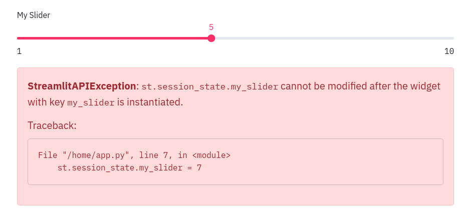
- Setting the widget state via the Session State API and using the `value` parameter in the widget declaration is not recommended, and will throw a warning on the first run. For example:
```python
st.session_state.my_slider = 7
slider = st.slider(
label='Choose a Value', min_value=1,
max_value=10, value=5, key='my_slider')
```
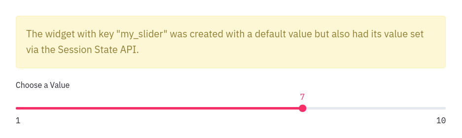
- Setting the state of button-like widgets: `st.button`, `st.download_button`, and `st.file_uploader` via the Session State API is not allowed. Such type of widgets are by default _False_ and have ephemeral _True_ states which are only valid for a single run. For example:
```python
if 'my_button' not in st.session_state:
st.session_state.my_button = True
st.button('My button', key='my_button')
# Throws an exception!
```
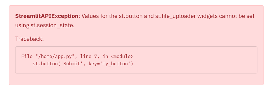
---
Source: https://docs.streamlit.io/develop/api-reference/caching-and-state/st.context
* Function signature:
st.context()
* Function signature:
context.cookies
* Function signature:
context.headers
* Function signature:
context.ip_address
* Function signature:
context.is_embedded
* Function signature:
context.locale
* Function signature:
context.theme
* Parameters:
| name | type | default | description |
|---|---|---|---|
| type | "light", "dark" | | The theme type inferred from the background color of the app. |
* Function signature:
context.timezone
* Function signature:
context.timezone_offset
* Function signature:
context.url
---
Source: https://docs.streamlit.io/develop/api-reference/caching-and-state/st.query_params
## st.query_params
`st.query_params` provides a dictionary-like interface to access query parameters in your app's URL and is available as of Streamlit 1.30.0. It behaves similarly to `st.session_state` with the notable exception that keys may be repeated in an app's URL. Handling of repeated keys requires special consideration as explained below.
`st.query_params` can be used with both key and attribute notation. For example, `st.query_params.my_key` and `st.query_params["my_key"]`. All keys and values will be set and returned as strings. When you write to `st.query_params`, key-value pair prefixed with `?` is added to the end of your app's URL. Each additional pair is prefixed with `` instead of `?`. Query parameters are cleared when navigating between pages in a multipage app.
For example, consider the following URL:
```javascript
https://your_app.streamlit.app/?first_key=1=two=true
```
The parameters in the URL above will be accessible in `st.query_params` as:
```python
{
"first_key" : "1",
"second_key" : "two",
"third_key" : "true"
}
```
This means you can use those parameters in your app like this:
```python
# You can read query params using key notation
if st.query_params["first_key"] == "1":
do_something()
# ...or using attribute notation
if st.query_params.second_key == "two":
do_something_else()
# And you can change a param by just writing to it
st.query_params.first_key = 2 # This gets converted to str automatically
```
### Repeated keys
When a key is repeated in your app's URL (`?a=1=2=3`), dict-like methods will return only the last value. In this example, `st.query_params["a"]` returns `"3"`. To get all keys as a list, use the [`.get_all()`](/develop/api-reference/caching-and-state/st.query_params#stquery_paramsget_all) method shown below. To set the value of a repeated key, assign the values as a list. For example, `st.query_params.a = ["1", "2", "3"]` produces the repeated key given at the beginning of this paragraph.
### Limitation
`st.query_params` can't get or set embedding settings as described in [Embed your app](/deploy/streamlit-community-cloud/share-your-app/embed-your-app#embed-options). `st.query_params.embed` and `st.query_params.embed_options` will raise an `AttributeError` or `StreamlitAPIException` when trying to get or set their values, respectively.
* Function signature:
st.query_params.clear()
* Returns: None
* Function signature:
st.query_params.from_dict(params)
* Parameters:
| name | type | default | description |
|---|---|---|---|
| params | dict | | A dictionary used to replace the current query parameters. |
* Function signature:
st.query_params.get_all(key)
* Parameters:
| name | type | default | description |
|---|---|---|---|
| key | str | | The label of the query parameter in the URL. |
* Returns: List[str]
A list of values associated to the given key. May return zero, one,
or multiple values.
* Function signature:
st.query_params.to_dict()
* Returns: Dict[str,str]
A dictionary of the current query parameters in the app's URL.
---
Source: https://docs.streamlit.io/develop/api-reference/caching-and-state/st.experimental_get_query_params
[Function 'streamlit.experimental_get_query_params' not found]
---
Source: https://docs.streamlit.io/develop/api-reference/caching-and-state/st.experimental_set_query_params
[Function 'streamlit.experimental_set_query_params' not found]
---
# Connections and databases
Source: https://docs.streamlit.io/develop/api-reference/connections
## Setup your connection
alt="screenshot" src="/images/api/connection.svg" />
Create a connection
Connect to a data source or API
```python
conn = st.connection('pets_db', type='sql')
pet_owners = conn.query('select * from pet_owners')
st.dataframe(pet_owners)
```
## Built-in connections
alt="screenshot" src="/images/api/connections.SnowflakeConnection.svg" />
SnowflakeConnection
A connection to Snowflake.
```python
conn = st.connection('snowflake')
```
alt="screenshot" src="/images/api/connections.SQLConnection.svg" />
SQLConnection
A connection to a SQL database using SQLAlchemy.
```python
conn = st.connection('sql')
```
## Third-party connections
Connection base class
Build your own connection with `BaseConnection`.
```python
class MyConnection(BaseConnection[myconn.MyConnection]):
def _connect(self, **kwargs) -> MyConnection:
return myconn.connect(**self._secrets, **kwargs)
def query(self, query):
return self._instance.query(query)
```
## Secrets
Secrets singleton
Access secrets from a local TOML file.
```python
key = st.secrets["OpenAI_key"]
```
Secrets file
Save your secrets in a per-project or per-profile TOML file.
```python
OpenAI_key = ""
```
## Deprecated classes
{true}>
SnowparkConnection
A connection to Snowflake.
```python
conn = st.connection("snowpark")
```
---
Source: https://docs.streamlit.io/develop/api-reference/connections/st.secrets
## st.secrets
`st.secrets` provides a dictionary-like interface to access secrets stored in a `secrets.toml` file. It behaves similarly to `st.session_state`. `st.secrets` can be used with both key and attribute notation. For example, `st.secrets.your_key` and `st.secrets["your_key"]` refer to the same value. For more information about using `st.secrets`, see [Secrets management](/develop/concepts/connections/secrets-management).
### secrets.toml
By default, secrets can be saved globally or per-project. When both types of secrets are saved, Streamlit will combine the saved values but give precedence to per-project secrets if there are duplicate keys. For information on how to format and locate your `secrets.toml` file for your development environment, see [`secrets.toml`](/develop/api-reference/connections/secrets.toml).
### Configure secrets locations
You can configure where Streamlit searches for secrets through the configuration option, [`secrets.files`](/develop/api-reference/configuration/config.toml#secrets). With this option, you can list additional secrets locations and change the order of precedence. You can specify other TOML files or include Kubernetes style secret files.
#### Example
```toml
OpenAI_key = "your OpenAI key"
whitelist = ["sally", "bob", "joe"]
[database]
user = "your username"
password = "your password"
```
In your Streamlit app, the following values would be true:
```python
st.secrets["OpenAI_key"] == "your OpenAI key"
"sally" in st.secrets.whitelist
st.secrets["database"]["user"] == "your username"
st.secrets.database.password == "your password"
```
---
Source: https://docs.streamlit.io/develop/api-reference/connections/secrets.toml
## secrets.toml
`secrets.toml` is an optional file you can define for your working directory or global development environment. When `secrets.toml` is defined both globally and in your working directory, Streamlit combines the secrets and gives precendence to the working-directory secrets. For more information, see [Secrets management](/develop/concepts/connections/secrets-management).
### File location
To define your secrets locally or per-project, add `.streamlit/secrets.toml` to your working directory. Your working directory is wherever you call `streamlit run`. If you haven't previously created the `.streamlit` directory, you will need to add it.
To define your configuration globally, you must first locate your global `.streamlit` directory. Streamlit adds this hidden directory to your OS user profile during installation. For MacOS/Linux, this will be `~/.streamlit/secrets.toml`. For Windows, this will be `%userprofile%/.streamlit/secrets.toml`.
Optionally, you can change where Streamlit searches for secrets through the configuration option, [`secrets.files`](/develop/api-reference/configuration/config.toml#secrets).
### File format
`secrets.toml` is a [TOML](https://toml.io/en/) file.
#### Example
```toml
OpenAI_key = "your OpenAI key"
whitelist = ["sally", "bob", "joe"]
[database]
user = "your username"
password = "your password"
```
In your Streamlit app, the following values would be true:
```python
st.secrets["OpenAI_key"] == "your OpenAI key"
"sally" in st.secrets.whitelist
st.secrets["database"]["user"] == "your username"
st.secrets.database.password == "your password"
```
---
Source: https://docs.streamlit.io/develop/api-reference/connections/st.connection
This page only contains the `st.connection` API. For a deeper dive into creating and managing data connections within Streamlit apps, read [Connecting to data](/develop/concepts/connections/connecting-to-data).
* Function signature:
st.connection(name, type=None, max_entries=None, ttl=None, **kwargs)
* Parameters:
| name | type | default | description |
|---|---|---|---|
| name | str | | The connection name used for secrets lookup in secrets.toml. Streamlit uses secrets under [connections.] for the connection. type will be inferred if name is one of the following: "snowflake", "snowpark", or "sql". |
| type | str, connection class, or None | | The type of connection to create. This can be one of the following: None (default): Streamlit will infer the connection type from name. If the type is not inferable from name, the type must be specified in secrets.toml instead. "snowflake": Streamlit will initialize a connection with SnowflakeConnection. "snowflake-callers-rights": Streamlit will initialize a "snowflake"-type connection, except the connection uses the current viewer's identity tokens instead of the app's connection configuration. "snowpark": Streamlit will initialize a connection with SnowparkConnection. This is deprecated. "sql": Streamlit will initialize a connection with SQLConnection. A string path to an importable class: This must be a dot-separated module path ending in the importable class. Streamlit will import the class and initialize a connection with it. The class must extend st.connections.BaseConnection. An imported class reference: Streamlit will initialize a connection with the referenced class, which must extend st.connections.BaseConnection. Important Connections of type "snowflake-callers-rights" only work when they run in a Snowflake Snowpark Container Services environment. If they are used in a local environment, they will raise exceptions. For local development, use an environment variable or secret to logically switch between a "snowflake" and "snowflake-callers-rights" connection depending on the runtime environment. |
| max_entries | int or None | | The maximum number of connections to keep in the cache. If this is None (default), the cache is unbounded. Otherwise, when a new entry is added to a full cache, the oldest cached entry is removed. |
| ttl | float, timedelta, or None | | The maximum number of seconds to keep results in the cache. If this is None (default), cached results do not expire with time. |
| **kwargs | any | | Connection-specific keyword arguments that are passed to the connection's ._connect() method. **kwargs are typically combined with (and take precedence over) key-value pairs in secrets.toml. To learn more, see the specific connection's documentation. |
* Returns: Subclass of BaseConnection
An initialized connection object of the specified type.
For a comprehensive overview of this feature, check out this video tutorial by Joshua Carroll, Streamlit's Product Manager for Developer Experience. You'll learn about the feature's utility in creating and managing data connections within your apps by using real-world examples.
---
Source: https://docs.streamlit.io/develop/api-reference/connections/st.connections.snowflakeconnection
This page only contains the `st.connections.SnowflakeConnection` class. For a deeper dive into creating and managing data connections within Streamlit apps, see [Connect Streamlit to Snowflake](/develop/tutorials/databases/snowflake) and [Connecting to data](/develop/concepts/connections/connecting-to-data).
* Function signature:
st.connections.SnowflakeConnection(connection_name, **kwargs)
* Function signature:
SnowflakeConnection.cursor()
* Returns: snowflake.connector.cursor.SnowflakeCursor
A cursor object for the connection.
* Function signature:
SnowflakeConnection.query(sql, *, ttl=None, show_spinner="Running `snowflake.query(...)`.", params=None, **kwargs)
* Parameters:
| name | type | default | description |
|---|---|---|---|
| sql | str | | The read-only SQL query to execute. |
| ttl | float, int, timedelta or None | | The maximum number of seconds to keep results in the cache. If this is None (default), cached results do not expire with time. |
| show_spinner | boolean or string | to | Whether to enable the spinner. When a cached query is executed, no spinner is displayed because the result is immediately available. When a new query is executed, the default is to show a spinner with the message "Running snowflake.query(...)." If this is False, no spinner displays while executing the query. If this is a string, the string will be used as the message for the spinner. |
| params | list, tuple, dict or None | s | List of parameters to pass to the Snowflake Connector for Python Cursor.execute() method. This connector supports binding data to a SQL statement using qmark bindings. For more information and examples, see the Snowflake Connector for Python documentation. This defaults to None. |
* Returns: pandas.DataFrame
The result of running the query, formatted as a pandas DataFrame.
* Function signature:
SnowflakeConnection.raw_connection
* Returns: snowflake.connector.connection.SnowflakeConnection
The connection object.
* Function signature:
SnowflakeConnection.reset()
* Returns: None
* Function signature:
SnowflakeConnection.session()
* Returns: snowflake.snowpark.Session
A new Snowpark session for this connection.
* Function signature:
SnowflakeConnection.write_pandas(df, table_name, database=None, schema=None, chunk_size=None, **kwargs)
* Parameters:
| name | type | default | description |
|---|---|---|---|
| df | pandas.DataFrame | | The pandas.DataFrame object containing the data to be copied into the table. |
| table_name | str | | Name of the table where the data should be copied to. |
| database | str | | Name of the database containing the table. By default, the function writes to the database that is currently in use in the session. Note If you specify this parameter, you must also specify the schema parameter. |
| schema | str | | Name of the schema containing the table. By default, the function writes to the table in the schema that is currently in use in the session. |
| chunk_size | int | | Number of elements to insert at a time. By default, the function inserts all elements in one chunk. |
| **kwargs | Any | | Additional keyword arguments for snowflake.connector.pandas_tools.write_pandas(). |
* Returns: tuple[bool, int, int]
A tuple containing three values:
A boolean value that is True if the write was successful.
An integer giving the number of chunks of data that were copied.
An integer giving the number of rows that were inserted.
---
Source: https://docs.streamlit.io/develop/api-reference/connections/st.connections.sqlconnection
This page only contains the `st.connections.SQLConnection` class. For a deeper dive into creating and managing data connections within Streamlit apps, read [Connecting to data](/develop/concepts/connections/connecting-to-data).
* Function signature:
st.connections.SQLConnection(connection_name, **kwargs)
* Function signature:
SQLConnection.connect()
* Returns: sqlalchemy.engine.Connection
A new SQLAlchemy connection object.
* Function signature:
SQLConnection.query(sql, *, show_spinner="Running `sql.query(...)`.", ttl=None, index_col=None, chunksize=None, params=None, **kwargs)
* Parameters:
| name | type | default | description |
|---|---|---|---|
| sql | str | | The read-only SQL query to execute. |
| show_spinner | boolean or string | to | Enable the spinner. The default is to show a spinner when there is a "cache miss" and the cached resource is being created. If a string, the value of the show_spinner param will be used for the spinner text. |
| ttl | float, int, timedelta or None | None | The maximum number of seconds to keep results in the cache, or None if cached results should not expire. The default is None. |
| index_col | str, list of str, or None | None | Column(s) to set as index(MultiIndex). Default is None. |
| chunksize | int or None | None | If specified, return an iterator where chunksize is the number of rows to include in each chunk. Default is None. |
| params | list, tuple, dict or None | None | List of parameters to pass to the execute method. The syntax used to pass parameters is database driver dependent. Check your database driver documentation for which of the five syntax styles, described in PEP 249 paramstyle, is supported. Default is None. |
| **kwargs | dict | | Additional keyword arguments are passed to pandas.read_sql. |
* Returns: pandas.DataFrame
The result of running the query, formatted as a pandas DataFrame.
* Function signature:
SQLConnection.reset()
* Returns: None
* Function signature:
SQLConnection.driver
* Returns: str
The name of the driver. For example, "pyodbc" or "psycopg2".
* Function signature:
SQLConnection.engine
* Returns: sqlalchemy.engine.base.Engine
The underlying SQLAlchemy Engine.
* Function signature:
SQLConnection.session
* Returns: sqlalchemy.orm.Session
A SQLAlchemy Session.
---
Source: https://docs.streamlit.io/develop/api-reference/connections/st.connections.baseconnection
This page only contains information on the `st.connections.BaseConnection` class. For a deeper dive into creating and managing data connections within Streamlit apps, read [Connecting to data](/develop/concepts/connections/connecting-to-data).
* Function signature:
st.connections.BaseConnection(connection_name, **kwargs)
* Function signature:
BaseConnection.reset()
* Returns: None
* Function signature:
BaseConnection.close()
* Returns: None
* Function signature:
BaseConnection.scope(cls)
* Returns: "global" or "session"
---
Source: https://docs.streamlit.io/develop/api-reference/connections/st.experimental_connection
This is an experimental feature. Experimental features and their APIs may change or be removed at any time. To learn more, click [here](/develop/quick-reference/prerelease#experimental-features).
This page only contains the `st.experimental_connection` API. For a deeper dive into creating and managing data connections within Streamlit apps, read [Connecting to data](/develop/concepts/connections/connecting-to-data).
[Function 'streamlit.experimental_connection' not found]
---
Source: https://docs.streamlit.io/develop/api-reference/connections/st.connections.snowparkconnection
This page only contains the `st.connections.SnowparkConnection` class. For a deeper dive into creating and managing data connections within Streamlit apps, read [Connecting to data](/develop/concepts/connections/connecting-to-data).
* Function signature:
st.connections.SnowparkConnection(connection_name, **kwargs)
---
Source: https://docs.streamlit.io/develop/api-reference/connections/st.connections.experimentalbaseconnection
This is an experimental feature. Experimental features and their APIs may change or be removed at any time. To learn more, click [here](/develop/quick-reference/prerelease#experimental-features).
This page only contains information on the `st.connections.ExperimentalBaseConnection` class. For a deeper dive into creating and managing data connections within Streamlit apps, read [Connecting to data](/develop/concepts/connections/connecting-to-data).
* Function signature:
st.connections.ExperimentalBaseConnection(connection_name, **kwargs)
---
# Custom components
Source: https://docs.streamlit.io/develop/api-reference/custom-components
Streamlit custom components extend your app beyond built-in widgets with custom UI elements. V2 components offer better performance and multiple callbacks without iframes, while V1 components run in iframes with single callbacks.
## V2 custom components
### Backend (Python)
Mount a custom component.
```python
my_component = st.components.v2.component(
html=HTML,
js=JS
)
my_component()
```
### Frontend (TypeScript)
npm support code
Support code published through npm.
```bash
npm i @streamlit/component-v2-lib
```
FrontendRenderer
Type alias for the component function.
```typescript
import { FrontendRenderer } from "@streamlit/component-v2-lib";
```
FrontendRendererArgs
Type alias for the component arguments.
```typescript
import { FrontendRendererArgs } from "@streamlit/component-v2-lib";
```
FrontendState
Type alias for the component state.
```typescript
import { FrontendState } from "@streamlit/component-v2-lib";
```
CleanupFunction
Type alias for the component cleanup function.
```typescript
import { CleanupFunction } from "@streamlit/component-v2-lib";
```
## V1 custom components
Declare a component
Create and register a custom component.
```python
from st.components.v1 import declare_component
declare_component(
"custom_slider",
"/frontend",
)
```
HTML
Display an HTML string in an iframe.
```python
from st.components.v1 import html
html(
"
Foo bar.
"
)
```
iframe
Load a remote URL in an iframe.
```python
from st.components.v1 import iframe
iframe(
"docs.streamlit.io"
)
```
---
Source: https://docs.streamlit.io/develop/api-reference/custom-components/st.components.v2.component
* Function signature:
st.components.v2.component(name, *, html=None, css=None, js=None, isolate_styles=True)
* Parameters:
| name | type | default | description |
|---|---|---|---|
| name | str | | A short, descriptive identifier for the component. This is used internally by Streamlit to manage instances of the component. Component names must be unique across an app. The names of imported components are prefixed by their module name to avoid collisions. If you register multiple components with the same name, a warning is logged and the last-registered component is used. Because this can lead to unexpected behavior, ensure that component names are unique. If you intend to have multiple instances of a component in one app, avoid wrapping a component definition together with its mounting command so you don't re-register your component with each instance. |
| html | str or None | | Inline HTML markup for the component root. This can be one of the following strings: Raw HTML. This doesn't require any , , or tags; just provide the inner HTML. A path or glob to an HTML file, relative to the component's asset directory. If any HTML depends on data passed at mount time, use a placeholder element and populate it via JavaScript. Alternatively, you can append a new element to the parent. For more information, see Example 2. |
| css | str or None | | Inline CSS. This can be one of the following strings: Raw CSS (without a block). A path or glob to a CSS file, relative to the component's asset directory. |
| js | str or None | | Inline JavaScript. This can be one of the following strings: Raw JavaScript (without a block). A path or glob to a JS file, relative to the component's asset directory. |
| isolate_styles | bool | | Whether to sandbox the component styles in a shadow root. If this is True (default), the component's HTML is mounted inside a shadow DOM and, in your component's JavaScript, parentElement returns a ShadowRoot. If this is False, the component's HTML is mounted directly into the app's DOM tree, and parentElement returns a regular HTMLElement. |
* Returns: ComponentRenderer
The component's mounting command.
This callable accepts the component parameters like key and
data and returns a BidiComponentResult object with the
component's state. The mounting command can be included in a
user-friendly wrapper function to provide a simpler API. A mounting
command can be called multiple times in an app to create multiple
instances of the component.
---
Source: https://docs.streamlit.io/develop/api-reference/custom-components/st.components.v2.types.componentrenderer
* Function signature:
ComponentRenderer(*args, **kwargs)
* Parameters:
| name | type | default | description |
|---|---|---|---|
| key | str or None | | An optional string to use as the unique key for the component instance. If this is omitted, an internal key is generated for the component instance based on its mounting parameters. No two Streamlit elements may have the same key. When a key is defined, the component's state is available in Session State via the key. Note If you want to access this key in your component's frontend, you must pass it explicitly within the data parameter. The key parameter in ComponentRenderer is not the same as the key property in FrontendRendererArgs in the component's frontend code. The frontend key is automatically generated to be unique among all instances of all components and to avoid collisions with classes and IDs in the app's DOM. |
| data | Any or None | | Data to pass to the component. This can be one of the following: A JSON-serializable object, like Dict[str, str | int] or List[str]. An Arrow-serializable object, like pandas.DataFrame. Raw bytes. A dictionary of JSON-serializable and Arrow-serializable objects. The dictionary's keys must be Python primitives. Because this data is sent to the frontend, it must be serializable by one of the supported serialization methods (JSON, Arrow, or raw bytes). You can't pass arbitrary Python objects. Arrow-serialization is only supported at the top level of the data parameter or one level deep in a dictionary. Raw bytes are only supported at the top level. |
| default | dict[str, Any] or None | state | Default state values for the component. Each key in the dictionary must correspond to a valid state attribute with an on__change callback. This callback can be empty, but must be included as a parameter when the component is mounted. Trigger values do not support manual defaults. All trigger and state values defined by an associated callback are initialized to None by default. |
| width | "stretch", "content", or int | | Width of the component. This can be one of the following: "stretch" (default): The component is wrapped in a with CSS style width: 100%;. "content": The component is wrapped in a with CSS style width: fit-content;. An integer specifying the width in pixels: The component is wrapped in a with the specified pixel width. You are responsible for ensuring the component's inner HTML content is responsive to the wrapper. |
| height | "content", "stretch", or int | | Height of the component. This can be one of the following: "content" (default): The component is wrapped in a with CSS style height: auto;. "stretch": The component is wrapped in a with CSS style height: 100%;. An integer specifying the height in pixels: The component is wrapped in a with the specified pixel height. If the component content is larger than the specified height, scrolling is enabled. Note Use scrolling containers sparingly. If you use scrolling containers, avoid heights that exceed 500 pixels. Otherwise, the scroll surface of the container might cover the majority of the screen on mobile devices, which makes it hard to scroll the rest of the app. If you want to disable scrolling for a fixed-height component, include an inner wrapper in your component's HTML to control the overflow behavior. You are responsible for ensuring the component's inner HTML content is responsive to the wrapper. |
| **callbacks | Callable or None | | Callbacks with the naming pattern on__change for each state and trigger key. For example, if your component has a state key of "value" and a trigger key of "click", its callbacks can include on_value_change and on_click_change. Only names that follow this pattern are recognized. Custom components don't currently support callbacks with arguments. Callbacks are required for any state values defined in the default parameter. Otherwise, a callback is optional. To ensure your component's result always returns the expected attributes, you can pass empty callbacks like lambda: None. |
* Returns: BidiComponentResult
Component state object that exposes state and trigger values.
* Function signature:
BidiComponentResult
* Parameters:
| name | type | default | description |
|---|---|---|---|
| <state_keys> | Any | | All state values from the component. State values are persistent across app reruns until explicitly changed. You can have multiple state keys as attributes. |
| <trigger_keys> | Any | | All trigger values from the component. Trigger values are transient and reset to None after one script run. You can have multiple trigger keys as attributes. |
---
Source: https://docs.streamlit.io/develop/api-reference/custom-components/component-v2-lib
## `@streamlit/component-v2-lib`
The [`@streamlit/component-v2-lib`](https://www.npmjs.com/package/@streamlit/component-v2-lib) package provides TypeScript type definitions and utilities for building Streamlit custom components using the v2 API.
### Installation
Install the package from npm:
```bash
npm i @streamlit/component-v2-lib
```
### Package Information
- **Package name**: `@streamlit/component-v2-lib`
- **Registry**: [npm](https://www.npmjs.com/package/@streamlit/component-v2-lib)
- **Purpose**: TypeScript type aliases and utilities for custom components v2
This package enables type-safe development when creating custom Streamlit components with modern JavaScript frameworks.
---
Source: https://docs.streamlit.io/develop/api-reference/custom-components/component-v2-lib-frontendrenderer
* Function signature:
FrontendRenderer<TState extends FrontendState = FrontendState, TData = unknown> = (componentArgs: FrontendRendererArgs<TState, TData>) => CleanupFunction | void
* Parameters:
| name | type | default | description |
|---|---|---|---|
| FrontendRendererArgs | FrontendRendererArgs<TState, TData> | | The inputs and utilities provided by Streamlit to your component. |
* Returns: CleanupFunction | void
An optional cleanup function that Streamlit will call when the component is unmounted.
---
Source: https://docs.streamlit.io/develop/api-reference/custom-components/component-v2-lib-frontendrendererargs
* Function signature:
FrontendRendererArgs<TState extends FrontendState = FrontendState, TData = unknown,>
* Parameters:
| name | type | default | description |
|---|---|---|---|
| data | TData | | The data payload sent from Python through the component's mounting command. This is the primary input for your component, typed by the component author via the TData generic. |
| key | string | | A stable identifier for this component instance generated by Streamlit. This key is independent from the key parameter passed to the component's mounting command in Python. This frontend key is automatically generated to be unique among all instances of all components and to avoid collisions with classes and IDs in the app's DOM. Important If a component is mounted without a key parameter in Python, and one of the parameters in the mounting command changes, then this frontend key may change between app runs. |
| name | string | | The component's name, as registered by Streamlit on the Python side. This is the same as the name parameter passed to st.components.v2.component. |
| parentElement | HTMLElement or ShadowRoot | | The host element for your component. Your HTML, JavaScript, and CSS are mounted inside this container. This is a ShadowRoot if isolate_styles is set to true in the component definition, otherwise it's an HTMLElement.Avoid directly setting the inner HTML of this element, as it may overwrite the HTML, CSS, and JavaScript from the component definition. Instead, update its children or append new elements to it. |
* Function signature:
setStateValue(name, value)
* Parameters:
| name | type | default | description |
|---|---|---|---|
| name | string | | The state key to set. If you are using TypeScript, this should be a key from TState.To assign a value to a state key, in the component's mounting command in Python, an on__change callback isn't required. However, the presence of a callback will ensure that the state key is always present in the result. |
| value | Any | | The value to associate with the key. Type must match the corresponding property type in your TState interface. |
* Returns: None
* Function signature:
setTriggerValue(name, value)
* Parameters:
| name | type | default | description |
|---|---|---|---|
| name | string | | The trigger key to set. If you are using TypeScript, this should be a key from TState.To assign a value to a trigger key, in the component's mounting command in Python, an on__change callback isn't required. However, the presence of a callback will ensure that the trigger key is always present in the result. |
| value | Any | | The value for this trigger. If you are using TypeScript, this should match the corresponding property type in your TState interface. |
* Returns: None
---
Source: https://docs.streamlit.io/develop/api-reference/custom-components/component-v2-lib-frontendstate
* Function signature:
FrontendState = Record<string, unknown>
---
Source: https://docs.streamlit.io/develop/api-reference/custom-components/component-v2-lib-cleanupfunction
* Function signature:
CleanupFunction = () => void
---
Source: https://docs.streamlit.io/develop/api-reference/custom-components/st.components.v1.declare_component
* Function signature:
st.components.v1.declare_component(name, path=None, url=None)
* Parameters:
| name | type | default | description |
|---|---|---|---|
| name | str | | A short, descriptive name for the component, like "slider". |
| path | str, Path, or None | | The path to serve the component's frontend files from. The path should be absolute. If path is None (default), Streamlit will serve the component from the location in url. Either path or url must be specified. If both are specified, then url will take precedence. |
| url | str or None | | The URL that the component is served from. If url is None (default), Streamlit will serve the component from the location in path. Either path or url must be specified. If both are specified, then url will take precedence. |
* Returns: CustomComponent
A CustomComponent that can be called like a function.
Calling the component will create a new instance of the component
in the Streamlit app.
---
Source: https://docs.streamlit.io/develop/api-reference/custom-components/st.components.v1.html
* Function signature:
st.components.v1.html(html, width=None, height=None, scrolling=False, *, tab_index=None)
* Parameters:
| name | type | default | description |
|---|---|---|---|
| html | str | | The HTML string to embed in the iframe. |
| width | int | element | The width of the iframe in CSS pixels. By default, this is the app's default element width. |
| height | int | | The height of the frame in CSS pixels. By default, this is 150. |
| scrolling | bool | | Whether to allow scrolling in the iframe. If this False (default), Streamlit crops any content larger than the iframe and does not show a scrollbar. If this is True, Streamlit shows a scrollbar when the content is larger than the iframe. |
| tab_index | int or None | behavior | Specifies how and if the iframe is sequentially focusable. Users typically use the Tab key for sequential focus navigation. This can be one of the following values: None (default): Uses the browser's default behavior. -1: Removes the iframe from sequential navigation, but still allows it to be focused programmatically. 0: Includes the iframe in sequential navigation in the order it appears in the document but after all elements with a positive tab_index. Positive integer: Includes the iframe in sequential navigation. Elements are navigated in ascending order of their positive tab_index. For more information, see the tabindex documentation on MDN. |
---
Source: https://docs.streamlit.io/develop/api-reference/custom-components/st.components.v1.iframe
* Function signature:
st.components.v1.iframe(src, width=None, height=None, scrolling=False, *, tab_index=None)
* Parameters:
| name | type | default | description |
|---|---|---|---|
| src | str | | The URL of the page to embed. |
| width | int | element | The width of the iframe in CSS pixels. By default, this is the app's default element width. |
| height | int | | The height of the frame in CSS pixels. By default, this is 150. |
| scrolling | bool | | Whether to allow scrolling in the iframe. If this False (default), Streamlit crops any content larger than the iframe and does not show a scrollbar. If this is True, Streamlit shows a scrollbar when the content is larger than the iframe. |
| tab_index | int or None | behavior | Specifies how and if the iframe is sequentially focusable. Users typically use the Tab key for sequential focus navigation. This can be one of the following values: None (default): Uses the browser's default behavior. -1: Removes the iframe from sequential navigation, but still allows it to be focused programmatically. 0: Includes the iframe in sequential navigation in the order it appears in the document but after all elements with a positive tab_index. Positive integer: Includes the iframe in sequential navigation. Elements are navigated in ascending order of their positive tab_index. For more information, see the tabindex documentation on MDN. |
---
# Configuration
Source: https://docs.streamlit.io/develop/api-reference/configuration
Configuration file
Configures the default settings for your app.
```
your-project/
├── .streamlit/
│ └── config.toml
└── your_app.py
```
Get config option
Retrieve a single configuration option.
```python
st.get_option("theme.primaryColor")
```
Set config option
Set a single configuration option. (This is very limited.)
```python
st.set_option("deprecation.showPyplotGlobalUse", False)
```
Set page title, favicon, and more
Configures the default settings of the page.
```python
st.set_page_config(
page_title="My app",
page_icon=":shark:",
)
```
---
Source: https://docs.streamlit.io/develop/api-reference/configuration/config.toml
## config.toml
`config.toml` is an optional file you can define for your working directory or global development environment. When `config.toml` is defined both globally and in your working directory, Streamlit combines the configuration options and gives precedence to the working-directory configuration. Additionally, you can use environment variables and command-line options to override additional configuration options. For more information, see [Configuration options](/develop/concepts/configuration/options).
### File location
To define your configuration locally or per-project, add `.streamlit/config.toml` to your working directory. Your working directory is wherever you call `streamlit run`. If you haven't previously created the `.streamlit` directory, you will need to add it.
To define your configuration globally, you must first locate your global `.streamlit` directory. Streamlit adds this hidden directory to your OS user profile during installation. For MacOS/Linux, this will be `~/.streamlit/config.toml`. For Windows, this will be `%userprofile%/.streamlit/config.toml`.
### File format
`config.toml` is a [TOML](https://toml.io/en/) file.
#### Example
```toml
[client]
showErrorDetails = "none"
[theme]
primaryColor = "#F63366"
backgroundColor = "black"
```
### Available configuration options
Below are all the sections and options you can have in your `.streamlit/config.toml` file. To see all configurations, use the following command in your terminal or CLI:
```bash
streamlit config show
```
#### Global
```toml
[global]
# By default, Streamlit displays a warning when a user sets both a widget
# default value in the function defining the widget and a widget value via
# the widget's key in `st.session_state`.
#
# If you'd like to turn off this warning, set this to True.
#
# Default: false
disableWidgetStateDuplicationWarning = false
# If True, will show a warning when you run a Streamlit-enabled script
# via "python my_script.py".
#
# Default: true
showWarningOnDirectExecution = true
```
#### Logger
```toml
[logger]
# Level of logging for Streamlit's internal logger: "error", "warning",
# "info", or "debug".
#
# Default: "info"
level = "info"
# String format for logging messages. If logger.datetimeFormat is set,
# logger messages will default to `%(asctime)s.%(msecs)03d %(message)s`.
#
# See Python's documentation for available attributes:
# https://docs.python.org/3/library/logging.html#formatter-objects
#
# Default: "%(asctime)s %(message)s"
messageFormat = "%(asctime)s %(message)s"
```
#### Client
```toml
[client]
# Controls whether uncaught app exceptions and deprecation warnings
# are displayed in the browser. This can be one of the following:
#
# - "full" : In the browser, Streamlit displays app deprecation
# warnings and exceptions, including exception types,
# exception messages, and associated tracebacks.
# - "stacktrace" : In the browser, Streamlit displays exceptions,
# including exception types, generic exception messages,
# and associated tracebacks. Deprecation warnings and
# full exception messages will only print to the
# console.
# - "type" : In the browser, Streamlit displays exception types and
# generic exception messages. Deprecation warnings, full
# exception messages, and associated tracebacks only
# print to the console.
# - "none" : In the browser, Streamlit displays generic exception
# messages. Deprecation warnings, full exception
# messages, associated tracebacks, and exception types
# will only print to the console.
# - True : This is deprecated. Streamlit displays "full"
# error details.
# - False : This is deprecated. Streamlit displays "stacktrace"
# error details.
#
# Default: "full"
showErrorDetails = "full"
# Change the visibility of items in the toolbar, options menu,
# and settings dialog (top right of the app).
#
# Allowed values:
# - "auto" : Show the developer options if the app is accessed through
# localhost or through Streamlit Community Cloud as a developer.
# Hide them otherwise.
# - "developer" : Show the developer options.
# - "viewer" : Hide the developer options.
# - "minimal" : Show only options set externally (e.g. through
# Streamlit Community Cloud) or through st.set_page_config.
# If there are no options left, hide the menu.
#
# Default: "auto"
toolbarMode = "auto"
# Controls whether to display the default sidebar page navigation in a
# multi-page app. This only applies when app's pages are defined by the
# `pages/` directory.
#
# Default: true
showSidebarNavigation = true
# Controls whether to show external help links (Google, ChatGPT) in
# error displays. The following values are valid:
# - "auto" (default) : Links are shown only on localhost.
# - True : Links are shown on all domains.
# - False : Links are never shown.
#
# Default: "auto"
showErrorLinks = "auto"
```
#### Runner
```toml
[runner]
# Allows you to type a variable or string by itself in a single line of
# Python code to write it to the app.
#
# Default: true
magicEnabled = true
# Handle script rerun requests immediately, rather than waiting for
# script execution to reach a yield point.
#
# This makes Streamlit much more responsive to user interaction, but it
# can lead to race conditions in apps that mutate session_state data
# outside of explicit session_state assignment statements.
#
# Default: true
fastReruns = true
# Raise an exception after adding unserializable data to Session State.
#
# Some execution environments may require serializing all data in Session
# State, so it may be useful to detect incompatibility during development,
# or when the execution environment will stop supporting it in the future.
#
# Default: false
enforceSerializableSessionState = false
# Adjust how certain 'options' widgets like radio, selectbox, and
# multiselect coerce Enum members.
#
# This is useful when the Enum class gets re-defined during a script
# re-run. For more information, check out the docs:
# https://docs.streamlit.io/develop/concepts/design/custom-classes#enums
#
# Allowed values:
# - "off" : Disables Enum coercion.
# - "nameOnly" : Enum classes can be coerced if their member names match.
# - "nameAndValue" : Enum classes can be coerced if their member names AND
# member values match.
#
# Default: "nameOnly"
enumCoercion = "nameOnly"
```
#### Server
```toml
[server]
# List of directories to watch for changes.
#
# By default, Streamlit watches files in the current working directory
# and its subdirectories. Use this option to specify additional
# directories to watch. Paths must be absolute.
#
# Default: []
folderWatchList = []
# List of directories to ignore for changes.
#
# By default, Streamlit watches files in the current working directory
# and its subdirectories. Use this option to specify exceptions within
# watched directories. Paths can be absolute or relative to the current
# working directory.
#
# Example: ['/home/user1/env', 'relative/path/to/folder']
#
# Default: []
folderWatchBlacklist = []
# Change the type of file watcher used by Streamlit, or turn it off
# completely.
#
# Allowed values:
# - "auto" : Streamlit will attempt to use the watchdog module, and
# falls back to polling if watchdog isn't available.
# - "watchdog" : Force Streamlit to use the watchdog module.
# - "poll" : Force Streamlit to always use polling.
# - "none" : Streamlit will not watch files.
#
# Default: "auto"
fileWatcherType = "auto"
# Symmetric key used to produce signed cookies. If deploying on multiple
# replicas, this should be set to the same value across all replicas to ensure
# they all share the same secret.
#
# Default: randomly generated secret key.
cookieSecret = "a-random-key-appears-here"
# If false, will attempt to open a browser window on start.
#
# Default: false unless (1) we are on a Linux box where DISPLAY is unset, or
# (2) we are running in the Streamlit Atom plugin.
headless = false
# Whether to show a terminal prompt for the user's email address when
# they run Streamlit (locally) for the first time. If you set
# `server.headless=True`, Streamlit will not show this prompt.
#
# Default: true
showEmailPrompt = true
# Automatically rerun script when the file is modified on disk.
#
# Default: false
runOnSave = false
# The address where the server will listen for client and browser
# connections.
#
# Use this if you want to bind the server to a specific address.
# If set, the server will only be accessible from this address, and not from
# any aliases (like localhost).
#
# Default: (unset)
address =
# The port where the server will listen for browser connections.
#
# Default: 8501
port = 8501
# The base path for the URL where Streamlit should be served from.
#
# Default: ""
baseUrlPath = ""
# Enables support for Cross-Origin Resource Sharing (CORS) protection,
# for added security.
#
# If XSRF protection is enabled and CORS protection is disabled at the
# same time, Streamlit will enable them both instead.
#
# Default: true
enableCORS = true
# Allowed list of origins.
#
# If CORS protection is enabled (`server.enableCORS=True`), use this
# option to set a list of allowed origins that the Streamlit server will
# accept traffic from.
#
# This config option does nothing if CORS protection is disabled.
#
# Example: ['http://example.com', 'https://streamlit.io']
#
# Default: []
corsAllowedOrigins = []
# Enables support for Cross-Site Request Forgery (XSRF) protection, for
# added security.
#
# If XSRF protection is enabled and CORS protection is disabled at the
# same time, Streamlit will enable them both instead.
#
# Default: true
enableXsrfProtection = true
# Max size, in megabytes, for files uploaded with the file_uploader.
#
# Default: 200
maxUploadSize = 200
# Max size, in megabytes, of messages that can be sent via the WebSocket
# connection.
#
# Default: 200
maxMessageSize = 200
# Enables support for websocket compression.
#
# Default: false
enableWebsocketCompression = false
# The interval (in seconds) at which the server pings the client to keep
# the websocket connection alive.
#
# The default value should work for most deployments. However, if you're
# experiencing frequent disconnections in certain proxy setups (e.g.,
# "Connection error" messages), you may want to try adjusting this value.
#
# Note: When you set this option, Streamlit automatically sets the ping
# timeout to match this interval. For Tornado >=6.5, a value less than 30
# may cause connection issues.
websocketPingInterval =
# Enable serving files from a `static` directory in the running app's
# directory.
#
# Default: false
enableStaticServing = false
# TTL in seconds for sessions whose websockets have been disconnected.
#
# The server may choose to clean up session state, uploaded files, etc
# for a given session with no active websocket connection at any point
# after this time has passed. If you are using load balancing or
# replication in your deployment, you must enable session stickiness
# in your proxy to guarantee reconnection to the existing session. For
# more information, see https://docs.streamlit.io/replication.
#
# Default: 120
disconnectedSessionTTL = 120
# Enable the experimental Starlette-based server implementation instead of
# Tornado. This is an experimental feature and may be removed in the future.
#
# Default: false
useStarlette = false
# Server certificate file for connecting via HTTPS.
# Must be set at the same time as "server.sslKeyFile".
#
# ['DO NOT USE THIS OPTION IN A PRODUCTION ENVIRONMENT. It has not gone through
# security audits or performance tests. For a production environment, we
# recommend performing SSL termination through a load balancer or reverse
# proxy.']
sslCertFile =
# Cryptographic key file for connecting via HTTPS.
# Must be set at the same time as "server.sslCertFile".
#
# ['DO NOT USE THIS OPTION IN A PRODUCTION ENVIRONMENT. It has not gone through
# security audits or performance tests. For a production environment, we
# recommend performing SSL termination through a load balancer or reverse
# proxy.']
sslKeyFile =
```
#### Browser
```toml
[browser]
# Internet address where users should point their browsers in order to
# connect to the app. Can be IP address or DNS name and path.
#
# This is used to:
# - Set the correct URL for CORS and XSRF protection purposes.
# - Show the URL on the terminal
# - Open the browser
#
# Default: "localhost"
serverAddress = "localhost"
# Whether to send usage statistics to Streamlit.
#
# Default: true
gatherUsageStats = true
# Port where users should point their browsers in order to connect to the
# app.
#
# This is used to:
# - Set the correct URL for XSRF protection purposes.
# - Show the URL on the terminal (part of `streamlit run`).
# - Open the browser automatically (part of `streamlit run`).
#
# This option is for advanced use cases. To change the port of your app, use
# `server.Port` instead.
#
# Default: whatever value is set in server.port.
serverPort = 8501
```
#### Mapbox
```toml
[mapbox]
# If you'd like to show maps using Mapbox rather than Carto, use this
# to pass the Mapbox API token.
#
# THIS IS DEPRECATED.
#
# Instead of this, you should use either the MAPBOX_API_KEY environment
# variable or PyDeck's `api_keys` argument.
#
# This option will be removed on or after 2026-05-01.
#
# Default: ""
token = ""
```
#### Theme
To define switchable light and dark themes, the configuration options in the
`[theme]` table can be used in separate `[theme.dark]` and `[theme.light]`
tables, except for the following options:
- `base`
- `fontFaces`
- `baseFontSize`
- `baseFontWeight`
- `showSidebarBorder`
- `chartCategoricalColors`
- `chartSequentialColors`
- `chartDivergingColors`
Additionally, everything in `[theme.sidebar]` can be configured in separate `[theme.dark.sidebar]` and `[theme.light.sidebar]` tables.
```toml
[theme]
# The theme that your custom theme inherits from.
#
# This can be one of the following:
# - "light": Streamlit's default light theme.
# - "dark" : Streamlit's default dark theme.
# - A local file path to a TOML theme file: A local custom theme, like
# "themes/custom.toml".
# - A URL to a TOML theme file: An externally hosted custom theme, like
# "https://example.com/theme.toml".
#
# A TOML theme file must contain a [theme] table with theme options.
# Any theme options defined in the app's config.toml file will override
# those defined in the TOML theme file.
base =
# Primary accent color.
primaryColor =
# Background color of the app.
backgroundColor =
# Background color used for most interactive widgets.
secondaryBackgroundColor =
# Color used for almost all text.
textColor =
# Red color used in the basic color palette.
#
# By default, this is #ff4b4b for the light theme and #ff2b2b for the
# dark theme.
#
# If `redColor` is provided, and `redBackgroundColor` isn't, then
# `redBackgroundColor` will be derived from `redColor` using 10%
# opacity for the light theme and 20% opacity for the dark theme.
redColor =
# Orange color used in the basic color palette.
#
# By default, this is #ffa421 for the light theme and #ff8700 for the
# dark theme.
#
# If `orangeColor` is provided, and `orangeBackgroundColor` isn't, then
# `orangeBackgroundColor` will be derived from `orangeColor` using 10%
# opacity for the light theme and 20% opacity for the dark theme.
orangeColor =
# Yellow color used in the basic color palette.
#
# By default, this is #faca2b for the light theme and #ffe312 for the
# dark theme.
#
# If `yellowColor` is provided, and `yellowBackgroundColor` isn't, then
# `yellowBackgroundColor` will be derived from `yellowColor` using 10%
# opacity for the light theme and 20% opacity for the dark theme.
yellowColor =
# Blue color used in the basic color palette.
#
# By default, this is #1c83e1 for the light theme and #0068c9 for the
# dark theme.
#
# If a `blueColor` is provided, and `blueBackgroundColor` isn't, then
# `blueBackgroundColor` will be derived from `blueColor` using 10%
# opacity for the light theme and 20% opacity for the dark theme.
blueColor =
# Green color used in the basic color palette.
#
# By default, this is #21c354 for the light theme and #09ab3b for the
# dark theme.
#
# If `greenColor` is provided, and `greenBackgroundColor` isn't, then
# `greenBackgroundColor` will be derived from `greenColor` using 10%
# opacity for the light theme and 20% opacity for the dark theme.
greenColor =
# Violet color used in the basic color palette.
#
# By default, this is #803df5 for both the light and dark themes.
#
# If a `violetColor` is provided, and `violetBackgroundColor` isn't, then
# `violetBackgroundColor` will be derived from `violetColor` using 10%
# opacity for the light theme and 20% opacity for the dark theme.
violetColor =
# Gray color used in the basic color palette.
#
# By default, this is #a3a8b8 for the light theme and #555867 for the
# dark theme.
#
# If `grayColor` is provided, and `grayBackgroundColor` isn't, then
# `grayBackgroundColor` will be derived from `grayColor` using 10%
# opacity for the light theme and 20% opacity for the dark theme.
grayColor =
# Red background color used in the basic color palette.
#
# If `redColor` is provided, this defaults to `redColor` using 10%
# opacity for the light theme and 20% opacity for the dark theme.
#
# Otherwise, this is #ff2b2b with 10% opacity for light theme and
# #ff6c6c with 20% opacity for dark theme.
redBackgroundColor =
# Orange background color used for the basic color palette.
#
# If `orangeColor` is provided, this defaults to `orangeColor` using 10%
# opacity for the light theme and 20% opacity for the dark theme.
#
# Otherwise, this is #ffa421 with 10% opacity for the light theme and
# #ff8700 with 20% opacity for the dark theme.
orangeBackgroundColor =
# Yellow background color used for the basic color palette.
#
# If `yellowColor` is provided, this defaults to `yellowColor` using 10%
# opacity for the light theme and 20% opacity for the dark theme.
#
# Otherwise, this is #ffff12 with 10% opacity for the light theme and
# #ffff12 with 20% opacity for the dark theme.
yellowBackgroundColor =
# Blue background color used for the basic color palette.
#
# If `blueColor` is provided, this defaults to `blueColor` using 10%
# opacity for the light theme and 20% opacity for the dark theme.
#
# Otherwise, this is #1c83ff with 10% opacity for the light theme and
# #3d9df3 with 20% opacity for the dark theme.
blueBackgroundColor =
# Green background color used for the basic color palette.
#
# If `greenColor` is provided, this defaults to `greenColor` using 10%
# opacity for the light theme and 20% opacity for the dark theme.
#
# Otherwise, this is #21c354 with 10% opacity for the light theme and
# #3dd56d with 20% opacity for the dark theme.
greenBackgroundColor =
# Violet background color used for the basic color palette.
#
# If `violetColor` is provided, this defaults to `violetColor` using 10%
# opacity for the light theme and 20% opacity for the dark theme.
#
# Otherwise, this is #9a5dff with 10% opacity for light theme and
# #9a5dff with 20% opacity for dark theme.
violetBackgroundColor =
# Gray background color used for the basic color palette.
#
# If `grayColor` is provided, this defaults to `grayColor` using 10%
# opacity for the light theme and 20% opacity for the dark theme.
#
# Otherwise, this is #31333f with 10% opacity for the light theme and
# #808495 with 20% opacity for the dark theme.
grayBackgroundColor =
# Red text color used for the basic color palette.
#
# If `redColor` is provided, this defaults to `redColor`, darkened by 15%
# for the light theme and lightened by 15% for the dark theme.
#
# Otherwise, this is #bd4043 for the light theme and #ff6c6c for the dark
# theme.
redTextColor =
# Orange text color used for the basic color palette.
#
# If `orangeColor` is provided, this defaults to `orangeColor`, darkened
# by 15% for the light theme and lightened by 15% for the dark theme.
#
# Otherwise, this is #e2660c for the light theme and #ffbd45 for the dark
# theme.
orangeTextColor =
# Yellow text color used for the basic color palette.
#
# If `yellowColor` is provided, this defaults to `yellowColor`, darkened
# by 15% for the light theme and lightened by 15% for the dark theme.
#
# Otherwise, this is #926c05 for the light theme and #ffffc2 for the dark
# theme.
yellowTextColor =
# Blue text color used for the basic color palette.
#
# If `blueColor` is provided, this defaults to `blueColor`, darkened by
# 15% for the light theme and lightened by 15% for the dark theme.
#
# Otherwise, this is #0054a3 for the light theme and #3d9df3 for the dark
# theme.
blueTextColor =
# Green text color used for the basic color palette.
#
# If `greenColor` is provided, this defaults to `greenColor`, darkened by
# 15% for the light theme and lightened by 15% for the dark theme.
#
# Otherwise, this is #158237 for the light theme and #5ce488 for the dark
# theme.
greenTextColor =
# Violet text color used for the basic color palette.
#
# If `violetColor` is provided, this defaults to `violetColor`, darkened
# by 15% for the light theme and lightened by 15% for the dark theme.
#
# Otherwise, this is #583f84 for the light theme and #b27eff for the dark
# theme.
violetTextColor =
# Gray text color used for the basic color palette.
#
# If `grayColor` is provided, this defaults to `grayColor`, darkened by
# 15% for the light theme and lightened by 15% for the dark theme.
#
# Otherwise, this is #31333f with 60% opacity for the light theme and
# #fafafa with 60% opacity for the dark theme.
grayTextColor =
# Color used for all links.
#
# This defaults to the resolved value of `blueTextColor`.
linkColor =
# Whether or not links should be displayed with an underline.
linkUnderline =
# Text color used for code blocks.
#
# This defaults to the resolved value of `greenTextColor`.
codeTextColor =
# Background color used for code blocks.
codeBackgroundColor =
# The font family for all text, except code blocks.
#
# This can be one of the following:
# - "sans-serif"
# - "serif"
# - "monospace"
# - The `family` value for a custom font table under [[theme.fontFaces]]
# - A URL to a CSS file in the format of ":" (like
# "Nunito:https://fonts.googleapis.com/css2?family=Nunito=swap")
# - A comma-separated list of these (as a single string) to specify
# fallbacks
#
# For example, you can use the following:
#
# font = "cool-font, fallback-cool-font, sans-serif"
font =
# An array of fonts to use in your app.
#
# Each font in the array is a table (dictionary) that can have the
# following attributes, closely resembling CSS font-face definitions:
# - family
# - url
# - weight (optional)
# - style (optional)
# - unicodeRange (optional)
#
# To host a font with your app, enable static file serving with
# `server.enableStaticServing=true`.
#
# You can define multiple [[theme.fontFaces]] tables, including multiple
# tables with the same family if your font is defined by multiple files.
#
# For example, a font hosted with your app may have a [[theme.fontFaces]]
# table as follows:
#
# [[theme.fontFaces]]
# family = "font_name"
# url = "app/static/font_file.woff"
# weight = "400"
# style = "normal"
fontFaces =
# The root font size (in pixels) for the app.
#
# This determines the overall scale of text and UI elements. This is a
# positive integer.
#
# If this isn't set, the font size will be 16px.
baseFontSize =
# The root font weight for the app.
#
# This determines the overall weight of text and UI elements. This is an
# integer multiple of 100. Values can be between 100 and 600, inclusive.
#
# If this isn't set, the font weight will be set to 400 (normal weight).
baseFontWeight =
# The font family to use for headings.
#
# This can be one of the following:
# - "sans-serif"
# - "serif"
# - "monospace"
# - The `family` value for a custom font table under [[theme.fontFaces]]
# - A URL to a CSS file in the format of ":" (like
# "Nunito:https://fonts.googleapis.com/css2?family=Nunito=swap")
# - A comma-separated list of these (as a single string) to specify
# fallbacks
#
# If this isn't set, Streamlit uses `theme.font` for headings.
headingFont =
# One or more font sizes for h1-h6 headings.
#
# If no sizes are set, Streamlit will use the default sizes for h1-h6
# headings. Heading font sizes set in [theme] are not inherited by
# [theme.sidebar]. The following sizes are used by default:
# [
# "2.75rem", # h1 (1.5rem for sidebar)
# "2.25rem", # h2 (1.25rem for sidebar)
# "1.75rem", # h3 (1.125rem for sidebar)
# "1.5rem", # h4 (1rem for sidebar)
# "1.25rem", # h5 (0.875rem for sidebar)
# "1rem", # h6 (0.75rem for sidebar)
# ]
#
# If you specify an array with fewer than six sizes, the unspecified
# heading sizes will be the default values. For example, you can use the
# following array to set the font sizes for h1-h3 headings while keeping
# h4-h6 headings at their default sizes:
# headingFontSizes = ["3rem", "2.875rem", "2.75rem"]
#
# Setting a single value (not in an array) will set the font size for all
# h1-h6 headings to that value:
# headingFontSizes = "2.75rem"
#
# Font sizes can be specified in pixels or rem, but rem is recommended.
headingFontSizes =
# One or more font weights for h1-h6 headings.
#
# If no weights are set, Streamlit will use the default weights for h1-h6
# headings. Heading font weights set in [theme] are not inherited by
# [theme.sidebar]. The following weights are used by default:
# [
# 700, # h1 (bold)
# 600, # h2 (semi-bold)
# 600, # h3 (semi-bold)
# 600, # h4 (semi-bold)
# 600, # h5 (semi-bold)
# 600, # h6 (semi-bold)
# ]
#
# If you specify an array with fewer than six weights, the unspecified
# heading weights will be the default values. For example, you can use
# the following array to set the font weights for h1-h2 headings while
# keeping h3-h6 headings at their default weights:
# headingFontWeights = [800, 700]
#
# Setting a single value (not in an array) will set the font weight for
# all h1-h6 headings to that value:
# headingFontWeights = 500
headingFontWeights =
# The font family to use for code (monospace) in the sidebar.
#
# This can be one of the following:
# - "sans-serif"
# - "serif"
# - "monospace"
# - The `family` value for a custom font table under [[theme.fontFaces]]
# - A URL to a CSS file in the format of ":" (like
# "'Space Mono':https://fonts.googleapis.com/css2?family=Space+Mono=swap")
# - A comma-separated list of these (as a single string) to specify
# fallbacks
codeFont =
# The font size (in pixels or rem) for code blocks and code text.
#
# This applies to font in code blocks, `st.json`, and `st.help`. It
# doesn't apply to inline code, which is set by default to 0.75em.
#
# If this isn't set, the code font size will be 0.875rem.
codeFontSize =
# The font weight for code blocks and code text.
#
# This applies to font in inline code, code blocks, `st.json`, and
# `st.help`. This is an integer multiple of 100. Values can be between
# 100 and 600, inclusive.
#
# If this isn't set, the code font weight will be 400 (normal weight).
codeFontWeight =
# The radius used as basis for the corners of most UI elements.
#
# This can be one of the following:
# - "none"
# - "small"
# - "medium"
# - "large"
# - "full"
# - The number in pixels or rem.
#
# For example, you can use "10px", "0.5rem", or "2rem". To follow best
# practices, use rem instead of pixels when specifying a numeric size.
baseRadius =
# The radius used as basis for the corners of buttons.
#
# This can be one of the following:
# - "none"
# - "small"
# - "medium"
# - "large"
# - "full"
# - The number in pixels or rem.
#
# For example, you can use "10px", "0.5rem", or "2rem". To follow best
# practices, use rem instead of pixels when specifying a numeric size.
#
# If this isn't set, Streamlit uses `theme.baseRadius` instead.
buttonRadius =
# The color of the border around elements.
borderColor =
# The color of the border around dataframes and tables.
#
# If this isn't set, Streamlit uses `theme.borderColor` instead.
dataframeBorderColor =
# The background color of the dataframe's header.
#
# This color applies to all non-interior cells of the dataframe. This
# includes the header row, the row-selection column (if present), and
# the bottom row of data editors with a dynamic number of rows. If this
# isn't set, Streamlit uses a mix of `theme.backgroundColor` and
# `theme.secondaryBackgroundColor`.
dataframeHeaderBackgroundColor =
# Whether to show a border around input widgets.
showWidgetBorder =
# Whether to show a vertical separator between the sidebar and the main
# content area.
showSidebarBorder =
# An array of colors to use for categorical chart data.
#
# This is a list of one or more color strings which are applied in order
# to categorical data. These colors apply to Plotly, Altair, and
# Vega-Lite charts.
#
# Invalid colors are skipped, and colors repeat cyclically if there are
# more categories than colors. If no chart categorical colors are set,
# Streamlit uses a default set of colors.
#
# For light themes, the following colors are the default:
# [
# "#0068c9", # blue80
# "#83c9ff", # blue40
# "#ff2b2b", # red80
# "#ffabab", # red40
# "#29b09d", # blueGreen80
# "#7defa1", # green40
# "#ff8700", # orange80
# "#ffd16a", # orange50
# "#6d3fc0", # purple80
# "#d5dae5", # gray40
# ]
# For dark themes, the following colors are the default:
# [
# "#83c9ff", # blue40
# "#0068c9", # blue80
# "#ffabab", # red40
# "#ff2b2b", # red80
# "#7defa1", # green40
# "#29b09d", # blueGreen80
# "#ffd16a", # orange50
# "#ff8700", # orange80
# "#6d3fc0", # purple80
# "#d5dae5", # gray40
# ]
chartCategoricalColors =
# An array of ten colors to use for sequential or continuous chart data.
#
# The ten colors create a gradient color scale. These colors apply to
# Plotly, Altair, and Vega-Lite charts.
#
# Invalid color strings are skipped. If there are not exactly ten
# valid colors specified, Streamlit uses a default set of colors.
#
# For light themes, the following colors are the default:
# [
# "#e4f5ff", #blue10
# "#c7ebff", #blue20
# "#a6dcff", #blue30
# "#83c9ff", #blue40
# "#60b4ff", #blue50
# "#3d9df3", #blue60
# "#1c83e1", #blue70
# "#0068c9", #blue80
# "#0054a3", #blue90
# "#004280", #blue100
# ]
# For dark themes, the following colors are the default:
# [
# "#004280", #blue100
# "#0054a3", #blue90
# "#0068c9", #blue80
# "#1c83e1", #blue70
# "#3d9df3", #blue60
# "#60b4ff", #blue50
# "#83c9ff", #blue40
# "#a6dcff", #blue30
# "#c7ebff", #blue20
# "#e4f5ff", #blue10
# ]
chartSequentialColors =
# An array of ten colors to use for diverging chart data.
#
# The ten colors create a diverging color scale, typically used for data
# with a meaningful midpoint. These colors apply to Plotly, Altair, and
# Vega-Lite charts.
#
# Invalid color strings are skipped. If there are not exactly ten
# valid colors specified, Streamlit uses a default set of colors.
#
# The default colors are:
# [
# "#7d353b", #red100
# "#bd4043", #red90
# "#ff4b4b", #red70
# "#ff8c8c", #red50
# "#ffc7c7", #red30
# "#a6dcff", #blue30
# "#60b4ff", #blue50
# "#1c83e1", #blue70
# "#0054a3", #blue90
# "#004280", #blue100
# ]
chartDivergingColors =
```
#### Sidebar theme
To define switchable light and dark themes, the configuration options in the
`[theme.sidebar]` table can be used in separate `[theme.dark.sidebar]` and
`[theme.light.sidebar]`.
```toml
[theme.sidebar]
# Primary accent color.
primaryColor =
# Background color of the app.
backgroundColor =
# Background color used for most interactive widgets.
secondaryBackgroundColor =
# Color used for almost all text.
textColor =
# Red color used in the basic color palette.
#
# By default, this is #ff4b4b for the light theme and #ff2b2b for the
# dark theme.
#
# If `redColor` is provided, and `redBackgroundColor` isn't, then
# `redBackgroundColor` will be derived from `redColor` using 10%
# opacity for the light theme and 20% opacity for the dark theme.
redColor =
# Orange color used in the basic color palette.
#
# By default, this is #ffa421 for the light theme and #ff8700 for the
# dark theme.
#
# If `orangeColor` is provided, and `orangeBackgroundColor` isn't, then
# `orangeBackgroundColor` will be derived from `orangeColor` using 10%
# opacity for the light theme and 20% opacity for the dark theme.
orangeColor =
# Yellow color used in the basic color palette.
#
# By default, this is #faca2b for the light theme and #ffe312 for the
# dark theme.
#
# If `yellowColor` is provided, and `yellowBackgroundColor` isn't, then
# `yellowBackgroundColor` will be derived from `yellowColor` using 10%
# opacity for the light theme and 20% opacity for the dark theme.
yellowColor =
# Blue color used in the basic color palette.
#
# By default, this is #1c83e1 for the light theme and #0068c9 for the
# dark theme.
#
# If a `blueColor` is provided, and `blueBackgroundColor` isn't, then
# `blueBackgroundColor` will be derived from `blueColor` using 10%
# opacity for the light theme and 20% opacity for the dark theme.
blueColor =
# Green color used in the basic color palette.
#
# By default, this is #21c354 for the light theme and #09ab3b for the
# dark theme.
#
# If `greenColor` is provided, and `greenBackgroundColor` isn't, then
# `greenBackgroundColor` will be derived from `greenColor` using 10%
# opacity for the light theme and 20% opacity for the dark theme.
greenColor =
# Violet color used in the basic color palette.
#
# By default, this is #803df5 for both the light and dark themes.
#
# If a `violetColor` is provided, and `violetBackgroundColor` isn't, then
# `violetBackgroundColor` will be derived from `violetColor` using 10%
# opacity for the light theme and 20% opacity for the dark theme.
violetColor =
# Gray color used in the basic color palette.
#
# By default, this is #a3a8b8 for the light theme and #555867 for the
# dark theme.
#
# If `grayColor` is provided, and `grayBackgroundColor` isn't, then
# `grayBackgroundColor` will be derived from `grayColor` using 10%
# opacity for the light theme and 20% opacity for the dark theme.
grayColor =
# Red background color used in the basic color palette.
#
# If `redColor` is provided, this defaults to `redColor` using 10%
# opacity for the light theme and 20% opacity for the dark theme.
#
# Otherwise, this is #ff2b2b with 10% opacity for light theme and
# #ff6c6c with 20% opacity for dark theme.
redBackgroundColor =
# Orange background color used for the basic color palette.
#
# If `orangeColor` is provided, this defaults to `orangeColor` using 10%
# opacity for the light theme and 20% opacity for the dark theme.
#
# Otherwise, this is #ffa421 with 10% opacity for the light theme and
# #ff8700 with 20% opacity for the dark theme.
orangeBackgroundColor =
# Yellow background color used for the basic color palette.
#
# If `yellowColor` is provided, this defaults to `yellowColor` using 10%
# opacity for the light theme and 20% opacity for the dark theme.
#
# Otherwise, this is #ffff12 with 10% opacity for the light theme and
# #ffff12 with 20% opacity for the dark theme.
yellowBackgroundColor =
# Blue background color used for the basic color palette.
#
# If `blueColor` is provided, this defaults to `blueColor` using 10%
# opacity for the light theme and 20% opacity for the dark theme.
#
# Otherwise, this is #1c83ff with 10% opacity for the light theme and
# #3d9df3 with 20% opacity for the dark theme.
blueBackgroundColor =
# Green background color used for the basic color palette.
#
# If `greenColor` is provided, this defaults to `greenColor` using 10%
# opacity for the light theme and 20% opacity for the dark theme.
#
# Otherwise, this is #21c354 with 10% opacity for the light theme and
# #3dd56d with 20% opacity for the dark theme.
greenBackgroundColor =
# Violet background color used for the basic color palette.
#
# If `violetColor` is provided, this defaults to `violetColor` using 10%
# opacity for the light theme and 20% opacity for the dark theme.
#
# Otherwise, this is #9a5dff with 10% opacity for light theme and
# #9a5dff with 20% opacity for dark theme.
violetBackgroundColor =
# Gray background color used for the basic color palette.
#
# If `grayColor` is provided, this defaults to `grayColor` using 10%
# opacity for the light theme and 20% opacity for the dark theme.
#
# Otherwise, this is #31333f with 10% opacity for the light theme and
# #808495 with 20% opacity for the dark theme.
grayBackgroundColor =
# Red text color used for the basic color palette.
#
# If `redColor` is provided, this defaults to `redColor`, darkened by 15%
# for the light theme and lightened by 15% for the dark theme.
#
# Otherwise, this is #bd4043 for the light theme and #ff6c6c for the dark
# theme.
redTextColor =
# Orange text color used for the basic color palette.
#
# If `orangeColor` is provided, this defaults to `orangeColor`, darkened
# by 15% for the light theme and lightened by 15% for the dark theme.
#
# Otherwise, this is #e2660c for the light theme and #ffbd45 for the dark
# theme.
orangeTextColor =
# Yellow text color used for the basic color palette.
#
# If `yellowColor` is provided, this defaults to `yellowColor`, darkened
# by 15% for the light theme and lightened by 15% for the dark theme.
#
# Otherwise, this is #926c05 for the light theme and #ffffc2 for the dark
# theme.
yellowTextColor =
# Blue text color used for the basic color palette.
#
# If `blueColor` is provided, this defaults to `blueColor`, darkened by
# 15% for the light theme and lightened by 15% for the dark theme.
#
# Otherwise, this is #0054a3 for the light theme and #3d9df3 for the dark
# theme.
blueTextColor =
# Green text color used for the basic color palette.
#
# If `greenColor` is provided, this defaults to `greenColor`, darkened by
# 15% for the light theme and lightened by 15% for the dark theme.
#
# Otherwise, this is #158237 for the light theme and #5ce488 for the dark
# theme.
greenTextColor =
# Violet text color used for the basic color palette.
#
# If `violetColor` is provided, this defaults to `violetColor`, darkened
# by 15% for the light theme and lightened by 15% for the dark theme.
#
# Otherwise, this is #583f84 for the light theme and #b27eff for the dark
# theme.
violetTextColor =
# Gray text color used for the basic color palette.
#
# If `grayColor` is provided, this defaults to `grayColor`, darkened by
# 15% for the light theme and lightened by 15% for the dark theme.
#
# Otherwise, this is #31333f with 60% opacity for the light theme and
# #fafafa with 60% opacity for the dark theme.
grayTextColor =
# Color used for all links.
#
# This defaults to the resolved value of `blueTextColor`.
linkColor =
# Whether or not links should be displayed with an underline.
linkUnderline =
# Text color used for code blocks.
#
# This defaults to the resolved value of `greenTextColor`.
codeTextColor =
# Background color used for code blocks.
codeBackgroundColor =
# The font family for all text, except code blocks.
#
# This can be one of the following:
# - "sans-serif"
# - "serif"
# - "monospace"
# - The `family` value for a custom font table under [[theme.fontFaces]]
# - A URL to a CSS file in the format of ":" (like
# "Nunito:https://fonts.googleapis.com/css2?family=Nunito=swap")
# - A comma-separated list of these (as a single string) to specify
# fallbacks
#
# For example, you can use the following:
#
# font = "cool-font, fallback-cool-font, sans-serif"
font =
# The font family to use for headings.
#
# This can be one of the following:
# - "sans-serif"
# - "serif"
# - "monospace"
# - The `family` value for a custom font table under [[theme.fontFaces]]
# - A URL to a CSS file in the format of ":" (like
# "Nunito:https://fonts.googleapis.com/css2?family=Nunito=swap")
# - A comma-separated list of these (as a single string) to specify
# fallbacks
#
# If this isn't set, Streamlit uses `theme.font` for headings.
headingFont =
# One or more font sizes for h1-h6 headings.
#
# If no sizes are set, Streamlit will use the default sizes for h1-h6
# headings. Heading font sizes set in [theme] are not inherited by
# [theme.sidebar]. The following sizes are used by default:
# [
# "2.75rem", # h1 (1.5rem for sidebar)
# "2.25rem", # h2 (1.25rem for sidebar)
# "1.75rem", # h3 (1.125rem for sidebar)
# "1.5rem", # h4 (1rem for sidebar)
# "1.25rem", # h5 (0.875rem for sidebar)
# "1rem", # h6 (0.75rem for sidebar)
# ]
#
# If you specify an array with fewer than six sizes, the unspecified
# heading sizes will be the default values. For example, you can use the
# following array to set the font sizes for h1-h3 headings while keeping
# h4-h6 headings at their default sizes:
# headingFontSizes = ["3rem", "2.875rem", "2.75rem"]
#
# Setting a single value (not in an array) will set the font size for all
# h1-h6 headings to that value:
# headingFontSizes = "2.75rem"
#
# Font sizes can be specified in pixels or rem, but rem is recommended.
headingFontSizes =
# One or more font weights for h1-h6 headings.
#
# If no weights are set, Streamlit will use the default weights for h1-h6
# headings. Heading font weights set in [theme] are not inherited by
# [theme.sidebar]. The following weights are used by default:
# [
# 700, # h1 (bold)
# 600, # h2 (semi-bold)
# 600, # h3 (semi-bold)
# 600, # h4 (semi-bold)
# 600, # h5 (semi-bold)
# 600, # h6 (semi-bold)
# ]
#
# If you specify an array with fewer than six weights, the unspecified
# heading weights will be the default values. For example, you can use
# the following array to set the font weights for h1-h2 headings while
# keeping h3-h6 headings at their default weights:
# headingFontWeights = [800, 700]
#
# Setting a single value (not in an array) will set the font weight for
# all h1-h6 headings to that value:
# headingFontWeights = 500
headingFontWeights =
# The font family to use for code (monospace) in the sidebar.
#
# This can be one of the following:
# - "sans-serif"
# - "serif"
# - "monospace"
# - The `family` value for a custom font table under [[theme.fontFaces]]
# - A URL to a CSS file in the format of ":" (like
# "'Space Mono':https://fonts.googleapis.com/css2?family=Space+Mono=swap")
# - A comma-separated list of these (as a single string) to specify
# fallbacks
codeFont =
# The font size (in pixels or rem) for code blocks and code text.
#
# This applies to font in code blocks, `st.json`, and `st.help`. It
# doesn't apply to inline code, which is set by default to 0.75em.
#
# If this isn't set, the code font size will be 0.875rem.
codeFontSize =
# The font weight for code blocks and code text.
#
# This applies to font in inline code, code blocks, `st.json`, and
# `st.help`. This is an integer multiple of 100. Values can be between
# 100 and 600, inclusive.
#
# If this isn't set, the code font weight will be 400 (normal weight).
codeFontWeight =
# The radius used as basis for the corners of most UI elements.
#
# This can be one of the following:
# - "none"
# - "small"
# - "medium"
# - "large"
# - "full"
# - The number in pixels or rem.
#
# For example, you can use "10px", "0.5rem", or "2rem". To follow best
# practices, use rem instead of pixels when specifying a numeric size.
baseRadius =
# The radius used as basis for the corners of buttons.
#
# This can be one of the following:
# - "none"
# - "small"
# - "medium"
# - "large"
# - "full"
# - The number in pixels or rem.
#
# For example, you can use "10px", "0.5rem", or "2rem". To follow best
# practices, use rem instead of pixels when specifying a numeric size.
#
# If this isn't set, Streamlit uses `theme.baseRadius` instead.
buttonRadius =
# The color of the border around elements.
borderColor =
# The color of the border around dataframes and tables.
#
# If this isn't set, Streamlit uses `theme.borderColor` instead.
dataframeBorderColor =
# The background color of the dataframe's header.
#
# This color applies to all non-interior cells of the dataframe. This
# includes the header row, the row-selection column (if present), and
# the bottom row of data editors with a dynamic number of rows. If this
# isn't set, Streamlit uses a mix of `theme.backgroundColor` and
# `theme.secondaryBackgroundColor`.
dataframeHeaderBackgroundColor =
# Whether to show a border around input widgets.
showWidgetBorder =
```
#### Secrets
```toml
[secrets]
# List of locations where secrets are searched.
#
# An entry can be a path to a TOML file or directory path where
# Kubernetes style secrets are saved. Order is important, import is
# first to last, so secrets in later files will take precedence over
# earlier ones.
#
# Default: [ local environment's secrets.toml file>, project's secrets.toml file>,]
files = [ "~/.streamlit/secrets.toml", "~/project directory/.streamlit/secrets.toml",]
```
---
Source: https://docs.streamlit.io/develop/api-reference/configuration/st.get_option
* Function signature:
st.get_option(key)
* Parameters:
| name | type | default | description |
|---|---|---|---|
| key | str | | The config option key of the form "section.optionName". To see all available options, run streamlit config show in a terminal. |
---
Source: https://docs.streamlit.io/develop/api-reference/configuration/st.set_option
* Function signature:
st.set_option(key, value)
* Parameters:
| name | type | default | description |
|---|---|---|---|
| key | str | | The config option key of the form "section.optionName". To see all available options, run streamlit config show in a terminal. |
| value | None | | The new value to assign to this config option. |
---
Source: https://docs.streamlit.io/develop/api-reference/configuration/st.set_page_config
* Function signature:
st.set_page_config(page_title=None, page_icon=None, layout=None, initial_sidebar_state=None, menu_items=None)
* Parameters:
| name | type | default | description |
|---|---|---|---|
| page_title | str or None | | The page title, shown in the browser tab. If this is None (default), the page title is inherited from the previous call of st.set_page_config. If this is None and no previous call exists, the page title is inferred from the page source. If a page source is a Python file, its inferred title is derived from the filename. If a page source is a callable object, its inferred title is derived from the callable's name. |
| page_icon | Anything supported by st.image (except list), str, or None | | The page favicon. If page_icon is None (default), the page icon is inherited from the previous call of st.set_page_config. If this is None and no previous call exists, the favicon is a monochrome Streamlit logo. In addition to the types supported by st.image (except list), the following strings are valid: A single-character emoji. For example, you can set page_icon="🦈". An emoji short code. For example, you can set page_icon=":shark:". For a list of all supported codes, see https://share.streamlit.io/streamlit/emoji-shortcodes. The string literal, "random". You can set page_icon="random" to set a random emoji from the supported list above. An icon from the Material Symbols library (rounded style) in the format ":material/icon_name:" where "icon_name" is the name of the icon in snake case. For example, page_icon=":material/thumb_up:" will display the Thumb Up icon. Find additional icons in the Material Symbols font library. Note Colors are not supported for Material icons. When you use a Material icon for favicon, it will be black, regardless of browser theme. |
| layout | "centered", "wide", or None | | Layout of the page content. The following layouts are supported: None (default): The page layout is inherited from the previous call of st.set_page_config. If no previous call exists, the page layout is "centered". "centered": Page elements are constrained to a centered column of fixed width. "wide": Page elements use the entire screen width. |
| initial_sidebar_state | "auto", "expanded", "collapsed", int, or None | | Initial state of the sidebar. The following states are supported: None (default): The sidebar state is inherited from the previous call of st.set_page_config. If no previous call exists, the sidebar state is "auto". "auto": The sidebar is hidden on small devices and shown otherwise. "expanded": The sidebar is shown initially. "collapsed": The sidebar is hidden initially. int: The sidebar will use "auto" behavior but start with the specified width in pixels. The width must be between 200 and 600 pixels, inclusive. In most cases, "auto" provides the best user experience across devices of different sizes. |
| menu_items | dict | | Configure the menu that appears on the top-right side of this app. The keys in this dict denote the menu item to configure. The following keys can have string or None values: "Get help": The URL this menu item should point to. "Report a Bug": The URL this menu item should point to. "About": A markdown string to show in the About dialog. A URL may also refer to an email address e.g. mailto:john@example.com. If you do not include a key, its menu item will be hidden (unless it was set by a previous call to st.set_page_config). To remove an item that was specified in a previous call to st.set_page_config, set its value to None in the dictionary. |
---
# App testing
Source: https://docs.streamlit.io/develop/api-reference/app-testing
Streamlit app testing framework enables developers to build and run headless tests that execute their app code directly, simulate user input, and inspect rendered outputs for correctness.
The provided class, AppTest, simulates a running app and provides methods to set up, manipulate, and inspect the app contents via API instead of a browser UI. It can be used to write automated tests of an app in various scenarios. These can then be run using a tool like pytest. A typical pattern is to build a suite of tests for an app that ensure consistent functionality as the app evolves, and run the tests locally and/or in a CI environment like Github Actions.
## The AppTest class
st.testing.v1.AppTest
`st.testing.v1.AppTest` simulates a running Streamlit app for testing.
```python
from streamlit.testing.v1 import AppTest
at = AppTest.from_file("streamlit_app.py")
at.secrets["WORD"] = "Foobar"
at.run()
assert not at.exception
at.text_input("word").input("Bazbat").run()
assert at.warning[0].value == "Try again."
```
{/** TODO: Bug fix. The second RefCard does not render. Empty card is a workaround. **/}
AppTest.from_file
`st.testing.v1.AppTest.from_file` initializes a simulated app from a file.
```python
from streamlit.testing.v1 import AppTest
at = AppTest.from_file("streamlit_app.py")
at.secrets["WORD"] = "Foobar"
at.run()
assert not at.exception
```
AppTest.from_string
`st.testing.v1.AppTest.from_string` initializes a simulated app from a string.
```python
from streamlit.testing.v1 import AppTest
app_script = """
import streamlit as st
word_of_the_day = st.text_input("What's the word of the day?", key="word")
if word_of_the_day == st.secrets["WORD"]:
st.success("That's right!")
elif word_of_the_day and word_of_the_day != st.secrets["WORD"]:
st.warn("Try again.")
"""
at = AppTest.from_string(app_script)
at.secrets["WORD"] = "Foobar"
at.run()
assert not at.exception
```
AppTest.from_function
`st.testing.v1.AppTest.from_function` initializes a simulated app from a function.
```python
from streamlit.testing.v1 import AppTest
def app_script ():
import streamlit as st
word_of_the_day = st.text_input("What's the word of the day?", key="word")
if word_of_the_day == st.secrets["WORD"]:
st.success("That's right!")
elif word_of_the_day and word_of_the_day != st.secrets["WORD"]:
st.warn("Try again.")
at = AppTest.from_function(app_script)
at.secrets["WORD"] = "Foobar"
at.run()
assert not at.exception
```
## Testing-element classes
Block
A representation of container elements, including:
- `st.chat_message`
- `st.columns`
- `st.sidebar`
- `st.tabs`
- The main body of the app.
```python
# at.sidebar returns a Block
at.sidebar.button[0].click().run()
assert not at.exception
```
Element
The base class for representation of all elements, including:
- `st.title`
- `st.header`
- `st.markdown`
- `st.dataframe`
```python
# at.title returns a sequence of Title
# Title inherits from Element
assert at.title[0].value == "My awesome app"
```
Button
A representation of `st.button` and `st.form_submit_button`.
```python
at.button[0].click().run()
```
ChatInput
A representation of `st.chat_input`.
```python
at.chat_input[0].set_value("What is Streamlit?").run()
```
Checkbox
A representation of `st.checkbox`.
```python
at.checkbox[0].check().run()
```
ColorPicker
A representation of `st.color_picker`.
```python
at.color_picker[0].pick("#FF4B4B").run()
```
DateInput
A representation of `st.date_input`.
```python
release_date = datetime.date(2023, 10, 26)
at.date_input[0].set_value(release_date).run()
```
Multiselect
A representation of `st.multiselect`.
```python
at.multiselect[0].select("New York").run()
```
NumberInput
A representation of `st.number_input`.
```python
at.number_input[0].increment().run()
```
Radio
A representation of `st.radio`.
```python
at.radio[0].set_value("New York").run()
```
SelectSlider
A representation of `st.select_slider`.
```python
at.select_slider[0].set_range("A","C").run()
```
Selectbox
A representation of `st.selectbox`.
```python
at.selectbox[0].select("New York").run()
```
Slider
A representation of `st.slider`.
```python
at.slider[0].set_range(2,5).run()
```
TextArea
A representation of `st.text_area`.
```python
at.text_area[0].input("Streamlit is awesome!").run()
```
TextInput
A representation of `st.text_input`.
```python
at.text_input[0].input("Streamlit").run()
```
TimeInput
A representation of `st.time_input`.
```python
at.time_input[0].increment().run()
```
Toggle
A representation of `st.toggle`.
```python
at.toggle[0].set_value("True").run()
```
---
Source: https://docs.streamlit.io/develop/api-reference/app-testing/st.testing.v1.apptest
{{display: "none"}}>
---
# Testing element classes
Source: https://docs.streamlit.io/develop/api-reference/app-testing/testing-element-classes
## st.testing.v1.element_tree.Block
The `Block` class has the same methods and attributes as `AppTest`. A `Block` instance represents a container of elements just as `AppTest` represents the entire app. For example, `Block.button` will produce a `WidgetList` of `Button` in the same manner as [`AppTest.button`](/develop/api-reference/testing/st.testing.v1.apptest#apptestbutton).
`ChatMessage`, `Column`, and `Tab` all inherit from `Block`. For all container classes, parameters of the original element can be obtained as properties. For example, `ChatMessage.avatar` and `Tab.label`.
* Function signature:
st.testing.v1.element_tree.Element(proto, root)
* Function signature:
st.testing.v1.element_tree.Button(proto, root)
* Function signature:
st.testing.v1.element_tree.ChatInput(proto, root)
* Function signature:
st.testing.v1.element_tree.Checkbox(proto, root)
* Function signature:
st.testing.v1.element_tree.ColorPicker(proto, root)
* Function signature:
st.testing.v1.element_tree.DateInput(proto, root)
* Function signature:
st.testing.v1.element_tree.Multiselect(proto, root)
* Function signature:
st.testing.v1.element_tree.NumberInput(proto, root)
* Function signature:
st.testing.v1.element_tree.Radio(proto, root)
* Function signature:
st.testing.v1.element_tree.SelectSlider(proto, root)
* Function signature:
st.testing.v1.element_tree.Selectbox(proto, root)
* Function signature:
st.testing.v1.element_tree.Slider(proto, root)
* Function signature:
st.testing.v1.element_tree.TextArea(proto, root)
* Function signature:
st.testing.v1.element_tree.TextInput(proto, root)
* Function signature:
st.testing.v1.element_tree.TimeInput(proto, root)
* Function signature:
st.testing.v1.element_tree.Toggle(proto, root)
---
# Command-line interface
Source: https://docs.streamlit.io/develop/api-reference/cli
When you install Streamlit, a command-line (CLI) tool gets installed
as well. The purpose of this tool is to run Streamlit apps, change Streamlit configuration options,
and help you diagnose and fix issues.
## Available commands
- [`streamlit cache clear`](/develop/api-reference/cli/cache): Clear the on-disk cache.
- [`streamlit config show`](/develop/api-reference/cli/config): Show all configuration options.
- [`streamlit docs`](/develop/api-reference/cli/docs): Open the Streamlit docs.
- [`streamlit hello`](/develop/api-reference/cli/hello): Run an example Streamlit app.
- [`streamlit help`](/develop/api-reference/cli/help): Show the available CLI commands.
- [`streamlit init`](/develop/api-reference/cli/init): Create the files for a new Streamlit app.
- [`streamlit run`](/develop/api-reference/cli/run): Run your Streamlit app.
- [`streamlit version`](/develop/api-reference/cli/version): Show the version of Streamlit.
### Run your app
The most important command is `streamlit run`, which is summarized for convenience here:
```bash
streamlit run your_script.py
```
At any time, in your terminal, you can stop the server with **Ctrl+C**.
---
Source: https://docs.streamlit.io/develop/api-reference/cli/cache
## `$ streamlit cache clear`
Clear persisted files from the on-disk [Streamlit cache](/develop/api-reference/caching-and-state), if present.
### Syntax
```
streamlit cache clear
```
---
Source: https://docs.streamlit.io/develop/api-reference/cli/config
## `$ streamlit config show`
Print all the available configuration options, including their descriptions, default values, and current values. For more information about configuration options, see [`config.toml`](/develop/api-reference/configuration/config.toml).
### Syntax
```
streamlit config show
```
---
Source: https://docs.streamlit.io/develop/api-reference/cli/docs
## `$ streamlit docs`
Open the Streamlit docs in your default browser.
### Syntax
```
streamlit docs
```
---
Source: https://docs.streamlit.io/develop/api-reference/cli/hello
## `$ streamlit hello`
Run the Hello app, an example Streamlit app included with the Streamlit library.
### Syntax
```
streamlit hello
```
### Options
The `hello` command accepts configuration options (just like the `run` command does). Configuration options are passed in the form of `--.
---
Source: https://docs.streamlit.io/develop/api-reference/cli/help
## `$ streamlit help`
Print the available commands for the Streamlit CLI tool. This command is equivalent to executing `streamlit --help`.
### Syntax
```
streamlit help
```
---
Source: https://docs.streamlit.io/develop/api-reference/cli/init
## `$ streamlit init`
This command creates the files for a new Streamlit app.
### Syntax
```
streamlit init
```
### Arguments
`` (Optional): The directory location of the new project. If no directory is provided, the current working directory will be used.
### Examples
#### Example 1: Create project files the current working directory
1. In your current working directory (CWD), execute the following:
```bash
streamlit init
```
Streamlit creates the following files:
```
CWD/
├── requirements.txt
└── streamlit_app.py
```
2. In your terminal, Streamlit prompts, `❓ Run the app now? [Y/n]`. Enter `Y` for yes.
This is equivalent to executing `streamlit run streamlit_app.py` from your current working directory.
3. Begin editing your `streamlit_app.py` file and save your changes.
#### Example 2: Create project files in another directory
1. In your current working directory (CWD), execute the following:
```bash
streamlit init project
```
Streamlit creates the following files:
```
CWD/
└── project/
├── requirements.txt
└── streamlit_app.py
```
2. In your terminal, Streamlit prompts, `❓ Run the app now? [Y/n]`. Enter `Y` for yes.
This is equivalent to executing `streamlit run project/streamlit_app.py` from your current working directory.
3. Begin editing your `streamlit_app.py` file and save your changes.
---
Source: https://docs.streamlit.io/develop/api-reference/cli/run
## `$ streamlit run`
This command starts your Streamlit app.
### Syntax
```
streamlit run [or directory>] [-- config options] [script args]
```
### Arguments
`or directory>` (optional): The path to your entrypoint file or directory for your Streamlit app.
- **If not provided**: Streamlit will try to run `streamlit_app.py` from the current working directory.
- **If a directory path is provided**: Streamlit will try to run `streamlit_app.py` in the specified directory.
- **If a file path is provided**: Streamlit will run the specified file.
In a multipage app with `st.navigation`, your entrypoint file acts as a router between your pages. Otherwise, your entrypoint file is your app's homepage.
### Options
Configuration options are passed in the form of `--.
---
Source: https://docs.streamlit.io/develop/api-reference/cli/version
## `$ streamlit version`
Print Streamlit's version number. This command is equivalent to executing `streamlit --version`.
### Syntax
```
streamlit version
```
---
# Tutorials
Source: https://docs.streamlit.io/develop/tutorials
Our tutorials include step-by-step examples of building different types of apps in Streamlit.
Add user authentication
Add user authentication with Streamlit's built-in support for OpenID Connect.
Chat apps and LLMs
Work with LLMs and create chat apps.
Configuration and theming
Customize the appearance of your app.
Connect to data sources
Connect to popular datasources.
Work with Streamlit's core elements
Work with core elements like dataframes and charts.
Use core features to work with Streamlit's execution model
Build simple apps and walk through examples to learn about Streamlit's core features and execution model.
Create multipage apps
Create multipage apps, navigation, and flows.
When you're done developing your app, see our [deployment tutorials](/deploy/tutorials), too!
---
# Authenticate users and personalize your app
Source: https://docs.streamlit.io/develop/tutorials/authentication
Streamlit supports user authentication with the OpenID Connect (OIDC) protocol. You can use any OIDC provider. Whether you want to create a social login or manage your enterprise users, Streamlit makes it simple to authenticate your users.
Google Auth Platform
Google is one of the most popular identity providers for social logins. You can use the Google Auth Platform with any Google account, including personal and organization accounts.
Microsoft Entra
Microsoft is popular for both social and business logins. You can include personal, school, or work accounts in your integration.
---
# Use the Google Auth Platform to authenticate users
Source: https://docs.streamlit.io/develop/tutorials/authentication/google
Google is one of the most popular identity providers for social logins. You can use the Google Auth Platform with both private and organizational Google accounts. This tutorial configures authentication for anyone with a Google account. For more information, see Google's overview of the [Google Auth Platform](https://support.google.com/cloud/topic/15540269?hl=en=3473162=576431444945556851-NC) and [OpenID Connect](https://developers.google.com/identity/openid-connect/openid-connect#discovery).
## Prerequisites
- This tutorial requires the following Python libraries:
```text
streamlit>=1.42.0
Authlib>=1.3.2
```
- You should have a clean working directory called `your-repository`.
- You must have a Google account and accept the terms of [Google Cloud](https://console.cloud.google.com/) to use their authentication service.
- You must have a project in Google Cloud within which to create your application.
For more information about managing your projects in Google Cloud, see [Creating and managing projects](https://cloud.google.com/resource-manager/docs/creating-managing-projects) in Google's documentation.
## Summary
In this tutorial, you'll build an app that users can log in to with their Google accounts. When they log in, they'll see a personalized greeting with their name and have the option to log out.
Here's a look at what you'll build:
{false}>
`.streamlit/secrets.toml`
```toml
[auth]
redirect_uri = "http://localhost:8501/oauth2callback"
cookie_secret = "xxx"
client_id = "xxx"
client_secret = "xxx"
server_metadata_url = "https://accounts.google.com/.well-known/openid-configuration"
```
`app.py`
```python
import streamlit as st
def login_screen():
st.header("This app is private.")
st.subheader("Please log in.")
st.button("Log in with Google", on_click=st.login)
if not st.user.is_logged_in:
login_screen()
else:
st.header(f"Welcome, {st.user.name}!")
st.button("Log out", on_click=st.logout)
```
---
# Use Microsoft Entra to authenticate users
Source: https://docs.streamlit.io/develop/tutorials/authentication/microsoft
[Microsoft Identity Platform](https://learn.microsoft.com/en-us/entra/identity-platform/v2-overview) is a service within Microsoft Entra that lets you build applications to authenticate users. Your applications can use personal, work, and school accounts managed by Microsoft.
## Prerequisites
- This tutorial requires the following Python libraries:
```text
streamlit>=1.42.0
Authlib>=1.3.2
```
- You should have a clean working directory called `your-repository`.
- You must have a Microsoft Azure account, which includes Microsoft Entra ID.
## Summary
In this tutorial, you'll build an app that users can log in to with their personal Microsoft accounts. When they log in, they'll see a personalized greeting with their name and have the option to log out.
Here's a look at what you'll build:
{false}>
`.streamlit/secrets.toml`
```toml
[auth]
redirect_uri = "http://localhost:8501/oauth2callback"
cookie_secret = "xxx"
client_id = "xxx"
client_secret = "xxx"
server_metadata_url = "https://login.microsoftonline.com/consumers/v2.0/.well-known/openid-configuration"
```
`app.py`
```python
import streamlit as st
def login_screen():
st.header("This app is private.")
st.subheader("Please log in.")
st.button("Log in with Microsoft", on_click=st.login)
if not st.user.is_logged_in:
login_screen()
else:
st.header(f"Welcome, {st.user.name}!")
st.button("Log out", on_click=st.logout)
```
---
# Build LLM apps
Source: https://docs.streamlit.io/develop/tutorials/chat-and-llm-apps
Build a basic chat app
Build a simple OpenAI chat app to get started with Streamlit's chat elements.
Build an LLM app using LangChain
Build a chat app using the LangChain framework with OpenAI.
Get chat response feedback
Buid a chat app and let users rate the responses.
({{ verticalAlign: "-.25em" }} className={{ class: "material-icons-sharp" }}>thumb_up{{ verticalAlign: "-.25em" }} className={{ class: "material-icons-sharp" }}>thumb_down)
---
# Build a basic LLM chat app
Source: https://docs.streamlit.io/develop/tutorials/chat-and-llm-apps/build-conversational-apps
## Introduction
The advent of large language models like GPT has revolutionized the ease of developing chat-based applications. Streamlit offers several [Chat elements](/develop/api-reference/chat), enabling you to build Graphical User Interfaces (GUIs) for conversational agents or chatbots. Leveraging [session state](/develop/concepts/architecture/session-state) along with these elements allows you to construct anything from a basic chatbot to a more advanced, ChatGPT-like experience using purely Python code.
In this tutorial, we'll start by walking through Streamlit's chat elements, `st.chat_message` and `st.chat_input`. Then we'll proceed to construct three distinct applications, each showcasing an increasing level of complexity and functionality:
1. First, we'll [Build a bot that mirrors your input](#build-a-bot-that-mirrors-your-input) to get a feel for the chat elements and how they work. We'll also introduce [session state](/develop/concepts/architecture/session-state) and how it can be used to store the chat history. This section will serve as a foundation for the rest of the tutorial.
2. Next, you'll learn how to [Build a simple chatbot GUI with streaming](#build-a-simple-chatbot-gui-with-streaming).
3. Finally, we'll [Build a ChatGPT-like app](#build-a-chatgpt-like-app) that leverages session state to remember conversational context, all within less than 50 lines of code.
Here's a sneak peek of the LLM-powered chatbot GUI with streaming we'll build in this tutorial:
Play around with the above demo to get a feel for what we'll build in this tutorial. A few things to note:
- There's a chat input at the bottom of the screen that's always visible. It contains some placeholder text. You can type in a message and press Enter or click the run button to send it.
- When you enter a message, it appears as a chat message in the container above. The container is scrollable, so you can scroll up to see previous messages. A default avatar is displayed to your messages' left.
- The assistant's responses are streamed to the frontend and are displayed with a different default avatar.
Before we start building, let's take a closer look at the chat elements we'll use.
## Chat elements
Streamlit offers several commands to help you build conversational apps. These chat elements are designed to be used in conjunction with each other, but you can also use them separately.
[`st.chat_message`](/develop/api-reference/chat/st.chat_message) lets you insert a chat message container into the app so you can display messages from the user or the app. Chat containers can contain other Streamlit elements, including charts, tables, text, and more. [`st.chat_input`](/develop/api-reference/chat/st.chat_input) lets you display a chat input widget so the user can type in a message.
For an overview of the API, check out this video tutorial by Chanin Nantasenamat ([@dataprofessor](https://www.youtube.com/dataprofessor)), a Senior Developer Advocate at Streamlit.
### st.chat_message
`st.chat_message` lets you insert a multi-element chat message container into your app. The returned container can contain any Streamlit element, including charts, tables, text, and more. To add elements to the returned container, you can use `with` notation.
`st.chat_message`'s first parameter is the `name` of the message author, which can be either `"user"` or `"assistant"` to enable preset styling and avatars, like in the demo above. You can also pass in a custom string to use as the author name. Currently, the name is not shown in the UI but is only set as an accessibility label. For accessibility reasons, you should not use an empty string.
Here's an minimal example of how to use `st.chat_message` to display a welcome message:
```python
import streamlit as st
with st.chat_message("user"):
st.write("Hello 👋")
```
Notice the message is displayed with a default avatar and styling since we passed in `"user"` as the author name. You can also pass in `"assistant"` as the author name to use a different default avatar and styling, or pass in a custom name and avatar. See the [API reference](/develop/api-reference/chat/st.chat_message) for more details.
```python
import streamlit as st
import numpy as np
with st.chat_message("assistant"):
st.write("Hello human")
st.bar_chart(np.random.randn(30, 3))
```
While we've used the preferred `with` notation in the above examples, you can also just call methods directly in the returned objects. The below example is equivalent to the one above:
```python
import streamlit as st
import numpy as np
message = st.chat_message("assistant")
message.write("Hello human")
message.bar_chart(np.random.randn(30, 3))
```
So far, we've displayed predefined messages. But what if we want to display messages based on user input?
### st.chat_input
`st.chat_input` lets you display a chat input widget so the user can type in a message. The returned value is the user's input, which is `None` if the user hasn't sent a message yet. You can also pass in a default prompt to display in the input widget. Here's an example of how to use `st.chat_input` to display a chat input widget and show the user's input:
```python
import streamlit as st
prompt = st.chat_input("Say something")
if prompt:
st.write(f"User has sent the following prompt: {prompt}")
```
Pretty straightforward, right? Now let's combine `st.chat_message` and `st.chat_input` to build a bot the mirrors or echoes your input.
## Build a bot that mirrors your input
In this section, we'll build a bot that mirrors or echoes your input. More specifically, the bot will respond to your input with the same message. We'll use `st.chat_message` to display the user's input and `st.chat_input` to accept user input. We'll also use [session state](/develop/concepts/architecture/session-state) to store the chat history so we can display it in the chat message container.
First, let's think about the different components we'll need to build our bot:
- Two chat message containers to display messages from the user and the bot, respectively.
- A chat input widget so the user can type in a message.
- A way to store the chat history so we can display it in the chat message containers. We can use a list to store the messages, and append to it every time the user or bot sends a message. Each entry in the list will be a dictionary with the following keys: `role` (the author of the message), and `content` (the message content).
```python
import streamlit as st
st.title("Echo Bot")
# Initialize chat history
if "messages" not in st.session_state:
st.session_state.messages = []
# Display chat messages from history on app rerun
for message in st.session_state.messages:
with st.chat_message(message["role"]):
st.markdown(message["content"])
```
In the above snippet, we've added a title to our app and a for loop to iterate through the chat history and display each message in the chat message container (with the author role and message content). We've also added a check to see if the `messages` key is in `st.session_state`. If it's not, we initialize it to an empty list. This is because we'll be adding messages to the list later on, and we don't want to overwrite the list every time the app reruns.
Now let's accept user input with `st.chat_input`, display the user's message in the chat message container, and add it to the chat history.
```python
# React to user input
if prompt := st.chat_input("What is up?"):
# Display user message in chat message container
with st.chat_message("user"):
st.markdown(prompt)
# Add user message to chat history
st.session_state.messages.append({"role": "user", "content": prompt})
```
We used the `:=` operator to assign the user's input to the `prompt` variable and checked if it's not `None` in the same line. If the user has sent a message, we display the message in the chat message container and append it to the chat history.
All that's left to do is add the chatbot's responses within the `if` block. We'll use the same logic as before to display the bot's response (which is just the user's prompt) in the chat message container and add it to the history.
```python
response = f"Echo: {prompt}"
# Display assistant response in chat message container
with st.chat_message("assistant"):
st.markdown(response)
# Add assistant response to chat history
st.session_state.messages.append({"role": "assistant", "content": response})
```
Putting it all together, here's the full code for our simple chatbot GUI and the result:
{false}>
```python
import streamlit as st
st.title("Echo Bot")
# Initialize chat history
if "messages" not in st.session_state:
st.session_state.messages = []
# Display chat messages from history on app rerun
for message in st.session_state.messages:
with st.chat_message(message["role"]):
st.markdown(message["content"])
# React to user input
if prompt := st.chat_input("What is up?"):
# Display user message in chat message container
st.chat_message("user").markdown(prompt)
# Add user message to chat history
st.session_state.messages.append({"role": "user", "content": prompt})
response = f"Echo: {prompt}"
# Display assistant response in chat message container
with st.chat_message("assistant"):
st.markdown(response)
# Add assistant response to chat history
st.session_state.messages.append({"role": "assistant", "content": response})
```
---
# Build an LLM app using LangChain
Source: https://docs.streamlit.io/develop/tutorials/chat-and-llm-apps/llm-quickstart
## OpenAI, LangChain, and Streamlit in 18 lines of code
In this tutorial, you will build a Streamlit LLM app that can generate text from a user-provided prompt. This Python app will use the LangChain framework and Streamlit. Optionally, you can deploy your app to [Streamlit Community Cloud](https://streamlit.io/cloud) when you're done.
_This tutorial is adapted from a blog post by Chanin Nantesanamat: [LangChain tutorial #1: Build an LLM-powered app in 18 lines of code](https://blog.streamlit.io/langchain-tutorial-1-build-an-llm-powered-app-in-18-lines-of-code/)._
## Objectives
1. Get an OpenAI key from the end user.
2. Validate the user's OpenAI key.
3. Get a text prompt from the user.
4. Authenticate OpenAI with the user's key.
5. Send the user's prompt to OpenAI's API.
6. Get a response and display it.
Bonus: Deploy the app on Streamlit Community Cloud!
## Prerequisites
- Python 3.9+
- Streamlit
- LangChain
- [OpenAI API key](https://platform.openai.com/account/api-keys?ref=blog.streamlit.io)
## Setup coding environment
In your IDE (integrated coding environment), open the terminal and install the following two Python libraries:
```python
pip install streamlit langchain-openai
```
Create a `requirements.txt` file located in the root of your working directory and save these dependencies. This is necessary for deploying the app to the Streamlit Community Cloud later.
```python
streamlit
openai
langchain
```
## Building the app
The app is only 18 lines of code:
```python
import streamlit as st
from langchain_openai.chat_models import ChatOpenAI
st.title("🦜🔗 Quickstart App")
openai_api_key = st.sidebar.text_input("OpenAI API Key", type="password")
def generate_response(input_text):
model = ChatOpenAI(temperature=0.7, api_key=openai_api_key)
st.info(model.invoke(input_text))
with st.form("my_form"):
text = st.text_area(
"Enter text:",
"What are the three key pieces of advice for learning how to code?",
)
submitted = st.form_submit_button("Submit")
if not openai_api_key.startswith("sk-"):
st.warning("Please enter your OpenAI API key!", icon="⚠")
if submitted and openai_api_key.startswith("sk-"):
generate_response(text)
```
To start, create a new Python file and save it as `streamlit_app.py` in the root of your working directory.
1. Import the necessary Python libraries.
```python
import streamlit as st
from langchain_openai.chat_models import ChatOpenAI
```
2. Create the app's title using `st.title`.
```python
st.title("🦜🔗 Quickstart App")
```
3. Add a text input box for the user to enter their OpenAI API key.
```python
openai_api_key = st.sidebar.text_input("OpenAI API Key", type="password")
```
4. Define a function to authenticate to OpenAI API with the user's key, send a prompt, and get an AI-generated response. This function accepts the user's prompt as an argument and displays the AI-generated response in a blue box using `st.info`.
```python
def generate_response(input_text):
model = ChatOpenAI(temperature=0.7, api_key=openai_api_key)
st.info(model.invoke(input_text))
```
5. Finally, use `st.form()` to create a text box (`st.text_area()`) for user input. When the user clicks `Submit`, the `generate-response()` function is called with the user's input as an argument.
```python
with st.form("my_form"):
text = st.text_area(
"Enter text:",
"What are the three key pieces of advice for learning how to code?",
)
submitted = st.form_submit_button("Submit")
if not openai_api_key.startswith("sk-"):
st.warning("Please enter your OpenAI API key!", icon="⚠")
if submitted and openai_api_key.startswith("sk-"):
generate_response(text)
```
6. Remember to save your file!
7. Return to your computer's terminal to run the app.
```bash
streamlit run streamlit_app.py
```
## Deploying the app
To deploy the app to the Streamlit Cloud, follow these steps:
1. Create a GitHub repository for the app. Your repository should contain two files:
```
your-repository/
├── streamlit_app.py
└── requirements.txt
```
1. Go to [Streamlit Community Cloud](http://share.streamlit.io), click the `New app` button from your workspace, then specify the repository, branch, and main file path. Optionally, you can customize your app's URL by choosing a custom subdomain.
1. Click the `Deploy!` button.
Your app will now be deployed to Streamlit Community Cloud and can be accessed from around the world! 🌎
## Conclusion
Congratulations on building an LLM-powered Streamlit app in 18 lines of code! 🥳 You can use this app to generate text from any prompt that you provide. The app is limited by the capabilities of the OpenAI LLM, but it can still be used to generate some creative and interesting text.
We hope you found this tutorial helpful! Check out [more examples](https://streamlit.io/generative-ai) to see the power of Streamlit and LLM. 💖
Happy Streamlit-ing! 🎈
---
# Collect user feedback about LLM responses
Source: https://docs.streamlit.io/develop/tutorials/chat-and-llm-apps/chat-response-feedback
A common task in a chat app is to collect user feedback about an LLM's responses. Streamlit includes `st.feedback` to conveniently collect user sentiment by displaying a group of selectable sentiment icons.
This tutorial uses Streamlit's chat commands and `st.feedback` to build a simple chat app that collects user feedback about each response.
## Applied concepts
- Use `st.chat_input` and `st.chat_message` to create a chat interface.
- Use `st.feedback` to collect user sentiment about chat responses.
## Prerequisites
- This tutorial requires the following version of Streamlit:
```text
streamlit>=1.42.0
```
- You should have a clean working directory called `your-repository`.
- You should have a basic understanding of [Session State](/develop/concepts/architecture/session-state).
## Summary
In this example, you'll build a chat interface. To avoid API calls, the chat app will echo the user's prompt within a fixed response. Each chat response will be followed by a feedback widget where the user can vote "thumb up" or "thumb down." In the following code, a user can't change their feedback after it's given. If you want to let users change their rating, see the optional instructions at the end of this tutorial.
Here's a look at what you'll build:
{false}>
```python
import streamlit as st
import time
def chat_stream(prompt):
response = f'You said, "{prompt}" ...interesting.'
for char in response:
yield char
time.sleep(0.02)
def save_feedback(index):
st.session_state.history[index]["feedback"] = st.session_state[f"feedback_{index}"]
if "history" not in st.session_state:
st.session_state.history = []
for i, message in enumerate(st.session_state.history):
with st.chat_message(message["role"]):
st.write(message["content"])
if message["role"] == "assistant":
feedback = message.get("feedback", None)
st.session_state[f"feedback_{i}"] = feedback
st.feedback(
"thumbs",
key=f"feedback_{i}",
disabled=feedback is not None,
on_change=save_feedback,
args=[i],
)
if prompt := st.chat_input("Say something"):
with st.chat_message("user"):
st.write(prompt)
st.session_state.history.append({"role": "user", "content": prompt})
with st.chat_message("assistant"):
response = st.write_stream(chat_stream(prompt))
st.feedback(
"thumbs",
key=f"feedback_{len(st.session_state.history)}",
on_change=save_feedback,
args=[len(st.session_state.history)],
)
st.session_state.history.append({"role": "assistant", "content": response})
```
---
# Validate and edit chat responses
Source: https://docs.streamlit.io/develop/tutorials/chat-and-llm-apps/validate-and-edit-chat-responses
As you train LLM models, you may want users to correct or improve chat responses. With Streamlit, you can build a chat app that lets users improve chat responses.
This tutorial uses Streamlit's chat commands to build a simple chat app that lets users modify chat responses to improve them.
## Applied concepts
- Use `st.chat_input` and `st.chat_message` to create a chat interface.
- Use Session State to manage stages of a process.
## Prerequisites
- This tutorial requires the following version of Streamlit:
```text
streamlit>=1.24.0
```
- You should have a clean working directory called `your-repository`.
- You should have a basic understanding of [Session State](/develop/concepts/architecture/session-state).
## Summary
In this example, you'll build a chat interface. To avoid API calls, the app will include a generator function to simulate a chat stream object. When the simulated chat assistant responds, a function validates the response and highlights possible "errors" for the user to review. The user must accept, correct, or rewrite the response before proceeding.
Here's a look at what you'll build:
{false}>
```python
import streamlit as st
import lorem
from random import randint
import time
if "stage" not in st.session_state:
st.session_state.stage = "user"
st.session_state.history = []
st.session_state.pending = None
st.session_state.validation = {}
def chat_stream():
for i in range(randint(3, 9)):
yield lorem.sentence() + " "
time.sleep(0.2)
def validate(response):
response_sentences = response.split(". ")
response_sentences = [
sentence.strip(". ") + "."
for sentence in response_sentences
if sentence.strip(". ") != ""
]
validation_list = [
True if sentence.count(" ") > 4 else False for sentence in response_sentences
]
return response_sentences, validation_list
def add_highlights(response_sentences, validation_list, bg="red", text="red"):
return [
f":{text}[:{bg}-background[" + sentence + "]]" if not is_valid else sentence
for sentence, is_valid in zip(response_sentences, validation_list)
]
for message in st.session_state.history:
with st.chat_message(message["role"]):
st.write(message["content"])
if st.session_state.stage == "user":
if user_input := st.chat_input("Enter a prompt"):
st.session_state.history.append({"role": "user", "content": user_input})
with st.chat_message("user"):
st.write(user_input)
with st.chat_message("assistant"):
response = st.write_stream(chat_stream())
st.session_state.pending = response
st.session_state.stage = "validate"
st.rerun()
elif st.session_state.stage == "validate":
st.chat_input("Accept, correct, or rewrite the answer above.", disabled=True)
response_sentences, validation_list = validate(st.session_state.pending)
highlighted_sentences = add_highlights(response_sentences, validation_list)
with st.chat_message("assistant"):
st.markdown(" ".join(highlighted_sentences))
st.divider()
cols = st.columns(3)
if cols[0].button(
"Correct errors", type="primary", disabled=all(validation_list)
):
st.session_state.validation = {
"sentences": response_sentences,
"valid": validation_list,
}
st.session_state.stage = "correct"
st.rerun()
if cols[1].button("Accept"):
st.session_state.history.append(
{"role": "assistant", "content": st.session_state.pending}
)
st.session_state.pending = None
st.session_state.validation = {}
st.session_state.stage = "user"
st.rerun()
if cols[2].button("Rewrite answer", type="tertiary"):
st.session_state.stage = "rewrite"
st.rerun()
elif st.session_state.stage == "correct":
st.chat_input("Accept, correct, or rewrite the answer above.", disabled=True)
response_sentences = st.session_state.validation["sentences"]
validation_list = st.session_state.validation["valid"]
highlighted_sentences = add_highlights(
response_sentences, validation_list, "gray", "gray"
)
if not all(validation_list):
focus = validation_list.index(False)
highlighted_sentences[focus] = ":red[:red" + highlighted_sentences[focus][11:]
else:
focus = None
with st.chat_message("assistant"):
st.markdown(" ".join(highlighted_sentences))
st.divider()
if focus is not None:
new_sentence = st.text_input(
"Replacement text:", value=response_sentences[focus]
)
cols = st.columns(2)
if cols[0].button(
"Update", type="primary", disabled=len(new_sentence.strip())
---
# Customize your theme and configure your app
Source: https://docs.streamlit.io/develop/tutorials/configuration-and-theming
Use external font files and fallbacks to customize your font
Make a new font available to your app. This tutorial uses externally hosted font files to define an alternative font and declares a built-in fallback.
Use static font files to customize your font
Make a new font available to your app. This tutorial uses static font files to define an alternative font.
Use variable font files to customize your font
Make a new font available to your app. This tutorial uses variable font files to define an alternative font.
---
# Use externally hosted fonts and fallbacks to customize your font
Source: https://docs.streamlit.io/develop/tutorials/configuration-and-theming/external-fonts
Streamlit comes with Source Sans as the default font, but you can configure your app to use another font. This tutorial uses variable font files and is a walkthrough of Example 3 from [Customize fonts in your Streamlit app](/develop/concepts/configuration/theming-customize-fonts#example-1-define-an-alternative-font-with-variable-font-files). For an example that uses self-hosted variable font files, see [Use variable font files to customize your font](/develop/tutorials/configuration-and-theming/variable-fonts). For an example that uses self-hosted static font files, see [Use static font files to customize your font](/develop/tutorials/configuration-and-theming/static-fonts).
This tutorial uses inline font definitions, which were introduced in Streamlit version 1.50.0. For an older workaround, see [Use externally hosted fonts and fallbacks to customize your font (`streamlit
---
# Use externally hosted fonts and fallbacks to customize your font (`streamlit
Source: https://docs.streamlit.io/develop/tutorials/configuration-and-theming/external-fonts-old
---
# Use static font files to customize your font
Source: https://docs.streamlit.io/develop/tutorials/configuration-and-theming/static-fonts
Streamlit comes with Source Sans as the default font, but you can configure your app to use another font. This tutorial uses static font files and is a walkthrough of Example 2 from [Customize fonts in your Streamlit app](/develop/concepts/configuration/theming-customize-fonts#example-2-define-an-alternative-font-with-static-font-files). For an example that uses variable font files, see [Use variable font files to customize your font](/develop/tutorials/configuration-and-theming/variable-fonts).
## Prerequisites
- This tutorial requires the following version of Streamlit:
```text
streamlit>=1.45.0
```
- You should have a clean working directory called `your-repository`.
- You should have a basic understanding of [static file serving](/develop/concepts/configuration/serving-static-files).
- You should have a basic understanding of working with font files in web development. Otherwise, start by reading [Customize fonts in your Streamlit app](/develop/concepts/configuration/theming-customize-fonts) up to Example 2.
## Summary
The following example uses [Tuffy](https://fonts.google.com/specimen/Tuffy) font. The font has four static font files which cover the four following weight-style pairs:
- normal normal
- normal bold
- italic normal
- italic bold
Here's a look at what you'll build:
{false}>
Directory structure:
```none
your_repository/
├── .streamlit/
│ └── config.toml
├── static/
│ ├── Tuffy-Bold.ttf
│ ├── Tuffy-BoldItalic.ttf
│ ├── Tuffy-Italic.ttf
│ └── Tuffy-Regular.ttf
└── streamlit_app.py
```
`.streamlit/config.toml`:
```toml
[server]
enableStaticServing = true
[[theme.fontFaces]]
family="tuffy"
url="app/static/Tuffy-Regular.ttf"
style="normal"
weight=400
[[theme.fontFaces]]
family="tuffy"
url="app/static/Tuffy-Bold.ttf"
style="normal"
weight=700
[[theme.fontFaces]]
family="tuffy"
url="app/static/Tuffy-Italic.ttf"
style="italic"
weight=400
[[theme.fontFaces]]
family="tuffy"
url="app/static/Tuffy-BoldItalic.ttf"
style="italic"
weight=700
[theme]
font="tuffy"
```
`streamlit_app.py`:
```
import streamlit as st
st.write("Normal ABCabc123")
st.write("*Italic ABCabc123*")
st.write("**Bold ABCabc123**")
st.write("***Bold-italic ABCabc123***")
st.write("`Code ABCabc123`")
```
---
# Use variable font files to customize your font
Source: https://docs.streamlit.io/develop/tutorials/configuration-and-theming/variable-fonts
Streamlit comes with Source Sans as the default font, but you can configure your app to use another font. This tutorial uses variable font files and is a walkthrough of Example 1 from [Customize fonts in your Streamlit app](/develop/concepts/configuration/theming-customize-fonts#example-1-define-an-alternative-font-with-variable-font-files). For an example that uses static font files, see [Use static font files to customize your font](/develop/tutorials/configuration-and-theming/static-fonts).
## Prerequisites
- This tutorial requires the following version of Streamlit:
```text
streamlit>=1.45.0
```
- You should have a clean working directory called `your-repository`.
- You should have a basic understanding of [static file serving](/develop/concepts/configuration/serving-static-files).
- You should have a basic understanding of working with font files in web development. Otherwise, start by reading [Customize fonts in your Streamlit app](/develop/concepts/configuration/theming-customize-fonts) up to Example 1.
## Summary
The following example uses static file serving to host Google's [Noto Sans](https://fonts.google.com/noto/specimen/Noto+Sans) and [Noto Sans Mono](https://fonts.google.com/noto/specimen/Noto+Sans+Mono) fonts and configures the app to use them. Both of these fonts are defined with variable font files that include a parameterized weight. However, because font style is not parameterized, Noto Sans requires two files to define the normal and italic styles separately. Noto Sans Mono does not include a separate file for its italic style. Per [CSS rules](https://developer.mozilla.org/en-US/docs/Web/CSS/font-style#italic), because no italic style is explicitly provided, it will be simulated by skewing the normal-style font.
Here's a look at what you'll build:
{false}>
Directory structure:
```none
your_repository/
├── .streamlit/
│ └── config.toml
├── static/
│ ├── NotoSans-Italic-VariableFont_wdth,wght.ttf
│ ├── NotoSans-VariableFont_wdth,wght.ttf
│ └── NotoSansMono-VariableFont_wdth,wght.ttf
└── streamlit_app.py
```
`.streamlit/config.toml`:
```toml
[server]
enableStaticServing = true
[[theme.fontFaces]]
family="noto-sans"
url="app/static/NotoSans-Italic-VariableFont_wdth,wght.ttf"
style="italic"
[[theme.fontFaces]]
family="noto-sans"
url="app/static/NotoSans-VariableFont_wdth,wght.ttf"
style="normal"
[[theme.fontFaces]]
family="noto-mono"
url="app/static/NotoSansMono-VariableFont_wdth,wght.ttf"
[theme]
font="noto-sans"
codeFont="noto-mono"
```
`streamlit_app.py`:
```
import streamlit as st
st.write("Normal efg")
st.write("*Italic efg*")
st.write("**Bold efg**")
st.write("***Bold-italic efg***")
st.write("`Code normal efg`")
st.write("*`Code italic efg`*")
st.write("**`Code bold efg`**")
st.write("***`Code bold-italic efg`***")
```
---
# Connect Streamlit to data sources
Source: https://docs.streamlit.io/develop/tutorials/databases
These step-by-step guides demonstrate how to connect Streamlit apps to various databases APIs.
They use Streamlit's [Secrets management](/develop/concepts/connections/secrets-management) and
[caching](/develop/concepts/architecture/caching) to provide secure and fast data access.
alt="screenshot" src="/images/databases/s3.png" />
---
# Connect Streamlit to AWS S3
Source: https://docs.streamlit.io/develop/tutorials/databases/aws-s3
## Introduction
This guide explains how to securely access files on AWS S3 from Streamlit Community Cloud. It uses [Streamlit FilesConnection](https://github.com/streamlit/files-connection), the [s3fs](https://github.com/dask/s3fs) library and optionally Streamlit's [Secrets management](/develop/concepts/connections/secrets-management).
## Create an S3 bucket and add a file
If you already have a bucket that you want to use, feel free
to [skip to the next step](#create-access-keys).
First, [sign up for AWS](https://aws.amazon.com/) or log in. Go to the [S3 console](https://s3.console.aws.amazon.com/s3/home) and create a new bucket:
Navigate to the upload section of your new bucket:
And note down the "AWS Region" for later. In this example, it's `us-east-1`, but it may differ for you.
Next, upload the following CSV file, which contains some example data:
myfile.csv
## Create access keys
Go to the [AWS console](https://console.aws.amazon.com/), create access keys as shown below and copy the "Access Key ID" and "Secret Access Key":
Access keys created as a root user have wide-ranging permissions. In order to make your AWS account
more secure, you should consider creating an IAM account with restricted permissions and using its
access keys. More information [here](https://docs.aws.amazon.com/general/latest/gr/aws-sec-cred-types.html).
## Set up your AWS credentials locally
Streamlit FilesConnection and s3fs will read and use your existing [AWS credentials and configuration](https://boto3.amazonaws.com/v1/documentation/api/latest/guide/credentials.html) if available - such as from an `~/.aws/credentials` file or environment variables.
If you don't already have this set up, or plan to host the app on Streamlit Community Cloud, you should specify the credentials from a file `.streamlit/secrets.toml` in your app's root directory or your home directory. Create this file if it doesn't exist yet and add to it the access key ID, access key secret, and the AWS default region you noted down earlier, as shown below:
```toml
# .streamlit/secrets.toml
AWS_ACCESS_KEY_ID = "xxx"
AWS_SECRET_ACCESS_KEY = "xxx"
AWS_DEFAULT_REGION = "xxx"
```
Be sure to replace `xxx` above with the values you noted down earlier, and add this file to `.gitignore` so you don't commit it to your GitHub repo!
## Copy your app secrets to the cloud
To host your app on Streamlit Community Cloud, you will need to pass your credentials to your deployed app via secrets. Go to the [app dashboard](https://share.streamlit.io/) and in the app's dropdown menu, click on **Edit Secrets**. Copy the content of `secrets.toml` above into the text area. More information is available at [Secrets management](/deploy/streamlit-community-cloud/deploy-your-app/secrets-management).
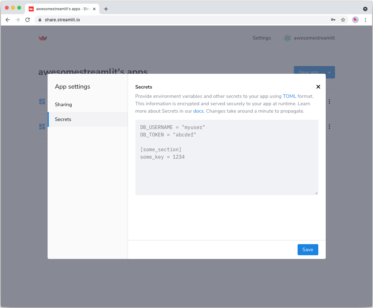
## Add FilesConnection and s3fs to your requirements file
Add the [FilesConnection](https://github.com/streamlit/files-connection) and [s3fs](https://github.com/dask/s3fs) packages to your `requirements.txt` file, preferably pinning the versions (replace `x.x.x` with the version you want installed):
```bash
# requirements.txt
s3fs==x.x.x
st-files-connection
```
## Write your Streamlit app
Copy the code below to your Streamlit app and run it. Make sure to adapt the name of your bucket and file. Note that Streamlit automatically turns the access keys from your secrets file into environment variables, where `s3fs` searches for them by default.
```python
# streamlit_app.py
import streamlit as st
from st_files_connection import FilesConnection
# Create connection object and retrieve file contents.
# Specify input format is a csv and to cache the result for 600 seconds.
conn = st.connection('s3', type=FilesConnection)
df = conn.read("testbucket-jrieke/myfile.csv", input_format="csv", ttl=600)
# Print results.
for row in df.itertuples():
st.write(f"{row.Owner} has a :{row.Pet}:")
```
See `st.connection` above? This handles secrets retrieval, setup, result caching and retries. By default, `read()` results are cached without expiring. In this case, we set `ttl=600` to ensure the file contents is cached for no longer than 10 minutes. You can also set `ttl=0` to disable caching. Learn more in [Caching](/develop/concepts/architecture/caching).
If everything worked out (and you used the example file given above), your app should look like this:
---
# Connect Streamlit to Google BigQuery
Source: https://docs.streamlit.io/develop/tutorials/databases/bigquery
## Introduction
This guide explains how to securely access a BigQuery database from Streamlit Community Cloud. It uses the
[google-cloud-bigquery](https://googleapis.dev/python/bigquery/latest/index.html) library and
Streamlit's [Secrets management](/develop/concepts/connections/secrets-management).
## Create a BigQuery database
If you already have a database that you want to use, feel free
to [skip to the next step](#enable-the-bigquery-api).
For this example, we will use one of the [sample datasets](https://cloud.google.com/bigquery/public-data#sample_tables) from BigQuery (namely the `shakespeare` table). If you want to create a new dataset instead, follow [Google's quickstart guide](https://cloud.google.com/bigquery/docs/quickstarts/quickstart-web-ui).
## Enable the BigQuery API
Programmatic access to BigQuery is controlled through [Google Cloud Platform](https://cloud.google.com). Create an account or sign in and head over to the [APIs Services dashboard](https://console.cloud.google.com/apis/dashboard) (select or create a project if asked). As shown below, search for the BigQuery API and enable it:
## Create a service account key file
To use the BigQuery API from Streamlit Community Cloud, you need a Google Cloud Platform service account (a special account type for programmatic data access). Go to the [Service Accounts](https://console.cloud.google.com/iam-admin/serviceaccounts) page and create an account with the **Viewer** permission (this will let the account access data but not change it):
If the button **CREATE SERVICE ACCOUNT** is gray, you don't have the correct permissions. Ask the
admin of your Google Cloud project for help.
After clicking **DONE**, you should be back on the service accounts overview. Create a JSON key file for the new account and download it:
## Add the key file to your local app secrets
Your local Streamlit app will read secrets from a file `.streamlit/secrets.toml` in your app's root
directory. Create this file if it doesn't exist yet and add the content of the key file you just
downloaded to it as shown below:
```toml
# .streamlit/secrets.toml
[gcp_service_account]
type = "service_account"
project_id = "xxx"
private_key_id = "xxx"
private_key = "xxx"
client_email = "xxx"
client_id = "xxx"
auth_uri = "https://accounts.google.com/o/oauth2/auth"
token_uri = "https://oauth2.googleapis.com/token"
auth_provider_x509_cert_url = "https://www.googleapis.com/oauth2/v1/certs"
client_x509_cert_url = "xxx"
```
Add this file to `.gitignore` and don't commit it to your GitHub repo!
## Copy your app secrets to the cloud
As the `secrets.toml` file above is not committed to GitHub, you need to pass its content to your deployed app (on Streamlit Community Cloud) separately. Go to the [app dashboard](https://share.streamlit.io/) and in the app's dropdown menu, click on **Edit Secrets**. Copy the content of `secrets.toml` into the text area. More information is available at [Secrets management](/deploy/streamlit-community-cloud/deploy-your-app/secrets-management).

## Add google-cloud-bigquery to your requirements file
Add the [google-cloud-bigquery](https://googleapis.dev/python/bigquery/latest/index.html) package to your `requirements.txt` file, preferably pinning its version (replace `x.x.x` with the version want installed):
```bash
# requirements.txt
google-cloud-bigquery==x.x.x
```
## Write your Streamlit app
Copy the code below to your Streamlit app and run it. Make sure to adapt the query if you don't use the sample table.
```python
# streamlit_app.py
import streamlit as st
from google.oauth2 import service_account
from google.cloud import bigquery
# Create API client.
credentials = service_account.Credentials.from_service_account_info(
st.secrets["gcp_service_account"]
)
client = bigquery.Client(credentials=credentials)
# Perform query.
# Uses st.cache_data to only rerun when the query changes or after 10 min.
@st.cache_data(ttl=600)
def run_query(query):
query_job = client.query(query)
rows_raw = query_job.result()
# Convert to list of dicts. Required for st.cache_data to hash the return value.
rows = [dict(row) for row in rows_raw]
return rows
rows = run_query("SELECT word FROM `bigquery-public-data.samples.shakespeare` LIMIT 10")
# Print results.
st.write("Some wise words from Shakespeare:")
for row in rows:
st.write("✍️ " + row['word'])
```
See `st.cache_data` above? Without it, Streamlit would run the query every time the app reruns (e.g. on a widget interaction). With `st.cache_data`, it only runs when the query changes or after 10 minutes (that's what `ttl` is for). Watch out: If your database updates more frequently, you should adapt `ttl` or remove caching so viewers always see the latest data. Learn more in [Caching](/develop/concepts/architecture/caching).
Alternatively, you can use pandas to read from BigQuery right into a dataframe! Follow all the above steps, install the [pandas-gbq](https://pandas-gbq.readthedocs.io/en/latest/index.html) library (don't forget to add it to `requirements.txt`!), and call `pandas.read_gbq(query, credentials=credentials)`. More info [in the pandas docs](https://pandas.pydata.org/docs/reference/api/pandas.read_gbq.html).
If everything worked out (and you used the sample table), your app should look like this:
---
# Connect Streamlit to Google Cloud Storage
Source: https://docs.streamlit.io/develop/tutorials/databases/gcs
## Introduction
This guide explains how to securely access files on Google Cloud Storage from Streamlit Community Cloud. It uses [Streamlit FilesConnection](https://github.com/streamlit/files-connection), the [gcsfs](https://github.com/fsspec/gcsfs) library and Streamlit's [Secrets management](/develop/concepts/connections/secrets-management).
## Create a Google Cloud Storage bucket and add a file
If you already have a bucket that you want to use, feel free
to [skip to the next step](#enable-the-google-cloud-storage-api).
First, [sign up for Google Cloud Platform](https://console.cloud.google.com/) or log in. Go to the [Google Cloud Storage console](https://console.cloud.google.com/storage/) and create a new bucket.
Navigate to the upload section of your new bucket:
And upload the following CSV file, which contains some example data:
myfile.csv
## Enable the Google Cloud Storage API
The Google Cloud Storage API is [enabled by default](https://cloud.google.com/service-usage/docs/enabled-service#default) when you create a project through the Google Cloud Console or CLI. Feel free to [skip to the next step](#create-a-service-account-and-key-file).
If you do need to enable the API for programmatic access in your project, head over to the [APIs Services dashboard](https://console.cloud.google.com/apis/dashboard) (select or create a project if asked). Search for the Cloud Storage API and enable it. The screenshot below has a blue "Manage" button and indicates the "API is enabled" which means no further action needs to be taken. This is very likely what you have since the API is enabled by default. However, if that is not what you see and you have an "Enable" button, you'll need to enable the API:
## Create a service account and key file
To use the Google Cloud Storage API from Streamlit, you need a Google Cloud Platform service account (a special type for programmatic data access). Go to the Service Accounts page and create an account with Viewer permission.
If the button **CREATE SERVICE ACCOUNT** is gray, you don't have the correct permissions. Ask the
admin of your Google Cloud project for help.
After clicking **DONE**, you should be back on the service accounts overview. Create a JSON key file for the new account and download it:
## Add the key to your local app secrets
Your local Streamlit app will read secrets from a file `.streamlit/secrets.toml` in your app's root directory. Create this file if it doesn't exist yet and add the access key to it as shown below:
```toml
# .streamlit/secrets.toml
[connections.gcs]
type = "service_account"
project_id = "xxx"
private_key_id = "xxx"
private_key = "xxx"
client_email = "xxx"
client_id = "xxx"
auth_uri = "https://accounts.google.com/o/oauth2/auth"
token_uri = "https://oauth2.googleapis.com/token"
auth_provider_x509_cert_url = "https://www.googleapis.com/oauth2/v1/certs"
client_x509_cert_url = "xxx"
```
Add this file to `.gitignore` and don't commit it to your GitHub repo!
## Copy your app secrets to the cloud
As the `secrets.toml` file above is not committed to GitHub, you need to pass its content to your deployed app (on Streamlit Community Cloud) separately. Go to the [app dashboard](https://share.streamlit.io/) and in the app's dropdown menu, click on **Edit Secrets**. Copy the content of `secrets.toml` into the text area. More information is available at [Secrets management](/deploy/streamlit-community-cloud/deploy-your-app/secrets-management).

## Add FilesConnection and gcsfs to your requirements file
Add the [FilesConnection](https://github.com/streamlit/files-connection) and [gcsfs](https://github.com/fsspec/gcsfs) packages to your `requirements.txt` file, preferably pinning the versions (replace `x.x.x` with the version you want installed):
```bash
# requirements.txt
gcsfs==x.x.x
st-files-connection
```
## Write your Streamlit app
Copy the code below to your Streamlit app and run it. Make sure to adapt the name of your bucket and file. Note that Streamlit automatically turns the access keys from your secrets file into environment variables.
```python
# streamlit_app.py
import streamlit as st
from st_files_connection import FilesConnection
# Create connection object and retrieve file contents.
# Specify input format is a csv and to cache the result for 600 seconds.
conn = st.connection('gcs', type=FilesConnection)
df = conn.read("streamlit-bucket/myfile.csv", input_format="csv", ttl=600)
# Print results.
for row in df.itertuples():
st.write(f"{row.Owner} has a :{row.Pet}:")
```
See `st.connection` above? This handles secrets retrieval, setup, result caching and retries. By default, `read()` results are cached without expiring. In this case, we set `ttl=600` to ensure the file contents is cached for no longer than 10 minutes. You can also set `ttl=0` to disable caching. Learn more in [Caching](/develop/concepts/architecture/caching).
If everything worked out (and you used the example file given above), your app should look like this:

---
# Connect Streamlit to Microsoft SQL Server
Source: https://docs.streamlit.io/develop/tutorials/databases/mssql
## Introduction
This guide explains how to securely access a **_remote_** Microsoft SQL Server database from Streamlit Community Cloud. It uses the [pyodbc](https://github.com/mkleehammer/pyodbc/wiki) library and Streamlit's [Secrets management](/develop/concepts/connections/secrets-management).
## Create an SQL Server database
If you already have a remote database that you want to use, feel free
to [skip to the next step](#add-username-and-password-to-your-local-app-secrets).
First, follow the Microsoft documentation to install [SQL Server](https://docs.microsoft.com/en-gb/sql/sql-server/?view=sql-server-ver15) and the `sqlcmd` [Utility](https://docs.microsoft.com/en-gb/sql/tools/sqlcmd-utility?view=sql-server-ver15). They have detailed installation guides on how to:
- [Install SQL Server on Windows](https://docs.microsoft.com/en-gb/sql/database-engine/install-windows/install-sql-server?view=sql-server-ver15)
- [Install on Red Hat Enterprise Linux](https://docs.microsoft.com/en-gb/sql/linux/quickstart-install-connect-red-hat?view=sql-server-ver15)
- [Install on SUSE Linux Enterprise Server](https://docs.microsoft.com/en-gb/sql/linux/quickstart-install-connect-suse?view=sql-server-ver15)
- [Install on Ubuntu](https://docs.microsoft.com/en-gb/sql/linux/quickstart-install-connect-ubuntu?view=sql-server-ver15)
- [Run on Docker](https://docs.microsoft.com/en-gb/sql/linux/quickstart-install-connect-docker?view=sql-server-ver15)
- [Provision a SQL VM in Azure](https://docs.microsoft.com/en-us/azure/virtual-machines/linux/sql/provision-sql-server-linux-virtual-machine?toc=/sql/toc/toc.json)
Once you have SQL Server installed, note down your SQL Server name, username, and password during setup.
## Connect locally
If you are connecting locally, use `sqlcmd` to connect to your new local SQL Server instance.
1. In your terminal, run the following command:
```bash
sqlcmd -S localhost -U SA -P ''
```
As you are connecting locally, the SQL Server name is `localhost`, the username is `SA`, and the password is the one you provided during the SA account setup.
2. You should see a **sqlcmd** command prompt `1>`, if successful.
3. If you run into a connection failure, review Microsoft's connection troubleshooting recommendations for your OS ([Linux](https://docs.microsoft.com/en-gb/sql/linux/sql-server-linux-troubleshooting-guide?view=sql-server-ver15#connection) [Windows](https://docs.microsoft.com/en-gb/sql/linux/sql-server-linux-troubleshooting-guide?view=sql-server-ver15#connection)).
When connecting remotely, the SQL Server name is the machine name or IP address. You might also need to open the SQL Server TCP port (default 1433) on your firewall.
### Create a SQL Server database
By now, you have SQL Server running and have connected to it with `sqlcmd`! 🥳 Let's put it to use by creating a database containing a table with some example values.
1. From the `sqlcmd` command prompt, run the following Transact-SQL command to create a test database `mydb`:
```sql
CREATE DATABASE mydb
```
2. To execute the above command, type `GO` on a new line:
```sql
GO
```
### Insert some data
Next create a new table, `mytable`, in the `mydb` database with three columns and two rows.
1. Switch to the new `mydb` database:
```sql
USE mydb
```
2. Create a new table with the following schema:
```sql
CREATE TABLE mytable (name varchar(80), pet varchar(80))
```
3. Insert some data into the table:
```sql
INSERT INTO mytable VALUES ('Mary', 'dog'), ('John', 'cat'), ('Robert', 'bird')
```
4. Type `GO` to execute the above commands:
```sql
GO
```
To end your **sqlcmd** session, type `QUIT` on a new line.
### Add username and password to your local app secrets
Your local Streamlit app will read secrets from a file `.streamlit/secrets.toml` in your app's root directory. Create this file if it doesn't exist yet and add the SQL Server name, database name, username, and password as shown below:
```toml
# .streamlit/secrets.toml
server = "localhost"
database = "mydb"
username = "SA"
password = "xxx"
```
When copying your app secrets to Streamlit Community Cloud, be sure to replace the values of **server**, **database**, **username**, and **password** with those of your _remote_ SQL Server!
And add this file to `.gitignore` and don't commit it to your GitHub repo.
## Copy your app secrets to Streamlit Community Cloud
As the `secrets.toml` file above is not committed to GitHub, you need to pass its content to your deployed app (on Streamlit Community Cloud) separately. Go to the [app dashboard](https://share.streamlit.io/) and in the app's dropdown menu, click on **Edit Secrets**. Copy the content of `secrets.toml` into the text area. More information is available at [Secrets management](/deploy/streamlit-community-cloud/deploy-your-app/secrets-management).

## Add pyodbc to your requirements file
To connect to SQL Server _locally_ with Streamlit, you need to `pip install pyodbc`, in addition to the Microsoft ODBC driver you installed during the SQL Server installation.
On _Streamlit Cloud_, we have built-in support for SQL Server. On popular demand, we directly added SQL Server tools including the ODBC drivers and the executables `sqlcmd` and `bcp` to the container image for Cloud apps, so you don't need to install them.
All you need to do is add the [`pyodbc`](https://github.com/mkleehammer/pyodbc) Python package to your `requirements.txt` file, and you're ready to go! 🎈
```bash
# requirements.txt
pyodbc==x.x.x
```
Replace `x.x.x` ☝️ with the version of pyodbc you want installed on Cloud.
At this time, Streamlit Community Cloud does not support Azure Active Directory authentication. We will update this tutorial when we add support for Azure Active Directory.
## Write your Streamlit app
Copy the code below to your Streamlit app and run it. Make sure to adapt `query` to use the name of your table.
```python
import streamlit as st
import pyodbc
# Initialize connection.
# Uses st.cache_resource to only run once.
@st.cache_resource
def init_connection():
return pyodbc.connect(
"DRIVER={ODBC Driver 17 for SQL Server};SERVER="
+ st.secrets["server"]
+ ";DATABASE="
+ st.secrets["database"]
+ ";UID="
+ st.secrets["username"]
+ ";PWD="
+ st.secrets["password"]
)
conn = init_connection()
# Perform query.
# Uses st.cache_data to only rerun when the query changes or after 10 min.
@st.cache_data(ttl=600)
def run_query(query):
with conn.cursor() as cur:
cur.execute(query)
return cur.fetchall()
rows = run_query("SELECT * from mytable;")
# Print results.
for row in rows:
st.write(f"{row[0]} has a :{row[1]}:")
```
See `st.cache_data` above? Without it, Streamlit would run the query every time the app reruns (e.g. on a widget interaction). With `st.cache_data`, it only runs when the query changes or after 10 minutes (that's what `ttl` is for). Watch out: If your database updates more frequently, you should adapt `ttl` or remove caching so viewers always see the latest data. Learn more in [Caching](/develop/concepts/architecture/caching).
If everything worked out (and you used the example table we created above), your app should look like this:

---
# Connect Streamlit to MongoDB
Source: https://docs.streamlit.io/develop/tutorials/databases/mongodb
## Introduction
This guide explains how to securely access a **_remote_** MongoDB database from Streamlit Community Cloud. It uses the [PyMongo](https://github.com/mongodb/mongo-python-driver) library and Streamlit's [Secrets management](/develop/concepts/connections/secrets-management).
## Create a MongoDB Database
If you already have a database that you want to use, feel free
to [skip to the next step](#add-username-and-password-to-your-local-app-secrets).
First, follow the official tutorials to [install MongoDB](https://docs.mongodb.com/guides/server/install/), [set up authentication](https://docs.mongodb.com/guides/server/auth/) (note down the username and password!), and [connect to the MongoDB instance](https://docs.mongodb.com/guides/server/drivers/). Once you are connected, open the `mongo` shell and enter the following two commands to create a collection with some example values:
```sql
use mydb
db.mycollection.insertMany([{"name" : "Mary", "pet": "dog"}, {"name" : "John", "pet": "cat"}, {"name" : "Robert", "pet": "bird"}])
```
## Add username and password to your local app secrets
Your local Streamlit app will read secrets from a file `.streamlit/secrets.toml` in your app's root directory. Create this file if it doesn't exist yet and add the database information as shown below:
```toml
# .streamlit/secrets.toml
[mongo]
host = "localhost"
port = 27017
username = "xxx"
password = "xxx"
```
When copying your app secrets to Streamlit Community Cloud, be sure to replace the values of **host**, **port**, **username**, and **password** with those of your _remote_ MongoDB database!
Add this file to `.gitignore` and don't commit it to your GitHub repo!
## Copy your app secrets to the cloud
As the `secrets.toml` file above is not committed to GitHub, you need to pass its content to your deployed app (on Streamlit Community Cloud) separately. Go to the [app dashboard](https://share.streamlit.io/) and in the app's dropdown menu, click on **Edit Secrets**. Copy the content of `secrets.toml` into the text area. More information is available at [Secrets management](/deploy/streamlit-community-cloud/deploy-your-app/secrets-management).

## Add PyMongo to your requirements file
Add the [PyMongo](https://github.com/mongodb/mongo-python-driver) package to your `requirements.txt` file, preferably pinning its version (replace `x.x.x` with the version you want installed):
```bash
# requirements.txt
pymongo==x.x.x
```
## Write your Streamlit app
Copy the code below to your Streamlit app and run it. Make sure to adapt the name of your database and collection.
```python
# streamlit_app.py
import streamlit as st
import pymongo
# Initialize connection.
# Uses st.cache_resource to only run once.
@st.cache_resource
def init_connection():
return pymongo.MongoClient(**st.secrets["mongo"])
client = init_connection()
# Pull data from the collection.
# Uses st.cache_data to only rerun when the query changes or after 10 min.
@st.cache_data(ttl=600)
def get_data():
db = client.mydb
items = db.mycollection.find()
items = list(items) # make hashable for st.cache_data
return items
items = get_data()
# Print results.
for item in items:
st.write(f"{item['name']} has a :{item['pet']}:")
```
See `st.cache_data` above? Without it, Streamlit would run the query every time the app reruns (e.g. on a widget interaction). With `st.cache_data`, it only runs when the query changes or after 10 minutes (that's what `ttl` is for). Watch out: If your database updates more frequently, you should adapt `ttl` or remove caching so viewers always see the latest data. Learn more in [Caching](/develop/concepts/architecture/caching).
If everything worked out (and you used the example data we created above), your app should look like this:

---
# Connect Streamlit to MySQL
Source: https://docs.streamlit.io/develop/tutorials/databases/mysql
## Introduction
This guide explains how to securely access a **_remote_** MySQL database from Streamlit Community Cloud. It uses [st.connection](/develop/api-reference/connections/st.connection) and Streamlit's [Secrets management](/develop/concepts/connections/secrets-management). The below example code will **only work on Streamlit version >= 1.28**, when `st.connection` was added.
## Create a MySQL database
If you already have a database that you want to use, feel free
to [skip to the next step](#add-username-and-password-to-your-local-app-secrets).
First, follow [this tutorial](https://dev.mysql.com/doc/mysql-getting-started/en/) to install MySQL and start the MySQL server (note down the username and password!). Once your MySQL server is up and running, connect to it with the `mysql` client and enter the following commands to create a database and a table with some example values:
```sql
CREATE DATABASE pets;
USE pets;
CREATE TABLE mytable (
name varchar(80),
pet varchar(80)
);
INSERT INTO mytable VALUES ('Mary', 'dog'), ('John', 'cat'), ('Robert', 'bird');
```
## Add username and password to your local app secrets
Your local Streamlit app will read secrets from a file `.streamlit/secrets.toml` in your app's root directory. Learn more about [Streamlit secrets management here](/develop/concepts/connections/secrets-management). Create this file if it doesn't exist yet and add the database name, user, and password of your MySQL server as shown below:
```toml
# .streamlit/secrets.toml
[connections.mysql]
dialect = "mysql"
host = "localhost"
port = 3306
database = "xxx"
username = "xxx"
password = "xxx"
query = { charset = "xxx" }
```
If you use `query` when defining your connection, you must use `streamlit>=1.35.0`.
When copying your app secrets to Streamlit Community Cloud, be sure to replace the values of **host**, **port**, **database**, **username**, and **password** with those of your _remote_ MySQL database!
Add this file to `.gitignore` and don't commit it to your GitHub repo!
## Copy your app secrets to the cloud
As the `secrets.toml` file above is not committed to GitHub, you need to pass its content to your deployed app (on Streamlit Community Cloud) separately. Go to the [app dashboard](https://share.streamlit.io/) and in the app's dropdown menu, click on **Edit Secrets**. Copy the content of `secrets.toml` into the text area. More information is available at [Secrets management](/deploy/streamlit-community-cloud/deploy-your-app/secrets-management).

## Add dependencies to your requirements file
Add the [mysqlclient](https://github.com/PyMySQL/mysqlclient) and [SQLAlchemy](https://github.com/sqlalchemy/sqlalchemy) packages to your `requirements.txt` file, preferably pinning its version (replace `x.x.x` with the version you want installed):
```bash
# requirements.txt
mysqlclient==x.x.x
SQLAlchemy==x.x.x
```
## Write your Streamlit app
Copy the code below to your Streamlit app and run it. Make sure to adapt `query` to use the name of your table.
```python
# streamlit_app.py
import streamlit as st
# Initialize connection.
conn = st.connection('mysql', type='sql')
# Perform query.
df = conn.query('SELECT * from mytable;', ttl=600)
# Print results.
for row in df.itertuples():
st.write(f"{row.name} has a :{row.pet}:")
```
See `st.connection` above? This handles secrets retrieval, setup, query caching and retries. By default, `query()` results are cached without expiring. In this case, we set `ttl=600` to ensure the query result is cached for no longer than 10 minutes. You can also set `ttl=0` to disable caching. Learn more in [Caching](/develop/concepts/architecture/caching).
If everything worked out (and you used the example table we created above), your app should look like this:

---
# Connect Streamlit to Neon
Source: https://docs.streamlit.io/develop/tutorials/databases/neon
## Introduction
This guide explains how to securely access a [Neon database](https://neon.tech/) from Streamlit. Neon is a fully managed serverless PostgreSQL database that separates storage and compute to offer features such as instant branching and automatic scaling.
### Prerequisites
- The following packages must be installed in your Python environment:
```txt
streamlit>=1.28
psycopg2-binary>=2.9.6
sqlalchemy>=2.0.0
```
You may use `psycopg2` instead of `psycopg2-binary`. However, building Psycopg requires a few prerequisites (like a C compiler). To use `psycopg2` on Community Cloud, you must include `libpq-dev` in a [`packages.txt`](/deploy/streamlit-community-cloud/deploy-your-app/app-dependencies#apt-get-dependencies) file in the root of your repository. `psycopg2-binary` is a stand-alone package that is practical for testing and development.
- You must have a Neon account.
- You should have a basic understanding of [`st.connection`](/develop/api-reference/connections/st.connection) and [Secrets management](/develop/concepts/connections/secrets-management).
## Create a Neon project
If you already have a Neon project that you want to use, you can [skip to the next step](#add-neon-connection-string-to-your-local-app-secrets).
1. Log in to the Neon console and navigate to the [Projects](https://console.neon.tech/app/projects) section.
1. If you see a prompt to enter your project name, skip to the next step. Otherwise, click the "**New Project**" button to create a new project.
1. Enter "Streamlit-Neon" for your project name, accept the othe default settings, and click "**Create Project**."
After Neon creates your project with a ready-to-use `neondb` database, you will be redirected to your project's Quickstart.
1. Click on "**SQL Editor**" from the left sidebar.
1. Replace the text in the input area with the following code and click "**Run**" to add sample data to your project.
```sql
CREATE TABLE home (
id SERIAL PRIMARY KEY,
name VARCHAR(100),
pet VARCHAR(100)
);
INSERT INTO home (name, pet)
VALUES
('Mary', 'dog'),
('John', 'cat'),
('Robert', 'bird');
```
## Add the Neon connection string to your local app secrets
1. Within your Neon project, click "**Dashboard**" in the left sidebar.
1. Within the "Connection Details" tile, locate your database connection string. It should look similar to this:
```bash
postgresql://neondb_owner:xxxxxxxxxxxx@ep-adjective-noun-xxxxxxxx.us-east-2.aws.neon.tech/neondb?sslmode=require
```
1. If you do not already have a `.streamlit/secrets.toml` file in your app's root directory, create an empty secrets file.
1. Copy your connection string and add it to your app's `.streamlit/secrets.toml` file as follows:
```toml
# .streamlit/secrets.toml
[connections.neon]
url="postgresql://neondb_owner:xxxxxxxxxxxx@ep-adjective-noun-xxxxxxxx.us-east-2.aws.neon.tech/neondb?sslmode=require"
```
Add this file to `.gitignore` and don't commit it to your GitHub repo!
## Write your Streamlit app
1. Copy the code below to your Streamlit app and save it.
```python
# streamlit_app.py
import streamlit as st
# Initialize connection.
conn = st.connection("neon", type="sql")
# Perform query.
df = conn.query('SELECT * FROM home;', ttl="10m")
# Print results.
for row in df.itertuples():
st.write(f"{row.name} has a :{row.pet}:")
```
The `st.connection` object above handles secrets retrieval, setup, query caching and retries.
By default, `query()` results are cached without expiring. Setting the `ttl` parameter to `"10m"` ensures the query result is cached for no longer than 10 minutes. You can also set `ttl=0` to disable caching. Learn more in [Caching](/develop/concepts/architecture/caching).
1. Run your Streamlit app.
```bash
streamlit run streamlit_app.py
```
If everything worked out (and you used the example table we created above), your app should look like this:

## Connecting to a Neon database from Community Cloud
This tutorial assumes a local Streamlit app, but you can also connect to a Neon database from apps hosted on Community Cloud. The additional steps are:
- Add a [`requirements.txt`](/deploy/streamlit-community-cloud/deploy-your-app/app-dependencies) file to your repo. Include all the packages listed in [Prequisites](#prerequisites) and any other dependencies.
- [Add your secrets](/deploy/streamlit-community-cloud/deploy-your-app/secrets-management#deploy-an-app-and-set-up-secrets) to your app in Community Cloud.
---
# Connect Streamlit to PostgreSQL
Source: https://docs.streamlit.io/develop/tutorials/databases/postgresql
## Introduction
This guide explains how to securely access a **_remote_** PostgreSQL database from Streamlit Community Cloud. It uses [st.connection](/develop/api-reference/connections/st.connection) and Streamlit's [Secrets management](/develop/concepts/connections/secrets-management). The below example code will **only work on Streamlit version >= 1.28**, when `st.connection` was added.
## Create a PostgreSQL database
If you already have a database that you want to use, feel free
to [skip to the next step](#add-username-and-password-to-your-local-app-secrets).
First, follow [this tutorial](https://www.tutorialspoint.com/postgresql/postgresql_environment.htm) to install PostgreSQL and create a database (note down the database name, username, and password!). Open the SQL Shell (`psql`) and enter the following two commands to create a table with some example values:
```sql
CREATE TABLE mytable (
name varchar(80),
pet varchar(80)
);
INSERT INTO mytable VALUES ('Mary', 'dog'), ('John', 'cat'), ('Robert', 'bird');
```
## Add username and password to your local app secrets
Your local Streamlit app will read secrets from a file `.streamlit/secrets.toml` in your app's root directory. Create this file if it doesn't exist yet and add the name, user, and password of your database as shown below:
```toml
# .streamlit/secrets.toml
[connections.postgresql]
dialect = "postgresql"
host = "localhost"
port = "5432"
database = "xxx"
username = "xxx"
password = "xxx"
```
When copying your app secrets to Streamlit Community Cloud, be sure to replace the values of **host**, **port**, **database**, **username**, and **password** with those of your _remote_ PostgreSQL database!
Add this file to `.gitignore` and don't commit it to your GitHub repo!
## Copy your app secrets to the cloud
As the `secrets.toml` file above is not committed to GitHub, you need to pass its content to your deployed app (on Streamlit Community Cloud) separately. Go to the [app dashboard](https://share.streamlit.io/) and in the app's dropdown menu, click on **Edit Secrets**. Copy the content of `secrets.toml` into the text area. More information is available at [Secrets management](/deploy/streamlit-community-cloud/deploy-your-app/secrets-management).

## Add dependencies to your requirements file
Add the [psycopg2-binary](https://www.psycopg.org/) and [SQLAlchemy](https://github.com/sqlalchemy/sqlalchemy) packages to your `requirements.txt` file, preferably pinning its version (replace `x.x.x` with the version you want installed):
```bash
# requirements.txt
psycopg2-binary==x.x.x
sqlalchemy==x.x.x
```
## Write your Streamlit app
Copy the code below to your Streamlit app and run it. Make sure to adapt `query` to use the name of your table.
```python
# streamlit_app.py
import streamlit as st
# Initialize connection.
conn = st.connection("postgresql", type="sql")
# Perform query.
df = conn.query('SELECT * FROM mytable;', ttl="10m")
# Print results.
for row in df.itertuples():
st.write(f"{row.name} has a :{row.pet}:")
```
See `st.connection` above? This handles secrets retrieval, setup, query caching and retries. By default, `query()` results are cached without expiring. In this case, we set `ttl="10m"` to ensure the query result is cached for no longer than 10 minutes. You can also set `ttl=0` to disable caching. Learn more in [Caching](/develop/concepts/architecture/caching).
If everything worked out (and you used the example table we created above), your app should look like this:

---
# Connect Streamlit to a private Google Sheet
Source: https://docs.streamlit.io/develop/tutorials/databases/private-gsheet
## Introduction
This guide explains how to securely access a private Google Sheet from Streamlit Community Cloud. It uses [st.connection](/develop/api-reference/connections/st.connection), [Streamlit GSheetsConnection](https://github.com/streamlit/gsheets-connection), and Streamlit's [Secrets management](/develop/concepts/connections/secrets-management).
If you are fine with enabling link sharing for your Google Sheet (i.e. everyone with the link can view it), the guide [Connect Streamlit to a public Google Sheet](/develop/tutorials/databases/public-gsheet) shows a simpler method of doing this. If your Sheet contains sensitive information and you cannot enable link sharing, keep on reading.
### Prerequisites
This tutorial requires `streamlit>=1.28` and `st-gsheets-connection` in your Python environment.
## Create a Google Sheet
If you already have a Sheet that you want to use, you can [skip to the next step](#enable-the-sheets-api).
Create a spreadsheet with this example data.
{{ maxWidth: '200px', margin: 'auto' }}>
| name | pet |
| :----- | :--- |
| Mary | dog |
| John | cat |
| Robert | bird |
---
# Connect Streamlit to a public Google Sheet
Source: https://docs.streamlit.io/develop/tutorials/databases/public-gsheet
## Introduction
This guide explains how to securely access a public Google Sheet from Streamlit. It uses [st.connection](/develop/api-reference/connections/st.connection), [Streamlit GSheetsConnection](https://github.com/streamlit/gsheets-connection), and Streamlit's [Secrets management](/develop/concepts/connections/secrets-management).
This method requires you to enable link sharing for your Google Sheet. While the sharing link will not appear in your code (and actually acts as sort of a password!), someone with the link can get all the data in the Sheet. If you don't want this, follow the (more complicated) guide to [Connect Streamlit to a private Google Sheet](private-gsheet).
### Prerequisites
This tutorial requires `streamlit>=1.28` and `st-gsheets-connection` in your Python environment.
## Create a Google Sheet and turn on link sharing
If you already have a Sheet that you want to access, you can [skip to the next step](#add-the-sheets-url-to-your-local-app-secrets). See Google's documentation on how to [share spreadsheets](https://support.google.com/docs/answer/9331169?hl=en#6.1) for more information.
Create a spreadsheet with this example data and create a share link. The link should have "Anyone with the link" set as a "Viewer."
{{ maxWidth: '200px', margin: 'auto' }}>
| name | pet |
| :----- | :--- |
| Mary | dog |
| John | cat |
| Robert | bird |
---
# Connect Streamlit to Snowflake
Source: https://docs.streamlit.io/develop/tutorials/databases/snowflake
## Introduction
This guide explains how to securely access a Snowflake database from Streamlit. It uses [st.connection](/develop/api-reference/connections/st.connection), the [Snowpark library](https://docs.snowflake.com/en/developer-guide/snowpark/python/index), and Streamlit's [Secrets management](/develop/concepts/connections/secrets-management).
### Prerequisites
- The following packages must be installed in your Python environment:
```txt
streamlit>=1.28
snowflake-snowpark-python>=0.9.0
snowflake-connector-python>=2.8.0
```
Use the correct version of Python required by `snowflake-snowpark-python`. For example, if you use `snowflake-snowpark-python==1.23.0`, you must use Python version \>=3.8, \
---
# Connect Streamlit to Supabase
Source: https://docs.streamlit.io/develop/tutorials/databases/supabase
## Introduction
This guide explains how to securely access a Supabase instance from Streamlit Community Cloud. It uses [st.connection](/develop/api-reference/connections/st.connection), [Streamlit Supabase Connector](https://github.com/SiddhantSadangi/st_supabase_connection/tree/main) (a community-built connection developed by [@SiddhantSadangi](https://github.com/SiddhantSadangi)) and Streamlit's [Secrets management](/develop/concepts/connections/secrets-management). Supabase is the open source Firebase alternative and is based on PostgreSQL.
Community-built connections, such as the [Streamlit Supabase Connector](https://github.com/SiddhantSadangi/st_supabase_connection/tree/main), extend and build on the `st.connection` interface and make it easier than ever to build Streamlit apps with a wide variety of data sources. These type of connections work exactly the same as [the ones built into Streamlit](/develop/api-reference/connections) and have access to all the same capabilities.
## Sign in to Supabase and create a project
First, head over to [Supabase](https://app.supabase.io/) and sign up for a free account using your GitHub.
Once you're signed in, you can create a project.
Your screen should look like this once your project has been created:
Make sure to note down your Project API Key and Project URL highlighted in the above screenshot. ☝️
You will need these to connect to your Supabase instance from Streamlit.
## Create a Supabase database
Now that you have a project, you can create a database and populate it with some sample data. To do so, click on the **SQL editor** button on the same project page, followed by the **New query** button in the SQL editor.
In the SQL editor, enter the following queries to create a database and a table with some example values:
```sql
CREATE TABLE mytable (
name varchar(80),
pet varchar(80)
);
INSERT INTO mytable VALUES ('Mary', 'dog'), ('John', 'cat'), ('Robert', 'bird');
```
Click **Run** to execute the queries. To verify that the queries were executed successfully, click on the **Table Editor** button on the left menu, followed by your newly created table `mytable`.
With your Supabase database created, you can now connect to it from Streamlit!
### Add Supabase Project URL and API key to your local app secrets
Your local Streamlit app will read secrets from a file `.streamlit/secrets.toml` in your app's root directory. Create this file if it doesn't exist yet and add the `SUPABASE_URL` and `SUPABASE_KEY` here:
```toml
# .streamlit/secrets.toml
[connections.supabase]
SUPABASE_URL = "xxxx"
SUPABASE_KEY = "xxxx"
```
Replace `xxxx` above with your Project URL and API key from [Step 1](/develop/tutorials/databases/supabase#sign-in-to-supabase-and-create-a-project).
Add this file to `.gitignore` and don't commit it to your GitHub repo!
## Copy your app secrets to the cloud
As the `secrets.toml` file above is not committed to GitHub, you need to pass its content to your deployed app (on Streamlit Community Cloud) separately. Go to the [app dashboard](https://share.streamlit.io/) and in the app's dropdown menu, click on **Edit Secrets**. Copy the content of `secrets.toml` into the text area. More information is available at [Secrets management](/deploy/streamlit-community-cloud/deploy-your-app/secrets-management).

## Add st-supabase-connection to your requirements file
Add the [`st-supabase-connection`](https://pypi.org/project/st-supabase-connection/) community-built connection library to your `requirements.txt` file, preferably pinning its version (replace `x.x.x` with the version you want installed):
```bash
# requirements.txt
st-supabase-connection==x.x.x
```
We've used the `st-supabase-connection` library here in combination with `st.connection` to benefit from the ease of setting up the data connection, managing your credentials, and Streamlit's caching capabilities that native and community-built connections provide.
You can however still directly use the [Supabase Python Client Library](https://pypi.org/project/supabase/) library if you prefer, but you'll need to write more code to set up the connection and cache the results. See [Using the Supabase Python Client Library](/develop/tutorials/databases/supabase#using-the-supabase-python-client-library) below for an example.
## Write your Streamlit app
Copy the code below to your Streamlit app and run it.
```python
# streamlit_app.py
import streamlit as st
from st_supabase_connection import SupabaseConnection
# Initialize connection.
conn = st.connection("supabase",type=SupabaseConnection)
# Perform query.
rows = conn.query("*", table="mytable", ttl="10m").execute()
# Print results.
for row in rows.data:
st.write(f"{row['name']} has a :{row['pet']}:")
```
See `st.connection` above? This handles secrets retrieval, setup, query caching and retries. By default, `query()` results are cached without expiring. In this case, we set `ttl="10m"` to ensure the query result is cached for no longer than 10 minutes. You can also set `ttl=0` to disable caching. Learn more in [Caching](/develop/concepts/architecture/caching).
If everything worked out (and you used the example table we created above), your app should look like this:
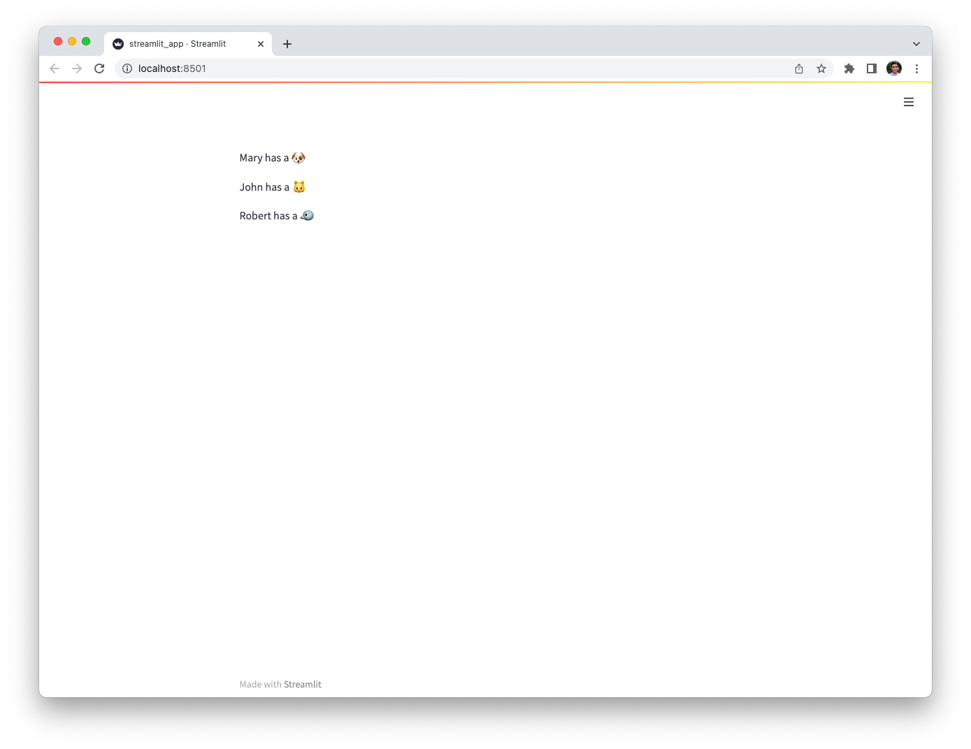
As Supabase uses PostgresSQL under the hood, you can also connect to Supabase by using the connection string Supabase provides under Settings > Databases. From there, you can refer to the [PostgresSQL tutorial](/develop/tutorials/databases/postgresql) to connect to your database.
## Using the Supabase Python Client Library
If you prefer to use the [Supabase Python Client Library](https://pypi.org/project/supabase/) directly, you can do so by following the steps below.
1. Add your Supabase Project URL and API key to your local app secrets:
Your local Streamlit app will read secrets from a file `.streamlit/secrets.toml` in your app's root directory. Create this file if it doesn't exist yet and add the SUPABASE_URL and SUPABASE_KEY here:
```toml
# .streamlit/secrets.toml
SUPABASE_URL = "xxxx"
SUPABASE_KEY = "xxxx"
```
2. Add `supabase` to your requirements file:
Add the [`supabase`](https://github.com/supabase-community/supabase-py) Python Client Library to your `requirements.txt` file, preferably pinning its version (replace `x.x.x` with the version you want installed):
```bash
# requirements.txt
supabase==x.x.x
```
3. Write your Streamlit app:
Copy the code below to your Streamlit app and run it.
```python
# streamlit_app.py
import streamlit as st
from supabase import create_client, Client
# Initialize connection.
# Uses st.cache_resource to only run once.
@st.cache_resource
def init_connection():
url = st.secrets["SUPABASE_URL"]
key = st.secrets["SUPABASE_KEY"]
return create_client(url, key)
supabase = init_connection()
# Perform query.
# Uses st.cache_data to only rerun when the query changes or after 10 min.
@st.cache_data(ttl=600)
def run_query():
return supabase.table("mytable").select("*").execute()
rows = run_query()
# Print results.
for row in rows.data:
st.write(f"{row['name']} has a :{row['pet']}:")
```
See `st.cache_data` above? Without it, Streamlit would run the query every time the app reruns (e.g. on a widget interaction). With `st.cache_data`, it only runs when the query changes or after 10 minutes (that's what `ttl` is for). Watch out: If your database updates more frequently, you should adapt `ttl` or remove caching so viewers always see the latest data. Learn more in [Caching](/develop/concepts/architecture/caching).
---
# Connect Streamlit to Tableau
Source: https://docs.streamlit.io/develop/tutorials/databases/tableau
## Introduction
This guide explains how to securely access data on Tableau from Streamlit Community Cloud. It uses the [tableauserverclient](https://tableau.github.io/server-client-python/#) library and Streamlit's [Secrets management](/develop/concepts/connections/secrets-management).
## Create a Tableau site
If you already have a database that you want to use, feel free
to [skip to the next step](#create-personal-access-tokens).
For simplicity, we are using the cloud version of Tableau here but this guide works equally well for self-hosted deployments. First, sign up for [Tableau Online](https://www.tableau.com/products/cloud-bi) or log in. Create a workbook or run one of the example workbooks under "Dashboard Starters".
## Create personal access tokens
While the Tableau API allows authentication via username and password, you should use [personal access tokens](https://help.tableau.com/current/server/en-us/security_personal_access_tokens.htm) for a production app.
Go to your [Tableau Online homepage](https://online.tableau.com/), create an access token and note down the token name and secret.
Personal access tokens will expire if not used after 15 consecutive days.
## Add token to your local app secrets
Your local Streamlit app will read secrets from a file `.streamlit/secrets.toml` in your app's root directory. Create this file if it doesn't exist yet and add your token, the site name you created during setup, and the URL of your Tableau server like below:
```toml
# .streamlit/secrets.toml
[tableau]
token_name = "xxx"
token_secret = "xxx"
server_url = "https://abc01.online.tableau.com/"
site_id = "streamlitexample" # in your site's URL behind the server_url
```
Add this file to `.gitignore` and don't commit it to your GitHub repo!
## Copy your app secrets to the cloud
As the `secrets.toml` file above is not committed to GitHub, you need to pass its content to your deployed app (on Streamlit Community Cloud) separately. Go to the [app dashboard](https://share.streamlit.io/) and in the app's dropdown menu, click on **Edit Secrets**. Copy the content of `secrets.toml` into the text area. More information is available at [Secrets management](/deploy/streamlit-community-cloud/deploy-your-app/secrets-management).

## Add tableauserverclient to your requirements file
Add the [tableauserverclient](https://tableau.github.io/server-client-python/#) package to your `requirements.txt` file, preferably pinning its version (replace `x.x.x` with the version you want installed):
```bash
# requirements.txt
tableauserverclient==x.x.x
```
## Write your Streamlit app
Copy the code below to your Streamlit app and run it. Note that this code just shows a few options of data you can get – explore the [tableauserverclient](https://tableau.github.io/server-client-python/#) library to find more!
```python
# streamlit_app.py
import streamlit as st
import tableauserverclient as TSC
# Set up connection.
tableau_auth = TSC.PersonalAccessTokenAuth(
st.secrets["tableau"]["token_name"],
st.secrets["tableau"]["personal_access_token"],
st.secrets["tableau"]["site_id"],
)
server = TSC.Server(st.secrets["tableau"]["server_url"], use_server_version=True)
# Get various data.
# Explore the tableauserverclient library for more options.
# Uses st.cache_data to only rerun when the query changes or after 10 min.
@st.cache_data(ttl=600)
def run_query():
with server.auth.sign_in(tableau_auth):
# Get all workbooks.
workbooks, pagination_item = server.workbooks.get()
workbooks_names = [w.name for w in workbooks]
# Get views for first workbook.
server.workbooks.populate_views(workbooks[0])
views_names = [v.name for v in workbooks[0].views]
# Get image CSV for first view of first workbook.
view_item = workbooks[0].views[0]
server.views.populate_image(view_item)
server.views.populate_csv(view_item)
view_name = view_item.name
view_image = view_item.image
# `view_item.csv` is a list of binary objects, convert to str.
view_csv = b"".join(view_item.csv).decode("utf-8")
return workbooks_names, views_names, view_name, view_image, view_csv
workbooks_names, views_names, view_name, view_image, view_csv = run_query()
# Print results.
st.subheader("📓 Workbooks")
st.write("Found the following workbooks:", ", ".join(workbooks_names))
st.subheader("👁️ Views")
st.write(
f"Workbook *{workbooks_names[0]}* has the following views:",
", ".join(views_names),
)
st.subheader("🖼️ Image")
st.write(f"Here's what view *{view_name}* looks like:")
st.image(view_image, width=300)
st.subheader("📊 Data")
st.write(f"And here's the data for view *{view_name}*:")
st.write(pd.read_csv(StringIO(view_csv)))
```
See `st.cache_data` above? Without it, Streamlit would run the query every time the app reruns (e.g. on a widget interaction). With `st.cache_data`, it only runs when the query changes or after 10 minutes (that's what `ttl` is for). Watch out: If your database updates more frequently, you should adapt `ttl` or remove caching so viewers always see the latest data. Learn more in [Caching](/develop/concepts/architecture/caching).
If everything worked out, your app should look like this (can differ based on your workbooks):
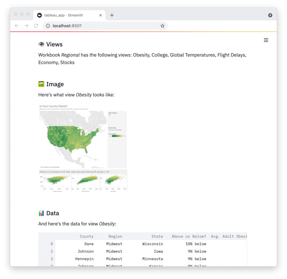
---
# Connect Streamlit to TiDB
Source: https://docs.streamlit.io/develop/tutorials/databases/tidb
## Introduction
This guide explains how to securely access a **_remote_** TiDB database from Streamlit Community Cloud. It uses [st.connection](/develop/api-reference/connections/st.connection) and Streamlit's [Secrets management](/develop/concepts/connections/secrets-management). The below example code will **only work on Streamlit version >= 1.28**, when `st.connection` was added.
[TiDB](https://www.pingcap.com/tidb/) is an open-source, MySQL-compatible database that supports Hybrid Transactional and Analytical Processing (HTAP) workloads. TiDB introducs a [built-in vector search](https://www.pingcap.com/ai/) to the SQL database family, enabling support for your AI applications without requiring a new database or additional technical stacks. [TiDB Cloud](https://tidb.cloud/) is a fully managed cloud database service that simplifies the deployment and management of TiDB databases for developers.
## Sign in to TiDB Cloud and create a cluster
First, head over to [TiDB Cloud](https://tidbcloud.com/free-trial) and sign up for a free account, using either Google, GitHub, Microsoft or E-mail:
Once you've signed in, you will already have a TiDB cluster:
You can create more clusters if you want to. Click the cluster name to enter cluster overview page:
Then click **Connect** to easily get the connection arguments to access the cluster. On the popup, click **Generate Password** to set the password.
Make sure to note down the password. It won't be available on TiDB Cloud after this step.
## Create a TiDB database
If you already have a database that you want to use, feel free
to [skip to the next step](#add-username-and-password-to-your-local-app-secrets).
Once your TiDB cluster is up and running, connect to it with the `mysql` client(or with **SQL Editor** tab on the console) and enter the following commands to create a database and a table with some example values:
```sql
CREATE DATABASE pets;
USE pets;
CREATE TABLE mytable (
name varchar(80),
pet varchar(80)
);
INSERT INTO mytable VALUES ('Mary', 'dog'), ('John', 'cat'), ('Robert', 'bird');
```
## Add username and password to your local app secrets
Your local Streamlit app will read secrets from a file `.streamlit/secrets.toml` in your app's root directory. Learn more about [Streamlit secrets management here](/develop/concepts/connections/secrets-management). Create this file if it doesn't exist yet and add host, username and password of your TiDB cluster as shown below:
```toml
# .streamlit/secrets.toml
[connections.tidb]
dialect = "mysql"
host = ""
port = 4000
database = "pets"
username = ""
password = ""
```
When copying your app secrets to Streamlit Community Cloud, be sure to replace the values of **host**, **username** and **password** with those of your _remote_ TiDB cluster!
Add this file to `.gitignore` and don't commit it to your GitHub repo!
## Copy your app secrets to the cloud
As the `secrets.toml` file above is not committed to GitHub, you need to pass its content to your deployed app (on Streamlit Community Cloud) separately. Go to the [app dashboard](https://share.streamlit.io/) and in the app's dropdown menu, click on **Edit Secrets**. Copy the content of `secrets.toml` into the text area. More information is available at [Secrets management](/deploy/streamlit-community-cloud/deploy-your-app/secrets-management).

## Add dependencies to your requirements file
Add the [mysqlclient](https://github.com/PyMySQL/mysqlclient) and [SQLAlchemy](https://github.com/sqlalchemy/sqlalchemy) packages to your `requirements.txt` file, preferably pinning its version (replace `x.x.x` with the version you want installed):
```bash
# requirements.txt
mysqlclient==x.x.x
SQLAlchemy==x.x.x
```
## Write your Streamlit app
Copy the code below to your Streamlit app and run it. Make sure to adapt `query` to use the name of your table.
```python
# streamlit_app.py
import streamlit as st
# Initialize connection.
conn = st.connection('tidb', type='sql')
# Perform query.
df = conn.query('SELECT * from mytable;', ttl=600)
# Print results.
for row in df.itertuples():
st.write(f"{row.name} has a :{row.pet}:")
```
See `st.connection` above? This handles secrets retrieval, setup, query caching and retries. By default, `query()` results are cached without expiring. In this case, we set `ttl=600` to ensure the query result is cached for no longer than 10 minutes. You can also set `ttl=0` to disable caching. Learn more in [Caching](/develop/concepts/architecture/caching).
If everything worked out (and you used the example table we created above), your app should look like this:

## Connect with PyMySQL
Other than [mysqlclient](https://github.com/PyMySQL/mysqlclient), [PyMySQL](https://github.com/PyMySQL/PyMySQL) is another popular MySQL Python client. To use PyMySQL, first you need to adapt your requirements file:
```bash
# requirements.txt
PyMySQL==x.x.x
SQLAlchemy==x.x.x
```
Then adapt your secrets file:
```toml
# .streamlit/secrets.toml
[connections.tidb]
dialect = "mysql"
driver = "pymysql"
host = ""
port = 4000
database = "pets"
username = ""
password = ""
create_engine_kwargs = { connect_args = { ssl = { ca = "" }}}
```
---
# Connect Streamlit to TigerGraph
Source: https://docs.streamlit.io/develop/tutorials/databases/tigergraph
## Introduction
This guide explains how to securely access a TigerGraph database from Streamlit Community Cloud. It uses the [pyTigerGraph](https://pytigergraph.github.io/pyTigerGraph/GettingStarted/) library and Streamlit's [Secrets management](/develop/concepts/connections/secrets-management).
## Create a TigerGraph Cloud Database
First, follow the official tutorials to create a TigerGraph instance in TigerGraph Cloud, either as a [blog](https://www.tigergraph.com/blog/getting-started-with-tigergraph-3-0/) or a [video](https://www.youtube.com/watch?v=NtNW2e8MfCQ). Note your username, password, and subdomain.
For this tutorial, we will be using the COVID-19 starter kit. When setting up your solution, select the “COVID-19 Analysis" option.
Once it is started, ensure your data is downloaded and queries are installed.
## Add username and password to your local app secrets
Your local Streamlit app will read secrets from a file `.streamlit/secrets.toml` in your app’s root directory. Create this file if it doesn’t exist yet and add your TigerGraph Cloud instance username, password, graph name, and subdomain as shown below:
```toml
# .streamlit/secrets.toml
[tigergraph]
host = "https://xxx.i.tgcloud.io/"
username = "xxx"
password = "xxx"
graphname = "xxx"
```
Add this file to `.gitignore` and don't commit it to your GitHub repo!
## Copy your app secrets to the cloud
As the `secrets.toml` file above is not committed to GitHub, you need to pass its content to your deployed app (on Streamlit Community Cloud) separately. Go to the [app dashboard](https://share.streamlit.io/) and in the app's dropdown menu, click on Edit Secrets. Copy the content of `secrets.toml` into the text area. More information is available at [Secrets management](/deploy/streamlit-community-cloud/deploy-your-app/secrets-management).

## Add PyTigerGraph to your requirements file
Add the pyTigerGraph package to your `requirements.txt` file, preferably pinning its version (replace `x.x.x` with the version you want installed):
```bash
# requirements.txt
pyTigerGraph==x.x.x
```
## Write your Streamlit app
Copy the code below to your Streamlit app and run it. Make sure to adapt the name of your graph and query.
```python
# streamlit_app.py
import streamlit as st
import pyTigerGraph as tg
# Initialize connection.
conn = tg.TigerGraphConnection(**st.secrets["tigergraph"])
conn.apiToken = conn.getToken(conn.createSecret())
# Pull data from the graph by running the "mostDirectInfections" query.
# Uses st.cache_data to only rerun when the query changes or after 10 min.
@st.cache_data(ttl=600)
def get_data():
most_infections = conn.runInstalledQuery("mostDirectInfections")[0]["Answer"][0]
return most_infections["v_id"], most_infections["attributes"]
items = get_data()
# Print results.
st.title(f"Patient {items[0]} has the most direct infections")
for key, val in items[1].items():
st.write(f"Patient {items[0]}'s {key} is {val}.")
```
See `st.cache_data` above? Without it, Streamlit would run the query every time the app reruns (e.g. on a widget interaction). With `st.cache_data`, it only runs when the query changes or after 10 minutes (that's what `ttl` is for). Watch out: If your database updates more frequently, you should adapt `ttl` or remove caching so viewers always see the latest data. Learn more in [Caching](/develop/concepts/architecture/caching).
If everything worked out (and you used the example data we created above), your app should look like this:
---
# Work with Streamlit elements
Source: https://docs.streamlit.io/develop/tutorials/elements
Annotate an Altair chart
Add annotations to an Altair chart.
Get row selections from dataframes
Work with user row-selections in dataframes.
---
# Annotate an Altair chart
Source: https://docs.streamlit.io/develop/tutorials/elements/annotate-an-altair-chart
Altair allows you to annotate your charts with text, images, and emojis. You can do this by overlaying two charts to create a [layered chart](https://altair-viz.github.io/user_guide/compound_charts.html#layered-charts).
## Applied concepts
- Use layered charts in Altair to create annotations.
## Prerequisites
- This tutorial requires the following Python libraries:
```txt
streamlit
altair>=4.0.0
vega_datasets
```
- This tutorial assumes you have a clean working directory called `your-repository`.
- You should have a basic understanding of the Vega-Altair charting library.
## Summary
In this example, you will create a time-series chart to track the evolution of stock prices. The chart will have two layers: a data layer and an
annotation layer. Each layer is an `altair.Chart` object. You will combine the two charts with the `+` opterator to create a layered chart.
Within the data layer, you'll add a multi-line tooltip to show information about datapoints. To learn more about multi-line tooltips, see this [example](https://altair-viz.github.io/gallery/multiline_tooltip.html) in Vega-Altair's documentation. You'll add another tooltip to the annotation layer.
Here's a look at what you'll build:
{false}>
```python
import streamlit as st
import altair as alt
import pandas as pd
from vega_datasets import data
@st.cache_data
def get_data():
source = data.stocks()
source = source[source.date.gt("2004-01-01")]
return source
stock_data = get_data()
hover = alt.selection_single(
fields=["date"],
nearest=True,
on="mouseover",
empty="none",
)
lines = (
alt.Chart(stock_data, title="Evolution of stock prices")
.mark_line()
.encode(
x="date",
y="price",
color="symbol",
)
)
points = lines.transform_filter(hover).mark_circle(size=65)
tooltips = (
alt.Chart(stock_data)
.mark_rule()
.encode(
x="yearmonthdate(date)",
y="price",
opacity=alt.condition(hover, alt.value(0.3), alt.value(0)),
tooltip=[
alt.Tooltip("date", title="Date"),
alt.Tooltip("price", title="Price (USD)"),
],
)
.add_selection(hover)
)
data_layer = lines + points + tooltips
ANNOTATIONS = [
("Sep 01, 2007", 450, "🙂", "Something's going well for GOOG AAPL."),
("Nov 01, 2008", 220, "🙂", "The market is recovering."),
("Dec 01, 2007", 750, "😱", "Something's going wrong for GOOG AAPL."),
("Dec 01, 2009", 680, "😱", "A hiccup for GOOG."),
]
annotations_df = pd.DataFrame(
ANNOTATIONS, columns=["date", "price", "marker", "description"]
)
annotations_df.date = pd.to_datetime(annotations_df.date)
annotation_layer = (
alt.Chart(annotations_df)
.mark_text(size=20, dx=-10, dy=0, align="left")
.encode(x="date:T", y=alt.Y("price:Q"), text="marker", tooltip="description")
)
combined_chart = data_layer + annotation_layer
st.altair_chart(combined_chart, use_container_width=True)
```
---
# Get dataframe row-selections from users
Source: https://docs.streamlit.io/develop/tutorials/elements/dataframe-row-selections
Streamlit offers two commands for rendering beautiful, interactive dataframes in your app. If you need users to edit data, add rows, or delete rows, use `st.data_editor`. If you don't want users to change the data in your dataframe, use `st.dataframe`. Users can sort and search through data rendered with `st.dataframe`. Additionally, you can activate selections to work with users' row and column selections.
This tutorial uses row selections, which were introduced in Streamlit version 1.35.0. For an older workaround using `st.data_editor`, see [Get dataframe row-selections (`streamlit
---
# Get dataframe row-selections from users (`streamlit
Source: https://docs.streamlit.io/develop/tutorials/elements/dataframe-row-selections-old
---
# Use core features to work with Streamlit's execution model
Source: https://docs.streamlit.io/develop/tutorials/execution-flow
## Fragments
Trigger a full-script rerun from inside a fragment
Call `st.rerun` from inside a fragment to trigger a full-script rerun when a condition is met.
Create a fragment across multiple containers
Use a fragment to write to multiple containers across your app.
Start and stop a streaming fragment
Use a fragment to live-stream data. Use a button to start and stop the live-streaming.
---
# Trigger a full-script rerun from inside a fragment
Source: https://docs.streamlit.io/develop/tutorials/execution-flow/trigger-a-full-script-rerun-from-a-fragment
Streamlit lets you turn functions into [fragments](/develop/concepts/architecture/fragments), which can rerun independently from the full script. When a user interacts with a widget inside a fragment, only the fragment reruns. Sometimes, you may want to trigger a full-script rerun from inside a fragment. To do this, call [`st.rerun`](/develop/api-reference/execution-flow/st.rerun) inside the fragment.
## Applied concepts
- Use a fragment to rerun part or all of your app, depending on user input.
## Prerequisites
- This tutorial requires the following version of Streamlit:
```text
streamlit>=1.37.0
```
- You should have a clean working directory called `your-repository`.
- You should have a basic understanding of fragments and `st.rerun`.
## Summary
In this example, you'll build an app to display sales data. The app has two sets of elements that depend on a date selection. One set of elements displays information for the selected day. The other set of elements displays information for the associated month. If the user changes days within a month, Streamlit only needs to update the first set of elements. If the user selects a day in a different month, Streamlit needs to update all the elements.
You'll collect the day-specific elements into a fragment to avoid rerunning the full app when a user changes days within the same month. If you want to jump ahead to the fragment function definition, see [Build a function to show daily sales data](#build-a-function-to-show-daily-sales-data).
{{ maxWidth: '60%', margin: 'auto' }}>
---
# Create a fragment across multiple containers
Source: https://docs.streamlit.io/develop/tutorials/execution-flow/create-a-multiple-container-fragment
Streamlit lets you turn functions into [fragments](/develop/concepts/architecture/fragments), which can rerun independently from the full script. If your fragment doesn't write to outside containers, Streamlit will clear and redraw all the fragment elements with each fragment rerun. However, if your fragment _does_ write elements to outside containers, Streamlit will not clear those elements during a fragment rerun. Instead, those elements accumulate with each fragment rerun until the next full-script rerun. If you want a fragment to update multiple containers in your app, use [`st.empty()`](/develop/api-reference/layout/st.empty) containers to prevent accumulating elements.
## Applied concepts
- Use fragments to run two independent processes separately.
- Distribute a fragment across multiple containers.
## Prerequisites
- This tutorial requires the following version of Streamlit:
```text
streamlit>=1.37.0
```
- You should have a clean working directory called `your-repository`.
- You should have a basic understanding of fragments and `st.empty()`.
## Summary
In this toy example, you'll build an app with six containers. Three containers will have orange cats. The other three containers will have black cats. You'll have three buttons in the sidebar: "**Herd the black cats**," "**Herd the orange cats**," and "**Herd all the cats**." Since herding cats is slow, you'll use fragments to help Streamlit run the associated processes efficiently. You'll create two fragments, one for the black cats and one for the orange cats. Since the buttons will be in the sidebar and the fragments will update containers in the main body, you'll use a trick with `st.empty()` to ensure you don't end up with too many cats in your app (if it's even possible to have too many cats). 😻
Here's a look at what you'll build:
{false}>
```python
import streamlit as st
import time
st.title("Cats!")
row1 = st.columns(3)
row2 = st.columns(3)
grid = [col.container(height=200) for col in row1 + row2]
safe_grid = [card.empty() for card in grid]
def black_cats():
time.sleep(1)
st.title("🐈⬛ 🐈⬛")
st.markdown("🐾 🐾 🐾 🐾")
def orange_cats():
time.sleep(1)
st.title("🐈 🐈")
st.markdown("🐾 🐾 🐾 🐾")
@st.fragment
def herd_black_cats(card_a, card_b, card_c):
st.button("Herd the black cats")
container_a = card_a.container()
container_b = card_b.container()
container_c = card_c.container()
with container_a:
black_cats()
with container_b:
black_cats()
with container_c:
black_cats()
@st.fragment
def herd_orange_cats(card_a, card_b, card_c):
st.button("Herd the orange cats")
container_a = card_a.container()
container_b = card_b.container()
container_c = card_c.container()
with container_a:
orange_cats()
with container_b:
orange_cats()
with container_c:
orange_cats()
with st.sidebar:
herd_black_cats(grid[0].empty(), grid[2].empty(), grid[4].empty())
herd_orange_cats(grid[1].empty(), grid[3].empty(), grid[5].empty())
st.button("Herd all the cats")
```
---
# Start and stop a streaming fragment
Source: https://docs.streamlit.io/develop/tutorials/execution-flow/start-and-stop-fragment-auto-reruns
Streamlit lets you turn functions into [fragments](/develop/concepts/architecture/fragments), which can rerun independently from the full script. Additionally, you can tell Streamlit to rerun a fragment at a set time interval. This is great for streaming data or monitoring processes. You may want the user to start and stop this live streaming. To do this, programmatically set the `run_every` parameter for your fragment.
## Applied concepts
- Use a fragment to stream live data.
- Start and stop a fragment from automatically rerunning.
## Prerequisites
- This tutorial requires the following version of Streamlit:
```text
streamlit>=1.37.0
```
- You should have a clean working directory called `your-repository`.
- You should have a basic understanding of fragments.
## Summary
In this example, you'll build an app that streams two data series in a line chart. Your app will gather recent data on the first load of a session and statically display the line chart. Two buttons in the sidebar will allow users to start and stop data streaming to update the chart in real time. You'll use a fragment to manage the frequency and scope of the live updates.
Here's a look at what you'll build:
{false}>
```python
import streamlit as st
import pandas as pd
import numpy as np
from datetime import datetime, timedelta
def get_recent_data(last_timestamp):
"""Generate and return data from last timestamp to now, at most 60 seconds."""
now = datetime.now()
if now - last_timestamp > timedelta(seconds=60):
last_timestamp = now - timedelta(seconds=60)
sample_time = timedelta(seconds=0.5) # time between data points
next_timestamp = last_timestamp + sample_time
timestamps = np.arange(next_timestamp, now, sample_time)
sample_values = np.random.randn(len(timestamps), 2)
data = pd.DataFrame(sample_values, index=timestamps, columns=["A", "B"])
return data
if "data" not in st.session_state:
st.session_state.data = get_recent_data(datetime.now() - timedelta(seconds=60))
if "stream" not in st.session_state:
st.session_state.stream = False
def toggle_streaming():
st.session_state.stream = not st.session_state.stream
st.title("Data feed")
st.sidebar.slider(
"Check for updates every: (seconds)", 0.5, 5.0, value=1.0, key="run_every"
)
st.sidebar.button(
"Start streaming", disabled=st.session_state.stream, on_click=toggle_streaming
)
st.sidebar.button(
"Stop streaming", disabled=not st.session_state.stream, on_click=toggle_streaming
)
if st.session_state.stream is True:
run_every = st.session_state.run_every
else:
run_every = None
@st.fragment(run_every=run_every)
def show_latest_data():
last_timestamp = st.session_state.data.index[-1]
st.session_state.data = pd.concat(
[st.session_state.data, get_recent_data(last_timestamp)]
)
st.session_state.data = st.session_state.data[-100:]
st.line_chart(st.session_state.data)
show_latest_data()
```
---
# Build multipage apps
Source: https://docs.streamlit.io/develop/tutorials/multipage
Create a dynamic navigation menu
Create a dynamic, user-dependant navigation menu with `st.navigation`.
---
# Create a dynamic navigation menu
Source: https://docs.streamlit.io/develop/tutorials/multipage/dynamic-navigation
`st.navigation` makes it easy to build dynamic navigation menus. You can change the set of pages passed to `st.navigation` with each rerun, which changes the navigation menu to match. This is a convenient feature for creating custom, role-based navigation menus.
This tutorial uses `st.navigation` and `st.Page`, which were introduced in Streamlit version 1.36.0. For an older workaround using the `pages/` directory and `st.page_link`, see [Build a custom navigation menu with `st.page_link`](/develop/tutorials/multipage/st.page_link-nav).
## Applied concepts
- Use `st.navigation` and `st.Page` to define a multipage app.
- Create a dynamic, role-based navigation menu.
## Prerequisites
- This tutorial requires the following version of Streamlit:
```
streamlit>=1.36.0
```
- You should have a clean working directory called `your-repository`.
- You should have a basic understanding of `st.navigation` and `st.Page`.
## Summary
In this example, we'll build a dynamic navigation menu for a multipage app that depends on the current user's role. You'll abstract away the use of username and credentials to simplify the example. Instead, you'll use a selectbox to let users choose a role and log in.
The entrypoint file, `streamlit_app.py` will handle user authentication. The other pages will be stubs representing account management (`settings.py`) and specific pages associated to three roles: Requester, Responder, and Admin. Requesters can access the account and request pages. Responders can access the account and respond pages. Admins can access all pages.
Here's a look at what we'll build:
{false}>
**Directory structure:**
```
your-repository/
├── admin
│ ├── admin_1.py
│ └── admin_2.py
├── images
│ ├── horizontal_blue.png
│ └── icon_blue.png
├── request
│ ├── request_1.py
│ └── request_2.py
├── respond
│ ├── respond_1.py
│ └── respond_2.py
├── settings.py
└── streamlit_app.py
```
**`streamlit_app.py`:**
```python
import streamlit as st
if "role" not in st.session_state:
st.session_state.role = None
ROLES = [None, "Requester", "Responder", "Admin"]
def login():
st.header("Log in")
role = st.selectbox("Choose your role", ROLES)
if st.button("Log in"):
st.session_state.role = role
st.rerun()
def logout():
st.session_state.role = None
st.rerun()
role = st.session_state.role
logout_page = st.Page(logout, title="Log out", icon=":material/logout:")
settings = st.Page("settings.py", title="Settings", icon=":material/settings:")
request_1 = st.Page(
"request/request_1.py",
title="Request 1",
icon=":material/help:",
default=(role == "Requester"),
)
request_2 = st.Page(
"request/request_2.py", title="Request 2", icon=":material/bug_report:"
)
respond_1 = st.Page(
"respond/respond_1.py",
title="Respond 1",
icon=":material/healing:",
default=(role == "Responder"),
)
respond_2 = st.Page(
"respond/respond_2.py", title="Respond 2", icon=":material/handyman:"
)
admin_1 = st.Page(
"admin/admin_1.py",
title="Admin 1",
icon=":material/person_add:",
default=(role == "Admin"),
)
admin_2 = st.Page("admin/admin_2.py", title="Admin 2", icon=":material/security:")
account_pages = [logout_page, settings]
request_pages = [request_1, request_2]
respond_pages = [respond_1, respond_2]
admin_pages = [admin_1, admin_2]
st.title("Request manager")
st.logo("images/horizontal_blue.png", icon_image="images/icon_blue.png")
page_dict = {}
if st.session_state.role in ["Requester", "Admin"]:
page_dict["Request"] = request_pages
if st.session_state.role in ["Responder", "Admin"]:
page_dict["Respond"] = respond_pages
if st.session_state.role == "Admin":
page_dict["Admin"] = admin_pages
if len(page_dict) > 0:
pg = st.navigation({"Account": account_pages} | page_dict)
else:
pg = st.navigation([st.Page(login)])
pg.run()
```
---
# Build a custom navigation menu with `st.page_link`
Source: https://docs.streamlit.io/develop/tutorials/multipage/st.page_link-nav
Streamlit lets you build custom navigation menus and elements with `st.page_link`. Introduced in Streamlit version 1.31.0, `st.page_link` can link to other pages in your multipage app or to external sites. When linked to another page in your app, `st.page_link` will show a highlight effect to indicate the current page. When combined with the [`client.showSidebarNavigation`](/develop/concepts/configuration#client) configuration option, you can build sleek, dynamic navigation in your app.
## Prerequisites
Create a new working directory in your development environment. We'll call this directory `your-repository`.
## Summary
In this example, we'll build a dynamic navigation menu for a multipage app that depends on the current user's role. We've abstracted away the use of username and creditials to simplify the example. Instead, we'll use a selectbox on the main page of the app to switch between roles. Session State will carry this selection between pages. The app will have a main page (`app.py`) which serves as the abstracted log-in page. There will be three additional pages which will be hidden or accessible, depending on the current role. The file structure will be as follows:
```
your-repository/
├── .streamlit/
│ └── config.toml
├── pages/
│ ├── admin.py
│ ├── super-admin.py
│ └── user.py
├── menu.py
└── app.py
```
Here's a look at what we'll build:
## Build the example
### Hide the default sidebar navigation
When creating a custom navigation menu, you need to hide the default sidebar navigation using `client.showSidebarNavigation`. Add the following `.streamlit/config.toml` file to your working directory:
```toml
[client]
showSidebarNavigation = false
```
### Create a menu function
You can write different menu logic for different pages or you can create a single menu function to call on multiple pages. In this example, we'll use the same menu logic on all pages, including a redirect to the main page when a user isn't logged in. We'll build a few helper functions to do this.
- `menu_with_redirect()` checks if a user is logged in, then either redirects them to the main page or renders the menu.
- `menu()` will call the correct helper function to render the menu based on whether the user is logged in or not.
- `authenticated_menu()` will display a menu based on an authenticated user's role.
- `unauthenticated_menu()` will display a menu for unauthenticated users.
We'll call `menu()` on the main page and call `menu_with_redirect()` on the other pages. `st.session_state.role` will store the current selected role. If this value does not exist or is set to `None`, then the user is not logged in. Otherwise, it will hold the user's role as a string: `"user"`, `"admin"`, or `"super-admin"`.
Add the following `menu.py` file to your working directory. (We'll describe the functions in more detail below.)
```python
import streamlit as st
def authenticated_menu():
# Show a navigation menu for authenticated users
st.sidebar.page_link("app.py", label="Switch accounts")
st.sidebar.page_link("pages/user.py", label="Your profile")
if st.session_state.role in ["admin", "super-admin"]:
st.sidebar.page_link("pages/admin.py", label="Manage users")
st.sidebar.page_link(
"pages/super-admin.py",
label="Manage admin access",
disabled=st.session_state.role != "super-admin",
)
def unauthenticated_menu():
# Show a navigation menu for unauthenticated users
st.sidebar.page_link("app.py", label="Log in")
def menu():
# Determine if a user is logged in or not, then show the correct
# navigation menu
if "role" not in st.session_state or st.session_state.role is None:
unauthenticated_menu()
return
authenticated_menu()
def menu_with_redirect():
# Redirect users to the main page if not logged in, otherwise continue to
# render the navigation menu
if "role" not in st.session_state or st.session_state.role is None:
st.switch_page("app.py")
menu()
```
Let's take a closer look at `authenticated_menu()`. When this function is called, `st.session_state.role` exists and has a value other than `None`.
```python
def authenticated_menu():
# Show a navigation menu for authenticated users
```
The first two pages in the navigation menu are available to all users. Since we know a user is logged in when this function is called, we'll use the label "Switch accounts" for the main page. (If you don't use the `label` parameter, the page name will be derived from the file name like it is with the default sidebar navigation.)
```python
st.sidebar.page_link("app.py", label="Switch accounts")
st.sidebar.page_link("pages/user.py", label="Your profile")
```
We only want to show the next two pages to admins. Furthermore, we've chosen to disablebut not hidethe super-admin page when the admin user is not a super-admin. We do this using the `disabled` parameter. (`disabled=True` when the role is not `"super-admin"`.)
```
if st.session_state.role in ["admin", "super-admin"]:
st.sidebar.page_link("pages/admin.py", label="Manage users")
st.sidebar.page_link(
"pages/super-admin.py",
label="Manage admin access",
disabled=st.session_state.role != "super-admin",
)
```
It's that simple! `unauthenticated_menu()` will only show a link to the main page of the app with the label "Log in." `menu()` does a simple inspection of `st.session_state.role` to switch between the two menu-rendering functions. Finally, `menu_with_redirect()` extends `menu()` to redirect users to `app.py` if they aren't logged in.
If you want to include emojis in your page labels, you can use the `icon` parameter. There's no need to include emojis in your file name or the `label` parameter.
### Create the main file of your app
The main `app.py` file will serve as a pseudo-login page. The user can choose a role from the `st.selectbox` widget. A few bits of logic will save that role into Session State to preserve it while navigating between pageseven when returning to `app.py`.
Add the following `app.py` file to your working directory:
```python
import streamlit as st
from menu import menu
# Initialize st.session_state.role to None
if "role" not in st.session_state:
st.session_state.role = None
# Retrieve the role from Session State to initialize the widget
st.session_state._role = st.session_state.role
def set_role():
# Callback function to save the role selection to Session State
st.session_state.role = st.session_state._role
# Selectbox to choose role
st.selectbox(
"Select your role:",
[None, "user", "admin", "super-admin"],
key="_role",
on_change=set_role,
)
menu() # Render the dynamic menu!
```
### Add other pages to your app
Add the following `pages/user.py` file:
```python
import streamlit as st
from menu import menu_with_redirect
# Redirect to app.py if not logged in, otherwise show the navigation menu
menu_with_redirect()
st.title("This page is available to all users")
st.markdown(f"You are currently logged with the role of {st.session_state.role}.")
```
Session State resets if a user manually navigates to a page by URL. Therefore, if a user tries to access an admin page in this example, Session State will be cleared, and they will be redirected to the main page as an unauthenicated user. However, it's still good practice to include a check of the role at the top of each restricted page. You can use `st.stop` to halt an app if a role is not whitelisted.
`pages/admin.py`:
```python
import streamlit as st
from menu import menu_with_redirect
# Redirect to app.py if not logged in, otherwise show the navigation menu
menu_with_redirect()
# Verify the user's role
if st.session_state.role not in ["admin", "super-admin"]:
st.warning("You do not have permission to view this page.")
st.stop()
st.title("This page is available to all admins")
st.markdown(f"You are currently logged with the role of {st.session_state.role}.")
```
`pages/super-admin.py`:
```python
import streamlit as st
from menu import menu_with_redirect
# Redirect to app.py if not logged in, otherwise show the navigation menu
menu_with_redirect()
# Verify the user's role
if st.session_state.role not in ["super-admin"]:
st.warning("You do not have permission to view this page.")
st.stop()
st.title("This page is available to super-admins")
st.markdown(f"You are currently logged with the role of {st.session_state.role}.")
```
As noted above, the redirect in `menu_with_redirect()` will prevent a user from ever seeing the warning messages on the admin pages. If you want to see the warning, just add another `st.page_link("pages/admin.py")` button at the bottom of `app.py` so you can navigate to the admin page after selecting the "user" role. 😉
---
# Quick reference
Source: https://docs.streamlit.io/develop/quick-reference
Cheatsheet
A dense list of Streamlit commands with example syntax.
Release notes
See how Streamlit has changed with each new version.
Pre-release features
Understand how we introduce new features and how you can get your hands on them sooner!
---
# Deploy your app on Community Cloud
Source: https://docs.streamlit.io/deploy/streamlit-community-cloud/deploy-your-app/deploy
After you've [organized your files](/deploy/streamlit-community-cloud/deploy-your-app/file-organization) and [added your dependencies](/deploy/streamlit-community-cloud/deploy-your-app/app-dependencies) as described on the previous pages, you're ready to deploy your app to Community Cloud!
## Select your repository and entrypoint file
1. From your workspace at share.streamlit.io, in the upper-right corner, click "**Create app**."
1. When asked "Do you already have an app?" click "**Yup, I have an app**."
1. Fill in your repository, branch, and file path. Alternatively, to paste a link directly to `your_app.py` on GitHub, click "**Paste GitHub URL**."
1. Optional: In the "App URL" field, choose a subdomain for your new app.
Every Community Cloud app is deployed to a subdomain on `streamlit.app`, but you can change your app's subdomain at any time. For more information, see [App settings](/deploy/streamlit-community-cloud/manage-your-app/app-settings). In the following example, Community Cloud will deploy an app to `https://red-balloon.streamlit.app/`.
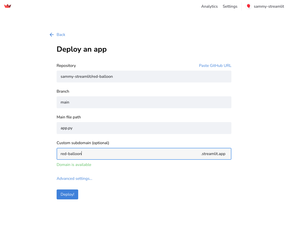
Although Community Cloud attempts to suggest available repositories and files, these suggestions are not always complete. If the desired information is not listed for any field, enter it manually.
## Optional: Configure secrets and Python version
Streamlit Community Cloud supports all released [versions of Python that are still receiving security updates](https://devguide.python.org/versions/). Streamlit Community Cloud defaults to version 3.12. You can select a version of your choice from the "Python version" dropdown in the "Advanced settings" modal. If an app is running a version of Python that becomes unsupported, it will be forcibly upgraded to the oldest supported version of Python and may break.
1. Click "**Advanced settings**."
1. Select your desired version of Python.
1. To define environment variables and secrets, in the "Secrets" field, paste the contents of your `secrets.toml` file.
For more information, see [Community Cloud secrets management](/deploy/streamlit-community-cloud/deploy-your-app/secrets-management).
1. Click "**Save**."
{{ maxWidth: '70%', margin: 'auto' }}>
---
# Manage your app
Source: https://docs.streamlit.io/deploy/streamlit-community-cloud/manage-your-app
You can manage your deployed app from your workspace at share.streamlit.io or directly from `.streamlit.app`. You can view, deploy, delete, reboot, or favorite an app.
## Manage your app from your workspace
Streamlit Community Cloud is organized into workspaces, which automatically group your apps according to their repository's owner in GitHub. Your workspace is indicated in the upper-left corner. For more information, see [Switching workspaces](/deploy/streamlit-community-cloud/get-started/explore-your-workspace#switching-workspaces).
To deploy or manage any app, always switch to the workspace matching the repository's owner first.
### Sort your apps
If you have many apps in your workspace, you can pin apps to the top by marking them as favorite ({{ verticalAlign: "-.25em", color: "#faca2b" }} className={{ class: "material-icons-sharp" }}>star). For more information, see [Favorite your app](/deploy/streamlit-community-cloud/manage-your-app/favorite-your-app).
### App overflow menus
Each app has a menu accessible from the overflow icon ({{ verticalAlign: "-.25em" }} className={{ class: "material-icons-sharp" }}>more_vert
---
# App analytics
Source: https://docs.streamlit.io/deploy/streamlit-community-cloud/manage-your-app/app-analytics
Streamlit Community Cloud allows you to see the viewership of each of your apps. Specifically, you can see:
- The total viewers count of your app (counted from April 2022).
- The most recent unique viewers (capped at the last 20 viewers).
- A relative timestamp of each unique viewer's last visit.
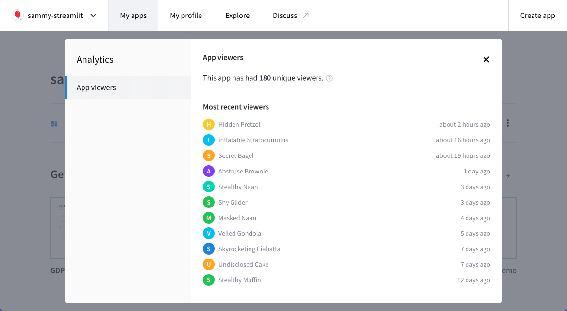
## Access your app analytics
You can get to your app's analytics:
- [From your workspace](#access-app-analytics-from-your-workspace).
- [From your Cloud logs](#access-app-analytics-from-your-cloud-logs).
### Access app analytics from your workspace
From your workspace at share.streamlit.io, click the overflow icon ({{ verticalAlign: "-.25em" }} className={{ class: "material-icons-sharp" }}>more_vert
---
# App settings
Source: https://docs.streamlit.io/deploy/streamlit-community-cloud/manage-your-app/app-settings
This page is about your app settings on Streamlit Community Cloud. From your app settings you can [view or change your app's URL](/deploy/streamlit-community-cloud/manage-your-app/app-settings#view-or-change-your-apps-url), manage [public or private access to your app](/deploy/streamlit-community-cloud/share-your-app), and update your saved [secrets for your apps](/deploy/streamlit-community-cloud/deploy-your-app/secrets-management).
If you access "**Settings**" from your [app chrome](/develop/concepts/architecture/app-chrome) in the upper-right corner of your running app, you can access features to control the appearance of your app while it's running.
## Access your app settings
You can get to your app's settings:
- [From your workspace](#access-app-settings-from-your-workspace).
- [From your Cloud logs](#access-app-settings-from-your-cloud-logs).
### Access app settings from your workspace
From your workspace at share.streamlit.io, click the overflow icon ({{ verticalAlign: "-.25em" }} className={{ class: "material-icons-sharp" }}>more_vert
---
# Delete your app
Source: https://docs.streamlit.io/deploy/streamlit-community-cloud/manage-your-app/delete-your-app
If you need to delete your app, it's simple and easy. There are several cases where you may need to delete your app:
- You have finished playing around with an example app.
- You want to deploy from a private repository but already have a private app.
- You want to [change the Python version](/deploy/streamlit-community-cloud/manage-your-app/upgrade-python) for your app.
- You want to [rename your repository](/deploy/streamlit-community-cloud/manage-your-app/rename-your-app) or move your entrypoint file.
If you delete your app and intend to immediately redploy it, your custom subdomain should be immediately available for reuse. Read more about data deletion in [Streamlit trust and security](/deploy/streamlit-community-cloud/get-started/trust-and-security#data-deletion).
You can delete your app:
- [From your workspace](#delete-your-app-from-your-workspace).
- [From your Cloud logs](#delete-your-app-from-your-cloud-logs).
### Delete your app from your workspace
1. From your workspace at share.streamlit.io, click the overflow icon ({{ verticalAlign: "-.25em" }} className={{ class: "material-icons-sharp" }}>more_vert
---
# Edit your app
Source: https://docs.streamlit.io/deploy/streamlit-community-cloud/manage-your-app/edit-your-app
You can edit your app from any development environment of your choice. Streamlit Community Cloud will monitor your repository and automatically copy any file changes you commit. You will immediately see commits reflected in your deployed app for most changes (such as edits to your app's Python files).
Community Cloud also makes it easy to skip the work of setting up a development environment. With a few simple clicks, you can configure a development environment using GitHub Codespaces.
## Edit your app with GitHub Codespaces
Spin up a cloud-based development environment for your deployed app in minutes. You can run your app within your codespace to enjoy experimenting in a safe, sandboxed environment. When you are done editing your code, you can commit your changes to your repo or just leave them in your codespace to return to later.
### Create a codespace for your deployed app
1. From your workspace at share.streamlit.io, click the overflow icon ({{ verticalAlign: "-.25em" }} className={{ class: "material-icons-sharp" }}>more_vert
---
# Favorite your app
Source: https://docs.streamlit.io/deploy/streamlit-community-cloud/manage-your-app/favorite-your-app
Streamlit Community Cloud supports a "favorite" feature that lets you quickly access your apps from your workspace. Favorited apps appear at the top of their workspace with a yellow star ({{ verticalAlign: "-.25em", color: "#faca2b" }} className={{ class: "material-icons-sharp" }}>star
---
# Reboot your app
Source: https://docs.streamlit.io/deploy/streamlit-community-cloud/manage-your-app/reboot-your-app
If you need to clear your app's memory or force a fresh build after modifying a file that Streamlit Community Cloud doesn't monitor, you may need to reboot your app. This will interrupt any user who may currently be using your app and may take a few minutes for your app to redeploy. Anyone visiting your app will see "Your app is in the oven" during a reboot.
Rebooting your app on Community Cloud is easy! You can reboot your app:
- [From your workspace](#reboot-your-app-from-your-workspace).
- [From your Cloud logs](#reboot-your-app-from-your-cloud-logs).
### Reboot your app from your workspace
1. From your workspace at share.streamlit.io, click the overflow icon ({{ verticalAlign: "-.25em" }} className={{ class: "material-icons-sharp" }}>more_vert
---
# Rename or change your app's GitHub coordinates
Source: https://docs.streamlit.io/deploy/streamlit-community-cloud/manage-your-app/rename-your-app
Streamlit Community Cloud identifies apps by their GitHub coordinates (owner, repository, branch, entrypoint file path). If you move or rename one of these coordinates without preparation, you will lose access to administer any associated app.
## Delete, rename, redeploy
If you need to rename your repository, move your entrypoint file, or otherwise change a deployed app's GitHub coordinates, do the following:
1. Delete your app.
1. Make your desired changes in GitHub.
1. Redeploy your app.
## Regain access when you've already made changes to your app's GitHub coordinates
If you have changed a repository so that Community Cloud can no longer find your app on GitHub, your app will be missing or shown as view-only. View-only means that you can't edit, reboot, delete, or view settings for your app. You can only access analytics.
You may be able to regain control as follows:
1. Revert the change you made to your app so that Community Cloud can see the owner, repository, branch, and entrypoint file it expects.
1. Sign out of Community Cloud and GitHub.
1. Sign back in to Community Cloud and GitHub.
1. If you have regained access, delete your app. Proceed with your original change, and redeploy your app.
If this does not restore access to your app, please [contact Snowflake support](/knowledge-base/deploy/how-to-submit-a-support-case-for-streamlit-community-cloud) for assistance. They can delete your disconnected apps so you can redeploy them. For the quickest help, please provide a complete list of your affected apps by URL.
---
# Upgrade your app's Python version on Community Cloud
Source: https://docs.streamlit.io/deploy/streamlit-community-cloud/manage-your-app/upgrade-python
Dependencies within Python can be upgraded in place by simply changing your environment configuration file (typically `requirements.txt`). However, Python itself can't be changed after deployment.
When you deploy an app, you can select the version of Python through the "**Advanced settings**" dialog. After you have deployed an app, you must delete it and redeploy it to change the version of Python it uses.
1. Take note of your app's settings:
- Current, custom subdomain.
- GitHub coordinates (repository, branch, and entrypoint file path).
- Secrets.
When you delete an app, its custom subdomain is immediately available for reuse.
1. [Delete your app](/deploy/streamlit-community-cloud/manage-your-app/delete-your-app).
1. [Deploy your app](/deploy/streamlit-community-cloud/deploy-your-app).
1. On the deployment page, select your app's GitHub coordinates.
1. Set your custom domain to match your deleted instance.
1. Click "**Advanced settings**."
1. Choose your desired version of Python.
1. Optional: If your app had secrets, re-enter them.
1. Click "**Save**."
1. Click "**Deploy**."
In a few minutes, Community Cloud will redirect you to your redployed app.
---
# Upgrade your app's Streamlit version on Streamlit Community Cloud
Source: https://docs.streamlit.io/deploy/streamlit-community-cloud/manage-your-app/upgrade-streamlit
Want to use a cool new Streamlit feature but your app on Streamlit Community Cloud is running an old version of the Streamlit library? If that's you, don't worry! Here's how to upgrade your app's Streamlit version, based on how you manage your [app dependencies](/deploy/streamlit-community-cloud/deploy-your-app/app-dependencies):
## No dependency file
When there is no dependencies file in your repository, your app will use the lastest Streamlit version that existed when it was last rebooted. In this case, simply [reboot your app](/deploy/streamlit-community-cloud/manage-your-app/reboot-your-app) and Community Cloud will install the latest version.
You may want to avoid getting into this situation if your app depends on a specific version of Streamlit. That is why we encourage you to use a dependency file and pin your desired version of Streamlit.
## With a dependency file
When your app includes a dependency file, reboot your app or change your dependency file as follows:
- If Streamlit is not included in your dependency file, reboot the app as described above.
Note that we don't recommend having an incomplete dependency file since `pip` won't be able to include `streamlit` when resolving compatible versions of your dependencies.
- If Streamlit is included in your dependency file, but the version is not pinned or capped, reboot the app as described above.
When Community Cloud reboots your app, it will re-resolve your dependency file. Your app will then have the latest version of all dependencies that are consistent with your dependency file.
- If Streamlit is included in your dependency file, and the version is pinned (e.g., `streamlit==1.37.0`), update your dependency file.
When you commit a change to your dependency file in your repository, Community Cloud will detect the change and automatically resolve the new dependencies. This is how you add, remove, or change all Python dependencies in general. You don't need to manually reboot your app, but you can if you want to.
---
# Share your app
Source: https://docs.streamlit.io/deploy/streamlit-community-cloud/share-your-app
Now that your app is deployed you can easily share it and collaborate on it. But first, let's take a moment and do a little joy dance for getting that app deployed! 🕺💃
Your app is now live at a fixed URL, so go wild and share it with whomever you want. Your app will inherit permissions from your GitHub repo, meaning that if your repo is private your app will be private and if your repo is public your app will be public. If you want to change that you can simply do so from the app settings menu.
You are only allowed one private app at a time. If you've deployed from a private repository, you will have to make that app public or delete it before you can deploy another app from a private repository. Only developers can change your app between public and private.
- [Make your app public or private](#make-your-app-public-or-private)
- [Share your public app](#share-your-public-app)
- [Share your private app](#share-your-private-app)
## Make your app public or private
If you deployed your app from a public repository, your app will be public by default. If you deployed your app from a private repository, you will need to make the app public if you want to freely share it with the community at large.
### Set privacy from your app settings
1. Access your [App settings](/deploy/streamlit-community-cloud/manage-your-app/app-settings) and go to the "**Sharing**" section.
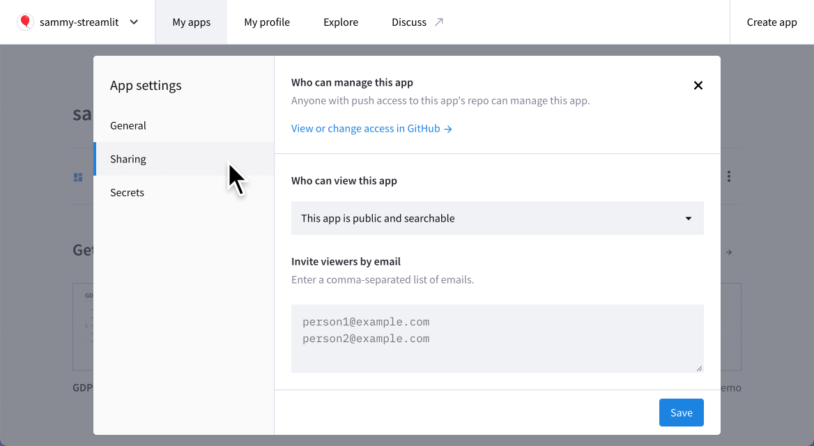
2. Set your app's privacy under "Who can view this app." Select "**This app is public and searchable**" to make your app public. Select "**Only specific people can view this app**" to make your app private.
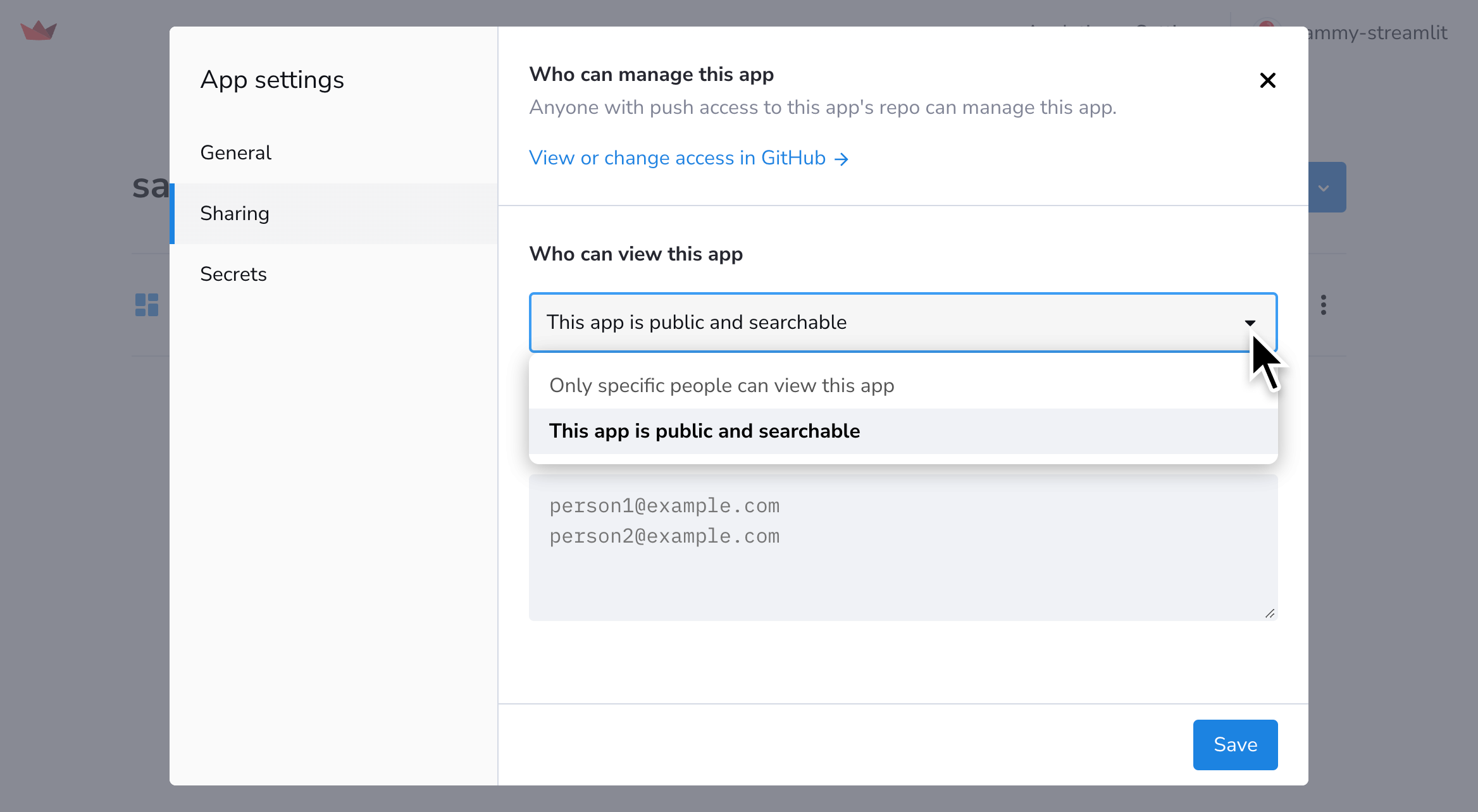
### Set privacy from the share button
1. From your app at `.streamlit.app`, click "**Share**" in the upper-right corner.
2. Toggle your app between public and private by clicking "**Make this app public**."
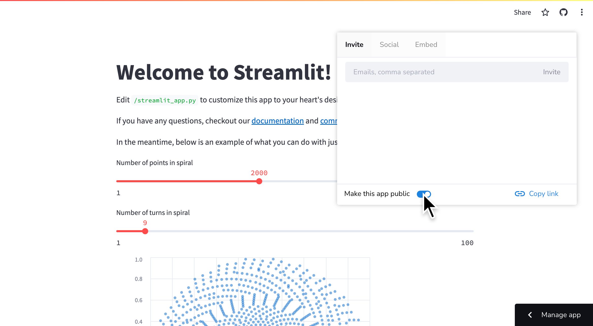
## Share your public app
Once your app is public, just give anyone your app's URL and they view it! Streamlit Community Cloud has several convenient shortcuts for sharing your app.
### Share your app on social media
1. From your app at `.streamlit.app`, click "**Share**" in the upper-right corner.
2. Click "**Social**" to access convenient social media share buttons.
Use the social media sharing buttons to post your app on our forum! We'd love to see what you make and perhaps feature your app as our app of the month. 💖
### Invite viewers by email
Whether your app is public or private, you can send an email invite to your app directly from Streamlit Community Cloud. This grants the viewer access to analytics for all your public apps and the ability to invite other viewers to your workspace. Developers and invited viewers are identified by their email in analytics instead of appearing anonymously (if they view any of your apps while signed in). Read more about viewers in [App analytics](/deploy/streamlit-community-cloud/manage-your-app/app-analytics).
1. From your app at `.streamlit.app`, click "**Share**" in the upper-right corner.
2. Enter an email address and click "**Invite**."
3. Invited users will get a direct link to your app in their inbox.
### Copy your app's URL
From your app click "**Share**" in the upper-right corner then click "**Copy link**."
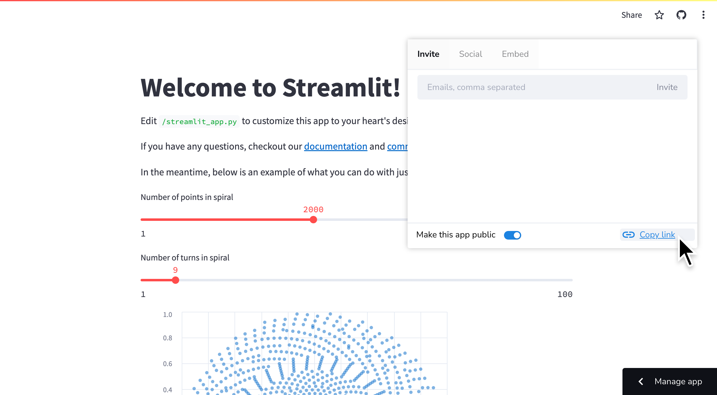
### Add a badge to your GitHub repository
To help others find and play with your Streamlit app, you can add Streamlit's GitHub badge to your repo. Below is an enlarged example of what the badge looks like. Clicking on the badge takes you toin this caseStreamlit's Roadmap.
{{ marginBottom: '2em' }}>
{{ width: 'fit-content', margin: 'auto' }}>
Once you deploy your app, you can embed this badge right into your GitHub README.md by adding the following Markdown:
```markdown
[](https://.streamlit.app)
```
Be sure to replace `https://.streamlit.app` with the URL of your deployed app!
## Share your private app
By default an app deployed from a private repository will be private to the developers in the workspace. A private app will not be visible to anyone else unless you grant them explicit permission. You can grant permission by adding them as a developer on GitHub or by adding them as a viewer on Streamlit Community Cloud.
Once you have added someone's email address to your app's viewer list, that person will be able to sign in and view your private app. If their email is associated with a Google account, they will be able to sign in with Google OAuth. Otherwise, they will be able to sign in with single-use, emailed links. Streamlit sends an email invitation with a link to your app every time you invite someone.
When you add a viewer to any app in your workspace, they are granted access to analytics for that app as well as analytics for all your public apps. They can also pass these permissions to others by inviting more viewers. All viewers and developers in your workspace are identified by their email in analytics. Furthermore, their emails show in analytics for every app in your workspace and not just apps they are explicitly invited to. Read more about viewers in [App analytics](/deploy/streamlit-community-cloud/manage-your-app/app-analytics)
### Invite viewers from the share button
1. From your app at `.streamlit.app`, click "**Share**" in the upper-right corner.

2. Enter the email to send an invitation to and click "**Invite**."

3. Invited users appear in the list below.
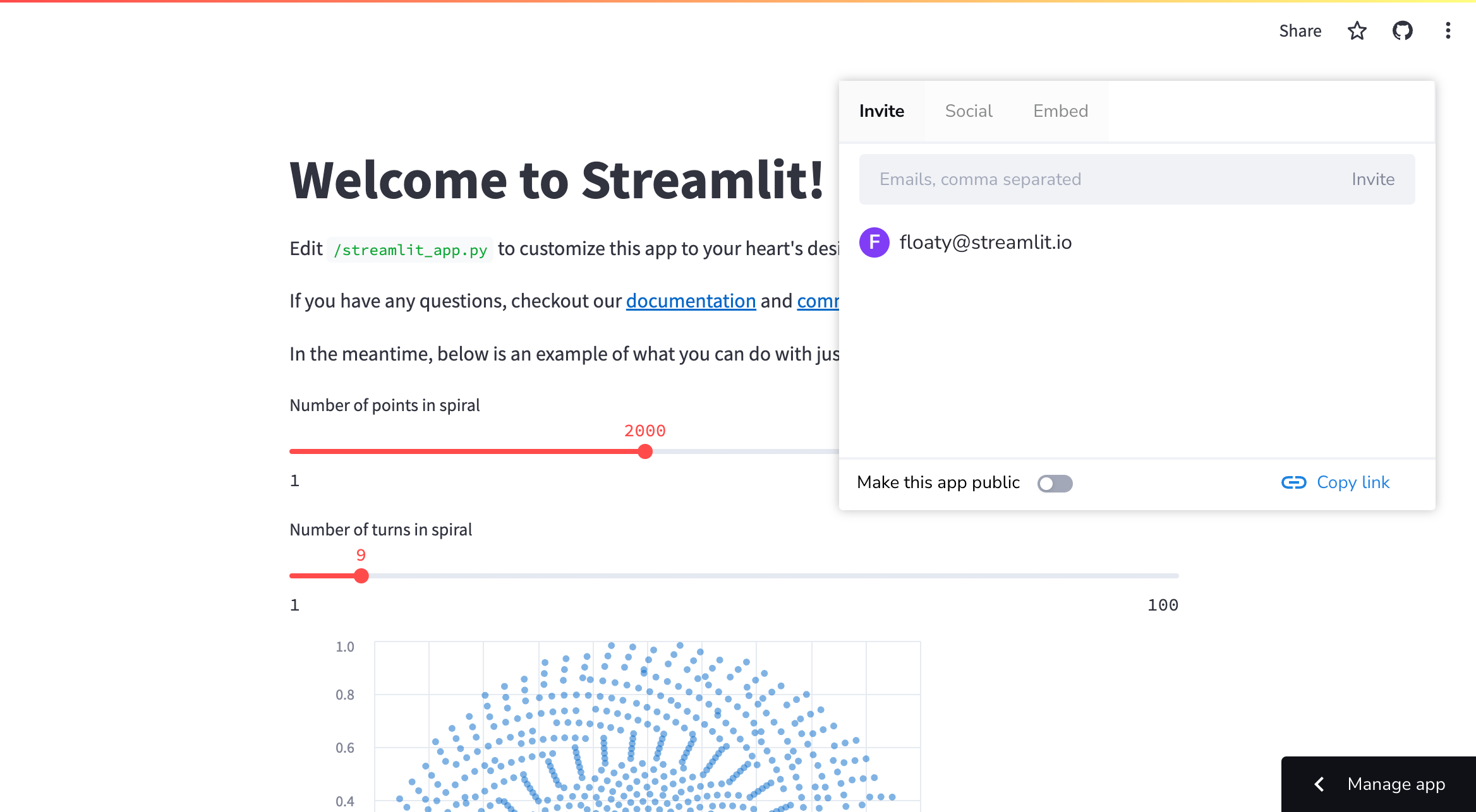
4. Invited users will get a direct link to your app in their inbox.

- To remove a viewer, simply access the share menu as above and click the {{ verticalAlign: "-.25em" }} className={{ class: "material-icons-sharp" }}>close next to their name.
### Invite viewers from your app settings
1. Access your [App settings](/deploy/streamlit-community-cloud/manage-your-app/app-settings) and go to the "**Sharing**" section.

2. Add or remove users from the list of viewers. Click "**Save**."

---
# Embed your app
Source: https://docs.streamlit.io/deploy/streamlit-community-cloud/share-your-app/embed-your-app
Embedding Streamlit Community Cloud apps enriches your content by integrating interactive, data-driven applications directly within your pages. Whether you're writing a blog post, a technical document, or sharing resources on platforms like Medium, Notion, or even StackOverflow, embedding Streamlit apps adds a dynamic component to your content. This allows your audience to interact with your ideas, rather than merely reading about them or looking at screenshots.
Streamlit Community Cloud supports both [iframe](#embedding-with-iframes) and [oEmbed](#embedding-with-oembed) methods for embedding **public** apps. This flexibility enables you to share your apps across a wide array of platforms, broadening your app's visibility and impact. In this guide, we'll cover how to use both methods effectively to share your Streamlit apps with the world.
## Embedding with iframes
Streamlit Community Cloud supports embedding **public** apps using the subdomain scheme. To embed a public app, add the query parameter `/?embed=true` to the end of the `*.streamlit.app` URL.
For example, say you want to embed the 30DaysOfStreamlit app. The URL to include in your iframe is: `https://30days.streamlit.app/?embed=true`:
```javascript
```
There will be no official support for embedding private apps.
In addition to allowing you to embed apps via iframes, the `?embed=true` query parameter also does the following:
- Removes the toolbar with the app menu icon ({{ verticalAlign: "-.25em" }} className={{ class: "material-icons-sharp" }}>more_vert
---
# SEO and search indexability
Source: https://docs.streamlit.io/deploy/streamlit-community-cloud/share-your-app/indexability
When you deploy a public app to Streamlit Community Cloud, it is automatically indexed by search engines like Google and Bing on a weekly basis. 🎈 This means that anyone can find your app by searching for its custom subdomain (e.g. "traingenerator.streamlit.app") or by searching for the app's title.
## Get the most out of app indexability
Here are some tips to help you get the most out of app indexability:
1. [Make sure your app is public](#make-sure-your-app-is-public)
2. [Choose a custom subdomain early](#choose-a-custom-subdomain-early)
3. [Choose a descriptive app title](#choose-a-descriptive-app-title)
4. [Customize your app's meta description](#customize-your-apps-meta-description)
### Make sure your app is public
All public apps hosted on Community Cloud are indexed by search engines. If your app is private, it will not be indexed by search engines. To make your private app public, read [Share your app](/deploy/streamlit-community-cloud/share-your-app).
### Choose a custom subdomain early
Community Cloud automatically generates a subdomain for your app if you do not choose one. However, you can change your subdomain at any time! Custom subdomains modify your app URLs to reflect your app content, personal branding, or whatever you’d like. To learn how to change your app's subdomain, see [View or change your app's URL](/deploy/streamlit-community-cloud/manage-your-app/app-settings#view-or-change-your-apps-url).
By choosing a custom subdomain, you can use it to help people find your app. For example, if you're deploying an app that generates training data, you might choose a subdomain like `traingenerator.streamlit.app`. This makes it easy for people to find your app by searching for "training generator" or "train generator streamlit app."
We recommend choosing a custom subdomain when you deploy your app. This ensures that your app is indexed by search engines using your custom subdomain, rather than the automatically generated one. If you choose a custom subdomain later, your app may be indexed multiple timesonce using the default subdomain and once using your custom subdomain. In this case, your old URL will result in a 404 error which can confuse users who are searching for your app.
### Choose a descriptive app title
The meta title of your app is the text that appears in search engine results. It is also the text that appears in the browser tab when your app is open. By default, the meta title of your app is the same as the title of your app. However, you can customize the meta title of your app by setting the [`st.set_page_config`](/develop/api-reference/configuration/st.set_page_config) parameter `page_title` to a custom string. For example:
```python
st.set_page_config(page_title="Traingenerator")
```
This will change the meta title of your app to "Traingenerator." This makes it easier for people to find your app by searching for "Traingenerator" or "train generator streamlit app":
### Customize your app's meta description
Meta descriptions are the short descriptions that appear in search engine results. Search engines use the meta description to help users understand what your app is about.
From our observations, search engines seem to favor the content in both `st.header` and `st.text` over `st.title`. If you put a description at the top of your app under `st.header` or `st.text`, there’s a good chance search engines will use this for the meta description.
## What does my indexed app look like?
If you're curious about what your app looks like in search engine results, you can type the following into Google Search:
```
site:.streamlit.app
```
Example: `site:traingenerator.streamlit.app`
## What if I don't want my app to be indexed?
If you don't want your app to be indexed by search engines, you can make it private. Read [Share your app](/deploy/streamlit-community-cloud/share-your-app) to learn more about making your app private. Note: each workspace can only have one private app. If you want to make your app private, you must first delete any other private app in your workspace or make it public.
That said, Community Cloud is an open and free platform for the community to deploy, discover, and share Streamlit apps and code with each other. As such, we encourage you to make your app public so that it can be indexed by search engines and discovered by other Streamlit users and community members.
---
# Share previews
Source: https://docs.streamlit.io/deploy/streamlit-community-cloud/share-your-app/share-previews
Social media sites generate a card with a title, preview image, and description when you share a link. This feature is called a "share preview." In the same way, when you share a link to a public Streamlit app on social media, a share preview is also generated. Here's an example of a share preview for a public Streamlit app posted on Twitter:
{{ marginLeft: '3em' }}>
---
# Manage your account
Source: https://docs.streamlit.io/deploy/streamlit-community-cloud/manage-your-account
You can [Update your email](/deploy/streamlit-community-cloud/manage-your-account/update-your-email) or completely [Delete your account](/deploy/streamlit-community-cloud/manage-your-account/delete-your-account) through [Workspace settings](/deploy/streamlit-community-cloud/manage-your-account/workspace-settings).
Your Streamlit Community Cloud account is identified by your email. When you sign in to Community Cloud, regardless of which method you use, you are providing Community Cloud with your email address. In particular, when you sign in to Community Cloud using GitHub, you are using the primary email on your GitHub account. You can view your email identity and source-control identity from your workspace settings, under "[**Linked accounts**](/deploy/streamlit-community-cloud/manage-your-account/workspace-settings#linked-accounts)."
## Access your workspace settings
1. Sign in to share.streamlit.io.
1. In the upper-left corner, click on your workspace name.
1. In the drop-down menu, click "**Settings**."
{{ maxWidth: '75%', marginLeft: '3em' }}>
---
# Sign in sign out
Source: https://docs.streamlit.io/deploy/streamlit-community-cloud/manage-your-account/sign-in-sign-out
After you've created your account, you can sign in to share.streamlit.io as described by the following options.
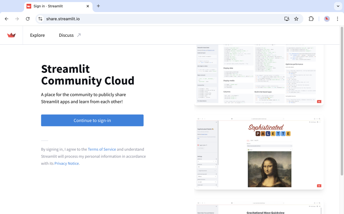
## Sign in with Google
1. Click "**Continue to sign-in**."
1. Click "**Continue with Google**."
1. Enter your Google account credentials and follow the prompts.
If your account is already linked to GitHub, you may be immediately prompted to sign in with GitHub.
## Sign in with GitHub
1. Click "**Continue to sign-in**."
1. Click "**Continue with GitHub**."
1. Enter your GitHub credentials and follow the prompts.
When you sign in with GitHub, Community Cloud will look for an account that uses the same email you have on your GitHub account. If such an account doesn't exist, Community Cloud will look for an account that uses your GitHub account for source control. In this latter instance, Community Cloud will update the email on your Community Cloud account to match the email on your GitHub account.
## Sign in with Email
1. Click "**Continue to sign-in**."
1. In the "Email" field, enter your email address.
1. Click "**Continue**." (If prompted, verify you are human.)
1. Go to your email inbox, and copy your one-time, six-digit code. The code is valid for ten minutes.
1. Return to the authentication page, and enter your code. (If prompted, verify you are human.)
If your account is already linked to GitHub, you may be immediately prompted to sign in with GitHub.
## Sign out of your account
From your workspace, click on your workspace name in the upper-left corner. Click "**Sign out**."
{{ maxWidth: '80%', margin: 'auto' }}>
---
# Workspace settings
Source: https://docs.streamlit.io/deploy/streamlit-community-cloud/manage-your-account/workspace-settings
From your workspace settings you can [Manage your account](/deploy/streamlit-community-cloud/manage-your-account), see your [App resources and limits](/deploy/streamlit-community-cloud/manage-your-app#app-resources-and-limits) and access support resources.
## Access your workspace settings
1. Sign in to share.streamlit.io.
1. In the upper-left corner, click on your workspace name.
1. In the drop-down menu, click "**Settings**."
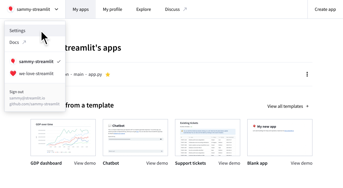
## Linked accounts
The "**Linked accounts**" section shows your current email identity and source control account. To learn more, see [Manage your account](/deploy/streamlit-community-cloud/manage-your-account).
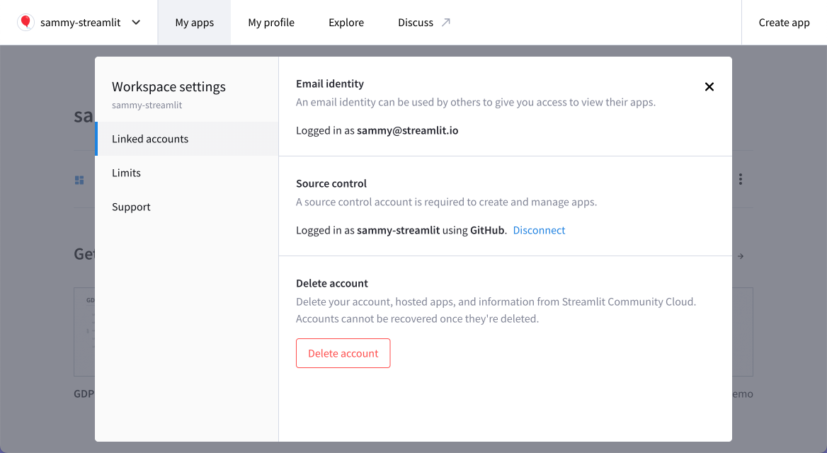
## Limits
The "**Limits**" section shows your current resources and limits. To learn more, see [App resources and limits](/deploy/streamlit-community-cloud/manage-your-app#app-resources-and-limits).
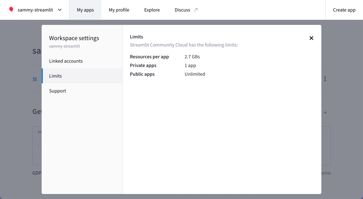
## Support
The "**Support**" section provides a convenient list of useful resources so you know where to go for help.
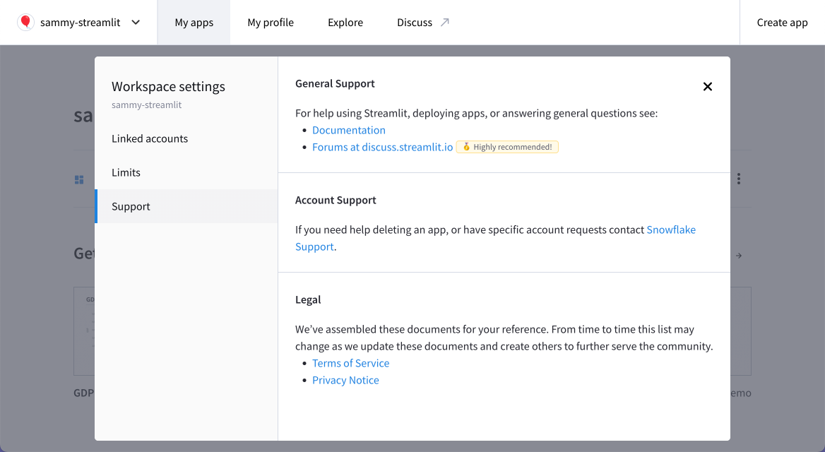
---
# Manage your GitHub connection
Source: https://docs.streamlit.io/deploy/streamlit-community-cloud/manage-your-account/manage-your-github-connection
If you have created an account but not yet connected GitHub, see [Connect your GitHub account](/deploy/streamlit-community-cloud/get-started/connect-your-github-account).
If you have already connected your GitHub account but still need to allow Streamlit Community Cloud to access private repositories, see [Optional: Add access to private repositories](/deploy/streamlit-community-cloud/get-started/connect-your-github-account#optional-add-access-to-private-repositories).
## Add access to an organization
If you are in an organization, you can grant or request access to that organization when you connect your GitHub account. For more information, see [Organization access](/deploy/streamlit-community-cloud/get-started/connect-your-github-account#organization-access).
If your GitHub account is already connected, you can remove permissions in your GitHub settings and force Streamlit to reprompt for GitHub authorization the next time you sign in to Community Cloud.
### Revoke and reauthorize
1. From your workspace, click on your workspace name in the upper-right corner. To sign out of Community Cloud, click "**Sign out**."
1. Go to your GitHub application settings at github.com/settings/applications.
1. Find the "Streamlit" application, and click on the three dots ({{ verticalAlign: "-.25em" }} className={{ class: "material-icons-sharp" }}>more_horiz
---
# Update your email
Source: https://docs.streamlit.io/deploy/streamlit-community-cloud/manage-your-account/update-your-email
To update your email on Streamlit Community Cloud, you have two options: You can create a new account and merge your existing account into it, or you can use your GitHub account to update your email.
## Option 1: Create a new account and merge it
Two Community Cloud accounts can't have the same GitHub account for source control. When you connect a GitHub account to a new Community Cloud account for source control, Community Cloud will automatically merge any existing account with the same source control.
Therefore, you can create a new account with the desired email and connect the same GitHub account to merge them together.
1. Create a new account with your new email.
1. Connect your GitHub account.
Your old and new accounts are now merged, and you have effectively changed your email address.
## Option 2: Use your GitHub account
Alternatively, you can change the email on your GitHub account and then sign in to Community Cloud with GitHub.
1. Go to GitHub, and set your primary email address to your new email.
1. If you are currently signed in to Community Cloud, sign out.
1. Sign in to Community Cloud _using GitHub_.
If you are redirected to your workspace and you see your existing apps, you're done! Your email has been changed. To confirm your current email and GitHub account, click on your workspace name in the upper-left corner, and look at the bottom of the drop-down menu.
If you are redirected to an empty workspace and you see "**Workspaces {{ verticalAlign: "-.25em", color: "#ff8700" }} className={{ class: "material-icons-sharp" }}>warning
---
# Delete your account
Source: https://docs.streamlit.io/deploy/streamlit-community-cloud/manage-your-account/delete-your-account
Deleting your Streamlit Community Cloud account is just as easy as creating it. When you delete your account, your information, account, and all your hosted apps are deleted as well. Read more about data deletion in [Streamlit trust and security](/deploy/streamlit-community-cloud/get-started/trust-and-security#data-deletion).
Deleting your account is permanent and cannot be undone. Make sure you really want to delete your account and all hosted apps before proceeding. Any app you've deployed will be deleted, regardless of the workspace it was deployed from.
## How to delete your account
Follow these steps to delete your account:
1. Sign in to Streamlit Community Cloud at share.streamlit.io and access your [Workspace settings](/deploy/streamlit-community-cloud/manage-your-account/workspace-settings).

1. From the "**Linked accounts**" section, click "**Delete account**."
1. In the confirmation dialog, follow the prompt and click "**Delete account forever**."
All your information and apps will be permanently deleted.
It's that simple! If you have any questions or run into issues deleting your account, please reach out to us on our forum. We're happy to help! 🎈
---
# Status and limitations of Community Cloud
Source: https://docs.streamlit.io/deploy/streamlit-community-cloud/status
## Community Cloud Status
You can view the current status of Community Cloud at [streamlitstatus.com](https://www.streamlitstatus.com/).
## GitHub OAuth scope
To deploy your app, Streamlit requires access to your app's source code in GitHub and the ability to manage the public keys associated with your repositories. The default GitHub OAuth scopes are sufficient to work with apps in public GitHub repositories. However, to access your private repositories, we create a read-only [GitHub Deploy Key](https://docs.github.com/en/free-pro-team@latest/developers/overview/managing-deploy-keys#deploy-keys) and then access your repo using an SSH key. When we create this key, GitHub notifies repo admins of the creation as a security measure.
Streamlit requires the additional `repo` OAuth scope from GitHub to work with your private repos and manage deploy keys. We recognize that the `repo` scope provides Streamlit with extra permissions that we do not really need and which, as people who prize security, we'd rather not even be granted. This was the permission model available from GitHub when Community Cloud was created. However, we are working on adopting the new GitHub permission model to reduce uneeded permissions.
### Developer permissions
Because of the OAuth limitations noted above, a developer must have administrative permissions to a repository to deploy apps from it.
## Repository file structure
You can deploy multiple apps from your repository, and your entrypoint file(s) may be anywhere in your directory structure. However, Community Cloud initializes all apps from the root of your repository, even if the entrypoint file is in a subdirectory. This has the following consequences:
- Community Cloud only recognizes one `.streamlit/configuration.toml` file at the root (of each branch) of your repository.
- You must declare image, video, and audio file paths for Streamlit commands relative to the root of your repository. For example, `st.image`, `st.logo`, and the `page_icon` parameter in `st.set_page_config` expect file locations relative to your working directory (i.e. where you execute `streamlit run`).
## Linux environments
Community Cloud is built on Debian Linux.
- Community Cloud uses Debian 11 ("bullseye"). To browse available packages that can be installed, see the [package list](https://packages.debian.org/bullseye/).
- All file paths must use forward-slash path separators.
## Python environments
- You cannot mix and match Python package managers for a single app. Community Cloud configures your app's Python environment based on the first environment configuration file it finds. For more information, see [Other Python package managers](/deploy/streamlit-community-cloud/deploy-your-app/app-dependencies#other-python-package-managers).
- We recommend that you use the latest version of Streamlit to ensure full Community Cloud functionality. Be sure to take note of Streamlit's [current requirements](https://github.com/streamlit/streamlit/blob/develop/lib/setup.py) for package compatibility when planning your environment, especially `protobuf>=3.20,
---
# Deploy Streamlit apps in Snowflake
Source: https://docs.streamlit.io/deploy/snowflake
Host your apps alongside your data in a single, global platform. Snowflake provides industry-leading features that ensure the highest levels of security for your account, users, data, and apps. If you're looking for an enterprise hosting solution, try Snowflake!
There are three ways to host Streamlit apps in Snowflake:
Run your Streamlit app as a native object in Snowflake. Enjoy an in-browser editor and minimal work to configure your environment. Share your app with other users in your Snowflake account through role-based access control (RBAC). This is a great way to deploy apps internally for your business. Check out Snowflake docs!Package your app with data and share it with other Snowflake accounts. This is a great way to share apps and their underlying data with other organizations who use Snowflake. Check out Snowflake docs!Deploy your app in a container that's optimized to run in Snowflake. This is the most flexible option, where you can use any library and assign a public URL to your app. Manage your allowed viewers through your Snowflake account. Check out Snowflake docs!
Using Snowpark Container Services to deploy a Streamlit app requires a compute pool, which is not available in a trial account at this time.
---
# Deployment tutorials
Source: https://docs.streamlit.io/deploy/tutorials
This sections contains step-by-step guides on how to deploy Streamlit apps to various cloud platforms and services. We have deployment guides for:
alt="screenshot" src="/images/deploy/streamlit-cloud.png" />
While we work on official Streamlit deployment guides for other hosting providers, here are some user-submitted tutorials for different cloud services:
- [How to deploy Streamlit apps to **Google App Engine**](https://dev.to/whitphx/how-to-deploy-streamlit-apps-to-google-app-engine-407o), by [Yuichiro Tachibana (Tsuchiya)](https://discuss.streamlit.io/u/whitphx/summary).
- [Host Streamlit on **Heroku**](https://towardsdatascience.com/quickly-build-and-deploy-an-application-with-streamlit-988ca08c7e83), by Maarten Grootendorst.
- [Deploy Streamlit on **Ploomber Cloud**](https://docs.cloud.ploomber.io/en/latest/apps/streamlit.html), by Ido Michael.
- [Host Streamlit on **21YunBox**](https://www.21yunbox.com/docs/#/deploy-streamlit), by Toby Lei.
- [Deploy a Streamlit App on **Koyeb**](https://www.koyeb.com/docs/deploy/streamlit), by Justin Ellingwood.
- [Community-supported deployment wiki](https://discuss.streamlit.io/t/streamlit-deployment-guide-wiki/5099).
---
# Deploy Streamlit using Docker
Source: https://docs.streamlit.io/deploy/tutorials/docker
## Introduction
So you have an amazing app and you want to start sharing it with other people, what do you do? You have a few options. First, where do you want to run your Streamlit app, and how do you want to access it?
- **On your corporate network** - Most corporate networks are closed to the outside world. You typically use a VPN to log onto your corporate network and access resources there. You could run your Streamlit app on a server in your corporate network for security reasons, to ensure that only folks internal to your company can access it.
- **On the cloud** - If you'd like to access your Streamlit app from outside of a corporate network, or share your app with folks outside of your home network or laptop, you might choose this option. In this case, it'll depend on your hosting provider. We have [community-submitted guides](/knowledge-base/deploy/deploy-streamlit-heroku-aws-google-cloud) from Heroku, AWS, and other providers.
Wherever you decide to deploy your app, you will first need to containerize it. This guide walks you through using Docker to deploy your app. If you prefer Kubernetes see [Deploy Streamlit using Kubernetes](/deploy/tutorials/kubernetes).
## Prerequisites
1. [Install Docker Engine](#install-docker-engine)
2. [Check network port accessibility](#check-network-port-accessibility)
### Install Docker Engine
If you haven't already done so, install [Docker](https://docs.docker.com/engine/install/#server) on your server. Docker provides `.deb` and `.rpm` packages from many Linux distributions, including:
- [Debian](https://docs.docker.com/engine/install/debian/)
- [Ubuntu](https://docs.docker.com/engine/install/ubuntu/)
Verify that Docker Engine is installed correctly by running the `hello-world` Docker image:
```bash
sudo docker run hello-world
```
Follow Docker's official [post-installation steps for Linux](https://docs.docker.com/engine/install/linux-postinstall/) to run Docker as a non-root user, so that you don't have to preface the `docker` command with `sudo`.
### Check network port accessibility
As you and your users are behind your corporate VPN, you need to make sure all of you can access a certain network port. Let's say port `8501`, as it is the default port used by Streamlit. Contact your IT team and request access to port `8501` for you and your users.
## Create a Dockerfile
Docker builds images by reading the instructions from a `Dockerfile`. A `Dockerfile` is a text document that contains all the commands a user could call on the command line to assemble an image. Learn more in the [Dockerfile reference](https://docs.docker.com/engine/reference/builder/). The [docker build](https://docs.docker.com/engine/reference/commandline/build/) command builds an image from a `Dockerfile`. The [docker run](https://docs.docker.com/engine/reference/commandline/run/) command first creates a container over the specified image, and then starts it using the specified command.
Here's an example `Dockerfile` that you can add to the root of your directory. i.e. in `/app/`
```docker
# app/Dockerfile
FROM python:3.9-slim
WORKDIR /app
RUN apt-get update apt-get install -y \
build-essential \
curl \
software-properties-common \
git \
rm -rf /var/lib/apt/lists/*
RUN git clone https://github.com/streamlit/streamlit-example.git .
RUN pip3 install -r requirements.txt
EXPOSE 8501
HEALTHCHECK CMD curl --fail http://localhost:8501/_stcore/health
ENTRYPOINT ["streamlit", "run", "streamlit_app.py", "--server.port=8501", "--server.address=0.0.0.0"]
```
### Dockerfile walkthrough
Let’s walk through each line of the Dockerfile :
1. A `Dockerfile` must start with a [`FROM`](https://docs.docker.com/engine/reference/builder/#from) instruction. It sets the [Base Image](https://docs.docker.com/glossary/#base-image) (think OS) for the container:
```docker
FROM python:3.9-slim
```
Docker has a number of official Docker base images based on various Linux distributions. They also have base images that come with language-specific modules such as [Python](https://hub.docker.com/_/python). The `python` images come in many flavors, each designed for a specific use case. Here, we use the `python:3.9-slim` image which is a lightweight image that comes with the latest version of Python 3.9.
You can also use your own base image, provided the image you use contains a [supported version of Python](/knowledge-base/using-streamlit/sanity-checks#check-0-are-you-using-a-streamlit-supported-version-of-python) for Streamlit. There is no one-size-fits-all approach to using any specific base image, nor is there an official Streamlit-specific base image.
2. The `WORKDIR` instruction sets the working directory for any `RUN`, `CMD`, `ENTRYPOINT`, `COPY` and `ADD` instructions that follow it in the `Dockerfile` . Let’s set it to `app/` :
```docker
WORKDIR /app
```
As mentioned in [Development flow](/get-started/fundamentals/main-concepts#development-flow), for Streamlit version 1.10.0 and higher, Streamlit apps cannot be run from the root directory of Linux distributions. Your main script should live in a directory other than the root directory. If you try to run a Streamlit app from the root directory, Streamlit will throw a `FileNotFoundError: [Errno 2] No such file or directory` error. For more information, see GitHub issue [#5239](https://github.com/streamlit/streamlit/issues/5239).
If you are using Streamlit version 1.10.0 or higher, you must set the `WORKDIR` to a directory other than the root directory. For example, you can set the `WORKDIR` to `/app` as shown in the example `Dockerfile` above.
3. Install `git` so that we can clone the app code from a remote repo:
```docker
RUN apt-get update apt-get install -y \
build-essential \
curl \
software-properties-common \
git \
rm -rf /var/lib/apt/lists/*
```
4. Clone your code that lives in a remote repo to `WORKDIR`:
a. If your code is in a public repo:
```docker
RUN git clone https://github.com/streamlit/streamlit-example.git .
```
Once cloned, the directory of `WORKDIR` will look like the following:
```bash
app/
- requirements.txt
- streamlit_app.py
```
where `requirements.txt` file contains all your [Python dependencies](/deploy/streamlit-community-cloud/deploy-your-app/app-dependencies#add-python-dependencies). E.g
```
altair
pandas
streamlit
```
and `streamlit_app.py` is your main script. E.g.
```python
from collections import namedtuple
import altair as alt
import math
import pandas as pd
import streamlit as st
"""
# Welcome to Streamlit!
Edit `/streamlit_app.py` to customize this app to your heart's desire :heart:
If you have any questions, checkout our [documentation](https://docs.streamlit.io) and [community
forums](https://discuss.streamlit.io).
In the meantime, below is an example of what you can do with just a few lines of code:
"""
with st.echo(code_location='below'):
total_points = st.slider("Number of points in spiral", 1, 5000, 2000)
num_turns = st.slider("Number of turns in spiral", 1, 100, 9)
Point = namedtuple('Point', 'x y')
data = []
points_per_turn = total_points / num_turns
for curr_point_num in range(total_points):
curr_turn, i = divmod(curr_point_num, points_per_turn)
angle = (curr_turn + 1) * 2 * math.pi * i / points_per_turn
radius = curr_point_num / total_points
x = radius * math.cos(angle)
y = radius * math.sin(angle)
data.append(Point(x, y))
st.altair_chart(alt.Chart(pd.DataFrame(data), height=500, width=500)
.mark_circle(color='#0068c9', opacity=0.5)
.encode(x='x:Q', y='y:Q'))
```
b. If your code is in a private repo, please read [Using SSH to access private data in builds](https://docs.docker.com/develop/develop-images/build_enhancements/#using-ssh-to-access-private-data-in-builds) and modify the Dockerfile accordingly -- to install an SSH client, download the public key for [github.com](https://github.com), and clone your private repo. If you use an alternative VCS such as GitLab or Bitbucket, please consult the documentation for that VCS on how to copy your code to the `WORKDIR` of the Dockerfile.
c. If your code lives in the same directory as the Dockerfile, copy all your app files from your server into the container, including `streamlit_app.py`, `requirements.txt`, etc, by replacing the `git clone` line with:
```docker
COPY . .
```
More generally, the idea is copy your app code from wherever it may live on your server into the container. If the code is not in the same directory as the Dockerfile, modify the above command to include the path to the code.
5. Install your app’s [Python dependencies](/deploy/streamlit-community-cloud/deploy-your-app/app-dependencies#add-python-dependencies) from the cloned `requirements.txt` in the container:
```docker
RUN pip3 install -r requirements.txt
```
6. The [`EXPOSE`](https://docs.docker.com/engine/reference/builder/#expose) instruction informs Docker that the container listens on the specified network ports at runtime. Your container needs to listen to Streamlit’s (default) port 8501:
```docker
EXPOSE 8501
```
7. The [`HEALTHCHECK`](https://docs.docker.com/engine/reference/builder/#expose) instruction tells Docker how to test a container to check that it is still working. Your container needs to listen to Streamlit’s (default) port 8501:
```docker
HEALTHCHECK CMD curl --fail http://localhost:8501/_stcore/health
```
8. An [`ENTRYPOINT`](https://docs.docker.com/engine/reference/builder/#entrypoint) allows you to configure a container that will run as an executable. Here, it also contains the entire `streamlit run` command for your app, so you don’t have to call it from the command line:
```docker
ENTRYPOINT ["streamlit", "run", "streamlit_app.py", "--server.port=8501", "--server.address=0.0.0.0"]
```
## Build a Docker image
The [`docker build`](https://docs.docker.com/engine/reference/commandline/build/) command builds an image from a `Dockerfile` . Run the following command from the `app/` directory on your server to build the image:
```docker
docker build -t streamlit .
```
The `-t` flag is used to tag the image. Here, we have tagged the image `streamlit`. If you run:
```docker
docker images
```
You should see a `streamlit` image under the REPOSITORY column. For example:
```
REPOSITORY TAG IMAGE ID CREATED SIZE
streamlit latest 70b0759a094d About a minute ago 1.02GB
```
## Run the Docker container
Now that you have built the image, you can run the container by executing:
```docker
docker run -p 8501:8501 streamlit
```
The `-p` flag publishes the container’s port 8501 to your server’s 8501 port.
If all went well, you should see an output similar to the following:
```
docker run -p 8501:8501 streamlit
You can now view your Streamlit app in your browser.
URL: http://0.0.0.0:8501
```
To view your app, users can browse to `http://0.0.0.0:8501` or `http://localhost:8501`
Based on your server's network configuration, you could map to port 80/443 so that users can view your app using the server IP or hostname. For example: `http://your-server-ip:80` or `http://your-hostname:443`.
---
# Deploy Streamlit using Kubernetes
Source: https://docs.streamlit.io/deploy/tutorials/kubernetes
## Introduction
So you have an amazing app and you want to start sharing it with other people, what do you do? You have a few options. First, where do you want to run your Streamlit app, and how do you want to access it?
- **On your corporate network** - Most corporate networks are closed to the outside world. You typically use a VPN to log onto your corporate network and access resources there. You could run your Streamlit app on a server in your corporate network for security reasons, to ensure that only folks internal to your company can access it.
- **On the cloud** - If you'd like to access your Streamlit app from outside of a corporate network, or share your app with folks outside of your home network or laptop, you might choose this option. In this case, it'll depend on your hosting provider. We have [community-submitted guides](/knowledge-base/deploy/deploy-streamlit-heroku-aws-google-cloud) from Heroku, AWS, and other providers.
Wherever you decide to deploy your app, you will first need to containerize it. This guide walks you through using Kubernetes to deploy your app. If you prefer Docker see [Deploy Streamlit using Docker](/deploy/tutorials/docker).
## Prerequisites
1. [Install Docker Engine](#install-docker-engine)
2. [Install the gcloud CLI](#install-the-gcloud-cli)
### Install Docker Engine
If you haven't already done so, install [Docker](https://docs.docker.com/engine/install/#server) on your server. Docker provides `.deb` and `.rpm` packages from many Linux distributions, including:
- [Debian](https://docs.docker.com/engine/install/debian/)
- [Ubuntu](https://docs.docker.com/engine/install/ubuntu/)
Verify that Docker Engine is installed correctly by running the `hello-world` Docker image:
```bash
sudo docker run hello-world
```
Follow Docker's official [post-installation steps for Linux](https://docs.docker.com/engine/install/linux-postinstall/) to run Docker as a non-root user, so that you don't have to preface the `docker` command with `sudo`.
### Install the gcloud CLI
In this guide, we will orchestrate Docker containers with Kubernetes and host docker images on the Google Container Registry (GCR). As GCR is a Google-supported Docker registry, we need to register [`gcloud`](https://cloud.google.com/sdk/gcloud/reference) as the Docker credential helper.
Follow the official documentation to [Install the gcloud CLI](https://cloud.google.com/sdk/docs/install) and initialize it.
## Create a Docker container
We need to create a docker container which contains all the dependencies and the application code. Below you can see the entrypoint, i.e. the command run when the container starts, and the Dockerfile definition.
### Create an entrypoint script
Create a `run.sh` script containing the following:
```bash
#!/bin/bash
APP_PID=
stopRunningProcess() {
# Based on https://linuxconfig.org/how-to-propagate-a-signal-to-child-processes-from-a-bash-script
if test ! "${APP_PID}" = '' ps -p ${APP_PID} > /dev/null ; then
> /proc/1/fd/1 echo "Stopping ${COMMAND_PATH} which is running with process ID ${APP_PID}"
kill -TERM ${APP_PID}
> /proc/1/fd/1 echo "Waiting for ${COMMAND_PATH} to process SIGTERM signal"
wait ${APP_PID}
> /proc/1/fd/1 echo "All processes have stopped running"
else
> /proc/1/fd/1 echo "${COMMAND_PATH} was not started when the signal was sent or it has already been stopped"
fi
}
trap stopRunningProcess EXIT TERM
source ${VIRTUAL_ENV}/bin/activate
streamlit run ${HOME}/app/streamlit_app.py
APP_ID=${!}
wait ${APP_ID}
```
### Create a Dockerfile
Docker builds images by reading the instructions from a `Dockerfile`. A `Dockerfile` is a text document that contains all the commands a user could call on the command line to assemble an image. Learn more in the [Dockerfile reference](https://docs.docker.com/engine/reference/builder/). The [docker build](https://docs.docker.com/engine/reference/commandline/build/) command builds an image from a `Dockerfile`. The [docker run](https://docs.docker.com/engine/reference/commandline/run/) command first creates a container over the specified image, and then starts it using the specified command.
Here's an example `Dockerfile` that you can add to the root of your directory.
```docker
FROM python:3.9-slim
RUN groupadd --gid 1000 appuser \
useradd --uid 1000 --gid 1000 -ms /bin/bash appuser
RUN pip3 install --no-cache-dir --upgrade \
pip \
virtualenv
RUN apt-get update apt-get install -y \
build-essential \
software-properties-common \
git
USER appuser
WORKDIR /home/appuser
RUN git clone https://github.com/streamlit/streamlit-example.git app
ENV VIRTUAL_ENV=/home/appuser/venv
RUN virtualenv ${VIRTUAL_ENV}
RUN . ${VIRTUAL_ENV}/bin/activate pip install -r app/requirements.txt
EXPOSE 8501
COPY run.sh /home/appuser
ENTRYPOINT ["./run.sh"]
```
As mentioned in [Development flow](/get-started/fundamentals/main-concepts#development-flow), for Streamlit version 1.10.0 and higher, Streamlit apps cannot be run from the root directory of Linux distributions. Your main script should live in a directory other than the root directory. If you try to run a Streamlit app from the root directory, Streamlit will throw a `FileNotFoundError: [Errno 2] No such file or directory` error. For more information, see GitHub issue [#5239](https://github.com/streamlit/streamlit/issues/5239).
If you are using Streamlit version 1.10.0 or higher, you must set the `WORKDIR` to a directory other than the root directory. For example, you can set the `WORKDIR` to `/home/appuser` as shown in the example `Dockerfile` above.
### Build a Docker image
Put the above files (`run.sh` and `Dockerfile`) in the same folder and build the docker image:
```docker
docker build --platform linux/amd64 -t gcr.io//k8s-streamlit:test .
```
Replace `` in the above command with the name of your Google Cloud project.
### Upload the Docker image to a container registry
The next step is to upload the Docker image to a container registry. In this example, we will use the [Google Container Registry (GCR)](https://cloud.google.com/container-registry). Start by enabling the Container Registry API. Sign in to Google Cloud and navigate to your project’s **Container Registry** and click **Enable**.
We can now build the Docker image from the previous step and push it to our project’s GCR. Be sure to replace `` in the docker push command with the name of your project:
```bash
gcloud auth configure-docker
docker push gcr.io//k8s-streamlit:test
```
## Create a Kubernetes deployment
For this step you will need a:
- Running Kubernetes service
- Custom domain for which you can generate a TLS certificate
- DNS service where you can configure your custom domain to point to the application IP
As the image was uploaded to the container registry in the previous step, we can run it in Kubernetes using the below configurations.
### Install and run Kubernetes
Make sure your [Kubernetes client](https://kubernetes.io/docs/tasks/tools/#kubectl), `kubectl`, is installed and running on your machine.
### Configure a Google OAuth Client and OAuth2-Proxy
For configuring the Google OAuth Client, please see [Google Auth Provider](https://oauth2-proxy.github.io/oauth2-proxy/docs/configuration/oauth_provider#google-auth-provider). Configure OAuth2-Proxy to use the desired [OAuth Provider Configuration](https://oauth2-proxy.github.io/oauth2-proxy/docs/configuration/oauth_provider) and update the OAuth2-Proxy config in the config map.
The below configuration contains an OAuth2-Proxy sidecar container which handles the authentication with Google. You can learn more from the [`oauth2-proxy` repository](https://github.com/oauth2-proxy/oauth2-proxy).
### Create a Kubernetes configuration file
Create a [YAML](https://yaml.org/) [configuration file](https://kubernetes.io/docs/concepts/cluster-administration/manage-deployment/#organizing-resource-configurations) named `k8s-streamlit.yaml`:
```yaml
apiVersion: v1
kind: ConfigMap
metadata:
name: streamlit-configmap
data:
oauth2-proxy.cfg: |-
http_address = "0.0.0.0:4180"
upstreams = ["http://127.0.0.1:8501/"]
email_domains = ["*"]
client_id = ""
client_secret = ""
cookie_secret = "
---
# Knowledge base
Source: https://docs.streamlit.io/knowledge-base
The knowledge base is a self-serve library of tips, step-by-step tutorials, and articles that answer your questions about creating and deploying Streamlit apps.
Here are some frequently asked questions about using Streamlit.If you run into problems installing dependencies for your Streamlit apps, we've got you covered.Have questions about deploying Streamlit apps to the cloud? This section covers deployment-related issues.
---
# FAQ
Source: https://docs.streamlit.io/knowledge-base/using-streamlit
Here are some frequently asked questions about using Streamlit. If you feel something important is missing that everyone needs to know, please [open an issue](https://github.com/streamlit/docs/issues) or [submit a pull request](https://github.com/streamlit/docs/pulls) and we'll be happy to review it!
- [Sanity checks](/knowledge-base/using-streamlit/sanity-checks)
- [How can I make Streamlit watch for changes in other modules I'm importing in my app?](/knowledge-base/using-streamlit/streamlit-watch-changes-other-modules-importing-app)
- [What browsers does Streamlit support?](/knowledge-base/using-streamlit/supported-browsers)
- [Where does st.file_uploader store uploaded files and when do they get deleted?](/knowledge-base/using-streamlit/where-file-uploader-store-when-deleted)
- [How do you retrieve the filename of a file uploaded with st.file_uploader?](/knowledge-base/using-streamlit/retrieve-filename-uploaded)
- [How to remove "· Streamlit" from the app title?](/knowledge-base/using-streamlit/remove-streamlit-app-title)
- [How to download a file in Streamlit?](/knowledge-base/using-streamlit/how-download-file-streamlit)
- [How to download a Pandas DataFrame as a CSV?](/knowledge-base/using-streamlit/how-download-pandas-dataframe-csv)
- [How can I make `st.pydeck_chart` use custom Mapbox styles?](/knowledge-base/using-streamlit/pydeck-chart-custom-mapbox-styles)
- [How to insert elements out of order?](/knowledge-base/using-streamlit/insert-elements-out-of-order)
- [How do I upgrade to the latest version of Streamlit?](/knowledge-base/using-streamlit/how-upgrade-latest-version-streamlit)
- [Widget updating for every second input when using session state](/knowledge-base/using-streamlit/widget-updating-session-state)
- [How do I create an anchor link?](/knowledge-base/using-streamlit/create-anchor-link)
- [How do I enable camera access?](/knowledge-base/using-streamlit/enable-camera)
- [Why does Streamlit restrict nested `st.columns`?](/knowledge-base/using-streamlit/why-streamlit-restrict-nested-columns)
- [What is serializable session state?](/knowledge-base/using-streamlit/serializable-session-state)
---
# How do I create an anchor link?
Source: https://docs.streamlit.io/knowledge-base/using-streamlit/create-anchor-link
## Overview
Have you wanted to create anchors so that users of your app can directly navigate to specific sections by specifying `#anchor` in the URL? If so, let's find out how.
## Solution
Anchors are automatically added to header text.
For example, if you define a header text via the [st.header()](/develop/api-reference/text/st.header) command as follows:
```python
st.header("Section 1")
```
Then you can create a link to this header using:
```python
st.markdown("[Section 1](#section-1)")
```
## Examples
- Demo app: [https://dataprofessor-streamlit-anchor-app-80kk8w.streamlit.app/](https://dataprofessor-streamlit-anchor-app-80kk8w.streamlit.app/)
- GitHub repo: [https://github.com/dataprofessor/streamlit/blob/main/anchor_app.py](https://github.com/dataprofessor/streamlit/blob/main/anchor_app.py)
---
# Enabling camera or microphone access in your browser
Source: https://docs.streamlit.io/knowledge-base/using-streamlit/enable-camera
Streamlit apps may include a widget to upload images from your camera or record sound with your microphone. To
safeguard the users' privacy and security, browsers require users to explicitly allow access to their
camera or microphone before those devices can be used.
To learn how to enable camera access, please check the documentation for your browser:
- [Chrome](https://support.google.com/chrome/answer/2693767)
- [Safari](https://support.apple.com/guide/safari/websites-ibrwe2159f50/mac)
- [Firefox](https://support.mozilla.org/en-US/kb/how-manage-your-camera-and-microphone-permissions)
---
# How to download a file in Streamlit?
Source: https://docs.streamlit.io/knowledge-base/using-streamlit/how-download-file-streamlit
Use the [`st.download_button`](/develop/api-reference/widgets/st.download_button) widget that is natively built into Streamlit. Check out a [sample app](https://streamlit-release-demos-0-88streamlit-app-0-88-v8ram3.streamlit.app/) demonstrating how you can use `st.download_button` to download common file formats.
## Example usage
```python
import streamlit as st
# Text files
text_contents = '''
Foo, Bar
123, 456
789, 000
'''
# Different ways to use the API
st.download_button('Download CSV', text_contents, 'text/csv')
st.download_button('Download CSV', text_contents) # Defaults to 'text/plain'
with open('myfile.csv') as f:
st.download_button('Download CSV', f) # Defaults to 'text/plain'
# ---
# Binary files
binary_contents = b'whatever'
# Different ways to use the API
st.download_button('Download file', binary_contents) # Defaults to 'application/octet-stream'
with open('myfile.zip', 'rb') as f:
st.download_button('Download Zip', f, file_name='archive.zip') # Defaults to 'application/octet-stream'
# You can also grab the return value of the button,
# just like with any other button.
if st.download_button(...):
st.write('Thanks for downloading!')
```
Additional resources:
- [https://blog.streamlit.io/0-88-0-release-notes/](https://blog.streamlit.io/0-88-0-release-notes/)
- [https://streamlit-release-demos-0-88streamlit-app-0-88-v8ram3.streamlit.app/](https://streamlit-release-demos-0-88streamlit-app-0-88-v8ram3.streamlit.app/)
- [https://docs.streamlit.io/develop/api-reference/widgets/st.download_button](/develop/api-reference/widgets/st.download_button)
---
# How to download a Pandas DataFrame as a CSV?
Source: https://docs.streamlit.io/knowledge-base/using-streamlit/how-download-pandas-dataframe-csv
Use the [`st.download_button`](/develop/api-reference/widgets/st.download_button) widget that is natively built into Streamlit. Check out a [sample app](https://streamlit-release-demos-0-88streamlit-app-0-88-v8ram3.streamlit.app/) demonstrating how you can use `st.download_button` to download common file formats.
## Example usage
```python
import streamlit as st
import pandas as pd
df = pd.read_csv("dir/file.csv")
@st.cache_data
def convert_df(df):
return df.to_csv(index=False).encode('utf-8')
csv = convert_df(df)
st.download_button(
"Press to Download",
csv,
"file.csv",
"text/csv",
key='download-csv'
)
```
Additional resources:
- [https://blog.streamlit.io/0-88-0-release-notes/](https://blog.streamlit.io/0-88-0-release-notes/)
- [https://streamlit-release-demos-0-88streamlit-app-0-88-v8ram3.streamlit.app/](https://streamlit-release-demos-0-88streamlit-app-0-88-v8ram3.streamlit.app/)
- [https://docs.streamlit.io/develop/api-reference/widgets/st.download_button](/develop/api-reference/widgets/st.download_button)
---
# How do I upgrade to the latest version of Streamlit?
Source: https://docs.streamlit.io/knowledge-base/using-streamlit/how-upgrade-latest-version-streamlit
We recommend upgrading to the latest official release of Streamlit so you have access to the newest, cutting-edge features. If you haven't installed Streamlit yet, please read our [Installation guide](/get-started/installation). It helps you set up your virtual environment and walks you through installing Streamlit on Windows, macOS, and Linux. Regardless of which package management tool and OS you're using, we recommend running the commands on this page in a virtual environment.
If you've previously installed Streamlit and want to upgrade to the latest version, here's how to do it based on your dependency manager.
## Pipenv
Streamlit's officially-supported environment manager for macOS and Linux is [Pipenv](https://pypi.org/project/pipenv/).
1. Navigate to the project folder containing your Pipenv environment:
```bash
cd myproject
```
2. Activate that environment, upgrade Streamlit, and verify you have the latest version:
```bash
pipenv shell
pip install --upgrade streamlit
streamlit version
```
Or if you want to use an easily-reproducible environment, replace `pip` with `pipenv`every time you install or update a package:
```bash
pipenv update streamlit
pipenv run streamlit version
```
## Conda
1. Activate the conda environment where Streamlit is installed:
```bash
conda activate $ENVIRONMENT_NAME
```
Be sure to replace`$ENVIRONMENT_NAME` ☝️ with the name your conda environment!
2. Update Streamlit within the active conda environment and verify you have the latest version:
```bash
conda update -c conda-forge streamlit -y
streamlit version
```
## Poetry
In order to get the latest version of Streamlit with [Poetry](https://python-poetry.org/) and verify you have the latest version, run:
```bash
poetry update streamlit
streamlit version
```
---
# How to insert elements out of order?
Source: https://docs.streamlit.io/knowledge-base/using-streamlit/insert-elements-out-of-order
You can use the [`st.empty`](/develop/api-reference/layout/st.empty) method as a placeholder,
to "save" a slot in your app that you can use later.
```python
st.text('This will appear first')
# Appends some text to the app.
my_slot1 = st.empty()
# Appends an empty slot to the app. We'll use this later.
my_slot2 = st.empty()
# Appends another empty slot.
st.text('This will appear last')
# Appends some more text to the app.
my_slot1.text('This will appear second')
# Replaces the first empty slot with a text string.
my_slot2.line_chart(np.random.randn(20, 2))
# Replaces the second empty slot with a chart.
```
---
# How can I make st.pydeck_chart use custom Mapbox styles?
Source: https://docs.streamlit.io/knowledge-base/using-streamlit/pydeck-chart-custom-mapbox-styles
If you are supplying a Mapbox token, but the resulting `pydeck_chart` doesn't show your custom Mapbox styles, please check that you are adding the Mapbox token to the Streamlit `config.toml` configuration file. Streamlit DOES NOT read Mapbox tokens from inside of a PyDeck specification (i.e. from inside of the Streamlit app). Please see this [forum thread](https://discuss.streamlit.io/t/deprecation-warning-deckgl-pydeck-maps-to-require-mapbox-token-for-production-usage/2982/10) for more information.
---
# How to remove "· Streamlit" from the app title?
Source: https://docs.streamlit.io/knowledge-base/using-streamlit/remove-streamlit-app-title
Using [`st.set_page_config`](/develop/api-reference/configuration/st.set_page_config) to assign the page title will not append "· Streamlit" to that title. E.g.:
```python
import streamlit as st
st.set_page_config(
page_title="Ex-stream-ly Cool App",
page_icon="🧊",
layout="wide",
initial_sidebar_state="expanded",
)
```
---
# How do you retrieve the filename of a file uploaded with st.file_uploader?
Source: https://docs.streamlit.io/knowledge-base/using-streamlit/retrieve-filename-uploaded
If you upload a single file (i.e. `accept_multiple_files=False`), the filename can be retrieved by using the `.name` attribute on the returned UploadedFile object:
```python
import streamlit as st
uploaded_file = st.file_uploader("Upload a file")
if uploaded_file:
st.write("Filename: ", uploaded_file.name)
```
If you upload multiple files (i.e. `accept_multiple_files=True`), the individual filenames can be retrieved by using the `.name` attribute on each UploadedFile object in the returned list:
```python
import streamlit as st
uploaded_files = st.file_uploader("Upload multiple files", accept_multiple_files=True)
if uploaded_files:
for uploaded_file in uploaded_files:
st.write("Filename: ", uploaded_file.name)
```
Related forum posts:
- https://discuss.streamlit.io/t/is-it-possible-to-get-uploaded-file-file-name/7586
---
# Sanity checks
Source: https://docs.streamlit.io/knowledge-base/using-streamlit/sanity-checks
If you're having problems running your Streamlit app, here are a few things to try out.
## Check #0: Are you using a Streamlit-supported version of Python?
Streamlit will maintain backwards-compatibility with earlier Python versions as practical,
guaranteeing compatibility with _at least_ the last three minor versions of Python 3.
As new versions of Python are released, we will try to be compatible with the new version as soon
as possible, though frequently we are at the mercy of other Python packages to support these new versions as well.
Streamlit currently supports versions 3.9, 3.10, 3.11, 3.12, and 3.13 of Python.
## Check #1: Is Streamlit running?
On a Mac or Linux machine, type this on the terminal:
```bash
ps -Al | grep streamlit
```
If you don't see `streamlit run` in the output (or `streamlit hello`, if that's
the command you ran) then the Streamlit server is not running. So re-run your command and see if the bug goes away.
## Check #2: Is this an already-fixed Streamlit bug?
We try to fix bugs quickly, so many times a problem will go away when you
upgrade Streamlit. So the first thing to try when having an issue is upgrading
to the latest version of Streamlit:
```bash
pip install --upgrade streamlit
streamlit version
```
...and then verify that the version number printed corresponds to the version number displayed on [PyPI](https://pypi.org/project/streamlit/).
**Try reproducing the issue now.** If not fixed, keep reading on.
## Check #3: Are you running the correct Streamlit binary?
Let's check whether your Python environment is set up correctly. Edit the
Streamlit script where you're experiencing your issue, **comment everything
out, and add these lines instead:**
```python
import streamlit as st
st.write(st.__version__)
```
...then call `streamlit run` on your script and make sure it says the same
version as above. If not the same version, check out [these
instructions](/get-started/installation) for some sure-fire ways to set up your
environment.
## Check #4: Is your browser caching your app too aggressively?
There are two easy ways to check this:
1. Load your app in a browser then press `Ctrl-Shift-R` or `⌘-Shift-R` to do a
hard refresh (Chrome/Firefox).
2. As a test, run Streamlit on another port. This way the browser starts the
page with a brand new cache. For that, pass the `--server.port`
argument to Streamlit on the command line:
```bash
streamlit run my_app.py --server.port=9876
```
## Check #5: Is this a Streamlit regression?
If you've upgraded to the latest version of Streamlit and things aren't
working, you can downgrade at any time using this command:
```bash
pip install --upgrade streamlit==1.0.0
```
...where `1.0.0` is the version you'd like to downgrade to. See
[Release notes](/develop/quick-reference/release-notes) for a complete list of Streamlit versions.
## Check #6 [Windows]: Is Python added to your PATH?
When installed by downloading from [python.org](https://www.python.org/downloads/), Python is
not automatically added to the [Windows system PATH](https://www.howtogeek.com/118594/how-to-edit-your-system-path-for-easy-command-line-access). Because of this, you may get error messages
like the following:
Command Prompt:
```bash
C:\Users\streamlit> streamlit hello
'streamlit' is not recognized as an internal or external command,
operable program or batch file.
```
PowerShell:
```bash
PS C:\Users\streamlit> streamlit hello
streamlit : The term 'streamlit' is not recognized as the name of a cmdlet, function, script file, or operable program. Check the spelling of the name, or if a path was included, verify that
the path is correct and try again.
At line:1 char:1
+ streamlit hello
+ ~~~~~~~~~
+ CategoryInfo : ObjectNotFound: (streamlit:String) [], CommandNotFoundException
+ FullyQualifiedErrorId : CommandNotFoundException
```
To resolve this issue, add [Python to the Windows system PATH](https://datatofish.com/add-python-to-windows-path/).
After adding Python to your Windows PATH, you should then be able to follow the instructions in our [Get Started](/get-started) section.
## Check #7 [Windows]: Do you need Build Tools for Visual Studio installed?
Streamlit includes [pyarrow](https://arrow.apache.org/docs/python/) as an install dependency. Occasionally, when trying to install Streamlit from PyPI, you may see errors such as the following:
```bash
Using cached pyarrow-1.0.1.tar.gz (1.3 MB)
Installing build dependencies ... error
ERROR: Command errored out with exit status 1:
command: 'c:\users\streamlit\appdata\local\programs\python\python38-32\python.exe' 'c:\users\streamlit\appdata\local\programs\python\python38-32\lib\site-packages\pip' install --ignore-installed --no-user --prefix 'C:\Users\streamlit\AppData\Local\Temp\pip-build-env-s7owjrle\overlay' --no-warn-script-location --no-binary :none: --only-binary :none: -i https://pypi.org/simple -- 'cython >= 0.29' 'numpy==1.14.5; python_version
---
# How can I make Streamlit watch for changes in other modules I'm importing in my app?
Source: https://docs.streamlit.io/knowledge-base/using-streamlit/streamlit-watch-changes-other-modules-importing-app
By default, Streamlit only watches modules contained in the current directory of the main app module. You can track other modules by adding the parent directory of each module to the `PYTHONPATH`.
```bash
export PYTHONPATH=$PYTHONPATH:/path/to/module
streamlit run your_script.py
```
---
# What browsers does Streamlit support?
Source: https://docs.streamlit.io/knowledge-base/using-streamlit/supported-browsers
The latest version of Streamlit is compatible with the two most recent versions of the following browsers:
- [Google Chrome](https://www.google.com/chrome/browser)
- [Firefox](https://www.mozilla.org/en-US/firefox/new/)
- [Microsoft Edge](https://www.microsoft.com/windows/microsoft-edge)
- [Safari](https://www.apple.com/safari/)
You may not be able to use all the latest features of Streamlit with unsupported browsers or older versions of the above browsers. Streamlit will not provide bug fixes for unsupported browsers.
---
# Where does st.file_uploader store uploaded files and when do they get deleted?
Source: https://docs.streamlit.io/knowledge-base/using-streamlit/where-file-uploader-store-when-deleted
When you upload a file using [`st.file_uploader`](/develop/api-reference/widgets/st.file_uploader), the data are copied to the Streamlit backend via the browser, and contained in a BytesIO buffer in Python memory (i.e. RAM, not disk). The data will persist in RAM until the Streamlit app re-runs from top-to-bottom, which is on each widget interaction. If you need to save the data that was uploaded between runs, then you can [cache](/develop/concepts/architecture/caching) it so that Streamlit persists it across re-runs.
As files are stored in memory, they get deleted immediately as soon as they’re not needed anymore.
This means Streamlit removes a file from memory when:
- The user uploads another file, replacing the original one
- The user clears the file uploader
- The user closes the browser tab where they uploaded the file
Related forum posts:
- https://discuss.streamlit.io/t/streamlit-sharing-fileupload-where-does-it-go/9267
- https://discuss.streamlit.io/t/how-to-update-the-uploaded-file-using-file-uploader/13512/
---
# Widget updating for every second input when using session state
Source: https://docs.streamlit.io/knowledge-base/using-streamlit/widget-updating-session-state
## Overview
You are using [session state](/develop/api-reference/caching-and-state/st.session_state) to store page interactions in your app. When users interact with a widget in your app (e.g., click a button), you expect your app to update its widget states and reflect the new values. However, you notice that it doesn't. Instead, users have to interact with the widget twice (e.g., click a button twice) for the app to show the correct values. What do you do now? 🤔 Let's walk through the solution in the section below.
## Solution
When using session state to update widgets or values in your script, you need to use the unique key you assigned to the widget, **not** the variable that you assigned your widget to. In the example code block below, the unique _key_ assigned to the slider widget is `slider`, and the _variable_ the widget is assigned to is `slide_val`.
Let's see this in an example. Say you want a user to click a button that resets a slider.
To have the slider's value update on the button click, you need to use a [callback function](/develop/api-reference/caching-and-state/st.session_state#use-callbacks-to-update-session-state) with the `on_click` parameter of [`st.button`](/develop/api-reference/widgets/st.button):
```python
# the callback function for the button will add 1 to the
# slider value up to 10
def plus_one():
if st.session_state["slider"]
---
# Why does Streamlit restrict nested `st.columns`?
Source: https://docs.streamlit.io/knowledge-base/using-streamlit/why-streamlit-restrict-nested-columns
Starting in version 1.46.0, Streamlit removed explicit limits on nesting columns, expanders, popovers, and chat message containers. To follow best design practices and maintain a good appearance on all screen sizes, don't overuse nested layouts.
From version 1.18.0 to 1.45.0, Streamlit allows nesting [`st.columns`](/develop/api-reference/layout/st.columns) inside other
`st.columns` with the following restrictions:
- In the main area of the app, columns can be nested up to one level of nesting.
- In the sidebar, columns cannot be nested.
These restrictions were in place to make Streamlit apps look good on all device sizes. Nesting columns multiple times often leads to a bad UI.
You might be able to make it look good on one screen size but as soon as a user on a different screen views the app,
they will have a bad experience. Some columns will be tiny, others will be way too long, and complex layouts will look out of place.
Streamlit tries its best to automatically resize elements to look good across devices, without any help from the developer.
But for complex layouts with multiple levels of nesting, this is not possible.
---
# What is serializable session state?
Source: https://docs.streamlit.io/knowledge-base/using-streamlit/serializable-session-state
## Serializable Session State
Serialization refers to the process of converting an object or data structure into a format that can be persisted and shared, and allowing you to recover the data’s original structure. Python’s built-in [pickle](https://docs.python.org/3/library/pickle.html) module serializes Python objects to a byte stream ("pickling") and deserializes the stream into an object ("unpickling").
By default, Streamlit’s [Session State](/develop/concepts/architecture/session-state) allows you to persist any Python object for the duration of the session, irrespective of the object’s pickle-serializability. This property lets you store Python primitives such as integers, floating-point numbers, complex numbers and booleans, dataframes, and even [lambdas](https://docs.python.org/3/reference/expressions.html#lambda) returned by functions. However, some execution environments may require serializing all data in Session State, so it may be useful to detect incompatibility during development, or when the execution environment will stop supporting it in the future.
To that end, Streamlit provides a `runner.enforceSerializableSessionState` [configuration option](/develop/concepts/configuration) that, when set to `true`, only allows pickle-serializable objects in Session State. To enable the option, either create a global or project config file with the following or use it as a command-line flag:
```toml
# .streamlit/config.toml
[runner]
enforceSerializableSessionState = true
```
By "_pickle-serializable_", we mean calling `pickle.dumps(obj)` should not raise a [`PicklingError`](https://docs.python.org/3/library/pickle.html#pickle.PicklingError) exception. When the config option is enabled, adding unserializable data to session state should result in an exception. E.g.,
```python
import streamlit as st
def unserializable_data():
return lambda x: x
#👇 results in an exception when enforceSerializableSessionState is on
st.session_state.unserializable = unserializable_data()
```
---
# Installing dependencies
Source: https://docs.streamlit.io/knowledge-base/dependencies
- [ModuleNotFoundError: No module named](/knowledge-base/dependencies/module-not-found-error)
- [ImportError: libGL.so.1: cannot open shared object file: No such file or directory](/knowledge-base/dependencies/libgl)
- [ERROR: No matching distribution found for](/knowledge-base/dependencies/no-matching-distribution)
- [How to install a package not on PyPI/Conda but available on GitHub](/knowledge-base/dependencies/install-package-not-pypi-conda-available-github)
---
# How to install a package not on PyPI/Conda but available on GitHub
Source: https://docs.streamlit.io/knowledge-base/dependencies/install-package-not-pypi-conda-available-github
## Overview
Are you trying to deploy your app to [Streamlit Community Cloud](/deploy/streamlit-community-cloud), but don't know how to specify a [Python dependency](/deploy/streamlit-community-cloud/deploy-your-app/app-dependencies#add-python-dependencies) in your requirements file that is available on a public GitHub repo but not any package index like PyPI or Conda? If so, continue reading to find out how!
Let's suppose you want to install `SomePackage` and its Python dependencies from GitHub, a hosting service for the popular version control system (VCS) Git. And suppose `SomePackage` is found at the the following URL: `https://github.com/SomePackage.git`.
pip (via `requirements.txt`) [supports](https://pip.pypa.io/en/stable/topics/vcs-support/) installing from GitHub. This support requires a working executable to be available (for Git). It is used through a URL prefix: `git+`.
## Specify the GitHub web URL
To install `SomePackage`, innclude the following in your `requirements.txt` file:
```bash
git+https://github.com/SomePackage#egg=SomePackage
```
You can even specify a "git ref" such as branch name, a commit hash or a tag name, as shown in the examples below.
## Specify a Git branch name
Install `SomePackage` by specifying a branch name such as `main`, `master`, `develop`, etc, in `requirements.txt`:
```bash
git+https://github.com/SomePackage.git@main#egg=SomePackage
```
## Specify a commit hash
Install `SomePackage` by specifying a commit hash in `requirements.txt`:
```bash
git+https://github.com/SomePackage.git@eb40b4ff6f7c5c1e4366cgfg0671291bge918#egg=SomePackage
```
## Specify a tag
Install `SomePackage` by specifying a tag in `requirements.txt`:
```bash
git+https://github.com/SomePackage.git@v1.1.0#egg=SomePackage
```
## Limitations
It is currently **not possible** to install private packages from private GitHub repos using the URI form:
```bash
git+https://{token}@github.com/user/project.git@{version}
```
where `version` is a tag, a branch, or a commit. And `token` is a personal access token with read only permissions. Streamlit Community Cloud only supports installing public packages from public GitHub repos.
---
# ImportError libGL.so.1 cannot open shared object file No such file or directory
Source: https://docs.streamlit.io/knowledge-base/dependencies/libgl
## Problem
You receive the error `ImportError libGL.so.1 cannot open shared object file No such file or directory` when using OpenCV in your app deployed on [Streamlit Community Cloud](https://streamlit.io/cloud).
## Solution
If you use OpenCV in your app, include `opencv-python-headless` in your requirements file on Streamlit Community Cloud in place of `opencv_contrib_python` and `opencv-python`.
If `opencv-python` is a _required_ (non-optional) dependency of your app or a dependency of a library used in your app, the above solution is not applicable. Instead, you can use the following solution:
Create a `packages.txt` file in your repo with the following line to install the [apt-get dependency](/deploy/streamlit-community-cloud/deploy-your-app/app-dependencies#apt-get-dependencies) `libgl`:
```
libgl1
```
---
# ModuleNotFoundError: No module named
Source: https://docs.streamlit.io/knowledge-base/dependencies/module-not-found-error
## Problem
You receive the error `ModuleNotFoundError: No module named` when you deploy an app on [Streamlit Community Cloud](https://streamlit.io/cloud).
## Solution
This error occurs when you import a module on Streamlit Community Cloud that isn’t included in your requirements file. Any external [Python dependencies](/deploy/streamlit-community-cloud/deploy-your-app/app-dependencies#add-python-dependencies) that are not distributed with a [standard Python installation](https://docs.python.org/3/py-modindex.html) should be included in your requirements file.
E.g. You will see `ModuleNotFoundError: No module named 'sklearn'` if you don’t include `scikit-learn` in your requirements file and `import sklearn` in your app.
Related forum posts:
- https://discuss.streamlit.io/t/getting-error-modulenotfounderror-no-module-named-beautifulsoup/9126
- https://discuss.streamlit.io/t/modulenotfounderror-no-module-named-vega-datasets/16354
---
# ERROR: No matching distribution found for
Source: https://docs.streamlit.io/knowledge-base/dependencies/no-matching-distribution
## Problem
You receive the error `ERROR: No matching distribution found for` when you deploy an app on [Streamlit Community Cloud](https://streamlit.io/cloud).
## Solution
This error occurs when you deploy an app on Streamlit Community Cloud and have one or more of the following issues with your [Python dependencies](/deploy/streamlit-community-cloud/deploy-your-app/app-dependencies#add-python-dependencies) in your requirements file:
1. The package is part of the [Python Standard Library](https://docs.python.org/3/py-modindex.html). E.g. You will see **`ERROR: No matching distribution found for base64`** if you include [`base64`](https://docs.python.org/3/library/base64.html) in your requirements file, as it is part of the Python Standard Library. The solution is to not include the package in your requirements file. Only include packages in your requirements file that are not distributed with a standard Python installation.
2. The package name in your requirements file is misspelled. Double-check the package name before including it in your requirements file.
3. The package does not support the operating system on which your Streamlit app is running. E.g. You see **`ERROR: No matching distribution found for pywin32`** while deploying to Streamlit Community Cloud. The `pywin32` module provides access to many of the Windows APIs from Python. Apps deployed to Streamlit Community Cloud are executed in a Linux environment. As such, `pywin32` fails to install on non-Windows systems, including on Streamlit Community Cloud. The solution is to either exclude `pywin32` from your requirements file, or deploy your app on a cloud service offering Windows machines.
Related forum posts:
- https://discuss.streamlit.io/t/error-no-matching-distribution-found-for-base64/15758
- https://discuss.streamlit.io/t/error-could-not-find-a-version-that-satisfies-the-requirement-pywin32-301-from-versions-none/15343/2
---
# Deployment-related questions and errors
Source: https://docs.streamlit.io/knowledge-base/deploy
- [How do I deploy Streamlit on a domain so it appears to run on a regular port (i.e. port 80)?](/knowledge-base/deploy/deploy-streamlit-domain-port-80)
- [How can I deploy multiple Streamlit apps on different subdomains?](/knowledge-base/deploy/deploy-multiple-streamlit-apps-different-subdomains)
- [Invoking a Python subprocess in a deployed Streamlit app](/knowledge-base/deploy/invoking-python-subprocess-deployed-streamlit-app)
- [Does Streamlit support the WSGI Protocol? (aka Can I deploy Streamlit with gunicorn?)](/knowledge-base/deploy/does-streamlit-support-wsgi-protocol)
- [Argh. This app has gone over its resource limits.](/knowledge-base/deploy/resource-limits)
- [App is not loading when running remotely](/knowledge-base/deploy/remote-start)
- [Authentication without SSO](/knowledge-base/deploy/authentication-without-sso)
- [How do I increase the upload limit of `st.file_uploader` on Streamlit Community Cloud?](/knowledge-base/deploy/increase-file-uploader-limit-streamlit-cloud)
- [Huh. This is isn't supposed to happen message after trying to log in](/knowledge-base/deploy/huh-this-isnt-supposed-to-happen-message-after-trying-to-log-in)
- [Login attempt to Streamlit Community Cloud fails with error 403](/knowledge-base/deploy/login-attempt-to-streamlit-community-cloud-fails-with-error-403)
- [How to submit a support case for Streamlit Community Cloud](/knowledge-base/deploy/how-to-submit-a-support-case-for-streamlit-community-cloud)
---
# How can I deploy multiple Streamlit apps on different subdomains?
Source: https://docs.streamlit.io/knowledge-base/deploy/deploy-multiple-streamlit-apps-different-subdomains
## Problem
You want to deploy multiple Streamlit apps on different subdomains.
## Solution
Like running your Streamlit app on more common ports such as 80, subdomains are handled by a web server like Apache or Nginx:
- Set up a web server on a machine with a public IP address, then use a DNS server to point all desired subdomains to your webserver's IP address
- Configure your web server to route requests for each subdomain to the different ports that your Streamlit apps are running on
For example, let’s say you had two Streamlit apps called `Calvin` and `Hobbes`. App `Calvin` is running on port **8501**. You set up app `Hobbes` to run on port **8502**. Your webserver would then be set up to "listen" for requests on subdomains `calvin.somedomain.com` and `hobbes.subdomain.com`, and route requests to port **8501** and **8502**, respectively.
Check out these two tutorials for Apache2 and Nginx that deal with setting up a webserver to redirect subdomains to different ports:
- [Apache2 subdomains](https://stackoverflow.com/questions/8541182/apache-redirect-to-another-port)
- [NGinx subdomains](https://gist.github.com/soheilhy/8b94347ff8336d971ad0)
---
# How do I deploy Streamlit on a domain so it appears to run on a regular port (i.e. port 80)?
Source: https://docs.streamlit.io/knowledge-base/deploy/deploy-streamlit-domain-port-80
## Problem
You want to deploy a Streamlit app on a domain so it appears to run on port 80.
## Solution
- You should use a **reverse proxy** to forward requests from a webserver like [Apache](https://httpd.apache.org/) or [Nginx](https://www.nginx.com/) to the port where your Streamlit app is running. You can accomplish this in several different ways. The simplest way is to [forward all requests sent to your domain](https://discuss.streamlit.io/t/permission-denied-in-ec2-port-80/798/3) so that your Streamlit app appears as the content of your website.
- Another approach is to configure your webserver to forward requests to designated subfolders (e.g. _http://awesomestuff.net/streamlitapp_) to different Streamlit apps on the same domain, as in this [example config for Nginx](https://discuss.streamlit.io/t/how-to-use-streamlit-with-nginx/378/7) submitted by a Streamlit community member.
Related forum posts:
- https://discuss.streamlit.io/t/permission-denied-in-ec2-port-80/798/3
- https://discuss.streamlit.io/t/how-to-use-streamlit-with-nginx/378/7
---
# Does Streamlit support the WSGI Protocol? (aka Can I deploy Streamlit with gunicorn?)
Source: https://docs.streamlit.io/knowledge-base/deploy/does-streamlit-support-wsgi-protocol
## Problem
You're not sure whether your Streamlit app can be deployed with gunicorn.
## Solution
Streamlit does not support the WSGI protocol at this time, so deploying Streamlit with (for example) gunicorn is not currently possible. Check out this [forum thread regarding deploying Streamlit in a gunicorn-like manner](https://discuss.streamlit.io/t/how-do-i-set-the-server-to-0-0-0-0-for-deployment-using-docker/216) to see how other users have accomplished this.
---
# How do I increase the upload limit of st.file_uploader on Streamlit Community Cloud?
Source: https://docs.streamlit.io/knowledge-base/deploy/increase-file-uploader-limit-streamlit-cloud
## Overview
By default, files uploaded using [`st.file_uploader()`](/develop/api-reference/widgets/st.file_uploader) are limited to 200MB. You can configure this using the `server.maxUploadSize` config option.
Streamlit provides [four different ways to set configuration options](/develop/concepts/configuration):
1. In a **global config file** at `~/.streamlit/config.toml` for macOS/Linux or `%userprofile%/.streamlit/config.toml` for Windows:
```toml
[server]
maxUploadSize = 200
```
2. In a **per-project config file** at `$CWD/.streamlit/config.toml`, where `$CWD` is the folder you're running Streamlit from.
3. Through `STREAMLIT_*` **environment variables**, such as:
```bash
export STREAMLIT_SERVER_MAX_UPLOAD_SIZE=200
```
4. As **flags on the command line** when running `streamlit run`:
```bash
streamlit run your_script.py --server.maxUploadSize 200
```
Which of the four options should you choose for an app deployed to [Streamlit Community Cloud](/deploy/streamlit-community-cloud)? 🤔
## Solution
When deploying your app to Streamlit Community Cloud, you should **use option 1**. Namely, set the `maxUploadSize` config option in a global config file (`.streamlit/config.toml`) uploaded to your app's GitHub repo. 🎈
For example, to increase the upload limit to 400MB, upload a `.streamlit/config.toml` file containing the following lines to your app's GitHub repo:
```toml
[server]
maxUploadSize = 400
```
## Relevant resources
- [Streamlit drag and drop capping at 200MB, need workaround](https://discuss.streamlit.io/t/streamlit-drag-and-drop-capping-at-200mb-need-workaround/19803/2)
- [File uploader widget API](/develop/api-reference/widgets/st.file_uploader)
- [How to set Streamlit configuration options](/develop/concepts/configuration)
---
# Invoking a Python subprocess in a deployed Streamlit app
Source: https://docs.streamlit.io/knowledge-base/deploy/invoking-python-subprocess-deployed-streamlit-app
## Problem
Let's suppose you want to invoke a subprocess to run a Python script `script.py` in your deployed Streamlit app `streamlit_app.py`. For example, the machine learning library [Ludwig](https://ludwig-ai.github.io/ludwig-docs/) is run using a command-line interface, or maybe you want to run a bash script or similar type of process from Python.
You have tried the following, but run into dependency issues for `script.py`, even though you have specified your Python dependencies in a requirements file:
```python
# streamlit_app.py
import streamlit as st
import subprocess
subprocess.run(["python", "script.py"])
```
## Solution
When you run the above code block, you will get the version of Python that is on the system path—not necessarily the Python executable installed in the virtual environment that the Streamlit code is running under.
The solution is to detect the Python executable directly with [`sys.executable`](https://docs.python.org/3/library/sys.html#sys.executable):
```python
# streamlit_app.py
import streamlit as st
import subprocess
import sys
subprocess.run([f"{sys.executable}", "script.py"])
```
This ensures that `script.py` is running under the same Python executable as your Streamlit code—where your [Python dependencies](/deploy/streamlit-community-cloud/deploy-your-app/app-dependencies#add-python-dependencies) are installed.
### Relevant links
- https://stackoverflow.com/questions/69947867/run-portion-of-python-code-in-parallel-from-a-streamlit-app/69948545#69948545
- https://discuss.streamlit.io/t/modulenotfounderror-no-module-named-cv2-streamlit/18319/3?u=snehankekre
- https://docs.python.org/3/library/sys.html#sys.executable
---
# App is not loading when running remotely
Source: https://docs.streamlit.io/knowledge-base/deploy/remote-start
Below are a few common errors that occur when users spin up their own solution
to host a Streamlit app remotely.
To learn about a deceptively simple way to host Streamlit apps that avoids all
the issues below, check out [Streamlit Community Cloud](https://streamlit.io/cloud).
### Symptom #1: The app never loads
When you enter the app's URL in a browser and all you see is a **blank page, a
"Page not found" error, a "Connection refused" error**, or anything like that,
first check that Streamlit is actually running on the remote server. On a Linux
server you can SSH into it and then run:
```bash
ps -Al | grep streamlit
```
If you see Streamlit running, the most likely culprit is the Streamlit port not
being exposed. The fix depends on your exact setup. Below are three example
fixes:
- **Try port 80:** Some hosts expose port 80 by default. To
set Streamlit to use that port, start Streamlit with the `--server.port`
option:
```bash
streamlit run my_app.py --server.port=80
```
- **AWS EC2 server**: First, click on your instance in the [AWS Console](https://us-west-2.console.aws.amazon.com/ec2/v2/home).
Then scroll down and click on _Security Groups_ → _Inbound_ → _Edit_. Next, add
a _Custom TCP_ rule that allows the _Port Range_ `8501` with _Source_
`0.0.0.0/0`.
- **Other types of server**: Check the firewall settings.
If that still doesn't solve the problem, try running a simple HTTP server
instead of Streamlit, and seeing if _that_ works correctly. If it does, then
you know the problem lies somewhere in your Streamlit app or configuration (in
which case you should ask for help in our
[forums](https://discuss.streamlit.io)!) If not, then it's definitely unrelated
to Streamlit.
How to start a simple HTTP server:
```bash
python -m http.server [port]
```
### Symptom #2: The app says "Please wait..." or shows skeleton elements forever
This symptom appears differently starting from version 1.29.0. For earlier
versions of Streamlit, a loading app shows a blue box in the center of the page
with a "Please wait..." message. Starting from version 1.29.0, a loading app
shows skeleton elements. If this loading screen does not go away, the
underlying cause is likely one of the following:
- Using port 3000 which is reserved for internal development.
- Misconfigured [CORS](https://developer.mozilla.org/en-US/docs/Web/HTTP/CORS)
protection.
- Server is stripping headers from the Websocket connection, thereby breaking
compression.
To diagnose the issue, first make sure you are not using port 3000. If in doubt,
try port 80 as described above.
Next, try temporarily disabling CORS protection by running Streamlit with the
`--server.enableCORS` flag set to `false`:
```bash
streamlit run my_app.py --server.enableCORS=false
```
If this fixes your issue, **you should re-enable CORS protection** and then set
`browser.serverAddress` to the URL of your Streamlit app.
If the issue persists, try disabling websocket compression by running Streamlit with the
`--server.enableWebsocketCompression` flag set to `false`
```bash
streamlit run my_app.py --server.enableWebsocketCompression=false
```
If this fixes your issue, your server setup is likely stripping the
`Sec-WebSocket-Extensions` HTTP header that is used to negotiate Websocket compression.
Compression is not required for Streamlit to work, but it's strongly recommended as it
improves performance. If you'd like to turn it back on, you'll need to find which part
of your infrastructure is stripping the `Sec-WebSocket-Extensions` HTTP header and
change that behavior.
### Symptom #3: Unable to upload files when running in multiple replicas
If the file uploader widget returns an error with status code 403, this is probably
due to a misconfiguration in your app's
[XSRF](https://en.wikipedia.org/wiki/Cross-site_request_forgery) protection logic.
To diagnose the issue, try temporarily disabling XSRF protection by running Streamlit
with the `--server.enableXsrfProtection` flag set to `false`:
```bash
streamlit run my_app.py --server.enableXsrfProtection=false
```
If this fixes your issue, **you should re-enable XSRF protection** and try one
or both of the following:
- Set `browser.serverAddress` and `browser.serverPort` to the URL and port of
your Streamlit app.
- Configure your app to use the same secret across every replica by setting the
`server.cookieSecret` config option to the same hard-to-guess string everywhere.
---
# Argh. This app has gone over its resource limits
Source: https://docs.streamlit.io/knowledge-base/deploy/resource-limits
Sorry! It means you've hit the [resource limits](/deploy/streamlit-community-cloud/manage-your-app#app-resources-and-limits) of your [Streamlit Community Cloud](https://streamlit.io/cloud) account.
There are a few things you can change in your app to make it less resource-hungry:
- Reboot your app (temporary fix)
- Use `st.cache_data` or `st.cache_resource` to load models or data only once
- Restrict the cache size with `ttl` or `max_entries`
- Move big datasets to a database
- Profile your app's memory usage
Check out our [blog post](https://blog.streamlit.io/common-app-problems-resource-limits/) on ["Common app problems: Resource limits"](https://blog.streamlit.io/common-app-problems-resource-limits/) for more in-depth tips prevent your app from hitting the [resource limits](/deploy/streamlit-community-cloud/manage-your-app#app-resources-and-limits) of the Streamlit Community Cloud.
Related forum posts:
- [https://discuss.streamlit.io/t/common-app-problems-resource-limits/16969](https://discuss.streamlit.io/t/common-app-problems-resource-limits/16969)
- [https://blog.streamlit.io/common-app-problems-resource-limits/](https://blog.streamlit.io/common-app-problems-resource-limits/)
We offer free resource increases only to support nonprofits or educational organizations on a case-by-case basis. If you are a nonprofit or educational organization, please complete [this form](https://info.snowflake.com/streamlit-resource-increase-request.html) and we will review your submission as soon as possible.
Once the increase is completed, you will receive an email from the Streamlit marketing team with a confirmation that the increase has been applied.
---
# Huh. This is isn't supposed to happen message after trying to log in
Source: https://docs.streamlit.io/knowledge-base/deploy/huh-this-isnt-supposed-to-happen-message-after-trying-to-log-in
This article helps to resolve the login issue caused by email mismatching between the GitHub and the Streamlit Community Cloud.
## Problem
You see the following message after signing in to your Streamlit Community Cloud account:
This message usually indicates that our system has linked your GitHub username with an email address other than the email address you're currently logged in with.
## Solution
No worries – all you have to do is:
1. Log out of Streamlit Community Cloud completely (via both your email and GitHub accounts).
2. Log in first with your email account (you can do so via either ["Continue with Google"](/deploy/streamlit-community-cloud/manage-your-account/sign-in-sign-out#sign-in-with-google) or ["Continue with email"](/knowledge-base/deploy/sign-in-without-sso)).
3. Log in with your [GitHub account](/deploy/streamlit-community-cloud/manage-your-account/sign-in-sign-out#sign-in-with-email).
---
# Login attempt to Streamlit Community Cloud fails with error 403
Source: https://docs.streamlit.io/knowledge-base/deploy/login-attempt-to-streamlit-community-cloud-fails-with-error-403
## Problem
Streamlit Community Cloud has monitoring jobs to detect malicious users using the platform for crypto mining. These jobs sometimes result in false positives and a normal user starts getting error 403 against a login attempt.
## Solution
Please contact [Support](mailto:support@streamlit.io) by providing your **GitHub username** for help referring to this article.
---
# How to submit a support case for Streamlit Community Cloud
Source: https://docs.streamlit.io/knowledge-base/deploy/how-to-submit-a-support-case-for-streamlit-community-cloud
This article describes the steps to submit a support request to Snowflake for Streamlit Community Cloud.
For Snowflake customers, a support case can be submitted via [the support portal on Snowsight](https://community.snowflake.com/s/article/How-To-Submit-a-Support-Case-in-Snowflake-Lodge#Option1).
1. Navigate to [https://community.snowflake.com/s/](https://community.snowflake.com/s/) in your browser.
1. If you already have a Snowflake Community account, sign in. Otherwise, click "**CREATE ACCOUNT**," and follow the prompts.
1. At the top of the page, click "**SUPPORT**."
1. From the drop-down menu, select "**Submit A Case**."
1. Select the option "**I am a Streamlit Community Cloud user**."
1. Click "**Next**" to open the case description page.
1. Fill out your request and submit the support case.
You should receive a confirmation email with the case number. A Snowflake Support engineer will follow up directly with the next steps to resolve your case. All communication will be through email.
---
 {{ display: "inline-block", width: "1em" }} /> You can use `:streamlit:` to render the Streamlit logo in [Markdown](/develop/api-reference/text/st.markdown).
- 🐍 [`st.text`](/develop/api-reference/text/st.text) wraps text and no longer uses monospace font.
- 🪣 You can set `use_container_width` for [`st.image`](/develop/api-reference/media/st.image). `use_column_width` is deprecated.
- 📅 [`st.date_input`](/develop/api-reference/widgets/st.date_input) infers the first day of the week from the user’s locale ([#9706](https://github.com/streamlit/streamlit/pull/9706), [#5215](https://github.com/streamlit/streamlit/issues/5215)).
**Other Changes**
- 🎶 Streamlit’s CLI tool accepts array values for configuration options ([#9577](https://github.com/streamlit/streamlit/pull/9577)).
- ⛓️ Static file serving supports symlinks ([#9147](https://github.com/streamlit/streamlit/pull/9147), [#9146](https://github.com/streamlit/streamlit/issues/9146)). Thanks, [link89](https://github.com/link89)!
- 🚀 Streamlit provides helpful links for deployment when an app is running locally ([#9681](https://github.com/streamlit/streamlit/pull/9681)).
- ↕️ The fullscreen button for charts matches with the dataframe toolbar ([#9721](https://github.com/streamlit/streamlit/pull/9721)).
- 🏃 The running-man icon has a brief delay before rendering to avoid an unnecessary flicker for fast running apps ([#9732](https://github.com/streamlit/streamlit/pull/9732)).
- 🖇️ The `ComponentRequestHandler` allows symlinks ([#9588](https://github.com/streamlit/streamlit/pull/9588)).
- 👆 Streamlit works with `pillow` version 11 ([#9742](https://github.com/streamlit/streamlit/pull/9742)). Thanks, [hauntsaninja](https://github.com/hauntsaninja)!
- 🗺️ Deck.gl was upgraded to version 9.0.33 ([#9636](https://github.com/streamlit/streamlit/pull/9636)).
- 🦠 Bug fix: `st.latex` stays center-aligned when using the `help` keyword argument ([#9698](https://github.com/streamlit/streamlit/pull/9698), [#9682](https://github.com/streamlit/streamlit/issues/9682)). Thanks, [emmagarr](https://github.com/emmagarr)!
- 🪰 Bug fix: Apps correctly access local storage on Android ([#9744](https://github.com/streamlit/streamlit/pull/9744), [#9740](https://github.com/streamlit/streamlit/issues/9740)).
- 🕷️ Bug fix: Cached class methods can be cleared ([#9642](https://github.com/streamlit/streamlit/pull/9642), [#9633](https://github.com/streamlit/streamlit/issues/9633)).
- 🐞 Bug fix: Streamlit clears fragment auto-reruns when a user changes pages. This prevents an invalid index ([#9617](https://github.com/streamlit/streamlit/pull/9617)).
- 🐝 Bug fix: `st.page_link` margins are correct ([#9625](https://github.com/streamlit/streamlit/pull/9625)).
- 🐜 Bug fix: Form widgets show submission instructions when in focus ([#9576](https://github.com/streamlit/streamlit/pull/9576), [#7079](https://github.com/streamlit/streamlit/issues/7079)).
- 🪲 Bug fix: `st.navigation` correctly reconciles `client.showSidebarNavigation` ([#9589](https://github.com/streamlit/streamlit/pull/9589), [#9581](https://github.com/streamlit/streamlit/issues/9581)).
- 🐛 Bug fix: `st.text_area` requires a minimum height of 68px which fits two lines ([#9561](https://github.com/streamlit/streamlit/pull/9561), [#9217](https://github.com/streamlit/streamlit/issues/9217)).
- 💅 Bug fix: Various styling fixes ([#9529](https://github.com/streamlit/streamlit/pull/9529), [#8131](https://github.com/streamlit/streamlit/issues/8131), [#9555](https://github.com/streamlit/streamlit/pull/9555), [#9496](https://github.com/streamlit/streamlit/issues/9496), [#9554](https://github.com/streamlit/streamlit/pull/9554), [#9349](https://github.com/streamlit/streamlit/issues/9349), [#7739](https://github.com/streamlit/streamlit/issues/7739)).
## **Version 1.39.0**
_Release date: October 1, 2024_
**Highlights**
- 🎤 Introducing [`st.experimental_audio_input`](/develop/api-reference/widgets/st.audio_input) to let users record with their microphones!
- 📍 [`st.pydeck_chart`](/develop/api-reference/charts/st.pydeck_chart#chart-selections) can return selection events!
**Notable Changes**
- 😃 [`st.button`](/develop/api-reference/widgets/st.button), [`st.download_button`](/develop/api-reference/widgets/st.download_button), [`st.form_submit_button`](/develop/api-reference/execution-flow/st.form_submit_button), [`st.link_button`](/develop/api-reference/widgets/st.link_button), and [`st.popover`](/develop/api-reference/layout/st.popover) each have a new parameter to add an icon.
- 🏢 [`st.logo`](/develop/api-reference/media/st.logo) has a new parameter to adjust the size of your logo.
- 🧭 [`st.navigation`](/develop/api-reference/navigation/st.navigation) lets you display an always-expanded or collapsible menu using a new `expanded` parameter.
- ↕️ You can set `height` and `width` for [`st.map`](/develop/api-reference/charts/st.map) and [`st.pydeck_chart`](/develop/api-reference/charts/st.pydeck_chart).
- ↩️ Form submission behavior can be configured with a new `enter_to_submit` parameter ([#9480](https://github.com/streamlit/streamlit/pull/9480), [#7538](https://github.com/streamlit/streamlit/issues/7538), [#9406](https://github.com/streamlit/streamlit/pull/9406), [#8042](https://github.com/streamlit/streamlit/issues/8042)).
- ⏱️ A new config option, `server.disconnectedSessionTTL`, lets you set a minimum time before a disconnected session is cleaned up ([#9179](https://github.com/streamlit/streamlit/pull/9179)).
- 🤹 Dataframes support multi-index headers ([#9483](https://github.com/streamlit/streamlit/pull/9483), [#6319](https://github.com/streamlit/streamlit/issues/6319)).
**Other Changes**
- 🔑 Widget keys appear as HTML classes in the DOM with an `st-key-` prefix ([#9295](https://github.com/streamlit/streamlit/pull/9295), [#5437](https://github.com/streamlit/streamlit/issues/5437), [#3888](https://github.com/streamlit/streamlit/issues/3888)).
- 🔍 The `StreamlitAPIException` class has been extended into more specific exceptions for some of the most common errors ([#9318](https://github.com/streamlit/streamlit/pull/9318)).
- 🗺️ `st.map` and `st.pydeck_chart` have a full-screen toggle that matches the dataframe toolbar.
- ⬆️ Frontend dependencies for Vega have been upgraded ([#9443](https://github.com/streamlit/streamlit/pull/9443), [#9438](https://github.com/streamlit/streamlit/issues/9438)).
- 🕵️ Streamlit is compatible with Watchdog version 5 ([#9354](https://github.com/streamlit/streamlit/pull/9354)). Thanks, [RubenVanEldik](https://github.com/RubenVanEldik)!
- 🔁 Streamlit is compatible with Tenacity version 9 ([#9348](https://github.com/streamlit/streamlit/pull/9348)).
- 🔢 Bug fix: Column configuration will override any text or number format from `pandas.Styler` ([#9538](https://github.com/streamlit/streamlit/pull/9538), [#7329](https://github.com/streamlit/streamlit/issues/7329), [#7977](https://github.com/streamlit/streamlit/issues/7977)).
- 🦋 Bug fix: Deck GL zoom button has the correct border radius ([#9536](https://github.com/streamlit/streamlit/pull/9536)).
- 🦐 Bug fix: Embedded apps have the correct padding to avoid hiding elements ([#9524](https://github.com/streamlit/streamlit/pull/9524), [#9341](https://github.com/streamlit/streamlit/issues/9341)).
- 🎨 Bug fix: The `st.multiselect` placeholder text has the correct color ([#9523](https://github.com/streamlit/streamlit/pull/9523), [#9514](https://github.com/streamlit/streamlit/issues/9514)).
- 🧹 Bug fix: `st.json` scrolls horizontally instead of overflowing its container ([#9521](https://github.com/streamlit/streamlit/pull/9521), [#9520](https://github.com/streamlit/streamlit/issues/9520)).
- 🌬️ Bug fix: Bokeh charts (temporarily) don't have a fullscreen button to prevent horizontal scrolling ([#9528](https://github.com/streamlit/streamlit/pull/9528), [#2358](https://github.com/streamlit/streamlit/issues/2358)).
- 🐡 Bug fix: Users are correctly redirected if they add a trailing slash to a page URL ([#9500](https://github.com/streamlit/streamlit/pull/9500), [#9127](https://github.com/streamlit/streamlit/issues/9127)).
- 📁 Bug fix: `st.Page` warns developers against using subdirectories in `url_path`, which is not supported ([#9499](https://github.com/streamlit/streamlit/pull/9499)).
- 💩 Bug fix: Streamlit correctly calculates dataframe widths to prevent Minified React error #185: Maximum update depth exceeded ([#9490](https://github.com/streamlit/streamlit/pull/9490), [#7949](https://github.com/streamlit/streamlit/issues/7949)).
- ☠️ Bug fix: ScriptRunContext handles the active script hash to avoid a race condition where widgets lose state in a multipage app ([#9441](https://github.com/streamlit/streamlit/pull/9441), [#9100](https://github.com/streamlit/streamlit/issues/9100)).
- 🪱 Bug fix: PDFs don't appear as plain text when hosted through static file serving in Streamlit ([#9439](https://github.com/streamlit/streamlit/pull/9439), [#9425](https://github.com/streamlit/streamlit/issues/9425)).
- 👻 Bug fix: Fragment elements don't disappear when used with custom components and callbacks ([#9381](https://github.com/streamlit/streamlit/pull/9381), [#9389](https://github.com/streamlit/streamlit/pull/9389), [#9372](https://github.com/streamlit/streamlit/issues/9372)).
- 👽 Bug fix: Streamlit watches the correct directory for file changes ([#9453](https://github.com/streamlit/streamlit/pull/9453), [#7467](https://github.com/streamlit/streamlit/issues/7467)).
- 🦀 Bug fix: The sidebar navigation uses page count to determine when to display a "show more" button for more consistent behavior ([#9394](https://github.com/streamlit/streamlit/pull/9394)).
- 🦎 Bug fix: The internal script hash is updated at the beginning of a script run instead of the end for correct page routing when a script run is interrupted ([#9408](https://github.com/streamlit/streamlit/pull/9408), [#8975](https://github.com/streamlit/streamlit/issues/8975)).
- 🐌 Bug fix: Bold formatting in headers is ignored ([#9395](https://github.com/streamlit/streamlit/pull/9395), [#4248](https://github.com/streamlit/streamlit/issues/4428)).
- 🕸️ Bug fix: Streamlit correctly identifies the MIME type of more files to prevent custom components from not rendering ([#9390](https://github.com/streamlit/streamlit/pull/9390), [#9365](https://github.com/streamlit/streamlit/issues/9365)). Thanks, [t0mdavid-m](https://github.com/t0mdavid-m)!
- 🦗 Bug fix: The `client.showSidebarNavigation` configuration option works correctly with `st.navigation` ([#9379](https://github.com/streamlit/streamlit/pull/9379)).
- 🦂 Bug fix: Streamlit uses `example.com` instead of `test.com` in a health check to avoid unnecessary warnings ([#9371](https://github.com/streamlit/streamlit/pull/9371)). Thanks, [wyattscarpenter](https://github.com/wyattscarpenter)!
- 🦟 Bug fix: `st.Page` will raise an error if it tries to initialize a page with an empty path ([#9374](https://github.com/streamlit/streamlit/pull/9374), [#8892](https://github.com/streamlit/streamlit/issues/8892)).
- 🦠 Bug fix: An unchanged `st.dialog` can be programmatically reopened after a user has dismissed it ([#9333](https://github.com/streamlit/streamlit/pull/9333), [#9323](https://github.com/streamlit/streamlit/issues/9323)).
- 🪰 Bug fix: Streamlit will not remove underscores from declared page titles in `st.Page` ([#9375](https://github.com/streamlit/streamlit/pull/9375), [#8890](https://github.com/streamlit/streamlit/issues/8890)).
- 🪳 Bug fix: `st.logo` does not flicker when switching pages ([#9361](https://github.com/streamlit/streamlit/pull/9361), [#8815](https://github.com/streamlit/streamlit/issues/8815)).
- 🕷️ Bug fix: `st.data_editor` allows users to re-add a row with the same index after deleting it ([#8864](https://github.com/streamlit/streamlit/pull/8864), [#8854](https://github.com/streamlit/streamlit/issues/8854)).
- 🐞 Bug fix: `st.logo` maintains its aspect ratio when resized to fit within the sidebar width ([#9368](https://github.com/streamlit/streamlit/pull/9368)).
- 🐝 Bug fix: Streamlit correctly removes `st.logo` if not called during a rerun ([#9337](https://github.com/streamlit/streamlit/pull/9337), [#9336](https://github.com/streamlit/streamlit/issues/9336)).
- 🐜 Bug fix: `st.logo` does not flicker when the sidebar changes its state ([#9338](https://github.com/streamlit/streamlit/pull/9338)).
- 🪲 Bug fix: Streamlit renders `st.balloons` and `st.snow` in a React Portal for improved rendering and compatibility with `st.dialog` ([#9335](https://github.com/streamlit/streamlit/pull/9335), [#9236](https://github.com/streamlit/streamlit/issues/9236)).
- 🐛 Bug fix: Option labels are cleanly truncated when `st.multiselect` is displayed in a narrow container ([#9334](https://github.com/streamlit/streamlit/pull/9334), [#8213](https://github.com/streamlit/streamlit/issues/8213)).
## **Version 1.38.0**
_Release date: August 27, 2024_
**Highlights**
- 📈 Streamlit natively supports more dataframe formats! Use dataframe and series objects from popular libraries like Dask, Modin, Numpy, pandas, Polars, PyArrow, Snowpark, Xarray, and more. Use database cursors compliant with the Python Database API Specification 2.0. Use anything that supports the Python dataframe interchange protocol. See the [docs](/develop/api-reference/data/st.dataframe).
**Notable Changes**
- ↔️ You can control the initial expansion state of [`st.json`](/develop/api-reference/data/st.json) elements.
- 🧑💻 You can choose to wrap lines in [`st.code`](/develop/api-reference/text/st.code).
- 🕵️ Streamlit supports Kubernetes style secrets so you can use Snowflake Snowpark Container Services secret format ([#9078](https://github.com/streamlit/streamlit/pull/9078)).
- ⤴️ Breaking change: We removed a patch that allows custom validators in `pydantic
---
# 2023 release notes
Source: https://docs.streamlit.io/develop/quick-reference/release-notes/2023
This page contains release notes for Streamlit versions released in 2023. For the latest version of Streamlit, see [Release notes](/develop/quick-reference/release-notes).
## **Version 1.29.0**
_Release date: November 30, 2023_
**Highlights**
- 🔲 [`st.container`](/develop/api-reference/layout/st.container) and [`st.form`](/develop/api-reference/execution-flow/st.form) now have a `border` parameter to show or hide a border.
- 🐍 Streamlit supports Python 3.12!
**Notable Changes**
- ⌛ `st.dataframe`, `st.data_editor`, and `st.table` support `datetime.timedelta` values ([#7689](https://github.com/streamlit/streamlit/pull/7689), [#4489](https://github.com/streamlit/streamlit/issues/4489)).
- 💀 Streamlit apps preload skeleton elements for a smoother appearance when initializing ([#7598](https://github.com/streamlit/streamlit/pull/7598)).
- 🏃 Reduced the overhead of running `AppTest`-simulated apps, especially for fast-running apps ([#7691](https://github.com/streamlit/streamlit/pull/7691)).
- 🛁 String representations of `AppTest` data are improved for a better testing and debugging experience ([#7658](https://github.com/streamlit/streamlit/pull/7658)).
- 🔢 Apps can be configured to identify `Enum` classes as the same if they have matching member names ([#7408](https://github.com/streamlit/streamlit/pull/7408), [#4909](https://github.com/streamlit/streamlit/issues/4909)). Thanks, [Asaurus1](https://github.com/Asaurus1)!
- ❌ The "Made with Streamlit" footer no longer appears at the bottom of apps ([#7583](https://github.com/streamlit/streamlit/pull/7583)).
- 🧹 Unused config options have been deprecated ([#7584](https://github.com/streamlit/streamlit/pull/7584)).
- 🕳️ Query parameters can be empty ([#7601](https://github.com/streamlit/streamlit/pull/7601), [#7416](https://github.com/streamlit/streamlit/issues/7416)).
- 💅 Visual tweaks ([#7592](https://github.com/streamlit/streamlit/pull/7592), [#7630](https://github.com/streamlit/streamlit/pull/7630)).
**Other Changes**
- 🦗 Bug fix: Convert floats to bytes instead of hashing to avoid hashing instability ([#7754](https://github.com/streamlit/streamlit/pull/7754)). Thanks, [BlackHC](https://github.com/BlackHC)!
- 🦎 Bug fix: Corrected broken URLs and typos in error messages ([#7746](https://github.com/streamlit/streamlit/pull/7746), [#7764](https://github.com/streamlit/streamlit/pull/7764), [#7770](https://github.com/streamlit/streamlit/pull/7770)). Thanks, [ObservedObserver](https://github.com/ObservedObserver)!
- 🐌 Bug fix: `st.connection` correctly caches results when using two connections of the same type ([#7730](https://github.com/streamlit/streamlit/pull/7730), [#7709](https://github.com/streamlit/streamlit/issues/7709)).
- 🕸️ Bug fix: Using context managers with multithreading now displays content in the expected order ([#7715](https://github.com/streamlit/streamlit/pull/7715), [#7668](https://github.com/streamlit/streamlit/issues/7668)). Thanks, [eric-skydio](https://github.com/eric-skydio)!
- 🦂 Bug fix: Added https fallback when obtaining the host machine's address ([#7712](https://github.com/streamlit/streamlit/pull/7712), [#7703](https://github.com/streamlit/streamlit/issues/7703)). Thanks, [LarsHill](https://github.com/LarsHill)!
- 🛡️ Bug fix: Added security patch for `pyarrow` vulnerability. Custom components using `pyarrow` table deserialization should require `pyarrow>=14.0.1` ([#7695](https://github.com/streamlit/streamlit/pull/7695), [#7700](https://github.com/streamlit/streamlit/issues/7700)).
- 🦟 Bug fix: Improved typing for `st.connection` ([#7671](https://github.com/streamlit/streamlit/pull/7671)). Thanks, [thezanke](https://github.com/thezanke)!
- 🪰 Bug fix: Retries of `SnowflakeConnection` methods are narrowed to only occur with transient errors to avoid unnecessary repeated errors ([#7645](https://github.com/streamlit/streamlit/pull/7645), [#7637](https://github.com/streamlit/streamlit/issues/7637)).
- 🏗️ Removed the v0 testing framework which was undocumented ([#7657](https://github.com/streamlit/streamlit/pull/7657)).
- 🪳 Bug fix: The navigation expander arrow no longer disappears ([#7634](https://github.com/streamlit/streamlit/pull/7634), [#7547](https://github.com/streamlit/streamlit/issues/7547)).
- ❄️ Improved the error message for `SnowflakeConnection` when a configuration is not found ([#7652](https://github.com/streamlit/streamlit/pull/7652)).
- 🕷️ Bug fix: `st.rerun` no longer causes a `RecursionError` when used with `st.chat_input` ([#7643](https://github.com/streamlit/streamlit/pull/7643), [#7629](https://github.com/streamlit/streamlit/issues/7629)).
- 🐞 Bug fix: `st.file_uploader` no longer causes an extra rerun and therefore doesn't conflict with `st.chat_input` ([#7641](https://github.com/streamlit/streamlit/pull/7641), [#7556](https://github.com/streamlit/streamlit/issues/7556)).
- 🐝 Bug fix: `AppTest` no longer raises an error when encountering `st.container` ([#7644](https://github.com/streamlit/streamlit/pull/7644), [#7636](https://github.com/streamlit/streamlit/issues/7636)).
- 🪲 Bug fix: Graphviz charts scale correctly when exiting fullscreen view ([#7398](https://github.com/streamlit/streamlit/pull/7398), [#7527](https://github.com/streamlit/streamlit/issues/6527)).
- 🎥 Bug fix: "Record a screencast" is hidden when known to be unsupported in a browser ([#7604](https://github.com/streamlit/streamlit/pull/7604)).
- 🐛 Bug fix: Increased the top padding of embedded apps to better display the dataframe toolbar ([#7681](https://github.com/streamlit/streamlit/pull/7681), [#7609](https://github.com/streamlit/streamlit/pull/7609), [#7607](https://github.com/streamlit/streamlit/issues/7607)).
- 🐜 Bug fix: `st.rerun` uses `NoReturn` for improved type checking ([#7422](https://github.com/streamlit/streamlit/pull/7422)) Thanks, [kongzii](https://github.com/kongzii).
## **Version 1.28.0**
_Release date: October 26, 2023_
**Release videos**
- [Introducing `AppTest`](https://www.youtube.com/watch?v=99OEoP5sy0U)
**Highlights**
- 🧪 Introducing a new testing framework for Streamlit apps! Check out our [documentation](/develop/api-reference/app-testing) to learn how to build automated tests for your apps.
- 💻 Announcing the general availability of `st.connection`, a command to conveniently manage connections in Streamlit apps. Check out the [docs](/develop/api-reference/connections/st.connection) to learn more.
- ❄️ `SnowparkConnection` has been upgraded to the new and improved `SnowflakeConnection` — the same, great functionality _plus more_! Check out our [built-in connections](/develop/api-reference/connections#built-in-connections).
- 🛠️ `st.dataframe` and `st.data_editor` have a new toolbar! Users can search and download data in addition to enjoying improved UI for row additions and deletions. See our updated guide on [Dataframes](/develop/concepts/design/dataframes).
**Notable Changes**
- 🌀 When using a spinner with cached functions, the spinner will be overlaid instead of pushing content down ([#7488](https://github.com/streamlit/streamlit/pull/7488)).
- 📅 `st.data_editor` now supports datetime index editing ([#7483](https://github.com/streamlit/streamlit/pull/7483)).
- 🔢 Improved support for `decimal.Decimal` in `st.dataframe` and `st.data_editor` ([#7475](https://github.com/streamlit/streamlit/pull/7475)).
- 🥸 Global kwargs were added for `hashlib` ([#7527](https://github.com/streamlit/streamlit/pull/7527), [#7526](https://github.com/streamlit/streamlit/issues/7526)). Thanks, [DueViktor](https://github.com/DueViktor)!
- 📋 `st.components.v1.iframe` now permits writing to clipboard ([#7487](https://github.com/streamlit/streamlit/pull/7487)). Thanks, [dilipthakkar](https://github.com/dilipthakkar)!
- 📝 `SafeSessionState` disconnect was replaced with script runner yield points for improved efficiency and clarity ([#7373](https://github.com/streamlit/streamlit/pull/7373)).
- 🤖 The Langchain callback handler will show the full input string inside the body of a `st.status` when the input string is too long to show as a label ([#7478](https://github.com/streamlit/streamlit/pull/7478)). Thanks, [pokidyshev](https://github.com/pokidyshev)!
- 📈 `st.graphviz_chart` now supports using different Graphviz layout engines ([#7505](https://github.com/streamlit/streamlit/pull/7505), [#4089](https://github.com/streamlit/streamlit/issues/4089)).
- 🦋 Assorted visual tweaks ([#7486](https://github.com/streamlit/streamlit/pull/7486), [#7592](https://github.com/streamlit/streamlit/pull/7592)).
- 📊 `plotly.js` was upgraded to version 2.26.1 ([#7449](https://github.com/streamlit/streamlit/pull/7449), [#7476](https://github.com/streamlit/streamlit/issues/7476), [#7045](https://github.com/streamlit/streamlit/issues/7045)).
- 💽 Legacy serialization for DataFrames was removed. All DataFrames will be serialized by Apache Arrow ([#7429](https://github.com/streamlit/streamlit/pull/7429)).
- 🖼️ Compatibility for Pillow 10.x was added ([#7442](https://github.com/streamlit/streamlit/pull/7442)).
- 📬 Migrated `_stcore/allowed-message-origins` endpoint to `_stcore/host-config` ([#7342](https://github.com/streamlit/streamlit/pull/7342)).
- 💬 Added `post_parent_message` platform command to send custom messages from a Streamlit app to its parent window ([#7522](https://github.com/streamlit/streamlit/pull/7522)).
**Other Changes**
- ⌨️ Improved string dtype handling for DataFrames ([#7479](https://github.com/streamlit/streamlit/pull/7479)).
- ✒️ `st.write` will avoid using `unsafe_allow_html=True` if possible ([#7432](https://github.com/streamlit/streamlit/pull/7432)).
- 🐛 Bug fix: Implementation of `st.expander` was simplified for improved behavior and consistency ([#7247](https://github.com/streamlit/streamlit/pull/7247), [#2839](https://github.com/streamlit/streamlit/issues/2839), [#4111](https://github.com/streamlit/streamlit/issues/4111), [#4651](https://github.com/streamlit/streamlit/issues/4651), [#5604](https://github.com/streamlit/streamlit/issues/5604)).
- 🪲 Bug fix: Multipage links in the sidebar are now aligned with other sidebar elements ([#7531](https://github.com/streamlit/streamlit/pull/7531)).
- 🐜 Bug fix: `st.chat_input` won't incorrectly prompt for `label` parameter in IDEs ([#7560](https://github.com/streamlit/streamlit/pull/7560)).
- 🐝 Bug fix: Scroll bars correctly overlay `st.dataframe` and `st.data_editor` without adding empty space ([#7090](https://github.com/streamlit/streamlit/pull/7090), [#6888](https://github.com/streamlit/streamlit/issues/6888)).
- 🐞 Bug fix: `st.chat_message` behaves correctly with the removal of AutoSizer ([#7504](https://github.com/streamlit/streamlit/pull/7504), [#7473](https://github.com/streamlit/streamlit/issues/7473)).
- 🕷️ Bug fix: Anchor links are reliably produced for non-English headers ([#7454](https://github.com/streamlit/streamlit/pull/7454), [#5291](https://github.com/streamlit/streamlit/issues/5291)).
- ☃️ Bug fix: `st.connections.SnowparkConnection` more accurately detects when it's running within Streamlit in Snowflake ([#7502](https://github.com/streamlit/streamlit/pull/7502)).
- 🪳 Bug fix: A user-friendly warning is shown when exceeding the size limitations of a pandas `Styler` object ([#7497](https://github.com/streamlit/streamlit/pull/7497), [#5953](https://github.com/streamlit/streamlit/issues/5953)).
- 🪰 Bug fix: `st.data_editor` automatically converts non-string column names to strings ([#7485](https://github.com/streamlit/streamlit/pull/7485), [#6950](https://github.com/streamlit/streamlit/issues/6950)).
- 🦠 Bug fix: `st.data_editor` correctly identifies non-range indices as a required column ([#7481](https://github.com/streamlit/streamlit/pull/7481), [#6995](https://github.com/streamlit/streamlit/issues/6995)).
- 🦟 Bug fix: `st.file_uploader` displays compound file extensions like `csv.gz` correctly ([#7362](https://github.com/streamlit/streamlit/pull/7362)). Thanks, [mo42](https://github.com/mo42)!
- 🦂 Bug fix: Column Configuration no longer uses deprecated type checks ([#7496](https://github.com/streamlit/streamlit/pull/7496), [#7477](https://github.com/streamlit/streamlit/pull/7477), [#7550](https://github.com/streamlit/streamlit/issues/7550)). Thanks, [c-bik](https://github.com/c-bik)!
- 🦗 Bug fix: Additional toolbar items no longer stack vertically ([#7470](https://github.com/streamlit/streamlit/pull/7470), [#7471](https://github.com/streamlit/streamlit/issues/7471)).
- 🕸️ Bug fix: Column Configuration no longer causes a type warning in Mypy ([#7457](https://github.com/streamlit/streamlit/pull/7457)). Thanks, [kopp](https://github.com/kopp)!
- 🐌 Bug fix: Bokeh Sliders no longer cause JavaScript errors ([#7441](https://github.com/streamlit/streamlit/pull/7441), [#7171](https://github.com/streamlit/streamlit/issues/7171)).
- 🦎 Bug fix: Caching now recognizes DataFrames with the same values but different column names as different ([#7331](https://github.com/streamlit/streamlit/pull/7331), [#7086](https://github.com/streamlit/streamlit/issues/7086)).
## **Version 1.27.0**
_Release date: September 21, 2023_
**Highlights**
- ✨ Introducing `st.scatter_chart` — a new, simple chart element to build scatter charts Streamlit-y fast and easy! See our [documentation](/develop/api-reference/charts/st.scatter_chart).
- 🔗 Introducing `st.link_button`! Want to open an external link in a new tab with a bit more pizazz than a plain-text link? Check out our [documentation](/develop/api-reference/widgets/st.link_button) to see how.
- 🏃 Announcing the general availability of [`st.rerun`](/develop/api-reference/execution-flow/st.rerun), a command to interrupt your script and trigger an immediate rerun.
**Notable Changes**
- 👻 You can initialize widgets with an empty state by setting `None` as an initial value for [`st.number_input`](/develop/api-reference/widgets/st.number_input), [`st.selectbox`](/develop/api-reference/widgets/st.selectbox), [`st.date_input`](/develop/api-reference/widgets/st.date_input), [`st.time_input`](/develop/api-reference/widgets/st.time_input), [`st.radio`](/develop/api-reference/widgets/st.radio), [`st.text_input`](/develop/api-reference/widgets/st.text_input), and [`st.text_area`](/develop/api-reference/widgets/st.text_area)!
- 📤 [`st.download_button`](/develop/api-reference/widgets/st.download_button) now uses `target="_self"` instead of opening a new tab ([#7151](https://github.com/streamlit/streamlit/pull/7151), [#7132](https://github.com/streamlit/streamlit/issues/7132)).
- 🧟 Removed unmaintained `pympler` dependency ([#7193](https://github.com/streamlit/streamlit/pull/7193), [#7131](https://github.com/streamlit/streamlit/issues/7131)). Thanks, [rudyardrichter](https://github.com/rudyardrichter)!
**Other Changes**
- 🐛 Bug fix: `st.multiselect` now shows a correct message when no result matches a user's search ([#7205](https://github.com/streamlit/streamlit/pull/7205), [#7116](https://github.com/streamlit/streamlit/issues/7116)).
- 🪲 Bug fix: `st.experimental_user` now defaults to `test@example.com` ([#7219](https://github.com/streamlit/streamlit/pull/7219), [#7215](https://github.com/streamlit/streamlit/issues/7215)).
- 🐜 Bug fix: `st.slider` labels don't overlap when small ranges are selected ([#7221](https://github.com/streamlit/streamlit/pull/7221), [#3385](https://github.com/streamlit/streamlit/issues/3385)).
- 🐝 Bug fix: Type-checking correctly identifies all string types to avoid hashing errors ([#7255](https://github.com/streamlit/streamlit/pull/7255), [#6455](https://github.com/streamlit/streamlit/issues/6455)).
- 🐞 Bug fix: JSON is parsed with JSON5 to avoid errors from null values when using `st.pydeck_chart` ([#7256](https://github.com/streamlit/streamlit/pull/7256), [#5799](https://github.com/streamlit/streamlit/issues/5799)).
- 🕷️ Bug fix: Identical widgets on different pages are correctly interpreted by Streamlit as distinct ([#7264](https://github.com/streamlit/streamlit/pull/7264), [#6146](https://github.com/streamlit/streamlit/issues/6146)).
- 🦋 Bug fix: Visual tweaks to widgets for responsive behavior ([#7145](https://github.com/streamlit/streamlit/pull/7145)).
- 🪳 Bug fix: SVGs are accurately displayed ([#7183](https://github.com/streamlit/streamlit/pull/7183), [#3882](https://github.com/streamlit/streamlit/issues/3882)).
- 🪰 Bug fix: `st.video` correctly updates with changes to `start_time` ([#7257](https://github.com/streamlit/streamlit/pull/7257), [#7126](https://github.com/streamlit/streamlit/issues/7126)).
- 🦠 Bug fix: Additional error handling was added to `st.session_state` ([#7280](https://github.com/streamlit/streamlit/pull/7280), [#7206](https://github.com/streamlit/streamlit/issues/7206)).
- 🦟 Bug fix: `st.map` correctly refreshes with new data ([#7307](https://github.com/streamlit/streamlit/pull/7307), [#7294](https://github.com/streamlit/streamlit/issues/7294)).
- 🦂 Bug fix: The decorative app header line is no longer covered by the sidebar ([#7297](https://github.com/streamlit/streamlit/pull/7297), [#6264](https://github.com/streamlit/streamlit/issues/6264)).
- 🦗 Bug fix: `st.code` no longer triggers a `CachedStFunctionWarning` ([#7306](https://github.com/streamlit/streamlit/pull/7306), [#7055](https://github.com/streamlit/streamlit/issues/7055)).
- 🕸️ Bug fix: `st.download_button` no longer resets with different `data` ([#7316](https://github.com/streamlit/streamlit/pull/7316), [#7308](https://github.com/streamlit/streamlit/issues/7308)).
- 🐌 Bug fix: Widgets consistently recognize user interaction while a page is still running, with or without `fastRerun` enabled ([#7283](https://github.com/streamlit/streamlit/pull/7283), [#6643](https://github.com/streamlit/streamlit/issues/6643)).
- 🦎 Bug fix: `st.tabs` was improved to better handle and render conditionally appearing tabs ([#7287](https://github.com/streamlit/streamlit/pull/7287), [#7310](https://github.com/streamlit/streamlit/pull/7310), [#5454](https://github.com/streamlit/streamlit/issues/5454), [#7040](https://github.com/streamlit/streamlit/issues/7040)).
## **Version 1.26.0**
_Release date: August 24, 2023_
**Highlights**
- 🤖 Introducing `st.status` to display output from long-running processes and external API calls ([#7140](https://github.com/streamlit/streamlit/pull/7140)). Works great with `st.chat_message`! See our [documentation](/develop/api-reference/status/st.status) for how to use this feature.
- 🚥 Introducing [`st.toggle`](/develop/api-reference/widgets/st.toggle) — an alternative to `st.checkbox` when you need an on/off switch.
**Notable Changes**
- 🎨 Simple [chart elements](/develop/api-reference/charts) have a `color` parameter to set the color of your data points or series ([#7022](https://github.com/streamlit/streamlit/pull/7022)).
- 🌈 [Markdown](/develop/api-reference/text/st.markdown) supports rainbow and gray colors ([#7106](https://github.com/streamlit/streamlit/pull/7106), [#7179](https://github.com/streamlit/streamlit/pull/7179)).
- 📏 [`st.header`](/develop/api-reference/text/st.header) and [`st.subheader`](/develop/api-reference/text/st.subheader) have optional, colored dividers ([#7133](https://github.com/streamlit/streamlit/pull/7133)).
- 🚀 Deploying to Community Cloud is even easier—locally running apps have a [deploy button](/develop/concepts/architecture/app-chrome#deploy-this-app) in their toolbars ([#7085](https://github.com/streamlit/streamlit/pull/7085), [#6935](https://github.com/streamlit/streamlit/issues/6935)).
- 🖌️ [`st.download_button`](/develop/api-reference/widgets/st.download_button) has a new parameter `type` for theming ([#7056](https://github.com/streamlit/streamlit/pull/7056), [#7038](https://github.com/streamlit/streamlit/issues/7038)).
- 🤖 [`st.chat_message`](/develop/api-reference/chat/st.chat_message) has ai and human presets for messages ([#7094](https://github.com/streamlit/streamlit/pull/7094)).
- 💅 [`st.radio`](/develop/api-reference/widgets/st.radio) options support markdown and have captions ([#7018](https://github.com/streamlit/streamlit/pull/7018), [#7105](https://github.com/streamlit/streamlit/pull/7105), [#6085](https://github.com/streamlit/streamlit/issues/6085)).
- 🧼 Assorted visual tweaks ([#7050](https://github.com/streamlit/streamlit/pull/7050), [#894](https://github.com/streamlit/streamlit/issues/894)).
- 🛏️ Replaced deprecated `imghdr` dependency with `pillow` ([#7081](https://github.com/streamlit/streamlit/pull/7081), [#7027](https://github.com/streamlit/streamlit/issues/7027)).
- 🔢 [`st.number_input`](/develop/api-reference/widgets/st.number_input)'s step buttons (+/-) are ignored during tabbing navigation ([#7154](https://github.com/streamlit/streamlit/pull/7154)). Thanks [@denck007](https://github.com/denck007)!
**Other Changes**
- 🍞 Bug fix: Toast messages are no longer blocked by `st.chat_input` ([#7204](https://github.com/streamlit/streamlit/pull/7204), [#7115](https://github.com/streamlit/streamlit/issues/7115)).
- 🕸️ Bug fix: Widget IDs are now stable to prevent inconsistent statefulness ([#7003](https://github.com/streamlit/streamlit/pull/7003)).
- 🦟 Bug fix: Browser autofill is correctly recognized within forms now ([#7150](https://github.com/streamlit/streamlit/pull/7150), [#7101](https://github.com/streamlit/streamlit/issues/7101), [#7084](https://github.com/streamlit/streamlit/issues/7084)).
- 🪱 Bug fix: `st.file_uploader` no longer causes session state to reset when a websocket connection is dropped and reconnected ([#7149](https://github.com/streamlit/streamlit/pull/7149), [#7025](https://github.com/streamlit/streamlit/pull/7025)).
- 🏎️ Bug fix: Pydeck JSON data is cached for improved performance ([#7113](https://github.com/streamlit/streamlit/pull/7113), [#5532](https://github.com/streamlit/streamlit/issues/5532)).
- 🦋 Bug fix: `st.chat_input` no longer submits prematurely while typing with an input method editor ([#6993](https://github.com/streamlit/streamlit/pull/6993)).
- 🐞 Bug fix: Label backgrounds for `st.tabs` are now transparent ([#7070](https://github.com/streamlit/streamlit/pull/7070), [#5707](https://github.com/streamlit/streamlit/issues/5707)).
- 🐝 Bug fix: Page width is no longer ignored when using the `help` parameter in `st.button` ([#7033](https://github.com/streamlit/streamlit/pull/7033), [#6161](https://github.com/streamlit/streamlit/issues/6161)).
- 🐜 Bug fix: Tweaked Altair color specification for improved visibility in dark mode ([#7061](https://github.com/streamlit/streamlit/pull/7061), [#3343](https://github.com/streamlit/streamlit/issues/3343)).
- 🪲 Bug fix: `st.chat_message` can correctly use local images as avatars ([#7130](https://github.com/streamlit/streamlit/pull/7130)).
- 🐛 Bug fix: Specified that MD5 is not used for security ([#7122](https://github.com/streamlit/streamlit/pull/7122), [#7120](https://github.com/streamlit/streamlit/issues/7120)).
- 🪄 Bug fix: Async function docstrings are ignored by [Streamlit magic](/develop/api-reference/write-magic/magic) ([#7143](https://github.com/streamlit/streamlit/pull/7143), [#7137](https://github.com/streamlit/streamlit/issues/7137)).
## **Version 1.25.0**
_Release date: July 20, 2023_
**Highlights**
- 🍞 Introducing `st.toast` — a command to briefly show toast messages to users in the bottom-right corner of apps. See [our documentation](/develop/api-reference/status/st.toast) on how to use this feature.
**Notable Changes**
- 🗺️ [`st.map`](/develop/api-reference/charts/st.map) now has parameters for `latitude`, `longitude`, `color`, and `size` to customize data points ([#6896](https://github.com/streamlit/streamlit/pull/6896)).
- 🚩 [`st.multiselect`](/develop/api-reference/widgets/st.multiselect) supports setting placeholders and specifying the maximum number of selections via the `placeholder` and `max_selections` keyword-only arguments, respectively ([#6901](https://github.com/streamlit/streamlit/pull/6901), [#4750](https://github.com/streamlit/streamlit/issues/4750)). Thanks, [@fhiroki](https://github.com/fhiroki)!
- 📅 Customize the date format for `st.date_input` with the `format` parameter ([#6974](https://github.com/streamlit/streamlit/pull/6974), [#5234](https://github.com/streamlit/streamlit/issues/5234)).
- ↩️ [Forms](/develop/api-reference/execution-flow/st.form) can now be submitted with Enter/Return while inside [`st.text_input`](/develop/api-reference/widgets/st.text_input), [`st.number_input`](/develop/api-reference/widgets/st.number_input), or [`st.text_area`](/develop/api-reference/widgets/st.text_area) ([#6911](https://github.com/streamlit/streamlit/pull/6911), [#3790](https://github.com/streamlit/streamlit/issues/3790)).
- 🍢 The app menu icon in the upper-right corner of apps has been changed from "**☰**" to "**⋮**" ([#6947](https://github.com/streamlit/streamlit/pull/6947)).
**Other Changes**
- ⛓️ Minimum required versions increased for multiple Python dependencies, including `numpy>=1.19.3` and `pandas>=1.3.0` ([#6802](https://github.com/streamlit/streamlit/pull/6802)).
- 🛡️ `protobufjs` was bumped from 7.2.1 to 7.2.4 ([#6959](https://github.com/streamlit/streamlit/pull/6959)).
- ✨ Visual design tweaks to Streamlit's input widgets ([#6944](https://github.com/streamlit/streamlit/pull/6944)).
- 🦋 Bug Fix: `st.slider` now accepts general number types like `numpy.int64` instead of just `int` and `float` ([#6816](https://github.com/streamlit/streamlit/pull/6816), [#6815](https://github.com/streamlit/streamlit/issues/6815)). Thanks, [@milliams](https://github.com/milliams)!
- 🐜 Bug Fix: Data labels for `st.slider` and `st.select_slider` no longer overflow when inside `st.expander` ([#6828](https://github.com/streamlit/streamlit/pull/6828), [#6297](https://github.com/streamlit/streamlit/issues/6297)).
- 🐛 Bug Fix: Elements no longer re-render from scratch with each rerun ([#6923](https://github.com/streamlit/streamlit/pull/6923), [#6920](https://github.com/streamlit/streamlit/issues/6920)).
- 🐞 Bug Fix: `st.data_editor` hashes styler objects correctly for stability across reruns ([#6815](https://github.com/streamlit/streamlit/pull/6915), [#6898](https://github.com/streamlit/streamlit/issues/6898)).
- 🐝 Bug Fix: Fixed the padding for embedded apps using `st.chat_input` to prevent messages being cutoff ([#6979](https://github.com/streamlit/streamlit/pull/6979)).
## **Version 1.24.0**
_Release date: June 27, 2023_
**Highlights**
- 💬 Introducing `st.chat_message` and `st.chat_input` — two new [chat elements](/develop/api-reference/chat) that let you build conversational apps. Learn how to use these features in your LLM-powered chat apps in our [tutorial](/develop/tutorials/llms/build-conversational-apps).
- 💾 Streamlit's caching decorators now allow you to customize Streamlit's hashing of input parameters with the keyword-only argument [`hash_funcs`](/develop/concepts/architecture/caching#the-hash_funcs-parameter).
**Notable Changes**
- 🐍 We've deprecated support for Python 3.7 in the core library and Streamlit Community Cloud ([#6868](https://github.com/streamlit/streamlit/pull/6868)).
- 📅 `st.cache_data` and `st.cache_resource` can hash timezone-aware `datetime` objects ([#6812](https://github.com/streamlit/streamlit/pull/6812), [#6690](https://github.com/streamlit/streamlit/issues/6690), [#5110](https://github.com/streamlit/streamlit/issues/5110)).
**Other Changes**
- ✨ Visual design tweaks to Streamlit's input widgets ([#6817](https://github.com/streamlit/streamlit/pull/6817)).
- 🐛 Bug fix: `st.write` pretty-prints dataclasses using `st.help` ([#6750](https://github.com/streamlit/streamlit/pull/6750)).
- 🪲 Bug fix: `st.button`'s height is consistent with that of other widgets ([#6738](https://github.com/streamlit/streamlit/pull/6738)).
- 🐜 Bug fix: Upgraded the `react-range` frontend dependency to fix the memory usage of sliders ([#6764](https://github.com/streamlit/streamlit/pull/6764), [#5436](https://github.com/streamlit/streamlit/issues/5436)). Thanks [@wolfd](https://github.com/wolfd)!
- 🐝 Bug fix: Pydantic validators no longer result in exceptions on app reruns ([#6664](https://github.com/streamlit/streamlit/pull/6664), [#3218](https://github.com/streamlit/streamlit/issues/3218)).
- 🐞 Bug fix: `streamlit config show` honors newlines ([#6758](https://github.com/streamlit/streamlit/pull/6758), [#2868](https://github.com/streamlit/streamlit/issues/2868)).
- 🪰 Bug fix: Fixed a race condition to ensure Streamlit reruns the latest code when the file changes ([#6884](https://github.com/streamlit/streamlit/pull/6884)).
- 🦋 Bug fix: Apps no longer rerun when users click anchor links ([#6834](https://github.com/streamlit/streamlit/pull/6834), [#6500](https://github.com/streamlit/streamlit/issues/6500)).
- 🕸️ Bug fix: Added robust out-of-bounds checks for `min_value` and `max_value` in `st.number_input` ([#6847](https://github.com/streamlit/streamlit/pull/6847), [#6797](https://github.com/streamlit/streamlit/issues/6797)).
## **Version 1.23.0**
_Release date: June 1, 2023_
**Highlights**
- ✂️ Announcing the general availability of [st.data_editor](/develop/api-reference/data/st.data_editor), a widget that allows you to edit DataFrames and many other data structures in a table-like UI. **Breaking change:** the data editor's representation used in `st.session_state` was altered. Find out more about the new format in [Access edited data](/develop/concepts/design/dataframes#access-edited-data).
- ⚙️ Introducing the [Column configuration API](/develop/api-reference/data/st.column_config) with a suite of methods to configure the display and editing behavior of `st.dataframe` and `st.data_editor` columns (e.g. their title, visibility, type, or format). Keep an eye out for a detailed [blog post](https://blog.streamlit.io/) and in-depth [documentation](/develop/concepts/design/dataframes#configuring-columns) upcoming in the next two weeks.
- 🔌 Learn to use `st.experimental_connection` to create and manage data connections in your apps with the new [Connecting to data](/develop/concepts/connections/connecting-to-data) docs and [video tutorial](https://www.youtube.com/watch?v=xQwDfW7UHMo).
**Notable Changes**
- 📊 Streamlit now supports Protobuf 4 and Altair 5 ([#6215](https://github.com/streamlit/streamlit/issues/6215), [#6618](https://github.com/streamlit/streamlit/pull/6618), [#5626](https://github.com/streamlit/streamlit/issues/5626), [#6622](https://github.com/streamlit/streamlit/pull/6622)).
- ☎️ st.dataframe and st.data_editor can hide index columns with `hide_index`, specify the display order of columns with `column_order`, and disable editing for individual columns with the `disabled` parameter.
- ⏱️ The `ttl` parameter in [st.cache_data](/develop/api-reference/caching-and-state/st.cache_data) and [st.cache_resource](/develop/api-reference/caching-and-state/st.cache_resource) accepts formatted strings, so you can simply say `ttl="30d"`, `ttl="1h30m"` and any other combination of `w`, `d`, `h`, `m`, `s` supported by [Pandas's Timedelta constructor](https://pandas.pydata.org/docs/reference/api/pandas.Timedelta.html) ([#6560](https://github.com/streamlit/streamlit/pull/6560)).
- 📂 `st.file_uploader` now interprets the `type` parameter more accurately. For example, "jpg" or ".jpg" now accept both "jpg" and "jpeg" extensions. This functionality has also been extended to "mpeg/mpg", "tiff/tif", "html/htm", and "mpeg4/mp4".
- 🤫 The new `global.disableWidgetStateDuplicationWarning` configuration option allows the silencing of warnings triggered by setting widget default values and keyed session state values concurrently ([#3605](https://github.com/streamlit/streamlit/issues/3605), [#6640](https://github.com/streamlit/streamlit/pull/6640)). Thanks, [@antonAce](https://github.com/antonAce)!
**Other Changes**
- 🏃♀️Improved startup time by lazy loading some dependencies ([#6531](https://github.com/streamlit/streamlit/pull/6531)).
- 👋 Removed `st.beta_*` and `st.experimental_show` due to deprecation and low-use ([#6558](https://github.com/streamlit/streamlit/pull/6558))
- 🚀 Further improvements to st.dataframe and st.data_editor:
- Improved editing on mobile devices for the data editor ([#6548](https://github.com/streamlit/streamlit/pull/6548)).
- All editable columns have an icon in their column header and support tooltips ([#6550](https://github.com/streamlit/streamlit/pull/6550), [#6561](https://github.com/streamlit/streamlit/pull/6561)).
- Enable editing for columns containing datetime, date, or time values ([#6025](https://github.com/streamlit/streamlit/pull/6025)).
- New input validation options for columns in the data editor, such as `max_chars` and `validate` for text columns, and `min_value`, `max_value` and `step` for number columns ([#6563](https://github.com/streamlit/streamlit/pull/6563)).
- Improved type parsing capabilities in the data editor ([#6551](https://github.com/streamlit/streamlit/pull/6551)).
- Unified missing values to `None` in returned data structures ([#6544](https://github.com/streamlit/streamlit/pull/6544)).
- A warning is shown in cells when integers exceed the maximum safe value of `(2^53) -1` ([#6311](https://github.com/streamlit/streamlit/issues/6311), [#6549](https://github.com/streamlit/streamlit/pull/6549)).
- Prevented editing the sessions state by showing a warning ([#6634](https://github.com/streamlit/streamlit/pull/6634)).
- Fixed issues with list columns sometimes breaking the frontend ([#6644](https://github.com/streamlit/streamlit/pull/6644)).
- Fixed a display issue with index columns using category dtype ([#6680](https://github.com/streamlit/streamlit/issues/6680), [#6598](https://github.com/streamlit/streamlit/pull/6598)).
- Fixed an issue that prevented a rerun when adding empty rows ([#6598](https://github.com/streamlit/streamlit/pull/6598)).
- Unified the behavior between `st.data_editor` and `st.dataframe` related to auto-hiding the index column(s) based on the input data ([#6659](https://github.com/streamlit/streamlit/issues/6659), [#6598](https://github.com/streamlit/streamlit/pull/6598))
- 🛡️ Streamlit's [Security Policy](https://github.com/streamlit/streamlit/blob/develop/SECURITY.md) can be found in its GitHub repository ([#6666](https://github.com/streamlit/streamlit/pull/6666)).
- 🤏 Documented the integer size limit for `st.number_input` and `st.slider` ([#6724](https://github.com/streamlit/streamlit/pull/6724)).
- 🐍 The majority of Streamlit's Python dependencies have set a maximum allowable version, with the standard upper limit set to the next major version, but not inclusive of it ([#6691](https://github.com/streamlit/streamlit/pull/6691)).
- 💅 UI design improvements to in-app modals ([#6688](https://github.com/streamlit/streamlit/pull/6688)).
- 🐞 Bug fix: `st.date_input`'s date selector is equally visible in dark mode ([#6072](https://github.com/streamlit/streamlit/issues/6072), [#6630](https://github.com/streamlit/streamlit/pull/6630)).
- 🐜 Bug fix: the sidebar navigation expansion indicator in multipage apps is restored ([#6731](https://github.com/streamlit/streamlit/pull/6731)).
- 🐛 Bug fix: The docstring and exception message for `st.set_page_config` have been updated to clarify that this command can be invoked once for each page within a multipage app, rather than once per entire app ([#6594](https://github.com/streamlit/streamlit/pull/6594)).
- 🐝 Bug fix: `st.json` no longer collapses multiple spaces in both keys and values with single space when rendered ([#6657](https://github.com/streamlit/streamlit/issues/6657), [#6663](https://github.com/streamlit/streamlit/pull/6663)).
## **Version 1.22.0**
_Release date: April 27, 2023_
**Highlights**
- 🔌 Introducing `st.experimental_connection`: Easily connect your app to data sources and APIs using our new connection feature. Find more details in the [API reference](/develop/api-reference/connections), and stay tuned for an upcoming blog post and in-depth documentation! In the meantime, explore our updated [MySQL](/develop/tutorials/databases/mysql) and [Snowflake](/develop/tutorials/databases/snowflake) connection tutorials for examples of this feature.
**Notable Changes**
- 🐼 Streamlit now supports Pandas 2.0 ([#6413](https://github.com/streamlit/streamlit/issues/6413), [#6378](https://github.com/streamlit/streamlit/pull/6378), [#6507](https://github.com/streamlit/streamlit/pull/6507)). Thanks, [connortann](https://github.com/connortann)!
- 🍔 Customize the visibility of items in the toolbar, options menu, and the settings dialog using the `client.toolbarMode` [config option](https://docs.streamlit.io/develop/concepts/configuration#view-all-configuration-options) ([#6174](https://github.com/streamlit/streamlit/pull/6174)).
- 🪵 Streamlit logs now reside in the "streamlit" namespace instead of the root logger, enabling app developers to better manage log handling ([#3978](https://github.com/streamlit/streamlit/issues/3978), [#6377](https://github.com/streamlit/streamlit/pull/6377)).
**Other Changes**
- 🔏 CLI parameters can no longer be used to set sensitive configuration values ([#6376](https://github.com/streamlit/streamlit/pull/6376)).
- 🤖 Improved the debugging experience by reducing log noise ([#6391](https://github.com/streamlit/streamlit/pull/6391)).
- 🐞 Bug fix: `@st.cache_data` decorated functions support UUID objects as parameters ([#6440](https://github.com/streamlit/streamlit/issues/6440), [#6459](https://github.com/streamlit/streamlit/pull/6459)).
- 🐛 Bug fix: Tabbing through buttons and other elements now displays a red border only when focused, not when clicked ([#6373](https://github.com/streamlit/streamlit/pull/6373)).
- 🪲 Bug fix: `st.multiselect`'s clear icon is larger and includes a hover effect ([#6471](https://github.com/streamlit/streamlit/pull/6471)).
- 🐜 Bug fix: Custom theme font settings no longer apply to code blocks ([#6484](https://github.com/streamlit/streamlit/issues/6484), [#6535](https://github.com/streamlit/streamlit/pull/6535)).
- ©️ Bug fix: `st.code`'s copy-to-clipboard button appears when you hover on code blocks ([#6490](https://github.com/streamlit/streamlit/issues/6490), [#6498](https://github.com/streamlit/streamlit/pull/6498)).
## **Version 1.21.0**
_Release date: April 6, 2023_
**Highlights**
- 📏 Introducing `st.divider` — a command that displays a horizontal line in your app. Learn how to use this command in its [API reference](/develop/api-reference/text/st.divider).
- 🔏 Streamlit now supports the use of a global `secrets.toml` file, in addition to a project-level file, to easily store and securely access your secrets. Learn more in [Secrets management](/develop/concepts/connections/secrets-management).
- 🚀 [st.help](/develop/api-reference/utilities/st.help) has been revamped to show more information about object methods, attributes, classes, and more, which is great for debugging ([#5857](https://github.com/streamlit/streamlit/pull/5857), [#6382](https://github.com/streamlit/streamlit/pull/6382))!
**Notable Changes**
- 🪜 [st.time_input](/develop/api-reference/widgets/st.time_input) supports adding a stepping interval with the keyword-only `step` parameter ([#6071](https://github.com/streamlit/streamlit/pull/6071)).
- ❓ Most [text elements](/develop/api-reference/text) can include tooltips with the `help` parameter ([#6043](https://github.com/streamlit/streamlit/pull/6043)).
- ↔️ [st.pyplot](/develop/api-reference/charts/st.pyplot) has a `use_container_width` parameter to set the chart to the container width (now all [chart elements](/develop/api-reference/charts) support this parameter) ([#6067](https://github.com/streamlit/streamlit/pull/6067)).
- 👩💻 [st.code](/develop/api-reference/text/st.code) supports optionally displaying line numbers to the code block's left with the boolean `line_numbers` parameter ([#5756](https://github.com/streamlit/streamlit/issues/5756), [#6042](https://github.com/streamlit/streamlit/pull/6042)).
- ⚓ Anchors in header elements can be turned off by setting `anchor=False` ([#6158](https://github.com/streamlit/streamlit/pull/6158)).
**Other Changes**
- 🐼 [st.table](/develop/api-reference/data/st.table) and [st.dataframe](/develop/api-reference/data/st.dataframe) support `pandas.Period`, and number and boolean types in categorical columns ([#2547](https://github.com/streamlit/streamlit/issues/2547), [#5429](https://github.com/streamlit/streamlit/pull/5429), [#5329](https://github.com/streamlit/streamlit/issues/5392), [#6248](https://github.com/streamlit/streamlit/pull/6248)).
- 🕸️ Added `.webp` to the list of allowed static file extensions ([#6331](https://github.com/streamlit/streamlit/pull/6331))
- 🐞 Bug fix: stop script execution on websocket close to immediately clear session information ([#6166](https://github.com/streamlit/streamlit/issues/6166), [#6204](https://github.com/streamlit/streamlit/pull/6204)).
- 🐜 Bug fixes: updated allowed/disallowed label markdown behavior such that unsupported elements are unwrapped and only their children (text contents) render ([#5872](https://github.com/streamlit/streamlit/issues/5872), [#6036](https://github.com/streamlit/streamlit/issues/6036), [#6054](https://github.com/streamlit/streamlit/issues/6054), [#6163](https://github.com/streamlit/streamlit/pull/6163)).
- 🪲 Bug fixes: don't push browser history states on rerun, use HTTPS to load external resources in `streamlit hello`, and make the browser back button work for multipage apps ([#5292](https://github.com/streamlit/streamlit/issues/5292), [#6266](https://github.com/streamlit/streamlit/pull/6266), [#6232](https://github.com/streamlit/streamlit/pull/6232)). Thanks, [whitphx](https://github.com/whitphx)!
- 🐝 Bug fix: avoid showing emoji on non-UTF-8 terminals. ([#2284](https://github.com/streamlit/streamlit/issues/2284), [#6088](https://github.com/streamlit/streamlit/pull/6088)). Thanks, [kcarnold](https://github.com/kcarnold)!
- 📁 Bug fix: override default use of [File System Access API](https://developer.mozilla.org/en-US/docs/Web/API/File_System_Access_API) for `react-dropzone` so that `st.file_uploader`'s File Selection Dialog only shows file types corresponding to those included in the `type` parameter ([#6176](https://github.com/streamlit/streamlit/issues/6176), [#6315](https://github.com/streamlit/streamlit/pull/6315)).
- 💾 Bug fix: make the `.clear()` method on cache-decorated functions work ([#6310](https://github.com/streamlit/streamlit/issues/6310), [#6321](https://github.com/streamlit/streamlit/pull/6321)).
- 🏃 Bug fix: `st.experimental_get_query_params` doesn't need reruns to work ([#6347](https://github.com/streamlit/streamlit/issues/6347), [#6348](https://github.com/streamlit/streamlit/pull/6348)). Thanks, [PaleNeutron](https://github.com/PaleNeutron)!
- 🐛 Bug fix: `CachedStFunctionWarning` mentions `experimental_allow_widgets` instead of the deprecated `suppress_st_warning` ([#6216](https://github.com/streamlit/streamlit/issues/6216), [#6217](https://github.com/streamlit/streamlit/pull/6217)).
## **Version 1.20.0**
_Release date: March 09, 2023_
**Notable Changes**
- 🔐 Added support for configuring SSL to [serve apps directly over HTTPS](/develop/concepts/configuration/https-support) ([#5969](https://github.com/streamlit/streamlit/pull/5969)).
- 🖼️ Granular control over app embedding behavior with the `/?embed` and `/?embed_options` query parameters. Learn how to use this feature in our [docs](/deploy/streamlit-community-cloud/share-your-app/embed-your-app) ([#6011](https://github.com/streamlit/streamlit/pull/6011), [#6019](https://github.com/streamlit/streamlit/pull/6019)).
- ⚡ Enabled the `runner.fastReruns` [configuration option](/develop/concepts/configuration#view-all-configuration-options) by default to make apps much more responsive to user interaction ([#6200](https://github.com/streamlit/streamlit/pull/6200)).
**Other Changes**
- 🍔 Cleaned up the hamburger menu by removing the least used options ([#6080](https://github.com/streamlit/streamlit/pull/6080)).
- 🖨️ Design changes to ensure apps being printed or saved as a PDF look good ([#6180](https://github.com/streamlit/streamlit/pull/6180)).
- 🐞 Bug fix: improved `dtypes` checking in `st.experimental_data_editor` ([#6185](https://github.com/streamlit/streamlit/issues/6185), [#6188](https://github.com/streamlit/streamlit/pull/6188)).
- 🐛 Bug fix: properly position `st.metric`'s `help` tooltip when not inside columns ([#6168](https://github.com/streamlit/streamlit/pull/6168)).
- 🪲 Bug fix: regression in retrieving messages from the server's `ForwardMsgCache` ([#6210](https://github.com/streamlit/streamlit/pull/6210)).
- 🌀 Bug fix: `st.cache_data` docstring for the `show_spinner` param now lists `str` as a supported type ([#6207](https://github.com/streamlit/streamlit/issues/6207), [#6213](https://github.com/streamlit/streamlit/pull/6213)).
- ⏱️ Made ping and websocket timeouts far more forgiving ([#6212](https://github.com/streamlit/streamlit/pull/6212)).
- 🗺️ `st.map` and `st.pydeck_chart` docs state that Streamlit's Mapbox token will not work indefinitely ([#6143](https://github.com/streamlit/streamlit/pull/6143)).
## **Version 1.19.0**
_Release date: February 23, 2023_
**Highlights**
- ✂️ Introducing `st.experimental_data_editor`, a widget that allows you to edit DataFrames and many other data structures in a table-like UI. Read more in our [documentation](/develop/concepts/design/dataframes) and [blog post](https://blog.streamlit.io/editable-dataframes-are-here/).
**Other Changes**
- ✨ Streamlit's GitHub README got a new look ([#6016](https://github.com/streamlit/streamlit/pull/6016)).
- 🌚 Improved readability of styled dataframe cells in dark mode ([#6060](https://github.com/streamlit/streamlit/issues/6060), [#6098](https://github.com/streamlit/streamlit/pull/6098)).
- 🐛 Bug fix: make apps work again in the latest versions of Safari, and in Chrome with third-party cookies blocked ([#6092](https://github.com/streamlit/streamlit/issues/6092), [#6094](https://github.com/streamlit/streamlit/pull/6094), [#6087](https://github.com/streamlit/streamlit/issues/6087), [#6100](https://github.com/streamlit/streamlit/pull/6100)).
- 🐞 Bug fix: refer to new cache primitives in the "Clear cache" dialog and error messages ([#6082](https://github.com/streamlit/streamlit/pull/6082), [#6128](https://github.com/streamlit/streamlit/pull/6128)).
- 🐝 Bug fix: properly cache class member functions and instance methods ([#6109](https://github.com/streamlit/streamlit/issues/6109), [#6114](https://github.com/streamlit/streamlit/pull/6114)).
- 🐜 Bug fix: regression in `st.metric` tooltip position ([#6093](https://github.com/streamlit/streamlit/issues/6093), [#6129](https://github.com/streamlit/streamlit/pull/6129)).
- 🪲 Bug fix: allow fullscreen button to show for dataframes, charts, etc, in expander ([#6083](https://github.com/streamlit/streamlit/pull/6083), [#6148](https://github.com/streamlit/streamlit/pull/6148)).
## **Version 1.18.0**
_Release date: February 09, 2023_
**Highlights**
- 🎊 Introducing `@st.cache_data` and `@st.cache_resource` — two new caching commands to replace `st.cache`! Check out our [blog post](https://blog.streamlit.io/p/c0a90231-9848-47ec-a40c-ad4a344e4de1/) and [documentation](/develop/concepts/architecture/caching) for more information.
**Notable Changes**
- 🪆 `st.columns` supports up to one level of column nesting (i.e., columns inside columns) in the main area of the app.
- ⏳ `st.progress` supports adding a message to display above the progress bar with the `text` keyword parameter.
- ↔️ `st.button` has an optional `use_container_width` parameter to allow you to stretch buttons across the full container width.
- 🐍 We formally added support for Python 3.11.
- 🖨️ Save your app as a PDF via the "Print" option in your app's hamburger menu.
- 🛎️ Apps can serve small, static media files via the `enableStaticServing` config option. See our [documentation](/develop/concepts/configuration/serving-static-files) on how to use this feature and our demo [app](https://static-file-serving.streamlit.app/) for an example.
**Other Changes**
- 🏁 All Streamlit endpoints (including `/healthz`) have been renamed to have a consistent pattern and avoid any clashes with reserved endpoints of GCP (notably Cloud Run and App Engine) ([#5534](https://github.com/streamlit/streamlit/pull/5534)).
- ⚡ Improved caching performance when multiple sessions access an uncomputed cached value simultaneously ([#6017](https://github.com/streamlit/streamlit/pull/6017)).
- 🚧 Streamlit only displays deprecation warnings in the browser when the `client.showErrorDetails` config option is set to `True`. Deprecation warnings always get logged to the console, regardless of whether they're displayed in-browser ([#5945](https://github.com/streamlit/streamlit/pull/5945)).
- 🏓 Refactored the `st.dataframe` internals to improve dataframe handling and conversion, such as detecting more types, converting key-value dicts to dataframes, and more ([#6026](https://github.com/streamlit/streamlit/pull/6026), [#6023](https://github.com/streamlit/streamlit/pull/6023)).
- 💽 The behavior of widget labels when they are passed unsupported Markdown elements is documented ([#5978](https://github.com/streamlit/streamlit/pull/5978)).
- 📊 Bug fix: Plotly improvements — upgraded multiple frontend dependencies, including Plotly, to the latest version to properly redraw cached charts, make Plotly mapbox animations work, and allow users to update the figure layout when using the Streamlit theme ([#5885](https://github.com/streamlit/streamlit/pull/5885), [#5967](https://github.com/streamlit/streamlit/pull/5967), [#6055](https://github.com/streamlit/streamlit/pull/6055)).
- 📶 Bug fix: allow browser tabs that transiently disconnect (due to a network blip, load balancer timeout, etc.) to avoid losing all of their state ([#5856](https://github.com/streamlit/streamlit/pull/5856)).
- 📱 Bug fix: the keyboard is hidden on mobile when `st.selectbox` and `st.multiselect` have less than 10 options ([#5979](https://github.com/streamlit/streamlit/pull/5979)).
- 🐝 Bug fix: design tweaks to `st.metric`, `st.multiselect`, `st.tabs` , and menu items to prevent label overflow and scrolling issues, especially with small viewport sizes ([#5933](https://github.com/streamlit/streamlit/pull/5933), [#6034](https://github.com/streamlit/streamlit/pull/6034)).
- 🐞 Bug fix: switched to a functioning Twemoji URL from which page favicons are loaded in `st.set_page_config` ([#5943](https://github.com/streamlit/streamlit/pull/5943)).
- ✍️ More type hints ([#5986](https://github.com/streamlit/streamlit/pull/5986)). Thanks, [harahu](https://github.com/harahu)!
## **Version 1.17.0**
_Release date: January 12, 2023_
**Notable Changes**
- 🪄 [`@st.experimental_singleton`](/develop/api-reference/caching-and-state/st.experimental_singleton#validating-the-cache) supports an optional `validate` parameter that accepts a validation function for cached data and is called each time the cached value is accessed.
- 💾 [`@st.experimental_memo`](/develop/api-reference/caching-and-state/st.experimental_memo)'s `persist` parameter can also accept booleans.
**Other Changes**
- 📟 Multipage apps exclude `__init__.py` from the page selector ([#5890](https://github.com/streamlit/streamlit/pull/5890)).
- 📐 The iframes of embedded apps have the ability to dynamically resize their height ([#5894](https://github.com/streamlit/streamlit/pull/5894)).
- 🐞 Bug fix: thumb values of range sliders respect the container width ([#5913](https://github.com/streamlit/streamlit/pull/5913)).
- 🪲 Bug fix: all examples in docstrings of Streamlit commands contain relevant imports to make them reproducible ([#5877](https://github.com/streamlit/streamlit/pull/5877)).
---
# 2022 release notes
Source: https://docs.streamlit.io/develop/quick-reference/release-notes/2022
This page contains release notes for Streamlit versions released in 2022. For the latest version of Streamlit, see [Release notes](/develop/quick-reference/release-notes).
## **Version 1.16.0**
_Release date: December 14, 2022_
**Highlights**
- 👩🎨 Introducing a new Streamlit theme for Altair, Plotly, and Vega-Lite charts! Check out our [blog post](https://blog.streamlit.io/a-new-streamlit-theme-for-altair-and-plotly/) for more information.
- 🎨 Streamlit now supports colored text in all commands that accept Markdown, including `st.markdown`, `st.header`, and more. Learn more in our [documentation](/develop/api-reference/text/st.markdown).
**Notable Changes**
- 🔁 Functions cached with `st.experimental_memo` or `st.experimental_singleton` can contain Streamlit media elements and forms.
- ⛄ All Streamlit commands that accept pandas DataFrames as input also support Snowpark and PySpark DataFrames.
- 🏷 [st.checkbox](/develop/api-reference/widgets/st.checkbox) and [st.metric](/develop/api-reference/data/st.metric) can customize how to hide their labels with the `label_visibility` parameter.
**Other Changes**
- 🗺️ `st.map` improvements: support for upper case columns and better exception messages ([#5679](https://github.com/streamlit/streamlit/pull/5679), [#5792](https://github.com/streamlit/streamlit/pull/5792)).
- 🐞 Bug fix: `st.plotly_chart` respects the figure's height attribute and the `use_container_width` parameter ([#5779](https://github.com/streamlit/streamlit/pull/5779)).
- 🪲 Bug fix: all commands with the `icon` parameter such as [st.error](/develop/api-reference/status/st.error), [st.warning](/develop/api-reference/status/st.warning), etc, can contain emojis with variant selectors ([#5583](https://github.com/streamlit/streamlit/pull/5583)).
- 🐝 Bug fix: prevent `st.camera_input` from jittering when resizing the browser window ([#5661](https://github.com/streamlit/streamlit/pull/5711)).
- 🐜 Bug fix: update exception layout to avoid overflow of stack traces ([#5700](https://github.com/streamlit/streamlit/pull/5700)).
## **Version 1.15.0**
_Release date: November 17, 2022_
**Notable Changes**
- 💅 Widget labels can contain inline Markdown. See our [docs](/develop/api-reference/widgets) and demo [app](https://markdown-labels.streamlit.app/) for more info.
- 🎵 [`st.audio`](/develop/api-reference/media/st.audio) now supports playing audio data passed in as NumPy arrays with the keyword-only `sample_rate` parameter.
- 🔁 Functions cached with `st.experimental_memo` or `st.experimental_singleton` can contain Streamlit widgets using the `experimental_allow_widgets` parameter. This allows caching checkboxes, sliders, radio buttons, and more!
**Other Changes**
- 👩🎨 Design tweak to prevent jittering in sliders ([#5612](https://github.com/streamlit/streamlit/pull/5612)).
- 🐛 Bug fix: links in headers are red, not blue ([#5609](https://github.com/streamlit/streamlit/pull/5609)).
- 🐞 Bug fix: properly resize Plotly charts when exiting fullscreen ([#5645](https://github.com/streamlit/streamlit/pull/5645)).
- 🐝: Bug fix: don't accidentally trigger `st.balloons` and `st.snow` ([#5401](https://github.com/streamlit/streamlit/pull/5401)).
## **Version 1.14.0**
_Release date: October 27, 2022_
**Highlights**
- 🎨 `st.button` and `st.form_submit_button` support designating buttons as "primary" (for additional emphasis) or "secondary" (for normal buttons) with the `type` keyword-only parameter.
**Notable Changes**
- 🤏 `st.multiselect` has a keyword-only `max_selections` parameter to limit the number of options that can be selected at a time.
- 📄 `st.form_submit_button` now has the `disabled` parameter that removes interactivity.
**Other Changes**
- 🏓 `st.dataframe` and `st.table` accept categorical intervals as input ([#5395](https://github.com/streamlit/streamlit/pull/5395)).
- ⚡ Performance improvements to Plotly charts ([#5542](https://github.com/streamlit/streamlit/pull/5542)).
- 🪲 Bug fix: `st.download_button` supports non-latin1 characters in filenames ([#5465](https://github.com/streamlit/streamlit/pull/5465)).
- 🐞 Bug fix: Allow `st.image` to render a local GIF as a GIF, not as a static PNG ([#5438](https://github.com/streamlit/streamlit/pull/5438)).
- 📱 Design tweaks to the sidebar in multipage apps ([#5538](https://github.com/streamlit/streamlit/pull/5538), [#5445](https://github.com/streamlit/streamlit/pull/5445), [#5559](https://github.com/streamlit/streamlit/pull/5559)).
- 📊 Improvements to the axis configuration for built-in charts ([#5412](https://github.com/streamlit/streamlit/pull/5412)).
- 🔧 Memo and singleton improvements: support text values for `show_spinner`, use `datetime.timedelta` objects as `ttl` parameter value, properly hash PIL images and `Enum` classes, show better error messages when returning unevaluated dataframes ([#5447](https://github.com/streamlit/streamlit/pull/5447), [#5413](https://github.com/streamlit/streamlit/pull/5413), [#5504](https://github.com/streamlit/streamlit/pull/5504), [#5426](https://github.com/streamlit/streamlit/pull/5426), [#5515](https://github.com/streamlit/streamlit/pull/5515)).
- 🔍 Zoom buttons in maps created with `st.map` and `st.pydeck_chart` use light or dark style based on the app's theme ([#5479](https://github.com/streamlit/streamlit/pull/5479)).
- 🗜 Websocket headers from the current session's incoming WebSocket request can be obtained from a new "internal" (i.e.: subject to change without deprecation) API ([#5457](https://github.com/streamlit/streamlit/pull/5457)).
- 📝 Improve the text that gets printed when you first install and use Streamlit ([#5473](https://github.com/streamlit/streamlit/pull/5473)).
## **Version 1.13.0**
_Release date: September 22, 2022_
**Notable Changes**
- 🏷 Widgets can customize how to hide their labels with the `label_visibility` parameter.
- 🔍 `st.map` adds zoom buttons to the map by default.
- ↔️ `st.dataframe` supports the `use_container_width` parameter to stretch across the full container width.
- 🪄 Improvements to `st.dataframe` sizing: Column width calculation respects column headers, supports double click between column headers to autosize, better fullscreen support, and fixes the issue with the `width` parameter.
**Other Changes**
- ⌨️ `st.time_input` allows for keyboard-only input ([#5194](https://github.com/streamlit/streamlit/pull/5194)).
- 💿 `st.memo` will warn the user when using `ttl` and `persist` keyword argument together ([#5032](https://github.com/streamlit/streamlit/pull/5032)).
- 🔢 `st.number_input` returns consistent type after rerun ([#5359](https://github.com/streamlit/streamlit/pull/5359)).
- 🚒 `st.sidebar` UI fixes including a fix for scrollbars in Firefox browsers ([#5157](https://github.com/streamlit/streamlit/pull/5157), [#5324](https://github.com/streamlit/streamlit/pull/5324)).
- 👩💻 Improvements to usage metrics to guide API development.
- ✍️ More type hints! ([#5191](https://github.com/streamlit/streamlit/pull/5191), [#5192](https://github.com/streamlit/streamlit/pull/5192), [#5242](https://github.com/streamlit/streamlit/pull/5242), [#5243](https://github.com/streamlit/streamlit/pull/5243), [#5244](https://github.com/streamlit/streamlit/pull/5244), [#5245](https://github.com/streamlit/streamlit/pull/5245), [#5246](https://github.com/streamlit/streamlit/pull/5246)) Thanks [harahu](https://github.com/harahu)!
## **Version 1.12.0**
_Release date: August 11, 2022_
**Highlights**
- 📊 Built-in charts (e.g. `st.line_chart`) get a brand-new look and parameters `x` and `y`! Check out our [blog post](https://blog.streamlit.io/built-in-charts-get-a-new-look-and-parameters/) for more information.
**Notable Changes**
- ⏯ Functions cached with `st.experimental_memo` or `st.experimental_singleton` can now contain static `st` commands. This allows caching text, charts, dataframes, and more!
- ↔️ The sidebar is now resizable via drag and drop.
- ☎️ `st.info`, `st.success`, `st.error`, and `st.warning` got a redesign and have a new keyword-only parameter: `icon`.
**Other Changes**
- 🎚️ `st.select_slider` correctly handles all floats now ([#4973](https://github.com/streamlit/streamlit/pull/4973), [#4978](https://github.com/streamlit/streamlit/pull/4978)).
- 🔢 `st.multi_select` can take values from enums ([#4987](https://github.com/streamlit/streamlit/pull/4987)).
- 🍊 `st.slider` range values can now be set through `st.session_state` ([#5007](https://github.com/streamlit/streamlit/pull/5007)).
- 🎨 `st.progress` got a redesign ([#5011](https://github.com/streamlit/streamlit/pull/5011), [#5086](https://github.com/streamlit/streamlit/pull/5086)).
- 🔘 `st.radio` better deals with list-like dataframes ([#5021](https://github.com/streamlit/streamlit/pull/5021)).
- 🧞♂️ `st.cache` properly handles JSON files now ([#5023](https://github.com/streamlit/streamlit/pull/5023)).
- ⚓️ Headers render markdown now when the `anchor` parameter is set ([#5038](https://github.com/streamlit/streamlit/pull/5038)).
- 🗻 `st.image` can now load SVGs from Inkscape ([#5040](https://github.com/streamlit/streamlit/pull/5040)).
- 🗺️ `st.map` and `st.pydeck_chart` use light or dark style based on the app's theme ([#5074](https://github.com/streamlit/streamlit/pull/5074), [#5108](https://github.com/streamlit/streamlit/pull/5108)).
- 🎈 Clicks on elements below `st.balloons` and `st.snow` don't get blocked anymore ([#5098](https://github.com/streamlit/streamlit/pull/5098)).
- 🔝 Embedded apps have lower top padding ([#5111](https://github.com/streamlit/streamlit/pull/5111)).
- 💅 Adjusted padding and alignment for widgets, charts, and dataframes ([#4995](https://github.com/streamlit/streamlit/pull/4995), [#5061](https://github.com/streamlit/streamlit/pull/5061), [#5081](https://github.com/streamlit/streamlit/pull/5081)).
- ✍️ More type hints! ([#4926](https://github.com/streamlit/streamlit/pull/4926), [#4932](https://github.com/streamlit/streamlit/pull/4932), [#4933](https://github.com/streamlit/streamlit/pull/4933))
## **Version 1.11.0**
_Release date: July 14, 2022_
**Highlights**
- 🗂 Introducing `st.tabs` to have tab containers in your app. See our [documentation](/develop/api-reference/layout/st.tabs) on how to use this feature.
**Notable Changes**
- ℹ️ `st.metric` supports tooltips with the `help` keyword parameter.
- 🚇 `st.columns` supports setting the gap size between columns with the `gap` keyword parameter.
**Other Changes**
- 💅 Design tweaks to `st.selectbox`, `st.expander`, `st.spinner` ([#4801](https://github.com/streamlit/streamlit/pull/4801)).
- 📱 The sidebar will close when users select a page from the navigation menu on mobile devices ([#4851](https://github.com/streamlit/streamlit/pull/4841)).
- 🧠 `st.memo` supports dataclasses! ([#4850](https://github.com/streamlit/streamlit/pull/4850))
- 🏎 Bug fix for a race condition that destroyed widget state with rapid interaction ([#4882](https://github.com/streamlit/streamlit/pull/4882)).
- 🏓 `st.table` presents overflowing content to be scrollable when placed inside columns and expanders ([#4934](https://github.com/streamlit/streamlit/pull/4934)).
- 🐍 Types: More updated type annotations across Streamlit! ([#4808](https://github.com/streamlit/streamlit/pull/4808), [#4809](https://github.com/streamlit/streamlit/pull/4809), [#4856](https://github.com/streamlit/streamlit/pull/4856))
## **Version 1.10.0**
_Release date: June 2, 2022_
**Highlights**
- 📖 Introducing native support for multipage apps! Check out our [blog post](https://blog.streamlit.io/introducing-multipage-apps) and try out our new `streamlit hello`.
**Notable Changes**
- ✨ `st.dataframe` has been redesigned.
- 🔘 `st.radio` has a `horizontal` keyword-only parameter to display options horizontally.
- ⚠️ Streamlit Community Cloud will support richer exception formatting.
- 🏂 Get user information on private apps using `st.experimental_user`.
**Other Changes**
- 📊 Upgraded Vega-Lite library to support even more interactive charting improvements. See their [release notes](https://github.com/vega/vega-lite/releases) to find out more. ([#4751](https://github.com/streamlit/streamlit/pull/4751)).
- 📈 `st.vega_lite_chart` will respond to updates, particularly in response to input widgets ([#4736](https://github.com/streamlit/streamlit/pull/4736)).
- 💬 `st.markdown` with long text will always wrap ([#4696](https://github.com/streamlit/streamlit/pull/4696)).
- 📦 Support for [PDM](https://pdm.fming.dev/) ([#4724](https://github.com/streamlit/streamlit/pull/4724)).
- ✍️ Types: Updated type annotations across Streamlit! ([#4679](https://github.com/streamlit/streamlit/pull/4679), [#4680](https://github.com/streamlit/streamlit/pull/4680), [#4681](https://github.com/streamlit/streamlit/pull/4681), [#4682](https://github.com/streamlit/streamlit/pull/4682), [#4683](https://github.com/streamlit/streamlit/pull/4683), [#4684](https://github.com/streamlit/streamlit/pull/4684), [#4685](https://github.com/streamlit/streamlit/pull/4685), [#4686](https://github.com/streamlit/streamlit/pull/4686), [#4687](https://github.com/streamlit/streamlit/pull/4687), [#4688](https://github.com/streamlit/streamlit/pull/4688), [#4690](https://github.com/streamlit/streamlit/pull/4690), [#4703](https://github.com/streamlit/streamlit/pull/4703), [#4704](https://github.com/streamlit/streamlit/pull/4704), [#4705](https://github.com/streamlit/streamlit/pull/4705), [#4706](https://github.com/streamlit/streamlit/pull/4706), [#4707](https://github.com/streamlit/streamlit/pull/4707), [#4708](https://github.com/streamlit/streamlit/pull/4708), [#4710](https://github.com/streamlit/streamlit/pull/4710), [#4723](https://github.com/streamlit/streamlit/pull/4723), [#4733](https://github.com/streamlit/streamlit/pull/4733)).
## **Version 1.9.0**
_Release date: May 4, 2022_
**Notable Changes**
- 🪗 `st.json` now supports a keyword-only argument, `expanded` on whether the JSON should be expanded by default (defaults to `True`).
- 🏃♀️ More performance improvements from reducing redundant work each script run.
**Other Changes**
- 🏇 Widgets when `disabled` is set/unset will maintain its value ([#4527](https://github.com/streamlit/streamlit/pull/4527)).
- 🧪 Experimental feature to increase the speed of reruns using configuration `runner.fastReruns`. See [#4628](https://github.com/streamlit/streamlit/pull/4628) for the known issues in enabling this feature.
- 🗺️ DataFrame timestamps support UTC offset (in addition to time zone notation) ([#4669](https://github.com/streamlit/streamlit/pull/4669)).
## **Version 1.8.0**
_Release date: March 24, 2022_
**Notable Changes**
- 🏃♀️ Dataframes should see performance improvements ([#4463](https://github.com/streamlit/streamlit/pull/4463)).
**Other Changes**
- 🕰 `st.slider` handles timezones better by removing timezone conversions on the backend ([#4348](https://github.com/streamlit/streamlit/pull/4358)).
- 👩🎨 Design improvements to our header ([#4496](https://github.com/streamlit/streamlit/pull/4496)).
## **Version 1.7.0**
_Release date: March 3, 2022_
**Highlights**
- Introducing `st.snow`, celebrating our acquisition by Snowflake! See more information in [our blog post](https://blog.streamlit.io/snowflake-to-acquire-streamlit/).
## **Version 1.6.0**
_Release date: Feb 24, 2022_
**Other Changes**
- 🗜 WebSocket compression is now disabled by default, which will improve CPU and latency performance for large dataframes. You can use the `server.enableWebsocketCompression` configuration option to re-enable it if you find the increased network traffic more impactful.
- ☑️ 🔘 Radio and checkboxes improve focus on Keyboard navigation ([#4308](https://github.com/streamlit/streamlit/pull/4308)).
## **Version 1.5.0**
_Release date: Jan 27, 2022_
**Notable Changes**
- 🌟 Favicon defaults to a PNG to allow for transparency ([#4272](https://github.com/streamlit/streamlit/pull/4272)).
- 🚦 Select Slider Widget now has the `disabled` parameter that removes interactivity (completing all of our widgets) ([#4314](https://github.com/streamlit/streamlit/pull/4314)).
**Other Changes**
- 🔤 Improvements to our markdown library to provide better support for HTML (specifically nested HTML) ([#4221](https://github.com/streamlit/streamlit/pull/4221)).
- 📖 Expanders maintain their expanded state better when multiple expanders are present ([#4290](https://github.com/streamlit/streamlit/pull/4290)).
- 🗳 Improved file uploader and camera input to call its `on_change` handler only when necessary ([#4270](https://github.com/streamlit/streamlit/pull/4270)).
## **Version 1.4.0**
_Release date: Jan 13, 2022_
**Highlights**
- 📸 Introducing `st.camera_input` for uploading images straight from your camera.
**Notable Changes**
- 🚦 Widgets now have the `disabled` parameter that removes interactivity.
- 🚮 Clear `st.experimental_memo` and `st.experimental_singleton` programmatically by using the `clear()` method on a cached function.
- 📨 Developers can now configure the maximum size of a message to accommodate larger messages within the Streamlit application. See `server.maxMessageSize`.
- 🐍 We formally added support for Python 3.10.
**Other Changes**
- 😵💫 Calling `str` or `repr` on `threading.current_thread()` does not cause a RecursionError ([#4172](https://github.com/streamlit/streamlit/issues/4172)).
- 📹 Gracefully stop screencast recording when user removes permission to record ([#4180](https://github.com/streamlit/streamlit/pull/4180)).
- 🌇 Better scale images by using a higher-quality image bilinear resampling algorithm ([#4159](https://github.com/streamlit/streamlit/pull/4159)).
---
# 2021 release notes
Source: https://docs.streamlit.io/develop/quick-reference/release-notes/2021
This page contains release notes for Streamlit versions released in 2021. For the latest version of Streamlit, see [Release notes](/develop/quick-reference/release-notes).
## Version 1.3.0
_Release date: Dec 16, 2021_
**Notable Changes**
- 💯 Support for NumPy values in `st.metric`.
- 🌐 Support for Mesh Layers in PyDeck.
- 📊 Updated Plotly chart version to support the latest features.
- 🏀 `st.spinner` element has visual animated spinner.
- 🍰 `st.caption` supports HTML in text with `unsafe_allow_html` parameter.
**Other Changes**
- 🪲 Bug fix: Allow `st.session_state` to be used to set number_input values with no warning ([#4047](https://github.com/streamlit/streamlit/pull/4047)).
- 🪲 Bug fix: Fix footer alignment in wide mode ([#4035](https://github.com/streamlit/streamlit/pull/4035)).
- 🐞 Bug fix: Better support for Graphviz and Bokeh charts in containers (columns, expanders, etc.) ([#4039](https://github.com/streamlit/streamlit/pull/4039)).
- 🐞 Bug fix: Support inline data values in Vega-Lite ([#4070](https://github.com/streamlit/streamlit/pull/4070)).
- ✍️ Types: Updated type annotations for experimental memo and singleton decorators.
- ✍️ Types: Improved type annotations for `st.selectbox`, `st.select_slider`, `st.radio`, `st.number_input`, and `st.multiselect`.
## Version 1.2.0
_Release date: Nov 11, 2021_
**Notable Changes**
- ✏️ `st.text_input` and `st.text_area` now have a `placeholder` parameter to display text when the field is empty.
- 📏 Viewers can now resize the input box in `st.text_area`.
- 📁 Streamlit can auto-reload when files in sub-directories change.
- 🌈 We've upgraded Bokeh support to 2.4.1! We recommend updating your Bokeh library to 2.4.1 to maintain functionality. Going forward, we'll let you know if there's a mismatch in your Bokeh version via an error prompt.
- 🔒 Developers can access secrets via attribute notation (e.g. `st.secrets.key` vs `st.secrets["key"]`) just like session state.
- ✍️ Publish type annotations according to [PEP 561](https://mypy.readthedocs.io/en/stable/installed_packages.html). Users now get type annotations for Streamlit when running mypy ([#4025](https://github.com/streamlit/streamlit/pull/4025)).
**Other Changes**
- 👀 Visual fixes ([#3863](https://github.com/streamlit/streamlit/pull/3863), [#3995](https://github.com/streamlit/streamlit/pull/3995), [#3926](https://github.com/streamlit/streamlit/pull/3926), [#3975](https://github.com/streamlit/streamlit/pull/3975)).
- 🍔 Fixes to the hamburger menu ([#3968](https://github.com/streamlit/streamlit/pull/3968)).
- 🖨️ Ability to print session state ([#3970](https://github.com/streamlit/streamlit/pull/3970)).
## Version 1.1.0
_Release date: Oct 21, 2021_
**Highlights**
- 🧠 Memory improvements: Streamlit apps allocate way less memory over time now.
**Notable Changes**
- ♻️ Apps automatically rerun now when the content of `secrets.toml` changes (before this you had to refresh the page manually).
**Other Changes**
- 🔗 Redirected some links to our [brand-new docs site](https://docs.streamlit.io/), e.g. in exceptions.
- 🪲 Bug fix: Allow initialization of range slider with session state ([#3586](https://github.com/streamlit/streamlit/issues/3586)).
- 🐞 Bug fix: Refresh chart when using `add_rows` with `datetime` index ([#3653](https://github.com/streamlit/streamlit/issues/3653)).
- ✍️ Added some more type annotation in our codebase ([#3908](https://github.com/streamlit/streamlit/issues/3908)).
## Version 1.0.0
_Release date: Oct 5, 2021_
**Highlights**
- 🎈Announcing Streamlit 1.0! To read more about check out our [1.0 blog post](https://blog.streamlit.io/announcing-streamlit-1-0/).
**Other Changes**
- 🐞 Fixed an issue where using `df.dtypes` to show datatypes for a DF fails while using Arrow ([#3709](https://github.com/streamlit/streamlit/issues/3709)), Image captions stay within image width and are readable ([#3530](https://github.com/streamlit/streamlit/issues/3530)).
## Version 0.89.0
_Release date: Sep 22, 2021_
**Highlights**
- 💰 Introducing `st.experimental_memo` and `experimental_singleton`, a new primitive for caching! See [our blog post](https://blog.streamlit.io/new-experimental-primitives-for-caching/).
- 🍔 Streamlit allows developers to configure their hamburger menu to be more user-centric.
**Notable Changes**
- 💅 We updated our UI to a more polished look with a new font.
- 🎨 We now support `theme.base` in the theme object when it's sent to custom components.
- 🧠 We've modified session state to reset widgets if any of their arguments changed even if they provide a key.
- Some widget behavior may have changed, but we believe this change makes the most sense. We have added a section to [our documentation](/develop/concepts/widget-semantics) describing how they behave.
**Other Changes**
- 🐞 Bug fixes: Support svgs from a URL ([#3809](https://github.com/streamlit/streamlit/pull/3809)) and that do not start with `
---
# 2020 release notes
Source: https://docs.streamlit.io/develop/quick-reference/release-notes/2020
This page contains release notes for Streamlit versions released in 2020. For the latest version of Streamlit, see [Release notes](/develop/quick-reference/release-notes).
## Version 0.73.0
_Release date: December 17, 2020_
**Notable Changes**
- 🐍 Streamlit can now be installed on Python 3.9. Streamlit components are not
yet compatible with Python 3.9 and must use version 3.8 or earlier.
- 🧱 Streamlit Components now allows same origin, enabling features provided by
the browser such as a webcam component.
- 🐙 Fix Streamlit sharing deploy experience for users running on Git versions
2.7.0 or earlier.
- 🧰 Handle unexpected closing of uploaded files for [`st.file_uploader`](https://docs.streamlit.io/en/0.72.0/api.html#streamlit.file_uploader).
## Version 0.72.0
_Release date: December 2, 2020_
**Notable Changes**
- 🌈 Establish a framework for theming and migrate existing components.
- 📱 Improve the sidebar experience for mobile devices.
- 🧰 Update [`st.file_uploader`](https://docs.streamlit.io/en/0.71.0/api.html#streamlit.file_uploader) to reduce reruns.
## Version 0.71.0
_Release date: November 11, 2020_
**Notable Changes**
- 📁 Updated [`st.file_uploader`](https://docs.streamlit.io/en/0.71.0/api.html#streamlit.file_uploader)
to automatically reset buffer on app reruns.
- 📊 Optimize the default rendering of charts and reduce issues with the initial render.
## Version 0.70.0
_Release date: October 28, 2020_
**Notable Changes**
- 🧪 [`st.set_page_config`](https://docs.streamlit.io/en/0.70.0/api.html#streamlit.set_page_config) and [`st.color_picker`](https://docs.streamlit.io/en/0.70.0/api.html#streamlit.color_picker) have now been moved into the
Streamlit namespace. These will be removed from beta January 28th, 2021. Learn
more about our beta process [here](https://docs.streamlit.io/en/0.70.0/api.html#beta-and-experimental-features).
- 📊 Improve display of bar charts for discrete values.
## Version 0.69.0
_Release date: October 15, 2020_
**Highlights:**
- 🎁 Introducing Streamlit sharing, the best way to deploy, manage, and share your public Streamlit apps—for free. Read more about it on our [blog post](http://blog.streamlit.io/introducing-streamlit-sharing/) or sign up [here](https://streamlit.io/sharing)!
- Added `st.experimental_rerun` to programatically re-run your app. Thanks [SimonBiggs](https://github.com/SimonBiggs)!
**Notable Changes**
- 📹 Better support across browsers for start and stop times for st.video.
- 🖼 Bug fix for intermittently failing media files
- 📦 Bug fix for custom components compatibility with Safari. Make sure to upgrade to the latest [streamlit-component-lib](https://www.npmjs.com/package/streamlit-component-lib).
## Version 0.68.0
_Release date: October 8, 2020_
**Highlights:**
- ⌗ Introducing new layout options for Streamlit! Move aside, vertical layout.
Make a little space for... horizontal layout! Check out our
[blog post](https://blog.streamlit.io/introducing-new-layout-options-for-streamlit/).
- 💾 File uploader redesigned with new functionality for multiple files uploads
and better support for working with uploaded files. This may cause breaking
changes. Please see the new api in our
[documentation](https://docs.streamlit.io/en/0.68.0/api.html#streamlit.file_uploader)
**Notable Changes**
- 🎈 `st.balloon` has gotten a facelift with nicer balloons and smoother animations.
- 🚨 Breaking Change: Following the deprecation of `st.deck_gl_chart` in
January 2020, we have now removed the API completely. Please use
`st.pydeck_chart` instead.
- 🚨 Breaking Change: Following the deprecation of `width` and `height` for
`st.altair_chart`, `st.graphviz_chart`, `st.plotly_chart`, and
`st.vega_lite_chart` in January 2020, we have now removed the args completely.
Please set the width and height in the respective charting library.
## Version 0.67.0
_Release date: September 16, 2020_
**Highlights:**
- 🦷 Streamlit Components can now return bytes to your Streamlit App. To create a
component that returns bytes, make sure to upgrade to the latest
[streamlit-component-lib](https://www.npmjs.com/package/streamlit-component-lib).
**Notable Changes**
- 📈 Deprecation warning: Beginning December 1st, 2020 `st.pyplot()` will require a figure to
be provided. To disable the deprecation warning, please set `deprecation.showPyplotGlobalUse`
to `False`
- 🎚 `st.multiselect` and `st.select` are now lightning fast when working with large datasets. Thanks [masa3141](https://github.com/masa3141)!
## Version 0.66.0
_Release date: September 1, 2020_
**Highlights:**
- ✏️ `st.write` is now available for use in the sidebar!
- 🎚 A slider for distinct or non-numerical values is now available with `st.select_slider`.
- ⌗ Streamlit Components can now return dataframes to your Streamlit App. Check out our [SelectableDataTable example](https://github.com/streamlit/component-template/tree/master/examples/SelectableDataTable).
- 📦 The Streamlit Components library used in our Streamlit Component template is
now available as a npm package ([streamlit-component-lib](https://www.npmjs.com/package/streamlit-component-lib)) to simplify future upgrades to the latest version.
Existing components do not need to migrate.
**Notable Changes**
- 🐼 Support StringDtype from pandas version 1.0.0
- 🧦 Support for running Streamlit on Unix sockets
## Version 0.65.0
_Release date: August 12, 2020_
**Highlights:**
- ⚙️ Ability to set page title, favicon, sidebar state, and wide mode via st.beta_set_page_config(). See our [documentation](https://docs.streamlit.io/en/0.65.0/api.html#streamlit.set_page_config) for details.
- 📝 Add stateful behaviors through the use of query parameters with st.experimental_set_query_params and st.experimental_get_query_params. Thanks [@zhaoooyue](https://github.com/zhaoooyue)!
- 🐼 Improved pandas dataframe support for st.radio, st.selectbox, and st.multiselect.
- 🛑 Break out of your Streamlit app with st.stop.
- 🖼 Inline SVG support for st.image.
**Callouts:**
- 🚨Deprecation Warning: The st.image parameter format has been renamed to output_format.
## Version 0.64.0
_Release date: July 23, 2020_
**Highlights:**
- 📊 Default matplotlib to display charts with a tight layout. To disable this,
set `bbox_inches` to `None`, inches as a string, or a `Bbox`
- 🗃 Deprecation warning for automatic encoding on `st.file_uploader`
- 🙈 If `gatherUserStats` is `False`, do not even load the Segment library.
Thanks [@tanmaylaud](https://github.com/tanmaylaud)!
## Version 0.63.0
_Release date: July 13, 2020_
**Highlights:**
- 🧩 **Support for Streamlit Components!!!** See
[documentation](https://docs.streamlit.io/en/latest/streamlit_components.html) for more info.
- 🕗 Support for datetimes in
[`st.slider`](https://docs.streamlit.io/en/latest/api.html#streamlit.slider). And, of course, just
like any other value you use in `st.slider`, you can also pass in two-element lists to get a
datetime range slider.
## Version 0.62.0
_Release date: June 21, 2020_
**Highlights:**
- 📨 Ability to turn websocket compression on/off via the config option
`server.enableWebsocketCompression`. This is useful if your server strips HTTP headers and you do
not have access to change that behavior.
- 🗝️ Out-of-the-box support for CSRF protection using the
[Cookie-to-header token](https://en.wikipedia.org/wiki/Cross-site_request_forgery#Cookie-to-header_token)
technique. This means that if you're serving your Streamlit app from multiple replicas you'll need
to configure them to to use the same cookie secret with the `server.cookieSecret` config option.
To turn XSRF protection off, set `server.enableXsrfProtection=false`.
**Notable bug fixes:**
- 🖼️ Added a grace period to the image cache expiration logic in order to fix multiple related bugs
where images sent with `st.image` or `st.pyplot` were sometimes missing.
## Version 0.61.0
_Release date: June 2, 2020_
**Highlights:**
- 📅 Support for date ranges in `st.date_picker`. See
[docs](https://docs.streamlit.io/en/latest/api.html#streamlit.date_picker)
for more info, but the TLDR is: just pass a list/tuple as the default date and it will be
interpreted as a range.
- 🗣️ You can now choose whether `st.echo` prints the code above or below the output of the echoed
block. To learn more, refer to the `code_location` argument in the
[docs](https://docs.streamlit.io/en/latest/api.html#streamlit.echo).
- 📦 Improved `@st.cache` support for Keras models and Tensorflow `saved_models`.
## Version 0.60.0
_Release date: May 18, 2020_
**Highlights:**
- ↕️ Ability to set the height of an `st.text_area` with the `height` argument
(expressed in pixels). See
[docs](https://docs.streamlit.io/en/latest/api.html#streamlit.text_area) for more.
- 🔡 Ability to set the maximimum number of characters allowed in `st.text_area`
or `st.text_input`. Check out the `max_chars` argument in the
[docs](https://docs.streamlit.io/en/latest/api.html#streamlit.text_area).
- 🗺️ Better DeckGL support for the [H3](https://h3geo.org/) geospatial indexing
system. So now you can use things like `H3HexagonLayer` in
[`st.pydeck_chart`](https://docs.streamlit.io/en/latest/api.html#streamlit.pydeck_chart).
- 📦 Improved `@st.cache` support for PyTorch TensorBase and Model.
## Version 0.59.0
_Release date: May 05, 2020_
**Highlights:**
- 🎨 New color-picker widget! Use it with
[`st.beta_color_picker()`](https://docs.streamlit.io/en/0.69.0/api.html#streamlit.beta_color_picker)
- 🧪 Introducing `st.beta_*` and `st.experimental_*` function prefixes, for faster
Streamlit feature releases. See
[docs](https://docs.streamlit.io/en/latest/api.html#pre-release-features) for more info.
- 📦 Improved `@st.cache` support for SQL Alchemy objects, CompiledFFI, PyTorch
Tensors, and `builtins.mappingproxy`.
## Version 0.58.0
_Release date: April 22, 2020_
**Highlights:**
- 💼 Made `st.selectbox` filtering case-insensitive.
- ㈬ Better support for Tensorflow sessions in `@st.cache`.
- 📊 Changed behavior of `st.pyplot` to auto-clear the figure only when using
the global Matplotlib figure (i.e. only when calling `st.pyplot()` rather
than `st.pyplot(fig)`).
## Version 0.57.0
_Release date: March 26, 2020_
**Highlights:**
- ⏲️ Ability to set expiration options for `@st.cache`'ed functions by setting
the `max_entries` and `ttl` arguments. See
[docs](https://docs.streamlit.io/en/latest/api.html#streamlit.cache).
- 🆙 Improved the machinery behind `st.file_uploader`, so it's much more
performant now! Also increased the default upload limit to 200MB
(configurable via `server.max_upload_size`).
- 🔒 The `server.address` config option now _binds_ the server to that address
for added security.
- 📄 Even more details added to error messages for `@st.cache` for easier
debugging.
## Version 0.56.0
_Release date: February 15, 2020_
**Highlights:**
- 📄 Improved error messages for st.cache. The errors now also point to the new
caching docs we just released. Read more
[here](https://discuss.streamlit.io/t/help-us-stress-test-streamlit-s-latest-caching-update/1944)!
**Breaking changes:**
- 🐍 As [announced last month](https://discuss.streamlit.io/t/streamlit-will-deprecate-python-2-in-february/1656),
**Streamlit no longer supports Python 2.** To use Streamlit you'll need
Python 3.5 or above.
## Version 0.55.0
_Release date: February 4, 2020_
**Highlights:**
- 📺 **Ability to record screencasts directly from Streamlit!** This allows
you to easily record and share explanations about your models, analyses,
data, etc. Just click ☰ then "Record a screencast". Give it a try!
## Version 0.54.0
_Release date: January 29, 2020_
**Highlights:**
- ⌨️ Support for password fields! Just pass `type="password"` to
`st.text_input()`.
**Notable fixes:**
- ✳️ Numerous st.cache improvements, including better support for complex objects.
- 🗣️ Fixed cross-talk in sidebar between multiple users.
**Breaking changes:**
- If you're using the SessionState
{{ display: "inline-block", width: "1em" }} /> You can use `:streamlit:` to render the Streamlit logo in [Markdown](/develop/api-reference/text/st.markdown).
- 🐍 [`st.text`](/develop/api-reference/text/st.text) wraps text and no longer uses monospace font.
- 🪣 You can set `use_container_width` for [`st.image`](/develop/api-reference/media/st.image). `use_column_width` is deprecated.
- 📅 [`st.date_input`](/develop/api-reference/widgets/st.date_input) infers the first day of the week from the user’s locale ([#9706](https://github.com/streamlit/streamlit/pull/9706), [#5215](https://github.com/streamlit/streamlit/issues/5215)).
**Other Changes**
- 🎶 Streamlit’s CLI tool accepts array values for configuration options ([#9577](https://github.com/streamlit/streamlit/pull/9577)).
- ⛓️ Static file serving supports symlinks ([#9147](https://github.com/streamlit/streamlit/pull/9147), [#9146](https://github.com/streamlit/streamlit/issues/9146)). Thanks, [link89](https://github.com/link89)!
- 🚀 Streamlit provides helpful links for deployment when an app is running locally ([#9681](https://github.com/streamlit/streamlit/pull/9681)).
- ↕️ The fullscreen button for charts matches with the dataframe toolbar ([#9721](https://github.com/streamlit/streamlit/pull/9721)).
- 🏃 The running-man icon has a brief delay before rendering to avoid an unnecessary flicker for fast running apps ([#9732](https://github.com/streamlit/streamlit/pull/9732)).
- 🖇️ The `ComponentRequestHandler` allows symlinks ([#9588](https://github.com/streamlit/streamlit/pull/9588)).
- 👆 Streamlit works with `pillow` version 11 ([#9742](https://github.com/streamlit/streamlit/pull/9742)). Thanks, [hauntsaninja](https://github.com/hauntsaninja)!
- 🗺️ Deck.gl was upgraded to version 9.0.33 ([#9636](https://github.com/streamlit/streamlit/pull/9636)).
- 🦠 Bug fix: `st.latex` stays center-aligned when using the `help` keyword argument ([#9698](https://github.com/streamlit/streamlit/pull/9698), [#9682](https://github.com/streamlit/streamlit/issues/9682)). Thanks, [emmagarr](https://github.com/emmagarr)!
- 🪰 Bug fix: Apps correctly access local storage on Android ([#9744](https://github.com/streamlit/streamlit/pull/9744), [#9740](https://github.com/streamlit/streamlit/issues/9740)).
- 🕷️ Bug fix: Cached class methods can be cleared ([#9642](https://github.com/streamlit/streamlit/pull/9642), [#9633](https://github.com/streamlit/streamlit/issues/9633)).
- 🐞 Bug fix: Streamlit clears fragment auto-reruns when a user changes pages. This prevents an invalid index ([#9617](https://github.com/streamlit/streamlit/pull/9617)).
- 🐝 Bug fix: `st.page_link` margins are correct ([#9625](https://github.com/streamlit/streamlit/pull/9625)).
- 🐜 Bug fix: Form widgets show submission instructions when in focus ([#9576](https://github.com/streamlit/streamlit/pull/9576), [#7079](https://github.com/streamlit/streamlit/issues/7079)).
- 🪲 Bug fix: `st.navigation` correctly reconciles `client.showSidebarNavigation` ([#9589](https://github.com/streamlit/streamlit/pull/9589), [#9581](https://github.com/streamlit/streamlit/issues/9581)).
- 🐛 Bug fix: `st.text_area` requires a minimum height of 68px which fits two lines ([#9561](https://github.com/streamlit/streamlit/pull/9561), [#9217](https://github.com/streamlit/streamlit/issues/9217)).
- 💅 Bug fix: Various styling fixes ([#9529](https://github.com/streamlit/streamlit/pull/9529), [#8131](https://github.com/streamlit/streamlit/issues/8131), [#9555](https://github.com/streamlit/streamlit/pull/9555), [#9496](https://github.com/streamlit/streamlit/issues/9496), [#9554](https://github.com/streamlit/streamlit/pull/9554), [#9349](https://github.com/streamlit/streamlit/issues/9349), [#7739](https://github.com/streamlit/streamlit/issues/7739)).
## **Version 1.39.0**
_Release date: October 1, 2024_
**Highlights**
- 🎤 Introducing [`st.experimental_audio_input`](/develop/api-reference/widgets/st.audio_input) to let users record with their microphones!
- 📍 [`st.pydeck_chart`](/develop/api-reference/charts/st.pydeck_chart#chart-selections) can return selection events!
**Notable Changes**
- 😃 [`st.button`](/develop/api-reference/widgets/st.button), [`st.download_button`](/develop/api-reference/widgets/st.download_button), [`st.form_submit_button`](/develop/api-reference/execution-flow/st.form_submit_button), [`st.link_button`](/develop/api-reference/widgets/st.link_button), and [`st.popover`](/develop/api-reference/layout/st.popover) each have a new parameter to add an icon.
- 🏢 [`st.logo`](/develop/api-reference/media/st.logo) has a new parameter to adjust the size of your logo.
- 🧭 [`st.navigation`](/develop/api-reference/navigation/st.navigation) lets you display an always-expanded or collapsible menu using a new `expanded` parameter.
- ↕️ You can set `height` and `width` for [`st.map`](/develop/api-reference/charts/st.map) and [`st.pydeck_chart`](/develop/api-reference/charts/st.pydeck_chart).
- ↩️ Form submission behavior can be configured with a new `enter_to_submit` parameter ([#9480](https://github.com/streamlit/streamlit/pull/9480), [#7538](https://github.com/streamlit/streamlit/issues/7538), [#9406](https://github.com/streamlit/streamlit/pull/9406), [#8042](https://github.com/streamlit/streamlit/issues/8042)).
- ⏱️ A new config option, `server.disconnectedSessionTTL`, lets you set a minimum time before a disconnected session is cleaned up ([#9179](https://github.com/streamlit/streamlit/pull/9179)).
- 🤹 Dataframes support multi-index headers ([#9483](https://github.com/streamlit/streamlit/pull/9483), [#6319](https://github.com/streamlit/streamlit/issues/6319)).
**Other Changes**
- 🔑 Widget keys appear as HTML classes in the DOM with an `st-key-` prefix ([#9295](https://github.com/streamlit/streamlit/pull/9295), [#5437](https://github.com/streamlit/streamlit/issues/5437), [#3888](https://github.com/streamlit/streamlit/issues/3888)).
- 🔍 The `StreamlitAPIException` class has been extended into more specific exceptions for some of the most common errors ([#9318](https://github.com/streamlit/streamlit/pull/9318)).
- 🗺️ `st.map` and `st.pydeck_chart` have a full-screen toggle that matches the dataframe toolbar.
- ⬆️ Frontend dependencies for Vega have been upgraded ([#9443](https://github.com/streamlit/streamlit/pull/9443), [#9438](https://github.com/streamlit/streamlit/issues/9438)).
- 🕵️ Streamlit is compatible with Watchdog version 5 ([#9354](https://github.com/streamlit/streamlit/pull/9354)). Thanks, [RubenVanEldik](https://github.com/RubenVanEldik)!
- 🔁 Streamlit is compatible with Tenacity version 9 ([#9348](https://github.com/streamlit/streamlit/pull/9348)).
- 🔢 Bug fix: Column configuration will override any text or number format from `pandas.Styler` ([#9538](https://github.com/streamlit/streamlit/pull/9538), [#7329](https://github.com/streamlit/streamlit/issues/7329), [#7977](https://github.com/streamlit/streamlit/issues/7977)).
- 🦋 Bug fix: Deck GL zoom button has the correct border radius ([#9536](https://github.com/streamlit/streamlit/pull/9536)).
- 🦐 Bug fix: Embedded apps have the correct padding to avoid hiding elements ([#9524](https://github.com/streamlit/streamlit/pull/9524), [#9341](https://github.com/streamlit/streamlit/issues/9341)).
- 🎨 Bug fix: The `st.multiselect` placeholder text has the correct color ([#9523](https://github.com/streamlit/streamlit/pull/9523), [#9514](https://github.com/streamlit/streamlit/issues/9514)).
- 🧹 Bug fix: `st.json` scrolls horizontally instead of overflowing its container ([#9521](https://github.com/streamlit/streamlit/pull/9521), [#9520](https://github.com/streamlit/streamlit/issues/9520)).
- 🌬️ Bug fix: Bokeh charts (temporarily) don't have a fullscreen button to prevent horizontal scrolling ([#9528](https://github.com/streamlit/streamlit/pull/9528), [#2358](https://github.com/streamlit/streamlit/issues/2358)).
- 🐡 Bug fix: Users are correctly redirected if they add a trailing slash to a page URL ([#9500](https://github.com/streamlit/streamlit/pull/9500), [#9127](https://github.com/streamlit/streamlit/issues/9127)).
- 📁 Bug fix: `st.Page` warns developers against using subdirectories in `url_path`, which is not supported ([#9499](https://github.com/streamlit/streamlit/pull/9499)).
- 💩 Bug fix: Streamlit correctly calculates dataframe widths to prevent Minified React error #185: Maximum update depth exceeded ([#9490](https://github.com/streamlit/streamlit/pull/9490), [#7949](https://github.com/streamlit/streamlit/issues/7949)).
- ☠️ Bug fix: ScriptRunContext handles the active script hash to avoid a race condition where widgets lose state in a multipage app ([#9441](https://github.com/streamlit/streamlit/pull/9441), [#9100](https://github.com/streamlit/streamlit/issues/9100)).
- 🪱 Bug fix: PDFs don't appear as plain text when hosted through static file serving in Streamlit ([#9439](https://github.com/streamlit/streamlit/pull/9439), [#9425](https://github.com/streamlit/streamlit/issues/9425)).
- 👻 Bug fix: Fragment elements don't disappear when used with custom components and callbacks ([#9381](https://github.com/streamlit/streamlit/pull/9381), [#9389](https://github.com/streamlit/streamlit/pull/9389), [#9372](https://github.com/streamlit/streamlit/issues/9372)).
- 👽 Bug fix: Streamlit watches the correct directory for file changes ([#9453](https://github.com/streamlit/streamlit/pull/9453), [#7467](https://github.com/streamlit/streamlit/issues/7467)).
- 🦀 Bug fix: The sidebar navigation uses page count to determine when to display a "show more" button for more consistent behavior ([#9394](https://github.com/streamlit/streamlit/pull/9394)).
- 🦎 Bug fix: The internal script hash is updated at the beginning of a script run instead of the end for correct page routing when a script run is interrupted ([#9408](https://github.com/streamlit/streamlit/pull/9408), [#8975](https://github.com/streamlit/streamlit/issues/8975)).
- 🐌 Bug fix: Bold formatting in headers is ignored ([#9395](https://github.com/streamlit/streamlit/pull/9395), [#4248](https://github.com/streamlit/streamlit/issues/4428)).
- 🕸️ Bug fix: Streamlit correctly identifies the MIME type of more files to prevent custom components from not rendering ([#9390](https://github.com/streamlit/streamlit/pull/9390), [#9365](https://github.com/streamlit/streamlit/issues/9365)). Thanks, [t0mdavid-m](https://github.com/t0mdavid-m)!
- 🦗 Bug fix: The `client.showSidebarNavigation` configuration option works correctly with `st.navigation` ([#9379](https://github.com/streamlit/streamlit/pull/9379)).
- 🦂 Bug fix: Streamlit uses `example.com` instead of `test.com` in a health check to avoid unnecessary warnings ([#9371](https://github.com/streamlit/streamlit/pull/9371)). Thanks, [wyattscarpenter](https://github.com/wyattscarpenter)!
- 🦟 Bug fix: `st.Page` will raise an error if it tries to initialize a page with an empty path ([#9374](https://github.com/streamlit/streamlit/pull/9374), [#8892](https://github.com/streamlit/streamlit/issues/8892)).
- 🦠 Bug fix: An unchanged `st.dialog` can be programmatically reopened after a user has dismissed it ([#9333](https://github.com/streamlit/streamlit/pull/9333), [#9323](https://github.com/streamlit/streamlit/issues/9323)).
- 🪰 Bug fix: Streamlit will not remove underscores from declared page titles in `st.Page` ([#9375](https://github.com/streamlit/streamlit/pull/9375), [#8890](https://github.com/streamlit/streamlit/issues/8890)).
- 🪳 Bug fix: `st.logo` does not flicker when switching pages ([#9361](https://github.com/streamlit/streamlit/pull/9361), [#8815](https://github.com/streamlit/streamlit/issues/8815)).
- 🕷️ Bug fix: `st.data_editor` allows users to re-add a row with the same index after deleting it ([#8864](https://github.com/streamlit/streamlit/pull/8864), [#8854](https://github.com/streamlit/streamlit/issues/8854)).
- 🐞 Bug fix: `st.logo` maintains its aspect ratio when resized to fit within the sidebar width ([#9368](https://github.com/streamlit/streamlit/pull/9368)).
- 🐝 Bug fix: Streamlit correctly removes `st.logo` if not called during a rerun ([#9337](https://github.com/streamlit/streamlit/pull/9337), [#9336](https://github.com/streamlit/streamlit/issues/9336)).
- 🐜 Bug fix: `st.logo` does not flicker when the sidebar changes its state ([#9338](https://github.com/streamlit/streamlit/pull/9338)).
- 🪲 Bug fix: Streamlit renders `st.balloons` and `st.snow` in a React Portal for improved rendering and compatibility with `st.dialog` ([#9335](https://github.com/streamlit/streamlit/pull/9335), [#9236](https://github.com/streamlit/streamlit/issues/9236)).
- 🐛 Bug fix: Option labels are cleanly truncated when `st.multiselect` is displayed in a narrow container ([#9334](https://github.com/streamlit/streamlit/pull/9334), [#8213](https://github.com/streamlit/streamlit/issues/8213)).
## **Version 1.38.0**
_Release date: August 27, 2024_
**Highlights**
- 📈 Streamlit natively supports more dataframe formats! Use dataframe and series objects from popular libraries like Dask, Modin, Numpy, pandas, Polars, PyArrow, Snowpark, Xarray, and more. Use database cursors compliant with the Python Database API Specification 2.0. Use anything that supports the Python dataframe interchange protocol. See the [docs](/develop/api-reference/data/st.dataframe).
**Notable Changes**
- ↔️ You can control the initial expansion state of [`st.json`](/develop/api-reference/data/st.json) elements.
- 🧑💻 You can choose to wrap lines in [`st.code`](/develop/api-reference/text/st.code).
- 🕵️ Streamlit supports Kubernetes style secrets so you can use Snowflake Snowpark Container Services secret format ([#9078](https://github.com/streamlit/streamlit/pull/9078)).
- ⤴️ Breaking change: We removed a patch that allows custom validators in `pydantic
---
# 2023 release notes
Source: https://docs.streamlit.io/develop/quick-reference/release-notes/2023
This page contains release notes for Streamlit versions released in 2023. For the latest version of Streamlit, see [Release notes](/develop/quick-reference/release-notes).
## **Version 1.29.0**
_Release date: November 30, 2023_
**Highlights**
- 🔲 [`st.container`](/develop/api-reference/layout/st.container) and [`st.form`](/develop/api-reference/execution-flow/st.form) now have a `border` parameter to show or hide a border.
- 🐍 Streamlit supports Python 3.12!
**Notable Changes**
- ⌛ `st.dataframe`, `st.data_editor`, and `st.table` support `datetime.timedelta` values ([#7689](https://github.com/streamlit/streamlit/pull/7689), [#4489](https://github.com/streamlit/streamlit/issues/4489)).
- 💀 Streamlit apps preload skeleton elements for a smoother appearance when initializing ([#7598](https://github.com/streamlit/streamlit/pull/7598)).
- 🏃 Reduced the overhead of running `AppTest`-simulated apps, especially for fast-running apps ([#7691](https://github.com/streamlit/streamlit/pull/7691)).
- 🛁 String representations of `AppTest` data are improved for a better testing and debugging experience ([#7658](https://github.com/streamlit/streamlit/pull/7658)).
- 🔢 Apps can be configured to identify `Enum` classes as the same if they have matching member names ([#7408](https://github.com/streamlit/streamlit/pull/7408), [#4909](https://github.com/streamlit/streamlit/issues/4909)). Thanks, [Asaurus1](https://github.com/Asaurus1)!
- ❌ The "Made with Streamlit" footer no longer appears at the bottom of apps ([#7583](https://github.com/streamlit/streamlit/pull/7583)).
- 🧹 Unused config options have been deprecated ([#7584](https://github.com/streamlit/streamlit/pull/7584)).
- 🕳️ Query parameters can be empty ([#7601](https://github.com/streamlit/streamlit/pull/7601), [#7416](https://github.com/streamlit/streamlit/issues/7416)).
- 💅 Visual tweaks ([#7592](https://github.com/streamlit/streamlit/pull/7592), [#7630](https://github.com/streamlit/streamlit/pull/7630)).
**Other Changes**
- 🦗 Bug fix: Convert floats to bytes instead of hashing to avoid hashing instability ([#7754](https://github.com/streamlit/streamlit/pull/7754)). Thanks, [BlackHC](https://github.com/BlackHC)!
- 🦎 Bug fix: Corrected broken URLs and typos in error messages ([#7746](https://github.com/streamlit/streamlit/pull/7746), [#7764](https://github.com/streamlit/streamlit/pull/7764), [#7770](https://github.com/streamlit/streamlit/pull/7770)). Thanks, [ObservedObserver](https://github.com/ObservedObserver)!
- 🐌 Bug fix: `st.connection` correctly caches results when using two connections of the same type ([#7730](https://github.com/streamlit/streamlit/pull/7730), [#7709](https://github.com/streamlit/streamlit/issues/7709)).
- 🕸️ Bug fix: Using context managers with multithreading now displays content in the expected order ([#7715](https://github.com/streamlit/streamlit/pull/7715), [#7668](https://github.com/streamlit/streamlit/issues/7668)). Thanks, [eric-skydio](https://github.com/eric-skydio)!
- 🦂 Bug fix: Added https fallback when obtaining the host machine's address ([#7712](https://github.com/streamlit/streamlit/pull/7712), [#7703](https://github.com/streamlit/streamlit/issues/7703)). Thanks, [LarsHill](https://github.com/LarsHill)!
- 🛡️ Bug fix: Added security patch for `pyarrow` vulnerability. Custom components using `pyarrow` table deserialization should require `pyarrow>=14.0.1` ([#7695](https://github.com/streamlit/streamlit/pull/7695), [#7700](https://github.com/streamlit/streamlit/issues/7700)).
- 🦟 Bug fix: Improved typing for `st.connection` ([#7671](https://github.com/streamlit/streamlit/pull/7671)). Thanks, [thezanke](https://github.com/thezanke)!
- 🪰 Bug fix: Retries of `SnowflakeConnection` methods are narrowed to only occur with transient errors to avoid unnecessary repeated errors ([#7645](https://github.com/streamlit/streamlit/pull/7645), [#7637](https://github.com/streamlit/streamlit/issues/7637)).
- 🏗️ Removed the v0 testing framework which was undocumented ([#7657](https://github.com/streamlit/streamlit/pull/7657)).
- 🪳 Bug fix: The navigation expander arrow no longer disappears ([#7634](https://github.com/streamlit/streamlit/pull/7634), [#7547](https://github.com/streamlit/streamlit/issues/7547)).
- ❄️ Improved the error message for `SnowflakeConnection` when a configuration is not found ([#7652](https://github.com/streamlit/streamlit/pull/7652)).
- 🕷️ Bug fix: `st.rerun` no longer causes a `RecursionError` when used with `st.chat_input` ([#7643](https://github.com/streamlit/streamlit/pull/7643), [#7629](https://github.com/streamlit/streamlit/issues/7629)).
- 🐞 Bug fix: `st.file_uploader` no longer causes an extra rerun and therefore doesn't conflict with `st.chat_input` ([#7641](https://github.com/streamlit/streamlit/pull/7641), [#7556](https://github.com/streamlit/streamlit/issues/7556)).
- 🐝 Bug fix: `AppTest` no longer raises an error when encountering `st.container` ([#7644](https://github.com/streamlit/streamlit/pull/7644), [#7636](https://github.com/streamlit/streamlit/issues/7636)).
- 🪲 Bug fix: Graphviz charts scale correctly when exiting fullscreen view ([#7398](https://github.com/streamlit/streamlit/pull/7398), [#7527](https://github.com/streamlit/streamlit/issues/6527)).
- 🎥 Bug fix: "Record a screencast" is hidden when known to be unsupported in a browser ([#7604](https://github.com/streamlit/streamlit/pull/7604)).
- 🐛 Bug fix: Increased the top padding of embedded apps to better display the dataframe toolbar ([#7681](https://github.com/streamlit/streamlit/pull/7681), [#7609](https://github.com/streamlit/streamlit/pull/7609), [#7607](https://github.com/streamlit/streamlit/issues/7607)).
- 🐜 Bug fix: `st.rerun` uses `NoReturn` for improved type checking ([#7422](https://github.com/streamlit/streamlit/pull/7422)) Thanks, [kongzii](https://github.com/kongzii).
## **Version 1.28.0**
_Release date: October 26, 2023_
**Release videos**
- [Introducing `AppTest`](https://www.youtube.com/watch?v=99OEoP5sy0U)
**Highlights**
- 🧪 Introducing a new testing framework for Streamlit apps! Check out our [documentation](/develop/api-reference/app-testing) to learn how to build automated tests for your apps.
- 💻 Announcing the general availability of `st.connection`, a command to conveniently manage connections in Streamlit apps. Check out the [docs](/develop/api-reference/connections/st.connection) to learn more.
- ❄️ `SnowparkConnection` has been upgraded to the new and improved `SnowflakeConnection` — the same, great functionality _plus more_! Check out our [built-in connections](/develop/api-reference/connections#built-in-connections).
- 🛠️ `st.dataframe` and `st.data_editor` have a new toolbar! Users can search and download data in addition to enjoying improved UI for row additions and deletions. See our updated guide on [Dataframes](/develop/concepts/design/dataframes).
**Notable Changes**
- 🌀 When using a spinner with cached functions, the spinner will be overlaid instead of pushing content down ([#7488](https://github.com/streamlit/streamlit/pull/7488)).
- 📅 `st.data_editor` now supports datetime index editing ([#7483](https://github.com/streamlit/streamlit/pull/7483)).
- 🔢 Improved support for `decimal.Decimal` in `st.dataframe` and `st.data_editor` ([#7475](https://github.com/streamlit/streamlit/pull/7475)).
- 🥸 Global kwargs were added for `hashlib` ([#7527](https://github.com/streamlit/streamlit/pull/7527), [#7526](https://github.com/streamlit/streamlit/issues/7526)). Thanks, [DueViktor](https://github.com/DueViktor)!
- 📋 `st.components.v1.iframe` now permits writing to clipboard ([#7487](https://github.com/streamlit/streamlit/pull/7487)). Thanks, [dilipthakkar](https://github.com/dilipthakkar)!
- 📝 `SafeSessionState` disconnect was replaced with script runner yield points for improved efficiency and clarity ([#7373](https://github.com/streamlit/streamlit/pull/7373)).
- 🤖 The Langchain callback handler will show the full input string inside the body of a `st.status` when the input string is too long to show as a label ([#7478](https://github.com/streamlit/streamlit/pull/7478)). Thanks, [pokidyshev](https://github.com/pokidyshev)!
- 📈 `st.graphviz_chart` now supports using different Graphviz layout engines ([#7505](https://github.com/streamlit/streamlit/pull/7505), [#4089](https://github.com/streamlit/streamlit/issues/4089)).
- 🦋 Assorted visual tweaks ([#7486](https://github.com/streamlit/streamlit/pull/7486), [#7592](https://github.com/streamlit/streamlit/pull/7592)).
- 📊 `plotly.js` was upgraded to version 2.26.1 ([#7449](https://github.com/streamlit/streamlit/pull/7449), [#7476](https://github.com/streamlit/streamlit/issues/7476), [#7045](https://github.com/streamlit/streamlit/issues/7045)).
- 💽 Legacy serialization for DataFrames was removed. All DataFrames will be serialized by Apache Arrow ([#7429](https://github.com/streamlit/streamlit/pull/7429)).
- 🖼️ Compatibility for Pillow 10.x was added ([#7442](https://github.com/streamlit/streamlit/pull/7442)).
- 📬 Migrated `_stcore/allowed-message-origins` endpoint to `_stcore/host-config` ([#7342](https://github.com/streamlit/streamlit/pull/7342)).
- 💬 Added `post_parent_message` platform command to send custom messages from a Streamlit app to its parent window ([#7522](https://github.com/streamlit/streamlit/pull/7522)).
**Other Changes**
- ⌨️ Improved string dtype handling for DataFrames ([#7479](https://github.com/streamlit/streamlit/pull/7479)).
- ✒️ `st.write` will avoid using `unsafe_allow_html=True` if possible ([#7432](https://github.com/streamlit/streamlit/pull/7432)).
- 🐛 Bug fix: Implementation of `st.expander` was simplified for improved behavior and consistency ([#7247](https://github.com/streamlit/streamlit/pull/7247), [#2839](https://github.com/streamlit/streamlit/issues/2839), [#4111](https://github.com/streamlit/streamlit/issues/4111), [#4651](https://github.com/streamlit/streamlit/issues/4651), [#5604](https://github.com/streamlit/streamlit/issues/5604)).
- 🪲 Bug fix: Multipage links in the sidebar are now aligned with other sidebar elements ([#7531](https://github.com/streamlit/streamlit/pull/7531)).
- 🐜 Bug fix: `st.chat_input` won't incorrectly prompt for `label` parameter in IDEs ([#7560](https://github.com/streamlit/streamlit/pull/7560)).
- 🐝 Bug fix: Scroll bars correctly overlay `st.dataframe` and `st.data_editor` without adding empty space ([#7090](https://github.com/streamlit/streamlit/pull/7090), [#6888](https://github.com/streamlit/streamlit/issues/6888)).
- 🐞 Bug fix: `st.chat_message` behaves correctly with the removal of AutoSizer ([#7504](https://github.com/streamlit/streamlit/pull/7504), [#7473](https://github.com/streamlit/streamlit/issues/7473)).
- 🕷️ Bug fix: Anchor links are reliably produced for non-English headers ([#7454](https://github.com/streamlit/streamlit/pull/7454), [#5291](https://github.com/streamlit/streamlit/issues/5291)).
- ☃️ Bug fix: `st.connections.SnowparkConnection` more accurately detects when it's running within Streamlit in Snowflake ([#7502](https://github.com/streamlit/streamlit/pull/7502)).
- 🪳 Bug fix: A user-friendly warning is shown when exceeding the size limitations of a pandas `Styler` object ([#7497](https://github.com/streamlit/streamlit/pull/7497), [#5953](https://github.com/streamlit/streamlit/issues/5953)).
- 🪰 Bug fix: `st.data_editor` automatically converts non-string column names to strings ([#7485](https://github.com/streamlit/streamlit/pull/7485), [#6950](https://github.com/streamlit/streamlit/issues/6950)).
- 🦠 Bug fix: `st.data_editor` correctly identifies non-range indices as a required column ([#7481](https://github.com/streamlit/streamlit/pull/7481), [#6995](https://github.com/streamlit/streamlit/issues/6995)).
- 🦟 Bug fix: `st.file_uploader` displays compound file extensions like `csv.gz` correctly ([#7362](https://github.com/streamlit/streamlit/pull/7362)). Thanks, [mo42](https://github.com/mo42)!
- 🦂 Bug fix: Column Configuration no longer uses deprecated type checks ([#7496](https://github.com/streamlit/streamlit/pull/7496), [#7477](https://github.com/streamlit/streamlit/pull/7477), [#7550](https://github.com/streamlit/streamlit/issues/7550)). Thanks, [c-bik](https://github.com/c-bik)!
- 🦗 Bug fix: Additional toolbar items no longer stack vertically ([#7470](https://github.com/streamlit/streamlit/pull/7470), [#7471](https://github.com/streamlit/streamlit/issues/7471)).
- 🕸️ Bug fix: Column Configuration no longer causes a type warning in Mypy ([#7457](https://github.com/streamlit/streamlit/pull/7457)). Thanks, [kopp](https://github.com/kopp)!
- 🐌 Bug fix: Bokeh Sliders no longer cause JavaScript errors ([#7441](https://github.com/streamlit/streamlit/pull/7441), [#7171](https://github.com/streamlit/streamlit/issues/7171)).
- 🦎 Bug fix: Caching now recognizes DataFrames with the same values but different column names as different ([#7331](https://github.com/streamlit/streamlit/pull/7331), [#7086](https://github.com/streamlit/streamlit/issues/7086)).
## **Version 1.27.0**
_Release date: September 21, 2023_
**Highlights**
- ✨ Introducing `st.scatter_chart` — a new, simple chart element to build scatter charts Streamlit-y fast and easy! See our [documentation](/develop/api-reference/charts/st.scatter_chart).
- 🔗 Introducing `st.link_button`! Want to open an external link in a new tab with a bit more pizazz than a plain-text link? Check out our [documentation](/develop/api-reference/widgets/st.link_button) to see how.
- 🏃 Announcing the general availability of [`st.rerun`](/develop/api-reference/execution-flow/st.rerun), a command to interrupt your script and trigger an immediate rerun.
**Notable Changes**
- 👻 You can initialize widgets with an empty state by setting `None` as an initial value for [`st.number_input`](/develop/api-reference/widgets/st.number_input), [`st.selectbox`](/develop/api-reference/widgets/st.selectbox), [`st.date_input`](/develop/api-reference/widgets/st.date_input), [`st.time_input`](/develop/api-reference/widgets/st.time_input), [`st.radio`](/develop/api-reference/widgets/st.radio), [`st.text_input`](/develop/api-reference/widgets/st.text_input), and [`st.text_area`](/develop/api-reference/widgets/st.text_area)!
- 📤 [`st.download_button`](/develop/api-reference/widgets/st.download_button) now uses `target="_self"` instead of opening a new tab ([#7151](https://github.com/streamlit/streamlit/pull/7151), [#7132](https://github.com/streamlit/streamlit/issues/7132)).
- 🧟 Removed unmaintained `pympler` dependency ([#7193](https://github.com/streamlit/streamlit/pull/7193), [#7131](https://github.com/streamlit/streamlit/issues/7131)). Thanks, [rudyardrichter](https://github.com/rudyardrichter)!
**Other Changes**
- 🐛 Bug fix: `st.multiselect` now shows a correct message when no result matches a user's search ([#7205](https://github.com/streamlit/streamlit/pull/7205), [#7116](https://github.com/streamlit/streamlit/issues/7116)).
- 🪲 Bug fix: `st.experimental_user` now defaults to `test@example.com` ([#7219](https://github.com/streamlit/streamlit/pull/7219), [#7215](https://github.com/streamlit/streamlit/issues/7215)).
- 🐜 Bug fix: `st.slider` labels don't overlap when small ranges are selected ([#7221](https://github.com/streamlit/streamlit/pull/7221), [#3385](https://github.com/streamlit/streamlit/issues/3385)).
- 🐝 Bug fix: Type-checking correctly identifies all string types to avoid hashing errors ([#7255](https://github.com/streamlit/streamlit/pull/7255), [#6455](https://github.com/streamlit/streamlit/issues/6455)).
- 🐞 Bug fix: JSON is parsed with JSON5 to avoid errors from null values when using `st.pydeck_chart` ([#7256](https://github.com/streamlit/streamlit/pull/7256), [#5799](https://github.com/streamlit/streamlit/issues/5799)).
- 🕷️ Bug fix: Identical widgets on different pages are correctly interpreted by Streamlit as distinct ([#7264](https://github.com/streamlit/streamlit/pull/7264), [#6146](https://github.com/streamlit/streamlit/issues/6146)).
- 🦋 Bug fix: Visual tweaks to widgets for responsive behavior ([#7145](https://github.com/streamlit/streamlit/pull/7145)).
- 🪳 Bug fix: SVGs are accurately displayed ([#7183](https://github.com/streamlit/streamlit/pull/7183), [#3882](https://github.com/streamlit/streamlit/issues/3882)).
- 🪰 Bug fix: `st.video` correctly updates with changes to `start_time` ([#7257](https://github.com/streamlit/streamlit/pull/7257), [#7126](https://github.com/streamlit/streamlit/issues/7126)).
- 🦠 Bug fix: Additional error handling was added to `st.session_state` ([#7280](https://github.com/streamlit/streamlit/pull/7280), [#7206](https://github.com/streamlit/streamlit/issues/7206)).
- 🦟 Bug fix: `st.map` correctly refreshes with new data ([#7307](https://github.com/streamlit/streamlit/pull/7307), [#7294](https://github.com/streamlit/streamlit/issues/7294)).
- 🦂 Bug fix: The decorative app header line is no longer covered by the sidebar ([#7297](https://github.com/streamlit/streamlit/pull/7297), [#6264](https://github.com/streamlit/streamlit/issues/6264)).
- 🦗 Bug fix: `st.code` no longer triggers a `CachedStFunctionWarning` ([#7306](https://github.com/streamlit/streamlit/pull/7306), [#7055](https://github.com/streamlit/streamlit/issues/7055)).
- 🕸️ Bug fix: `st.download_button` no longer resets with different `data` ([#7316](https://github.com/streamlit/streamlit/pull/7316), [#7308](https://github.com/streamlit/streamlit/issues/7308)).
- 🐌 Bug fix: Widgets consistently recognize user interaction while a page is still running, with or without `fastRerun` enabled ([#7283](https://github.com/streamlit/streamlit/pull/7283), [#6643](https://github.com/streamlit/streamlit/issues/6643)).
- 🦎 Bug fix: `st.tabs` was improved to better handle and render conditionally appearing tabs ([#7287](https://github.com/streamlit/streamlit/pull/7287), [#7310](https://github.com/streamlit/streamlit/pull/7310), [#5454](https://github.com/streamlit/streamlit/issues/5454), [#7040](https://github.com/streamlit/streamlit/issues/7040)).
## **Version 1.26.0**
_Release date: August 24, 2023_
**Highlights**
- 🤖 Introducing `st.status` to display output from long-running processes and external API calls ([#7140](https://github.com/streamlit/streamlit/pull/7140)). Works great with `st.chat_message`! See our [documentation](/develop/api-reference/status/st.status) for how to use this feature.
- 🚥 Introducing [`st.toggle`](/develop/api-reference/widgets/st.toggle) — an alternative to `st.checkbox` when you need an on/off switch.
**Notable Changes**
- 🎨 Simple [chart elements](/develop/api-reference/charts) have a `color` parameter to set the color of your data points or series ([#7022](https://github.com/streamlit/streamlit/pull/7022)).
- 🌈 [Markdown](/develop/api-reference/text/st.markdown) supports rainbow and gray colors ([#7106](https://github.com/streamlit/streamlit/pull/7106), [#7179](https://github.com/streamlit/streamlit/pull/7179)).
- 📏 [`st.header`](/develop/api-reference/text/st.header) and [`st.subheader`](/develop/api-reference/text/st.subheader) have optional, colored dividers ([#7133](https://github.com/streamlit/streamlit/pull/7133)).
- 🚀 Deploying to Community Cloud is even easier—locally running apps have a [deploy button](/develop/concepts/architecture/app-chrome#deploy-this-app) in their toolbars ([#7085](https://github.com/streamlit/streamlit/pull/7085), [#6935](https://github.com/streamlit/streamlit/issues/6935)).
- 🖌️ [`st.download_button`](/develop/api-reference/widgets/st.download_button) has a new parameter `type` for theming ([#7056](https://github.com/streamlit/streamlit/pull/7056), [#7038](https://github.com/streamlit/streamlit/issues/7038)).
- 🤖 [`st.chat_message`](/develop/api-reference/chat/st.chat_message) has ai and human presets for messages ([#7094](https://github.com/streamlit/streamlit/pull/7094)).
- 💅 [`st.radio`](/develop/api-reference/widgets/st.radio) options support markdown and have captions ([#7018](https://github.com/streamlit/streamlit/pull/7018), [#7105](https://github.com/streamlit/streamlit/pull/7105), [#6085](https://github.com/streamlit/streamlit/issues/6085)).
- 🧼 Assorted visual tweaks ([#7050](https://github.com/streamlit/streamlit/pull/7050), [#894](https://github.com/streamlit/streamlit/issues/894)).
- 🛏️ Replaced deprecated `imghdr` dependency with `pillow` ([#7081](https://github.com/streamlit/streamlit/pull/7081), [#7027](https://github.com/streamlit/streamlit/issues/7027)).
- 🔢 [`st.number_input`](/develop/api-reference/widgets/st.number_input)'s step buttons (+/-) are ignored during tabbing navigation ([#7154](https://github.com/streamlit/streamlit/pull/7154)). Thanks [@denck007](https://github.com/denck007)!
**Other Changes**
- 🍞 Bug fix: Toast messages are no longer blocked by `st.chat_input` ([#7204](https://github.com/streamlit/streamlit/pull/7204), [#7115](https://github.com/streamlit/streamlit/issues/7115)).
- 🕸️ Bug fix: Widget IDs are now stable to prevent inconsistent statefulness ([#7003](https://github.com/streamlit/streamlit/pull/7003)).
- 🦟 Bug fix: Browser autofill is correctly recognized within forms now ([#7150](https://github.com/streamlit/streamlit/pull/7150), [#7101](https://github.com/streamlit/streamlit/issues/7101), [#7084](https://github.com/streamlit/streamlit/issues/7084)).
- 🪱 Bug fix: `st.file_uploader` no longer causes session state to reset when a websocket connection is dropped and reconnected ([#7149](https://github.com/streamlit/streamlit/pull/7149), [#7025](https://github.com/streamlit/streamlit/pull/7025)).
- 🏎️ Bug fix: Pydeck JSON data is cached for improved performance ([#7113](https://github.com/streamlit/streamlit/pull/7113), [#5532](https://github.com/streamlit/streamlit/issues/5532)).
- 🦋 Bug fix: `st.chat_input` no longer submits prematurely while typing with an input method editor ([#6993](https://github.com/streamlit/streamlit/pull/6993)).
- 🐞 Bug fix: Label backgrounds for `st.tabs` are now transparent ([#7070](https://github.com/streamlit/streamlit/pull/7070), [#5707](https://github.com/streamlit/streamlit/issues/5707)).
- 🐝 Bug fix: Page width is no longer ignored when using the `help` parameter in `st.button` ([#7033](https://github.com/streamlit/streamlit/pull/7033), [#6161](https://github.com/streamlit/streamlit/issues/6161)).
- 🐜 Bug fix: Tweaked Altair color specification for improved visibility in dark mode ([#7061](https://github.com/streamlit/streamlit/pull/7061), [#3343](https://github.com/streamlit/streamlit/issues/3343)).
- 🪲 Bug fix: `st.chat_message` can correctly use local images as avatars ([#7130](https://github.com/streamlit/streamlit/pull/7130)).
- 🐛 Bug fix: Specified that MD5 is not used for security ([#7122](https://github.com/streamlit/streamlit/pull/7122), [#7120](https://github.com/streamlit/streamlit/issues/7120)).
- 🪄 Bug fix: Async function docstrings are ignored by [Streamlit magic](/develop/api-reference/write-magic/magic) ([#7143](https://github.com/streamlit/streamlit/pull/7143), [#7137](https://github.com/streamlit/streamlit/issues/7137)).
## **Version 1.25.0**
_Release date: July 20, 2023_
**Highlights**
- 🍞 Introducing `st.toast` — a command to briefly show toast messages to users in the bottom-right corner of apps. See [our documentation](/develop/api-reference/status/st.toast) on how to use this feature.
**Notable Changes**
- 🗺️ [`st.map`](/develop/api-reference/charts/st.map) now has parameters for `latitude`, `longitude`, `color`, and `size` to customize data points ([#6896](https://github.com/streamlit/streamlit/pull/6896)).
- 🚩 [`st.multiselect`](/develop/api-reference/widgets/st.multiselect) supports setting placeholders and specifying the maximum number of selections via the `placeholder` and `max_selections` keyword-only arguments, respectively ([#6901](https://github.com/streamlit/streamlit/pull/6901), [#4750](https://github.com/streamlit/streamlit/issues/4750)). Thanks, [@fhiroki](https://github.com/fhiroki)!
- 📅 Customize the date format for `st.date_input` with the `format` parameter ([#6974](https://github.com/streamlit/streamlit/pull/6974), [#5234](https://github.com/streamlit/streamlit/issues/5234)).
- ↩️ [Forms](/develop/api-reference/execution-flow/st.form) can now be submitted with Enter/Return while inside [`st.text_input`](/develop/api-reference/widgets/st.text_input), [`st.number_input`](/develop/api-reference/widgets/st.number_input), or [`st.text_area`](/develop/api-reference/widgets/st.text_area) ([#6911](https://github.com/streamlit/streamlit/pull/6911), [#3790](https://github.com/streamlit/streamlit/issues/3790)).
- 🍢 The app menu icon in the upper-right corner of apps has been changed from "**☰**" to "**⋮**" ([#6947](https://github.com/streamlit/streamlit/pull/6947)).
**Other Changes**
- ⛓️ Minimum required versions increased for multiple Python dependencies, including `numpy>=1.19.3` and `pandas>=1.3.0` ([#6802](https://github.com/streamlit/streamlit/pull/6802)).
- 🛡️ `protobufjs` was bumped from 7.2.1 to 7.2.4 ([#6959](https://github.com/streamlit/streamlit/pull/6959)).
- ✨ Visual design tweaks to Streamlit's input widgets ([#6944](https://github.com/streamlit/streamlit/pull/6944)).
- 🦋 Bug Fix: `st.slider` now accepts general number types like `numpy.int64` instead of just `int` and `float` ([#6816](https://github.com/streamlit/streamlit/pull/6816), [#6815](https://github.com/streamlit/streamlit/issues/6815)). Thanks, [@milliams](https://github.com/milliams)!
- 🐜 Bug Fix: Data labels for `st.slider` and `st.select_slider` no longer overflow when inside `st.expander` ([#6828](https://github.com/streamlit/streamlit/pull/6828), [#6297](https://github.com/streamlit/streamlit/issues/6297)).
- 🐛 Bug Fix: Elements no longer re-render from scratch with each rerun ([#6923](https://github.com/streamlit/streamlit/pull/6923), [#6920](https://github.com/streamlit/streamlit/issues/6920)).
- 🐞 Bug Fix: `st.data_editor` hashes styler objects correctly for stability across reruns ([#6815](https://github.com/streamlit/streamlit/pull/6915), [#6898](https://github.com/streamlit/streamlit/issues/6898)).
- 🐝 Bug Fix: Fixed the padding for embedded apps using `st.chat_input` to prevent messages being cutoff ([#6979](https://github.com/streamlit/streamlit/pull/6979)).
## **Version 1.24.0**
_Release date: June 27, 2023_
**Highlights**
- 💬 Introducing `st.chat_message` and `st.chat_input` — two new [chat elements](/develop/api-reference/chat) that let you build conversational apps. Learn how to use these features in your LLM-powered chat apps in our [tutorial](/develop/tutorials/llms/build-conversational-apps).
- 💾 Streamlit's caching decorators now allow you to customize Streamlit's hashing of input parameters with the keyword-only argument [`hash_funcs`](/develop/concepts/architecture/caching#the-hash_funcs-parameter).
**Notable Changes**
- 🐍 We've deprecated support for Python 3.7 in the core library and Streamlit Community Cloud ([#6868](https://github.com/streamlit/streamlit/pull/6868)).
- 📅 `st.cache_data` and `st.cache_resource` can hash timezone-aware `datetime` objects ([#6812](https://github.com/streamlit/streamlit/pull/6812), [#6690](https://github.com/streamlit/streamlit/issues/6690), [#5110](https://github.com/streamlit/streamlit/issues/5110)).
**Other Changes**
- ✨ Visual design tweaks to Streamlit's input widgets ([#6817](https://github.com/streamlit/streamlit/pull/6817)).
- 🐛 Bug fix: `st.write` pretty-prints dataclasses using `st.help` ([#6750](https://github.com/streamlit/streamlit/pull/6750)).
- 🪲 Bug fix: `st.button`'s height is consistent with that of other widgets ([#6738](https://github.com/streamlit/streamlit/pull/6738)).
- 🐜 Bug fix: Upgraded the `react-range` frontend dependency to fix the memory usage of sliders ([#6764](https://github.com/streamlit/streamlit/pull/6764), [#5436](https://github.com/streamlit/streamlit/issues/5436)). Thanks [@wolfd](https://github.com/wolfd)!
- 🐝 Bug fix: Pydantic validators no longer result in exceptions on app reruns ([#6664](https://github.com/streamlit/streamlit/pull/6664), [#3218](https://github.com/streamlit/streamlit/issues/3218)).
- 🐞 Bug fix: `streamlit config show` honors newlines ([#6758](https://github.com/streamlit/streamlit/pull/6758), [#2868](https://github.com/streamlit/streamlit/issues/2868)).
- 🪰 Bug fix: Fixed a race condition to ensure Streamlit reruns the latest code when the file changes ([#6884](https://github.com/streamlit/streamlit/pull/6884)).
- 🦋 Bug fix: Apps no longer rerun when users click anchor links ([#6834](https://github.com/streamlit/streamlit/pull/6834), [#6500](https://github.com/streamlit/streamlit/issues/6500)).
- 🕸️ Bug fix: Added robust out-of-bounds checks for `min_value` and `max_value` in `st.number_input` ([#6847](https://github.com/streamlit/streamlit/pull/6847), [#6797](https://github.com/streamlit/streamlit/issues/6797)).
## **Version 1.23.0**
_Release date: June 1, 2023_
**Highlights**
- ✂️ Announcing the general availability of [st.data_editor](/develop/api-reference/data/st.data_editor), a widget that allows you to edit DataFrames and many other data structures in a table-like UI. **Breaking change:** the data editor's representation used in `st.session_state` was altered. Find out more about the new format in [Access edited data](/develop/concepts/design/dataframes#access-edited-data).
- ⚙️ Introducing the [Column configuration API](/develop/api-reference/data/st.column_config) with a suite of methods to configure the display and editing behavior of `st.dataframe` and `st.data_editor` columns (e.g. their title, visibility, type, or format). Keep an eye out for a detailed [blog post](https://blog.streamlit.io/) and in-depth [documentation](/develop/concepts/design/dataframes#configuring-columns) upcoming in the next two weeks.
- 🔌 Learn to use `st.experimental_connection` to create and manage data connections in your apps with the new [Connecting to data](/develop/concepts/connections/connecting-to-data) docs and [video tutorial](https://www.youtube.com/watch?v=xQwDfW7UHMo).
**Notable Changes**
- 📊 Streamlit now supports Protobuf 4 and Altair 5 ([#6215](https://github.com/streamlit/streamlit/issues/6215), [#6618](https://github.com/streamlit/streamlit/pull/6618), [#5626](https://github.com/streamlit/streamlit/issues/5626), [#6622](https://github.com/streamlit/streamlit/pull/6622)).
- ☎️ st.dataframe and st.data_editor can hide index columns with `hide_index`, specify the display order of columns with `column_order`, and disable editing for individual columns with the `disabled` parameter.
- ⏱️ The `ttl` parameter in [st.cache_data](/develop/api-reference/caching-and-state/st.cache_data) and [st.cache_resource](/develop/api-reference/caching-and-state/st.cache_resource) accepts formatted strings, so you can simply say `ttl="30d"`, `ttl="1h30m"` and any other combination of `w`, `d`, `h`, `m`, `s` supported by [Pandas's Timedelta constructor](https://pandas.pydata.org/docs/reference/api/pandas.Timedelta.html) ([#6560](https://github.com/streamlit/streamlit/pull/6560)).
- 📂 `st.file_uploader` now interprets the `type` parameter more accurately. For example, "jpg" or ".jpg" now accept both "jpg" and "jpeg" extensions. This functionality has also been extended to "mpeg/mpg", "tiff/tif", "html/htm", and "mpeg4/mp4".
- 🤫 The new `global.disableWidgetStateDuplicationWarning` configuration option allows the silencing of warnings triggered by setting widget default values and keyed session state values concurrently ([#3605](https://github.com/streamlit/streamlit/issues/3605), [#6640](https://github.com/streamlit/streamlit/pull/6640)). Thanks, [@antonAce](https://github.com/antonAce)!
**Other Changes**
- 🏃♀️Improved startup time by lazy loading some dependencies ([#6531](https://github.com/streamlit/streamlit/pull/6531)).
- 👋 Removed `st.beta_*` and `st.experimental_show` due to deprecation and low-use ([#6558](https://github.com/streamlit/streamlit/pull/6558))
- 🚀 Further improvements to st.dataframe and st.data_editor:
- Improved editing on mobile devices for the data editor ([#6548](https://github.com/streamlit/streamlit/pull/6548)).
- All editable columns have an icon in their column header and support tooltips ([#6550](https://github.com/streamlit/streamlit/pull/6550), [#6561](https://github.com/streamlit/streamlit/pull/6561)).
- Enable editing for columns containing datetime, date, or time values ([#6025](https://github.com/streamlit/streamlit/pull/6025)).
- New input validation options for columns in the data editor, such as `max_chars` and `validate` for text columns, and `min_value`, `max_value` and `step` for number columns ([#6563](https://github.com/streamlit/streamlit/pull/6563)).
- Improved type parsing capabilities in the data editor ([#6551](https://github.com/streamlit/streamlit/pull/6551)).
- Unified missing values to `None` in returned data structures ([#6544](https://github.com/streamlit/streamlit/pull/6544)).
- A warning is shown in cells when integers exceed the maximum safe value of `(2^53) -1` ([#6311](https://github.com/streamlit/streamlit/issues/6311), [#6549](https://github.com/streamlit/streamlit/pull/6549)).
- Prevented editing the sessions state by showing a warning ([#6634](https://github.com/streamlit/streamlit/pull/6634)).
- Fixed issues with list columns sometimes breaking the frontend ([#6644](https://github.com/streamlit/streamlit/pull/6644)).
- Fixed a display issue with index columns using category dtype ([#6680](https://github.com/streamlit/streamlit/issues/6680), [#6598](https://github.com/streamlit/streamlit/pull/6598)).
- Fixed an issue that prevented a rerun when adding empty rows ([#6598](https://github.com/streamlit/streamlit/pull/6598)).
- Unified the behavior between `st.data_editor` and `st.dataframe` related to auto-hiding the index column(s) based on the input data ([#6659](https://github.com/streamlit/streamlit/issues/6659), [#6598](https://github.com/streamlit/streamlit/pull/6598))
- 🛡️ Streamlit's [Security Policy](https://github.com/streamlit/streamlit/blob/develop/SECURITY.md) can be found in its GitHub repository ([#6666](https://github.com/streamlit/streamlit/pull/6666)).
- 🤏 Documented the integer size limit for `st.number_input` and `st.slider` ([#6724](https://github.com/streamlit/streamlit/pull/6724)).
- 🐍 The majority of Streamlit's Python dependencies have set a maximum allowable version, with the standard upper limit set to the next major version, but not inclusive of it ([#6691](https://github.com/streamlit/streamlit/pull/6691)).
- 💅 UI design improvements to in-app modals ([#6688](https://github.com/streamlit/streamlit/pull/6688)).
- 🐞 Bug fix: `st.date_input`'s date selector is equally visible in dark mode ([#6072](https://github.com/streamlit/streamlit/issues/6072), [#6630](https://github.com/streamlit/streamlit/pull/6630)).
- 🐜 Bug fix: the sidebar navigation expansion indicator in multipage apps is restored ([#6731](https://github.com/streamlit/streamlit/pull/6731)).
- 🐛 Bug fix: The docstring and exception message for `st.set_page_config` have been updated to clarify that this command can be invoked once for each page within a multipage app, rather than once per entire app ([#6594](https://github.com/streamlit/streamlit/pull/6594)).
- 🐝 Bug fix: `st.json` no longer collapses multiple spaces in both keys and values with single space when rendered ([#6657](https://github.com/streamlit/streamlit/issues/6657), [#6663](https://github.com/streamlit/streamlit/pull/6663)).
## **Version 1.22.0**
_Release date: April 27, 2023_
**Highlights**
- 🔌 Introducing `st.experimental_connection`: Easily connect your app to data sources and APIs using our new connection feature. Find more details in the [API reference](/develop/api-reference/connections), and stay tuned for an upcoming blog post and in-depth documentation! In the meantime, explore our updated [MySQL](/develop/tutorials/databases/mysql) and [Snowflake](/develop/tutorials/databases/snowflake) connection tutorials for examples of this feature.
**Notable Changes**
- 🐼 Streamlit now supports Pandas 2.0 ([#6413](https://github.com/streamlit/streamlit/issues/6413), [#6378](https://github.com/streamlit/streamlit/pull/6378), [#6507](https://github.com/streamlit/streamlit/pull/6507)). Thanks, [connortann](https://github.com/connortann)!
- 🍔 Customize the visibility of items in the toolbar, options menu, and the settings dialog using the `client.toolbarMode` [config option](https://docs.streamlit.io/develop/concepts/configuration#view-all-configuration-options) ([#6174](https://github.com/streamlit/streamlit/pull/6174)).
- 🪵 Streamlit logs now reside in the "streamlit" namespace instead of the root logger, enabling app developers to better manage log handling ([#3978](https://github.com/streamlit/streamlit/issues/3978), [#6377](https://github.com/streamlit/streamlit/pull/6377)).
**Other Changes**
- 🔏 CLI parameters can no longer be used to set sensitive configuration values ([#6376](https://github.com/streamlit/streamlit/pull/6376)).
- 🤖 Improved the debugging experience by reducing log noise ([#6391](https://github.com/streamlit/streamlit/pull/6391)).
- 🐞 Bug fix: `@st.cache_data` decorated functions support UUID objects as parameters ([#6440](https://github.com/streamlit/streamlit/issues/6440), [#6459](https://github.com/streamlit/streamlit/pull/6459)).
- 🐛 Bug fix: Tabbing through buttons and other elements now displays a red border only when focused, not when clicked ([#6373](https://github.com/streamlit/streamlit/pull/6373)).
- 🪲 Bug fix: `st.multiselect`'s clear icon is larger and includes a hover effect ([#6471](https://github.com/streamlit/streamlit/pull/6471)).
- 🐜 Bug fix: Custom theme font settings no longer apply to code blocks ([#6484](https://github.com/streamlit/streamlit/issues/6484), [#6535](https://github.com/streamlit/streamlit/pull/6535)).
- ©️ Bug fix: `st.code`'s copy-to-clipboard button appears when you hover on code blocks ([#6490](https://github.com/streamlit/streamlit/issues/6490), [#6498](https://github.com/streamlit/streamlit/pull/6498)).
## **Version 1.21.0**
_Release date: April 6, 2023_
**Highlights**
- 📏 Introducing `st.divider` — a command that displays a horizontal line in your app. Learn how to use this command in its [API reference](/develop/api-reference/text/st.divider).
- 🔏 Streamlit now supports the use of a global `secrets.toml` file, in addition to a project-level file, to easily store and securely access your secrets. Learn more in [Secrets management](/develop/concepts/connections/secrets-management).
- 🚀 [st.help](/develop/api-reference/utilities/st.help) has been revamped to show more information about object methods, attributes, classes, and more, which is great for debugging ([#5857](https://github.com/streamlit/streamlit/pull/5857), [#6382](https://github.com/streamlit/streamlit/pull/6382))!
**Notable Changes**
- 🪜 [st.time_input](/develop/api-reference/widgets/st.time_input) supports adding a stepping interval with the keyword-only `step` parameter ([#6071](https://github.com/streamlit/streamlit/pull/6071)).
- ❓ Most [text elements](/develop/api-reference/text) can include tooltips with the `help` parameter ([#6043](https://github.com/streamlit/streamlit/pull/6043)).
- ↔️ [st.pyplot](/develop/api-reference/charts/st.pyplot) has a `use_container_width` parameter to set the chart to the container width (now all [chart elements](/develop/api-reference/charts) support this parameter) ([#6067](https://github.com/streamlit/streamlit/pull/6067)).
- 👩💻 [st.code](/develop/api-reference/text/st.code) supports optionally displaying line numbers to the code block's left with the boolean `line_numbers` parameter ([#5756](https://github.com/streamlit/streamlit/issues/5756), [#6042](https://github.com/streamlit/streamlit/pull/6042)).
- ⚓ Anchors in header elements can be turned off by setting `anchor=False` ([#6158](https://github.com/streamlit/streamlit/pull/6158)).
**Other Changes**
- 🐼 [st.table](/develop/api-reference/data/st.table) and [st.dataframe](/develop/api-reference/data/st.dataframe) support `pandas.Period`, and number and boolean types in categorical columns ([#2547](https://github.com/streamlit/streamlit/issues/2547), [#5429](https://github.com/streamlit/streamlit/pull/5429), [#5329](https://github.com/streamlit/streamlit/issues/5392), [#6248](https://github.com/streamlit/streamlit/pull/6248)).
- 🕸️ Added `.webp` to the list of allowed static file extensions ([#6331](https://github.com/streamlit/streamlit/pull/6331))
- 🐞 Bug fix: stop script execution on websocket close to immediately clear session information ([#6166](https://github.com/streamlit/streamlit/issues/6166), [#6204](https://github.com/streamlit/streamlit/pull/6204)).
- 🐜 Bug fixes: updated allowed/disallowed label markdown behavior such that unsupported elements are unwrapped and only their children (text contents) render ([#5872](https://github.com/streamlit/streamlit/issues/5872), [#6036](https://github.com/streamlit/streamlit/issues/6036), [#6054](https://github.com/streamlit/streamlit/issues/6054), [#6163](https://github.com/streamlit/streamlit/pull/6163)).
- 🪲 Bug fixes: don't push browser history states on rerun, use HTTPS to load external resources in `streamlit hello`, and make the browser back button work for multipage apps ([#5292](https://github.com/streamlit/streamlit/issues/5292), [#6266](https://github.com/streamlit/streamlit/pull/6266), [#6232](https://github.com/streamlit/streamlit/pull/6232)). Thanks, [whitphx](https://github.com/whitphx)!
- 🐝 Bug fix: avoid showing emoji on non-UTF-8 terminals. ([#2284](https://github.com/streamlit/streamlit/issues/2284), [#6088](https://github.com/streamlit/streamlit/pull/6088)). Thanks, [kcarnold](https://github.com/kcarnold)!
- 📁 Bug fix: override default use of [File System Access API](https://developer.mozilla.org/en-US/docs/Web/API/File_System_Access_API) for `react-dropzone` so that `st.file_uploader`'s File Selection Dialog only shows file types corresponding to those included in the `type` parameter ([#6176](https://github.com/streamlit/streamlit/issues/6176), [#6315](https://github.com/streamlit/streamlit/pull/6315)).
- 💾 Bug fix: make the `.clear()` method on cache-decorated functions work ([#6310](https://github.com/streamlit/streamlit/issues/6310), [#6321](https://github.com/streamlit/streamlit/pull/6321)).
- 🏃 Bug fix: `st.experimental_get_query_params` doesn't need reruns to work ([#6347](https://github.com/streamlit/streamlit/issues/6347), [#6348](https://github.com/streamlit/streamlit/pull/6348)). Thanks, [PaleNeutron](https://github.com/PaleNeutron)!
- 🐛 Bug fix: `CachedStFunctionWarning` mentions `experimental_allow_widgets` instead of the deprecated `suppress_st_warning` ([#6216](https://github.com/streamlit/streamlit/issues/6216), [#6217](https://github.com/streamlit/streamlit/pull/6217)).
## **Version 1.20.0**
_Release date: March 09, 2023_
**Notable Changes**
- 🔐 Added support for configuring SSL to [serve apps directly over HTTPS](/develop/concepts/configuration/https-support) ([#5969](https://github.com/streamlit/streamlit/pull/5969)).
- 🖼️ Granular control over app embedding behavior with the `/?embed` and `/?embed_options` query parameters. Learn how to use this feature in our [docs](/deploy/streamlit-community-cloud/share-your-app/embed-your-app) ([#6011](https://github.com/streamlit/streamlit/pull/6011), [#6019](https://github.com/streamlit/streamlit/pull/6019)).
- ⚡ Enabled the `runner.fastReruns` [configuration option](/develop/concepts/configuration#view-all-configuration-options) by default to make apps much more responsive to user interaction ([#6200](https://github.com/streamlit/streamlit/pull/6200)).
**Other Changes**
- 🍔 Cleaned up the hamburger menu by removing the least used options ([#6080](https://github.com/streamlit/streamlit/pull/6080)).
- 🖨️ Design changes to ensure apps being printed or saved as a PDF look good ([#6180](https://github.com/streamlit/streamlit/pull/6180)).
- 🐞 Bug fix: improved `dtypes` checking in `st.experimental_data_editor` ([#6185](https://github.com/streamlit/streamlit/issues/6185), [#6188](https://github.com/streamlit/streamlit/pull/6188)).
- 🐛 Bug fix: properly position `st.metric`'s `help` tooltip when not inside columns ([#6168](https://github.com/streamlit/streamlit/pull/6168)).
- 🪲 Bug fix: regression in retrieving messages from the server's `ForwardMsgCache` ([#6210](https://github.com/streamlit/streamlit/pull/6210)).
- 🌀 Bug fix: `st.cache_data` docstring for the `show_spinner` param now lists `str` as a supported type ([#6207](https://github.com/streamlit/streamlit/issues/6207), [#6213](https://github.com/streamlit/streamlit/pull/6213)).
- ⏱️ Made ping and websocket timeouts far more forgiving ([#6212](https://github.com/streamlit/streamlit/pull/6212)).
- 🗺️ `st.map` and `st.pydeck_chart` docs state that Streamlit's Mapbox token will not work indefinitely ([#6143](https://github.com/streamlit/streamlit/pull/6143)).
## **Version 1.19.0**
_Release date: February 23, 2023_
**Highlights**
- ✂️ Introducing `st.experimental_data_editor`, a widget that allows you to edit DataFrames and many other data structures in a table-like UI. Read more in our [documentation](/develop/concepts/design/dataframes) and [blog post](https://blog.streamlit.io/editable-dataframes-are-here/).
**Other Changes**
- ✨ Streamlit's GitHub README got a new look ([#6016](https://github.com/streamlit/streamlit/pull/6016)).
- 🌚 Improved readability of styled dataframe cells in dark mode ([#6060](https://github.com/streamlit/streamlit/issues/6060), [#6098](https://github.com/streamlit/streamlit/pull/6098)).
- 🐛 Bug fix: make apps work again in the latest versions of Safari, and in Chrome with third-party cookies blocked ([#6092](https://github.com/streamlit/streamlit/issues/6092), [#6094](https://github.com/streamlit/streamlit/pull/6094), [#6087](https://github.com/streamlit/streamlit/issues/6087), [#6100](https://github.com/streamlit/streamlit/pull/6100)).
- 🐞 Bug fix: refer to new cache primitives in the "Clear cache" dialog and error messages ([#6082](https://github.com/streamlit/streamlit/pull/6082), [#6128](https://github.com/streamlit/streamlit/pull/6128)).
- 🐝 Bug fix: properly cache class member functions and instance methods ([#6109](https://github.com/streamlit/streamlit/issues/6109), [#6114](https://github.com/streamlit/streamlit/pull/6114)).
- 🐜 Bug fix: regression in `st.metric` tooltip position ([#6093](https://github.com/streamlit/streamlit/issues/6093), [#6129](https://github.com/streamlit/streamlit/pull/6129)).
- 🪲 Bug fix: allow fullscreen button to show for dataframes, charts, etc, in expander ([#6083](https://github.com/streamlit/streamlit/pull/6083), [#6148](https://github.com/streamlit/streamlit/pull/6148)).
## **Version 1.18.0**
_Release date: February 09, 2023_
**Highlights**
- 🎊 Introducing `@st.cache_data` and `@st.cache_resource` — two new caching commands to replace `st.cache`! Check out our [blog post](https://blog.streamlit.io/p/c0a90231-9848-47ec-a40c-ad4a344e4de1/) and [documentation](/develop/concepts/architecture/caching) for more information.
**Notable Changes**
- 🪆 `st.columns` supports up to one level of column nesting (i.e., columns inside columns) in the main area of the app.
- ⏳ `st.progress` supports adding a message to display above the progress bar with the `text` keyword parameter.
- ↔️ `st.button` has an optional `use_container_width` parameter to allow you to stretch buttons across the full container width.
- 🐍 We formally added support for Python 3.11.
- 🖨️ Save your app as a PDF via the "Print" option in your app's hamburger menu.
- 🛎️ Apps can serve small, static media files via the `enableStaticServing` config option. See our [documentation](/develop/concepts/configuration/serving-static-files) on how to use this feature and our demo [app](https://static-file-serving.streamlit.app/) for an example.
**Other Changes**
- 🏁 All Streamlit endpoints (including `/healthz`) have been renamed to have a consistent pattern and avoid any clashes with reserved endpoints of GCP (notably Cloud Run and App Engine) ([#5534](https://github.com/streamlit/streamlit/pull/5534)).
- ⚡ Improved caching performance when multiple sessions access an uncomputed cached value simultaneously ([#6017](https://github.com/streamlit/streamlit/pull/6017)).
- 🚧 Streamlit only displays deprecation warnings in the browser when the `client.showErrorDetails` config option is set to `True`. Deprecation warnings always get logged to the console, regardless of whether they're displayed in-browser ([#5945](https://github.com/streamlit/streamlit/pull/5945)).
- 🏓 Refactored the `st.dataframe` internals to improve dataframe handling and conversion, such as detecting more types, converting key-value dicts to dataframes, and more ([#6026](https://github.com/streamlit/streamlit/pull/6026), [#6023](https://github.com/streamlit/streamlit/pull/6023)).
- 💽 The behavior of widget labels when they are passed unsupported Markdown elements is documented ([#5978](https://github.com/streamlit/streamlit/pull/5978)).
- 📊 Bug fix: Plotly improvements — upgraded multiple frontend dependencies, including Plotly, to the latest version to properly redraw cached charts, make Plotly mapbox animations work, and allow users to update the figure layout when using the Streamlit theme ([#5885](https://github.com/streamlit/streamlit/pull/5885), [#5967](https://github.com/streamlit/streamlit/pull/5967), [#6055](https://github.com/streamlit/streamlit/pull/6055)).
- 📶 Bug fix: allow browser tabs that transiently disconnect (due to a network blip, load balancer timeout, etc.) to avoid losing all of their state ([#5856](https://github.com/streamlit/streamlit/pull/5856)).
- 📱 Bug fix: the keyboard is hidden on mobile when `st.selectbox` and `st.multiselect` have less than 10 options ([#5979](https://github.com/streamlit/streamlit/pull/5979)).
- 🐝 Bug fix: design tweaks to `st.metric`, `st.multiselect`, `st.tabs` , and menu items to prevent label overflow and scrolling issues, especially with small viewport sizes ([#5933](https://github.com/streamlit/streamlit/pull/5933), [#6034](https://github.com/streamlit/streamlit/pull/6034)).
- 🐞 Bug fix: switched to a functioning Twemoji URL from which page favicons are loaded in `st.set_page_config` ([#5943](https://github.com/streamlit/streamlit/pull/5943)).
- ✍️ More type hints ([#5986](https://github.com/streamlit/streamlit/pull/5986)). Thanks, [harahu](https://github.com/harahu)!
## **Version 1.17.0**
_Release date: January 12, 2023_
**Notable Changes**
- 🪄 [`@st.experimental_singleton`](/develop/api-reference/caching-and-state/st.experimental_singleton#validating-the-cache) supports an optional `validate` parameter that accepts a validation function for cached data and is called each time the cached value is accessed.
- 💾 [`@st.experimental_memo`](/develop/api-reference/caching-and-state/st.experimental_memo)'s `persist` parameter can also accept booleans.
**Other Changes**
- 📟 Multipage apps exclude `__init__.py` from the page selector ([#5890](https://github.com/streamlit/streamlit/pull/5890)).
- 📐 The iframes of embedded apps have the ability to dynamically resize their height ([#5894](https://github.com/streamlit/streamlit/pull/5894)).
- 🐞 Bug fix: thumb values of range sliders respect the container width ([#5913](https://github.com/streamlit/streamlit/pull/5913)).
- 🪲 Bug fix: all examples in docstrings of Streamlit commands contain relevant imports to make them reproducible ([#5877](https://github.com/streamlit/streamlit/pull/5877)).
---
# 2022 release notes
Source: https://docs.streamlit.io/develop/quick-reference/release-notes/2022
This page contains release notes for Streamlit versions released in 2022. For the latest version of Streamlit, see [Release notes](/develop/quick-reference/release-notes).
## **Version 1.16.0**
_Release date: December 14, 2022_
**Highlights**
- 👩🎨 Introducing a new Streamlit theme for Altair, Plotly, and Vega-Lite charts! Check out our [blog post](https://blog.streamlit.io/a-new-streamlit-theme-for-altair-and-plotly/) for more information.
- 🎨 Streamlit now supports colored text in all commands that accept Markdown, including `st.markdown`, `st.header`, and more. Learn more in our [documentation](/develop/api-reference/text/st.markdown).
**Notable Changes**
- 🔁 Functions cached with `st.experimental_memo` or `st.experimental_singleton` can contain Streamlit media elements and forms.
- ⛄ All Streamlit commands that accept pandas DataFrames as input also support Snowpark and PySpark DataFrames.
- 🏷 [st.checkbox](/develop/api-reference/widgets/st.checkbox) and [st.metric](/develop/api-reference/data/st.metric) can customize how to hide their labels with the `label_visibility` parameter.
**Other Changes**
- 🗺️ `st.map` improvements: support for upper case columns and better exception messages ([#5679](https://github.com/streamlit/streamlit/pull/5679), [#5792](https://github.com/streamlit/streamlit/pull/5792)).
- 🐞 Bug fix: `st.plotly_chart` respects the figure's height attribute and the `use_container_width` parameter ([#5779](https://github.com/streamlit/streamlit/pull/5779)).
- 🪲 Bug fix: all commands with the `icon` parameter such as [st.error](/develop/api-reference/status/st.error), [st.warning](/develop/api-reference/status/st.warning), etc, can contain emojis with variant selectors ([#5583](https://github.com/streamlit/streamlit/pull/5583)).
- 🐝 Bug fix: prevent `st.camera_input` from jittering when resizing the browser window ([#5661](https://github.com/streamlit/streamlit/pull/5711)).
- 🐜 Bug fix: update exception layout to avoid overflow of stack traces ([#5700](https://github.com/streamlit/streamlit/pull/5700)).
## **Version 1.15.0**
_Release date: November 17, 2022_
**Notable Changes**
- 💅 Widget labels can contain inline Markdown. See our [docs](/develop/api-reference/widgets) and demo [app](https://markdown-labels.streamlit.app/) for more info.
- 🎵 [`st.audio`](/develop/api-reference/media/st.audio) now supports playing audio data passed in as NumPy arrays with the keyword-only `sample_rate` parameter.
- 🔁 Functions cached with `st.experimental_memo` or `st.experimental_singleton` can contain Streamlit widgets using the `experimental_allow_widgets` parameter. This allows caching checkboxes, sliders, radio buttons, and more!
**Other Changes**
- 👩🎨 Design tweak to prevent jittering in sliders ([#5612](https://github.com/streamlit/streamlit/pull/5612)).
- 🐛 Bug fix: links in headers are red, not blue ([#5609](https://github.com/streamlit/streamlit/pull/5609)).
- 🐞 Bug fix: properly resize Plotly charts when exiting fullscreen ([#5645](https://github.com/streamlit/streamlit/pull/5645)).
- 🐝: Bug fix: don't accidentally trigger `st.balloons` and `st.snow` ([#5401](https://github.com/streamlit/streamlit/pull/5401)).
## **Version 1.14.0**
_Release date: October 27, 2022_
**Highlights**
- 🎨 `st.button` and `st.form_submit_button` support designating buttons as "primary" (for additional emphasis) or "secondary" (for normal buttons) with the `type` keyword-only parameter.
**Notable Changes**
- 🤏 `st.multiselect` has a keyword-only `max_selections` parameter to limit the number of options that can be selected at a time.
- 📄 `st.form_submit_button` now has the `disabled` parameter that removes interactivity.
**Other Changes**
- 🏓 `st.dataframe` and `st.table` accept categorical intervals as input ([#5395](https://github.com/streamlit/streamlit/pull/5395)).
- ⚡ Performance improvements to Plotly charts ([#5542](https://github.com/streamlit/streamlit/pull/5542)).
- 🪲 Bug fix: `st.download_button` supports non-latin1 characters in filenames ([#5465](https://github.com/streamlit/streamlit/pull/5465)).
- 🐞 Bug fix: Allow `st.image` to render a local GIF as a GIF, not as a static PNG ([#5438](https://github.com/streamlit/streamlit/pull/5438)).
- 📱 Design tweaks to the sidebar in multipage apps ([#5538](https://github.com/streamlit/streamlit/pull/5538), [#5445](https://github.com/streamlit/streamlit/pull/5445), [#5559](https://github.com/streamlit/streamlit/pull/5559)).
- 📊 Improvements to the axis configuration for built-in charts ([#5412](https://github.com/streamlit/streamlit/pull/5412)).
- 🔧 Memo and singleton improvements: support text values for `show_spinner`, use `datetime.timedelta` objects as `ttl` parameter value, properly hash PIL images and `Enum` classes, show better error messages when returning unevaluated dataframes ([#5447](https://github.com/streamlit/streamlit/pull/5447), [#5413](https://github.com/streamlit/streamlit/pull/5413), [#5504](https://github.com/streamlit/streamlit/pull/5504), [#5426](https://github.com/streamlit/streamlit/pull/5426), [#5515](https://github.com/streamlit/streamlit/pull/5515)).
- 🔍 Zoom buttons in maps created with `st.map` and `st.pydeck_chart` use light or dark style based on the app's theme ([#5479](https://github.com/streamlit/streamlit/pull/5479)).
- 🗜 Websocket headers from the current session's incoming WebSocket request can be obtained from a new "internal" (i.e.: subject to change without deprecation) API ([#5457](https://github.com/streamlit/streamlit/pull/5457)).
- 📝 Improve the text that gets printed when you first install and use Streamlit ([#5473](https://github.com/streamlit/streamlit/pull/5473)).
## **Version 1.13.0**
_Release date: September 22, 2022_
**Notable Changes**
- 🏷 Widgets can customize how to hide their labels with the `label_visibility` parameter.
- 🔍 `st.map` adds zoom buttons to the map by default.
- ↔️ `st.dataframe` supports the `use_container_width` parameter to stretch across the full container width.
- 🪄 Improvements to `st.dataframe` sizing: Column width calculation respects column headers, supports double click between column headers to autosize, better fullscreen support, and fixes the issue with the `width` parameter.
**Other Changes**
- ⌨️ `st.time_input` allows for keyboard-only input ([#5194](https://github.com/streamlit/streamlit/pull/5194)).
- 💿 `st.memo` will warn the user when using `ttl` and `persist` keyword argument together ([#5032](https://github.com/streamlit/streamlit/pull/5032)).
- 🔢 `st.number_input` returns consistent type after rerun ([#5359](https://github.com/streamlit/streamlit/pull/5359)).
- 🚒 `st.sidebar` UI fixes including a fix for scrollbars in Firefox browsers ([#5157](https://github.com/streamlit/streamlit/pull/5157), [#5324](https://github.com/streamlit/streamlit/pull/5324)).
- 👩💻 Improvements to usage metrics to guide API development.
- ✍️ More type hints! ([#5191](https://github.com/streamlit/streamlit/pull/5191), [#5192](https://github.com/streamlit/streamlit/pull/5192), [#5242](https://github.com/streamlit/streamlit/pull/5242), [#5243](https://github.com/streamlit/streamlit/pull/5243), [#5244](https://github.com/streamlit/streamlit/pull/5244), [#5245](https://github.com/streamlit/streamlit/pull/5245), [#5246](https://github.com/streamlit/streamlit/pull/5246)) Thanks [harahu](https://github.com/harahu)!
## **Version 1.12.0**
_Release date: August 11, 2022_
**Highlights**
- 📊 Built-in charts (e.g. `st.line_chart`) get a brand-new look and parameters `x` and `y`! Check out our [blog post](https://blog.streamlit.io/built-in-charts-get-a-new-look-and-parameters/) for more information.
**Notable Changes**
- ⏯ Functions cached with `st.experimental_memo` or `st.experimental_singleton` can now contain static `st` commands. This allows caching text, charts, dataframes, and more!
- ↔️ The sidebar is now resizable via drag and drop.
- ☎️ `st.info`, `st.success`, `st.error`, and `st.warning` got a redesign and have a new keyword-only parameter: `icon`.
**Other Changes**
- 🎚️ `st.select_slider` correctly handles all floats now ([#4973](https://github.com/streamlit/streamlit/pull/4973), [#4978](https://github.com/streamlit/streamlit/pull/4978)).
- 🔢 `st.multi_select` can take values from enums ([#4987](https://github.com/streamlit/streamlit/pull/4987)).
- 🍊 `st.slider` range values can now be set through `st.session_state` ([#5007](https://github.com/streamlit/streamlit/pull/5007)).
- 🎨 `st.progress` got a redesign ([#5011](https://github.com/streamlit/streamlit/pull/5011), [#5086](https://github.com/streamlit/streamlit/pull/5086)).
- 🔘 `st.radio` better deals with list-like dataframes ([#5021](https://github.com/streamlit/streamlit/pull/5021)).
- 🧞♂️ `st.cache` properly handles JSON files now ([#5023](https://github.com/streamlit/streamlit/pull/5023)).
- ⚓️ Headers render markdown now when the `anchor` parameter is set ([#5038](https://github.com/streamlit/streamlit/pull/5038)).
- 🗻 `st.image` can now load SVGs from Inkscape ([#5040](https://github.com/streamlit/streamlit/pull/5040)).
- 🗺️ `st.map` and `st.pydeck_chart` use light or dark style based on the app's theme ([#5074](https://github.com/streamlit/streamlit/pull/5074), [#5108](https://github.com/streamlit/streamlit/pull/5108)).
- 🎈 Clicks on elements below `st.balloons` and `st.snow` don't get blocked anymore ([#5098](https://github.com/streamlit/streamlit/pull/5098)).
- 🔝 Embedded apps have lower top padding ([#5111](https://github.com/streamlit/streamlit/pull/5111)).
- 💅 Adjusted padding and alignment for widgets, charts, and dataframes ([#4995](https://github.com/streamlit/streamlit/pull/4995), [#5061](https://github.com/streamlit/streamlit/pull/5061), [#5081](https://github.com/streamlit/streamlit/pull/5081)).
- ✍️ More type hints! ([#4926](https://github.com/streamlit/streamlit/pull/4926), [#4932](https://github.com/streamlit/streamlit/pull/4932), [#4933](https://github.com/streamlit/streamlit/pull/4933))
## **Version 1.11.0**
_Release date: July 14, 2022_
**Highlights**
- 🗂 Introducing `st.tabs` to have tab containers in your app. See our [documentation](/develop/api-reference/layout/st.tabs) on how to use this feature.
**Notable Changes**
- ℹ️ `st.metric` supports tooltips with the `help` keyword parameter.
- 🚇 `st.columns` supports setting the gap size between columns with the `gap` keyword parameter.
**Other Changes**
- 💅 Design tweaks to `st.selectbox`, `st.expander`, `st.spinner` ([#4801](https://github.com/streamlit/streamlit/pull/4801)).
- 📱 The sidebar will close when users select a page from the navigation menu on mobile devices ([#4851](https://github.com/streamlit/streamlit/pull/4841)).
- 🧠 `st.memo` supports dataclasses! ([#4850](https://github.com/streamlit/streamlit/pull/4850))
- 🏎 Bug fix for a race condition that destroyed widget state with rapid interaction ([#4882](https://github.com/streamlit/streamlit/pull/4882)).
- 🏓 `st.table` presents overflowing content to be scrollable when placed inside columns and expanders ([#4934](https://github.com/streamlit/streamlit/pull/4934)).
- 🐍 Types: More updated type annotations across Streamlit! ([#4808](https://github.com/streamlit/streamlit/pull/4808), [#4809](https://github.com/streamlit/streamlit/pull/4809), [#4856](https://github.com/streamlit/streamlit/pull/4856))
## **Version 1.10.0**
_Release date: June 2, 2022_
**Highlights**
- 📖 Introducing native support for multipage apps! Check out our [blog post](https://blog.streamlit.io/introducing-multipage-apps) and try out our new `streamlit hello`.
**Notable Changes**
- ✨ `st.dataframe` has been redesigned.
- 🔘 `st.radio` has a `horizontal` keyword-only parameter to display options horizontally.
- ⚠️ Streamlit Community Cloud will support richer exception formatting.
- 🏂 Get user information on private apps using `st.experimental_user`.
**Other Changes**
- 📊 Upgraded Vega-Lite library to support even more interactive charting improvements. See their [release notes](https://github.com/vega/vega-lite/releases) to find out more. ([#4751](https://github.com/streamlit/streamlit/pull/4751)).
- 📈 `st.vega_lite_chart` will respond to updates, particularly in response to input widgets ([#4736](https://github.com/streamlit/streamlit/pull/4736)).
- 💬 `st.markdown` with long text will always wrap ([#4696](https://github.com/streamlit/streamlit/pull/4696)).
- 📦 Support for [PDM](https://pdm.fming.dev/) ([#4724](https://github.com/streamlit/streamlit/pull/4724)).
- ✍️ Types: Updated type annotations across Streamlit! ([#4679](https://github.com/streamlit/streamlit/pull/4679), [#4680](https://github.com/streamlit/streamlit/pull/4680), [#4681](https://github.com/streamlit/streamlit/pull/4681), [#4682](https://github.com/streamlit/streamlit/pull/4682), [#4683](https://github.com/streamlit/streamlit/pull/4683), [#4684](https://github.com/streamlit/streamlit/pull/4684), [#4685](https://github.com/streamlit/streamlit/pull/4685), [#4686](https://github.com/streamlit/streamlit/pull/4686), [#4687](https://github.com/streamlit/streamlit/pull/4687), [#4688](https://github.com/streamlit/streamlit/pull/4688), [#4690](https://github.com/streamlit/streamlit/pull/4690), [#4703](https://github.com/streamlit/streamlit/pull/4703), [#4704](https://github.com/streamlit/streamlit/pull/4704), [#4705](https://github.com/streamlit/streamlit/pull/4705), [#4706](https://github.com/streamlit/streamlit/pull/4706), [#4707](https://github.com/streamlit/streamlit/pull/4707), [#4708](https://github.com/streamlit/streamlit/pull/4708), [#4710](https://github.com/streamlit/streamlit/pull/4710), [#4723](https://github.com/streamlit/streamlit/pull/4723), [#4733](https://github.com/streamlit/streamlit/pull/4733)).
## **Version 1.9.0**
_Release date: May 4, 2022_
**Notable Changes**
- 🪗 `st.json` now supports a keyword-only argument, `expanded` on whether the JSON should be expanded by default (defaults to `True`).
- 🏃♀️ More performance improvements from reducing redundant work each script run.
**Other Changes**
- 🏇 Widgets when `disabled` is set/unset will maintain its value ([#4527](https://github.com/streamlit/streamlit/pull/4527)).
- 🧪 Experimental feature to increase the speed of reruns using configuration `runner.fastReruns`. See [#4628](https://github.com/streamlit/streamlit/pull/4628) for the known issues in enabling this feature.
- 🗺️ DataFrame timestamps support UTC offset (in addition to time zone notation) ([#4669](https://github.com/streamlit/streamlit/pull/4669)).
## **Version 1.8.0**
_Release date: March 24, 2022_
**Notable Changes**
- 🏃♀️ Dataframes should see performance improvements ([#4463](https://github.com/streamlit/streamlit/pull/4463)).
**Other Changes**
- 🕰 `st.slider` handles timezones better by removing timezone conversions on the backend ([#4348](https://github.com/streamlit/streamlit/pull/4358)).
- 👩🎨 Design improvements to our header ([#4496](https://github.com/streamlit/streamlit/pull/4496)).
## **Version 1.7.0**
_Release date: March 3, 2022_
**Highlights**
- Introducing `st.snow`, celebrating our acquisition by Snowflake! See more information in [our blog post](https://blog.streamlit.io/snowflake-to-acquire-streamlit/).
## **Version 1.6.0**
_Release date: Feb 24, 2022_
**Other Changes**
- 🗜 WebSocket compression is now disabled by default, which will improve CPU and latency performance for large dataframes. You can use the `server.enableWebsocketCompression` configuration option to re-enable it if you find the increased network traffic more impactful.
- ☑️ 🔘 Radio and checkboxes improve focus on Keyboard navigation ([#4308](https://github.com/streamlit/streamlit/pull/4308)).
## **Version 1.5.0**
_Release date: Jan 27, 2022_
**Notable Changes**
- 🌟 Favicon defaults to a PNG to allow for transparency ([#4272](https://github.com/streamlit/streamlit/pull/4272)).
- 🚦 Select Slider Widget now has the `disabled` parameter that removes interactivity (completing all of our widgets) ([#4314](https://github.com/streamlit/streamlit/pull/4314)).
**Other Changes**
- 🔤 Improvements to our markdown library to provide better support for HTML (specifically nested HTML) ([#4221](https://github.com/streamlit/streamlit/pull/4221)).
- 📖 Expanders maintain their expanded state better when multiple expanders are present ([#4290](https://github.com/streamlit/streamlit/pull/4290)).
- 🗳 Improved file uploader and camera input to call its `on_change` handler only when necessary ([#4270](https://github.com/streamlit/streamlit/pull/4270)).
## **Version 1.4.0**
_Release date: Jan 13, 2022_
**Highlights**
- 📸 Introducing `st.camera_input` for uploading images straight from your camera.
**Notable Changes**
- 🚦 Widgets now have the `disabled` parameter that removes interactivity.
- 🚮 Clear `st.experimental_memo` and `st.experimental_singleton` programmatically by using the `clear()` method on a cached function.
- 📨 Developers can now configure the maximum size of a message to accommodate larger messages within the Streamlit application. See `server.maxMessageSize`.
- 🐍 We formally added support for Python 3.10.
**Other Changes**
- 😵💫 Calling `str` or `repr` on `threading.current_thread()` does not cause a RecursionError ([#4172](https://github.com/streamlit/streamlit/issues/4172)).
- 📹 Gracefully stop screencast recording when user removes permission to record ([#4180](https://github.com/streamlit/streamlit/pull/4180)).
- 🌇 Better scale images by using a higher-quality image bilinear resampling algorithm ([#4159](https://github.com/streamlit/streamlit/pull/4159)).
---
# 2021 release notes
Source: https://docs.streamlit.io/develop/quick-reference/release-notes/2021
This page contains release notes for Streamlit versions released in 2021. For the latest version of Streamlit, see [Release notes](/develop/quick-reference/release-notes).
## Version 1.3.0
_Release date: Dec 16, 2021_
**Notable Changes**
- 💯 Support for NumPy values in `st.metric`.
- 🌐 Support for Mesh Layers in PyDeck.
- 📊 Updated Plotly chart version to support the latest features.
- 🏀 `st.spinner` element has visual animated spinner.
- 🍰 `st.caption` supports HTML in text with `unsafe_allow_html` parameter.
**Other Changes**
- 🪲 Bug fix: Allow `st.session_state` to be used to set number_input values with no warning ([#4047](https://github.com/streamlit/streamlit/pull/4047)).
- 🪲 Bug fix: Fix footer alignment in wide mode ([#4035](https://github.com/streamlit/streamlit/pull/4035)).
- 🐞 Bug fix: Better support for Graphviz and Bokeh charts in containers (columns, expanders, etc.) ([#4039](https://github.com/streamlit/streamlit/pull/4039)).
- 🐞 Bug fix: Support inline data values in Vega-Lite ([#4070](https://github.com/streamlit/streamlit/pull/4070)).
- ✍️ Types: Updated type annotations for experimental memo and singleton decorators.
- ✍️ Types: Improved type annotations for `st.selectbox`, `st.select_slider`, `st.radio`, `st.number_input`, and `st.multiselect`.
## Version 1.2.0
_Release date: Nov 11, 2021_
**Notable Changes**
- ✏️ `st.text_input` and `st.text_area` now have a `placeholder` parameter to display text when the field is empty.
- 📏 Viewers can now resize the input box in `st.text_area`.
- 📁 Streamlit can auto-reload when files in sub-directories change.
- 🌈 We've upgraded Bokeh support to 2.4.1! We recommend updating your Bokeh library to 2.4.1 to maintain functionality. Going forward, we'll let you know if there's a mismatch in your Bokeh version via an error prompt.
- 🔒 Developers can access secrets via attribute notation (e.g. `st.secrets.key` vs `st.secrets["key"]`) just like session state.
- ✍️ Publish type annotations according to [PEP 561](https://mypy.readthedocs.io/en/stable/installed_packages.html). Users now get type annotations for Streamlit when running mypy ([#4025](https://github.com/streamlit/streamlit/pull/4025)).
**Other Changes**
- 👀 Visual fixes ([#3863](https://github.com/streamlit/streamlit/pull/3863), [#3995](https://github.com/streamlit/streamlit/pull/3995), [#3926](https://github.com/streamlit/streamlit/pull/3926), [#3975](https://github.com/streamlit/streamlit/pull/3975)).
- 🍔 Fixes to the hamburger menu ([#3968](https://github.com/streamlit/streamlit/pull/3968)).
- 🖨️ Ability to print session state ([#3970](https://github.com/streamlit/streamlit/pull/3970)).
## Version 1.1.0
_Release date: Oct 21, 2021_
**Highlights**
- 🧠 Memory improvements: Streamlit apps allocate way less memory over time now.
**Notable Changes**
- ♻️ Apps automatically rerun now when the content of `secrets.toml` changes (before this you had to refresh the page manually).
**Other Changes**
- 🔗 Redirected some links to our [brand-new docs site](https://docs.streamlit.io/), e.g. in exceptions.
- 🪲 Bug fix: Allow initialization of range slider with session state ([#3586](https://github.com/streamlit/streamlit/issues/3586)).
- 🐞 Bug fix: Refresh chart when using `add_rows` with `datetime` index ([#3653](https://github.com/streamlit/streamlit/issues/3653)).
- ✍️ Added some more type annotation in our codebase ([#3908](https://github.com/streamlit/streamlit/issues/3908)).
## Version 1.0.0
_Release date: Oct 5, 2021_
**Highlights**
- 🎈Announcing Streamlit 1.0! To read more about check out our [1.0 blog post](https://blog.streamlit.io/announcing-streamlit-1-0/).
**Other Changes**
- 🐞 Fixed an issue where using `df.dtypes` to show datatypes for a DF fails while using Arrow ([#3709](https://github.com/streamlit/streamlit/issues/3709)), Image captions stay within image width and are readable ([#3530](https://github.com/streamlit/streamlit/issues/3530)).
## Version 0.89.0
_Release date: Sep 22, 2021_
**Highlights**
- 💰 Introducing `st.experimental_memo` and `experimental_singleton`, a new primitive for caching! See [our blog post](https://blog.streamlit.io/new-experimental-primitives-for-caching/).
- 🍔 Streamlit allows developers to configure their hamburger menu to be more user-centric.
**Notable Changes**
- 💅 We updated our UI to a more polished look with a new font.
- 🎨 We now support `theme.base` in the theme object when it's sent to custom components.
- 🧠 We've modified session state to reset widgets if any of their arguments changed even if they provide a key.
- Some widget behavior may have changed, but we believe this change makes the most sense. We have added a section to [our documentation](/develop/concepts/widget-semantics) describing how they behave.
**Other Changes**
- 🐞 Bug fixes: Support svgs from a URL ([#3809](https://github.com/streamlit/streamlit/pull/3809)) and that do not start with `
---
# 2020 release notes
Source: https://docs.streamlit.io/develop/quick-reference/release-notes/2020
This page contains release notes for Streamlit versions released in 2020. For the latest version of Streamlit, see [Release notes](/develop/quick-reference/release-notes).
## Version 0.73.0
_Release date: December 17, 2020_
**Notable Changes**
- 🐍 Streamlit can now be installed on Python 3.9. Streamlit components are not
yet compatible with Python 3.9 and must use version 3.8 or earlier.
- 🧱 Streamlit Components now allows same origin, enabling features provided by
the browser such as a webcam component.
- 🐙 Fix Streamlit sharing deploy experience for users running on Git versions
2.7.0 or earlier.
- 🧰 Handle unexpected closing of uploaded files for [`st.file_uploader`](https://docs.streamlit.io/en/0.72.0/api.html#streamlit.file_uploader).
## Version 0.72.0
_Release date: December 2, 2020_
**Notable Changes**
- 🌈 Establish a framework for theming and migrate existing components.
- 📱 Improve the sidebar experience for mobile devices.
- 🧰 Update [`st.file_uploader`](https://docs.streamlit.io/en/0.71.0/api.html#streamlit.file_uploader) to reduce reruns.
## Version 0.71.0
_Release date: November 11, 2020_
**Notable Changes**
- 📁 Updated [`st.file_uploader`](https://docs.streamlit.io/en/0.71.0/api.html#streamlit.file_uploader)
to automatically reset buffer on app reruns.
- 📊 Optimize the default rendering of charts and reduce issues with the initial render.
## Version 0.70.0
_Release date: October 28, 2020_
**Notable Changes**
- 🧪 [`st.set_page_config`](https://docs.streamlit.io/en/0.70.0/api.html#streamlit.set_page_config) and [`st.color_picker`](https://docs.streamlit.io/en/0.70.0/api.html#streamlit.color_picker) have now been moved into the
Streamlit namespace. These will be removed from beta January 28th, 2021. Learn
more about our beta process [here](https://docs.streamlit.io/en/0.70.0/api.html#beta-and-experimental-features).
- 📊 Improve display of bar charts for discrete values.
## Version 0.69.0
_Release date: October 15, 2020_
**Highlights:**
- 🎁 Introducing Streamlit sharing, the best way to deploy, manage, and share your public Streamlit apps—for free. Read more about it on our [blog post](http://blog.streamlit.io/introducing-streamlit-sharing/) or sign up [here](https://streamlit.io/sharing)!
- Added `st.experimental_rerun` to programatically re-run your app. Thanks [SimonBiggs](https://github.com/SimonBiggs)!
**Notable Changes**
- 📹 Better support across browsers for start and stop times for st.video.
- 🖼 Bug fix for intermittently failing media files
- 📦 Bug fix for custom components compatibility with Safari. Make sure to upgrade to the latest [streamlit-component-lib](https://www.npmjs.com/package/streamlit-component-lib).
## Version 0.68.0
_Release date: October 8, 2020_
**Highlights:**
- ⌗ Introducing new layout options for Streamlit! Move aside, vertical layout.
Make a little space for... horizontal layout! Check out our
[blog post](https://blog.streamlit.io/introducing-new-layout-options-for-streamlit/).
- 💾 File uploader redesigned with new functionality for multiple files uploads
and better support for working with uploaded files. This may cause breaking
changes. Please see the new api in our
[documentation](https://docs.streamlit.io/en/0.68.0/api.html#streamlit.file_uploader)
**Notable Changes**
- 🎈 `st.balloon` has gotten a facelift with nicer balloons and smoother animations.
- 🚨 Breaking Change: Following the deprecation of `st.deck_gl_chart` in
January 2020, we have now removed the API completely. Please use
`st.pydeck_chart` instead.
- 🚨 Breaking Change: Following the deprecation of `width` and `height` for
`st.altair_chart`, `st.graphviz_chart`, `st.plotly_chart`, and
`st.vega_lite_chart` in January 2020, we have now removed the args completely.
Please set the width and height in the respective charting library.
## Version 0.67.0
_Release date: September 16, 2020_
**Highlights:**
- 🦷 Streamlit Components can now return bytes to your Streamlit App. To create a
component that returns bytes, make sure to upgrade to the latest
[streamlit-component-lib](https://www.npmjs.com/package/streamlit-component-lib).
**Notable Changes**
- 📈 Deprecation warning: Beginning December 1st, 2020 `st.pyplot()` will require a figure to
be provided. To disable the deprecation warning, please set `deprecation.showPyplotGlobalUse`
to `False`
- 🎚 `st.multiselect` and `st.select` are now lightning fast when working with large datasets. Thanks [masa3141](https://github.com/masa3141)!
## Version 0.66.0
_Release date: September 1, 2020_
**Highlights:**
- ✏️ `st.write` is now available for use in the sidebar!
- 🎚 A slider for distinct or non-numerical values is now available with `st.select_slider`.
- ⌗ Streamlit Components can now return dataframes to your Streamlit App. Check out our [SelectableDataTable example](https://github.com/streamlit/component-template/tree/master/examples/SelectableDataTable).
- 📦 The Streamlit Components library used in our Streamlit Component template is
now available as a npm package ([streamlit-component-lib](https://www.npmjs.com/package/streamlit-component-lib)) to simplify future upgrades to the latest version.
Existing components do not need to migrate.
**Notable Changes**
- 🐼 Support StringDtype from pandas version 1.0.0
- 🧦 Support for running Streamlit on Unix sockets
## Version 0.65.0
_Release date: August 12, 2020_
**Highlights:**
- ⚙️ Ability to set page title, favicon, sidebar state, and wide mode via st.beta_set_page_config(). See our [documentation](https://docs.streamlit.io/en/0.65.0/api.html#streamlit.set_page_config) for details.
- 📝 Add stateful behaviors through the use of query parameters with st.experimental_set_query_params and st.experimental_get_query_params. Thanks [@zhaoooyue](https://github.com/zhaoooyue)!
- 🐼 Improved pandas dataframe support for st.radio, st.selectbox, and st.multiselect.
- 🛑 Break out of your Streamlit app with st.stop.
- 🖼 Inline SVG support for st.image.
**Callouts:**
- 🚨Deprecation Warning: The st.image parameter format has been renamed to output_format.
## Version 0.64.0
_Release date: July 23, 2020_
**Highlights:**
- 📊 Default matplotlib to display charts with a tight layout. To disable this,
set `bbox_inches` to `None`, inches as a string, or a `Bbox`
- 🗃 Deprecation warning for automatic encoding on `st.file_uploader`
- 🙈 If `gatherUserStats` is `False`, do not even load the Segment library.
Thanks [@tanmaylaud](https://github.com/tanmaylaud)!
## Version 0.63.0
_Release date: July 13, 2020_
**Highlights:**
- 🧩 **Support for Streamlit Components!!!** See
[documentation](https://docs.streamlit.io/en/latest/streamlit_components.html) for more info.
- 🕗 Support for datetimes in
[`st.slider`](https://docs.streamlit.io/en/latest/api.html#streamlit.slider). And, of course, just
like any other value you use in `st.slider`, you can also pass in two-element lists to get a
datetime range slider.
## Version 0.62.0
_Release date: June 21, 2020_
**Highlights:**
- 📨 Ability to turn websocket compression on/off via the config option
`server.enableWebsocketCompression`. This is useful if your server strips HTTP headers and you do
not have access to change that behavior.
- 🗝️ Out-of-the-box support for CSRF protection using the
[Cookie-to-header token](https://en.wikipedia.org/wiki/Cross-site_request_forgery#Cookie-to-header_token)
technique. This means that if you're serving your Streamlit app from multiple replicas you'll need
to configure them to to use the same cookie secret with the `server.cookieSecret` config option.
To turn XSRF protection off, set `server.enableXsrfProtection=false`.
**Notable bug fixes:**
- 🖼️ Added a grace period to the image cache expiration logic in order to fix multiple related bugs
where images sent with `st.image` or `st.pyplot` were sometimes missing.
## Version 0.61.0
_Release date: June 2, 2020_
**Highlights:**
- 📅 Support for date ranges in `st.date_picker`. See
[docs](https://docs.streamlit.io/en/latest/api.html#streamlit.date_picker)
for more info, but the TLDR is: just pass a list/tuple as the default date and it will be
interpreted as a range.
- 🗣️ You can now choose whether `st.echo` prints the code above or below the output of the echoed
block. To learn more, refer to the `code_location` argument in the
[docs](https://docs.streamlit.io/en/latest/api.html#streamlit.echo).
- 📦 Improved `@st.cache` support for Keras models and Tensorflow `saved_models`.
## Version 0.60.0
_Release date: May 18, 2020_
**Highlights:**
- ↕️ Ability to set the height of an `st.text_area` with the `height` argument
(expressed in pixels). See
[docs](https://docs.streamlit.io/en/latest/api.html#streamlit.text_area) for more.
- 🔡 Ability to set the maximimum number of characters allowed in `st.text_area`
or `st.text_input`. Check out the `max_chars` argument in the
[docs](https://docs.streamlit.io/en/latest/api.html#streamlit.text_area).
- 🗺️ Better DeckGL support for the [H3](https://h3geo.org/) geospatial indexing
system. So now you can use things like `H3HexagonLayer` in
[`st.pydeck_chart`](https://docs.streamlit.io/en/latest/api.html#streamlit.pydeck_chart).
- 📦 Improved `@st.cache` support for PyTorch TensorBase and Model.
## Version 0.59.0
_Release date: May 05, 2020_
**Highlights:**
- 🎨 New color-picker widget! Use it with
[`st.beta_color_picker()`](https://docs.streamlit.io/en/0.69.0/api.html#streamlit.beta_color_picker)
- 🧪 Introducing `st.beta_*` and `st.experimental_*` function prefixes, for faster
Streamlit feature releases. See
[docs](https://docs.streamlit.io/en/latest/api.html#pre-release-features) for more info.
- 📦 Improved `@st.cache` support for SQL Alchemy objects, CompiledFFI, PyTorch
Tensors, and `builtins.mappingproxy`.
## Version 0.58.0
_Release date: April 22, 2020_
**Highlights:**
- 💼 Made `st.selectbox` filtering case-insensitive.
- ㈬ Better support for Tensorflow sessions in `@st.cache`.
- 📊 Changed behavior of `st.pyplot` to auto-clear the figure only when using
the global Matplotlib figure (i.e. only when calling `st.pyplot()` rather
than `st.pyplot(fig)`).
## Version 0.57.0
_Release date: March 26, 2020_
**Highlights:**
- ⏲️ Ability to set expiration options for `@st.cache`'ed functions by setting
the `max_entries` and `ttl` arguments. See
[docs](https://docs.streamlit.io/en/latest/api.html#streamlit.cache).
- 🆙 Improved the machinery behind `st.file_uploader`, so it's much more
performant now! Also increased the default upload limit to 200MB
(configurable via `server.max_upload_size`).
- 🔒 The `server.address` config option now _binds_ the server to that address
for added security.
- 📄 Even more details added to error messages for `@st.cache` for easier
debugging.
## Version 0.56.0
_Release date: February 15, 2020_
**Highlights:**
- 📄 Improved error messages for st.cache. The errors now also point to the new
caching docs we just released. Read more
[here](https://discuss.streamlit.io/t/help-us-stress-test-streamlit-s-latest-caching-update/1944)!
**Breaking changes:**
- 🐍 As [announced last month](https://discuss.streamlit.io/t/streamlit-will-deprecate-python-2-in-february/1656),
**Streamlit no longer supports Python 2.** To use Streamlit you'll need
Python 3.5 or above.
## Version 0.55.0
_Release date: February 4, 2020_
**Highlights:**
- 📺 **Ability to record screencasts directly from Streamlit!** This allows
you to easily record and share explanations about your models, analyses,
data, etc. Just click ☰ then "Record a screencast". Give it a try!
## Version 0.54.0
_Release date: January 29, 2020_
**Highlights:**
- ⌨️ Support for password fields! Just pass `type="password"` to
`st.text_input()`.
**Notable fixes:**
- ✳️ Numerous st.cache improvements, including better support for complex objects.
- 🗣️ Fixed cross-talk in sidebar between multiple users.
**Breaking changes:**
- If you're using the SessionState