API reference
Streamlit makes it easy for you to visualize, mutate, and share data. The API reference is organized by activity type, like displaying data or optimizing performance. Each section includes methods associated with the activity type, including examples.
Browse our API below and click to learn more about any of our available commands! 🎈
Display almost anything
Write and magic
st.write
Write arguments to the app.
st.write("Hello **world**!")
st.write(my_data_frame)
st.write(my_mpl_figure)
st.write_stream
Write generators or streams to the app with a typewriter effect.
st.write_stream(my_generator)
st.write_stream(my_llm_stream)
Magic
Any time Streamlit sees either a variable or literal value on its own line, it automatically writes that to your app using st.write
"Hello **world**!"
my_data_frame
my_mpl_figure
Text elements
Markdown
Display string formatted as Markdown.
st.markdown("Hello **world**!")
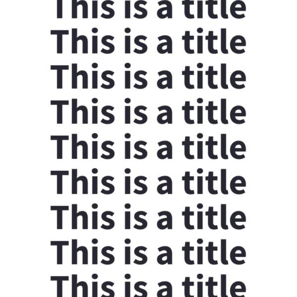
Title
Display text in title formatting.
st.title("The app title")
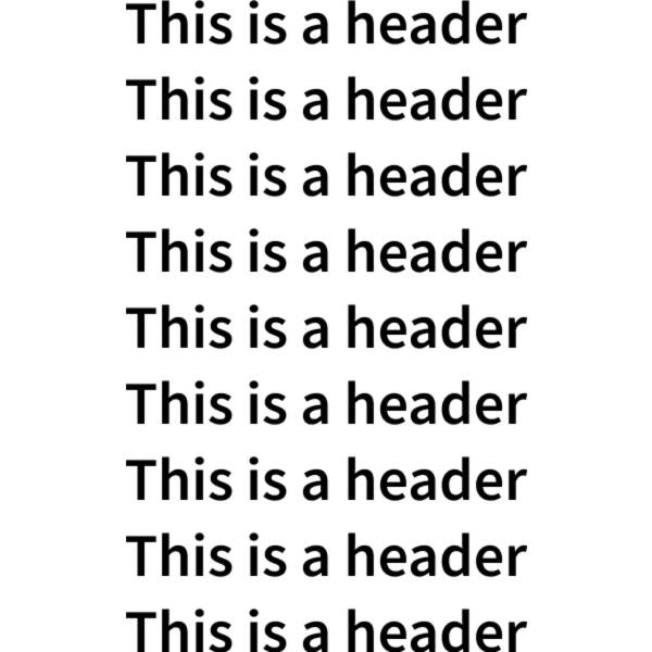
Header
Display text in header formatting.
st.header("This is a header")
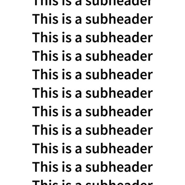
Subheader
Display text in subheader formatting.
st.subheader("This is a subheader")
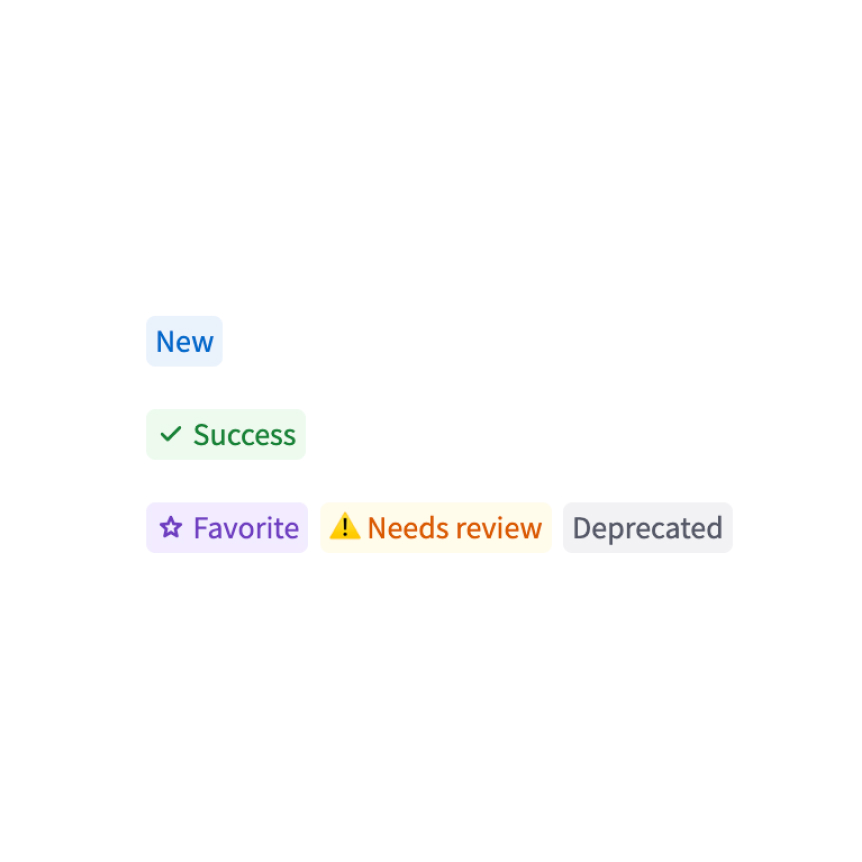
Badge
Display a small, colored badge.
st.badge("New")
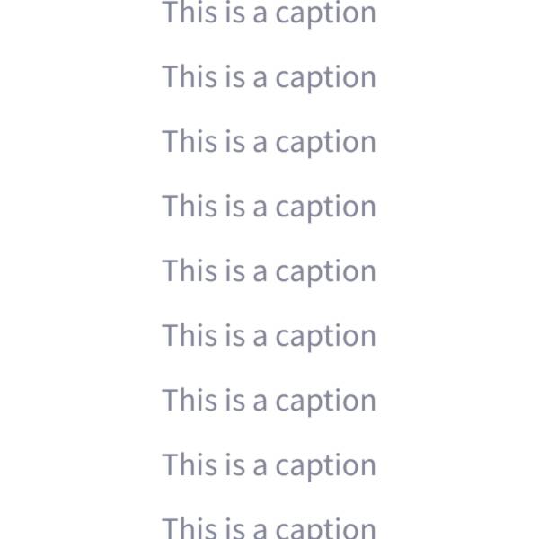
Caption
Display text in small font.
st.caption("This is written small caption text")
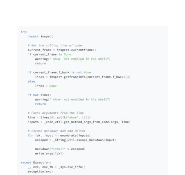
Code block
Display a code block with optional syntax highlighting.
st.code("a = 1234")
Echo
Display some code in the app, then execute it. Useful for tutorials.
with st.echo():
  st.write('This code will be printed')
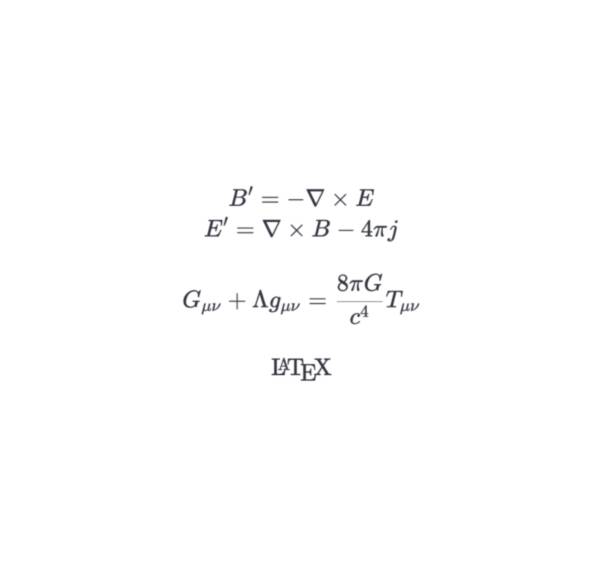
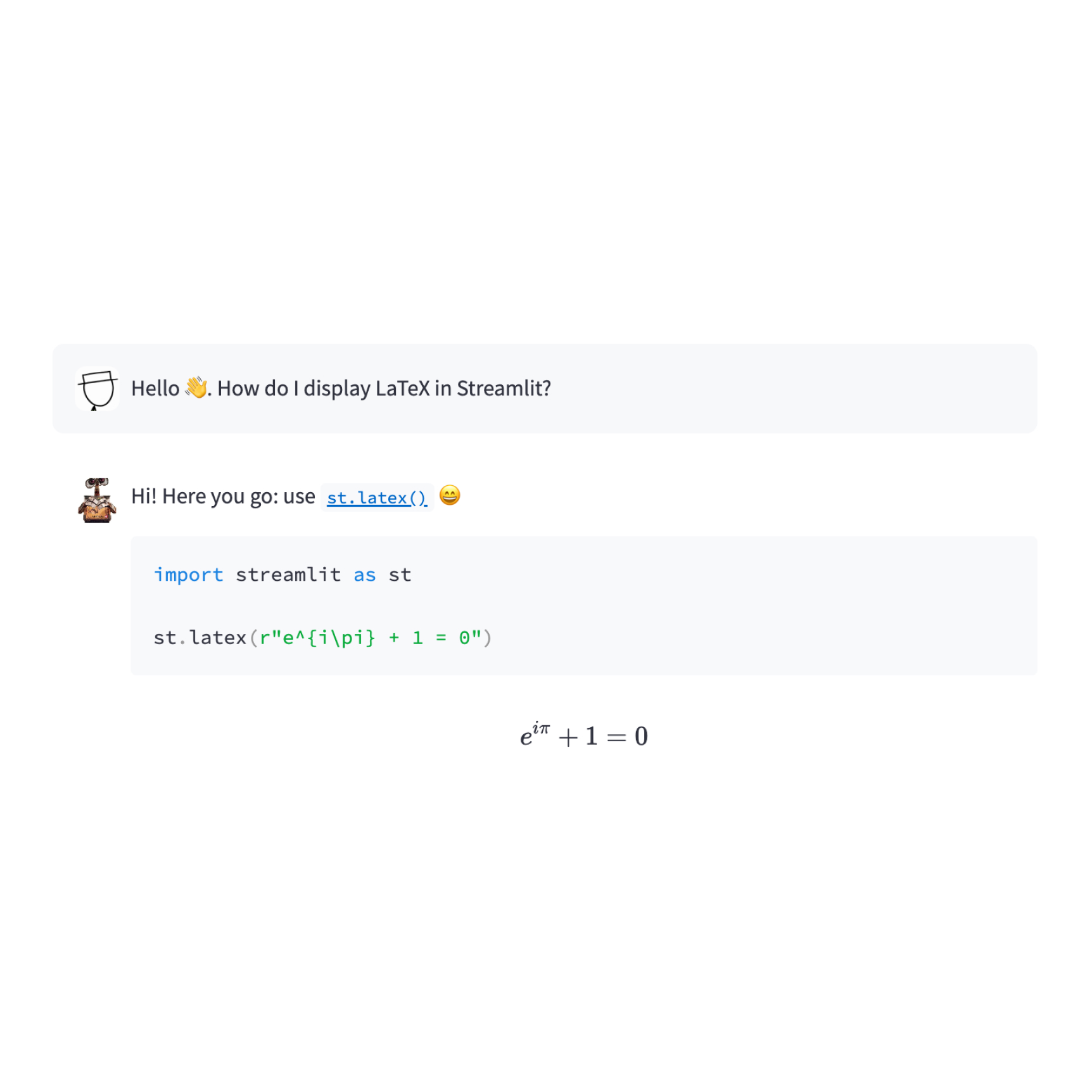
LaTeX
Display mathematical expressions formatted as LaTeX.
st.latex("\int a x^2 \,dx")
Preformatted text
Write fixed-width and preformatted text.
st.text("Hello world")
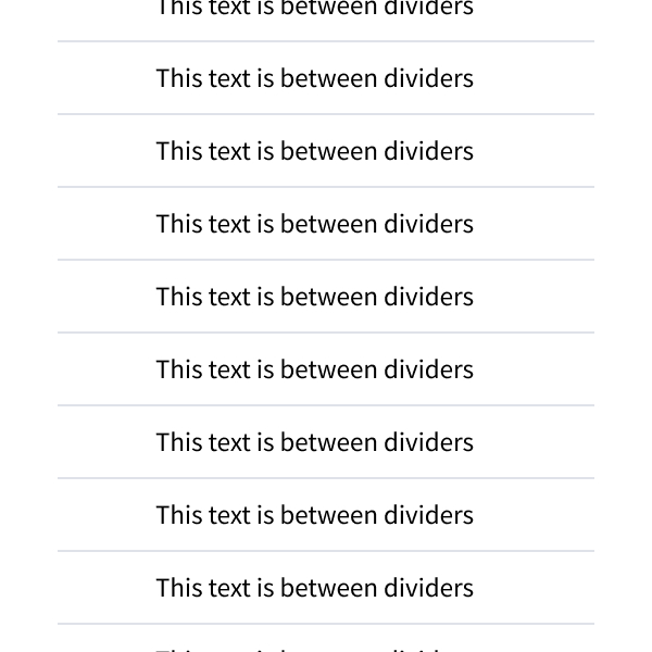
Divider
Display a horizontal rule.
st.divider()
Get help
Display object’s doc string, nicely formatted.
st.help(st.write)
st.help(pd.DataFrame)
Render HTML
Renders HTML strings to your app.
st.html("<p>Foo bar.</p>")
Iframe
Display content in an iframe
st.iframe("https://docs.streamlit.io")
st.iframe("<p>Streamlit is cool.</p>")
st.iframe("my_content.html")
Third-party components
These are featured components created by our lovely community. For more examples and inspiration, check out our Components Gallery and Streamlit Extras!
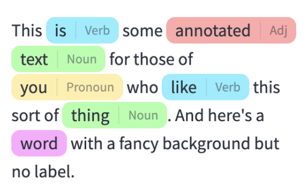
Annotated text
Display annotated text in Streamlit apps. Created by @tvst.
annotated_text("This ", ("is", "verb"), " some ", ("annotated", "adj"), ("text", "noun"), " for those of ", ("you", "pronoun"), " who ", ("like", "verb"), " this sort of ", ("thing", "noun"), ".")
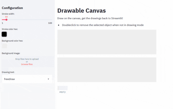
Drawable Canvas
Provides a sketching canvas using Fabric.js. Created by @andfanilo.
st_canvas(fill_color="rgba(255, 165, 0, 0.3)", stroke_width=stroke_width, stroke_color=stroke_color, background_color=bg_color, background_image=Image.open(bg_image) if bg_image else None, update_streamlit=realtime_update, height=150, drawing_mode=drawing_mode, point_display_radius=point_display_radius if drawing_mode == 'point' else 0, key="canvas",)
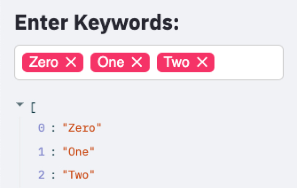
Tags
Add tags to your Streamlit apps. Created by @gagan3012.
st_tags(label='# Enter Keywords:', text='Press enter to add more', value=['Zero', 'One', 'Two'], suggestions=['five', 'six', 'seven', 'eight', 'nine', 'three', 'eleven', 'ten', 'four'], maxtags = 4, key='1')
Data elements
Dataframes
Display a dataframe as an interactive table.
st.dataframe(my_data_frame)
Data editor
Display a data editor widget.
edited = st.data_editor(df, num_rows="dynamic")
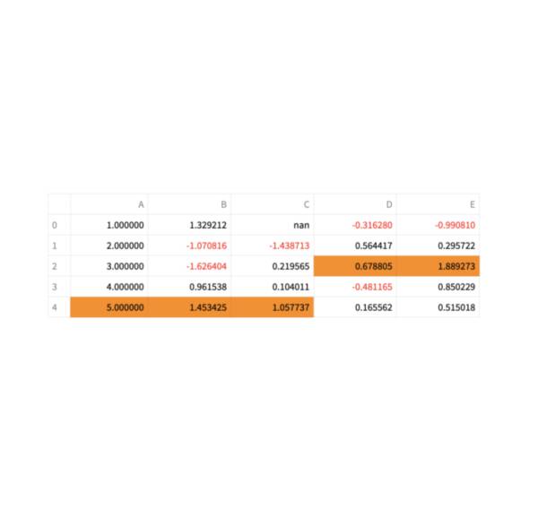
Column configuration
Configure the display and editing behavior of dataframes and data editors.
st.column_config.NumberColumn("Price (in USD)", min_value=0, format="$%d")
Static tables
Display a static table.
st.table(my_data_frame)
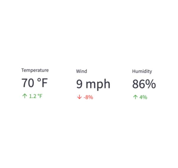
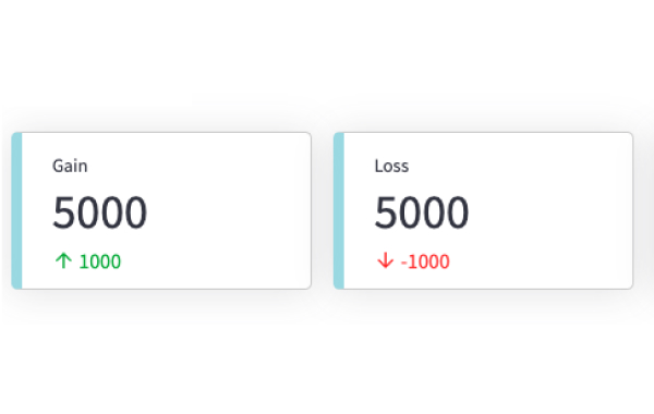
Metrics
Display a metric in big bold font, with an optional indicator of how the metric changed.
st.metric("My metric", 42, 2)
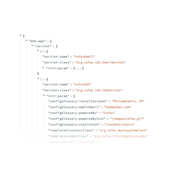
Dicts and JSON
Display object or string as a pretty-printed JSON string.
st.json(my_dict)
Third-party components
These are featured components created by our lovely community. For more examples and inspiration, check out our Components Gallery and Streamlit Extras!
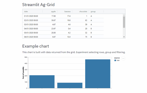
Streamlit Aggrid
Implementation of Ag-Grid component for Streamlit. Created by @PablocFonseca.
df = pd.DataFrame({'col1': [1, 2, 3], 'col2': [4, 5, 6]})
grid_return = AgGrid(df, editable=True)

new_df = grid_return['data']
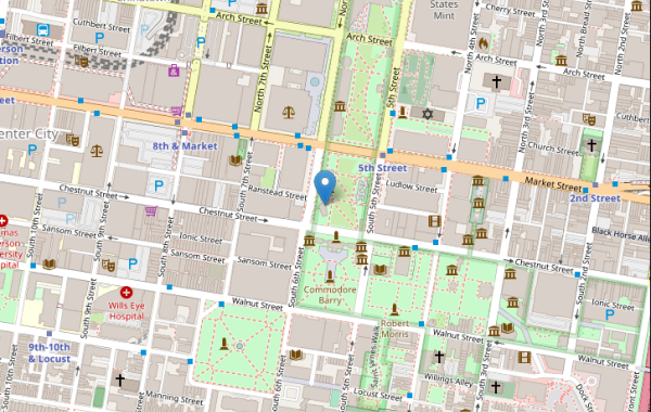
Streamlit Folium
Streamlit Component for rendering Folium maps. Created by @randyzwitch.
m = folium.Map(location=[39.949610, -75.150282], zoom_start=16)
folium.Marker([39.949610, -75.150282], popup="Liberty Bell", tooltip="Liberty Bell").add_to(m)

st_data = st_folium(m, width=725)
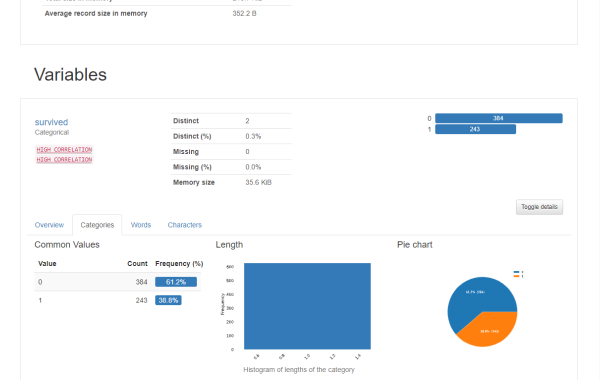
Pandas Profiling
Pandas profiling component for Streamlit. Created by @okld.
df = pd.read_csv("https://storage.googleapis.com/tf-datasets/titanic/train.csv")
pr = df.profile_report()

st_profile_report(pr)
Chart elements
Simple area charts
Display an area chart.
st.area_chart(my_data_frame)
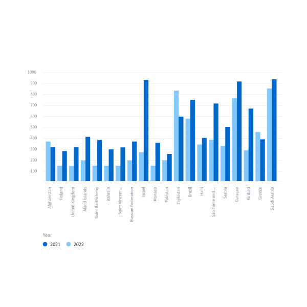
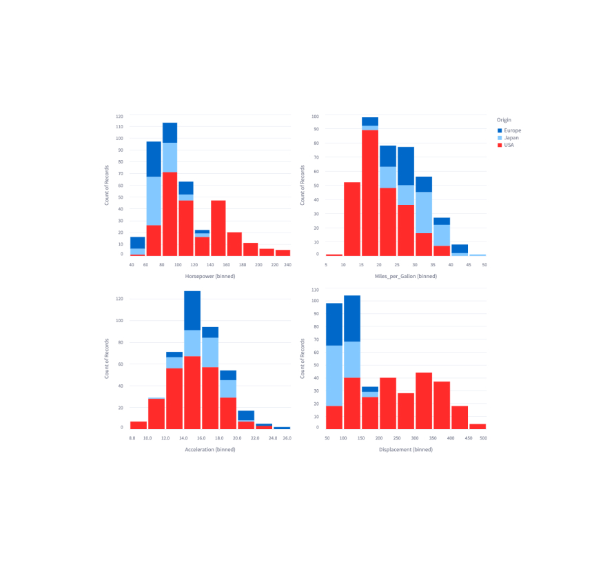
Simple bar charts
Display a bar chart.
st.bar_chart(my_data_frame)
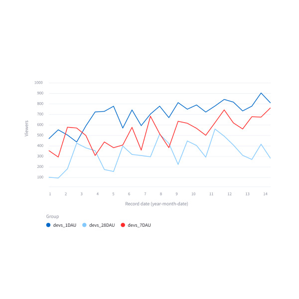
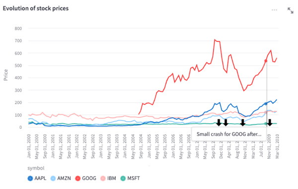
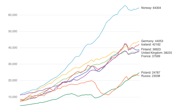
Simple line charts
Display a line chart.
st.line_chart(my_data_frame)

Simple scatter charts
Display a line chart.
st.scatter_chart(my_data_frame)
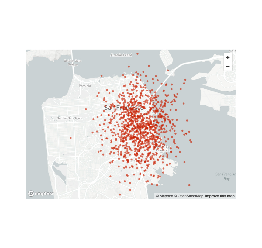
Scatterplots on maps
Display a map with points on it.
st.map(my_data_frame)
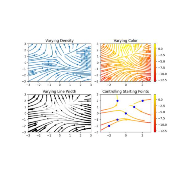
Matplotlib
Display a matplotlib.pyplot figure.
st.pyplot(my_mpl_figure)
Altair
Display a chart using the Altair library.
st.altair_chart(my_altair_chart)
Vega-Lite
Display a chart using the Vega-Lite library.
st.vega_lite_chart(my_vega_lite_chart)
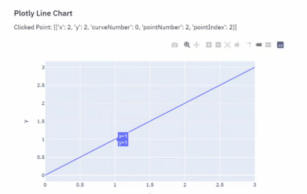
Plotly
Display an interactive Plotly chart.
st.plotly_chart(my_plotly_chart)
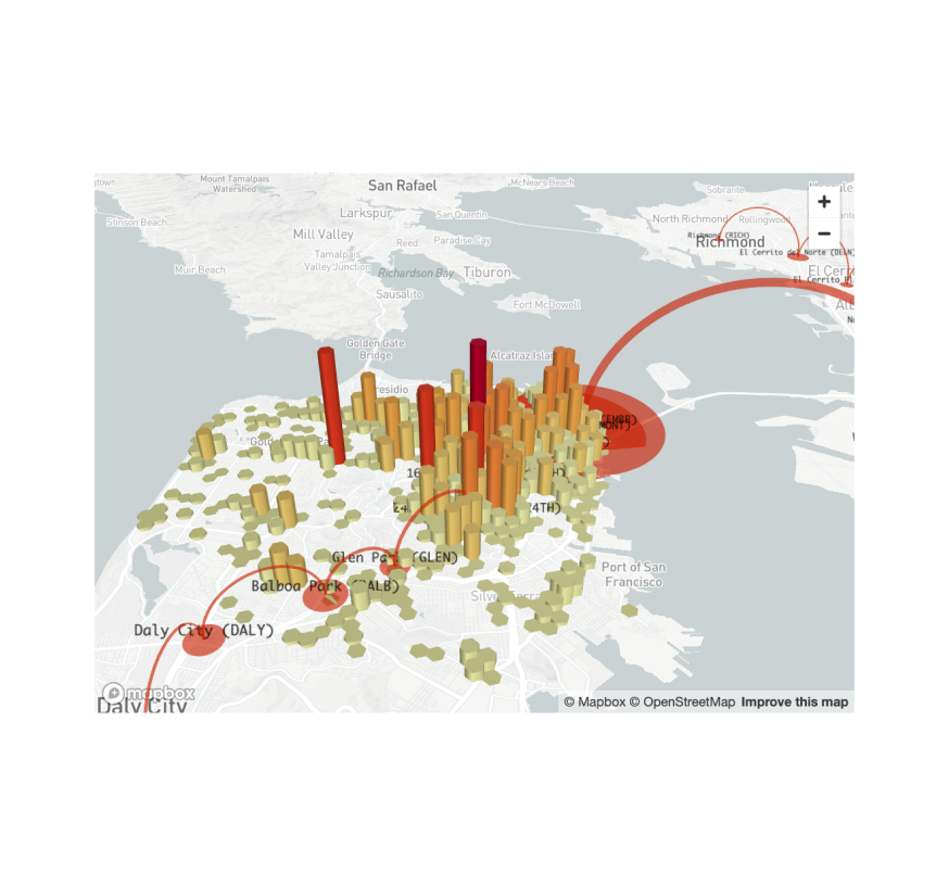
PyDeck
Display a chart using the PyDeck library.
st.pydeck_chart(my_pydeck_chart)
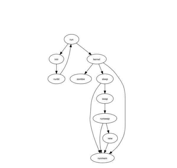
GraphViz
Display a graph using the dagre-d3 library.
st.graphviz_chart(my_graphviz_spec)
Third-party components
These are featured components created by our lovely community. For more examples and inspiration, check out our Components Gallery and Streamlit Extras!

Plost
A deceptively simple plotting library for Streamlit. Created by @tvst.
import plost
plost.line_chart(my_dataframe, x='time', y='stock_value', color='stock_name',)
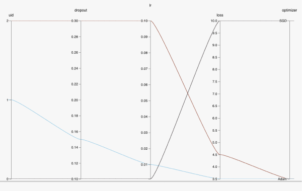
HiPlot
High dimensional Interactive Plotting. Created by @facebookresearch.
data = [{'dropout':0.1, 'lr': 0.001, 'loss': 10.0, 'optimizer': 'SGD'}, {'dropout':0.15, 'lr': 0.01, 'loss': 3.5, 'optimizer': 'Adam'}, {'dropout':0.3, 'lr': 0.1, 'loss': 4.5, 'optimizer': 'Adam'}]
hip.Experiment.from_iterable(data).display()
ECharts
High dimensional Interactive Plotting. Created by @andfanilo.
from streamlit_echarts import st_echarts
st_echarts(options=options)
Input widgets

Button
Display a button widget.
clicked = st.button("Click me")

Download button
Display a download button widget.
st.download_button("Download file", file)

Form button
Display a form submit button. For use with st.form.
st.form_submit_button("Sign up")

Link button
Display a link button.
st.link_button("Go to gallery", url)
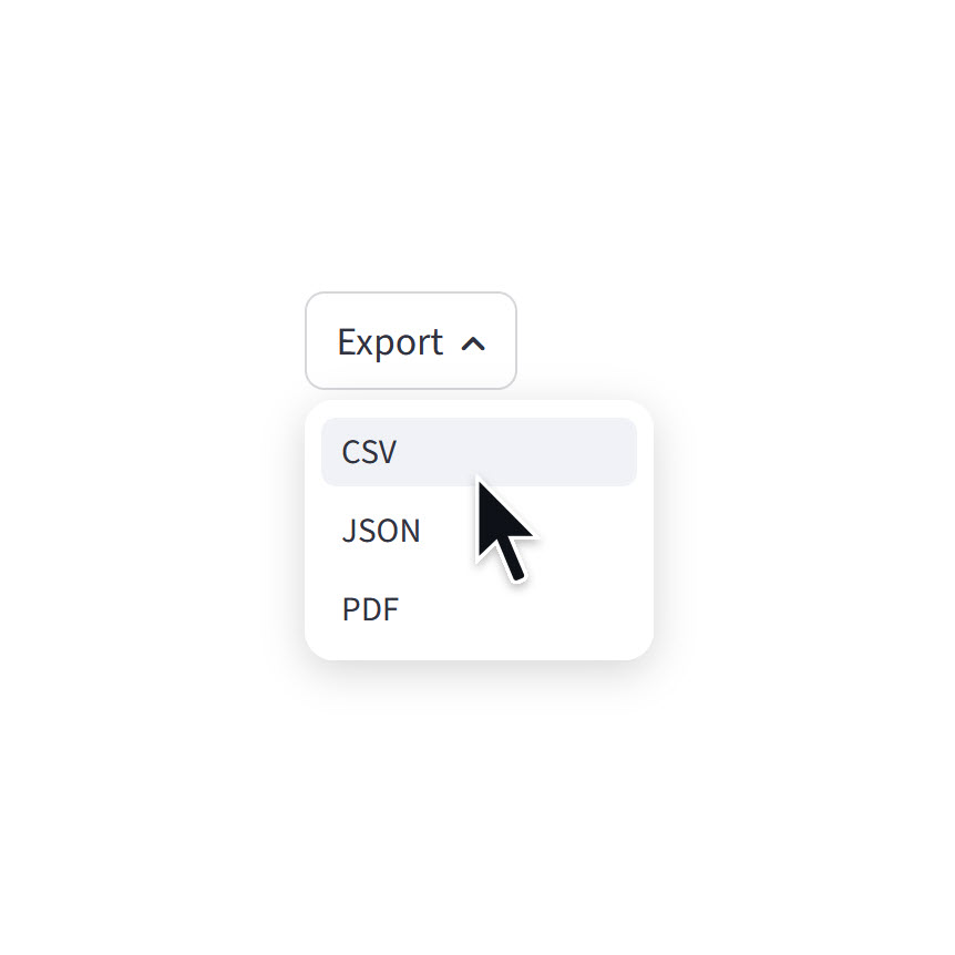
Menu button
Display a menu button.
st.menu_button("Export", options=["CSV", "JSON", "PDF"])
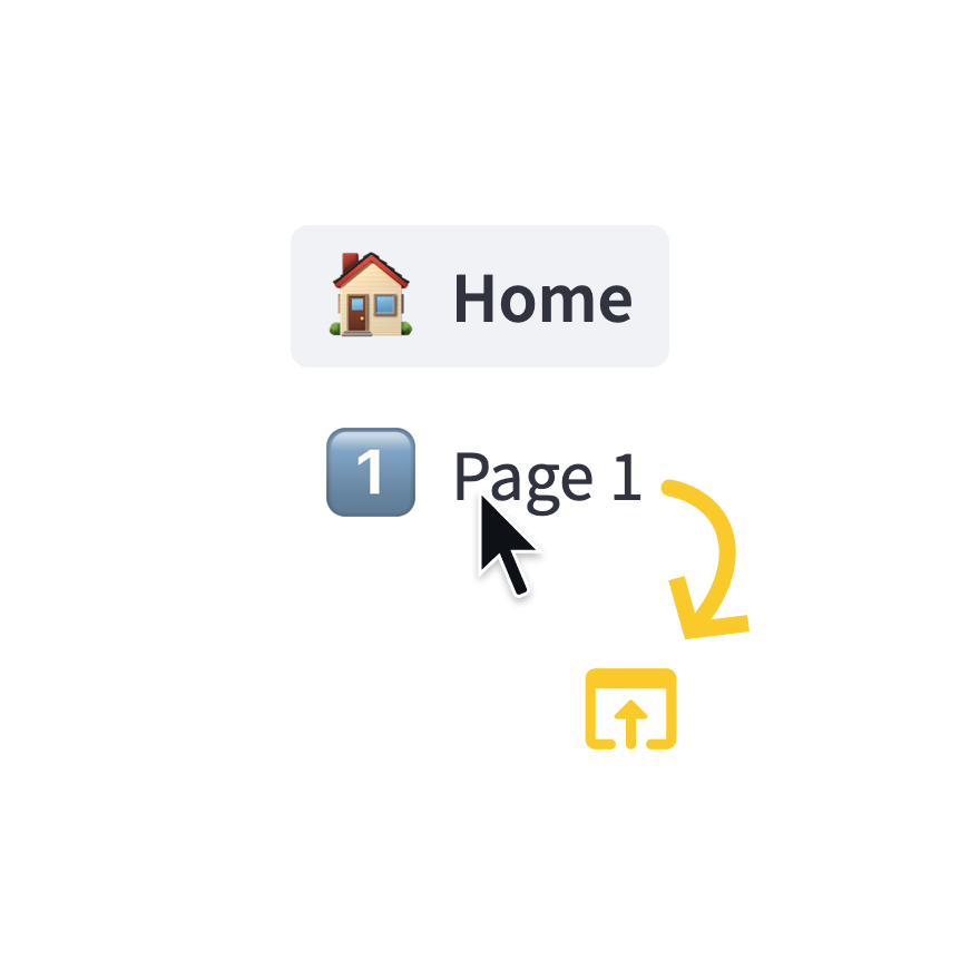
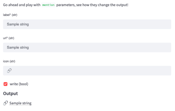
Page link
Display a link to another page in a multipage app.
st.page_link("app.py", label="Home", icon="🏠")
st.page_link("pages/profile.py", label="My profile")
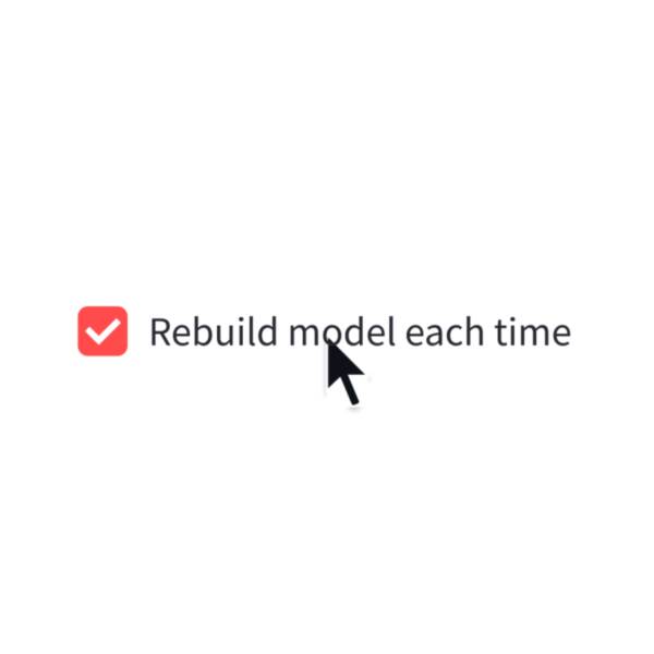
Checkbox
Display a checkbox widget.
selected = st.checkbox("I agree")
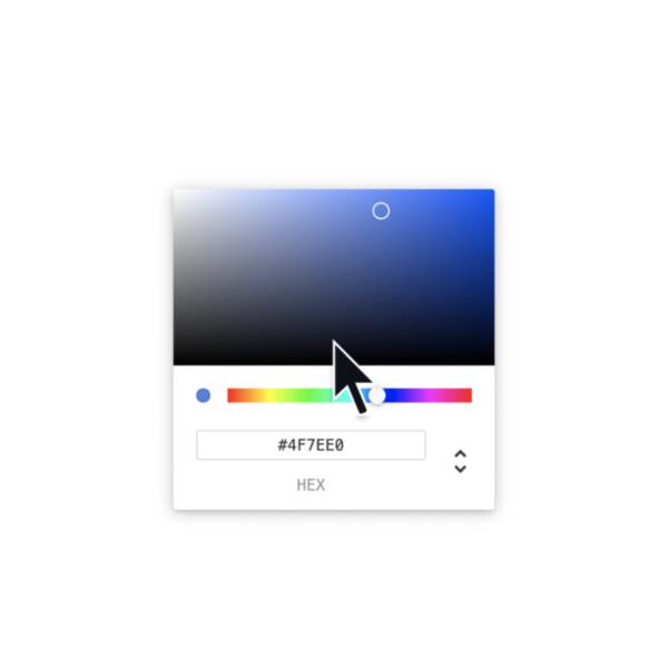
Color picker
Display a color picker widget.
color = st.color_picker("Pick a color")
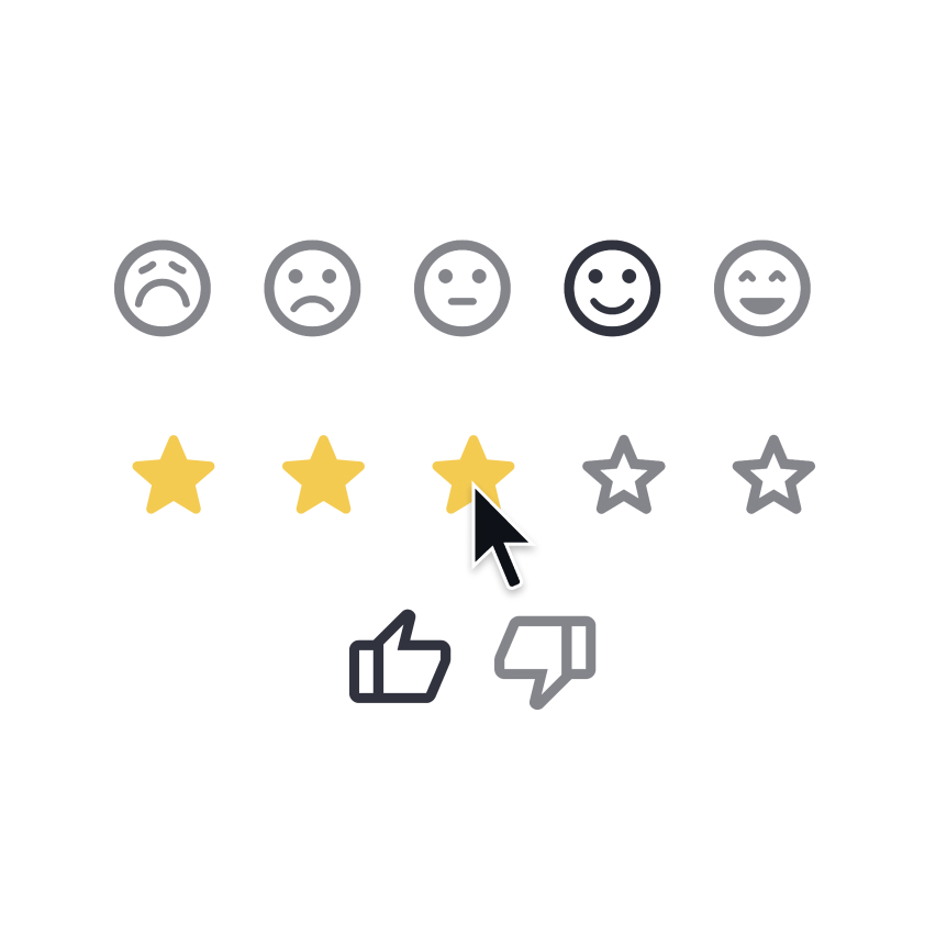
Feedback
Display a rating or sentiment button group.
st.feedback("stars")
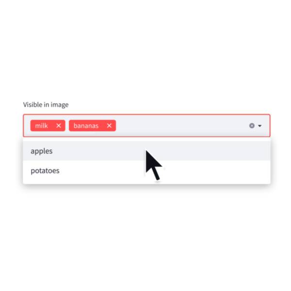
Multiselect
Display a multiselect widget. The multiselect widget starts as empty.
choices = st.multiselect("Buy", ["milk", "apples", "potatoes"])
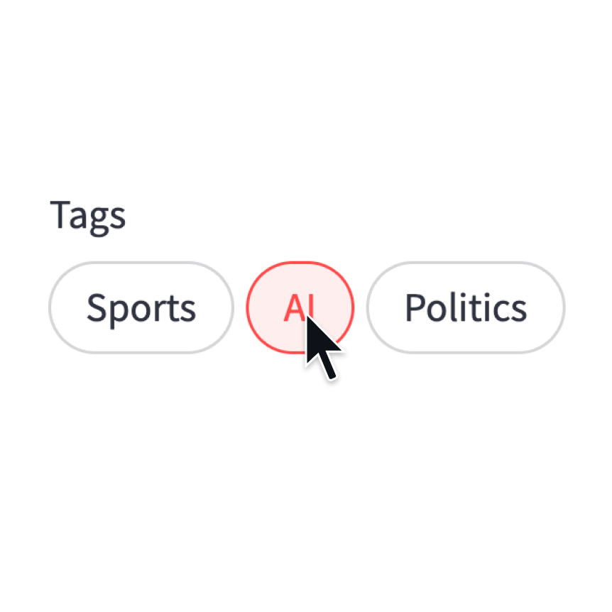
Pills
Display a pill-button selection widget.
st.pills("Tags", ["Sports", "AI", "Politics"])
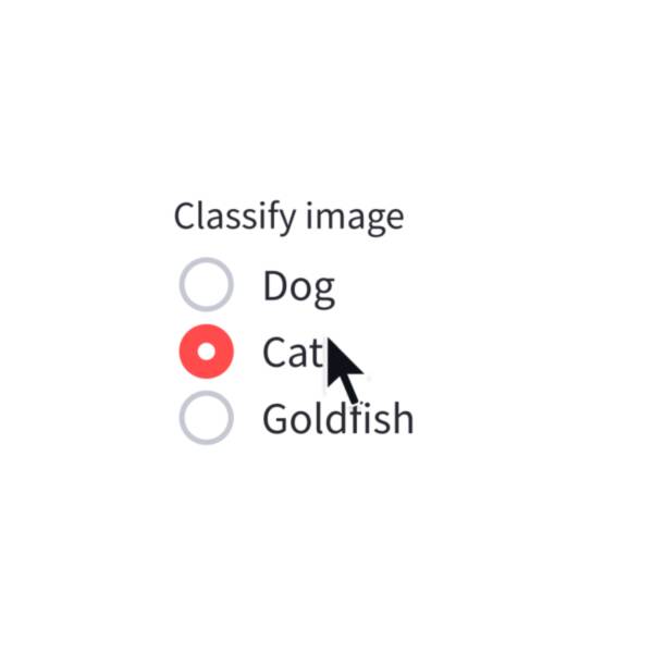
Radio
Display a radio button widget.
choice = st.radio("Pick one", ["cats", "dogs"])
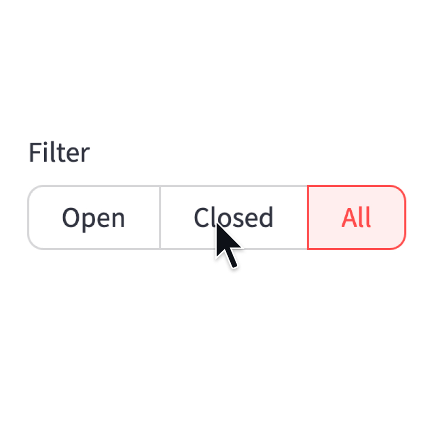
Segmented control
Display a segmented-button selection widget.
st.segmented_control("Filter", ["Open", "Closed", "All"])
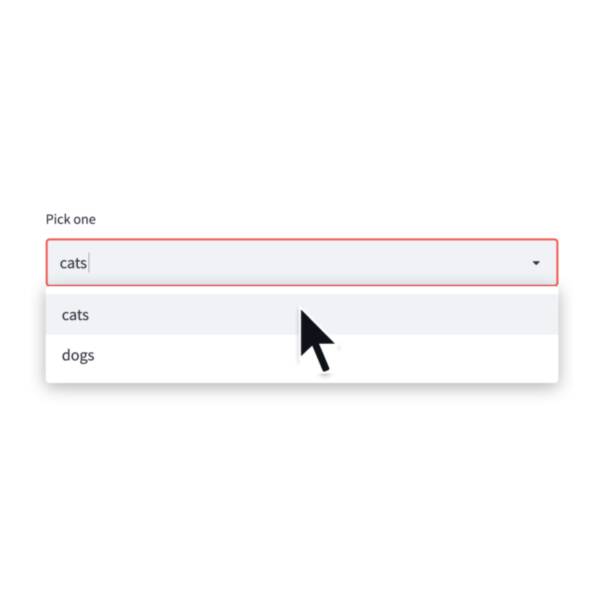
Selectbox
Display a select widget.
choice = st.selectbox("Pick one", ["cats", "dogs"])
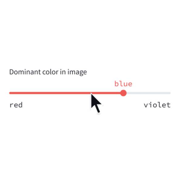
Select-slider
Display a slider widget to select items from a list.
size = st.select_slider("Pick a size", ["S", "M", "L"])
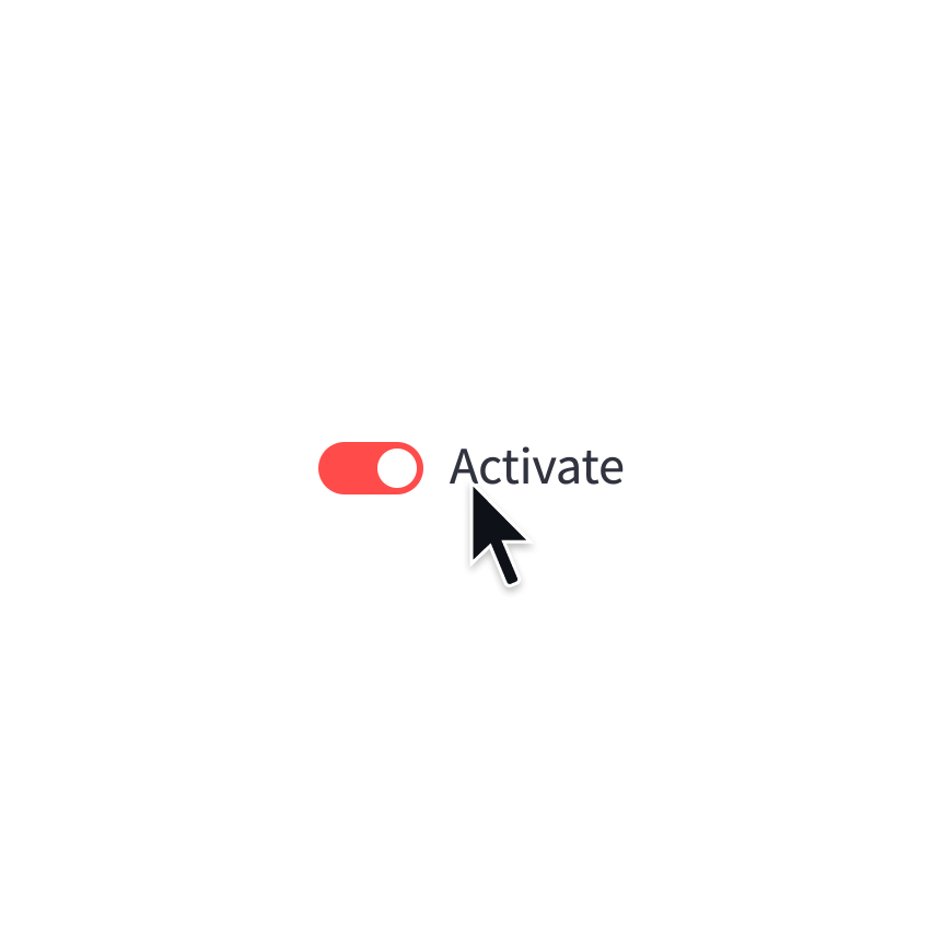
Toggle
Display a toggle widget.
activated = st.toggle("Activate")
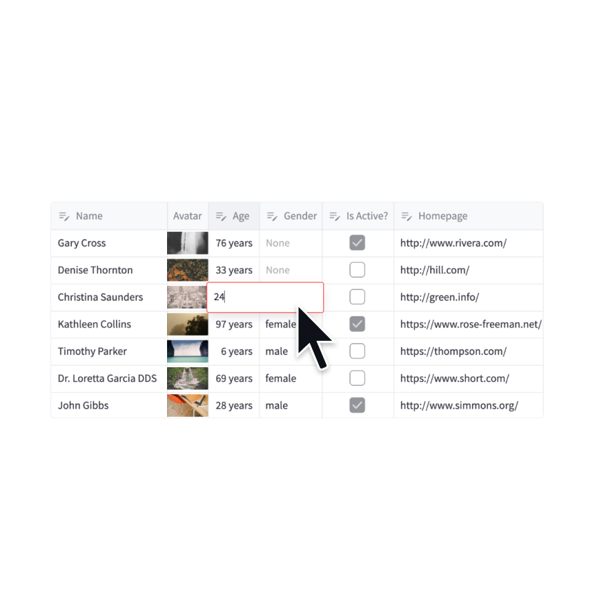
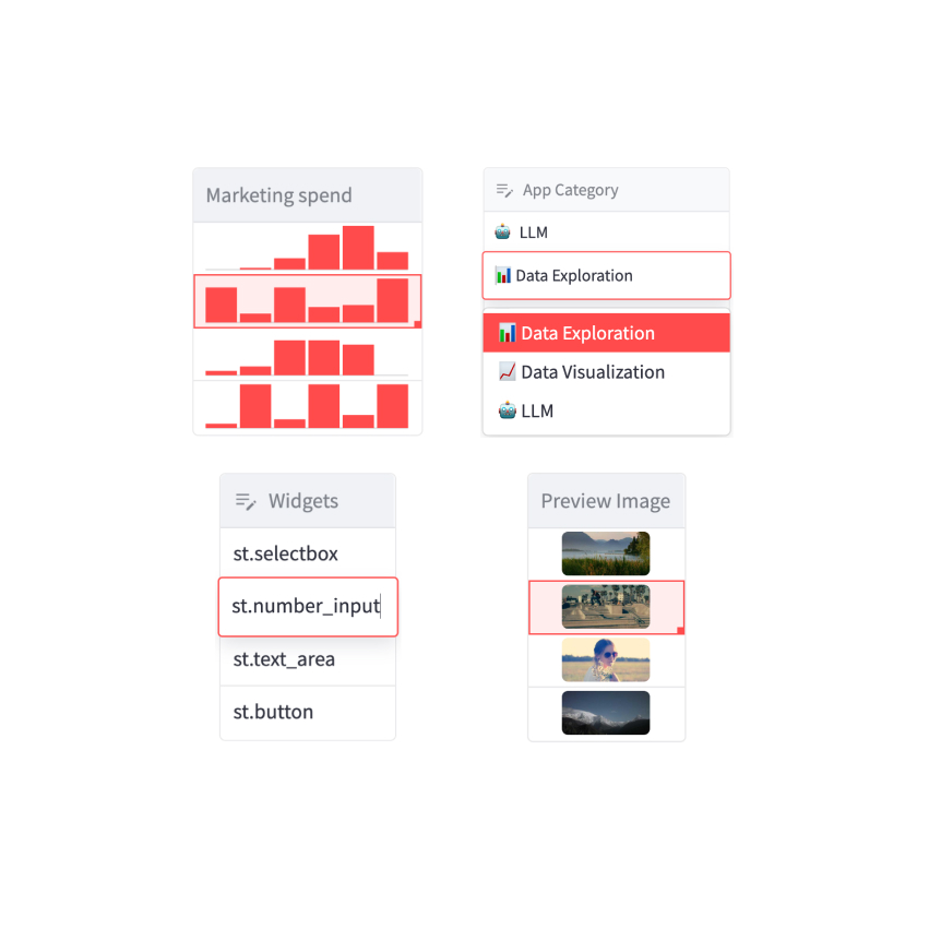
Number input
Display a numeric input widget.
choice = st.number_input("Pick a number", 0, 10)
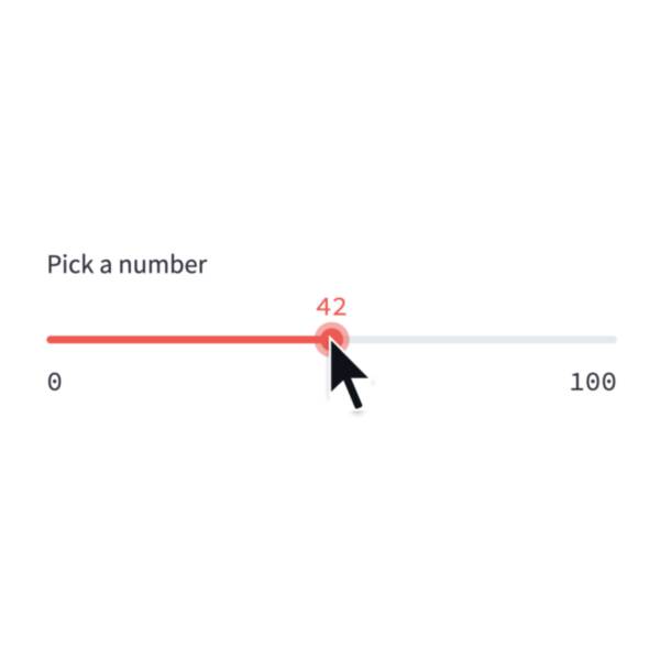
Slider
Display a slider widget.
number = st.slider("Pick a number", 0, 100)
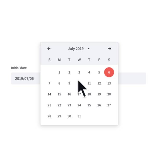
Date input
Display a date input widget.
date = st.date_input("Your birthday")
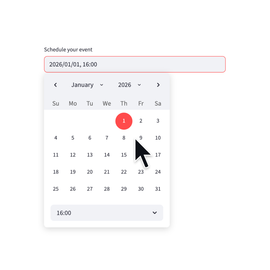
Datetime input
Display a datetime input widget.
datetime = st.datetime_input("Schedule your event")
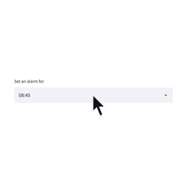
Time input
Display a time input widget.
time = st.time_input("Meeting time")
Chat input
Display a chat input widget.
prompt = st.chat_input("Say something")
if prompt:
st.write(f"The user has sent: {prompt}")
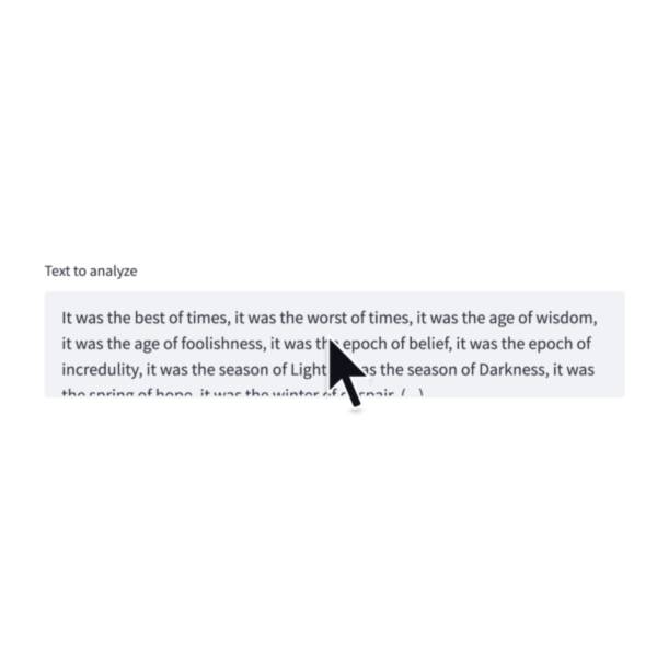
Text-area
Display a multi-line text input widget.
text = st.text_area("Text to translate")
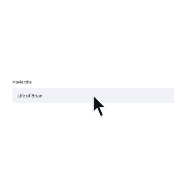
Text input
Display a single-line text input widget.
name = st.text_input("First name")
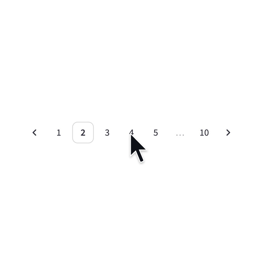
Pagination
Display a pagination widget.
page = st.pagination(10)
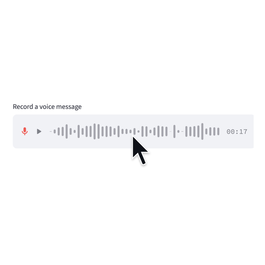
Audio input
Display a widget that allows users to record with their microphone.
speech = st.audio_input("Record a voice message")
Data editor
Display a data editor widget.
edited = st.data_editor(df, num_rows="dynamic")
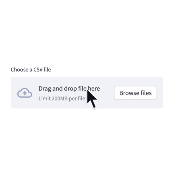
File uploader
Display a file uploader widget.
data = st.file_uploader("Upload a CSV")

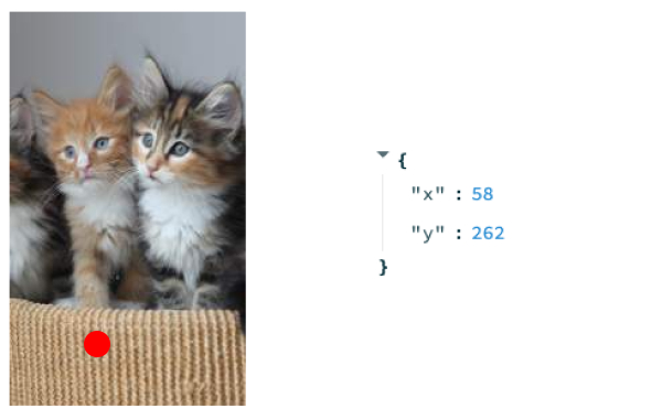
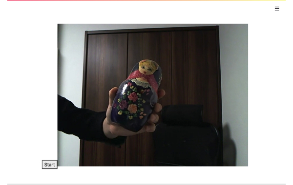
Camera input
Display a widget that allows users to upload images directly from a camera.
image = st.camera_input("Take a picture")
Third-party components
These are featured components created by our lovely community. For more examples and inspiration, check out our Components Gallery and Streamlit Extras!
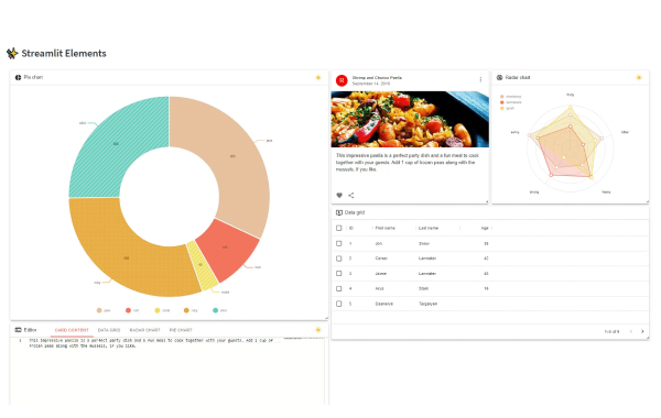
Streamlit Elements
Create a draggable and resizable dashboard in Streamlit. Created by @okls.
from streamlit_elements import elements, mui, html
with elements("new_element"):
mui.Typography("Hello world")
Tags
Add tags to your Streamlit apps. Created by @gagan3012.
from streamlit_tags import st_tags
st_tags(label='# Enter Keywords:', text='Press enter to add more', value=['Zero', 'One', 'Two'],
suggestions=['five', 'six', 'seven', 'eight', 'nine', 'three', 'eleven', 'ten', 'four'], maxtags = 4, key='1')
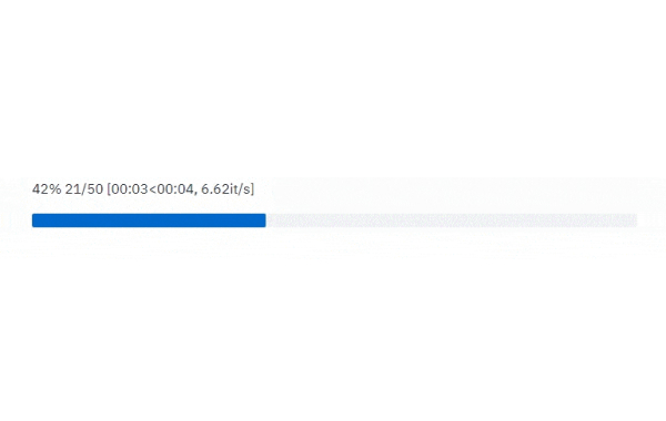
Stqdm
The simplest way to handle a progress bar in streamlit app. Created by @Wirg.
from stqdm import stqdm
for _ in stqdm(range(50)):
sleep(0.5)

Media elements
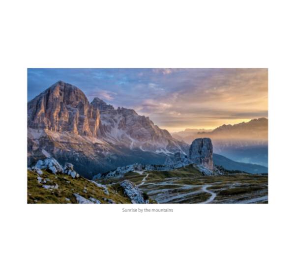
Image
Display an image or list of images.
st.image(numpy_array)
st.image(image_bytes)
st.image(file)
st.image("https://example.com/myimage.jpg")
Logo
Display a logo in the upper-left corner of your app and its sidebar.
st.logo("logo.jpg")
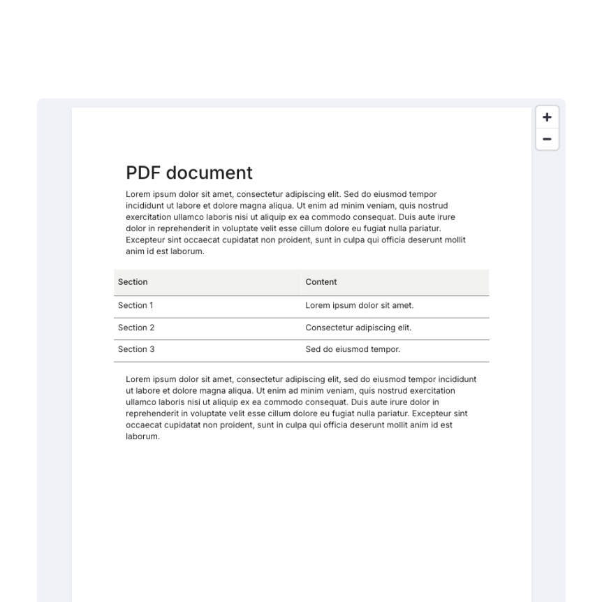
Display a PDF file.
st.pdf("my_document.pdf")
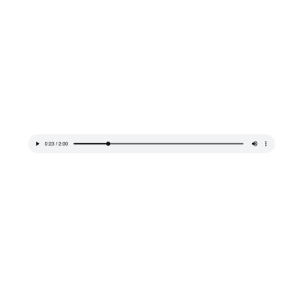
Audio
Display an audio player.
st.audio(numpy_array)
st.audio(audio_bytes)
st.audio(file)
st.audio("https://example.com/myaudio.mp3", format="audio/mp3")

Video
Display a video player.
st.video(numpy_array)
st.video(video_bytes)
st.video(file)
st.video("https://example.com/myvideo.mp4", format="video/mp4")
Third-party components
These are featured components created by our lovely community. For more examples and inspiration, check out our Components Gallery and Streamlit Extras!
Streamlit Webrtc
Handling and transmitting real-time video/audio streams with Streamlit. Created by @whitphx.
from streamlit_webrtc import webrtc_streamer
webrtc_streamer(key="sample")
Drawable Canvas
Provides a sketching canvas using Fabric.js. Created by @andfanilo.
from streamlit_drawable_canvas import st_canvas
st_canvas(fill_color="rgba(255, 165, 0, 0.3)", stroke_width=stroke_width, stroke_color=stroke_color, background_color=bg_color, background_image=Image.open(bg_image) if bg_image else None, update_streamlit=realtime_update, height=150, drawing_mode=drawing_mode, point_display_radius=point_display_radius if drawing_mode == 'point' else 0, key="canvas",)
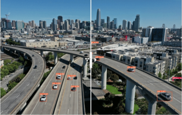
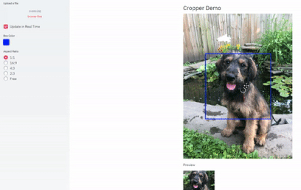
Image Comparison
Compare images with a slider using JuxtaposeJS. Created by @fcakyon.
from streamlit_image_comparison import image_comparison
image_comparison(img1="image1.jpg", img2="image2.jpg",)
Layouts and containers
Columns
Insert containers laid out as side-by-side columns.
col1, col2 = st.columns(2)
col1.write("this is column 1")
col2.write("this is column 2")
Container
Insert a multi-element container.
c = st.container()
st.write("This will show last")
c.write("This will show first")
c.write("This will show second")
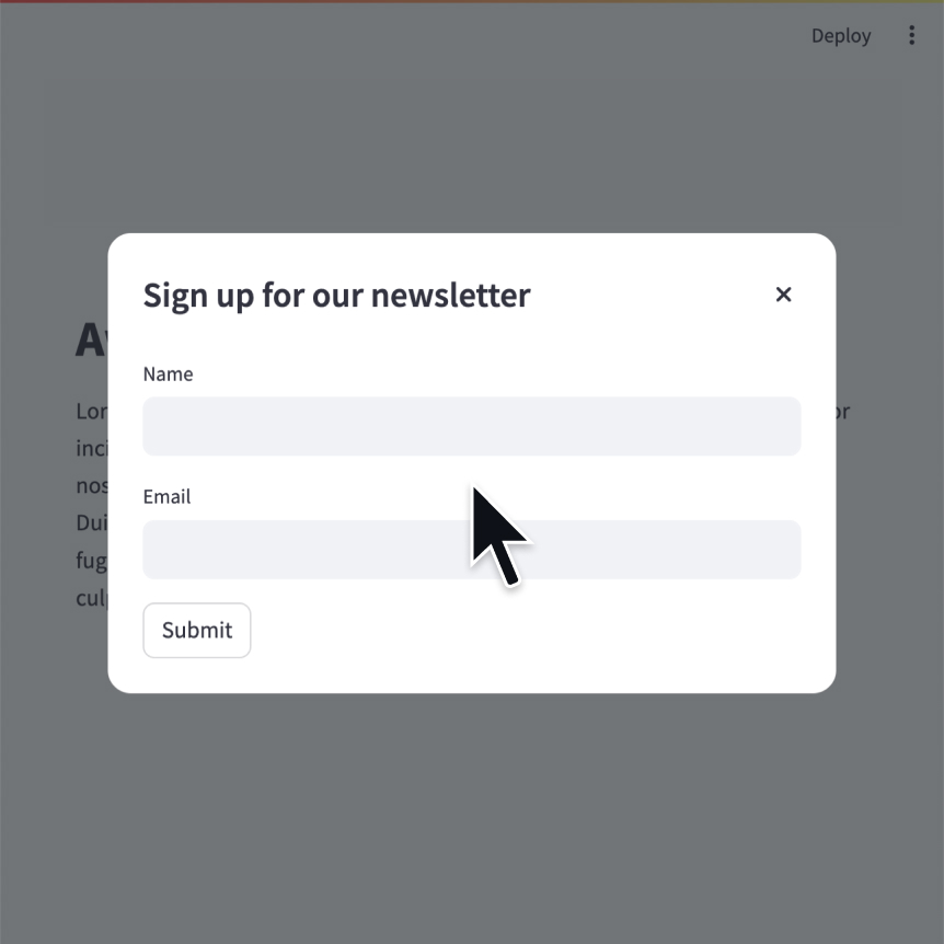
Modal dialog
Insert a modal dialog that can rerun independently from the rest of the script.
@st.dialog("Sign up")
def email_form():
name = st.text_input("Name")
email = st.text_input("Email")
Empty
Insert a single-element container.
c = st.empty()
st.write("This will show last")
c.write("This will be replaced")
c.write("This will show first")
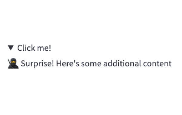
Expander
Insert a multi-element container that can be expanded/collapsed.
with st.expander("Open to see more"):
st.write("This is more content")

Popover
Insert a multi-element popover container that can be opened/closed.
with st.popover("Settings"):
st.checkbox("Show completed")
Sidebar
Display items in a sidebar.
st.sidebar.write("This lives in the sidebar")
st.sidebar.button("Click me!")
Bottom
Display items at the bottom of the window.
st.bottom.chat_input("Say something")
Space
Add vertical or horizontal space.
st.space("small")
Tabs
Insert containers separated into tabs.
tab1, tab2 = st.tabs(["Tab 1", "Tab2"])
tab1.write("this is tab 1")
tab2.write("this is tab 2")
Third-party components
These are featured components created by our lovely community. For more examples and inspiration, check out our Components Gallery and Streamlit Extras!
Streamlit Elements
Create a draggable and resizable dashboard in Streamlit. Created by @okls.
from streamlit_elements import elements, mui, html
with elements("new_element"):
mui.Typography("Hello world")
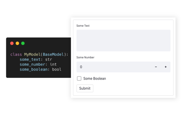
Pydantic
Auto-generate Streamlit UI from Pydantic Models and Dataclasses. Created by @lukasmasuch.
import streamlit_pydantic as sp
sp.pydantic_form(key="my_form",
model=ExampleModel)
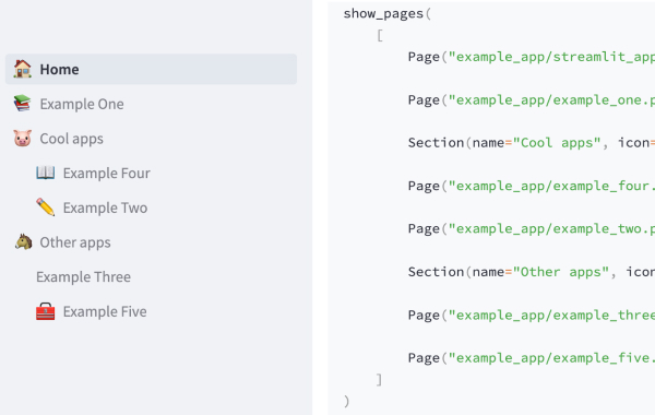
Streamlit Pages
An experimental version of Streamlit Multi-Page Apps. Created by @blackary.
from st_pages import Page, show_pages, add_page_title
show_pages([ Page("streamlit_app.py", "Home", "🏠"),
Page("other_pages/page2.py", "Page 2", ":books:"), ])
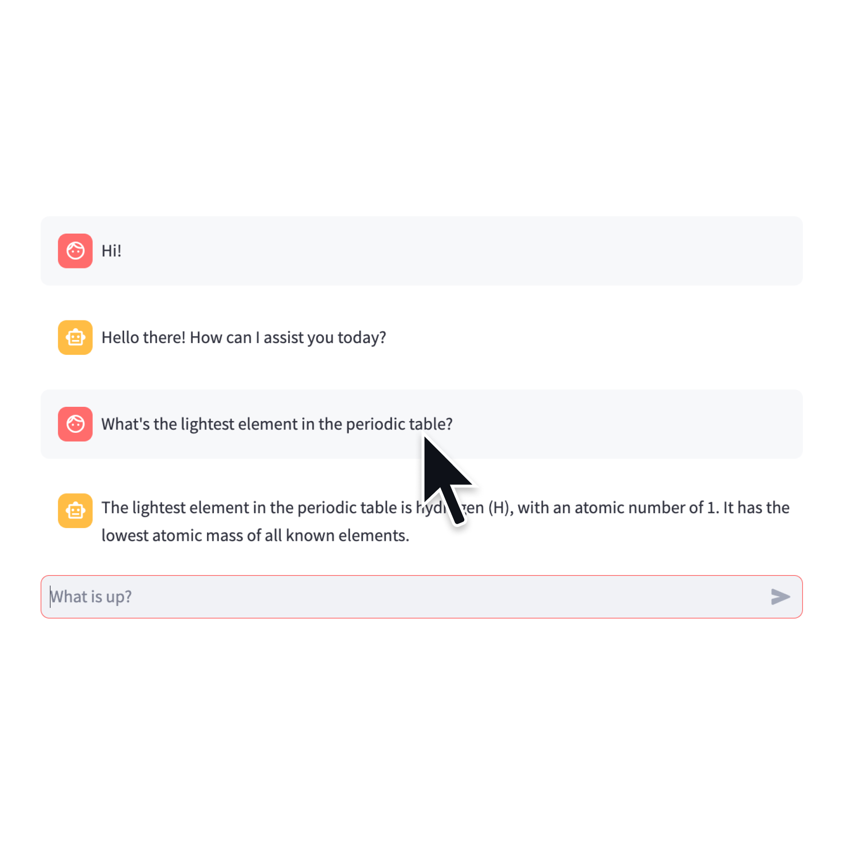
Chat elements
Streamlit provides a few commands to help you build conversational apps. These chat elements are designed to be used in conjunction with each other, but you can also use them separately.
st.chat_message lets you insert a chat message container into the app so you can display messages from the user or the app. Chat containers can contain other Streamlit elements, including charts, tables, text, and more. st.chat_input lets you display a chat input widget so the user can type in a message.
Chat input
Display a chat input widget.
prompt = st.chat_input("Say something")
if prompt:
st.write(f"The user has sent: {prompt}")
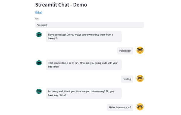
Chat message
Insert a chat message container.
import numpy as np
with st.chat_message("user"):
st.write("Hello 👋")
st.line_chart(np.random.randn(30, 3))
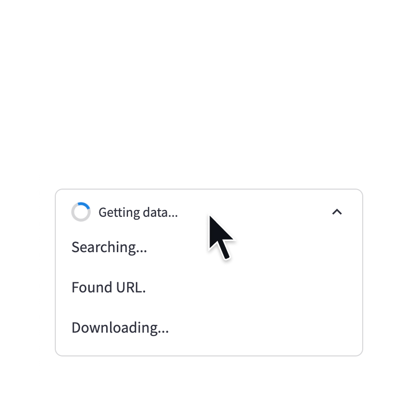
Status container
Display output of long-running tasks in a container.
with st.status('Running'):
do_something_slow()
st.write_stream
Write generators or streams to the app with a typewriter effect.
st.write_stream(my_generator)
st.write_stream(my_llm_stream)
Status elements
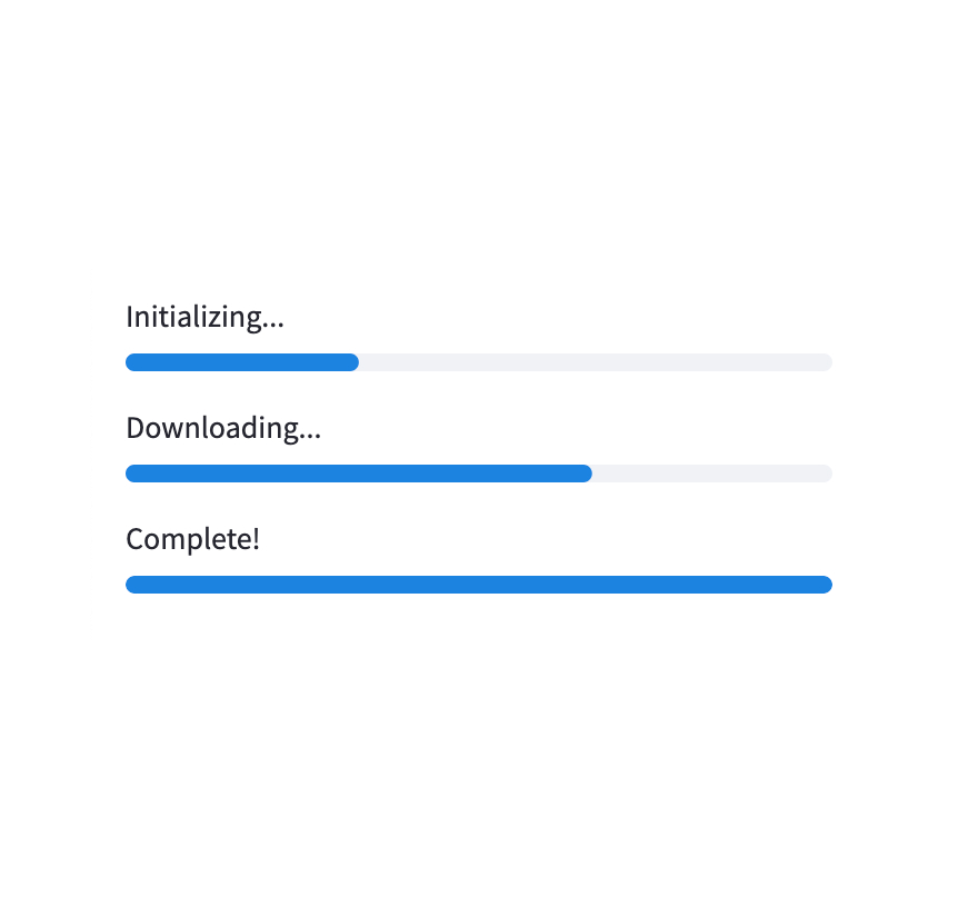
Progress bar
Display a progress bar.
for i in range(101):
st.progress(i)
do_something_slow()

Spinner
Temporarily displays a message while executing a block of code.
with st.spinner("Please wait..."):
do_something_slow()
Status container
Display output of long-running tasks in a container.
with st.status('Running'):
do_something_slow()
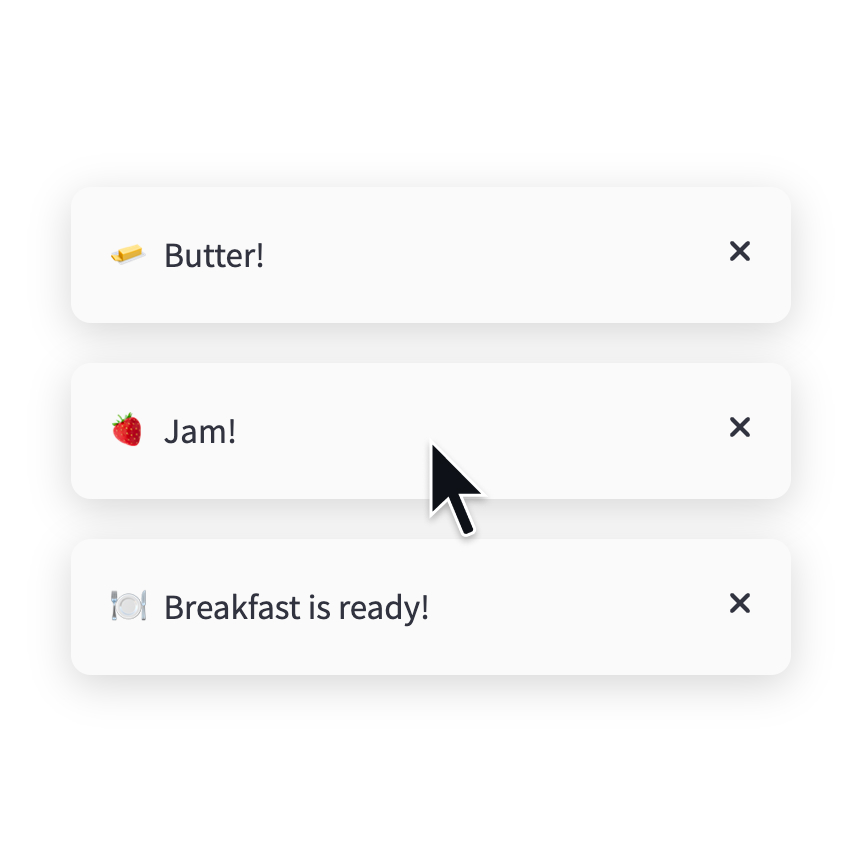
Toast
Briefly displays a toast message in the bottom-right corner.
st.toast('Butter!', icon='🧈')

Balloons
Display celebratory balloons!
do_something()
# Celebrate when all done!
st.balloons()

Snowflakes
Display celebratory snowflakes!
do_something()
# Celebrate when all done!
st.snow()
Success box
Display a success message.
st.success("Match found!")
Info box
Display an informational message.
st.info("Dataset is updated every day at midnight.")
Warning box
Display warning message.
st.warning("Unable to fetch image. Skipping...")
Error box
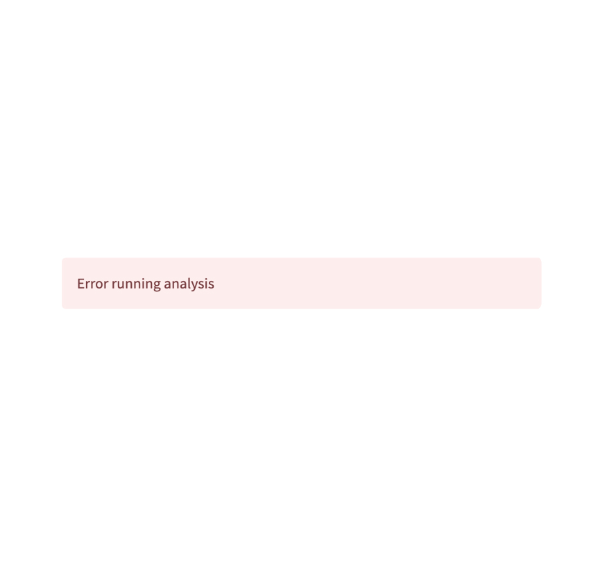
Display error message.
st.error("We encountered an error")
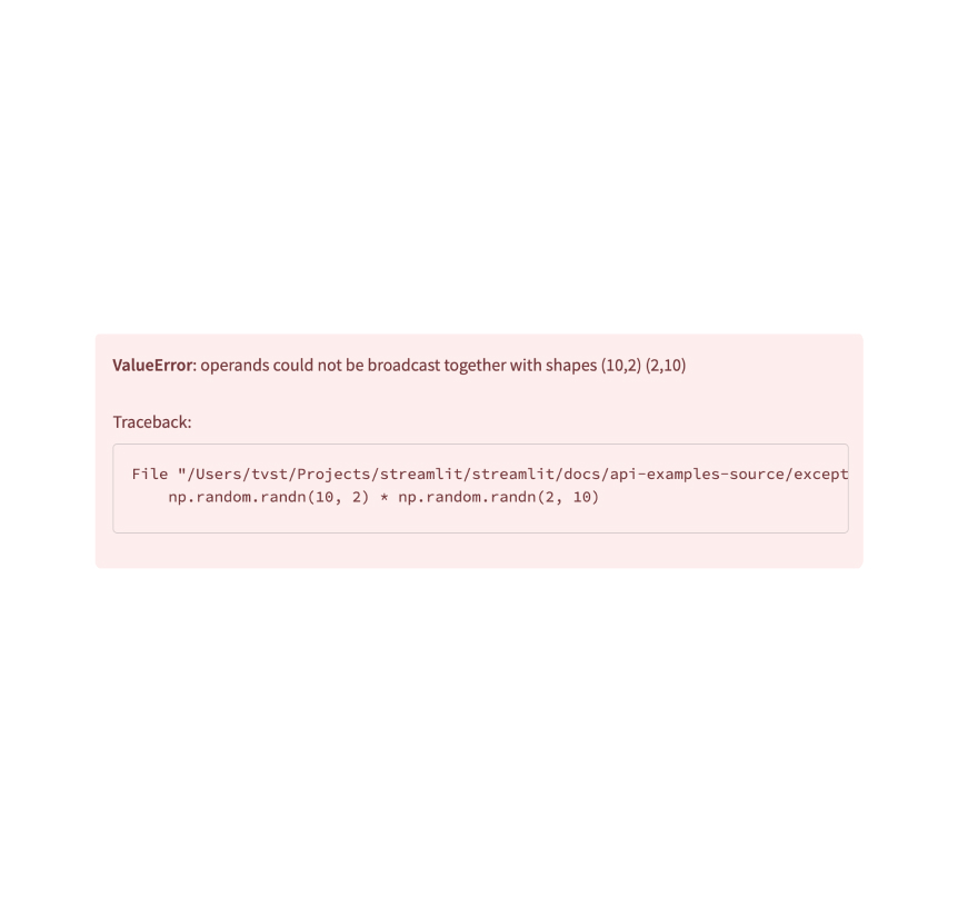
Exception output
Display an exception.
e = RuntimeError("This is an exception of type RuntimeError")
st.exception(e)
Third-party components
These are featured components created by our lovely community. For more examples and inspiration, check out our Components Gallery and Streamlit Extras!
Stqdm
The simplest way to handle a progress bar in streamlit app. Created by @Wirg.
from stqdm import stqdm
for _ in stqdm(range(50)):
sleep(0.5)
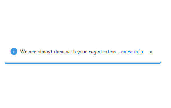
Custom notification box
A custom notification box with the ability to close it out. Created by @Socvest.
from streamlit_custom_notification_box import custom_notification_box
styles = {'material-icons':{'color': 'red'}, 'text-icon-link-close-container': {'box-shadow': '#3896de 0px 4px'}, 'notification-text': {'':''}, 'close-button':{'':''}, 'link':{'':''}}
custom_notification_box(icon='info', textDisplay='We are almost done with your registration...', externalLink='more info', url='#', styles=styles, key="foo")
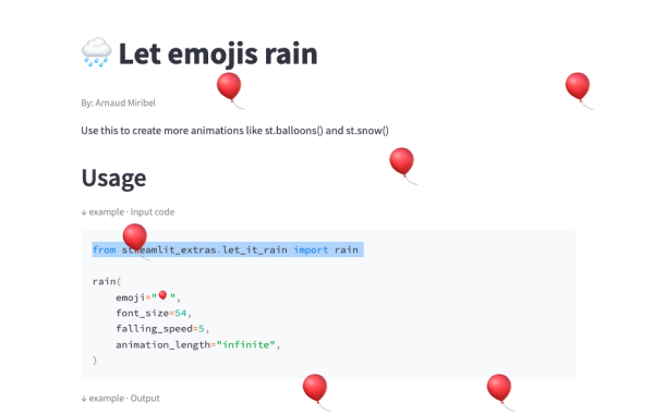
Streamlit Extras
A library with useful Streamlit extras. Created by @arnaudmiribel.
from streamlit_extras.let_it_rain import rain
rain(emoji="🎈", font_size=54,
falling_speed=5, animation_length="infinite",)
App logic and configuration
App server
App
Configure the underlying Starlette server for your app.
app = st.App()
Authentication
Log in a user
st.login() starts an authentication flow with an identity provider.
st.login()
Log out a user
st.logout() removes a user's identity information.
st.logout()
User info
st.user returns information about a logged-in user.
if st.user.is_logged_in:
st.write(f"Welcome back, {st.user.name}!")
Navigation and pages
Navigation
Configure the available pages in a multipage app.
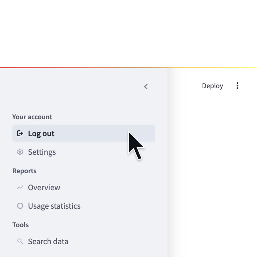
st.navigation({
"Your account" : [log_out, settings],
"Reports" : [overview, usage],
"Tools" : [search]
})
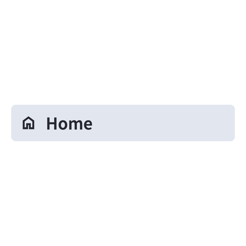
Page
Define a page in a multipage app.
home = st.Page(
"home.py",
title="Home",
icon=":material/home:"
)
Page link
Display a link to another page in a multipage app.
st.page_link("app.py", label="Home", icon="🏠")
st.page_link("pages/profile.py", label="My profile")
Switch page
Programmatically navigates to a specified page.
st.switch_page("pages/my_page.py")
Execution flow
Modal dialog
Insert a modal dialog that can rerun independently from the rest of the script.
@st.dialog("Sign up")
def email_form():
name = st.text_input("Name")
email = st.text_input("Email")
Forms
Create a form that batches elements together with a “Submit" button.
with st.form(key='my_form'):
name = st.text_input("Name")
email = st.text_input("Email")
st.form_submit_button("Sign up")
Fragments
Define a fragment to rerun independently from the rest of the script.
@st.fragment(run_every="10s")
def fragment():
df = get_data()
st.line_chart(df)
Rerun script
Rerun the script immediately.
st.rerun()
Stop execution
Stops execution immediately.
st.stop()
Third-party components
These are featured components created by our lovely community. For more examples and inspiration, check out our Components Gallery and Streamlit Extras!

Autorefresh
Force a refresh without tying up a script. Created by @kmcgrady.
from streamlit_autorefresh import st_autorefresh
st_autorefresh(interval=2000, limit=100,
key="fizzbuzzcounter")
Pydantic
Auto-generate Streamlit UI from Pydantic Models and Dataclasses. Created by @lukasmasuch.
import streamlit_pydantic as sp
sp.pydantic_form(key="my_form",
model=ExampleModel)
Streamlit Pages
An experimental version of Streamlit Multi-Page Apps. Created by @blackary.
from st_pages import Page, show_pages, add_page_title
show_pages([ Page("streamlit_app.py", "Home", "🏠"),
Page("other_pages/page2.py", "Page 2", ":books:"), ])
Caching and state
Cache data
Function decorator to cache functions that return data (e.g. dataframe transforms, database queries, ML inference).
@st.cache_data
def long_function(param1, param2):
# Perform expensive computation here or
# fetch data from the web here
return data
Cache resource
Function decorator to cache functions that return global resources (e.g. database connections, ML models).
@st.cache_resource
def init_model():
# Return a global resource here
return pipeline(
"sentiment-analysis",
model="distilbert-base-uncased-finetuned-sst-2-english"
)
Session state
Session state is a way to share variables between reruns, for each user session.
st.session_state['key'] = value
Query parameters
Get, set, or clear the query parameters that are shown in the browser's URL bar.
st.query_params[key] = value
st.query_params.clear()
Context
st.context provides a read-only interface to access cookies, headers, locale, and other browser-session information.
st.context.cookies
st.context.headers
Connections and databases
Setup your connection

Create a connection
Connect to a data source or API
conn = st.connection('pets_db', type='sql')
pet_owners = conn.query('select * from pet_owners')
st.dataframe(pet_owners)
Built-in connections

SnowflakeConnection
A connection to Snowflake.
conn = st.connection('snowflake')

SQLConnection
A connection to a SQL database using SQLAlchemy.
conn = st.connection('sql')
Build your own connections
Connection base class
Build your own connection with BaseConnection.
class MyConnection(BaseConnection[myconn.MyConnection]):
def _connect(self, **kwargs) -> MyConnection:
return myconn.connect(**self._secrets, **kwargs)
def query(self, query):
return self._instance.query(query)
Secrets management
Secrets singleton
Access secrets from a local TOML file.
key = st.secrets["OpenAI_key"]
Secrets file
Save your secrets in a per-project or per-profile TOML file.
OpenAI_key = "<YOUR_SECRET_KEY>"
Third-party components
These are featured components created by our lovely community. For more examples and inspiration, check out our Components Gallery and Streamlit Extras!
Authenticator
A secure authentication module to validate user credentials. Created by @mkhorasani.
import streamlit_authenticator as stauth
authenticator = stauth.Authenticate( config['credentials'], config['cookie']['name'],
config['cookie']['key'], config['cookie']['expiry_days'], config['preauthorized'])
WS localStorage
A simple synchronous way of accessing localStorage from your app. Created by @gagangoku.
from streamlit_ws_localstorage import injectWebsocketCode
ret = conn.setLocalStorageVal(key='k1', val='v1')
st.write('ret: ' + ret)
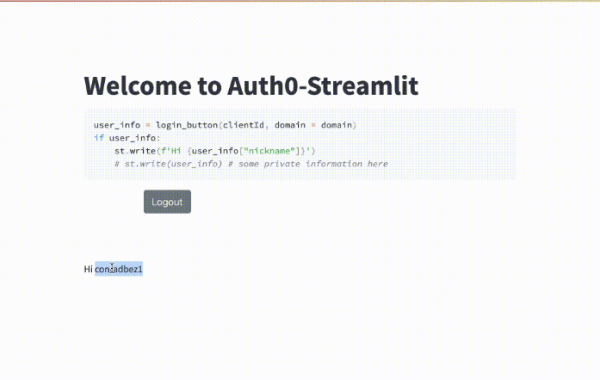
Streamlit Auth0
The fastest way to provide comprehensive login inside Streamlit. Created by @conradbez.
from auth0_component import login_button
user_info = login_button(clientId, domain = domain)
st.write(user_info)
Custom Components
V2 custom components
Register
Register a custom component.
my_component = st.components.v2.component(
html=HTML,
js=JS
)
my_component()
Mount
Mount a custom component.
my_component = st.components.v2.component(
html=HTML,
js=JS
)
my_component()
npm support code
Support code published through npm.
npm i @streamlit/component-v2-lib
FrontendRenderer
Type alias for the component function.
import { FrontendRenderer } from "@streamlit/component-v2-lib";
FrontendRendererArgs
Type alias for the component arguments.
import { FrontendRendererArgs } from "@streamlit/component-v2-lib";
FrontendState
Type alias for the component state.
import { FrontendState } from "@streamlit/component-v2-lib";
CleanupFunction
Type alias for the component cleanup function.
import { CleanupFunction } from "@streamlit/component-v2-lib";
V1 custom components
Declare a component
Create and register a custom component.
from st.components.v1 import declare_component
declare_component(
"custom_slider",
"/frontend",
)
HTML
Display an HTML string in an iframe.
from st.components.v1 import html
html(
"<p>Foo bar.</p>"
)
iframe
Load a remote URL in an iframe.
from st.components.v1 import iframe
iframe(
"docs.streamlit.io"
)
Configuration
Configuration file
Configures the default settings for your app.
your-project/
├── .streamlit/
│ └── config.toml
└── your_app.py
Get config option
Retrieve a single configuration option.
st.get_option("theme.primaryColor")
Set config option
Set a single configuration option. (This is very limited.)
st.set_option("deprecation.showPyplotGlobalUse", False)
Set page title, favicon, and more
Configures the default settings of the page.
st.set_page_config(
page_title="My app",
page_icon=":shark:",
)
Developer tools
App testing
st.testing.v1.AppTest
st.testing.v1.AppTest simulates a running Streamlit app for testing.
from streamlit.testing.v1 import AppTest
at = AppTest.from_file("streamlit_app.py")
at.secrets["WORD"] = "Foobar"
at.run()
assert not at.exception
at.text_input("word").input("Bazbat").run()
assert at.warning[0].value == "Try again."
AppTest.from_file
st.testing.v1.AppTest.from_file initializes a simulated app from a file.
from streamlit.testing.v1 import AppTest
at = AppTest.from_file("streamlit_app.py")
at.run()
AppTest.from_string
st.testing.v1.AppTest.from_string initializes a simulated app from a string.
from streamlit.testing.v1 import AppTest
at = AppTest.from_string(app_script_as_string)
at.run()
AppTest.from_function
st.testing.v1.AppTest.from_function initializes a simulated app from a function.
from streamlit.testing.v1 import AppTest
at = AppTest.from_function(app_script_as_callable)
at.run()
Block
A representation of container elements, including:
st.chat_messagest.columnsst.sidebarst.tabs- The main body of the app.
# at.sidebar returns a Block
at.sidebar.button[0].click().run()
assert not at.exception
Element
The base class for representation of all elements, including:
st.titlest.headerst.markdownst.dataframe
# at.title returns a sequence of Title
# Title inherits from Element
assert at.title[0].value == "My awesome app"
Button
A representation of st.button and st.form_submit_button.
at.button[0].click().run()
ChatInput
A representation of st.chat_input.
at.chat_input[0].set_value("What is Streamlit?").run()
Checkbox
A representation of st.checkbox.
at.checkbox[0].check().run()
ColorPicker
A representation of st.color_picker.
at.color_picker[0].pick("#FF4B4B").run()
DateInput
A representation of st.date_input.
release_date = datetime.date(2023, 10, 26)
at.date_input[0].set_value(release_date).run()
Multiselect
A representation of st.multiselect.
at.multiselect[0].select("New York").run()
NumberInput
A representation of st.number_input.
at.number_input[0].increment().run()
Radio
A representation of st.radio.
at.radio[0].set_value("New York").run()
SelectSlider
A representation of st.select_slider.
at.select_slider[0].set_range("A","C").run()
Selectbox
A representation of st.selectbox.
at.selectbox[0].select("New York").run()
Slider
A representation of st.slider.
at.slider[0].set_range(2,5).run()
TextArea
A representation of st.text_area.
at.text_area[0].input("Streamlit is awesome!").run()
TextInput
A representation of st.text_input.
at.text_input[0].input("Streamlit").run()
TimeInput
A representation of st.time_input.
at.time_input[0].increment().run()
Toggle
A representation of st.toggle.
at.toggle[0].set_value("True").run()
Third-party components
These are featured components created by our lovely community. For more examples and inspiration, check out our Components Gallery and Streamlit Extras!
Pandas Profiling
Pandas profiling component for Streamlit. Created by @okld.
df = pd.read_csv("https://storage.googleapis.com/tf-datasets/titanic/train.csv")
pr = df.profile_report()

st_profile_report(pr)
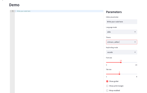
Streamlit Ace
Ace editor component for Streamlit. Created by @okld.
from streamlit_ace import st_ace

content = st_ace()
content
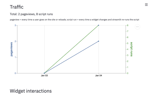
Streamlit Analytics
Track & visualize user interactions with your streamlit app. Created by @jrieke.
import streamlit_analytics

with streamlit_analytics.track():
    st.text_input("Write something")
Still have questions?
Our forums are full of helpful information and Streamlit experts.